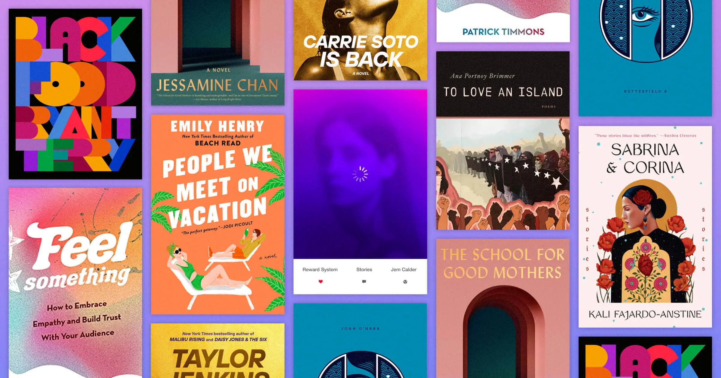
Book cover design might not be an accurate representation of the quality of a book, but the colors often set the tone for the story within.
If you’ve ever strolled through a bookstore or scrolled through social media feeds, you probably know what it feels like to be drawn to a book based on sight alone.
Even though we’ve been told to not pay attention to book covers and instead read the summaries and reviews on the back or inside flap, it’s easy to get drawn in by the front cover. And as we all know, you can’t see reviews from across the bookstore.
Authors might not like it, but even the most voracious readers have to admit that we’re all susceptible to eye-catching book design. And great designers know that color is one of the best ways to grab our attention.
So, let’s judge some books by their covers — or at least by their use of color.
Vibrant color palettes
If you’re looking for bright color palette ideas, take a note from these vivid designs.
Black Food edited by Bryant Terry
It makes sense that a book that’s been described as “visually stunning” would have such a bold book cover design. The book itself is so much more than food — it’s a curated collection of recipes, essays, and artwork that represent the voices of the African Diaspora.
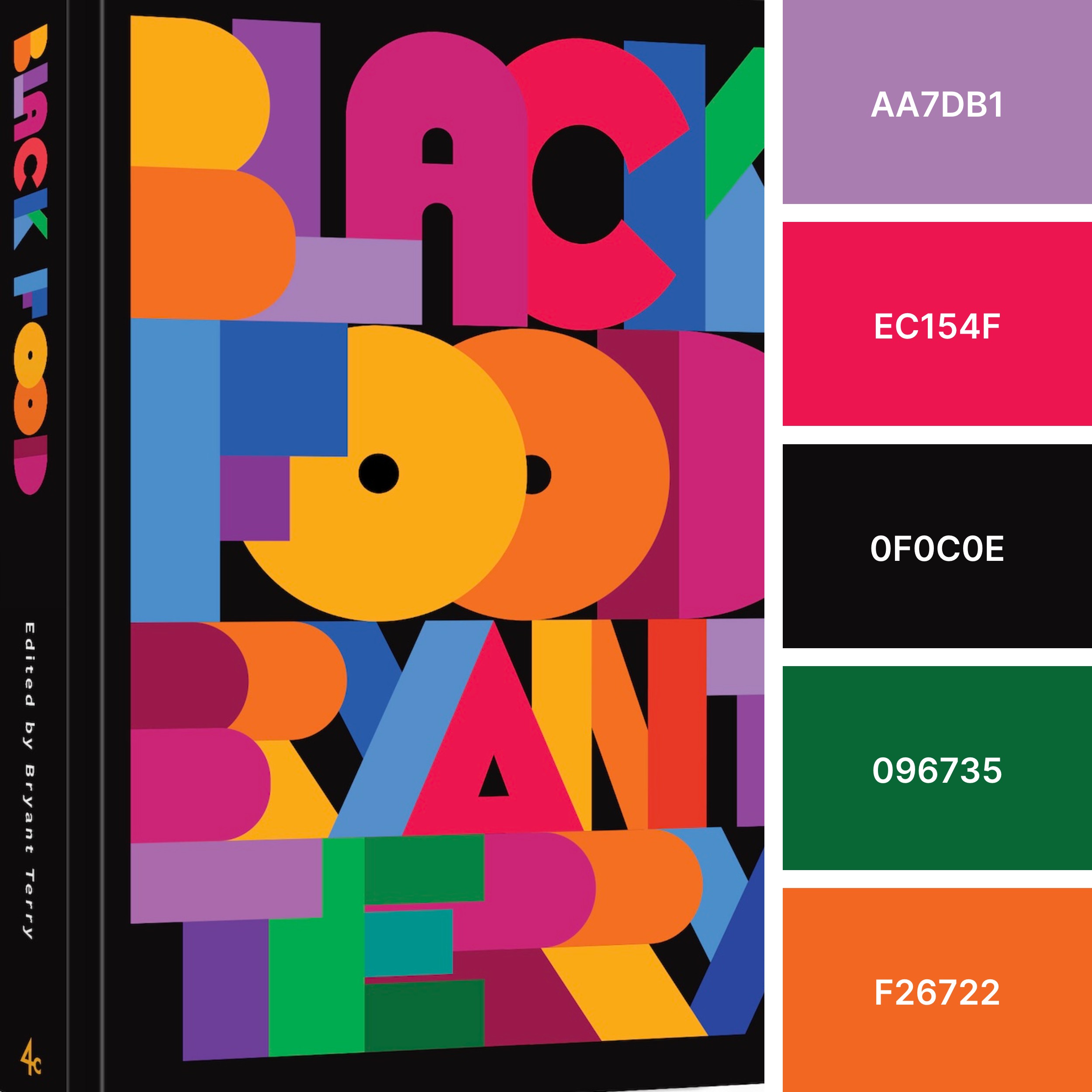
We love how the saturated color scheme — a mix of purple, magenta, black, green, and orange — and block letters immediately grab your attention. It’s an eclectic color scheme that would pop in print or set the vibe for an artsy locale.
Feel Something by Patrick Timmons
Webflow’s own Patrick Timmons delivers a pleasing gradient with a touch of grain.
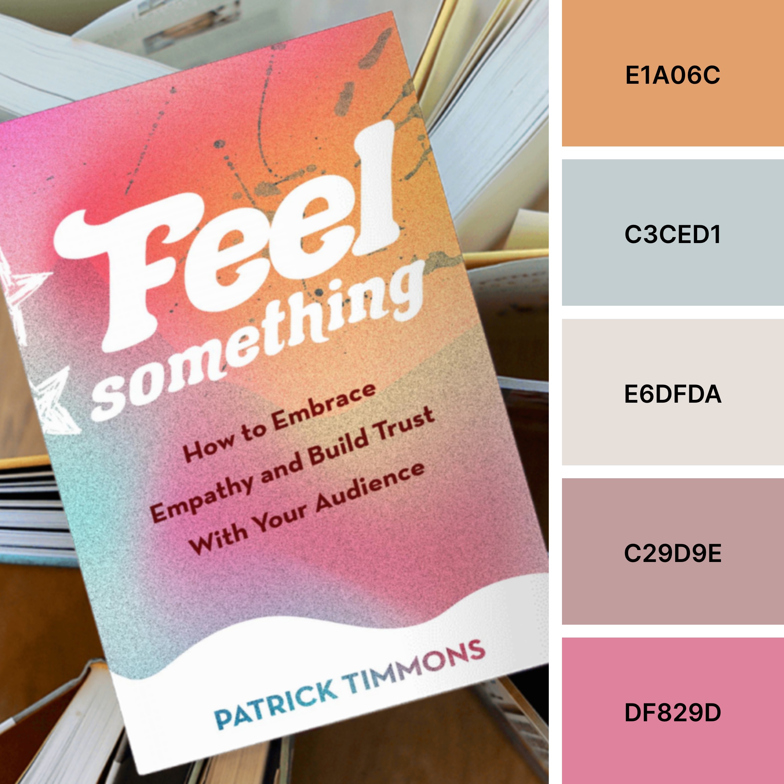
While the textured look doesn’t translate to the color palette, the collection projects a certain state of mind — a lively, optimistic tone that matches the book’s focus on empathy.
What we love about this palette is how the colors work together. Individually, they seem muted, but together the colors feel more expressive — perfect for a creative office space or hover-activated buttons like those on Patrick’s website.
People We Meet on Vacation by Emily Henry
Emily Henry’s book cover design style leans into bright colors, illustrations, and white block letters. While many of her book covers make great use of color, we especially love this vacation-inspired palette.
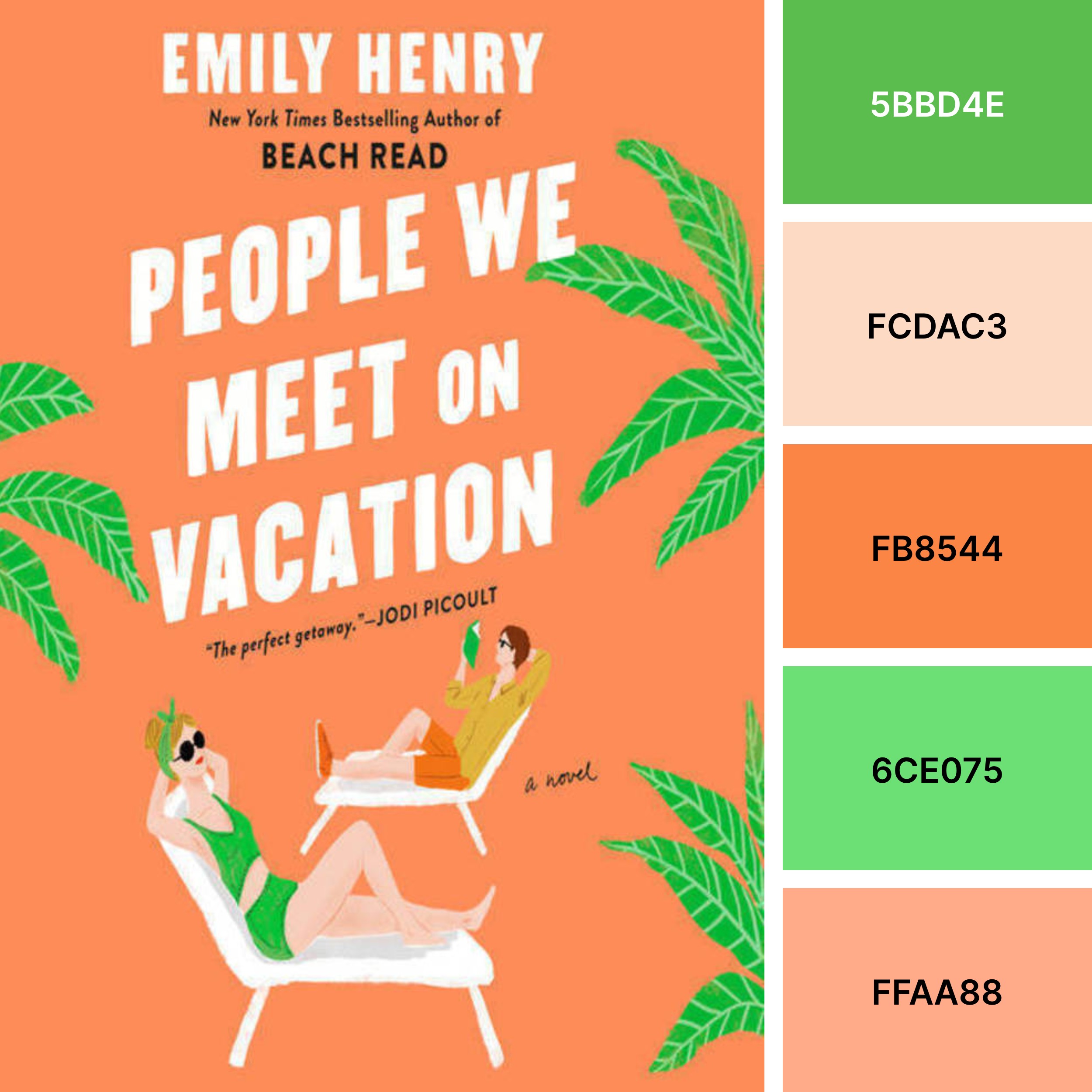
Neon greens, warm oranges, and a touch of peach come together to set an energetic tone. It’s a clever, attention-grabbing choice for a book that people might spot in an airport and buy on the way to their beach vacay.
Mostly monochrome color palettes
Artful use of color doesn’t haven’t to span the entire rainbow. Sometimes, (mostly) monochromatic color schemes can stand out.
BUtterfield 8 by John O’Hara
BUtterfield 8’s alternate book cover from the Penguin Drop Caps series serves up various moody blues.
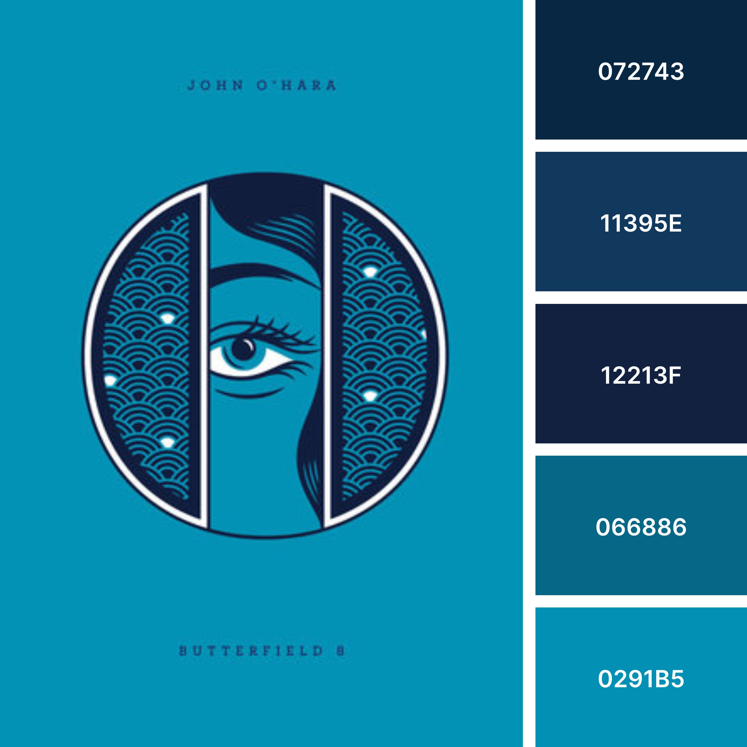
On the BUtterfield 8 cover, five different blues flow together like stormy waters. A simple-yet-impactful color palette like this would work well for a brand that wants to leverage color psychology to project a sense of tranquility or dependability.
Carrie Soto is Back by Taylor Jenkins Reid
It’s probably not a coincidence that a book about a tennis player past her prime coming back for “one last grand slam” would go all in on the sort of golden hues you’d see in a trophy case.
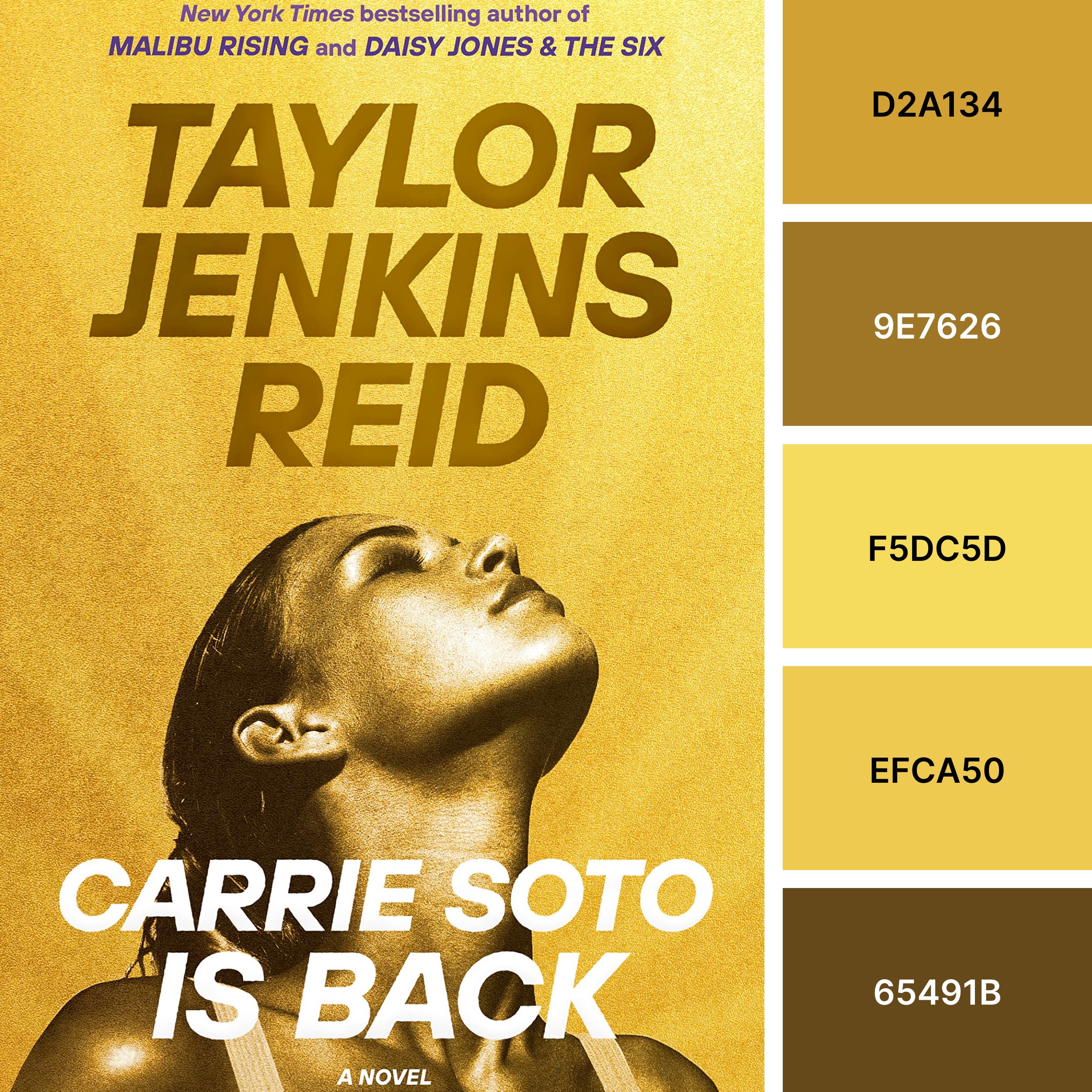
While we love bright yellows like lemon or canary, the use of golden and mustard yellows give this book cover a more intense, slightly serious feel. Thanks to the bronze, this palette has a sun-kissed warmth we could imagine working well for a sunscreen brand or makeup line.
Reward System: Stories by Jem Calder
Don’t worry, your internet isn’t lagging — the spinning loading circle is part of the book cover design.
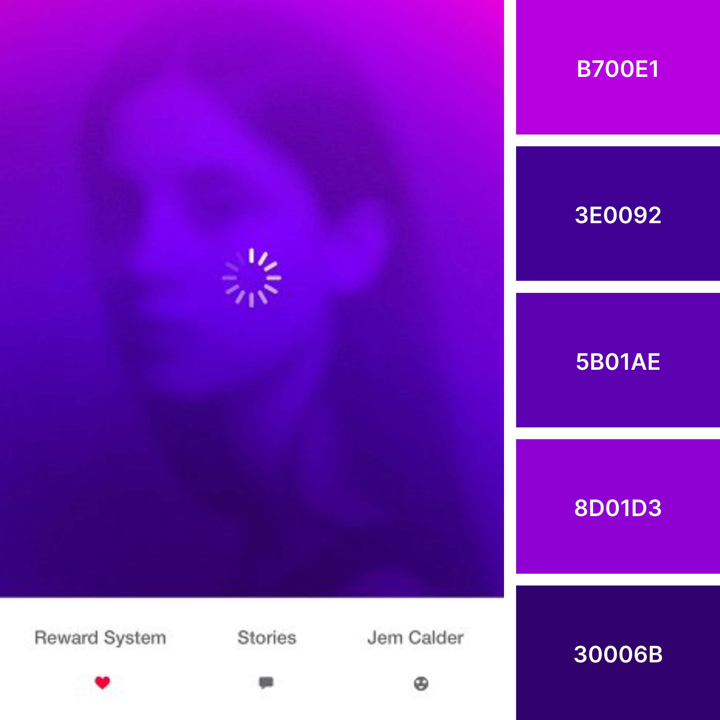
A blurred portrait paired with dark purples creates a pensive, brooding sensation on this book cover. Purple is often considered a mark of power, with ties to royalty in many cultures. It can also symbolize creativity, mystery, or magic. The deep violets and indigos from this palette would work equally well in a meditation space or a creative design portfolio.
Muted color palettes
While it’s tempting to go for flashy colors to stand out, book cover color choices should reflect the tone of the book itself. When thoughtfully curated, muted color palettes can be just as stunning as brightly colored designs.
To Love an Island by Ana Portnoy Brimmer
This collection, which “marries poems of protest and love for Puerto Rico,” has an appropriately intense palette that projects strength.
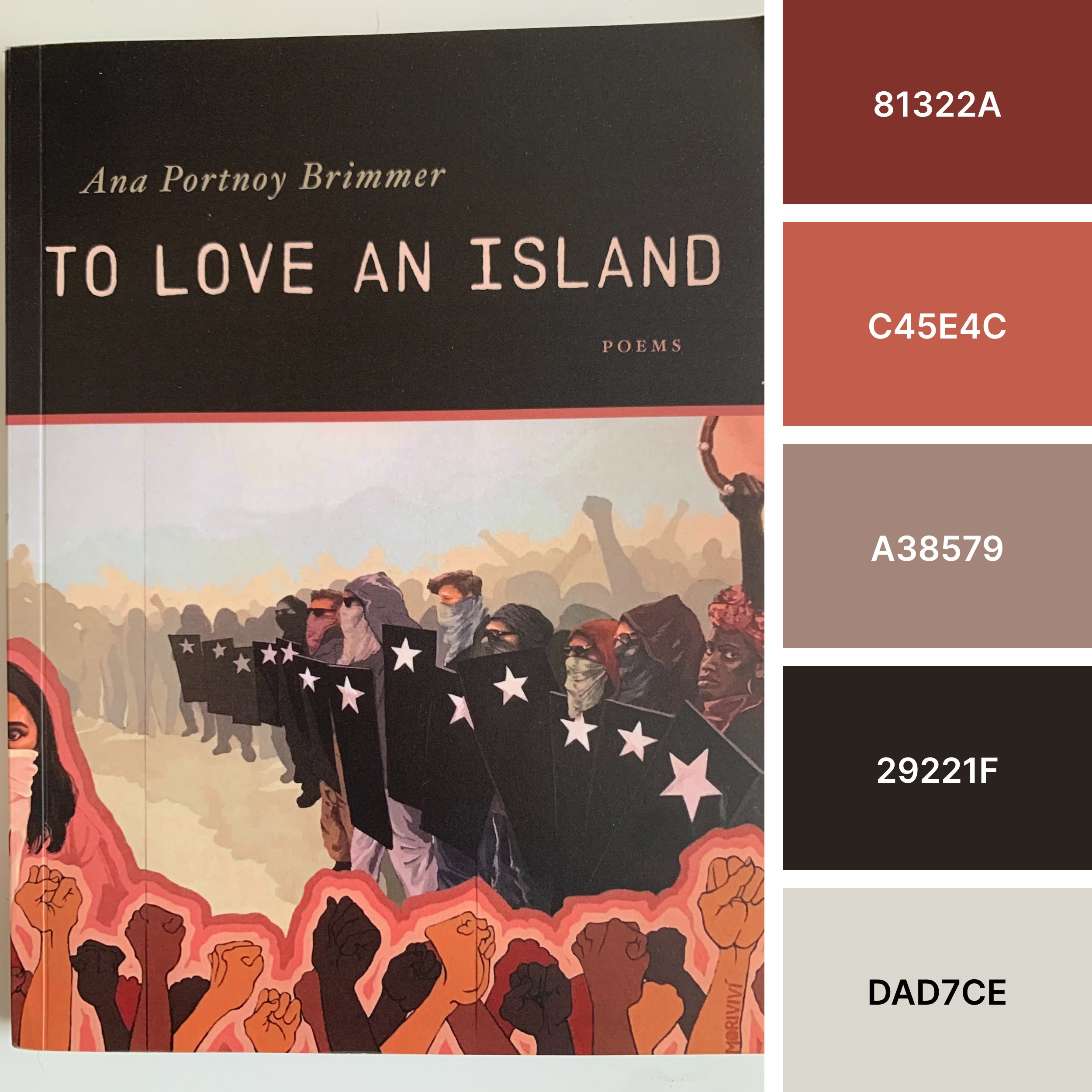
While the hues may be muted, the palette does not feel subdued. Colors pull from the raised fists that represent the diverse and united protesters featured on the book cover. Deep maroons seem to symbolize their passion and sacrifice. It’s a powerful color scheme that fits well with the fierce poetry collection.
The School for Good Mothers by Jessamine Chan
While the increasingly darker shades — moving from salmon to maroon — that make up the 3D doorway on this book cover would make a great color palette on their own, we love the addition of the emerald greens.
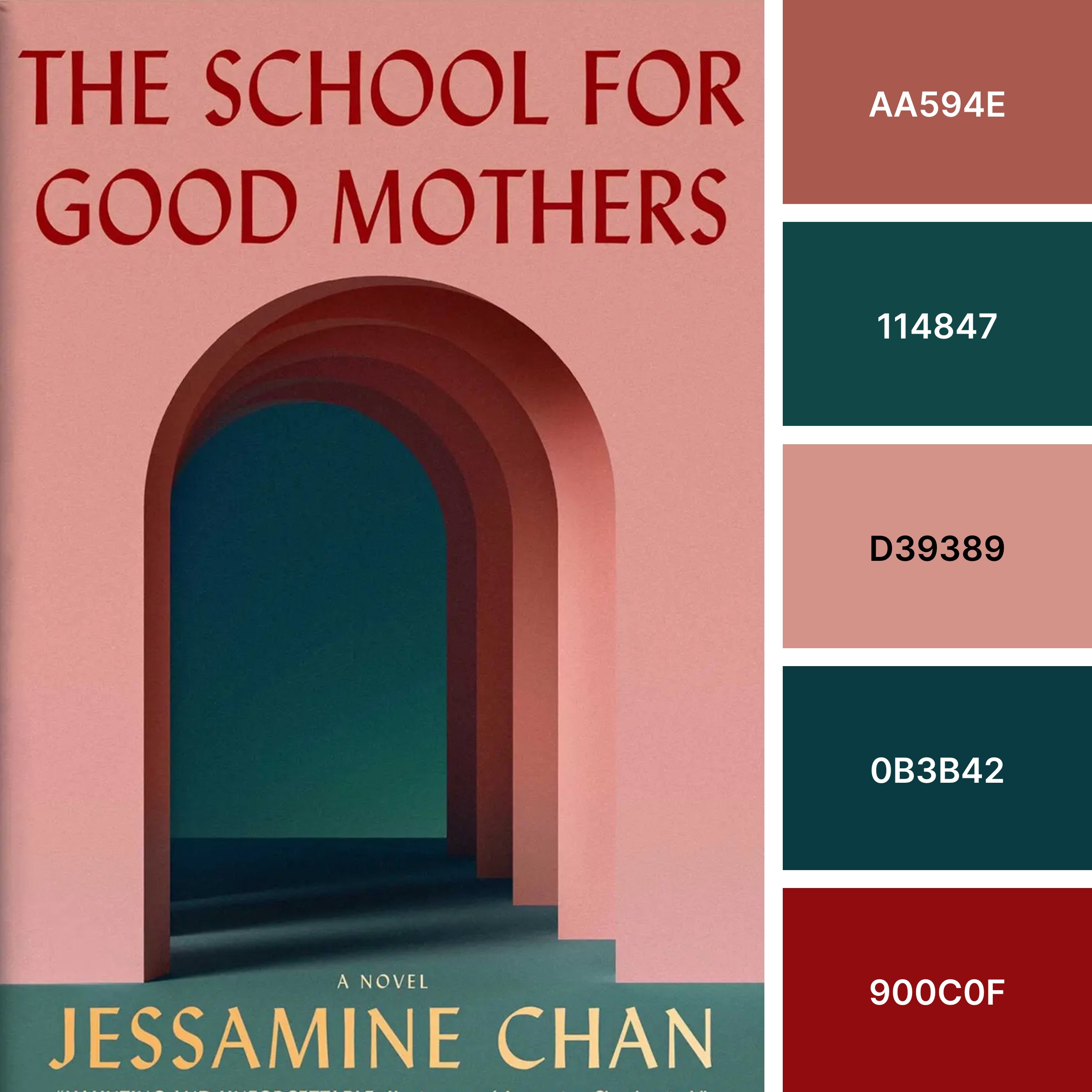
This mellow color palette feels intriguing, much like the slightly mysterious book cover. Complementary colors work together in this palette to create a classy look that we can imagine for a smoky lounge or a swanky boutique hotel.
Sabrina & Corina: Stories by Kali Fajardo-Anstine
From charcoal gray and black, into forest green, shifting into warmer shades of red-orange and goldenrod, the Sabrina & Corina color palette builds upon itself.
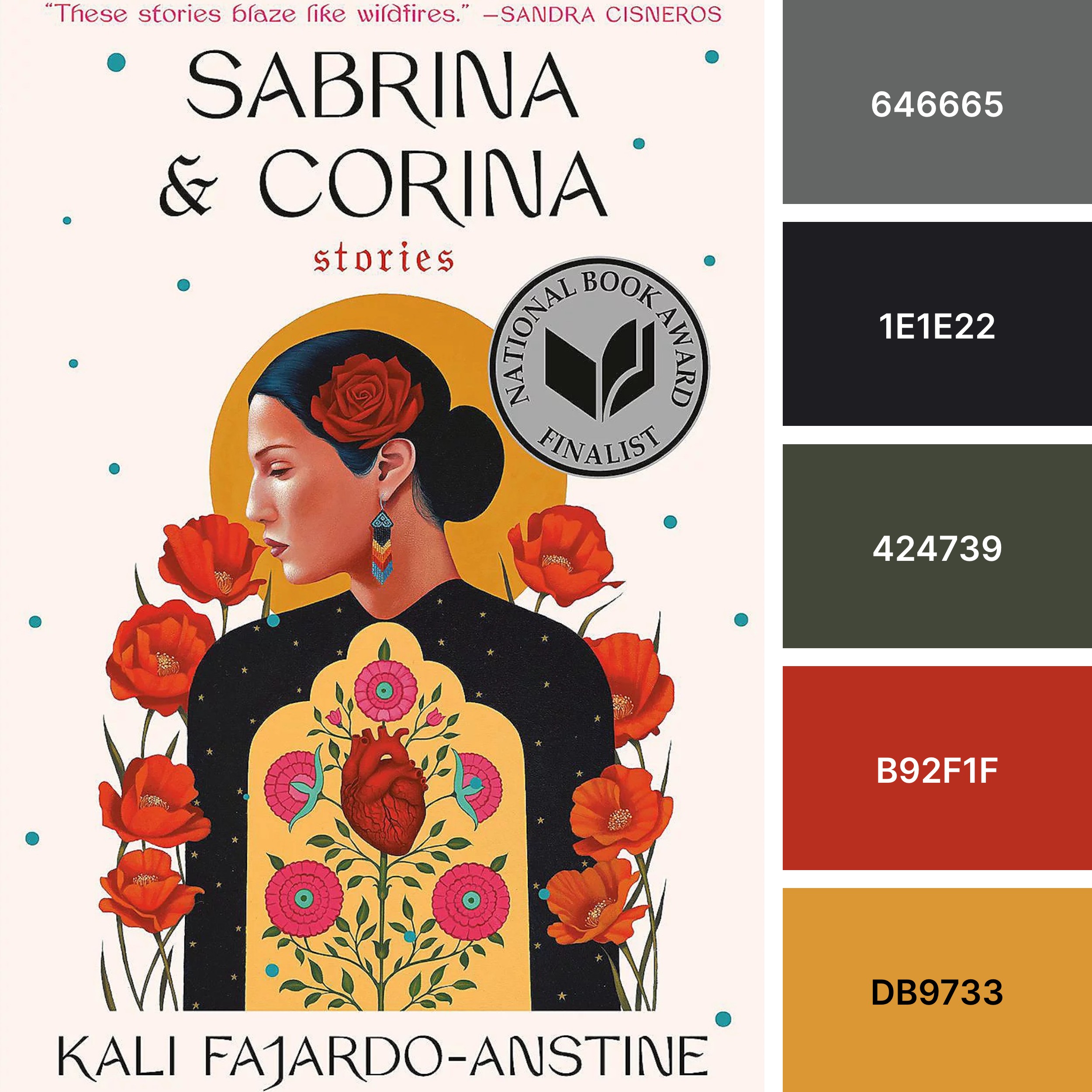
Gray, black, and muted green provide a foundation while the red-orange and goldenrod add pops of color without overpowering this low-key palette. It’s a flexible palette that could work in various settings, whether it be a chic website or stylish store.
Which types of color palettes speak to you?
Great designers know that color is a powerful tool — one that can communicate emotion, set a scene, or even speak to a specific generation. So whether you’re judging a book or working on a new web design, be sure to think about what the color choices convey.









Need creative inspiration, like, every week?
Join more than 800,000 people getting the best, coolest, and latest in design and no-code each week.


