Viva Magenta is officially the 2023 Pantone Color of the Year.
Every year, the Pantone Color Institute uses color psychology and in-depth research of color influences in society to determine what color speaks for design trends across industries including web design, fashion, generational marketing, and beyond.
In 2023, the deeply saturated Viva Magenta shade will leave its mark.
Both the color and its name feel powerful and celebratory. The word “viva” translates to “live” in many Latin-based languages but is often used to express and promote the long life of something. “Viva” is used everywhere from slogans like “Viva Las Vegas” to chants of national pride like “Viva México!”
While we can’t confirm that’s why the name was chosen, the Pantone Color Institute does describe Viva Magenta as “expressive of a new signal of strength” and “a pulsating color whose exuberance promotes a joyous and optimistic celebration.”
Get to know Viva Magenta
Magenta might not be the first color that comes to mind when you think of nature, but it’s not a completely artificial shade. In fact, Viva Magenta was inspired by one of the oldest natural dyes — a red derived from a scale insect, cochineal.
While Viva Magenta descends from the red family, it also leans towards pink. Color psychology tells us that red hues tend to communicate passion, love, power, vigor, and urgency. Meanwhile, pink shades are associated with romance, playfulness, caring, and youth.
Viva Magenta strikes a balance between red and pink — communicating power with a touch of playful rebellion.
How to use the Pantone Color of the Year in your designs
Viva Magenta is a strong color that could overtake a design if not used thoughtfully. But it also has the potential to give your visuals a pop of color, make a bold statement, or complement other design elements.
As you explore these color palettes, keep color contrast ratios in mind. Dark colors like Viva Magenta may not be the best choice for background or text color. Use Webflow’s color contrast checker or external tools like WebAIM to ensure your color choices for text and background are accessible to the widest range of vision possible.
Viva Magenta color shades
The Pantone Color Institute chose Viva Magenta in part to reconnect with and draw inspiration from nature. Unsurprisingly, their suggested “magentaverse” color palette includes several muted, natural colors like Pale Dogwood, Gray Sand, Fields of Rye, and Plein Air.

In this particular palette, Viva Magenta is the eye-grabbing color amongst neutrals. But if muted grays and sandy browns aren’t your thing, there are plenty of other ways to apply color theory and use Viva Magenta in your designs.
Monochromatic Viva Magenta color palette
Monochromatic color palettes use different tints, shades, and tones of a single color.

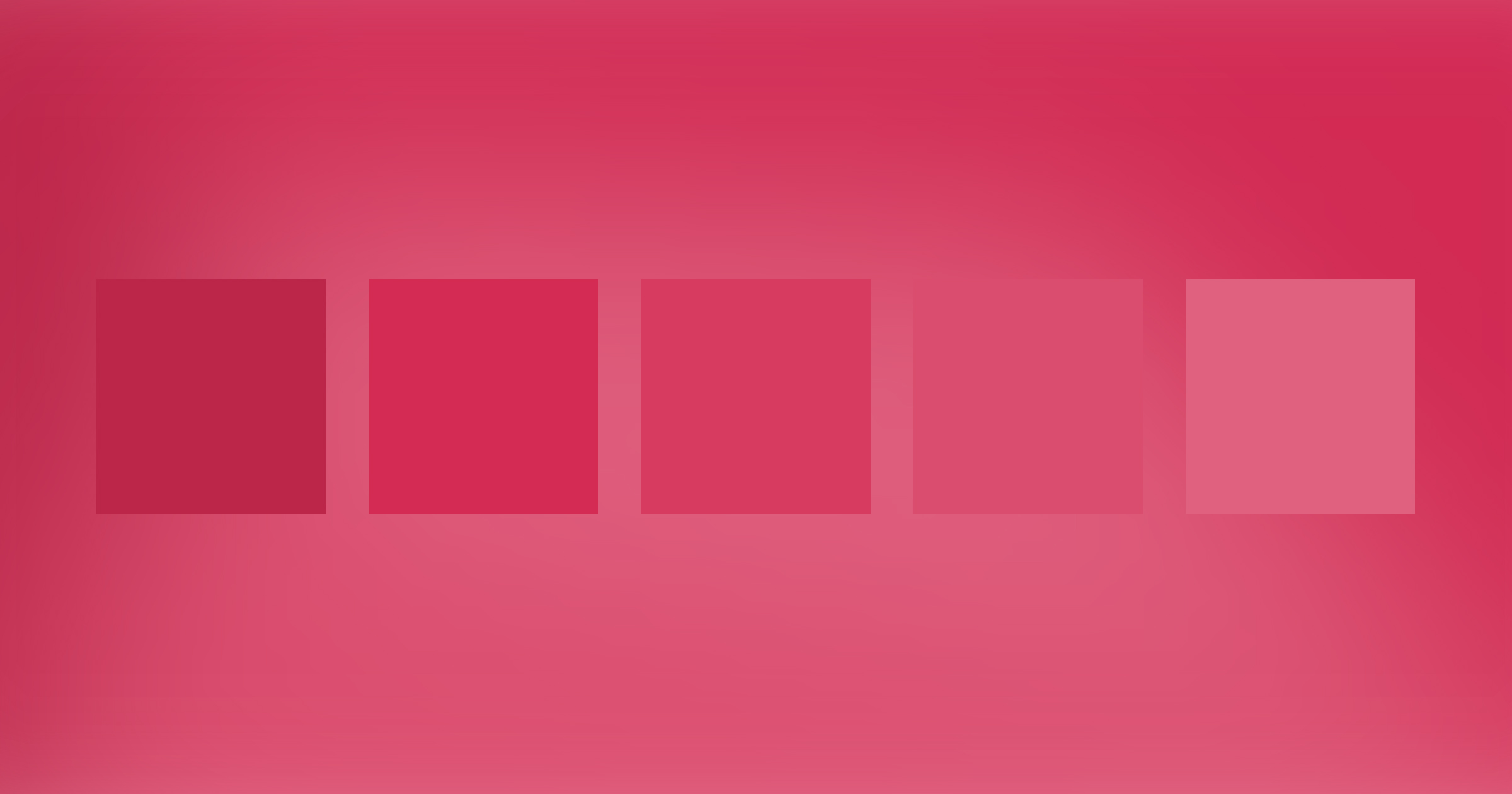
This monochromatic palette features various tints of Viva Magenta with more white added to each color, resulting in increasingly lighter colors.
What colors go with magenta?
Analogous Viva Magenta color palette
Analogous color schemes traditionally include three colors that sit next to each other on the color wheel, but we expanded to five.

For this analogous color palette, we ventured into the reds, oranges, and purples that appear on either side of Viva Magenta on the color wheel.
Triadic Viva Magenta color palette
Triadic color combinations traditionally feature three colors that form an equilateral triangle on the color wheel.

For this triadic palette, we included some additional shades of the magenta and green to expand to five colors.



Get started for free
Create custom, scalable websites — without writing code. Start building in Webflow.
Complementary Viva Magenta color palette
Complementary colors are probably the most familiar type of color combination. These color pairings sit across from each other on the color wheel, creating a balance. Whether you’ve realized it or not, you’ve likely selected a complementary color scheme based on what looks and feels right.

The color in the middle of this palette, “mountain meadow,” is the direct complement to Viva Magenta. This complementary color palette features additional colors from the magenta and green sides of the color wheel.
Split-complementary Viva Magenta color palette
To create a split-complementary color palette, we take two complementary colors and swap one of those colors for an analogous color. In this case, we started with Viva Magenta’s complementary color, “mountain meadow,” and swapped it for an analogous color — a dark blue.

After selecting the two base colors (magenta and blue), we finished this split-complementary color palette with additional colors from the magenta and blue areas of the color wheel, along with a deep forest green.
Tetradic Viva Magenta color palette
Tetradic color palettes traditionally include 4 colors — two pairs of complementary colors, forming a square or rectangle on the color wheel.

Viva Magenta, viva colorful design
Viva Magenta is an intriguing addition to the Pantone Color of the Year timeline. Each year, the Color of the Year influences mobile phone colors, fashion choices, web design, and more. Just look at what happened with the 2016 color, Dusty Rose, which essentially became millennial pink and 2021’s color, Illuminating, which became Gen Z yellow.
Viva Magenta may or may not be the color that defines an entire generation — but it will certainly influence trends in 2023. Play around with these magenta color pairings and consider incorporating Viva Magenta into your colorful designs.


