If you’re at all familiar with how the web works, Webflow is a pretty straightforward tool. You don't need to read a library full of documentation to start building a gorgeous website.
But there are a few pro tips designers have found by chance, and other tricks shared on the forum by the Webflow team. And they’re sure to speed up your design workflow significantly.
This post originally appeared on Vincent's superb blog, inb4.webflow. It has been expanded with a few extra tips from the Webflow team.
1. Use non-HTTP links by adding a backtick (or grave)
Let’s say that, with a little research, you discovered a bit of code that makes a link work like the browser’s back button: window.history.go(-1).
But when you add that snippet of code in the URL box in a link’s settings, Webflow automatically tacks http:// onto the link, killing whatever clever, non-HTTP functionality you had in mind.
But there’s a solution! Whenever you need to add special code instead of an HTTP link, just put a backtick (`) in front of the code, then hit Tab or just click out of the field, and Webflow won't add the infamous http://.

This is handy since what you can put in an HREF attribute constantly evolves. Webflow has you covered as far as HTTP, mailto, tel, and anchor links are concerned. But any new functions that crop up will require that backtick.
2. Vertically center an anchor link’s destination with custom attributes
Clicking an anchor link in Webflow typically brings the anchored section to the top of the page, or just below the navbar.

But what if you want to bring the anchored section into the middle of the viewport instead? It’s easy: just add a new custom attribute to the section called data-scroll and set its value to mid.
Select the element you’re anchoring to (not the link that triggers the scroll), switch to the Settings tab, and click the + icon to add a new custom attribute.

And voila! Now the section will center itself in the viewport when you click its anchor link.

Note: You may need to reload the Designer for this to work in Preview mode. Also, if the anchored section is taller than the viewport, it’ll still scroll to the top of the viewport.
3. Control the speed of the smooth scroll to an anchor
When an element has a section ID defined, you can tell a link to anchor down to that section. When a user clicks that anchor link, the page will smooth scroll to that ID with an ease-in-out easing mode over 1000 ms (that’s one whole second).
Now, one second is a long time when it comes to an interaction. Most click and hover interactions take between 200 and 350 ms. Of course, it makes sense for a long scroll to require a little more time, but for many, 1 second is too much. And for those who want to use the smooth scroll as a narrative effect, 1 second may be too short.
Thankfully, you can change that scroll speed with custom attributes. You can do this two ways, depending on whether you want all scroll interactions to share one time, or you need more granular control:
- Add the custom attribute data-scroll-time to the <body> tag, to affect all scroll operations on the page
- Add the custom attribute data-scroll-time to the individual element you’re anchor-linking to to control scroll speed to that element
Of course, you can also combine the two methods: Set one default scroll speed for all links on the page by adding the custom attribute to the <body>, and override that setting by adding other values directly to the targeted elements.
Here's how to add a custom attribute. Select your target element or the <body> tag, go to the Settings tab, and add an attribute and its value in the Custom Attributes section.
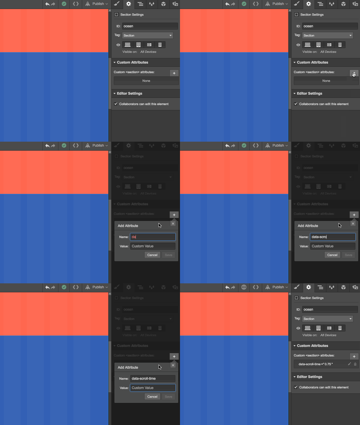
You can set any value you’d like, so long as it’s a multiplier of the default value of 1000 ms. You can use the following formula to calculate the duration of the smooth scroll:
Duration of the smooth scroll = value you enter × 1000 ms
Here’s how that plays out for a few example data-scroll-time values:
- 0 = scroll immediately to the element
- 0.75 = scroll a little faster than the default (750 ms)
- 1 = scroll at the default speed (1000 ms)
- 1.25 = scroll a little slower than the default (1250 ms)
- 2 = scroll twice as slow as usual
- 20 = TurtleMode™
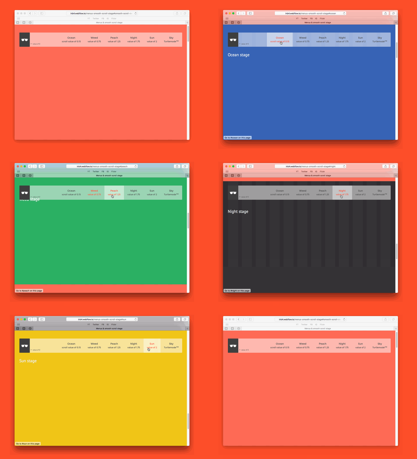
Just be careful with very high values, as you won't be able to cancel the scroll once you’ve started it, even in the Designer. A long scroll will begin, then be interrupted by another event (say, a click), then continue as soon as the other event finishes.
This trick was posted by Vlad Magdalin in the forum thread Customize Webflow Anchor Scrolling Behavior/Speed from February 2014.
4. Target an element with a combo class in an interaction
Yes, you can target an element with a combo class in an interaction! After using it in pretty much all of my interactions, I’ve found it safe to use. This is a little more involved, so check out my tutorial “Affect an element with a combo class.”
5. Do math right in a Webflow field
Ever wondered exactly how many decimals places you should include for your 1/3rd-width element: 33.3% or 33.333333333333333333333? Do you always have your Calculator app open while you’re designing?
Thankfully, you don’t need to know the answer to that. Or have your Calculator open. Because Webflow can do the math for you.
Just enter your calculation (e.g., 100/3) into any of the width/height fields in the Style tab, hit enter or tab, and watch the magic happen. Don't forget to add the unit you want the final calculation in!


Why your design team should use Webflow
Discover how design teams are streamlining their workflows — and building better experiences — with Webflow.
6. Highlight all elements with the same class
Unlike these other tips, this one’s pretty well documented, and widely known. But it’s also easily overlooked, and many people new to Webflow don’t know of it.
See the label under the selector field in the Style tab? It tells you how many instances of the current selector appear on the page you’re working on, plus other pages.
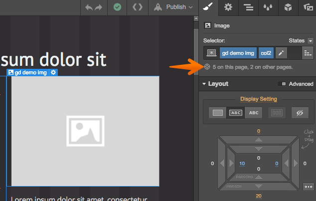
It's very convenient, as it can help keep you from modifying elements that are just right the way they are, and help you make decisions about when to create a combo class, or a whole new one.
But did you know that you can click that helpful message to visually highlight all elements with the same selector? You totally can.
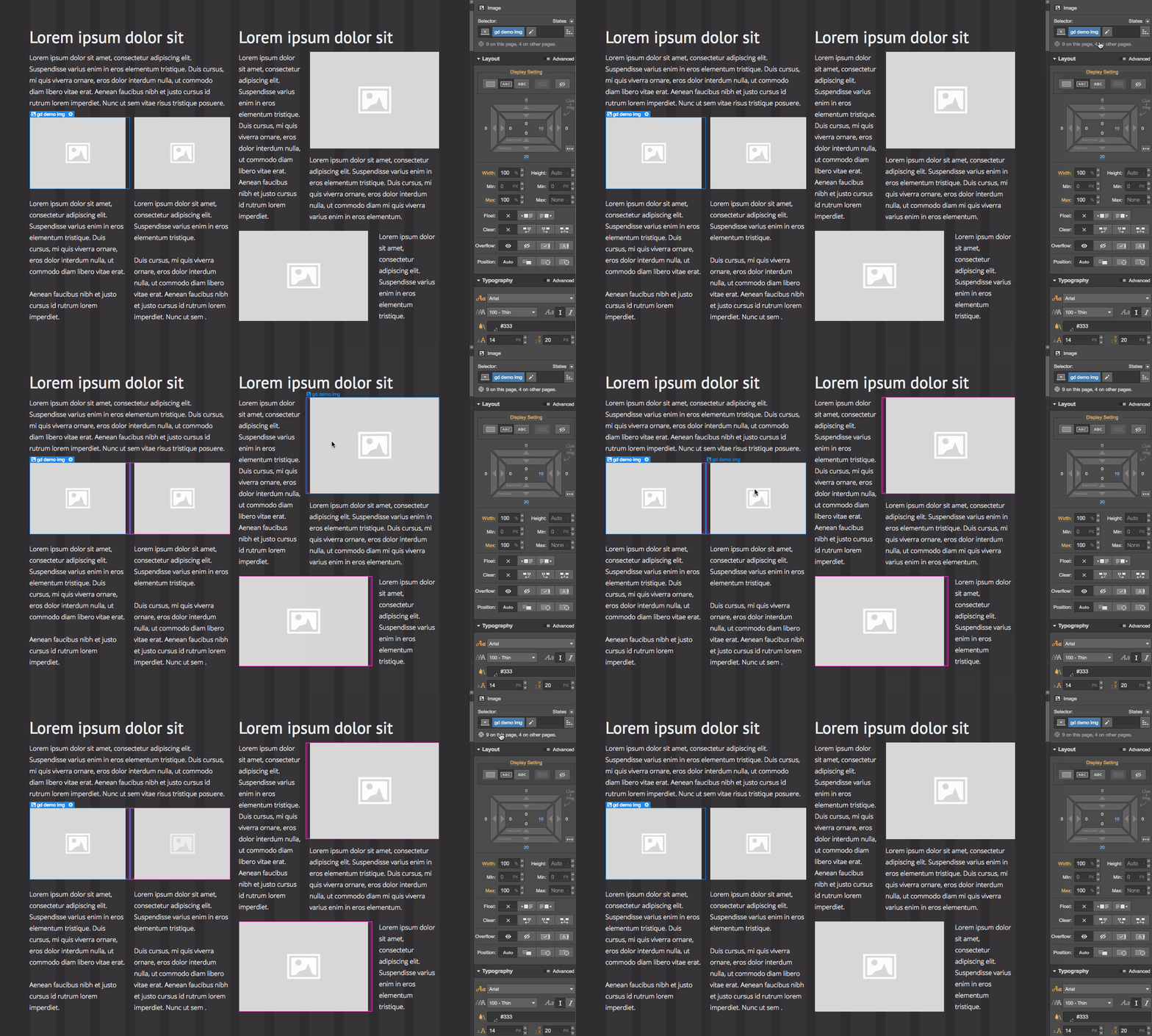
So, if you select an object with the class ".demo-image,” then click the “X on this page, Y on other pages” text, all the other objects with this class will be outlined in pink. Even if they have a combo-class after the selected selector.
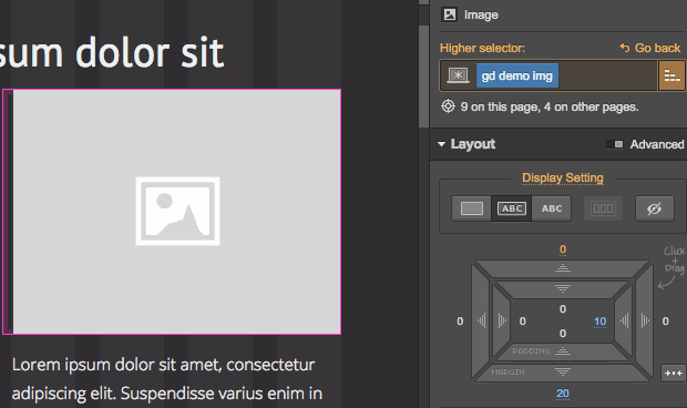
The feature works when you select a higher selector too.
7. Clear styles with an Option/Alt + Click
In the early stages of a design, you can end up going back and forth on a lot of design decisions. (Or at least, I do.) And often, as you work through your responsive breakpoints, simply clearing a style from bigger screen sizes will do the trick.
Handily, there’s a quick and easy way to remove a style adjustment from an element. Just hover over any blue-highlighted style you added, then hold Option (on Mac) or Alt (Windows) as you click.
That’ll immediately clear out the style you added!
Note: If the style you added overrides a default or inherited style, this will update the style to the default or inherited value, rather than completely removing it. For example, Heading elements in Webflow have top and bottom margin right out of the box. If you overrode that for your H1 styles, for example, Option+clicking will restore the default margins, not zero them out.
8. Adjust multiple margin/padding values at once with Alt/Shift + drag
Setting a 5% margin on all four sides of a card design, one margin at a time?
Ain’t nobody got time for that.
So, hold Option (Alt on Windows) while you drag that margin or padding value to adjust two opposite sides (top and bottom or left and right), or hold Command (Control on Windows) to adjust all four sides, all at the same time.
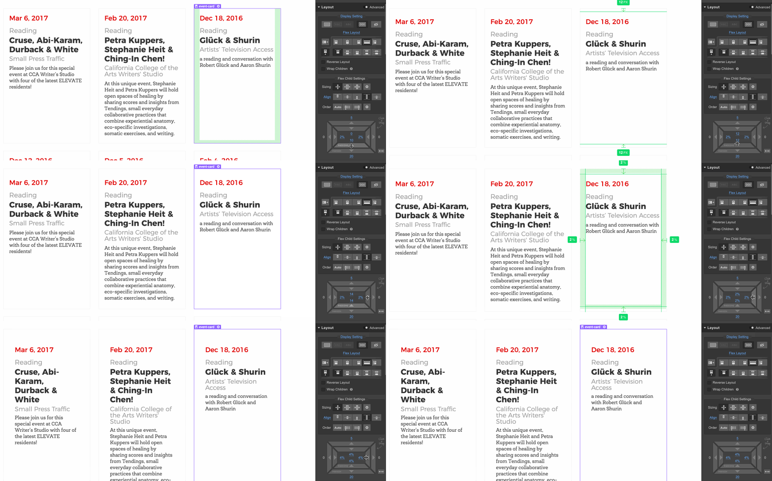
9. Speed up unit updates with Shift
Need to bump your hero headline up from 3 to 4 em, but don’t want to type it? Or hit the up arrow 10 times?
Just hold Shift while you hit the up or down arrow in any unit box (i.e., margin, padding, width, height, font size, etc.) to move by tens instead of ones.
10. Move through elements in Navigator order with Option + Up or Down arrow
Need to quickly get to a parent or child element without switching to the Navigator? Just select an element, then hold Option as you hit the Up or Down arrow. This lets you quickly travel through nested and parent elements and — unlike just using the arrows — will move between sections after you’ve passed up the last child in the previous section.
11. Duplicate elements with Option + drag
Here’s a super-handy one you’ll immediately recognize if you’re familiar with Photoshop and/or Sketch: next time you need to duplicate an element you’ve already designed, just click on it, then hold Option (or Alt on Windows) while you drag the element to a new location. Instead of moving the selected element, it’ll simply duplicate it in the new location — complete with all its nested child elements!


