

If you’re like most designers, you’re probably most comfortable tackling the early stages of the design process in a desktop app like Photoshop or Sketch. This can be a great way to handle the process as it minimizes the number of choices you have to make within Webflow, speeding things up even more.
But unfortunately, it can also mean a lot of duplicative work. With that in mind, here’s how I make the PSD-to-Webflow design process faster and easier.
Want to follow along?
Throughout this post, I’ll be working on building a Webflow site based on Robert Mayer’s freebie PSD portfolio design.
Step 1: Extract all your image assets from Photoshop
I used to think that this was a very tedious task, but Adobe created a wonderful “Generate Image Assets” feature that makes the process much faster and easier.
Here’s how to generate your image assets in Photoshop:
1. In the Layers panel, select and name all your images
Make sure the names are production-ready, as you'll be exporting them in the next step.

2. Go to File ➞ Generate ➞ Image Assets
This will create a folder containing all your image assets. They’ll have the names, formats, and image sizes you defined in Photoshop.

Step 2: Create a new Webflow project and add your fonts
Once you’ve created a new Webflow project, go to the Fonts tab in the project’s settings and add all the fonts you need. You can choose from any font in the Google Fonts library, any fonts you own, or connect your Typekit account to add fonts from there.

Whether you’re uploading fonts or selecting them from Google Fonts or Typekit, be careful to only select the weights you need on your site. Every font weight you add to your site adds to the total file size, and hence, load time.
Step 3: Upload your images
In the Designer, open the Assets panel and add all your images, either by dragging and dropping them in, or clicking the upload button (the cloud icon with the upward-pointing arrow). Either way, you can batch-upload your images.

Step 4: Create your style guide
Creating a style guide in Webflow allows you to adjust global site styles in one place, so you can quickly update your design when your client decides they don’t like the headline font, or wants a different shade of blue.
You can create the style guide either as its own page of the site, or make it a Symbol so you can easily add and delete it from pages while you work.
When building a style guide, I usually include:
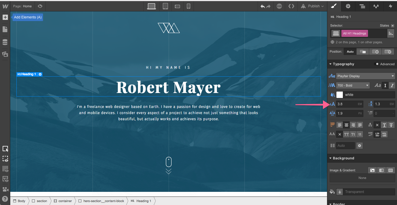
- H1 through H6 headings. Be sure to style your global selectors (i.e., “All H1 Headings”) for each heading level.
- Paragraph. You may need to have separate paragraph styles for long-form and other content.
- Button. Don’t forget to style its different states!
- Text-link. Ditto on states.
- Colors. Be sure to save all your custom colors as global swatches.
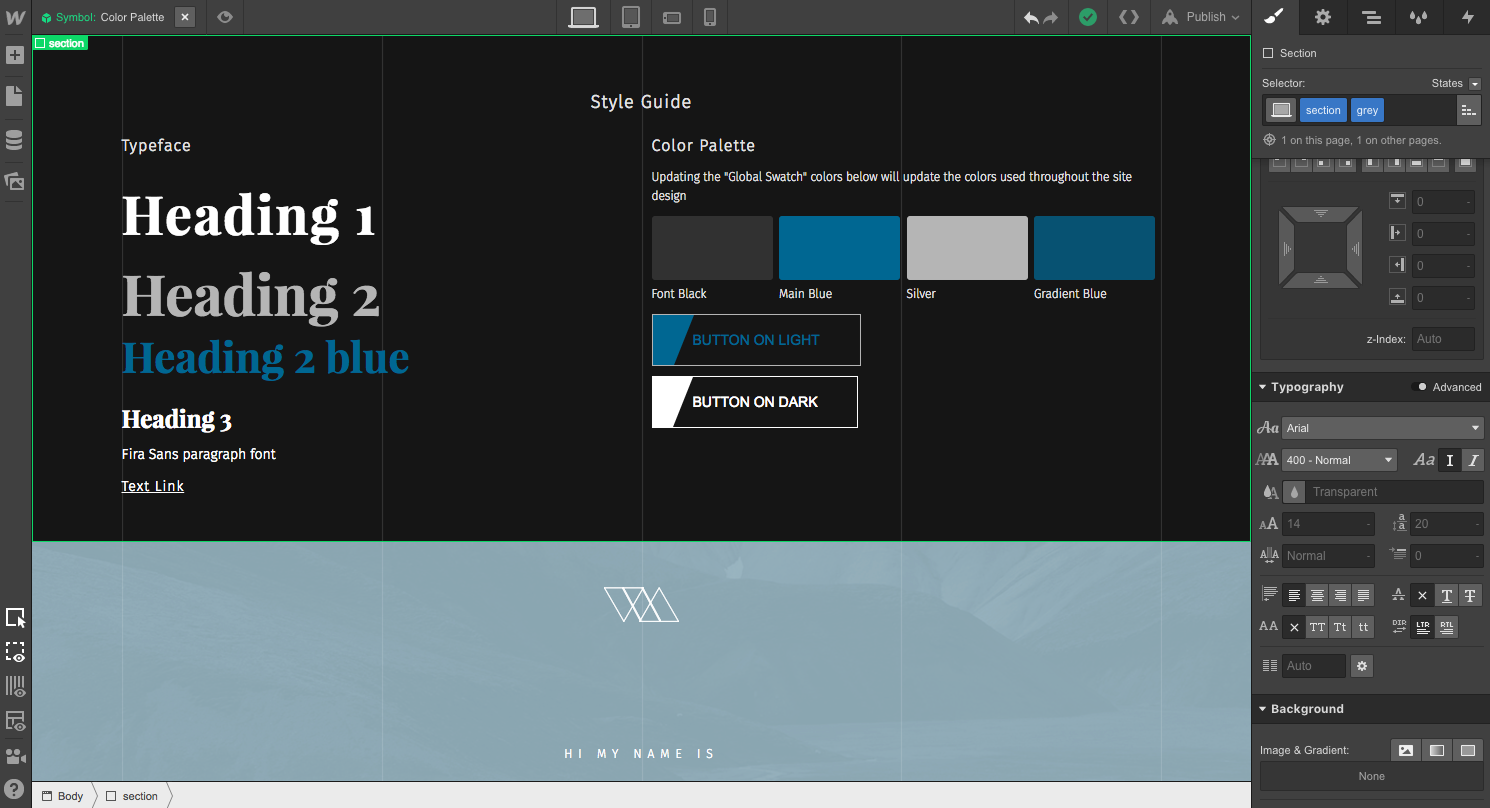
Pro tip: Make your style guide a Symbol
Turn your entire style guide section into a Symbol so it’s easy to add or delete from any page. This is handy as it allows you to have the style guide on the page you’re working on for reference, and can easily delete it when the page is done.
You can also add light and dark variants of text elements and logos. Handy if page backgrounds will differ in color.
Step 5: Create your brand color palette
We mentioned adding colors to the style guide in the previous step, but it warrants a little more attention.
Add a div block to your page and give it a background color from your Photoshop design. Use the eyedropper to select the color in your PSD and paste the hex code right into Webflow to ensure you’ve got just the right shade. Then save the color as a global swatch and name it appropriately.
Repeat until you’ve got your entire color palette locked down. With each swatch saved globally, you’ll be able to quickly and easily apply the right colors across your site — and even update them as needed later.

Step 6: Build out your global elements
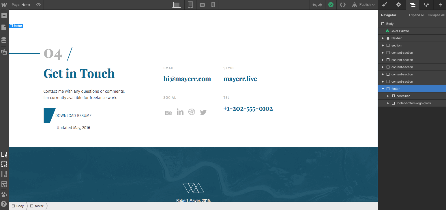
Elements such as your site navigation, footer, contact form, and more often don’t change from page to page. As you build out these global elements, be sure to make each into a Symbol.
Symbols allow you to turn any recurring element into a reusable component, and to keep all instances of that Symbol synchronized across your site as you make updates.
That way, you can quickly add global elements to each page that needs them, vastly speeding up the design process.


Get started for free
Create custom, scalable websites — without writing code. Start building in Webflow.
Step 7: Set yourself up for responsive success
When you’re working from a PSD, it can be all too easy to get stuck in a pixel-based mindset. But to simplify the responsive design process, you need to think in relative not fixed units — and for much of your site, that means thinking in percentages.
Doing that will save you a lot of work as you adjust your design for smaller devices.
Here are a few steps I take to ensure that my design will be easily responsive:
- Set your Sections to 100% width, relative position and have them clear: left. This ensures that child elements stay within the parent element and that the section doesn’t collapse at any point. I also do this out of habit as Internet Explorer requires fairly explicit style directions.
- Add overflow: hidden to any elements that will extend beyond the page width to prevent horizontal scrolling
- If you add a max-width to an element, make sure its width is set as a percentage
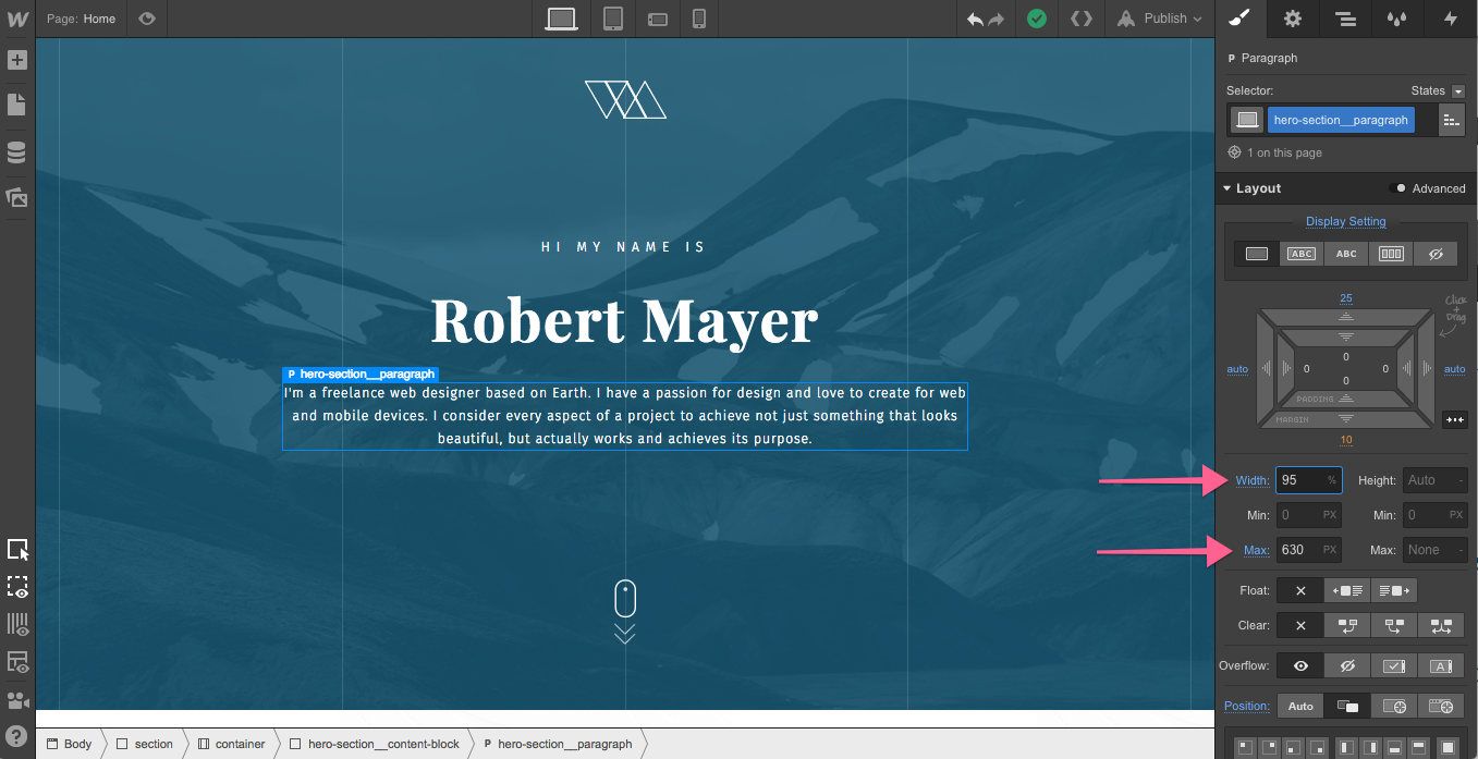
- Use ems for font sizing, at least for line-heights, and ideally for size as well
- Finish your desktop design before styling your mobile breakpoints as the styles cascade down in Webflow
- If you’re working from a PSD with multiple breakpoints pre-designed, be sure to compare the various designs before you start to see if you’ll need to account for any radical changes
Step 8: Flex responsibly
Flexbox is a powerful layout tool that can dramatically speed up your workflow, especially when you’re trying to vertically center content, evenly distribute elements, or change element positions at different breakpoints.

I typically use basic box model styles like relative, absolute, and fixed positioning — but that’s just because I grew up in a world where people were still using IE8.
That said, there are several great use cases for flexbox:
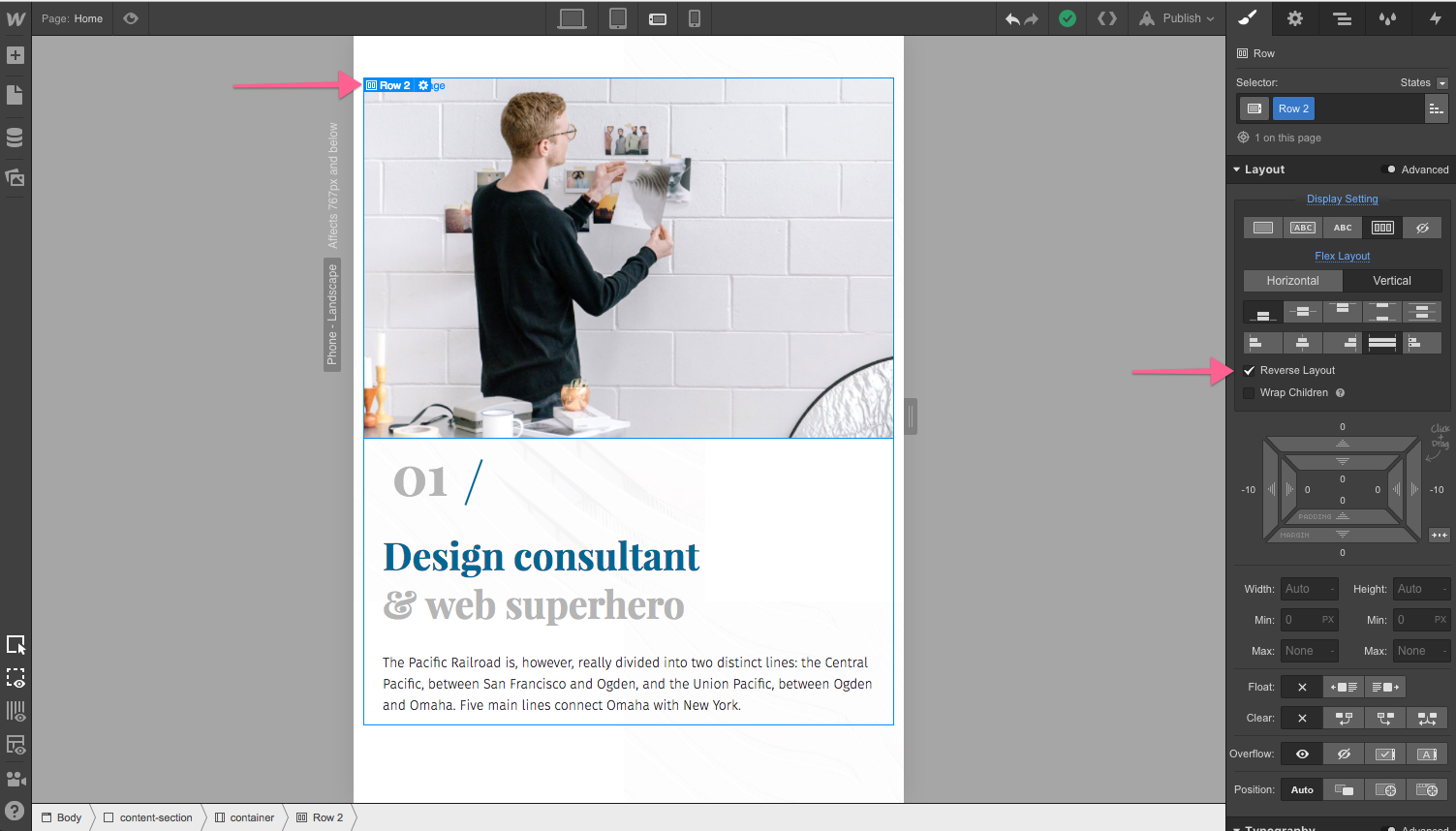
- Reverse layout: Layouts that alternated between “text-left, image-right” and “image-right, text-left” used to be difficult to handle on mobile. But with flexbox, you can just click the “reverse layout” checkbox to ensure that images consistently display above or below text.

- Centering elements vertically
Believe it or not, vertically centering elements within a container used to be pretty hard. Flexbox makes it one-click-simple.
- Fluid grid designs
Flexbox also simplifies the creation of fluid grid-based designs.
Step 9: Decide between inline and background images
Deciding between an inline image or a background image can be difficult at times, so I use these rules of thumb to help me make the right decision:
If you want the image to:
- Serve as a section’s background, filling both width and height
- Have a gradient or single-color overlay
- Have an inner shadow
- Be fixed, to create a parallax scrolling effect
Then use a background image.
However, note that elements with background images are more difficult to reuse (unless you’re serving the background image dynamically), as you’ll need to add a combo class to avoid serving the same background image again and again.
Otherwise, use an inline image. Webflow automatically resizes inline images for various devices, and you can easily add alt tags to them. Plus, they're easier to reuse than elements with background images.

Step 10: When to use margin vs. padding
I get this question often, so I thought I’d add a quick tip here.
If you’re trying to separate content from other content, use margins. If you’re trying to keep content within a certain area or add space around an entire component (like a hero section), use padding and width styles.
In other words, margin adds space outside an element, while padding adds space within an element.

Step 11: Adding animations and hover effects
I know how tempting it can be to start building out interactions and hover effects, but hold off till your static design is done. Getting lost in the weeds wondering how a card will transform as a user interacts with it can seriously slow down the rest of your site build.
If you’d like to see another article covering animation in site design, let me know in the comments!
Step 12: Build out the rest of your site
Now that you’ve successfully added your assets, basic styles, and fonts to your site, your workflow speed should improve drastically. This process usually takes anywhere from 5 to 30+ minutes depending on the size of your site or PSD files and complexity of the design.
Converting from Photoshop to Webflow
With this process outline and tips, you should be well on your way to faster, easier transitions from Photoshop to Webflow. If you have any tricks or tips of your own, please share them with the community in the comments!