


It's easy to get a little snobby about trends in creative disciplines. After all, there’s nothing creative or innovative about keeping tabs on “what’s hot” — unless maybe you’re doing so just to continuously buck the trends.
Check out our latest post: 11 engaging web design trends for 2023
But the fact is that creativity is a conversation.
A conversation that’s been ongoing since we first learned to recreate elements of our world in ochre and charcoal on cave walls. Since we learned to turn abstract marks carved in clay with sticks into packages full of meaning — i.e., language.
Trends are just the main threads in that sprawling, chaotic, polyphonous conversation. Whether we choose to adopt or resist them, our creative choices exist alongside these trends.
They provide context. Because what’s innovation if not a break from the normative? And what’s the normative but last year’s trends?
So, just like last year, I sat down with Webflow’s crackerjack design team and asked them to stare into their VR crystal balls and see what will define design in 2018.
Here’s what Sergie Magdalin, Ryan Morrison, Linsey Peterson, Nathan Romero, and Darin Dimitroff had to say. (Along with a few of my own thoughts, of course.)
1. Broken grid layouts
In designers’ neverending quest for more creative and engaging layouts, the grid we’ve always relied on to bring harmony and logic to our layouts has itself become a kind of constraint.
Which isn’t to say that broken grid layouts ditch the concept of the grid altogether — instead, they allow images and text elements to drift into and across the gutters that usually serve as hard stops in more sober layouts. Here, the usual discreet boxes of images and text begin to overlap and converge, often creating beautifully unexpected juxtapositions of bitmap and letterform.
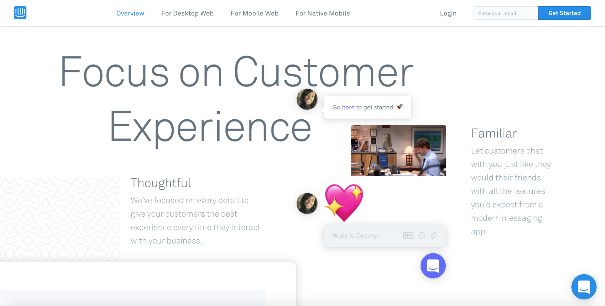
2. Illustrations take center stage
One of the more interesting challenges I’ve witnessed in the world of marketing digital products is that of image selection. I’ve watched whole design teams mull over the debate, usually ending up in one of two places:
- Product UI shots and GIFs
- Editorial/lifestyle photography
The former emphasizes the in-product experience, features, and functionality, while the latter tries to emphasize the product’s human dimension: the effect it has on people’s lives.
But heading into 2018, we’re seeing — and will continue to see — the work of illustrators attain an all-new prominence in both marketing and product design.
Why this is happening fascinates me, and I can’t decide exactly what it is. Perhaps it’s just the same cyclicality we’ve long observed in the world of fashion — after all, illustration dominated the advertising world up till the late 60s or so.
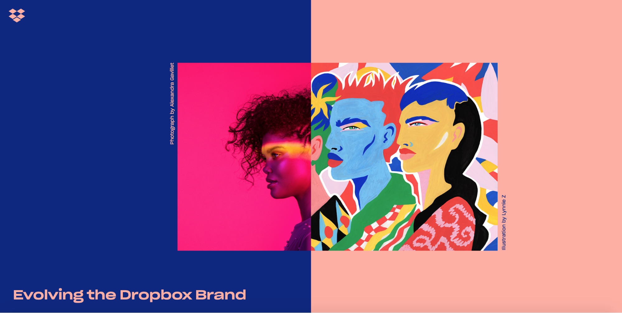
Or, maybe Dropbox’s design team was onto something with this explanation of their new illustration style:
We create rough sketches using graphite, then pair them with colorful, abstract shapes to bring the creative process to life. Our style is inspired by the moment when you first have an idea, and serves as a reminder that the “canvas is only blank until you make the first mark.”
I mean … they had to be onto something with this redesign ... right?
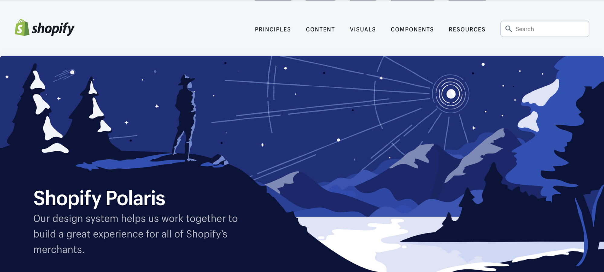
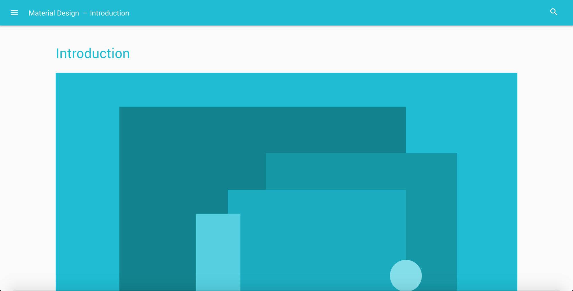
Illustrations can also be very powerful in bringing more abstract concepts to vivid life, as you can see in Shopify’s Polaris site. With a single drawing, Shopify clarifies that the Polaris design system is intended to serve as a guiding light — a north star — for every member of the team.
Finally, it’s worth noting that illustrations can also neatly resolve some of the representational challenges posed by photography.
We build our digital products for a staggeringly diverse array of human beings — but the moment you capture a photo of a real human being and pop that photo into your website’s hero, that human being personifies your user. And leaves all other users unrepresented.
In contrast, the human being illustrated in Shopify Polaris’ hero image is just a human being. Specifiers like race, gender, nationality, and much more are left undefined, making it easier for any of us to project ourselves into the role of that lone thinker, contemplating the creative possibilities illuminated by a guiding light.
3. Brutalism reaches mainstream status
Early in 2017, we published an article touching on the rise of brutalism and sought to answer the why of the emerging style:
Brutalism ... is ripping open a space where designers can do what they want, rather than what they should. The works created here eschew all the optimization advice and best practices lists in favor of looks and effects that live in the jarring, and sometimes border on the offensive (to expectations, anyway).
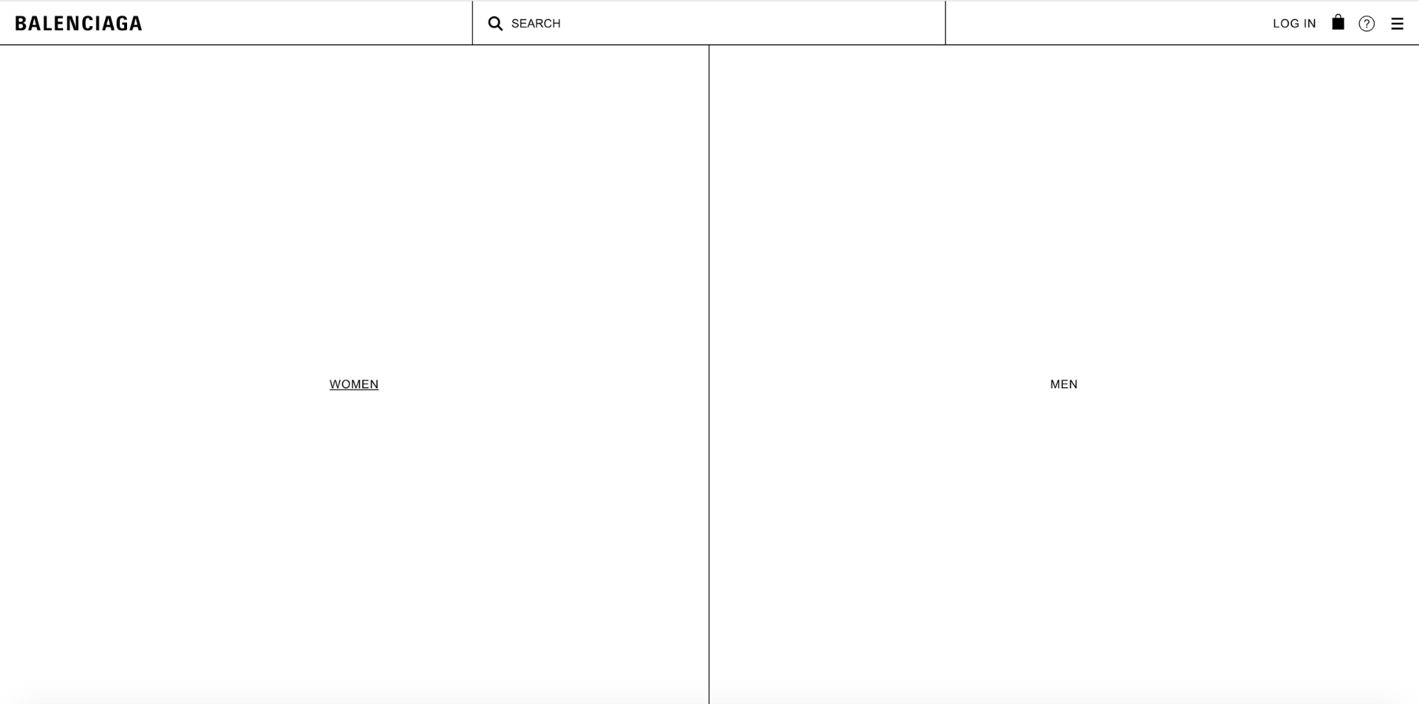
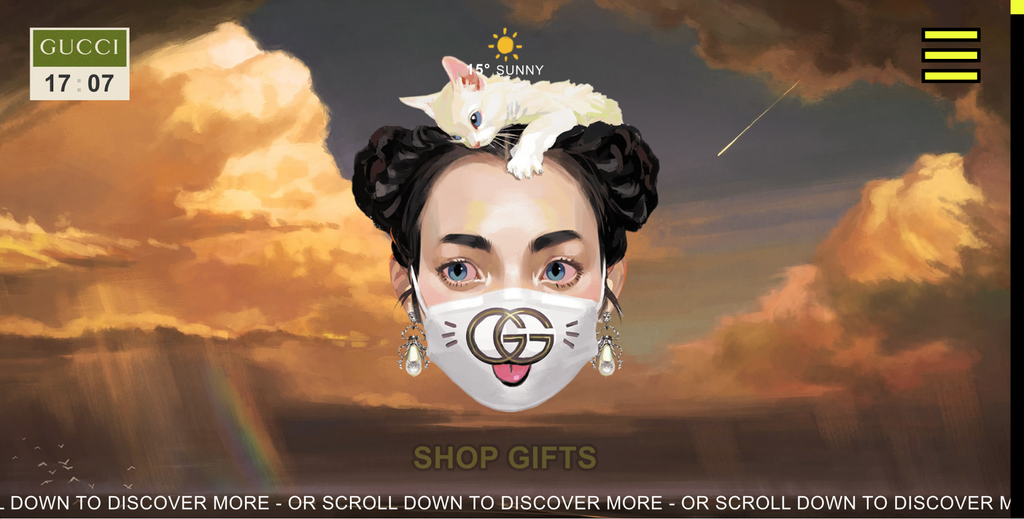
So you can imagine our surprise when, of all site types, two ecommerce outlets jumped on the brutal bandwagon:
Balenciaga
Gucci
4. More organic and oblique shapes
Nature abhors a straight line.
–William Kent
Both web and mobile design have been dominated by card-based UIs for several years now. Until recently, most of those cards were (mostly) sharp-edged and right-angled, exposing the geometry of their underlying divs in an almost modernist concern for the materials of web design.
That’s changed in a big, big way in 2017. Now, every app from Google Now to Twitter to Facebook boasts almost aggressively rounded corners on their cards, input boxes, profile avatars, and more.
And it’s not just those primary elements growing more organic shapes. Backgrounds now abound with almost amoeboid blobs of color, dramatic diagonals, even dashes of the real world rendered almost cartoonish.
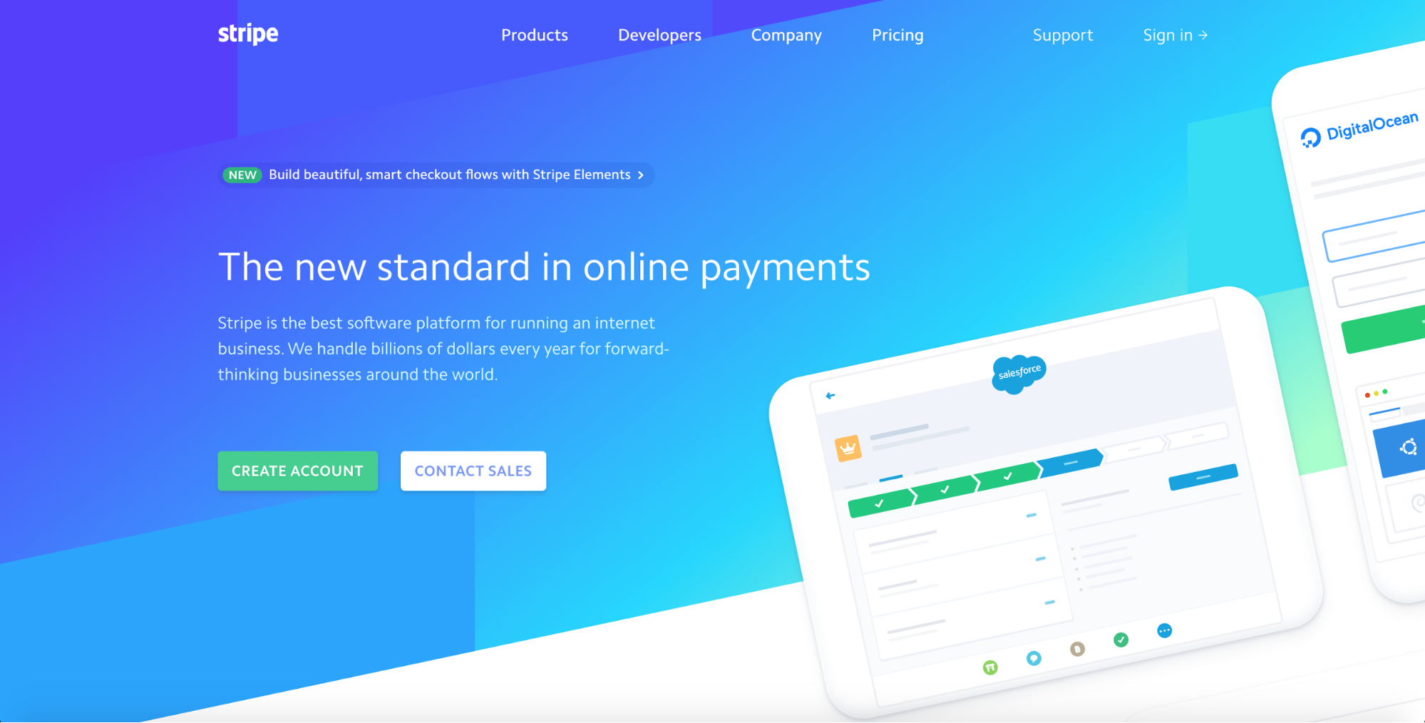
But designers aren’t just turning to organic curves in their never-ending search for a way out of the box. Many simply give those boxes a twist out of their usual 90° angles, freshening up their designs with a simple change of perspective, as on Stripe’s homepage.
All this isn’t to say that right angles are going to go the way of the dinosaur. We’ve also seen several sites double-down on straight lines — and mix them effectively with more organic and spherical shapes.

You’ll also notice the emergence of “flashing” or “vibrating” colors in many website UIs. While these color combinations create incredibly striking effects — including ghostly afterimages that seem to linger in your eye as you scroll on — it’s worth noting that they represent iffy territory from an accessibility perspective.
While accessibility is usually thought of as making a design user-friendly for the disabled, it’s worth remembering that even those with color vision can have a hard time with jarring color combos.
According to LinkedIn’s Accessibility Engineering Manager, Jennison Asuncion, accessibility can be defined as:
Designing and developing user interfaces that everyone, including people with disabilities, can independently consume and interact with.
That everyone is key.
5. Even more pervasive interactions and animations
The medium is the message.
–Marshall McLuhan
The web isn’t a static medium. Despite the enduring beauty and truth of pieces like Justin Jackson’s “This is a web page,” the web allows for so much more than just printing words on a page. And if McLuhan’s famous adage holds any water, that means that at least some of the web’s message — its meaning — lies in its capacity for motion and interactivity: the ability for a web page to not simply present us with information, but to make that information move and, more importantly, to allow us to interact with and impact that information.
Increasingly, as you scroll through the web, information isn’t just presented for your approval, but slides up into your awareness, calling attention to itself piece by piece.
Obviously, we shouldn’t go overboard here — there’s always the potential for animations to make otherwise delightful experiences overwhelming, especially for those with cognitive disabilities or sensitivity to motion.
But done right, even a subtle animation can direct the visitor’s attention to the right content at the right time, helping ensure they don’t miss vital lines of copy, or a conversion-driving form.
Take this gorgeous site Heco Partners built for the agency Black Sheep. As you scroll down, the highlighting of the “current” line helps keep you focused on the very well-written copy. Then a series of boldly designed tooltips start vying for your attention with the copy, crying out for you to stop reading and click over to another page. It’s a creative solution to the challenge of building an inline navigational system — but it can also add unnecessary tension to the experience for some users.
We’re also seeing a ton of tools arise to simplify the creation of more complex animations and interactions — long a gap in the digital designer’s toolkit — from our own Interactions 2.0 to Airbnb’s Lottie.
More specifically, we’re looking forward to more of two particular animation patterns: unusual scrolling rates and page transitions.
Unexpected scrolling rates
Parallax may be passe these days, but that doesn’t mean designers aren’t interested in linking scrolling to element movement in intriguing ways.
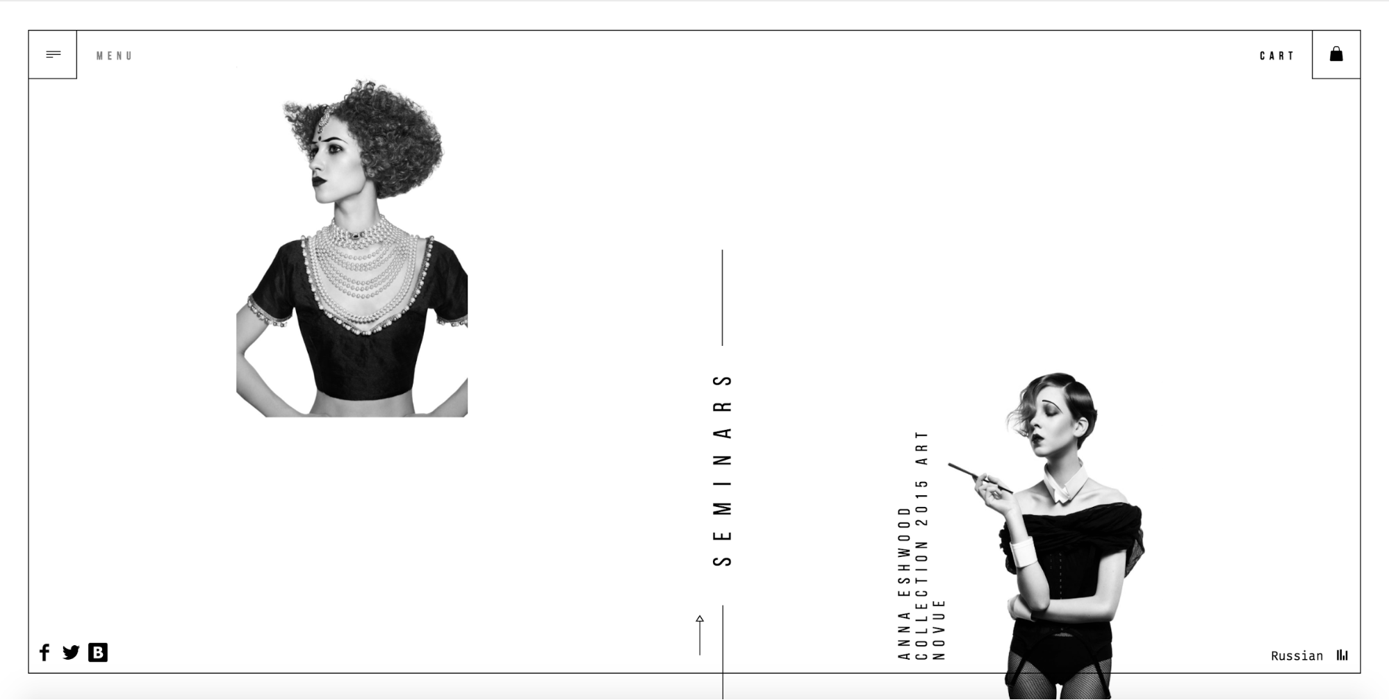
Take the site of Anna Eshwood, for example. Each photo on the site acts normally until you scroll past them, at which point they rapidly ascend, faster than your scroll rate. This gives the site an interestingly ethereal feel that plays nicely with the austere, monochromatic photos and their severe models.
As interactions and animations become an even more prominent part of our online experiences, expect to see more dashes of the unexpected thrown in to add spice.
Page transitions
In a web full of beautiful animations with the potential to clearly tell us “something has changed on this page,” it’s always felt a little odd that moving from one page to another feels pretty much the same, no matter what website you’re on.
A state-change animation might sweep you away from one page, and another greet you on the new page, but those are discreet, with nothing necessarily linking them. The transition itself looks like any other switch from page to page: things go blank for a sec, then the new page loads in. Nothing fancy.
But we’re starting to see more and more sites make that change in state something beautiful to behold. Take for example these transitions on the site of agency 3drops:
Here, the page transition keeps the experience cohesive and on-brand. You’re not so much “navigating to a new page” as you are accessing another “view” within a library of views. It’s a nice layer of polish to round out the presentation of a design-centric brand.
6. The emergence of maximalism
Good design is as little design as possible
–Dieter Rams
For years now, it’s seemed like the most powerful and coveted bit of design feedback you could get was: “it’s clean.”
That was the design world in the era of minimalism. Deeply influenced by Dieter Rams’ principles of good design, as well as the influential essay on typography, “The Crystal Goblet,” visual designers have long sought to get out of users’ way by offering as few choices and visual distractions as possible.
And for a world where living within the digital was a new and rare experience, that choice made a lot of sense. We need to be eased into this strange new world.
But today, we have sites like the following — which, fair warning, could possibly cause seizures:
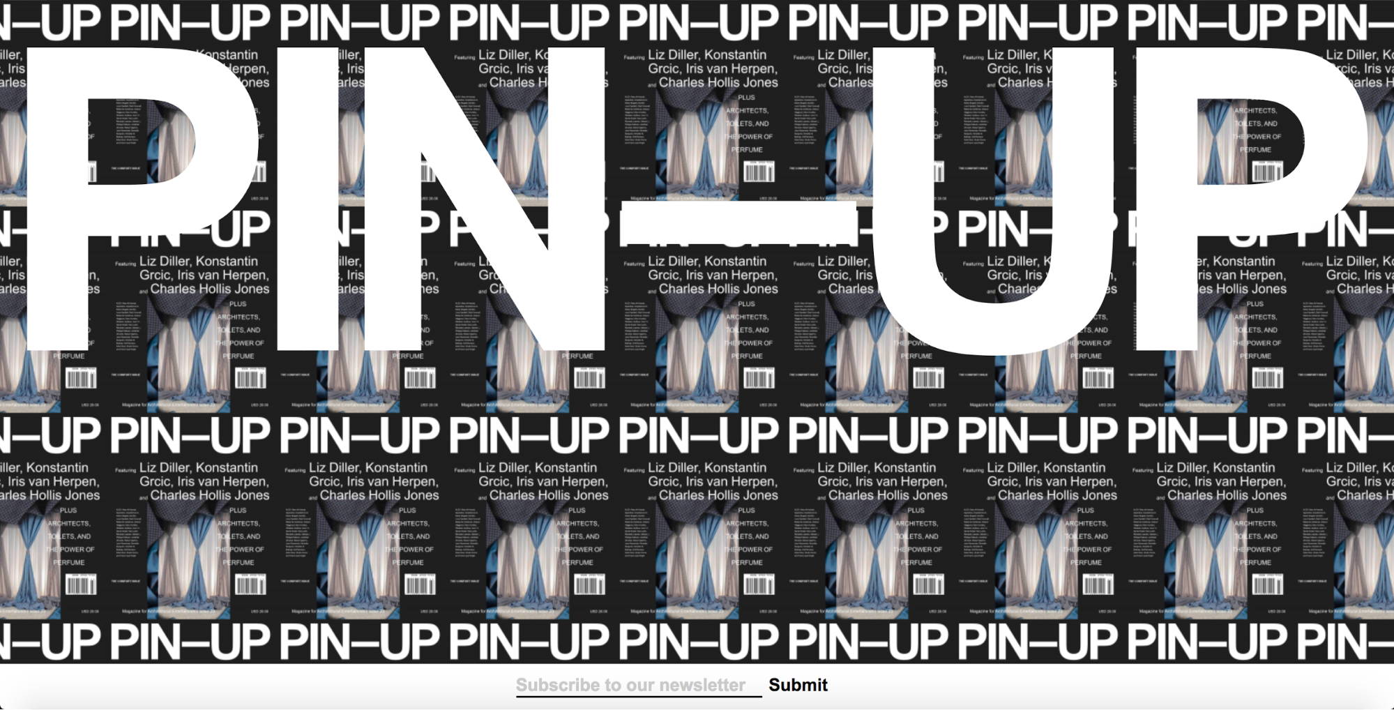
Pin-Up Magazine
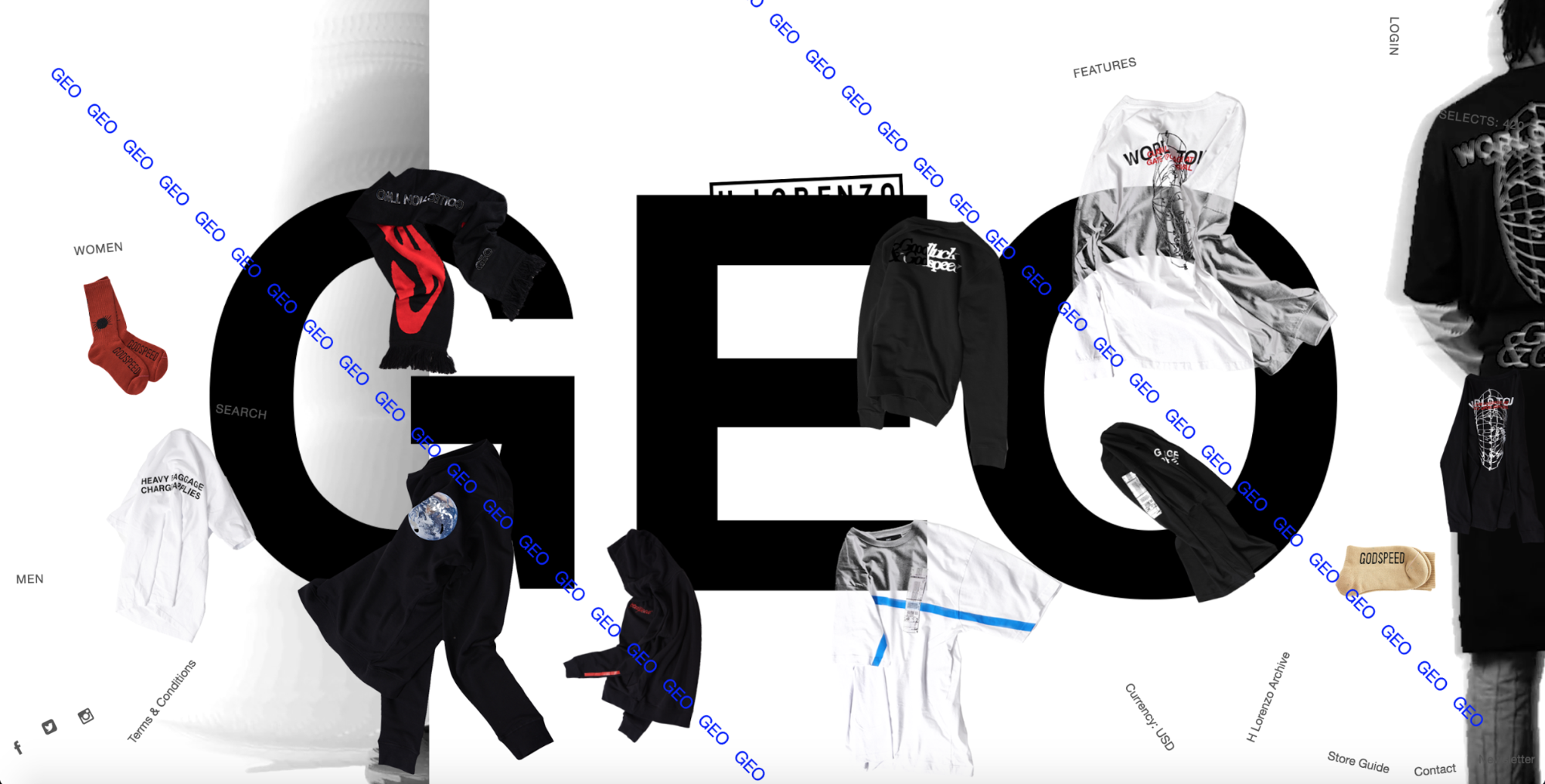
H. Lorenzo
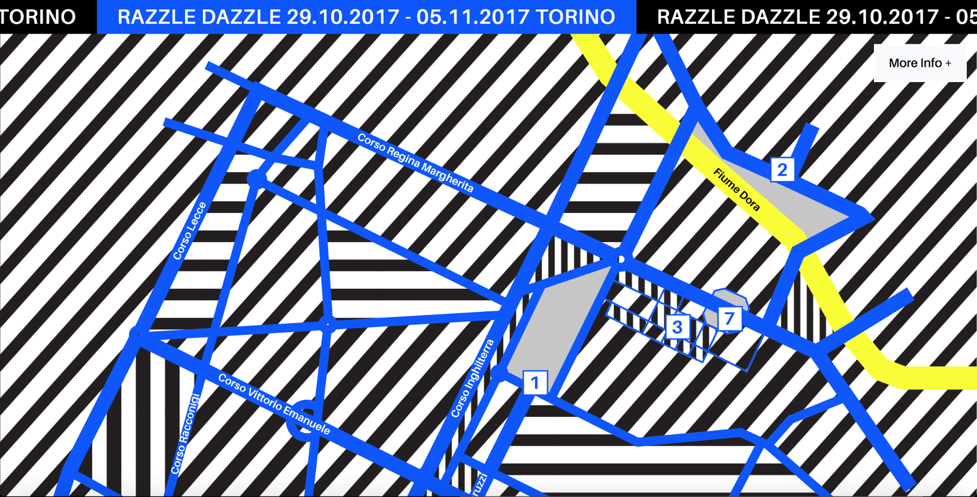
Razzle Dazzle Torino
All of which seem to be striving to throw everything and the kitchen sink at you from the moment you arrive.
You could call this a strain of brutalism — and in fact, I found all of the above sites on Brutalist Websites — but we think we can all expect to say more maximalist sites emerging even outside of what you’d deem brutal. As we all become more and more digitally savvy, it’s only natural that some sites will expect more from visitors.
7. Serifs put their best feet forward
Back in the bad old days of non-retina screens and poor font support, sticking to sans serif fonts in your web interfaces made a lot of sense. But as both screens and font rendering technologies — not to mention, custom font support — become more robust, we’re starting to see more and more elaborate typefaces taking center stage. Or at least, much more prominent supporting roles.
Witness Kickstarter’s recent redesign, which features block quotes from creators set in a softly curving serif:
Or the big, bold headlines of Reform Collective:
While a scroll through Typewolf on just about any given day will reveal several serifs stealing the scene:
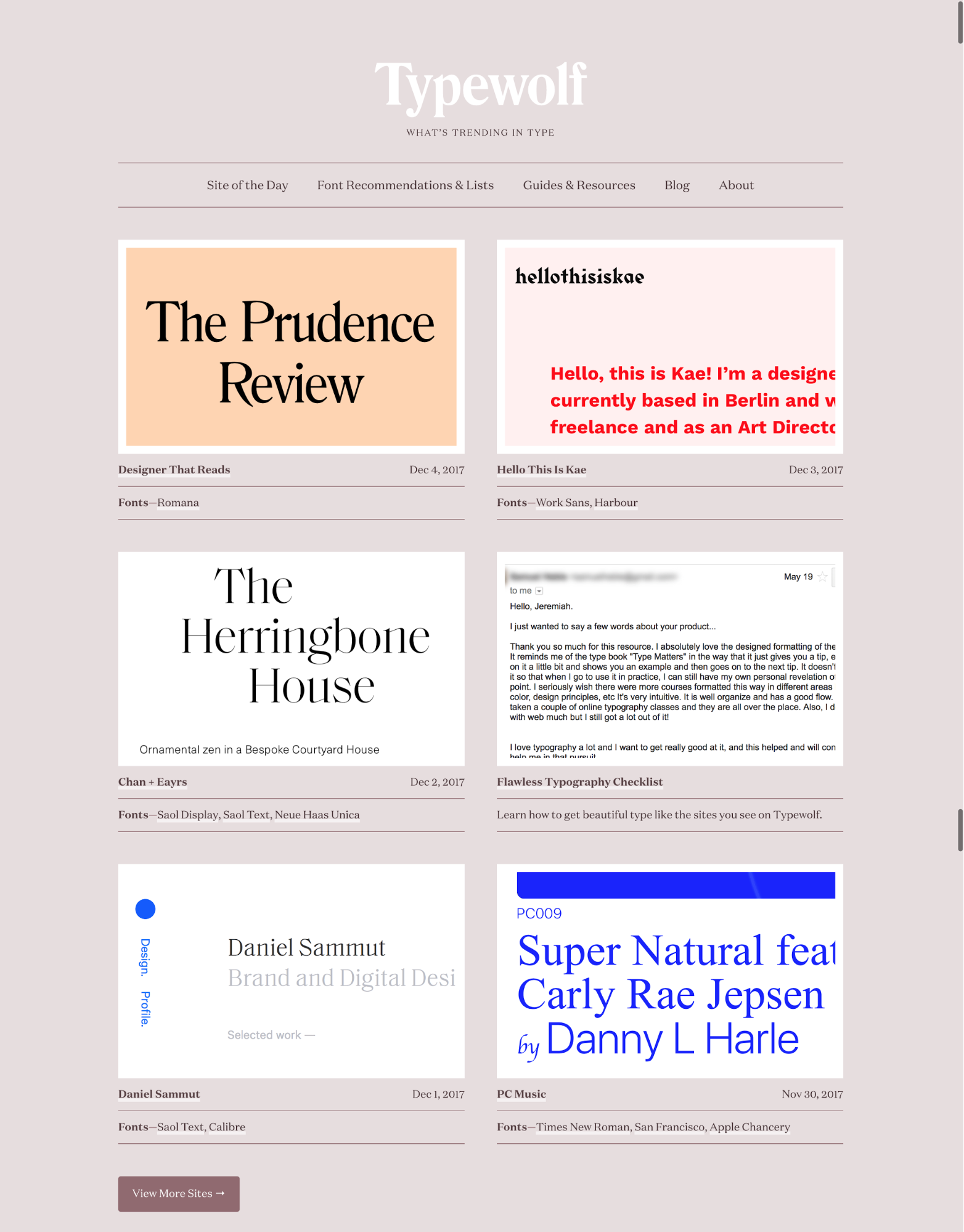
As a long-time fan of serifs and their ability to evoke feelings of elegance, refinement, and literary polish, I warmly welcome our new footed overlords.
8. Floating navigation menus
Fixed navigation has become a mainstay of sites that are either conversion-focused (because the core CTA can stick with you as you scroll) or have sprawling menus. It’s a nice way to simplify the experience of a site by keeping navigational controls constantly at the user’s fingertips.
Lately, we’re seeing designers take the idea a step further by visually detaching the nav from the rest of the site design, and moving it a bit below the browser’s chrome. This reinforces the feeling that the navigation is a global object, not necessarily a part of any one page, but there to follow you reassuringly through the site.
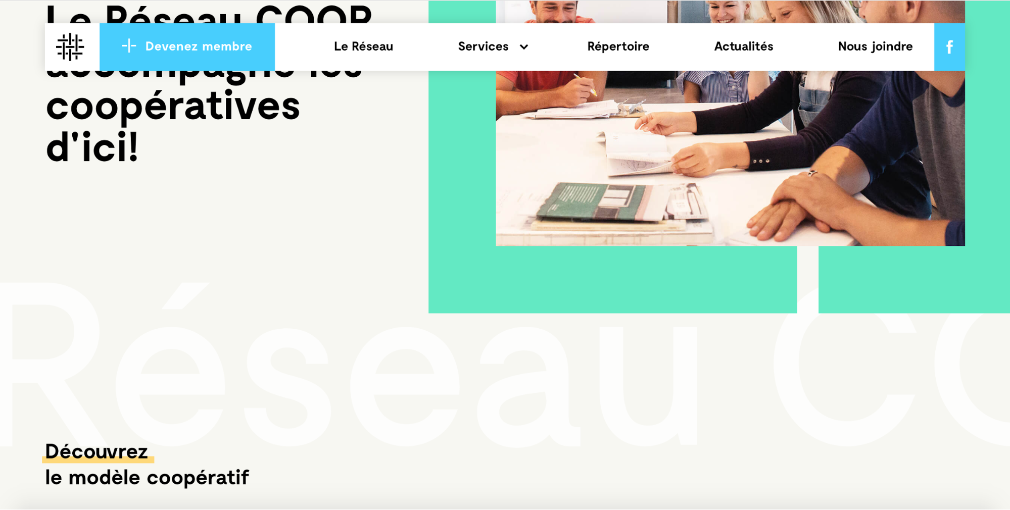
The most obvious way to go about this visually is to add a drop shadow to the navbar, and move it a bit below the very top of the site, as seen in Reseau’s site above. But it’s doable in a flatter design as well, as you can see on the site of Anchor & Orbit.
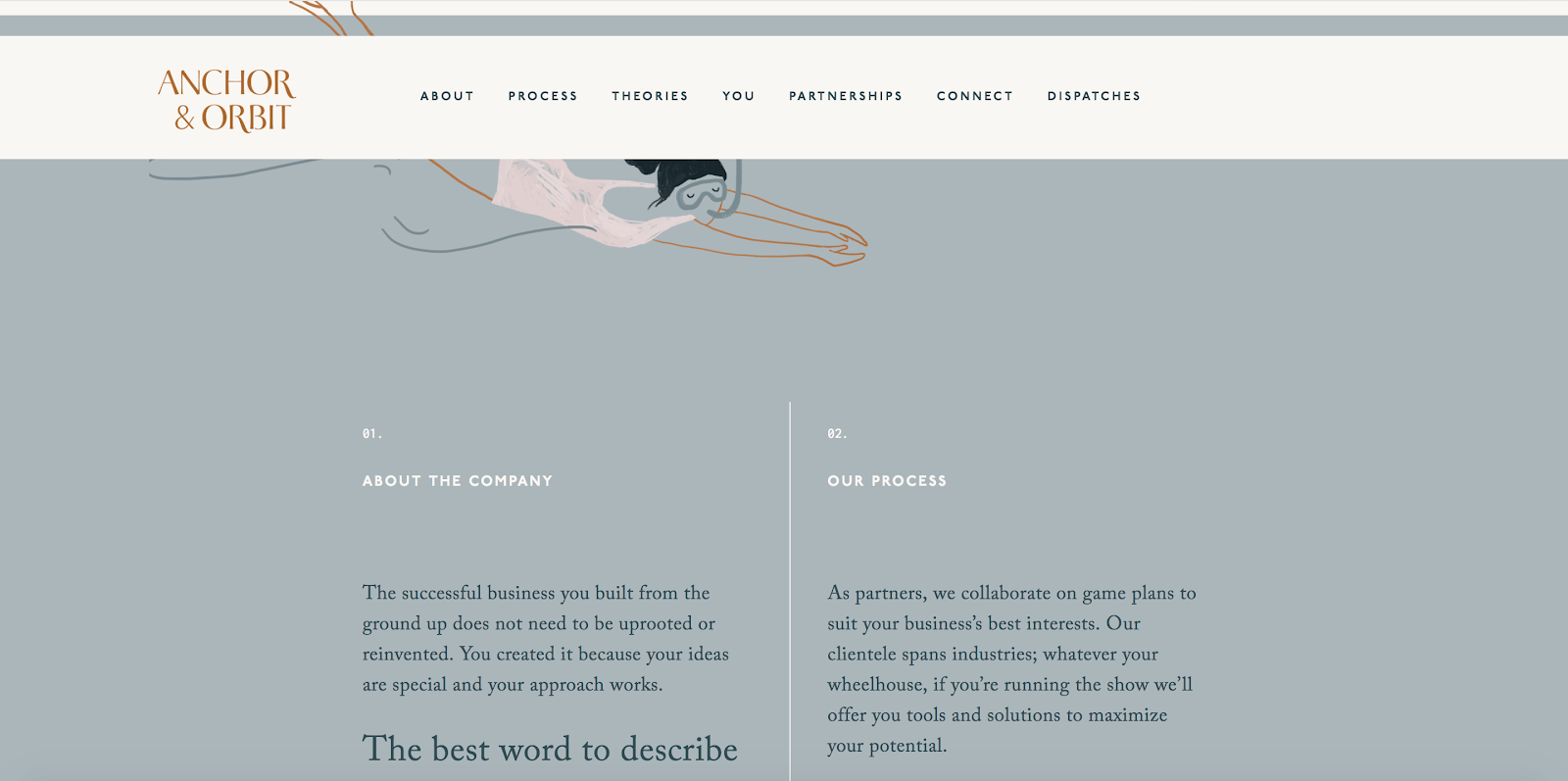
Similar to off-grid designs, this allows for interesting juxtapositions to naturally (or purposefully) occur within the design, which provides a fun creative challenge.
9. The <video> element
When you’re trying to convey complex information in a visual format, a static image often just won’t do. After all, complexity tends to unfold over time — a still image of a UI only tells you what’s in it, not how to use it.
Enter the <video> element.

This is powerful for several reasons:
- It can slip seamlessly into the design, without the intrusive chrome of an embedded YouTube or Vimeo video
- It remains extremely high quality, even with lots of colors, gradients, and detail in the image — something GIFs struggle to do without exponentially ballooning in size
- It can be looped to ensure the details of the copy and those of the image remain in sync, and repeat for those who need it
So it’s no surprise we’re seeing the video element spring up all over the web, from our very own homepage to feature pages like Stripe Sigma.


What to look for in a web hosting service
There are tons of web hosting options out there — but how do you know what features to look for? See how Webflow Hosting could be the perfect fit.
10. More immersive “multimedia” longform
When we’re looking to publish longform content, it can be tempting to just throw a long text field onto the page and call it a day — especially when our longform content is powered by a CMS, where a single layout does the heavy lifting for content ranging from 200-word blurbs to detailed, short-story-length tutorials.
But some designers and writers are heroically resisting the temptation and returning to the concept of feature stories — combining custom layouts with copy carefully tailored to the presentation to tell riveting, lengthy stories that enrich the narrative with video, sound, charts and graphs, maps, and much more.
To be fair, this is hardly a “new” trend — in fact, I’d call it a keystone of the long-running conversation around web publishing — but with all the tools for web publishing arising right now, ourselves included, it seems like the perfect time for this facet to become even more prominent in 2018.
Take this CNN story on global warming’s impact on Greenland — and the rest of the world.
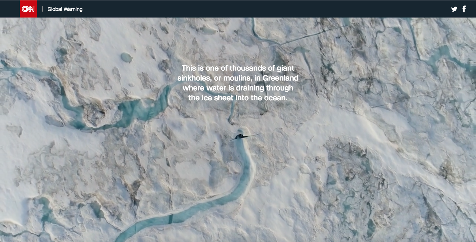
The story comes as close to literally taking you there as it can. Which is vital for an issue that still seems abstract — unreal even — to far too many. It also smartly turns a complex topic into a series of easily-digestible paragraphs. You never feel overwhelmed by the total volume of content, because it doesn’t call attention to itself. Instead, you find yourself reading every word because it’s just so darn easy and absorbing.
Note that I’m not criticizing CMSs here: in fact, it’s possible to deliver these sorts of experiences via a CMS. It just takes a little ingenuity — all of the visuals from this story can be delivered via background images and videos — and careful attention to consistency across stories, as you’re writing, designing, and developing them. And yes — a content model that differs from your standard “blog posts.”

It’s worth noting that these more diverse approaches to longform can play with either a broken grid, or with a standard column, as seen in the New York Times piece above.
11. Variable fonts!
Looking at the web today, it’s hard to believe that just a few years ago, we were forced to rely on a sparse handful of typefaces to deliver all our textual content.
Today, the web abounds with a massive diversity of gorgeous typefaces, leading to revolutionary levels of interest in typography, typeface design, and good ole conspicuous consumption — of fonts.
And it’s only going to get better with the release of variable fonts. A joint project between the biggest names in tech (and typography) — Apple, Google, Microsoft, and Adobe — the variable font project enables a whole new form of typeface design. Officially an addition to the OpenType format, it:
allows type designers to interpolate a font’s entire glyph set or individual glyphs along up to 64,000 axes of variation (weight, width, etc.), and define specific positions in the design space as named instances (“Bold”, “Condensed”, etc.).
If (like me) that sentence leaves you scratching your head a little, focus on John Hudson’s much more direct version, in which he says that a variable font is:
A single font file that behaves like multiple fonts.
But maybe it’s best, when discussing a visual art like letterform design, to stick with the visual:
That’s variable fonts in a nutshell: a single font file, capable of going from Thin to Black in a jiff. Without calling 16 different fonts in your CSS.
It’s gonna be big.
12. Content hubs — or webooks? — get cool
(To be clear: content has always been cool. 😎)
As a content geek, I’ve been thrilled to see a bunch of beautiful, content-focused websites serving up heaping helpings of helpful, well-written information in 2017. And I’m guessing we’ll see many more in 2018, given all the success 2017’s batch has seen.
It’s also been fascinating to see a lot of leading brands ditch the familiar gated PDF approach to ebook distribution and fully embrace the web’s potential for publishing longform content in what I like to call “webooks.”
What am I referring to? Well:
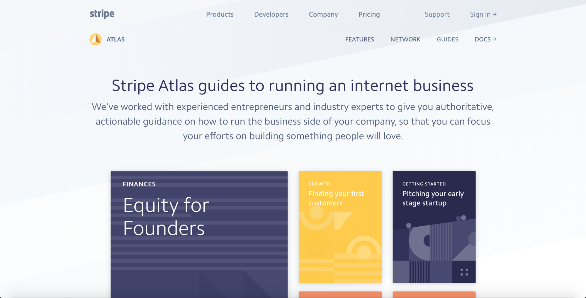
Stripe Atlas Guides
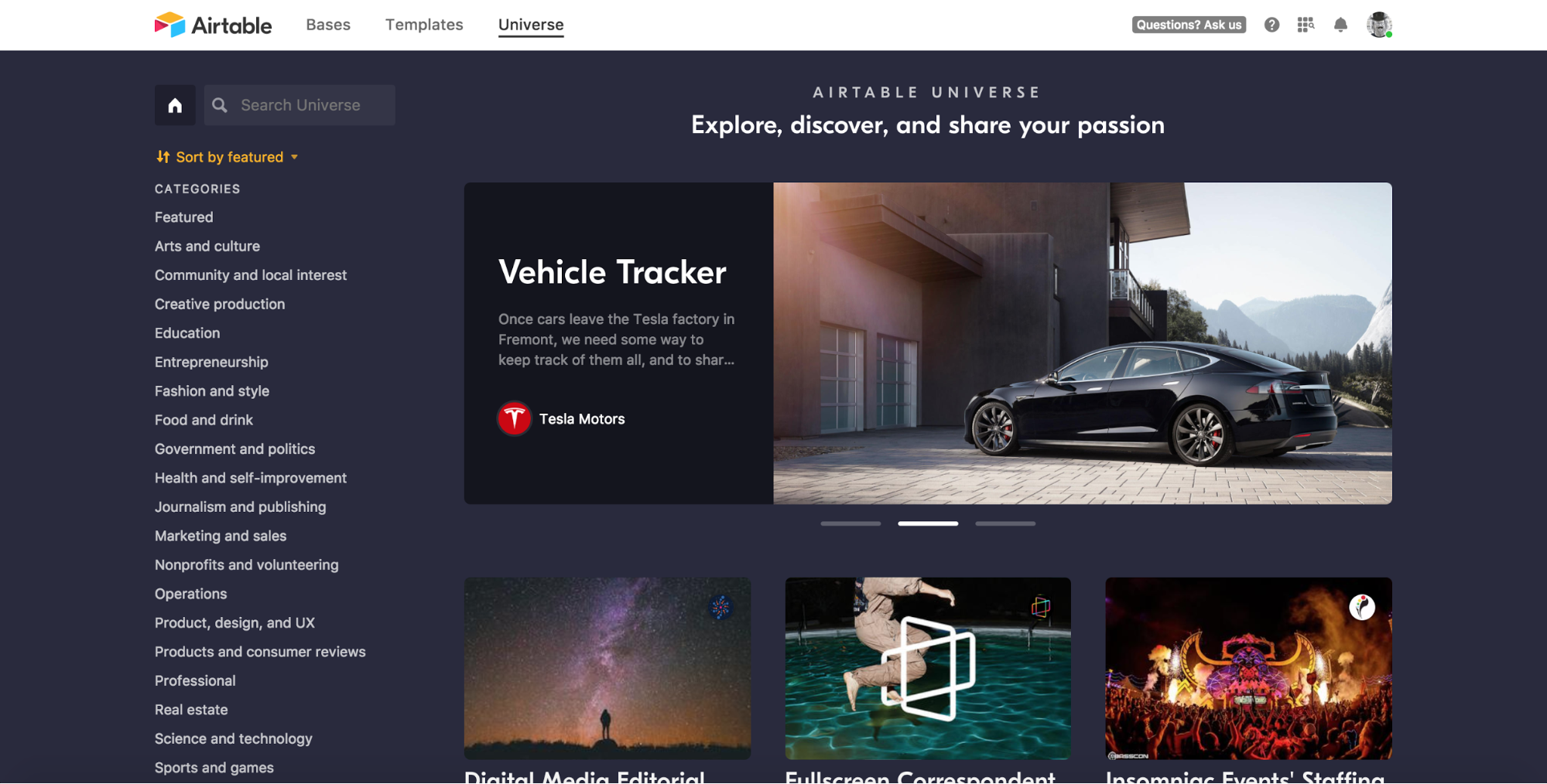
Airtable Universe.
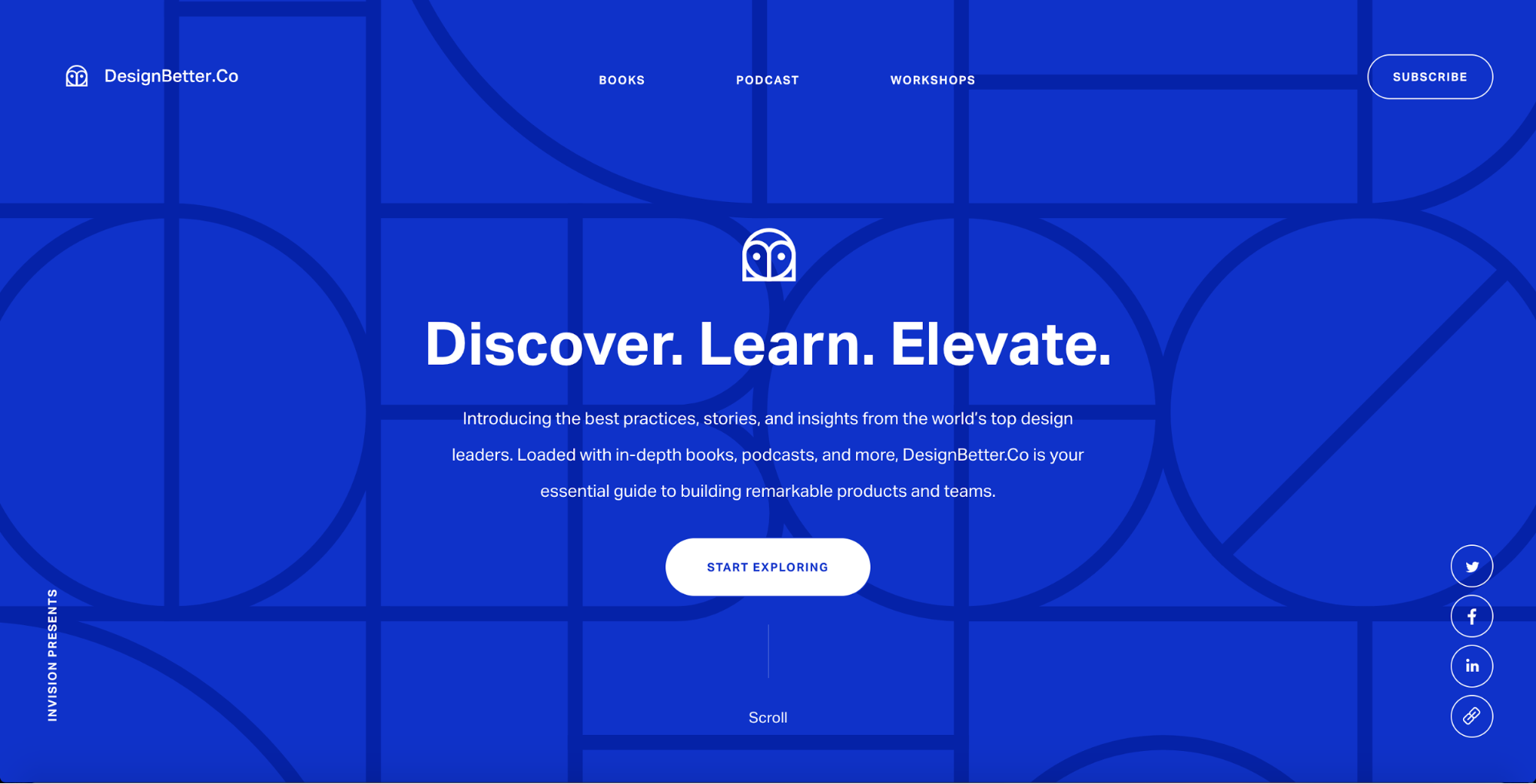
DesignBetter.co
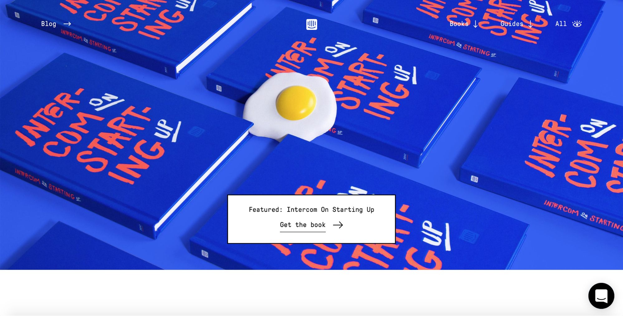
Intercom Books
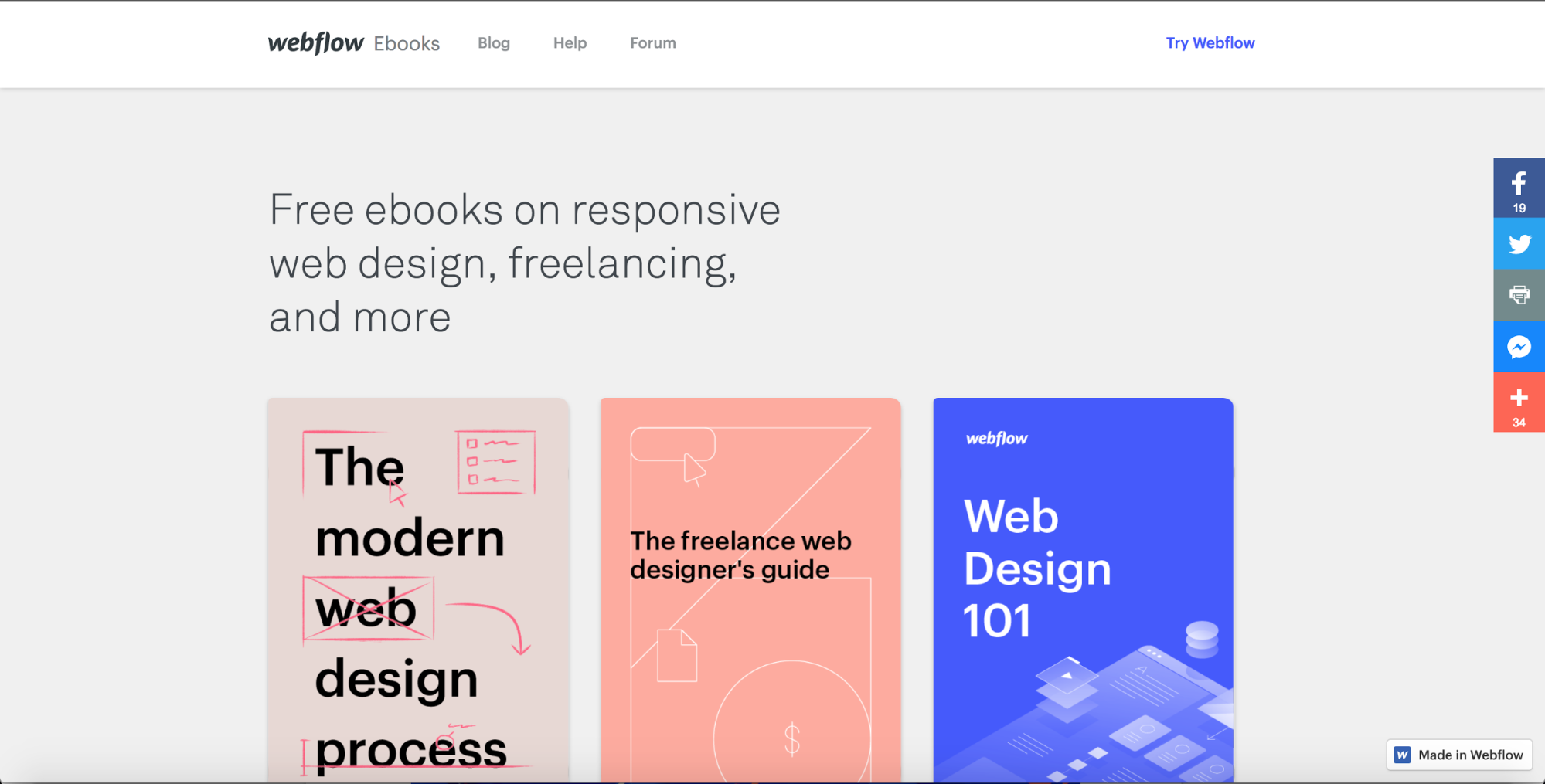
Our own ebooks site.
Need I go on?
13. CSS grid!
As Robin Rendle so eloquently put it on CSS-Tricks:
Well, CSS Grid is the first real layout system for the web. It's designed for organizing content both into columns and rows and it finally gives developers almost God-like control of the screens before us.
Cue evil laughter.
Note: Webflow will support CSS grid, but no official date on that yet.
14. The quest for the perfect digital design tool
2017 was a big year for in-depth discussion of the nature of design tools and how well-suited they are to our work.
Bryn Jackson of Spectrum advanced his case for:
An intermediary format between design and engineering tools to enable more efficient, capable tooling for product teams generally and designers especially.
In a post called, simply, “Interface.” He goes on to posit that, “Every popular design tool available today is optimized for illustration.”
(Though it should be noted that he categorizes “illustration” as any design work that results in “an image, icon, illustration, typeface, advertisements, print media, or some other visual communication medium without native interactivity,” which is a debatable assertion. Aren’t reading and seeing forms of interaction, after all?)
Concerns over the definitions of illustration and interactivity aside, it’s not hard to see Jackson’s point: at base, most modern design tools fixate on the production of images, not interfaces.
Designer and engineer Adam Michela hit many of the same notes in “I’m a Designer at Facebook, and This Is What’s Missing in Design Tools Today.” There, he argues that most designers spend the vast majority of their time creating artifacts of little to no tangible value because they merely represent the final product — the digital interfaces that quickly diverge from said representations.
He ends the piece on a hopeful note, saying “there is opportunity to create tools that blend (rather than bridge) design and implementation.”
Which is exactly what we’re trying to build here at Webflow. Like Michela, we envision a design deliverable that isn’t a schematic of a website, but is the website itself. Not a documentation of the interface, but the interface itself. Constantly evolving in perfect sync with the site, but continuously generating a timeline of versions that can be reviewed and even restored with the click of a button.
We’re not all the way there yet, but with your help, that’s the direction we’re moving in.
15. Diversity and inclusion as design challenges
Webflow is an equal opportunity employer. We’re dedicated to building a team where diversity in both ideas and identities is not only welcomed, but encouraged.
– Our job listings
Here in the United States, where Webflow is based, an increasingly heated political climate is driving an intense focus on the role of diversity and inclusion in design.
We’re acknowledging that design choices as seemingly small as deciding which options to include in gender dropdowns — or even including gender dropdowns at all — matter deeply to many of our fellow humans. We’re seeing — all over again — how powerful the wording of error messaging and the mechanics of data validation can be in the dynamics of human-computer interactions. We’re realizing that making race a filter in advertising tools can have downright racist effects, and thereby uphold existing power relations many of us would love to see upended.
And we’re realizing that if our teams aren’t diverse and inclusive, our design solutions can’t be either.
Some of us, anyway.
On the other hand, we’re also seeing gender bias rear its ugly head in obviously contradictory and marginalizing ways — turning conversations we usually regard as mostly virtuous, such as providing feedback, into glaring examples of double standards.
Ultimately, as user experience (UX) professionals, it’s our job to provide everyone, regardless of their specifics, with a usable and ideally pleasant experience.
In other words: our job is all about inclusion. Let’s make 2018 the year for all of us to focus on doing our job to the fullest.
16. The “pivot to video” plays on
Despite the fact that approximately none of us are clamoring for video to become the web publishing medium du jour, publishers continue to be amazingly bullish about the switch.
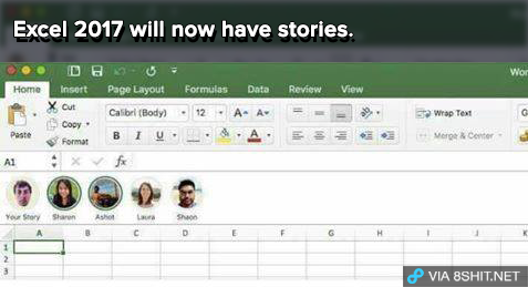
You see it everywhere: from the news sites that practically insist that you watch the video rather than read to the shortform “stories” pushed by first Snapchat, then Instagram, and finally Facebook. Surely Excel will hop on the bandwagon soon!
But like most things in tech, this is hardly a neutral development. Thousands of journalists have lost their jobs in this pivot away from text toward the moving image.
And the outlook may not be so good for sites making the switch either. According to the Columbia Journalism Review:
Publishers who pivoted to video have forfeited the majority of their hard-won native audiences in only a year of churning out undifferentiated, bland chunks of largely aggregated “snackable” video.
Independent journalism is suffering regardless — thanks, Trump — but the move to video hasn’t exactly helped.
One positive note: according to Digiday, “video CPMs are much greater than display CPMs” (CPM being “cost per impression”). In an ideal world, that would mean that newspapers could get away with including fewer ads in their stories.
But of course, that won’t happen.
In the face of all this, it’s worth remembering the strengths of text as both a creative and informational medium:
- It’s relatively quick to produce
- It’s cheap
- It’s still the primary format of most communication on the web
That last point may make you scratch your head. But I’d encourage you to hop over to whatever major social networks and take a scroll. Unless you’re hitting up Instagram, Pinterest, or Snapchat, chances are you’re seeing a whole lot of writing. And even on those visuals-first platforms, text still plays a key supporting role.
Because while a picture may be “worth a thousand words” in capturing a scene, they rarely capture context — the who, what, when, where, why, and how that make images meaningful.
Which leads us rather naturally to our next point:
17. The rise of the UX writer continues
Anyone who influences what the design becomes is the designer. This includes developers, PMs, even corporate legal. All are the designers.
–Jared Spool
I touched on this a bit in last year’s design trends piece, but today I’d like to focus even more on the rise of the disciple called “UX writing.”
Put simply, a UX writer focuses on the content found within UIs, mostly for larger digital products and web apps. Now, when I’ve explained that I write in-product content for companies like Webflow and, in the past, LinkedIn, people have a remarkable tendency to say “what?”
But rest assured: UIs are packed with written content. And that content often plays a key role in you understanding:
- What you can do within a UI
- How to do those things
- What limitations and complexities you might run into along the way
But UX writing can do much more than that. The words within an interface can also be a powerful tool for shaping perceptions of the brands behind our favorite UIs. Just think of all the tweets you’ve seen highlighting a hilarious line of copy in a web app, or all the 404-page showcases with witty messaging designed to drive action in a suboptimal moment.
This becomes most obvious in the UI format known as the chatbot. Generally speaking, these UIs consist of nothing but words. Words become the UI. The chatbot’s personality — or brand — can only be expressed through language. With maybe a few carefully chosen emoji thrown in for spice.
As an experienced UX writer, I’m so excited to see this key role getting more of the acknowledgement it has long deserved.
We’re designers too. We just work in syllables and letterforms. We can’t wait to work with you.
18. Design. Systematized.
Now that design has earned its “place at the table,” the conversation has shifted away from assertions of value to a more mature analysis of how to make design’s successes more systematic, scalable, and cohesive across a brand’s many outputs and environments.
Design systems focus on translating brand aesthetics and approaches to functionality into modular components that can be mixed and matched to meet (ideally) any UI’s unique needs. When a design language is systemized, it simplifies decision-making, cuts down on development times, and frees up designers to work on higher-profile projects where design patterns haven’t already been established.
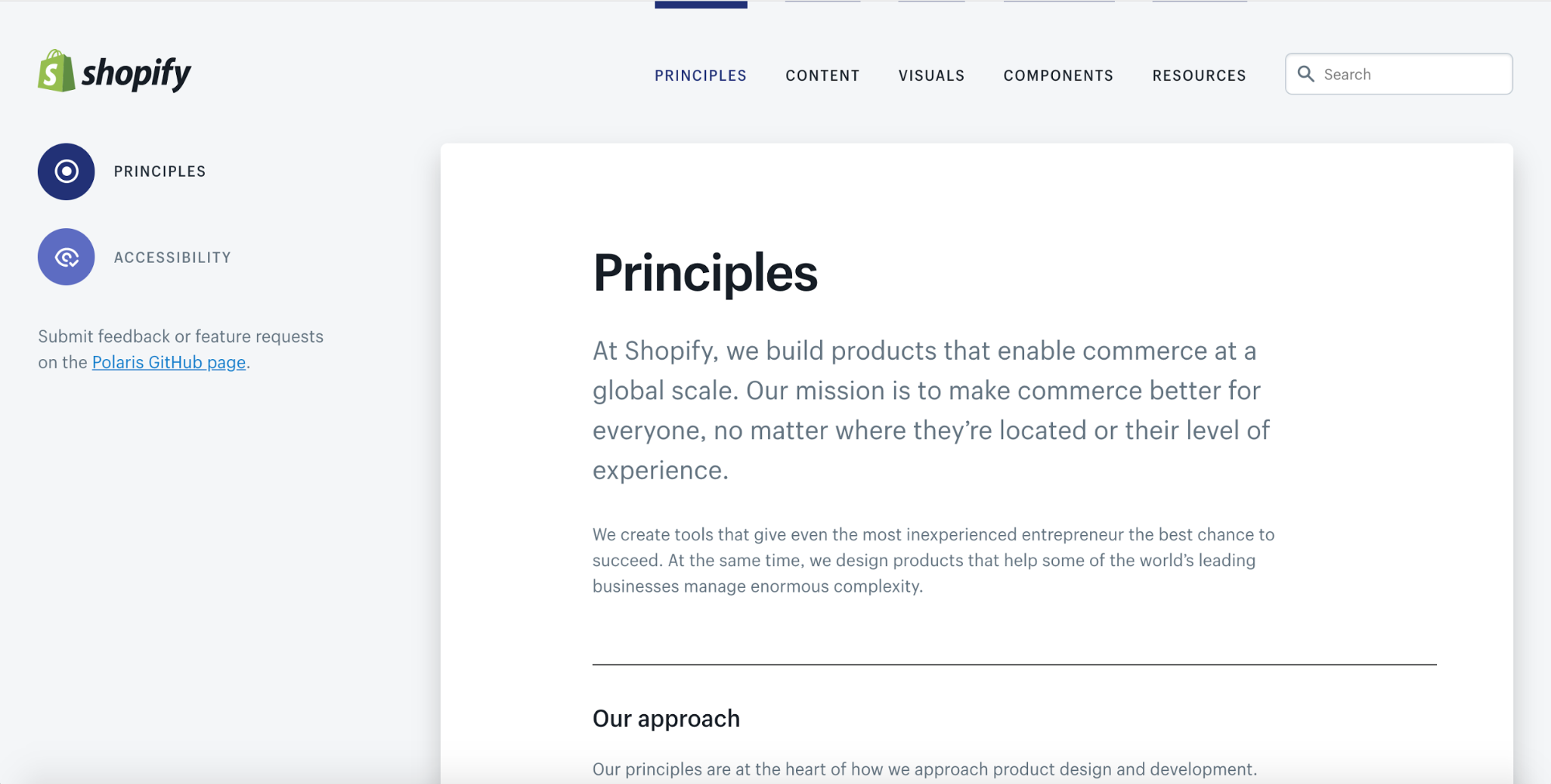
And brands are, per usual, right on top of the trend. UXPin launched Systems, a tool for creating and maintaining design systems. Shopify launched Polaris to high praise for its unique merger of content, design, and development guidelines (something I feel pretty passionate about). UX Power Tools launched a library that attempts to make Sketch a viable design systems tool (we’ll see!).
Expect to see much more of this in 2018.
19. Principles-first design
The design world has long been obsessed with one of those chicken-or-the-egg debates: content-first or design-first.
I’ve always been on the content-first side of the argument. And not just because I’m a “content guy.” To me it just seems like pure logic to nail down the message before you decide how to package it.
But lately, as I’ve moved away from designing content strategies for specific deliverables to more systems-oriented work (brand-level content strategies), I’m warming to the idea that our work shouldn’t start with design or content.
It should start with principles.
Everything else — how it looks, how it works, how it sounds — should flow from and depend upon a set of well-defined and precisely articulated principles.
Or as Shopify senior UX lead Amy Thibodeau put it in her beautiful article “Locating Polaris”:
If the system is created to enable real work, it should reflect how an organization makes things and what it values. A design system that doesn’t include anything about principles, or an approach to content, for example, may not prioritize thinking about those things in the practical day-to-day.
Principles provide a framework for all other decision-making, from how long the copy in the hero should be to what image provides the backdrop for the content. After all, brands are founded on principles: a mission, a vision, and a promise. Each of these things requires underlying beliefs to animate them, to make them relevant to others.
In other words: principles provide the why.
For example: at Webflow, our mission is to empower designers, entrepreneurs, and creative professionals to bring their ideas to life on the web. That mission infuses everything we do, from the aesthetic approach Ryan created for us to the voice and tone standards I’ve designed.
And it’s those standards that guide our first drafts, inform our feedback to each other, and that hopefully suffuse every blog post, email, marketing page, etc. So far, it's a great place to start.
What do you think 2018 will hold for digital design?
Every time I put together one of these lists, I’m overwhelmed by how much I could talk about — and how much my constraint of year + 1 forces me to prioritize.
That’s why I’ve left out some obvious forces — like AR and VR, which we mentioned last year — that have to date had limited impact on the web. With that in mind, what would you add to this list?
(Please note that if you include links in your comments, they’ll be flagged as possible spam. So feel free to leave out the links — give us enough to Google it and we should be good to go.)
And, hey: thanks for reading.