

Here at Webflow, we’re always looking out for the next big thing(s) in web design. And right now, one of the most up-and-coming elements of digital design has got to be illustration.
At first blush, it can feel like there’s something a touch paradoxical about digital designers obsessing over a medium so firmly founded in print. But as we touched on in 19 web design trends for 2018, illustration offers designers numerous advantages over “traditional” photos and user interface mockups/screenshots.
First, illustrations can be tremendously helpful when you’re discussing more abstract concepts that can’t be easily captured in a single photo. And they require less logistical finagling than setting up a photoshoot — and feel far more custom than grabbing a few stock photos off the web. They also sidestep the representational issues that photos can introduce, as we’ll discuss later in this post.
So without further preamble, let’s get to those trends!
1. Photo-collage helps build memorable brands
I’ve got a little design challenge for you:
You: ambitious young brand designer.
Your brand: popular platform for the sharing of long-form writing, including literature, startup manifestors, guerilla journalism, personal essays, “why I’m leaving Silicon Valley hot-takes,” and more. Oh — and your imagery will basically be overwhelmed by all the user-generated content on the site. So whatever you create has to be impactful.
Your solution: … ?
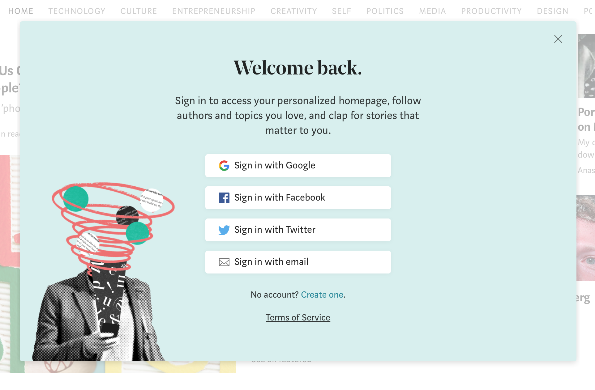
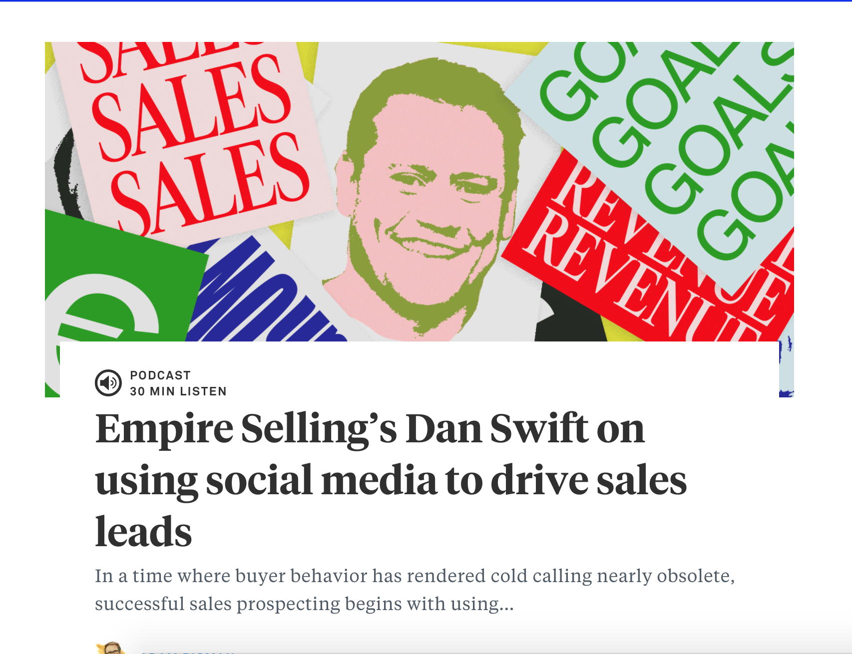
For the folks at Medium, the solution seems to be: photo-collage! This style makes for a beautiful fit, both intrinsically and because of long-standing associations with thoughtful editorial.
Take this sign-in modal, where collaged photos and a single hand-drawn swirl gorgeously capture the welter of ideas awhirl in your head as you sit down to write.
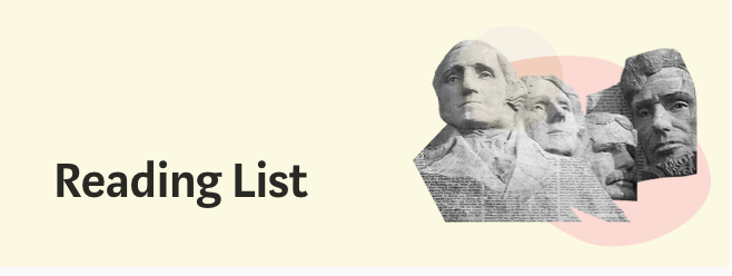
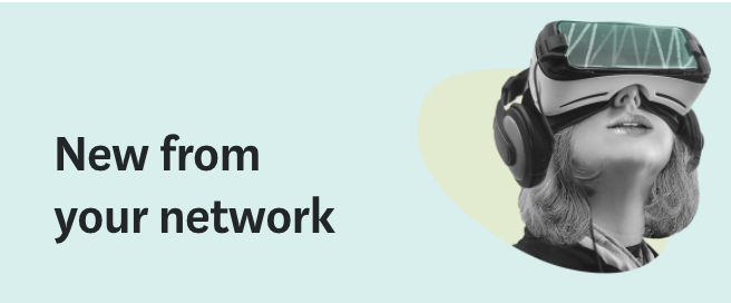
Or these little sidebar “hero” images:
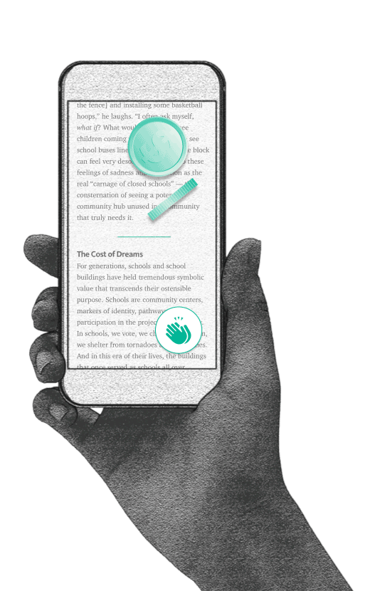
Showing, not telling
They even manage to use photo-collage to tell you about the platform itself, such as in this GIF, which tells you how the applause interaction relates to the payment model:
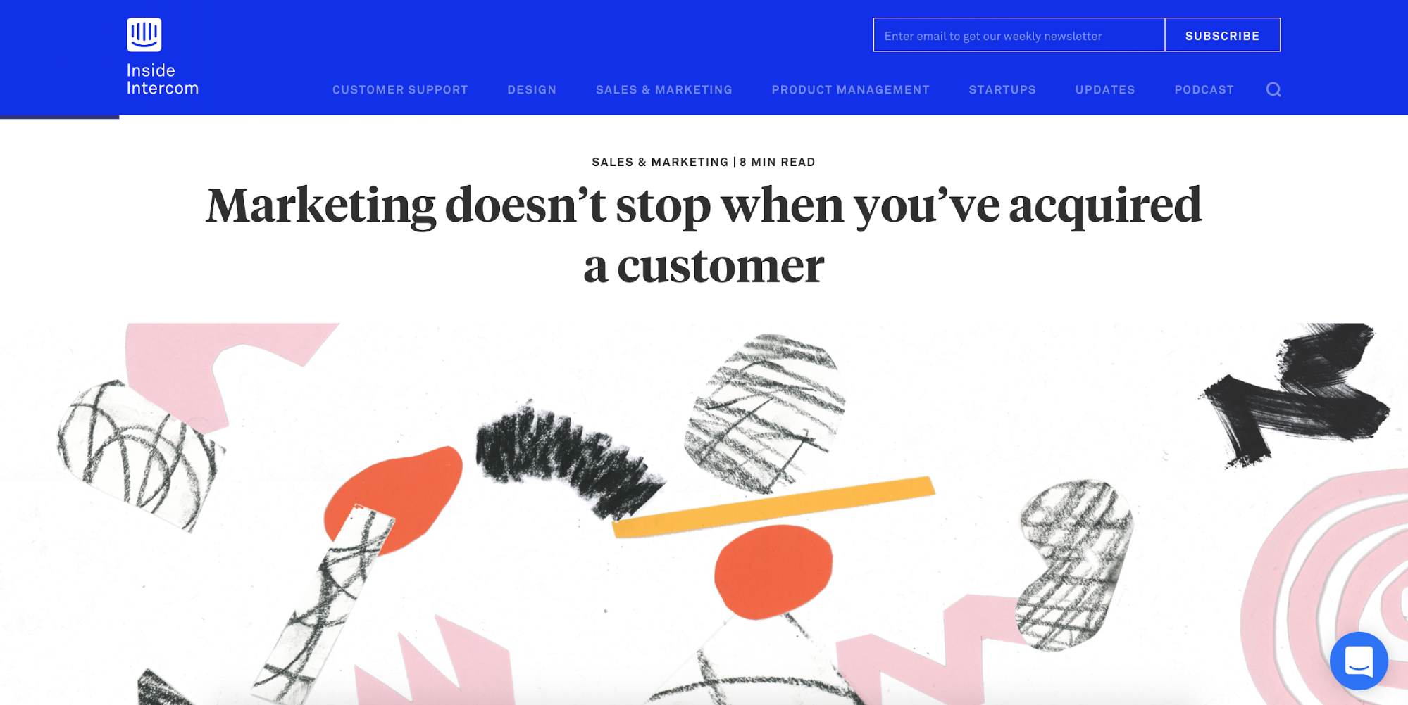
Intercom, a brand justly famed for the quality of its content, also makes use of photo-collage on its blog. Here, to incorporate a headshot of a special guest:
2. The intersection of UI and IRL

Slack’s shiny new homepage hero illustration shows human employees interacting with a larger-than-life Slack UI. This presents the product in an friendly, human way — a key element of the Slack brand that’s most evident in their skillful microcopy.
And it does so without capturing an unnecessarily specific (and, let’s face it, kinda boring) screenshot or defaulting to the classic “hey everybody, look at where I’m pointing at my screen!” stock photo. It also skillfully shows how Slack brings people together — a message that the reasonable alternative of a split-screen photo would’ve undercut.


The visual site-mapping tool Flowmapp makes use of the same thematic — again suggesting that the tool brings human beings together to collaborate on the digital. This brings a certain warmth to a space we usually deem cold and inhuman.
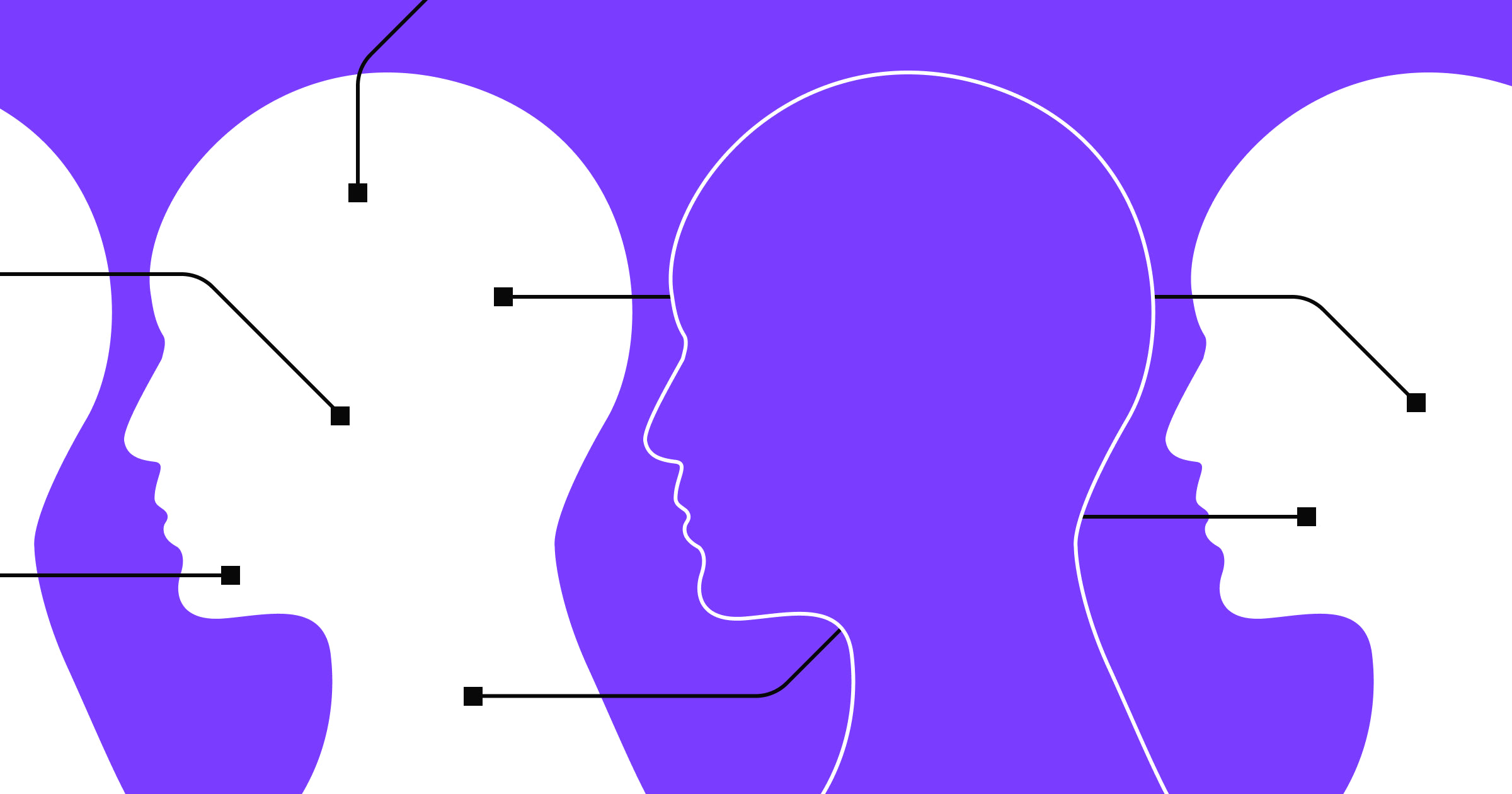
3. Abstracted but human shapes. With dramatic hair.
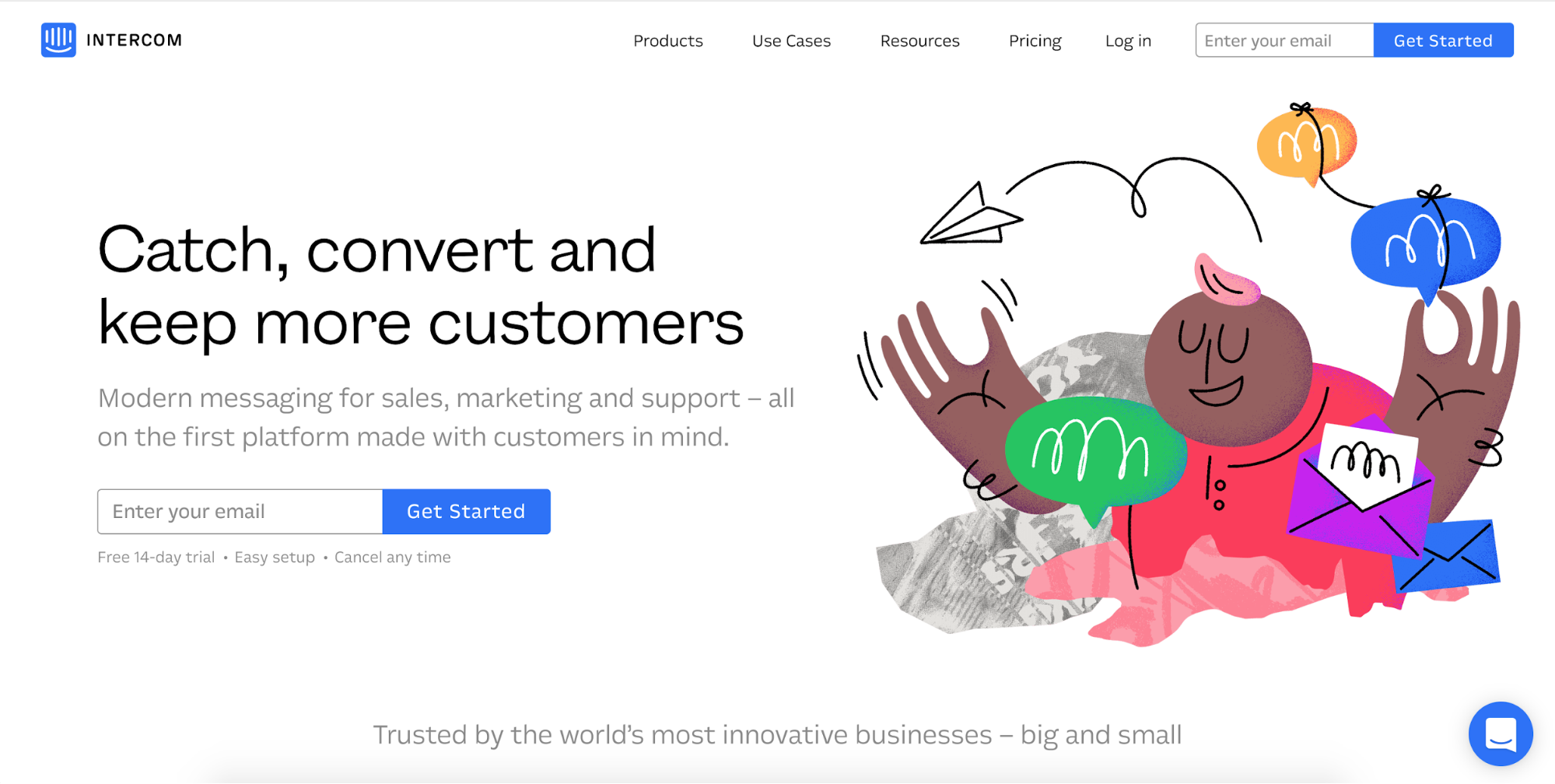
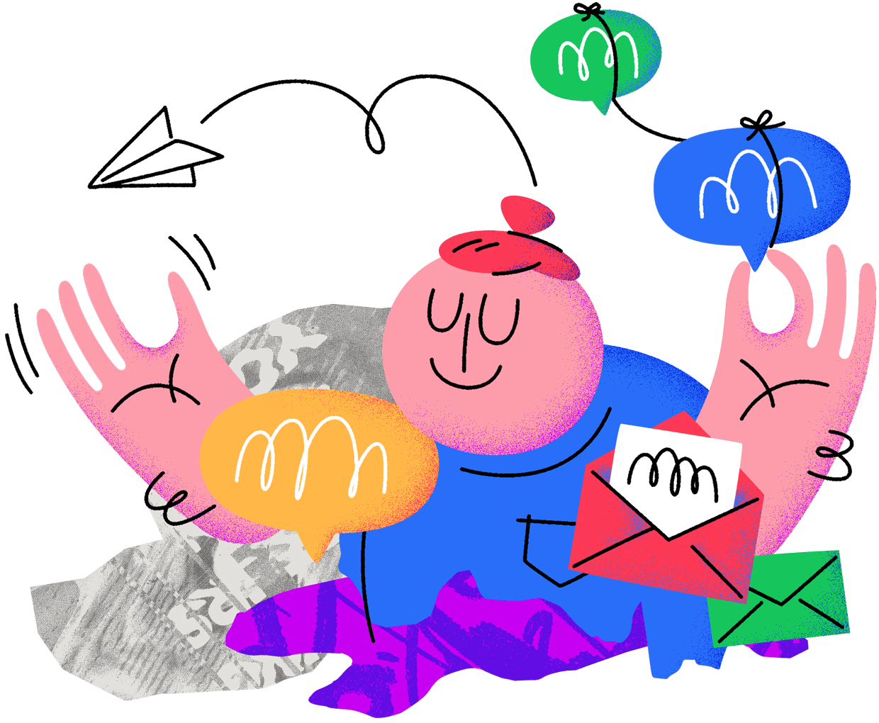
Fire up Intercom’s homepage as of publishing and you might see the above friendly figure, apparently juggling a torrent of communications — via chat, regular conversation, and … physical mail? Is that a real envelope?!
Or you might see this delightfully ambiguous, bun-rocking character.
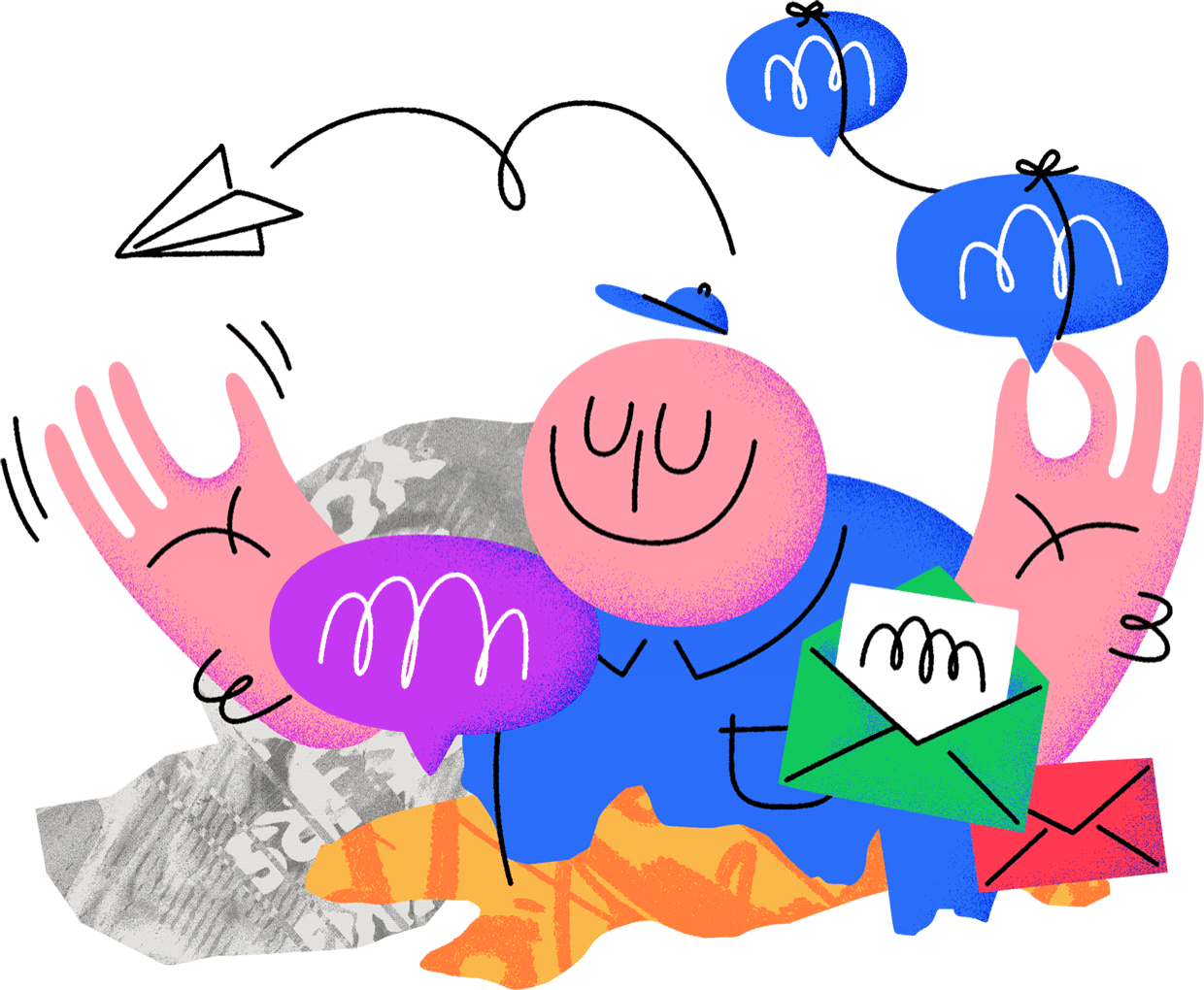
Or this smiling, be-hatted young man. (Could be a kid, honestly.)
So either Intercom is running a test to see which of the above illustrations best impacts conversion and/or retention, or demonstrating their commitment to diversity without cramming their hero section full of folks. Either way, smart approach.
But what I’m really interested in here is how Intercom’s illustrator has chosen to represent the human form. It’s all rounded and squiggly. Friendly. Simultaneously organic and geometric. And super nonspecific about qualities like gender, race, and even age.
So we’re left with a kind of archetypal person, a gesture toward universalist inclusion that gives you just enough to identify yourself with the product, but not overidentify.
Also: super dramatic things happening with the hair here. Just like what you’ll see in a new batch of illustrations for Credit Karma.

And in designs from Oscar, a famously human health insurance brand.
(As an Esurance alum, I can tell you insurance companies are always looking for ways to humanize. Comes with the industry.)


The modern web design process
Discover the processes and tools behind high-performing websites in this free ebook.
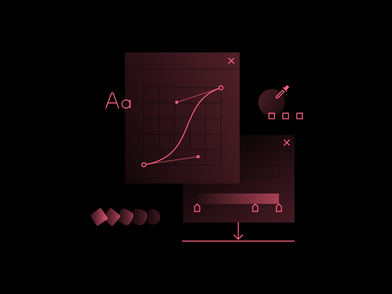
4. Complex interplays of isomorphism, gradient, and opacity

Our lead brand designer, Ryan Morrison, is at the forefront of an emerging illustration style that brings new dimension to the icon-driven design common in software. He takes sometimes-dramatic gradients, layers on opacity after opacity, then gives it all an isometric twist to create an experience that’s as soft and lulling as a Casper mattress — yet somehow exciting. (If only because great skill is always provocative; a challenge to do your own thing.)
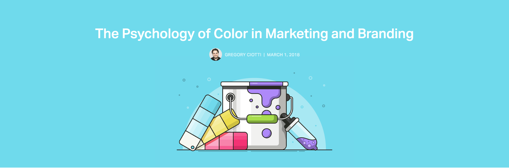
5. Abstract illustrations for abstract topics
Another design challenge for you: Provide a graphic that communicates “this post is about how marketing is a full-funnel activity.”
Constraints include: no literal images of funnels, people falling into funnels, or word clouds.
Solution: Cy Twombly-esque abstraction!
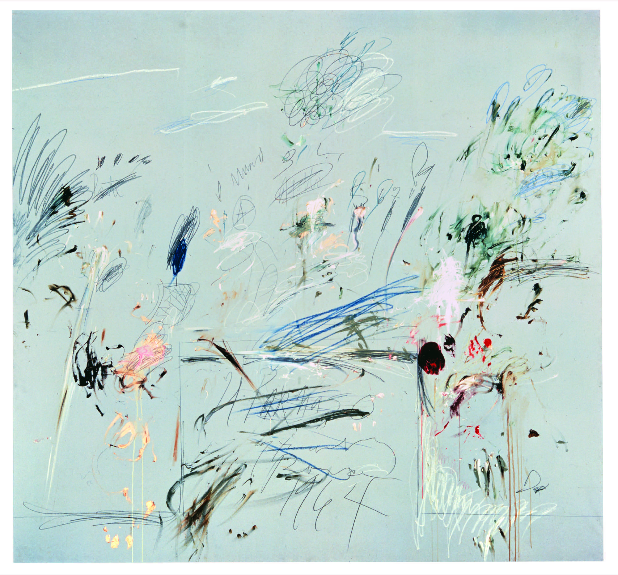
That’s what Cy Twombly’s work looks like.
As a content strategist and frequent “blogger,” I know well that finding just the right image can be incredibly challenging. Especially when the topic doesn’t lend itself to well-understood visualizations. Or, conversely, if it lends itself too well to cliched visualizations. (As is the case with the good ole funnel.)
Thankfully, illustration gives us a powerful way of inciting emotion and eliciting interest without being atrociously literal. Or digging the bottom of the stock-photo barrel. I, for one, look forward to seeing a lot more of this.
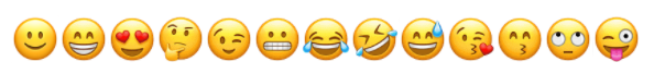
6. They’re bringing bubbly back
Bubbly is back, baby.
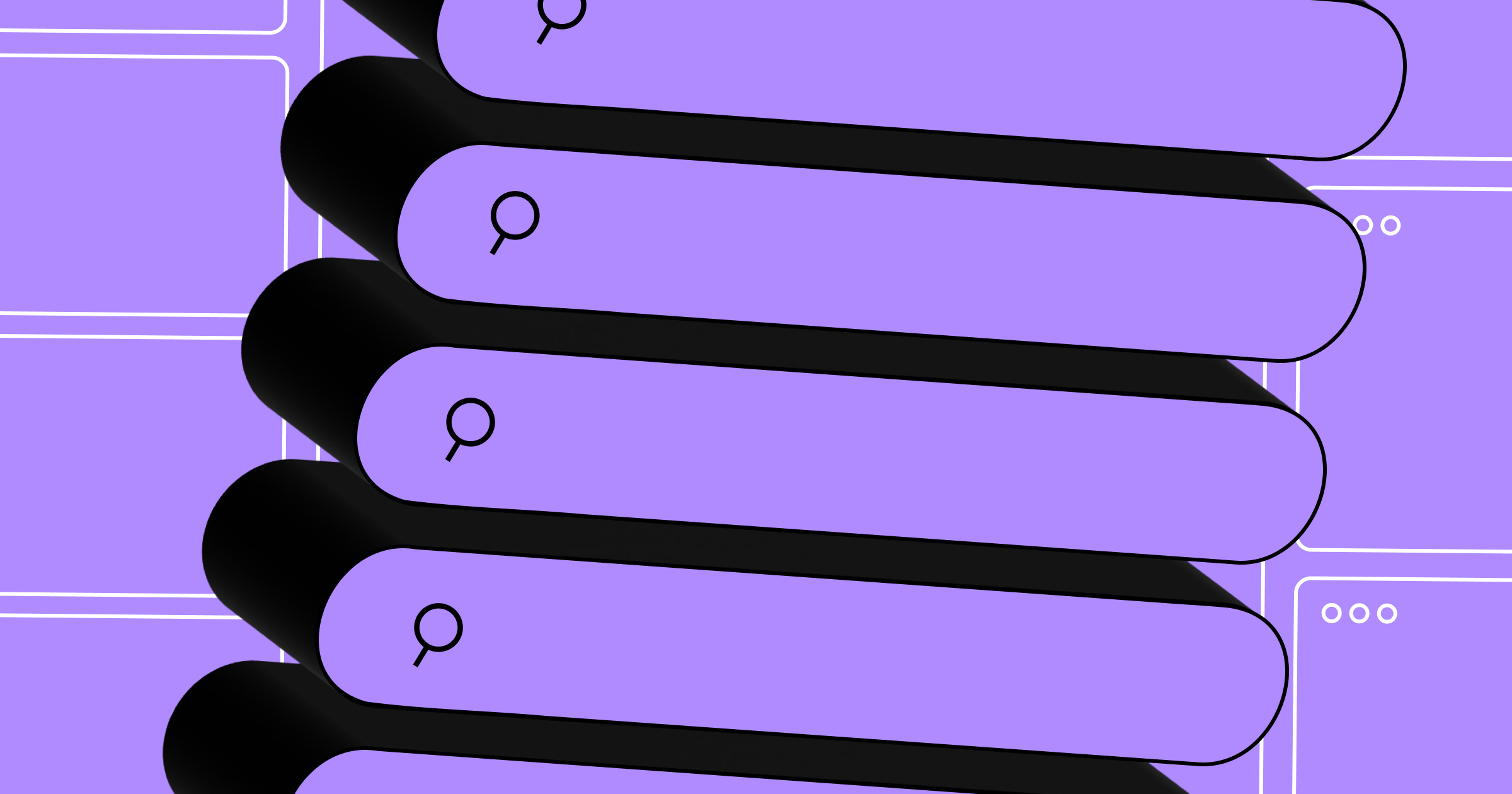
Often confused with skeuomorphism, three-dimensionality obtained via extreme roundedness and purposeful banding is making its way out of outline icon packs and into full-color headers and high-fidelity designs.
Witness the Help Scout blog, another justly famed resource that’s packed with bubbly colored-in icons serving as hero images.
And of course, it really doesn’t get any bubblier than the emoji all us Slack-using workers see every day (now that they disabled choice on that front).
Any trends we missed?
If you’ve seen some other illo trends flourishing out there in the wilds, let us know all about them in the comments below.


.jpeg)