A trend is so much more than just a popular style or collective behavior embraced by mainstream culture for a given period of time.
Design trends can look back at the past with nostalgia, creating connections to the styles and trends of the time and finding new ways to bring them into the future. Trends can inspire designers to find new ways of designing rooted in their unique perspectives and identities. Trends can emerge alongside new technologies like Web3 or use new techniques to build interactive and exciting experiences for their users.
Designers can use trends to find inspiration and make sites and projects for their clients that stay current and connect with modern audiences. For 2023, the standout theme is the shift toward more immersive experiences. Whether it’s coming from the advancement of web-building technology or increasingly immersive environments like the metaverse — we’re excited to see what’s in store for the upcoming year.
If you want to see shifts in web design trends over the years, check out our write ups 2022, 2021, 2020, 2019, 2018, 2017, and 2016.
1. Nostalgia and the Y2K aesthetic
This year, we expect to see the Y2K aesthetic continue to grow in popularity. In recent years, there’s been a resurgence of early 2000s style in everything from fashion to music, interior design, and even art. Naturally, that trend is bleeding through to design and the web.
Nostalgia trends historically run in a (hotly debated) 40-year cycle (some say 30, others 50). With the rise of social media, the adoption and sharing of new trends has become more accessible, so that cycle is speeding up. And now, 23 years post Y2K, the aesthetics of the turn of the century are back in full force.
Some designers are taking this trend in a retrofuturist direction, using the aesthetics of Vaporwave, Glitch, and Cybercore. Others are just incorporating specific elements of Y2K design, like retro typeface use, pixelated fonts and images, or custom cursors.
Design tip: taking just one design element and interpreting it in a more modern way makes your designs call back to a specific era without feeling too themed.

There are some great resources out there for finding Y2K internet inspiration. Use Internet Archive’s Wayback Machine to peruse real website designs from the era or track the evolution of a specific website’s design over the decades. For a more curated selection, the Web Design Museum (and its fantastic Twitter feed) showcases screenshots of iconic designs from the late 90s and early 2000s.
Y2K fonts and text-based designs
With Y2K trending, we anticipate more designers taking inspiration from the fonts and text layouts of the era in 2023. Y2K-inspired designs are less minimal and often use dense text or mixed fonts to create a design that’s eye-catching.
Fonts used in web design during the Y2K era were simple, often sans serif or monospaced, and sometimes visibly pixelated, like in Christopher Nelson’s website above. Since images loaded slowly in the early 2000s, web design tended toward simple, text-focused layouts with a lot of white space.
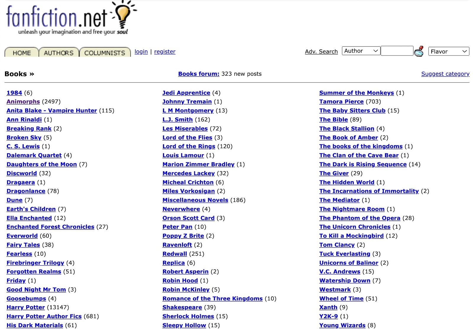
A classic Y2K-era website might have looked something like FanFiction.net circa 2001 — lots of white space, small image icons, and a whole lot of Arial or Verdana.
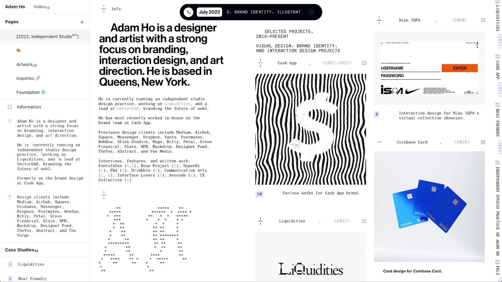
Designer and artist Adam Ho’s portfolio site takes clear inspiration from this era with his stark text-on-white design. He adds visual interest by mixing fonts in a way that contrasts with the sectioned layout and clean background.
Adam also uses a bold, sans-serif font to draw attention to certain elements of his design, balanced by a mix of light-serifs for visual interest. The design even includes a touch of cyber aesthetic by using a typeface with the slashed zero (like Terminal or Consolas) for dates.
Unique cursors
If you were online during the 90s and early 2000s, you might remember changing your cursor into a cat, smiley face, or green alien head. You may have enjoyed playing with endlessly entertaining cursor effects like the clock, fairy dust, or ghost trail. Y2K was a truly fun time in the history of cursor graphics.
In 2023, expect to see more custom cursors. Cursors can use an original image as an icon, or they can use animated effects to create an interactive experience. However, this time around, you can use them without installing a cursor pack and filling your computer with malware.
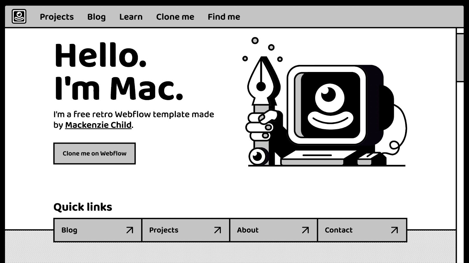
A great example of this trend has been Mackenzie Child’s interactive custom cursors on Mac, his cloneable retro site template. Mackenzie’s two cursors— a classic arrow and a pointer finger for links — are comically oversized with a cartoonish face that perfectly suits the other elements of his design.
To continue with the Y2K theme, Mackenzie uses a grayscale color scheme, heavy boxed layout, and sans-serif font directly influenced by early software like Apple Lisa and Adobe PageMaker.
Pixelation
Pixelation, which was originally a technological necessity in the early days of computers, has become an aesthetic as Y2K makes its resurgence. Recently, designers have been using pixelation in fonts, icons, and images to add visual interest.

Take Attentive’s Y2K-inspired holiday marketing site, for example. They created a pixelated rainbow logo, used pixelated icons, and pixelated the photos used for its articles. The simple shapes and pixelation unify the design and give the feeling of a self-contained retro world when you use their site.
2. Custom typefaces
As text-based website designs have taken over in recent years, we’re anticipating the rise of custom fonts and hand-created lettering as the next evolution of this trend in 2023.
We’ve seen more and more designers creating typefaces or custom lettering for personal or client projects as a way to stand out. Designs that center around type have been a trend for a few years now, so this style continues the trend while bringing it to a whole new level of originality.
And there are no specific designs or styles that will universally dominate. Given the custom nature of this trend, we see designers incorporating their own touches from anything and everything — poster design, graphic novels, real-world materials, and even their own lives.
You can approach this trend a few different ways, depending on the effect you’re trying to create and your level of experience with illustration and lettering techniques. Font generator tools like BitFontMaker, FontStruct, and Calligraphr give you different ways of building, downloading, and using your original font.
If you have some skill with digital illustration tools, you can create custom, lettered graphics. You can also digitize artwork you’ve created physically with pencils, pens, paint, or almost any other medium. It takes some technical skill, but there’s also the option to take illustrations and vectorize them to turn them into fully-functional typefaces.
Now, let’s take a closer look at some of our favorite designs we’ve seen as of late.
Stenciled and screen-printed font designs from Tré Seals
Text-based web design works well when it’s bold, graphic, and easy to read. This makes it similar to signs, posters, and banners that need to be eye-catching and legible.
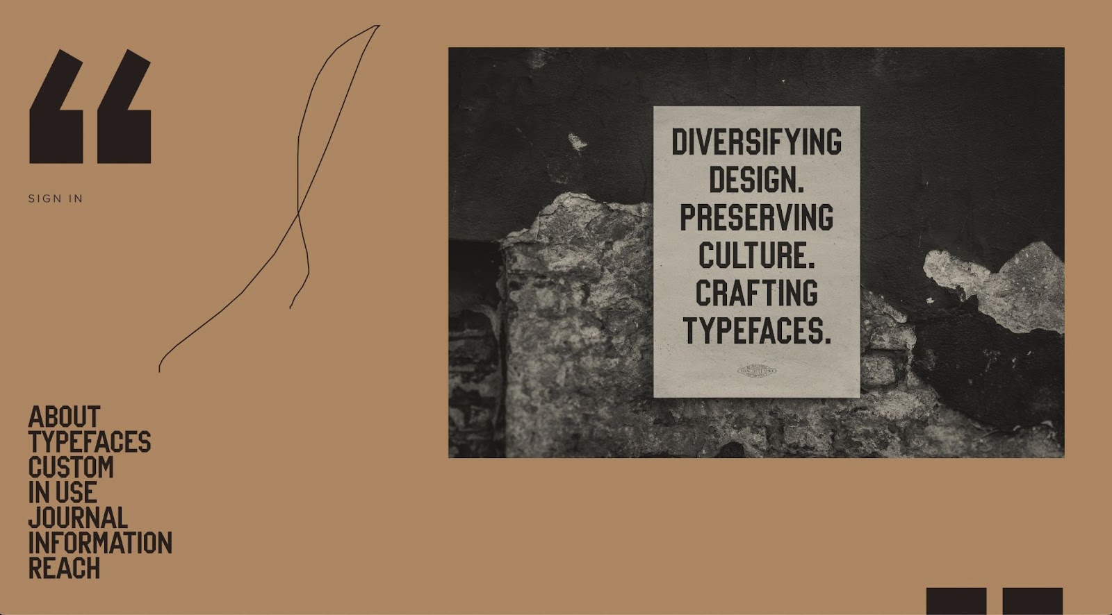
Tré Seals is a graphic designer, the founder of Vocal Type Co, and a Black creative who takes direct inspiration for his typefaces from social movements and political movements that are meaningful to him.
The lettering on the signs and posters used in these movements was usually hand painted, screen printed, or stenciled. It needed to get its message across, so it was distinct and easy to read.
With this in mind, Tré uses heavier font weights, hard edges, and straight lines to make each letter distinctive. The results are typefaces that can be used to create web designs that attract attention.
Colorful hand-drawn lettering from Leandro Assis
Abstract illustrations have been tending since last year, and illustrative design styles like Corporate Memphis continue to remain popular. Given this, we’ve seen many designers lean into illustrative hand-drawn lettering as a complementary pairing to those illustration styles.

One of our favorite examples of this has been the work of Leandro Assis, a Brazilian lettering artist who creates bright and playful fonts that take influence from cartooning and illustration. The fun graphic style of his work has become popular with clients like Nike, Amazon Music, and even RuPaul’s Drag Race.
Leandro uses flat blocks of color, curved lines, and black outlines to make his lettering stand out. He has even created animated effects with his lettering, making it attention-grabbing.
Trompe-l’oeil from Aurelie Maron
There’s been some great examples of lettering that look like chalk drawings, metal and neon signage, and even textile effects like embroidered letters in web design recently. This style is called trompe l’oeil, meaning “fools the eye” in French. It gives the illusion of 3D texture and real materials, almost popping off the screen.

In particular, we’ve loved Aurelie Maron’s work with trompe l’oeil lettering. Her custom lettering imitates physical, artistic mediums. This effect isn’t easy to achieve, but she’s produced a series of lettering design classes and tutorials to help designers create their own original lettering.
3. Shareable frameworks
As creators are sharing resources and techniques as a way to build community, grow their reputation, and make the web an overall better place — expect to see an explosion in shareable frameworks moving into 2023.
Notably, Flowbase has found that offering free resources is a major growth channel for its business. Webflow agency Finsweet built their strong reputation by being open with their techniques and sharing their knowledge in the design space.
A lot of web creators also genuinely want to build a better web experience for everyone. Alexa Heinrich talked about her Accessible Social Guidebook in a recent interview with Webflow. She cares about making social media a more accessible place. Rather than just telling people to build accessibility, she chose to share a practical guide to help them do it.
Designers are sharing their sites as cloneable templates on Made in Webflow. We’ve also seen an uptick in people sharing Notion templates, like this one from Trist Adlington, and creating style systems like Finsweet’s Client-First. Plus, many creators contribute to resource libraries like The Noun Project.

One of our favorites has been Edgar Allan’s Knockout — an end-to-end development framework designed to help designers and developers work together within Webflow. It includes a full Figma template that gives the user a responsive grid, a class naming system, and a built-in responsive design. It solves a lot of the organizational pieces of building for the web, so the user can focus on making great designs.
4. Illustrations with dimensionality
With the rise of the metaverse, illustrations that mimic the virtual world are coming into fashion — with 3D illustrations and Claymorphism leading the way.
While 3D illustration has been a trend in previous years, it was more exclusively an illustration style. Current sites are beginning to add dimensionality in a more immersive way, pulling users into cyberspace by adding animations, full-page effects, and multi-layered illustrations.
3D illustrations
In 2023, we’ll see a resurgence in the popularity of 3D illustrations in web design. With flat illustration styles dominating trends in recent years, 3D design has become a way for projects and sites to stand out from the crowd.
What feels even more modern and on-trend is building a full-on 3D visual experience throughout your site, like Redis Agency did with their website. Instead of using the animation as a header or standalone illustration, they put it in front of the site content. The site is made even more engaging with the addition of a parallax scrolling effect.

Technology continues to improve, and 3D images are easier to create than ever, but you don’t need to be a 3D illustrator to take advantage of this trend. We anticipate seeing a lot more designers creating pre-built 3D libraries others can use to add visual interest to their websites this upcoming year.
Metaverse
The metaverse is an idea, an interactive digital space, and a new online world. It may be hotly debated, but that just means it’s increasingly top of mind. As web users have gotten used to online spaces and virtual reality, the design style of the metaverse will become an increasingly important part of the visual language of web design in 2023.
The metaverse is a form of virtual reality. Visually, that means every element builds to form a cohesive world. Instead of a single 3D illustration or element on a webpage, we’ve seen sites taking their inspiration from the metaverse build an all-encompassing 3D style for their page.
This includes everything from illustrations, backgrounds, text, and even cursors. Sites have also included Interactions and animated effects to help draw the user in and make the site feel more interactive.
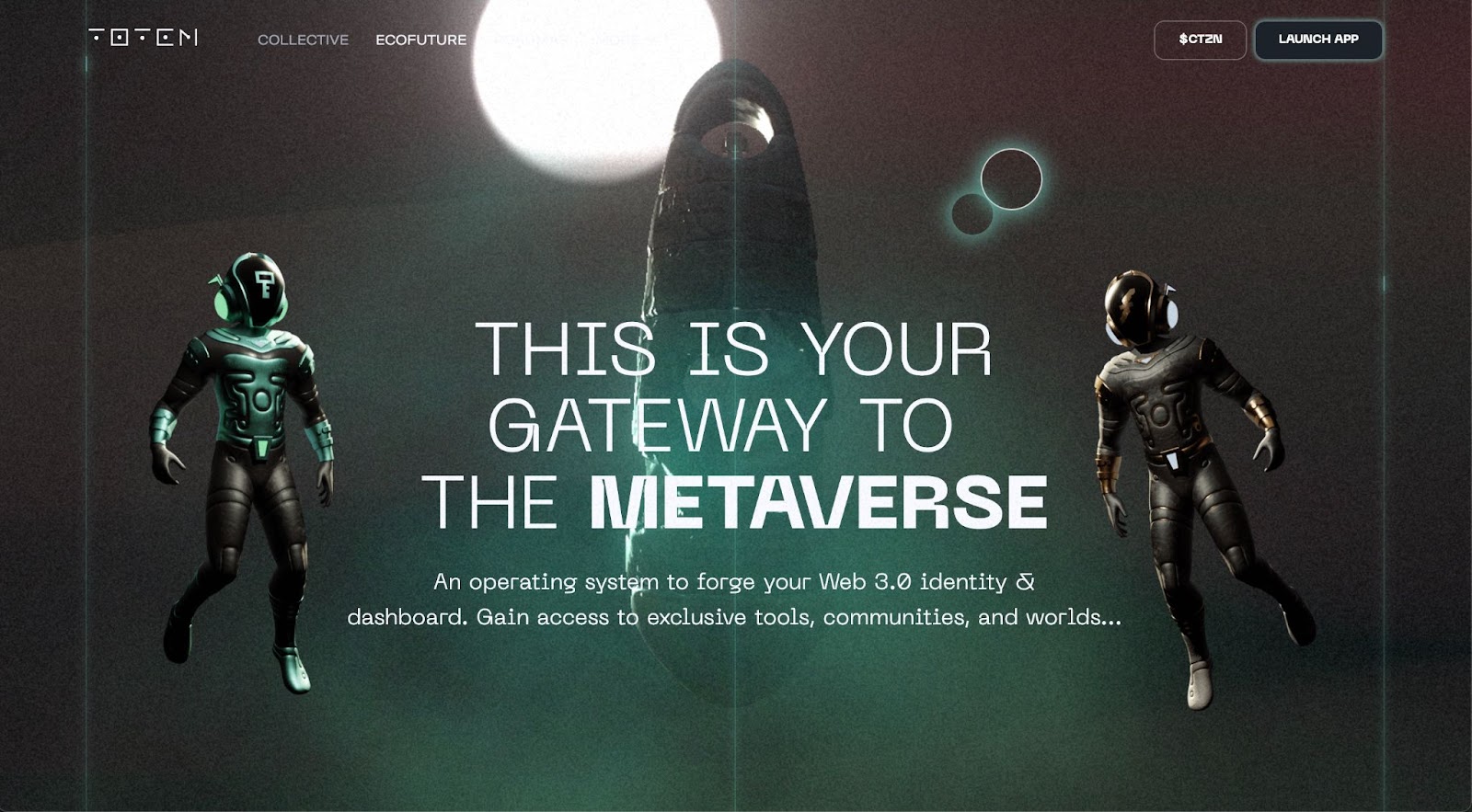
A notable example is Totem’s website which uses animated effects to build an immersive website experience. Offbrand, the designer of the site, used a grainy effect and layers of luminous mist to unify its site content, background, and illustrated elements.
On the other side of the metaverse coin, the Music Mania site uses its 3D animations as a background element that is separated from the rest of the website with overlaid frames, text, and flat-illustrated elements. The separation helps the animation feel less overwhelming.
Claymorphism
Claymorphism creates a dynamic experience in a different way, giving the viewer illustrations that feel tactile and real. A lot of web users may have a strong emotional attachment to claymation effects after growing up with films like “Wallace & Gromit” or “Coraline.”
We expect to see claymation-inspired designs be popular in 2023, as they combine 3D effects with the cartoonish human figures that have been popular in web design over the last few years.

Claymorphism is a great approach for creating 3D human figures that are playful without approaching uncanny valley territory. Some great examples are Guuulp!’s animation library which has a great range of claymation-style humans and Webflow’s Community Grants site that incorporates Claymorphic characters to give the page some life.
5. “Just for fun” interactions
This year, we are expecting to see more interactions that are “just for fun” and don’t serve any particular purpose besides adding to the experience of a website.
Building on top of last year’s trend of app-like websites — just for fun interactions let users play with a site and bring that experiential wonder to sections of a larger site.

When it comes to just-for-fun animations, it doesn’t have to be part of the primary navigation of your site to be effective. In fact, sometimes, it’s best if it isn’t. Interactive animations like the Ball Pit or the Love Button are engaging and super fun to play with without impacting the accessibility of a site.
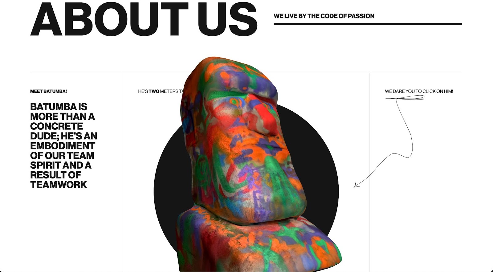
A “just for fun” animation can also add meaning to your site if used creatively. Lazarev Agency designed Batumba as a mascot and created his interactive animated effect as a team-building exercise. The character makes the agency memorable and shows off the team’s coding skills to potential clients in a fun way.


Get started for free
Create custom, scalable websites — without writing code. Start building in Webflow.
6. Loading animations
Loading animations were popular in the early days of the web but fell out of style for a long time. Recently, we've seen large swaths of designers beginning to incorporate loading screens into their designs again, and this trend will continue into 2023.
This resurrection of the loading screen comes from the rising popularity of interaction, animation, and immersive website designs. A loading screen is another opportunity to engage with viewers and communicate your identity into your website. Web users hate waiting for pages to load and animations make waiting feel less like a chore.
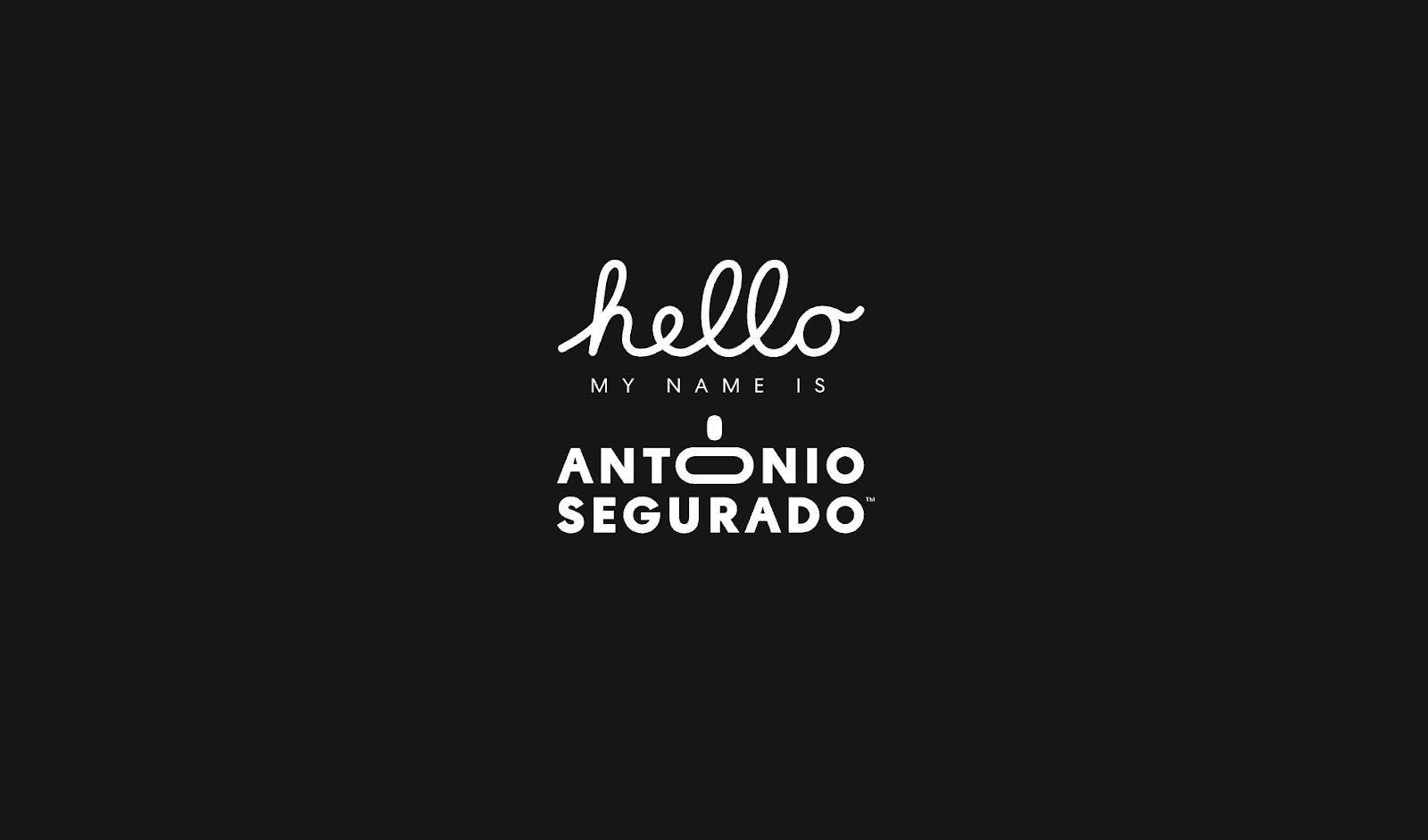
One of our favorites that we’ve seen is Antonio Segurado’s site which uses a loading animation to introduce Antonio to visitors — creating a simple yet welcoming effect. Similarly, Cory Runnells creates a full narrative for his website. It starts with an animated zoom-out through a city on load, then he introduces himself as a superhero-like character and explains his expertise via a comic strip.
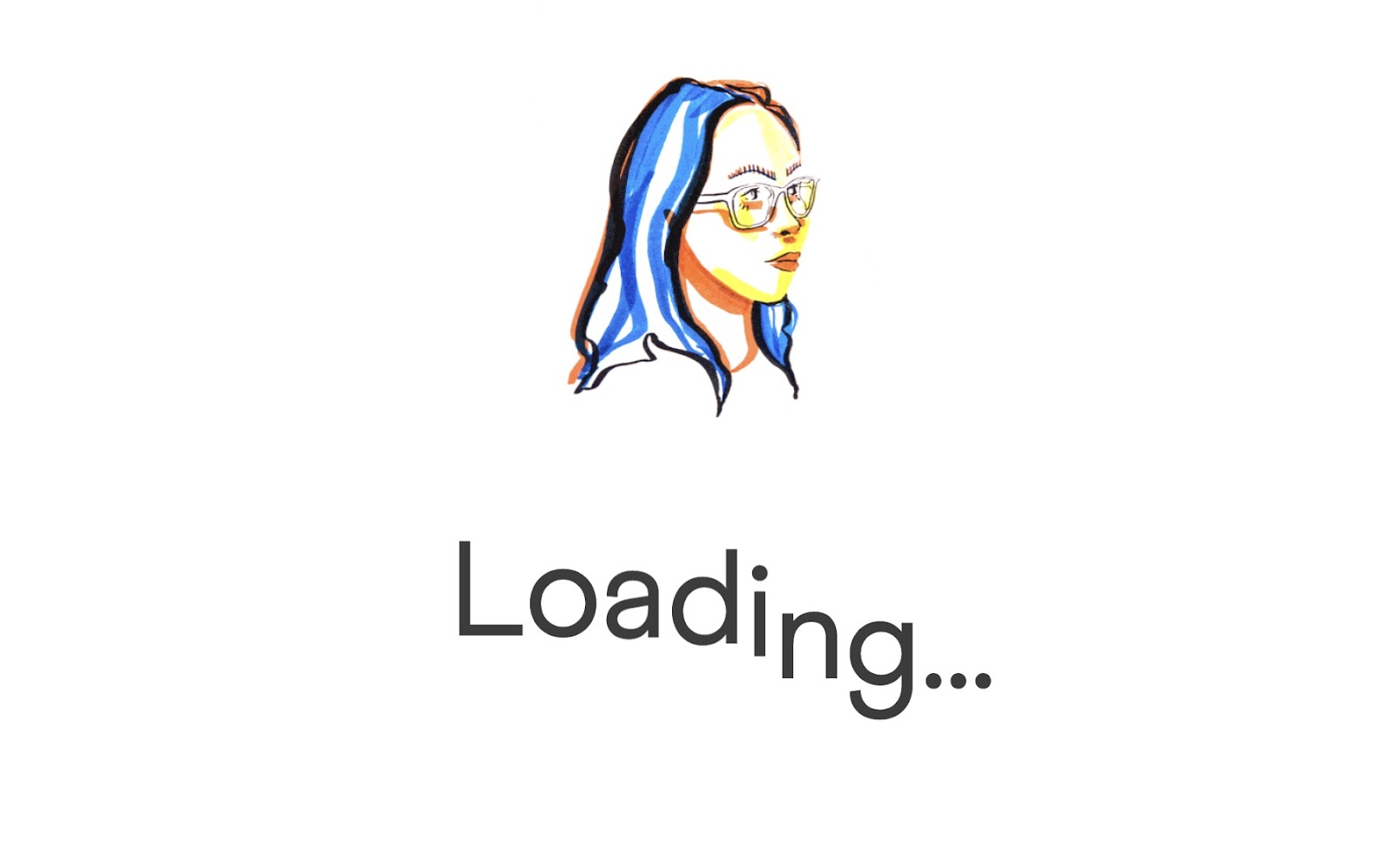
We also loved Rachel Bavaresco’s loading animation which focuses on an animated collection of her hand-drawn characters — a perfect way to show off her skills and introduce visitors to her work.
7. Collaboration
Work-from-home and hybrid working environments have become the norm since the start of the COVID-19 pandemic. Given this, digital tools that enable remote collaboration, or features that incorporate explicit collaborative support, like Webflow’s roles and permissions, are not just popular but have become essential. We’ll continue to see the trend of adding built-in collaborative features to digital tools continue to grow.
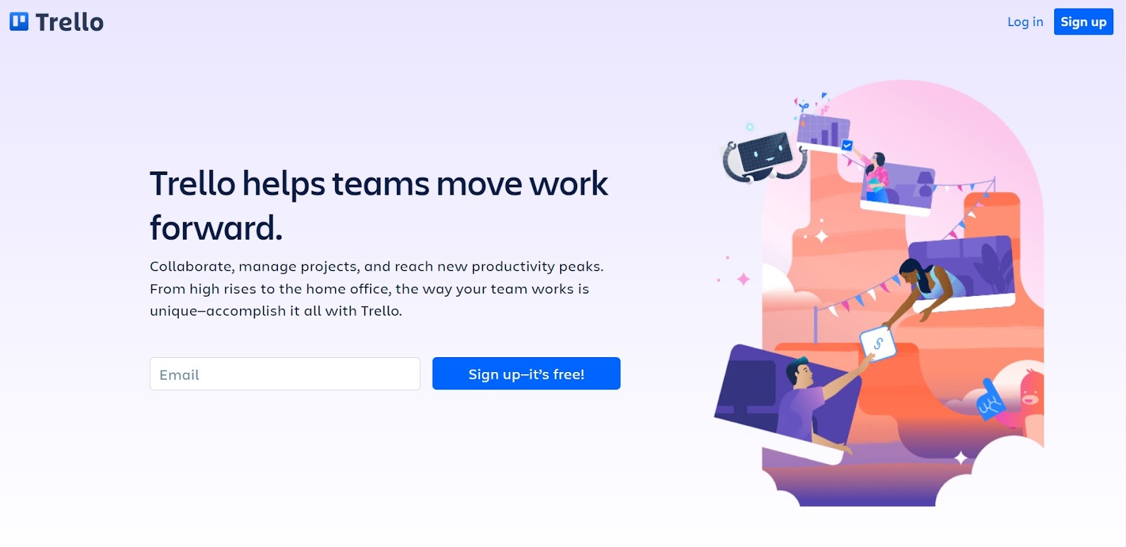
Adobe announced in September that it would be acquiring the popular design collaboration tool Figma. The company is widely known for its collaborative features like prototype sharing and design systems that keep shared assets in one place.
This acquisition signals that workplaces are seeing the value of software that supports digital collaboration in a more meaningful way. We expect to see more and more digital tools launching collaborative features in the near future.
8. Premium content experiences
Moving forward into 2023, we expect more creators and businesses to discover the value in memberships, gated content, and premium experiences. The whole concept of Web3 — which has gained an immense amount of traction in the past year — is the decentralization of the web. Building gated content into a website gives you more control over your community and helps you get paid for creating valuable content.
Creators will increasingly embrace the independence that comes with owning their own content portal. While businesses — who are looking at ways they can be more recession-resilient — will draw towards premium content and gated memberships to let them build an additional income stream directly from their own website.
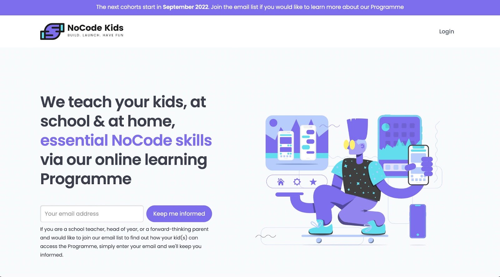
A great example of a site creating premium content experiences has been NoCode Kids which uses Webflow memberships to build an entire online learning platform to teach young people how to use no-code tools.
Another site, Ladies Get Paid, has a paid portal that gives users access to a whole community of women in business, along with educational resources.
Sequoia Ampersand also uses Webflow’s memberships feature to provide access to its extensive archive of business resources. This not only helps Sequoia Ampersand in their efforts to provide benefits to their community, it helps them engage more directly with their users.
A premium content gateway or memberships feature also enables you to make your website more valuable and more engaging than just a static source of information. You can create your own memberships for clients or add subscriptions to monetize your templates and designs. You can also pitch premium content portals to clients, adding value to the work you do for others.
9. Lightweight, more efficient websites
Both visually and on the back end, websites that are light, quick, and optimized for the user experience will become more common in 2023. Users hate to wait. Not only that, but more and more users are accessing sites on their mobile devices or networks that may be slow. The trend of lightweight websites ensures users get what they need and enjoy accessing your website.
Throughout internet history, designers oftentimes limited images and graphics to increase website loading speed. Though this isn’t strictly necessary anymore, you still need to be aware of how data-heavy the media files on your site are.
Technology like WebP images and techniques like designing lazy load background videos lets you add all the media you want without damaging the user experience.
10. More intentional use of notifications
Historically, companies have used mobile notifications as a sales tool. Notifications have the power to prompt consumers to buy, whether that’s alerting them of sales, something to purchase, or a new feature.
More apps and websites will incorporate notifications to connect with their users this year. Audiences want their interactions with the apps they are using to feel more genuine and be more useful to them.
Notifications have the power to make websites and apps more useful, more personal, and more integrated into users’ lives. This year has seen an overall trend toward more engaging experiences on the web. In particular, we expect to see notifications being used in more creative ways to interact with users and provide useful information.
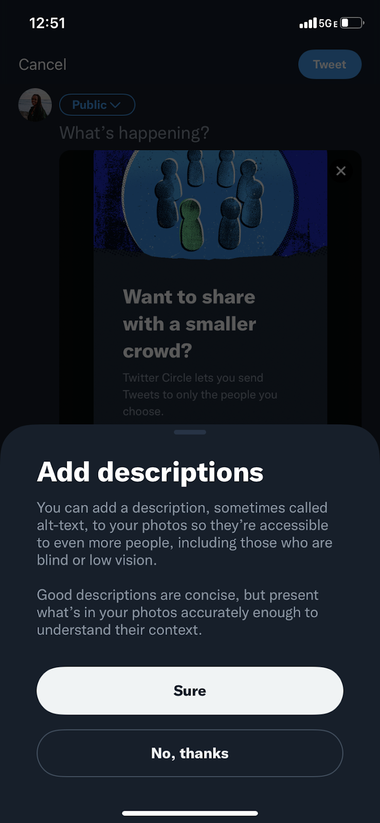
Twitter recently added notifications to its app that remind users to include alt text when they add images. Alt text is hugely important for accessibility, allowing users who rely on screen readers, such as those who are blind and have low vision, to understand the content of an image. This simple addition has the potential to increase the accessibility of the entire Twitter platform in a meaningful way.
Some other recent examples we see have been the new Apple iOS which includes a feature to “Share Focus status” and inform someone who is trying to contact them if they are set to Focus mode while driving or on Do Not Disturb after bedtime. Lyft has also incorporated incredibly useful notifications like “ride taking longer than expected” and silent 911 assistance when needed.
These examples are signals of the increased awareness of the power of notifications. These two prominent platforms are experimenting with using notifications in a more integrated way. It makes a strong early signal that we are likely to see even more features like this rolling out over the course of the next year.
11. Customizable viewing experiences
With the rise in personalization on the web, more sites will allow for customizable viewing experiences. Going into 2023 web experiences are becoming more catered to the needs and preferences of their users.
Website building platforms now give designers the tools to easily let their users customize features of their site experience. There is more awareness of accessibility — in society and on the web. Features like dark mode and sound can make a site more user friendly for people with differing needs.
People respond well to sites that accommodate their preferences, interactions, and designs they can customize to their taste. This trend toward building more customizable viewing experiences is a natural progression from the popularity of sites-as-games and interactive features we have seen in previous years.

Customizable settings can be used in all sorts of helpful and creative ways. Timothy Ricks created a Persistent Dark Mode Switch visitors can use to change their viewing experience (try the cloneable feature in a project). Another useful feature is the changing tabs toggle, which provides the user information that responds to the settings they select, such as a monthly or annual plan subscription (try it out here).
Customizable viewing experiences can also be used for creative expression. Happy Medium lets users change the text color on their site to suit their whims, which is a fun addition to the site experience.
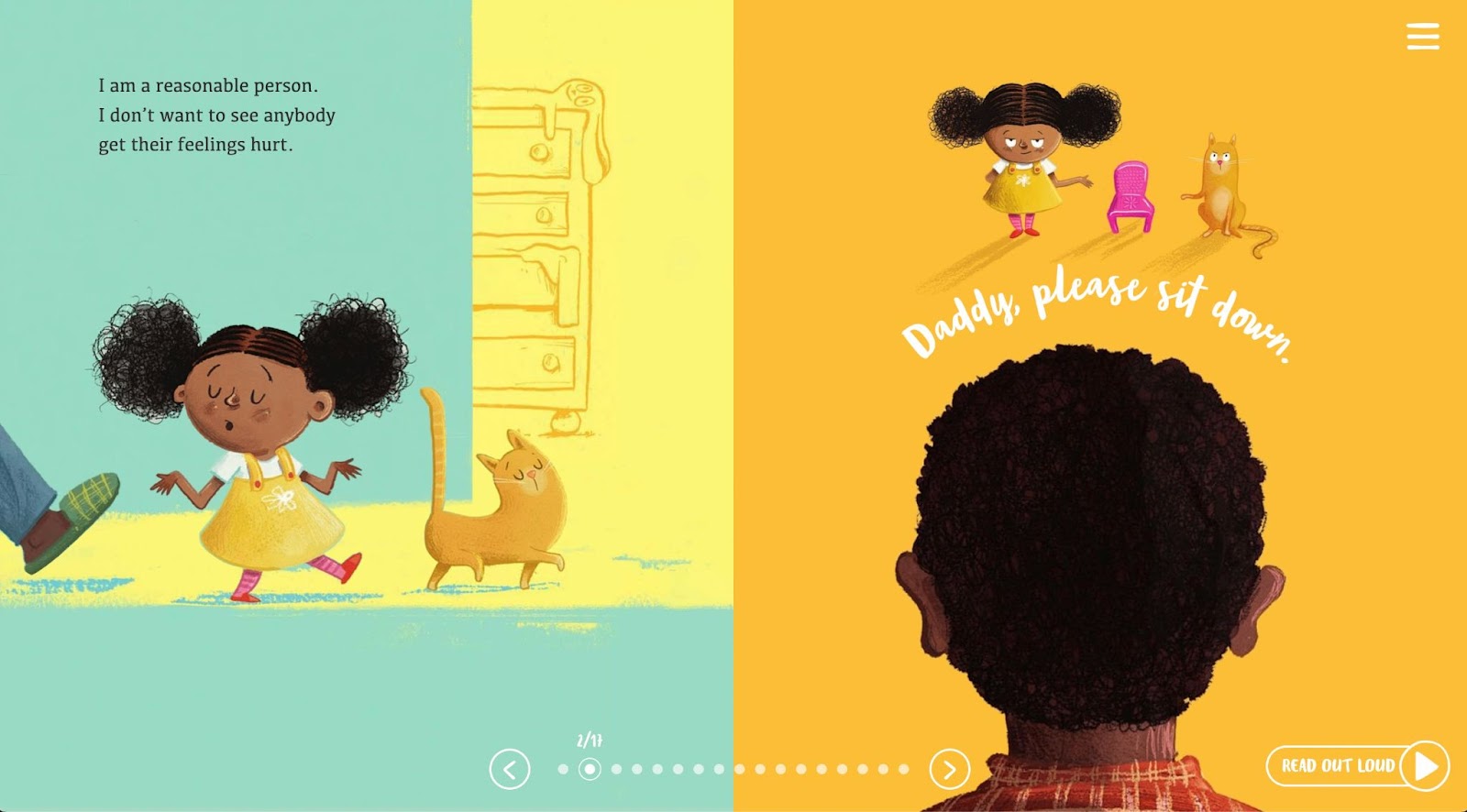
Anfernee Grant even turned a website into an immersive bedtime story with The Big Bed. He lets the user choose to have sections read out loud to them or skip to specific pages. Anyone who has read bedtime stories to kids will recognize how useful it is to go back to their favorite page over and over (and over and over) again.
2023 is the year of user engagement
The web is an interactive place, and it has been since its inception. Designers have always loved making immersive experiences and creative games and making visitors an active part of their website experience. What sets this year apart is how effortlessly integrated the idea of user engagement has become.
We now have the technology to empower web users to participate in shaping their own experience of the web; not just in the metaverse or Web3 or whatever digital zeitgeist is happening but also in small but meaningful parts of their daily internet use.
You can build engagement into your site with responsiveness, animation, and fun. You can add functionality to turn your site into a bedtime story, a learning resource, a shared web development framework, or just an amusing place to play.
What is clear is that modern websites are increasingly living, breathing places where designers and users find new ways to interact and engage. We think that seems like a delightful way to experience the web.


.jpeg)


