

How we consume the web changes how we design websites. Mobile devices and the trend towards responsive design push designers to find ways to maximize web experiences for everyone, no matter what device(s) they’re using.
Check out our latest post: 11 engaging web design trends for 2023
These 17 trends — 16 for this year (2016), plus 1 for the future — respond directly to the evolving ways we move through the web.
1. Microinteractions

From pressing an elevator button to liking a photo on Instagram, we all perform tons of single-action tasks every day, usually without much thought. We call these simple moments of engagement microinteractions.
Well-designed microinteractions can be defining because, despite their simplicity, they’re often very powerful. Pinning an inspirational photo, liking a witty status, and retweeting a powerful message have become so common we don’t even need to name the websites that birthed them.
When done right, microinteractions offer an intuitive way to interact with a website. When done wrong, they can cause frustration through unexpected functionality — or downright quirkiness.
As we designers streamline our web experiences, we’ll see — and create — more microinteractions to help us simplify the actions we need to take.
But how do you know your microinteractions provide the simplicity and power people want from them? Well, this cheatsheet from Dan Saffer, author of O’Reilly’s Microinteractions: Designing with Details, can help:
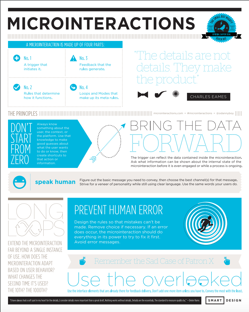
Download the PDF of the Microinteractions cheatsheet
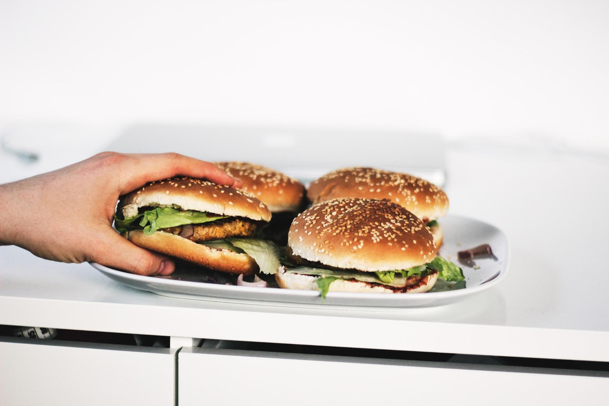
2. Reliance on images over text

As web design evolves, the importance of high-quality images will only increase. Solid copy strengthens any website, but if it can be said with a photo, animation, or short video, it might be a really good idea to do so.
Written content remains invaluable for SEO purposes, but with every piece of content you add to your site, always ask yourself: is there a more engaging, concise, and shareable way of conveying this idea?
In general, text works best for removing the ambiguity that visual methods of communication are prone to.
It’s also worth remembering that it’s not always a question of “one or the other.” If you want to design and publish in an accessible way that prioritizes every user’s experience, you’ll want to pair visual and written content. That way, everyone can experience your content in the best way for them.
3. Designing with real data (i.e., content)

Sure, mockups look pretty. But with their lush images and precise lorem ipsum text placements, they represent an idealized reality. Like the appliances in a model home, mockups are about as functional as a cardboard television.
Designing with real data gives us a deeper understanding of how a page will function. In part because it surfaces all the “problems” designers strive to avoid in their mockups, such as long headlines, low-quality images, etc.
Designing with real content gives both writers and designers better insight into what they need to do. If you haven’t yet, check out “Why your design process should start with content.” Webflow’s CMS helps you design functional prototypes with real content, giving both designers and writers a better idea of just how a website will function.
4. Scrooooooooooooooooolling

With the multitude of screen sizes out there, the term “above the fold” has lost significance.
Once dismissed as bad design, the long scroll’s intuitive functionality on mobile devices has brought it widespread acceptance. It makes navigation easier, eliminating the extra clicks necessary to reveal content. Eye-catching transitions and differentiated section designs transform what could be a monotonous trudge into a delightful process of discovery.
Long scrolling changes UX design, opening the door for more narrative approaches and simpler interaction models.

5. Conversational/bot websites and apps

Many science fiction writers have envisioned a future dystopia where humanity has fallen under the rule of robot overlords. But here in reality, artificial intelligence has actually been pretty helpful in the development of websites and apps. Sorry, Isaac Asimov.
Nobody wants to navigate a complex series of menus to get something done. Conversation makes for a much easier experience. Apps and other web services are using this more natural approach to make ordering goods, getting financial advice, or booking a hotel room as easy as sending a few text messages.
Plus, various tools have popped up to help non-coders make their own bots, so we’re likely to see tons more of these over the coming years.
One particularly interesting question arises from the ‘bots’ rise: how will the role of the web/UI/UX design transform as this new form of interface gains popularity? After all, in most cases, there’s already a well-built design wrapping the conversational experience. That means the words themselves become the core UI.
Which leads naturally to the question: will 2017 be the year of the “content designer”?
6. The death of the hamburger menu
Hamburger menus are polarizing. Much like election-year politics, we don’t recommend discussing them after a few drinks in mixed company. Especially if said company includes UX designers.
Sure, hamburger menus save precious real estate on tiny screens.
But from a usability standpoint, hamburger menus have their problems. Few people even recognize the icon. And even those who do recognize it don’t know what to expect when the menu opens, given all the ways that interaction can unfold. They’re also inefficient, in that they add an extra step to the process of navigating a site.
Finally, they also conceal a site’s breadth, thereby voiding individual page’s context and place within the larger whole. With navigation visible on-screen, people can easily get the lay of the land and see their options. Without it, that big-picture orientation gets much harder.
Apps like Spotify have ditched their hamburger menus in favor of simplified navigation, and we expect we’ll see much more of that as the year continues.
7. Desktop push notifications

We’ve all experienced the power of push notifications. No matter where you are or what you’re doing, it’s so hard to ignore that little ding or buzz. So hard to not whip out your phone and engage with whoever’s pinging you.
And now, many websites are trying to bring that power to the desktop. If you haven’t seen it yet, this usually manifests as a little modal-like element sliding down from the top of the browser, asking you if the site can send you desktop notifications, a la Slack.
It makes perfect sense: after all, here you are on the site, ready to engage with it. Why hope you’ll sign up for the newsletter and then hope you’ll actually open it, when they can just hit you up right here and now?
That said, these modals always seem to fire as soon as the site loads, so it’s hard to say yes to such a premature, invasive request. (Much like your average newsletter popup.) Perhaps the next year will see this technique refined to be more effective and helpful.
8. Product explainer videos

These have been around for awhile, yes. But their importance will only grow in the coming years.
Clocking in at around 90 seconds, product explainer videos offer a quick, concise way to tout the virtues of a given product. With informative voiceovers and clever animations, product explainer videos can work for any-sized company in letting people know just why their products are great.
One thing brands will have to keep in mind when using such videos is their inaccessibility to some audiences if captions aren’t included. Plus, many people (including me, Ed.) simply refuse to watch videos on marketing sites, so you don’t want to lean on videos to explain everything.


Get started for free
Create custom, scalable websites — without writing code. Start building in Webflow.
9. Duotones

Duotone images are created by “printing” a grayscale image with a second, non-black color. The technique has its origins in printing and fits well within a minimalist web design aesthetic.
Duotone images make great hero backgrounds because they add some life without unduly distracting from the content, or creating legibility issues. A simple duotone color scheme can also be a great way to create a clean, consistent-looking page — particularly when you’re trying to present several very-different images in the same place (such as logos or team member headshots).
10. Stylized typography

A minimalist design approach leaves room for more artistic uses of type. Extremes in sizing, custom typefaces, traditional fonts used in unconventional ways, and highly stylized lettering can all have a huge impact. And with the increased access to typographic choices Google Fonts and Adobe Typekit offer, there’s no need to stick with another ho-hum sans serif anymore.
Combining font sizes can have a huge impact on the look and organization of a page. Single words can take up an entire page. Using vastly different sized fonts creates hierarchy, which in turn supports people in their efforts to understand a website and find the content they want. Larger fonts emphasize the primary messaging of a page, while smaller ones naturally guide one's eyes to the supporting messaging. Designers are making more visually dynamic pages through their creative use of differing font sizes.
Proprietary typefaces have also gained a whole new prominence in our lives. Once the domain of brands’ wordmarks, print materials, and brand style guides, bespoke fonts have now taken key roles in interfaces we see every day. Apple’s own San Francisco typeface, Amazon Kindle’s Bookerly, Android’s Roboto, and even UPS’ sans font are all are great examples of the effect typography can have on a brand’s identity. It may be costly and time consuming to design an entire font family, but it can have a strong effect on differentiating your company.
Traditional fonts are being repurposed and used in more creative ways too. Text is showing up in the form of masks, where letters are cut out of an image, flipping the traditional text-overlay approach. We’re also seeing a resurgence in distressed, “vintage”-feeling fonts as brands embrace a DIY aesthetic to capture that all important “kale chip and craft beer” demographic.
It can be overkill to fill a page with flourish-rich fonts, but when used tastefully, this kind of typography can create a strong mood and bring life to a page.
On the other hand …
In stark contrast, we’re also seeing the beginning of a move back to system fonts for some major platforms, including GitHub. While custom fonts help create a dramatically more diverse and beautiful web, they can also negatively impact performance. Let’s just be thankful that today’s system fonts are a far cry from Arial and Helvetica.
11. Vibrant color schemes

As flat and minimalist design have gained popularity, bright colors have been on the rise too. As noted by sitepoint.com, these more vibrant color schemes aren’t limited to just web design, but can be found in fashion design, weathercast graphics, and interior design.
Card or container layouts have become more popular and using vibrant colors in these blocks creates a bold layout. Bright colors also help UI elements like buttons and navigation jump out from a page. Finally, bright palettes can have a strong brand affect — you can’t really think of Huge without thinking “bright pink,” or Google without “primary colors.”

There’s an artistry in using vibrant color schemes effectively and it’s easy to go overboard with a kaleidoscope of head-spinning hues, evoking that last time you saw Phish.
12. Broken grid layouts
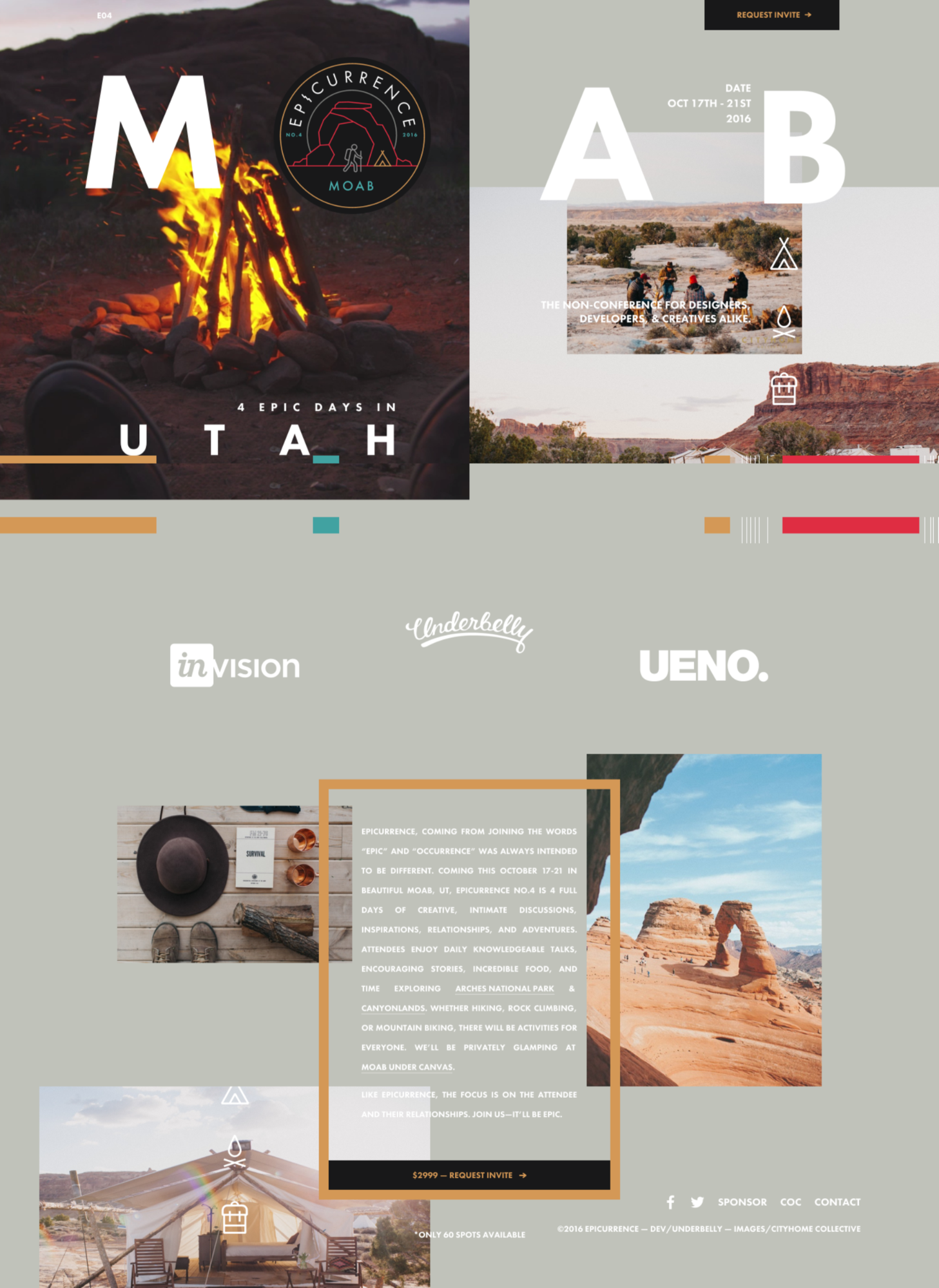
Symmetrical websites may be beautiful in their simplicity, but strict geometry can also be confining. Broken grids are a way to loosen up layout, while still retaining some sense of visual order. This type of layout breaks free from convention and its freshness keeps people engaged. Be careful, as too much chaos may result in a confused jumble of content.
Breaking the grid, for reasons
We wholeheartedly recommend shaking up your grid systems, but be sure you’re doing it with cause. No design decision should be motivated by a statement like “because it looks cool.” Instead, think about how breaking the grid might mean something for your brand, and keep that meaning in mind as you build out your design.
For example, the Epicurrence website breaks the grid to shake up our usual perceptions of the relationship between imagery and content. And it’s more than just a slick design move — after all, this “non-conference” asks to shake up the way you think about industry events too.
No design decision should be motivated by a statement like 'because it looks cool.'
13. Dynamic storytelling
Businesses strive to connect with their customers. After all, people don’t want to interact with a cold, faceless entity — they want to interact with real people. Dynamic story uses video, graphics, and text to create an interactive journey that helps people get a richer understanding of a brand, the people behind it, and the value of their mission.
Same goes for products. Nothing emerges from a vacuum, devoid of history. There’s always a backstory, and giving people a glimpse of that story adds dimension and depth to what might otherwise be just another piece of software.
14. Direct chat with support

Chatting with customers and responding to their questions helps personalize a company's web presence. Apps like Intercom modernize the support experience by mirroring how messaging works on social media sites like Facebook. The ability to get help immediately also helps build trust in a brand.
Chat thus becomes an effective tool in helping customers solve their problems. For those who aren’t comfortable with computers, a representative can now help them remotely by cobrowsing or screen-sharing. And it removes the need to find and then browse through dense technical documentation, reducing friction.
Direct chat can also help convert new users in a highly contextual way. After all, if you’re working to solve a particular problem and suddenly get a message that helps you overcome exactly that problem, your belief in a product will skyrocket.
15. Full-screen sign up “modals”
Traditional popups are done. Will full-screen takeovers replace them?
Instead of interrupting you right when you thought tip #3 was getting really good, these full-screen “modals” push the content down, filling your whole screen. The smooth scrolling action makes it less disruptive, and the full-screen layout offers more space to incorporate actually persuasive content. Plus, there’s no need to manually close out the modal — you just scroll to move on.
With email marketing being such a huge deal, getting interested customers to sign up is more important than ever. And while they might not present a perfect-world solution where blogs just let us sign up if we want to, at least they’re a bit less annoying.
16. Custom illustration and iconography
Yes, you can find tons of well-designed stock visuals to use in your designs. But to really set yourself apart, you need to create something unique. Having someone create visuals and iconography customizes your website and projects your personality. Plus, it shows that you really put time and care into this design.
Stock graphics are one of the hallmarks of the boring homogeneity many people perceive in the web design world. Creating custom visuals that speak directly with and to your content offers one way out of the fast food design trap. Here’s hoping we see much, much more of this.
17. Looking to the future: virtual reality for the web

It may be in only its earliest stages of development, but virtual reality web browsing will one day be a ... uh ... reality. Mozilla’s WebVR team envisions a virtual reality web where every site can present people with an immersive, 3D reality utterly different from the web we’ve grown used to. Like most virtual reality technologies, WebVR still has a ways to go before it will easily accessible to most people.
That said, there’s no better time to think about the future than right now.
What trends have you seen in 2016 — and what do you see coming next?
The web teems with innovative design and content approaches, so we’re sure we missed something. Let us know what you’ve seen this year — and what you’d like to see even more of — in the comments below!