Clients and designers don't always speak the same language. But with these three tools, you can translate your clients’ brand and vision into concrete visual styles that not only help you get approval, but also speed up your development process.
Each tool focuses not on an entire webpage design, but on specific design elements you can either apply to your final build directly, or use as inspiration. That gets clients focused on helping you develop a visual language for your website design. That way, when you start building out the pages of the website, you can focus on higher-level details like the user experience and flow, rather than getting bogged down in the visual details. And to help you get started with them, we've included a free responsive style tile template you can use however you'd like.
Let's meet the tools, shall we?
1. Style tiles
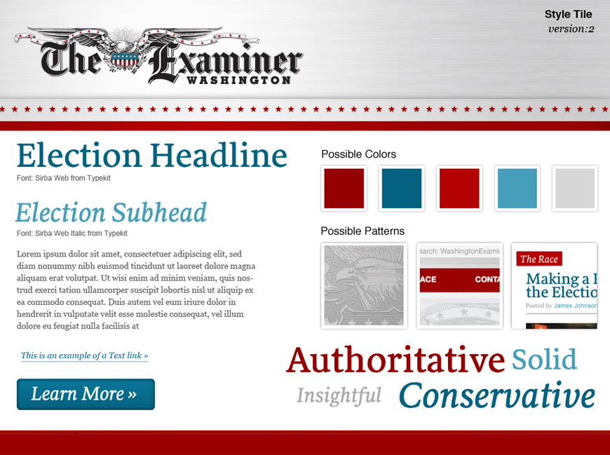
Designer Samantha Warren writes that style tiles “help form a common visual language between the designers and the stakeholders and provide a catalyst for discussions around the preferences and goals of the client.” They do that by creating a middle ground between moodboards, which many clients find too vague, and full mockups, giving designers space to iterate on ideas before going all-in on a specific approach.
Samantha’s style tile template offers room for:
- The client’s logo
- A headline (H1)
- A subhead (H2)
- Text link
- Body copy
- Button
- Color scheme
- Patterns/textures
- Brand attributes
You can tell at a glance that style tiles keep the conversation at a high level, while remaining actionable. The elements of Samantha’s template prove particularly useful for a text-heavy website like a newspaper: once it’s approved, you’ll have most everything you need.
Pro tip: Tailor your style tiles to the site you’re making. Samantha’s is great for a newspaper site, but if you’re working on, say, a restaurant site, you might want to include image treatments for food photography, type styles for the menu, etc.
Advantages of designing style tiles
Clarity
Style tiles help clients and stakeholders literally see the intimate relationship between abstractions like brand attributes and concrete design elements. When you look at the tiles for The Washington Examiner, it’s obvious how the typography and colors manifest ideas like “authoritative,” “insightful,” and “conservative.”
Practicality
Style tiles are obviously just sample design elements, so they keep reviewers focused on the trees, not the forest. At the same time, they make it easy to work those trees into the forest. I.e., once you’ve gotten sign-off on Playfair Display as a headline font, you’re good to use it in the final design.
Device-independence
As Samantha herself puts it, “Style Tiles don't imply dimensions nor device; only that the design will be digital.” That helps you avoid implying that anything will happen on mobile that just can’t, like Dan Mall’s book-turning button interaction (see below).
Process-based
Style tiles make sense as an output of the discovery process. That helps clients and stakeholders understand how you arrived at this artifact and how it’ll help shape the final design.
Potential disadvantages of designing style tiles
I love style tiles, but they can introduce some issues you’ll want to look out for. Thankfully, a careful explanation of what the style is and what it’s for will help avoid most troubles.
Prone to Frankenstein-ing
Some people will try to combine elements of different versions of your style tiles. Granted, it’s much easier to Frankenstein your style tiles than full mockups, but the format sometimes seems to encourage such “improvisation.”
Vague
It's not super clear how certain elements of the template, such as “Possible Patterns,” might translate into the final design. They hint at a level of fidelity style tiles try to avoid, and I’ve seen clients fixate on certain features to the exclusion of the more abstracted elements.
Too "designed"
I’ve heard of clients confusing style tiles with actual mockups and missing unlabeled details like the brushed steel background of the tile above.
Free responsive style tile template made in Webflow

Our own Mat Vogels built this handy responsive style tile and moodboard template for you to use in your own projects. Just:
2. Customize it by swapping in your logo and images, styling the typography and buttons, and updating the color swatches
3. Add your images to the mood board template—or just remove the link if you're not creating a mood board for this client
4. Send to your client for feedback
Note that you might want to create several alternate versions of your style tiles to give clients a sense of the breadth of options. Just be sure to clearly explain to your clients what your style tiles are and what kind of feedback will help you make the most of the designs.
2. Element collages
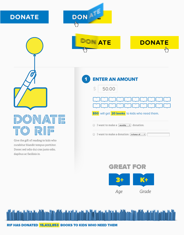
Designer Dan Mall created this variation on Samantha Warren’s style tiles because of his love of collaging. But he uses this variant for more than just personal reasons. As he notes in his post on the topic, the term “collage” clarifies that:
What we’re looking at isn’t a final design but rather an assembly of disparate pieces without specific logic or order.
–Dan Mall, Founder of Super Friendly, Cofounder of Typedia
His element collages also fit his design process. He says that he often has ideas in bursts, and the element collage lets him quickly capture those ideas without having to place them in a larger context. Sounds cool, right?
See how the element collage captures specific design elements in a variety of ways, ranging from isolated (like the button) to in context (like the form)? That’s a key difference from style tiles. The collage style seems to give Dan more flexibility to play with an idea and illustrate its different states, as with the button.
After all, you could argue that a button isn’t a single design, but a design with at least three different states: normal, on-hover, and on-click. This also lets Dan introduce animations as a design detail—without actually creating an animated GIF or coding up the interaction. Of course, with Webflow, it'd be easy enough to make that button actually interactive.
Advantages of element collages
Flexibility
Element collages let you visualize an idea as it comes to you, and follow that idea out to its logical conclusion.
Specificity
Element collages reflect the final deliverable—the website—so you can add more specifically digital elements, like interactions, forms, buttons, etc.
Concreteness
Element collages let you show how deeply your design ideas are founded in the brand itself. In Dan’s designs for RIF, it’s wildly obvious how inspired by books and reading he is: the button interaction looks like turning pages, important bits of copy are highlighted in classic canary yellow, and the icons look like open books.
Possible disadvantages of element collages
A step too far
Element collages stand between style tiles and full mocks, abstracting design elements out of the full mockup, but in a more fleshed-out way. Which means there’s more room for getting bogged down in the details and doing work that’ll end up in your trash (or swipe file).
Not device-independent
Because element collages are so freeform, it’s easy to travel down a particular road that could end up being too device-specific. For instance, the button interaction and form in the collage above are obviously desktop-focused.
3. Moodboards

Possibly the oldest tool for establishing a visual language with clients, moodboards have become a go-to for many designers, even if they have no intention of sharing them with clients or stakeholders. That’s because they’re a great way to capture inspiration and influence.
Best of all, moodboards don’t take a ton of work. Between Pinterest and a bunch of moodboarding web apps, you don’t even need to take screenshots or fire up a design tool. Plus, they’re a ton of fun to build, letting you stock up your inspirational arsenal, stay aware of current trends, and take a break that’s still work-related.
Moodboards help you understand the visual style(s) clients like, the mood they want to set, and can even give you some concrete design metaphors to work with, whether it’s Google Now–style cards, hand-drawn illustrations, or Swiss typography.
Since moodboards are so well known, let’s break with the pro/con approach and stick with some tips on using moodboards.
Tips for moodboarding
Moodboarding is super simple, but there are ways to make the most of them. These tips will help.
Don’t design your moodboards
Moodboards should present external sources of inspiration—any design elements you add will just distract and potentially confuse your clients.
IRL A-OK
The world’s full of amazing design work, and importing elements of a print magazine, newspaper, billboard, or whatever can help people think “outside the box (model).”
Use your words
Remember that copy is a key element of any design, and you can use others’ writing to inspire your own project’s voice. Also, if your client has defined brand attributes, you can link these terms to design elements like you do with style tiles.
How do you get on the same page with your clients?
Do you use design deliverables like these to help get you and your clients on the same page? Tell us about your experiences in the comments!


The modern web design process
Discover the processes and tools behind high-performing websites in this free ebook.


