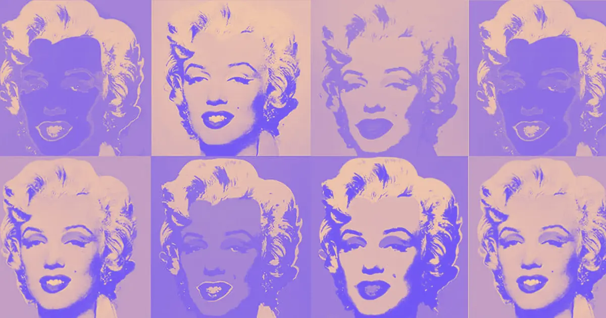
Every designer today is familiar with the bright, graphic comic paintings of Roy Lichtenstein and the multiplied Campbell’s soup cans Andy Warhol created.
Both works are part of the Pop Art Movement. While Pop Art has become wildly popular (and commercially successful) today, it shocked and outraged the art world when it first appeared.

If you’re just looking at how Pop Art appears — the bright colors and fun subject matter — you’ll miss a lot of what makes it so interesting. The artwork plays with ideas around consumerism, mass media, and popular culture and even challenges the very definition of art. It set the art world on its head and changed the way we think about “high culture” and “lowbrow” forever.
Let’s take a look at the origins of the Pop Art Movement and how we can gain inspiration from it.
The Pop Art Movement’s origins and artists
Pop artists rejected the elitism of the art world. They saw everything as worthy of artistic depiction, not just “elevated” and serious topics. They collaged images from magazines, reproduced celebrity faces, used corporate logos, and presented mass-manufactured objects as art. They copied, stole, and borrowed liberally.
In a letter written to friends in 1957, artist Richard Hamilton defined Pop Art as,
“Popular (designed for a mass audience), Transient (short-term solution), Expendable (easily forgotten), Low-cost, Mass-produced, Young (aimed at youth), Witty, Sexy, Gimmicky, Glamorous, Big business.”
Critics have never been able to settle whether Pop Art was an endorsement or cultural critique of consumerism, capitalism, and popular culture. The truth is, it was probably a little bit of both. Pop Art’s commercial popularity highlighted the fact that fine art itself is just another commodity for consumption.
1950s: Pop Art develops as a reaction to consumerism
Pop Art emerged during the post-World War II period, a time when mass manufacturing and popular media were suddenly exploding. TV, movies, and magazines brought advertising and celebrity culture to every person’s home, and commercially-made products were more readily available than ever before.
Robert Indiana described Pop as “newborn out of a boredom with the finality and over-saturation of Abstract Expressionism,” which rejected representational and figurative art completely. Pop artists rejected abstract art, choosing instead to represent the things they saw in the everyday world around them.
Pop Art also has roots in the Dada movement, which introduced the idea of re-contextualizing “readymade” or “found” objects as art simply by signing them or putting them in a gallery.
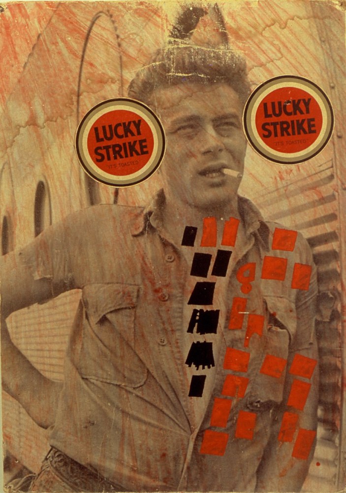
Pop artists like Richard Hamilton and Ray Johnson created collages out of ads, comics, and magazines. They appropriated popular imagery to react to the consumerism and excess of the 1950s post-war economic boom.
1960s: Replication, reproduction, and commercialization
Starting in the 1960s, Roy Lichtenstein began creating the comic paintings that became the most recognizable Pop Art images. By stealing his images from “lowbrow” sources like comic books and reproducing them, he challenged the art world to question the definition of art itself. Is it still art if it’s a copy?
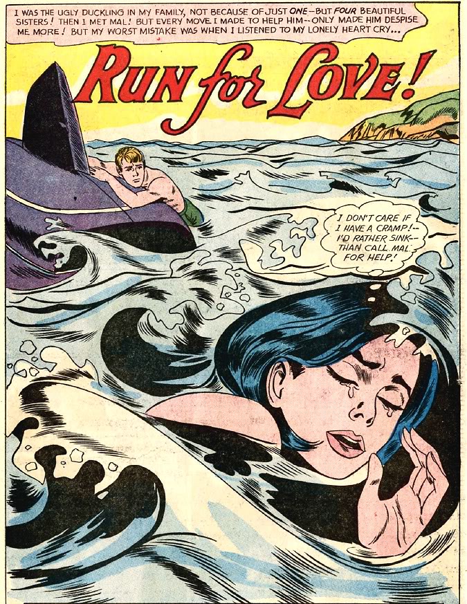
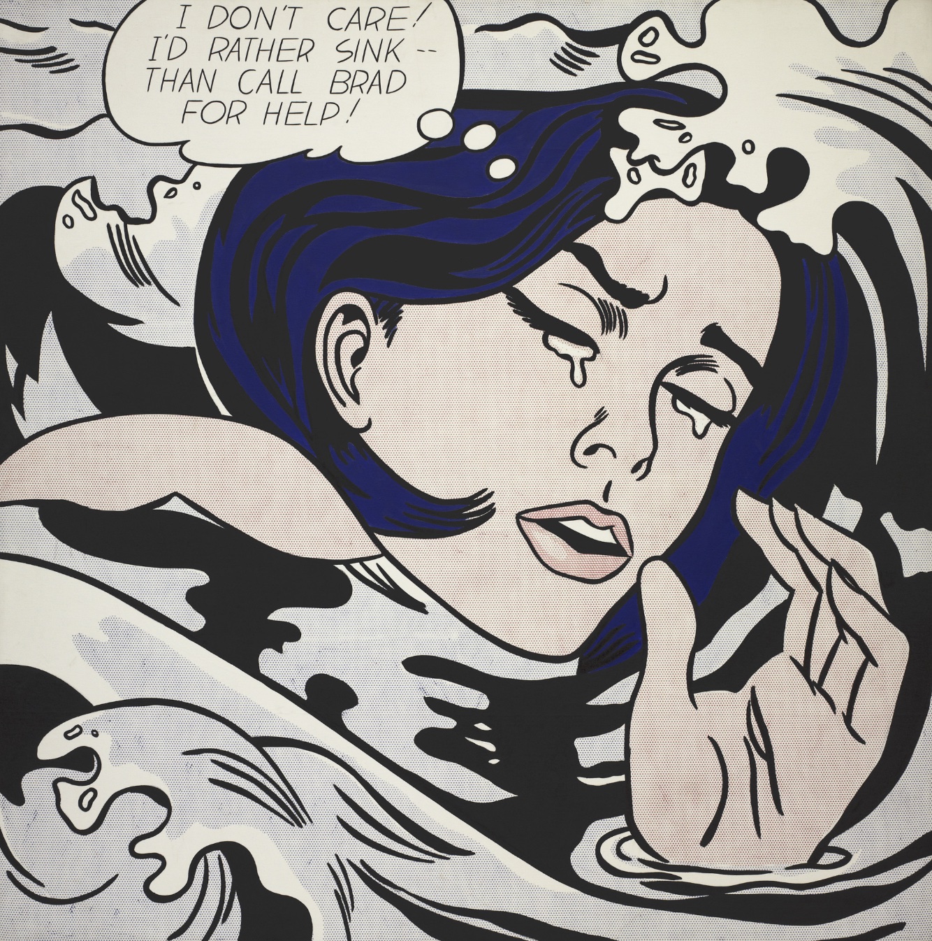
Lichtenstein didn’t just copy comic images — he streamlined and exaggerated them to create a heightened sense of drama and visual impact. This style mimicked commercial screen printing, where Ben-Day dots were used to add shading and complex colors to prints inexpensively.
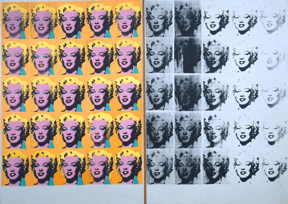
Andy Warhol gained massive fame for replicating mass-produced images of celebrities, politicians, and commercial products. He either screen printed or hand painted images over and over and hung them in galleries and museums, breaking down the division between commercial work and fine art.
In his book, Andy Warhol advises, “Don’t think about making art, just get it done. Let everyone else decide if it’s good or bad, whether they love it or hate it. While they are deciding, make even more art.”
Pop Art continues to be popular — and commercially successful — today
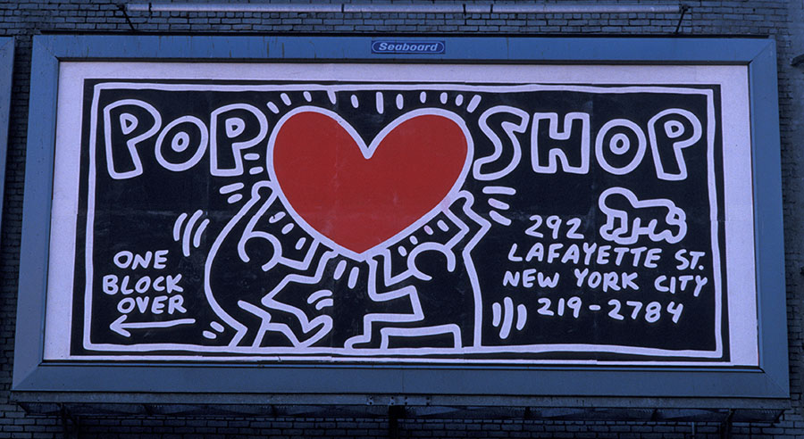
The Pop Art Movement has stayed relevant over the years. Famed Pop artist Robert Indiana continued to produce and show relevant work until his death in 2018. Keith Haring made an unforgettable mark on the world with his political and cartoonish Pop Art figures in the ’80s.
Today, Neo-Pop artists like Yayoi Kusama and Jeff Koons are some of the biggest names in the art world.
Use Pop Art to energize your web design
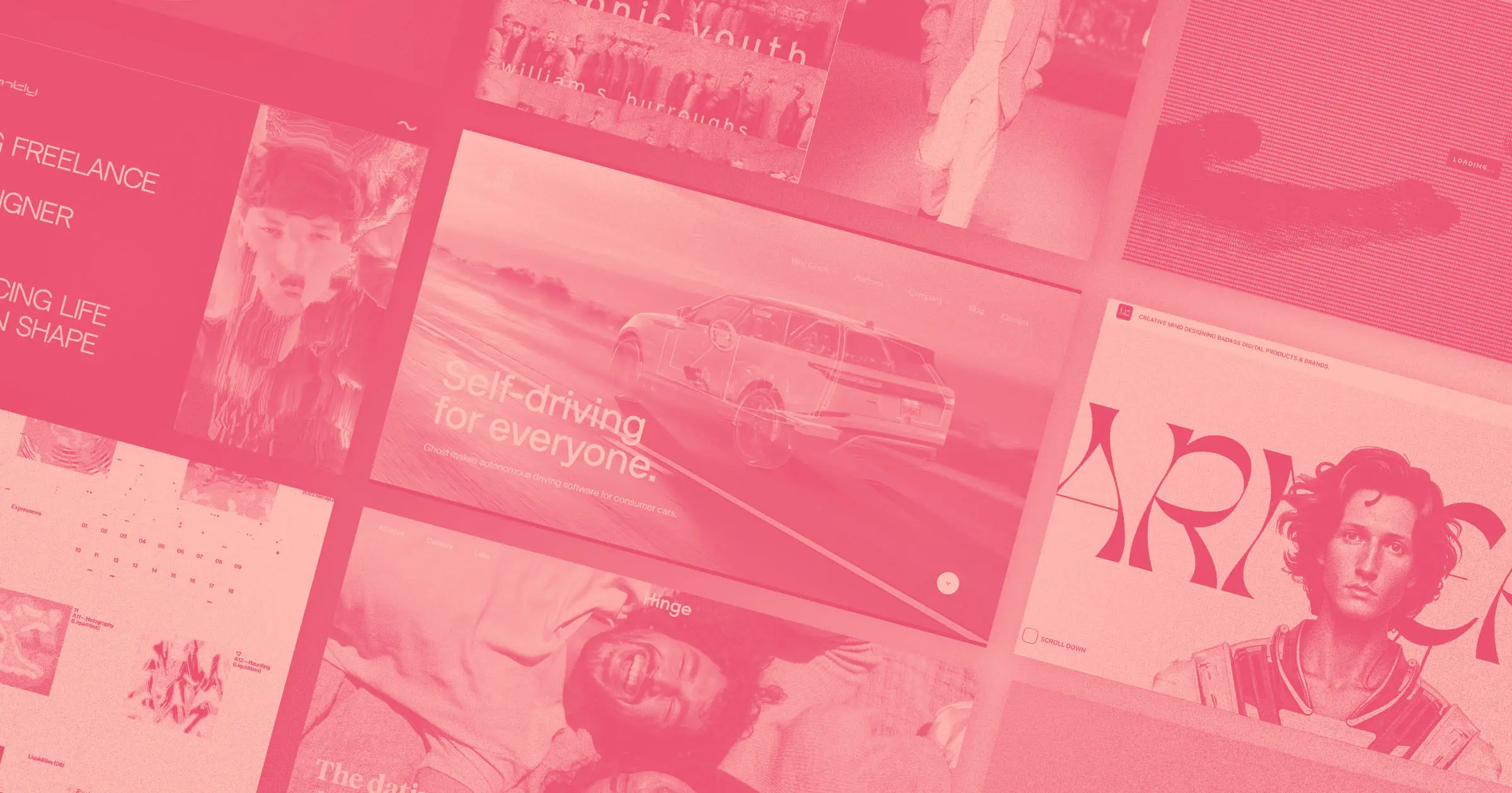
Pop Art influences have been trending in web design as part of a bigger trend toward maximalism and nostalgia. It might even take over as the next big trend in web design as audiences get tired of Corporate Memphis cartoon people.
Pop Art’s bright, fun, and attention-grabbing aesthetics fit right in with internet culture, which remixes popular sounds, images, and memes infinitely. The style is also perfect for creating vector graphics in web design since it uses a lot of solid primary colors and shapes.
Use Pop Art’s aesthetics shamelessly
Pop Art is about copying, stealing, and repurposing. Why reference it indirectly when you can honor the spirit of the movement by taking elements from it directly? Create designs that riff off of Pop Art’s most iconic visuals — like comic images, bright colors, and Ben-Day dot textures.
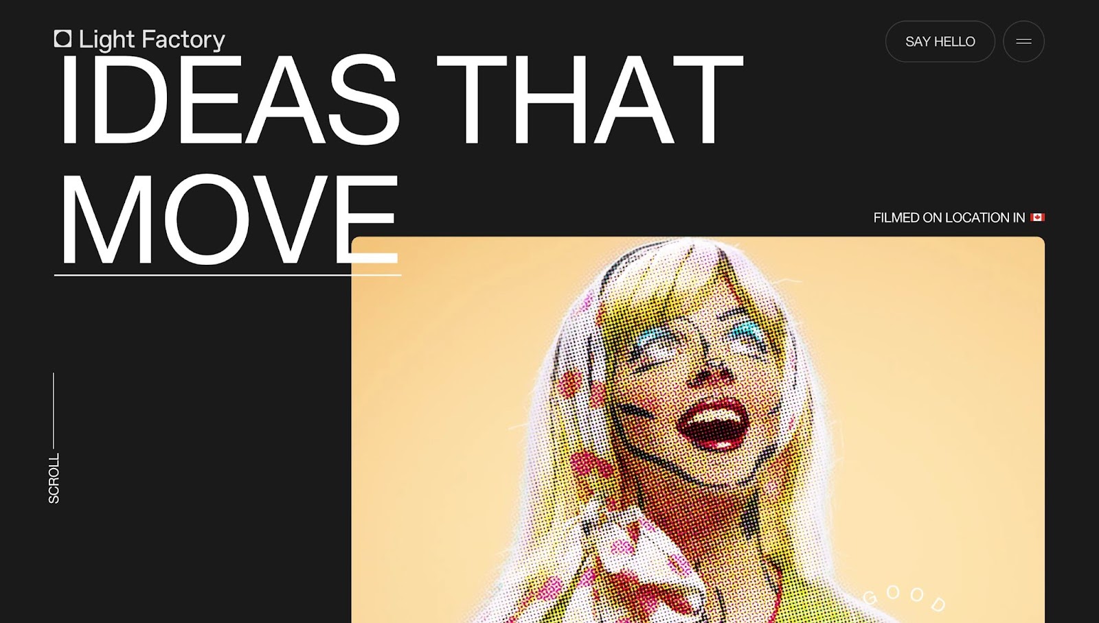
Light Factory’s website design highlights the video production house’s video work by foregrounding clips of their videos against a dramatic dark background. They use a Pop Art re-creation from a spot they created for the Glenbow Museum as a visually impactful hero image.
Achos Agency created a website for designer and illustrator Mariano Pascual that incorporates in-your-face colors, bold black outlines, and cartoonish visual icons that evoke Pop Art. It channels the spirit of the Pop Art Movement by not taking itself too seriously. It also reproduces a retro operating system, in a nod to Y2K era web design.
This website’s bold look won’t be appropriate for every client. However, it’s a great approach for a customer who wants to create a youthful, fun, and high-energy website.
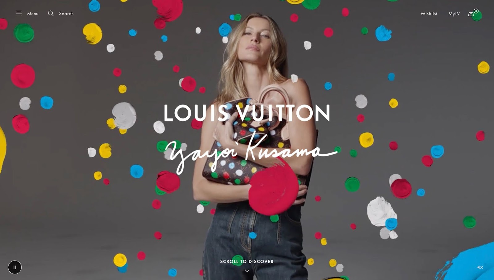
You can even hire an actual Pop artist. Louis Vuitton did just that in their recent collaboration with Neo-Pop artist Yayoi Kusama. The site designer dreamily integrates the artist’s signature multicolor dots into each page. The dots appear in and around images and video clips, on page backgrounds, and even within text. They also spin and appear to paint themselves as the user scrolls through the page.
The minimalist text and backgrounds balance out the energetic color and movement of the dot designs, making this type of Pop Art-inspired look appropriate for almost any type of website.
Use a template like cssdots by Oliver Hoffmann to add Kusama-like spots or Ben-Day dots in your website layout and possibly even create fully animated Pop Art images.
Remix, riff on, and collage images
Pop Art uses a lot of collage, repurposing existing images and changing their meaning by juxtaposing them. In web design, collages give web pages more texture and movement than a plain image gallery.
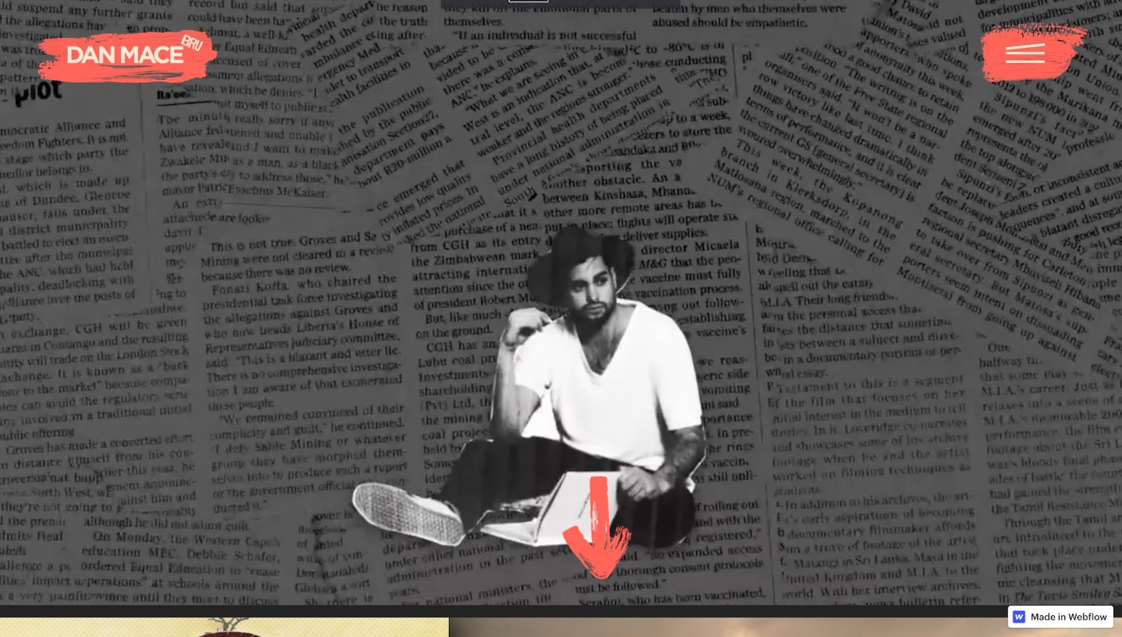
The website of “film director, Youtube creator and South African influencer Dan Mace” creates a dynamic website experience with an animated Pop Art-style collage. The collage highlights a wide selection of Dan’s work and shows off his artistic approach and personality. The home page is a chaotic edit of Dan’s video work, pieced together with cutout collage effects, newspaper clippings, photographs, and even splashes of paint.

The CINELAUNCH website uses collages to illustrate that it’s a financing app for filmmakers. It features stylized photos of filmmakers with fun-colored elements — similar to Andy Warhol’s screenprints of Marilyn — and symbols such as dollar signs. It’s also a more minimalist and accessible look than some of the other collage-style websites, limiting collaged imagery to cards on the right-hand side of the screen.
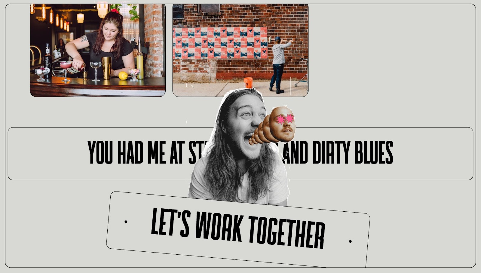
Creative director Jordan Bauer uses collage effects throughout their website to show off their creative and unique work. Jordan animates collages to catch visitors' eyes and add interest to what would otherwise be a standard headshot. This also effectively draws attention to their CTA.
Play with popular culture
Pop culture references are an essential element of Pop Art and today’s meme-ified internet culture. Reference current pop culture in a Pop Art style to create an amusing and attention-grabbing site design.
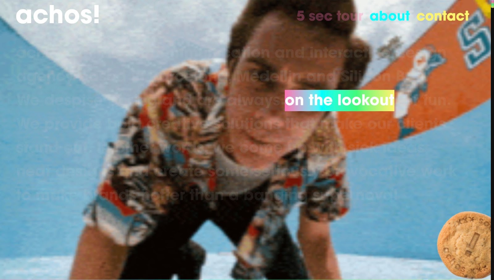
Achos Agency’s website shows off their “sex, drugs, and rock and roll” design aesthetic. They just use brief snippets of various pop culture sounds and images. This keeps the focus on the overall effect rather than one specific reference.
Their provocative approach matches the sensibility of a lot of their clients (dating apps, smoke shops, and CBD menstrual products) and their clients’ target audiences (young, hip, and online).
Don’t be afraid to be irreverent
Pop Art is about so much more than simple aesthetics. It was a rebellion against the snobbery of the art world, and it leaned unironically into lowbrow references and humor. If you want to truly channel the spirit of Pop Art, embrace humor and push boundaries.
This obviously won’t work for all website designs. A candy company might need a site that uses bright, Pop Art aesthetics minus the edge. However, a company like Tvigwychsin Vodka can embrace the Pop Art rebellion.
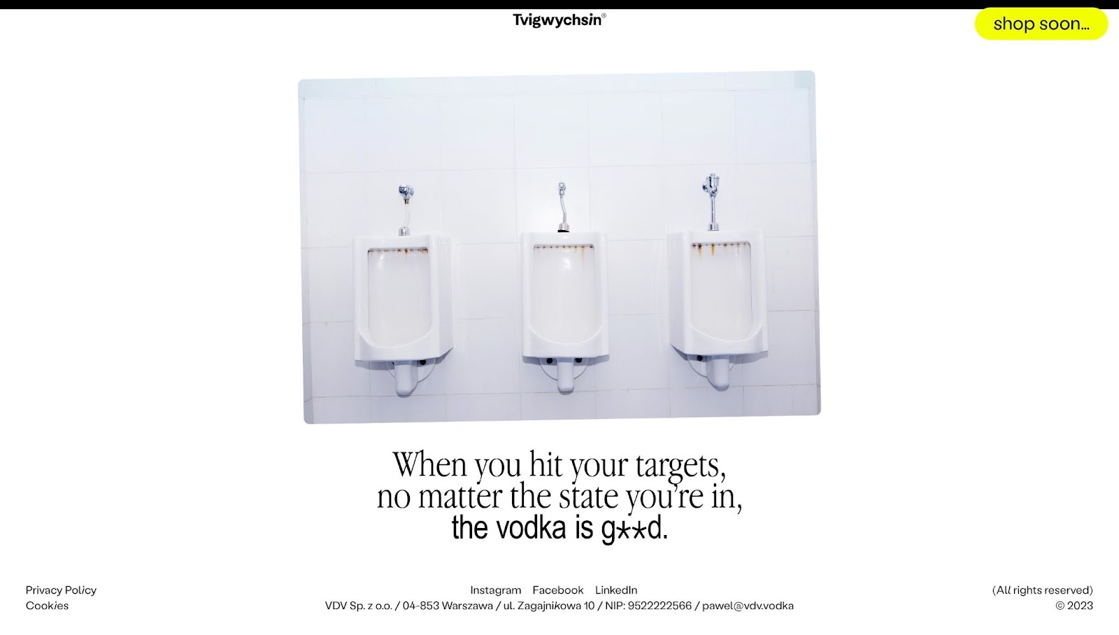
Their site describes their drinks as “the modernist's last masterpiece,” censoring words as if they’re obscenities and referencing Duchamp’s famous Fountain — a readymade urinal that was an early spark of the Pop Art Movement.
In a 1963 interview between young art critic G. R. Swenson and Pop artist Robert Indiana, they attempt to define Pop Art:
“Is Pop death?
“Yes, death to smuggery and the Preconceived-Notion-of-What-Art-is-diehards.”
“Is Pop the new morality?”
“Probably. It is libertine, free and easy with the old forms, contemptuous of its elders’ rigid rules.”
If you want to truly channel Pop Art, throw out the rules of web design and marketing. Reject stuffy standards, give yourself permission to play with form, and instead create a website that will be original and unexpected.


Need creative inspiration, like, every week?
Join more than 800,000 people getting the best, coolest, and latest in design and no-code each week.


