If you haven’t put together an online portfolio, you need to get on that. Like now. We know it’s tough to devote personal time to building your portfolio. Especially when you’ve got client projects and personal responsibilities to juggle. But having all the projects you’ve flexed your creative muscles on, all in one place, is absolutely the best way to show a potential client just what you’re capable of.
Not to mention, passively attract more new clients.
As with any design project, the more prepared you are before you start, the easier the design process will be. So we put these tips together to give you a head start in putting your portfolio together.
1. Think about what you want to feature
It’s tempting to include every project you’ve ever worked on. But this approach just makes your best work harder to find. After all, we’ve all worked on projects that aren’t very exciting — and that we never want to work on again.
In my own career as a writer, I wrote copy for a major retailer’s coupons. And the only people who get excited about coupons are those holding up the line in the supermarket. I didn’t include any of these in my portfolio, because they don’t showcase my creativity. (But hey, if you need someone to write killer copy for 15% off organic cat food, I’m available!)
Plus, I never want to write coupon copy again (despite the above joke). And if people see coupons in my portfolio, they’ll want to hire me to write more.
You’re the curator of your portfolio. And just like any curator, you need to know what the purpose of each piece is.
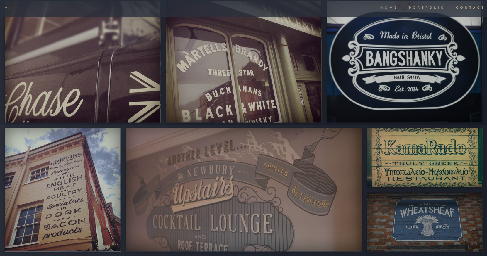
When considering whether to include a piece, you need to think about how it fits into the larger whole of how you’re marketing yourself. Ask yourself: what talents or technical skills does this piece communicate? The Mr. Signwriter site has focus, which makes the impact of the skills on display that much more powerful.
Don’t include work you don’t feel good about just to put something there. You want your portfolio to be a showcase of the best of your best. Think of your portfolio like an all-star basketball team. Mediocre players are going to stand out.
Focus on your specialities. Whether your strengths are character illustration, 3D modelling, or responsive web design, show prospective clients the types of projects that you’re looking for — not just whatever’s available.
2. Collect images of your best stuff
Poor-quality images of great work only diminish their value. So make sure all your graphics are high-resolution and carefully cropped. Whenever you’re working on a project, make sure to save several high-quality visuals of it so you have a variety of images to choose from. Especially if you’re working full-time in the corporate sphere where layoffs are common and often unforeseen, you’ll want to make sure that you have copies of all of your fantastic work ready to go. Screenshots should be your last resort for projects where you no longer have access to the source files.
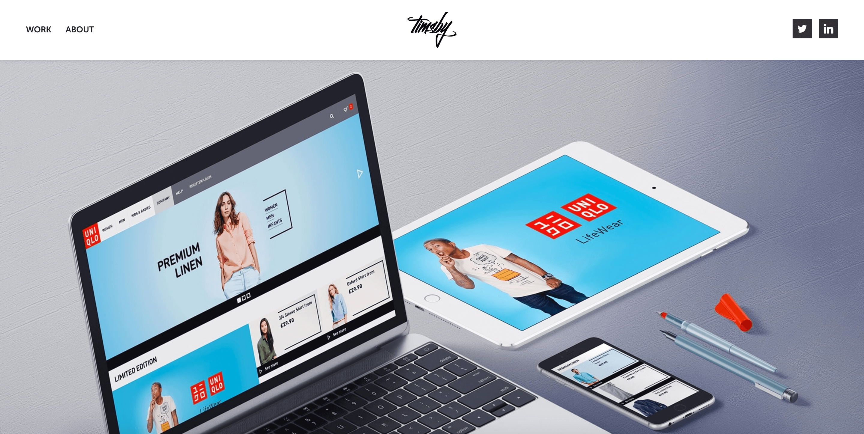
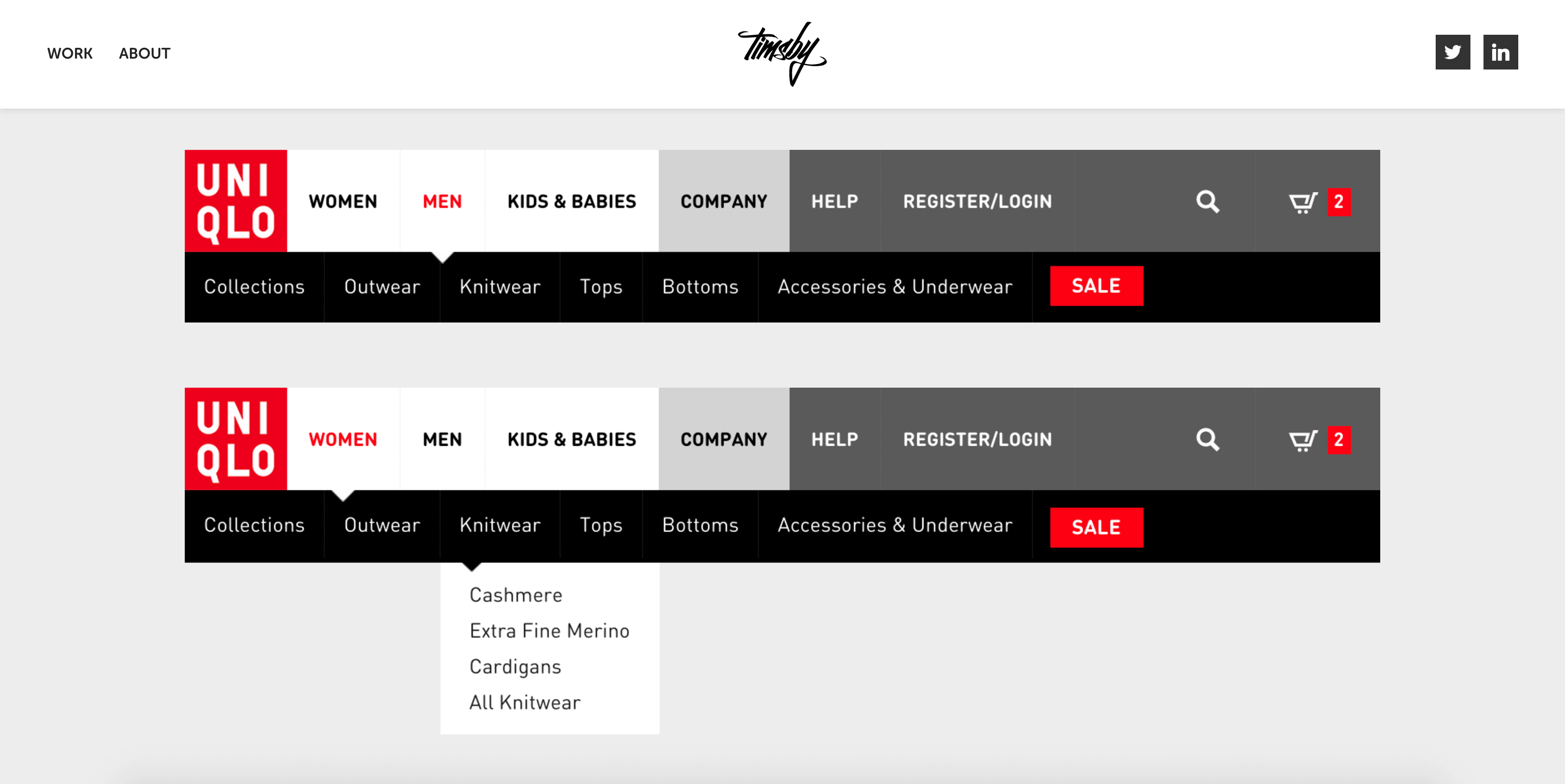
Beyond getting the work itself in presentable shape, you'll want to carefully consider how you'll present it. Straight screenshots can feel very different from source files mocked into dummy laptops. And while there's no one right way to do it, keeping your presentations consistent can provide viewers with a more harmonious experience. Which isn't to say you have to keep things the same from graphic to graphic. Timothy Noah, for example, successfully combines screenshots, device mockups, and and focused shots of UI components to great effect in his portfolio.
What to do with tangible work
If you’re a graphic designer or writer who’s worked on physical deliverables, from print ads to concrete products, it’s a good idea to show photos of the finished product rather than just the flat Photoshop or Illustrator files. Seeing your ideas translated into a physical product shows details that an image file can’t.
3. Show us your current work

Make sure that you’re showing current projects. You know that graphic design work you did 8 years ago that featured the Bleeding Cowboy font that was all the rage? Yeah, we know you were proud of it at the time. But now it’s hopelessly outdated. It’s like showing up for a job interview wearing a disco suit. It’s not going to give a client faith that you’re keeping up with the ever-evolving world of design. Unless of course your knowledge is in the design of wide-collared, polyester dancewear.
Consistency is important in the work you feature in your portfolio, and highlighting current work can lend to that. Of course, you can also use CSS filters or similar techniques to bring some harmoniousness to the presentation of your work.
Just remember: You’ve come a long way from that flyer you designed for your aunt’s yard sale.
Another benefit of showing in-progress work is that it can demonstrate your openness to sharing and getting feedback. Just search "WIP" on Dribbble and you'll find hundreds of current projects from designers looking for confirmation of their design direction and feedback from fellow designers. Even better: sharing current projects can drum up a lot of excitement for what's coming next.
4. Tell us about you, in your own words
We’ve all heard that basic rule of writing:
Show, don't tell.
Your portfolio is going to say so much through your imagery. But don’t forget to tell us about your creative process, explain your key skills, and give us a stronger sense of who you are as a human being—and potentially, a coworker.
Creative types tend to be humble. But you have skills and shouldn’t hesitate to talk about them. Whether it’s at a job interview or within the content of your portfolio, don’t hesitate to promote who you are. Don’t overinflate or distort things, but be truthful about what makes you different from all the other candidates out there. The same goes for first dates.
And always remember: whether it's a company or an individual client, people hire people, not robots. Providing a sense of who you are is key.
Writing about your process
“Stop waxing poetic about your process”
–Christian Beck, Advice to Young Designers
In a recent piece on Medium, designer Christian Beck advised young designers to “stop waxing poetic about … process (it’s all the same).”
And he’s got a point. But it’s one that warrants a little more nuance: Sure, everyone’s process is “the same.” We all do competitor and user research to better understand people’s expectations for the type of site we want to build. We all sketch, wireframe, and/or prototype. We all diverge and converge on potential solutions.
But talking about your process in the context of a specific project can illustrate your depth of design thinking, and show that you’re able to apply abstract “best practices” to real-world situations and challenges. If you tweaked a common process to fit specific constraints, tell us about that. If you encountered a unique challenge in product positioning or prototyping and overcame it, share your insights.
That’s still going to differentiate you, no matter how many of us do ethnographic analysis of our target audiences.
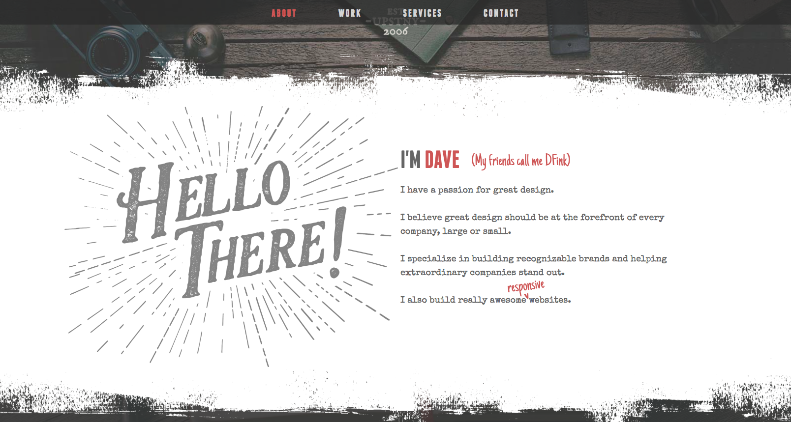


Build your online portfolio
Build and visually design a full portfolio website in just 21 days — with our free online course.
5. Keep things organized
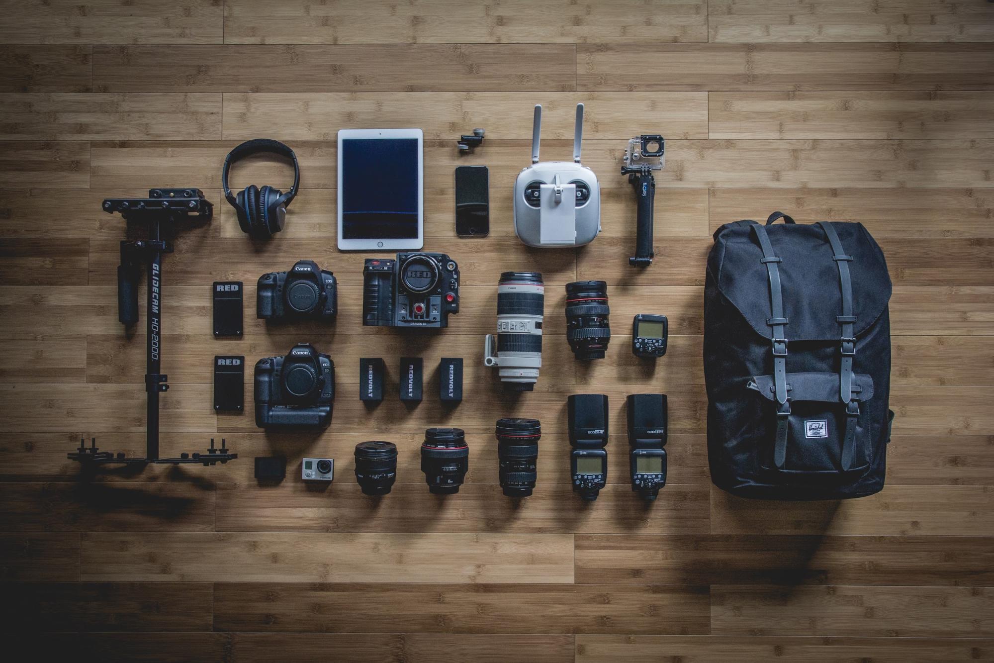
Bring logic to the presentation of your work. Projects can be grouped together depending on the type of work: like book cover design or blog writing. You can also group together projects that show off a similar skill set. If your speciality is custom typography, group projects that show that off, even if they vary in terms of media.
Note: With Webflow CMS, you can place all your projects in one Collection, then create a separate Collection of tags to add to projects. Display these tags on your site and filter your projects’ dynamic lists so people can easily pick the types of projects they’d like to see.
It’s always good to have someone else take a look at your portfolio. Have a friend or family member take a look and let you know if anything feels out of place. All of the work you feature needs to show consistency.
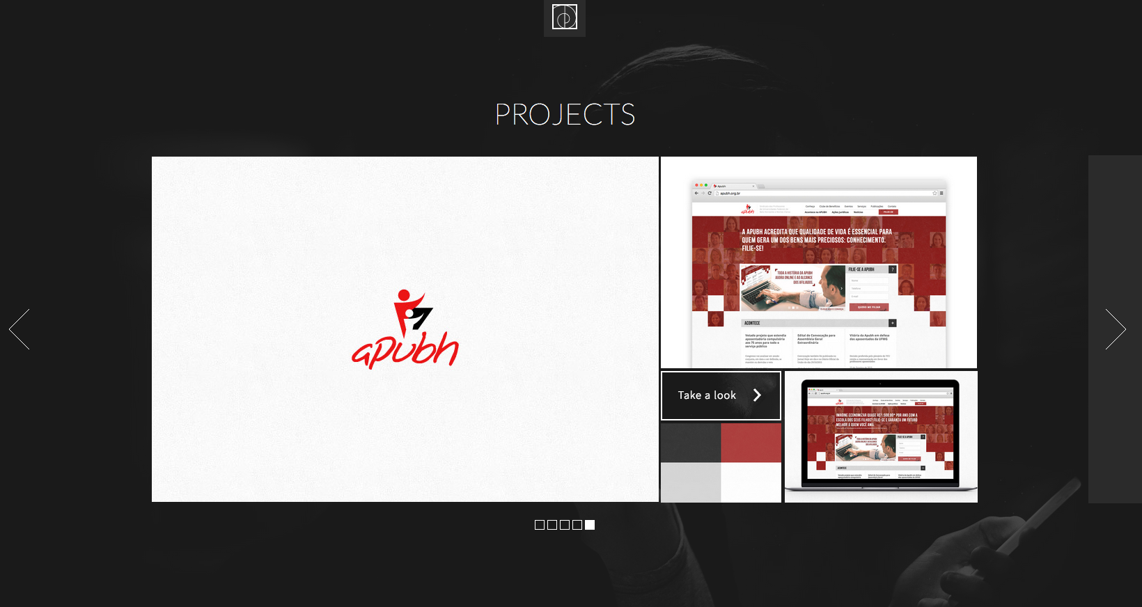
6. Who are your clients and how have you helped them?
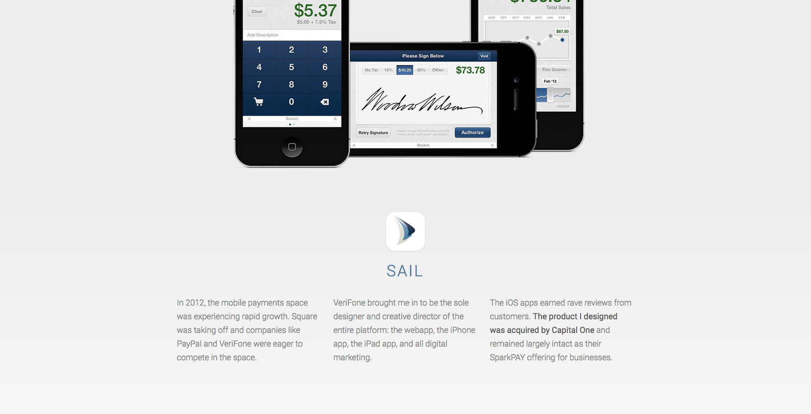
Yes, some projects don’t need a lot of explanation. A holiday ad for Coca-Cola doesn’t need a lengthy description of the client is or what the project was about.
But let’s face it: most of us aren’t building solutions for the Coca-Colas of the world. We freelancers often take on a variety of clients and projects, the vast majority of which won’t be familiar to most viewers. No matter how small or large the job, it’s our task to find the right solutions for the client’s needs. And that’s no less true for your portfolio.
So think of your readers, and give a little bit of your clients’ backstories and project goals. Explain what your role was, how you helped meet the client’s needs — and perhaps most importantly, how successful your work was.
This is a key element that far too many creatives leave out of their portfolios. If you were tasked with redesigning a company’s website, chances are it wasn’t just to “make it pretty.” Chances are, they were also hoping for more leads, a better click-through rate, or more brand awareness.
And believe me: if you delivered on any of those goals, that’s far more important than the fact that the site is more attractive now.
7. Let your customers help tell your story
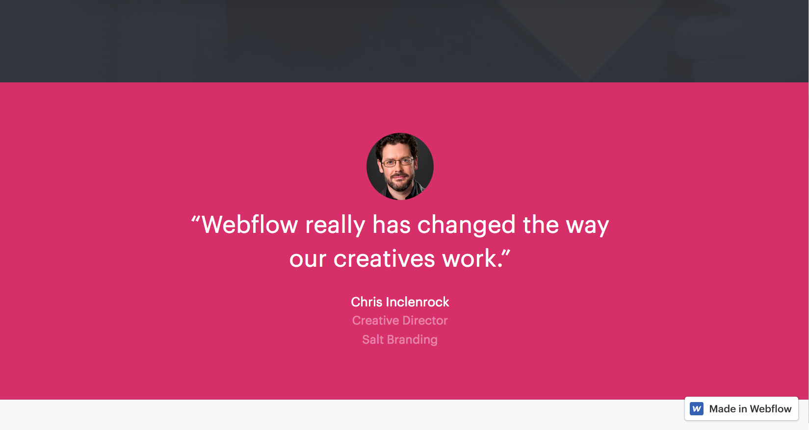
You can proclaim your skills all you want. But having others attest to and validate those skills can be far more meaningful. Whether you’re a writer, videographer, or product designer, ask your clients to share how you helped them. Don’t be afraid to reach out and ask people for quotes that you can use on your website. People who are grateful for your work usually won’t hesitate to give you a glowing testimonial!
8. Your website is always a work in progress
Once your page is live, the hardest part is behind you. But just because it’s “done” doesn’t mean the work is over. Be sure to keep adding new projects and other cool things you’ve worked on while they’re fresh in your mind—and it’s easy to get source files, stats, and quotes from the right people. Make sure to get any important data such as page views for things that you’ve written and other numbers to show people how your work gets results.
Not only does it look good to a client to see all of your great work in one place, it can also help inspire you. If you ever get stuck, you can always look at all you’ve done and feel a sense of accomplishment, not to mention renewed vigor.
You’ve created many fantastic things—and will create many more.


