A great online portfolio website demonstrates not only your skills, but also your personality and passions.
When you’re hyper-focused on the amazing work you do, it’s tough to make time to work on your own online portfolio. But investing time into your portfolio is crucial if you want to keep winning new clients. Not only does it give you a place to display your projects, but it also allows you to show off what makes you — and your work — so unique.
How to make an online portfolio
If you’re not sure how to put together a portfolio, getting started can feel overwhelming. It helps to break the process into these four focus areas.
1. Determine the purpose of your online portfolio website
While portfolio websites and personal websites are similar, the goals are often different. Online portfolios exist to showcase your work, so it’s crucial to define your niche so your portfolio has a clear purpose.
Before you start building an online portfolio website, answer these questions:
- What type of work do I want to do?
- Who are the potential clients I want to attract?
- How will my portfolio function to further my career?
Maybe you’re a graphic designer who loves tech and you’d love to work with more tech companies. Or you're a concert photographer and you're looking to make a photography portfolio. Whatever your interests are, your portfolio should be geared towards the potential clients and new projects you want to take on.
Take a look at this portfolio from UX designer Gregory Christian below. He’s worked with an impressive array of tech-related clients, and his design demonstrates that he knows how to deliver a website with the hip and modern feel that these types of companies are after. It’s obvious what kind of work he’s interested in.

The purpose of your online portfolio should influence the projects you feature, the content you produce, and the overall web design of your portfolio web page. Make sure everything from your custom domain name to the typography and color choices communicate your style and talents.
Site visitors should get a feel for the type of work you do as soon as they land on your homepage. This way, when your ideal client lands on your site, they’ll be intrigued right away.
2. Build a portfolio website that matches your personality and skills
An online portfolio website should be more than just a collection of your work — it should be a chance for people to get to know you and what you value.
UX designer and content marketer Mel Perry opens her design portfolio homepage by saying that she believes in “designing simple, authentic experiences that feel native to all people.”

Mel tells us how inclusivity guides her design work. She goes beyond a simple project gallery by also sharing what she is passionate about, which helps her build a stronger connection with potential clients.
Consider the site format
A professional portfolio can be as simple or as complex as you want it to be — it all depends on your aesthetic and the type of work you want to earn. If you’re a photographer, a simple one-page website that showcases some of your best photographs could be very effective. But if you’re a professional web designer hoping to take on major website projects, it makes sense to show off your design skills through your website. In fact, one Webflow user ramped up revenue from $0-100K by strategically designing his website with his ideal customer in mind.
Whether you choose to use a template or build from scratch — don’t forget about search engine optimization (SEO). Because a perfect online portfolio website won’t do you any good if no one can find it. If you’re not sure where to start, check out our essential SEO guide.
Customize with illustrations, typography, and layout
Bold design choices give you a portfolio that doesn’t look like everyone else's. And remember, you can still get creative without sacrificing usability.
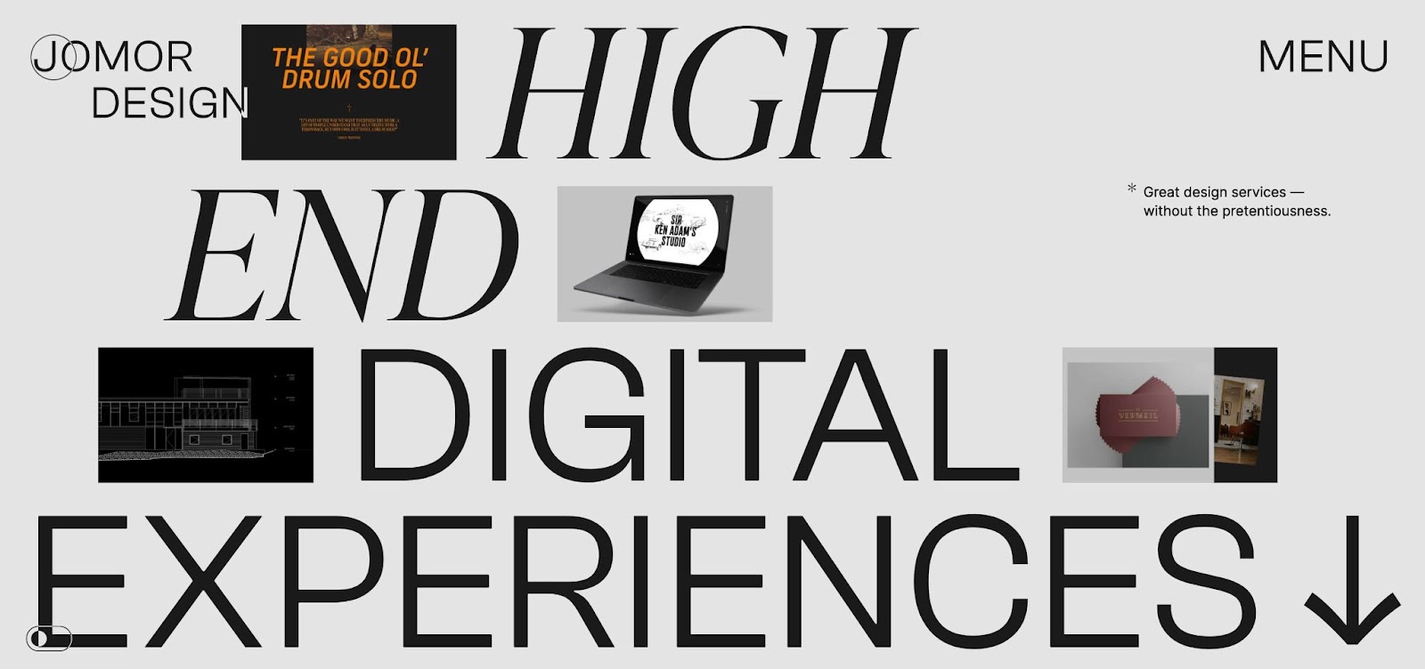
Take Jonathan Morin’s portfolio, for instance. Jonathan maximizes every bit of space of their portfolio for Jomor Design. Text floats and spins, and images shift. Jonathan keeps you intrigued with an interactive experience.

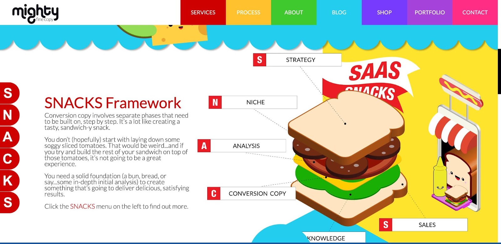
Of course, you don’t have to be a professional designer to make an online portfolio that catches the eye. Rachael Pilcher's website, Mighty Fine Copy, is full of quirky characters and delightful animations, along with well-written content. Copywriting portfolios aren’t usually known for their visual dazzle, so Rachael’s colorful site stands out.

Illustrations and rainbow color palettes aren’t your thing? Consider leaning into a popular design trend — oversized typography. Going big with your font sizes can help fill space in an impactful way because it makes text the central focus of the design.
Whatever your area of expertise — whether you’re a graphic designer, web designer, copywriter, or other type of creative — you can use visuals to transform your average-looking portfolio into something extraordinary.


Build your online portfolio
Build and visually design a full portfolio website in just 21 days — with our free online course.
3. Showcase your best work
The goal of an online portfolio is to win new clients — so put the spotlight on what you do best.
Maybe you create hand-drawn lettering full of inky stylized flourishes. Or perhaps your talents lie in crafting sophisticated web designs. You may even be a wordsmith, churning out funny and conversational UX writing. Whatever your area of specialization, your online portfolio should show off your unique talents.

Think about how you want to present your work. Ask yourself what a potential client would want to see and experience, then choose a layout that delivers that experience.
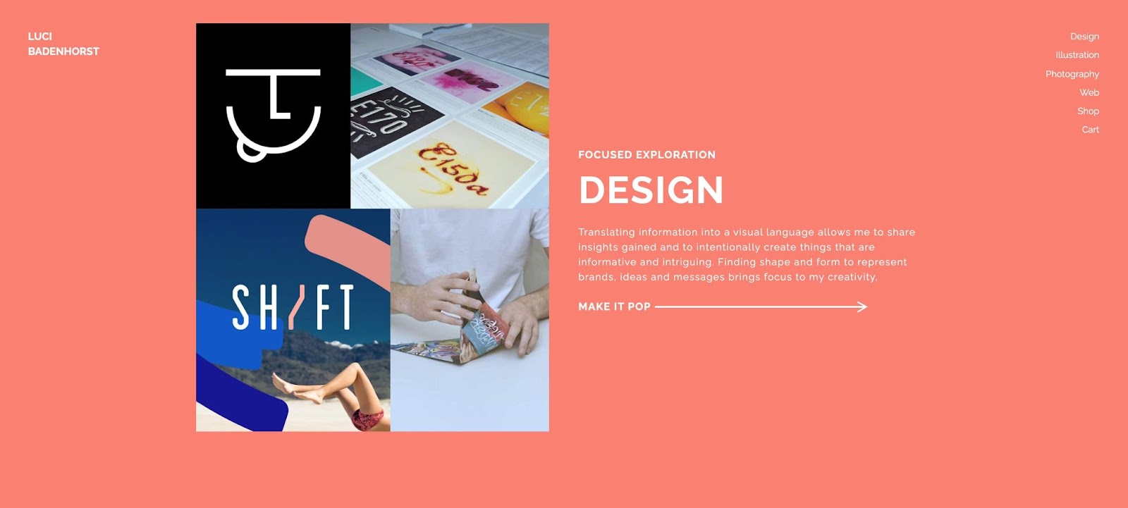
For example, Luci Badenhorst uses individual pages for each discipline — design, illustration, photography, and web — so potential clients can jump to the work that’s most relevant to their needs.
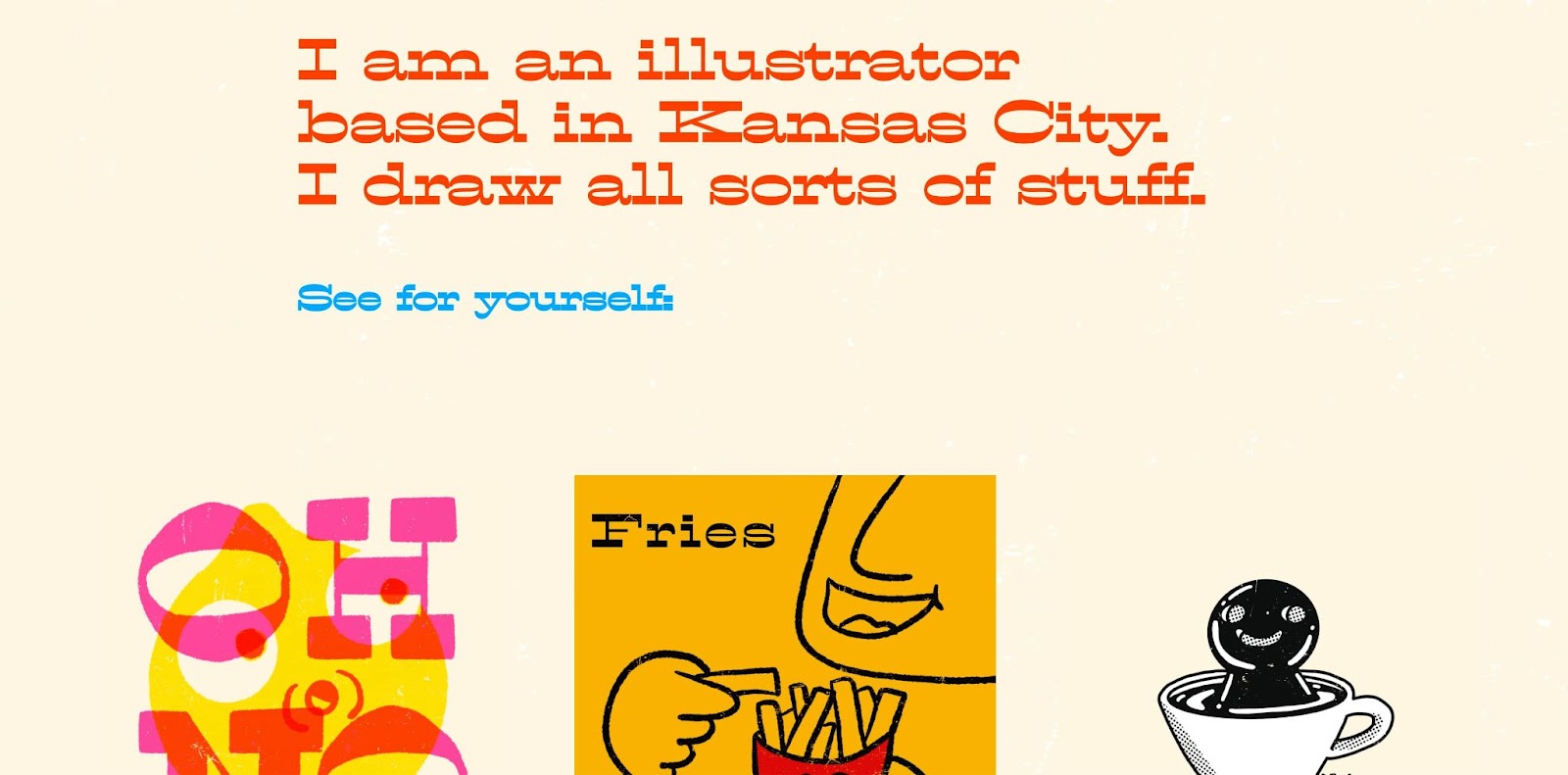
Meanwhile, Frank Myles focuses on a single discipline — illustration — for his portfolio site, Everything is Bad. Frank gets right to the point by including illustrations and client names on the homepage. Each image is clickable and takes site visitors to a landing page with project details.

Including client testimonials is another great way to build confidence in your skills. Add a testimonial slider or grid area for reviews so your happy customers can sell your services for you.
4. Make it easy for potential clients to get in touch
While this may seem obvious, many online portfolios focus so much on design that they forget about the site’s main purpose — to connect you with potential customers.
Be sure to include contact information such as an email address, phone number, or a contact form built into the site. And don’t forget about your social media accounts and profiles on relevant websites such as Behance or GitHub. You can dedicate an entire page to contact information and profiles, place links in the website footer, or even put a big “contact me” button on the homepage — just make it as easy as possible for interested clients to reach you.
Build your portfolio with Webflow
Whether you want to start from scratch or use one of our many templates, Webflow is a great portfolio builder. With an intuitive interface and plenty of online support, it’s easy to get your customizable personal website up and running.
Webflow offers a great selection of templates that have features like an About page, contact form, blog, and testimonial pages already built in so you can focus on what's important — showcasing all of your brilliant work and content.
A portfolio is an ongoing project that’s never really finished. What this means is that after you land more gigs, you’ll want to refresh your portfolio with your newest and best work. Webflow’s content management system (CMS) lets you manage your projects in one place with CMS templates, rather than having to hassle with changing the layout. Webflow’s CMS functions in maintaining dynamic content in a way that’s simple.


.jpeg)


