Niika co-founder Mark Lipert unpacks how their team makes large-scale design translate across various applications. Their approach — starting small, with the core identity — brings both incredible challenges and opportunities. Mark shares how they dig in and find success.
Unlike logos, posters, and simple websites, large-scale design projects — like music festivals and other events with offline content — require multiple, unique creative elements that work consistently across applications.
Creating beautiful artwork that fulfills the requirements of large-scale design projects is one thing — making sure the artwork has the longevity and durability for a creative rollout without sacrificing consistency? Well, that’s an entirely different ball game.
At Niika, we’ve had the pleasure of working with various music festivals and event projects and, as our team has tackled these projects, we’ve picked up a few tips and tricks to make them more manageable.
There are many aspects of a full rollout to consider — today we’ll focus on the juiciest: core identity.
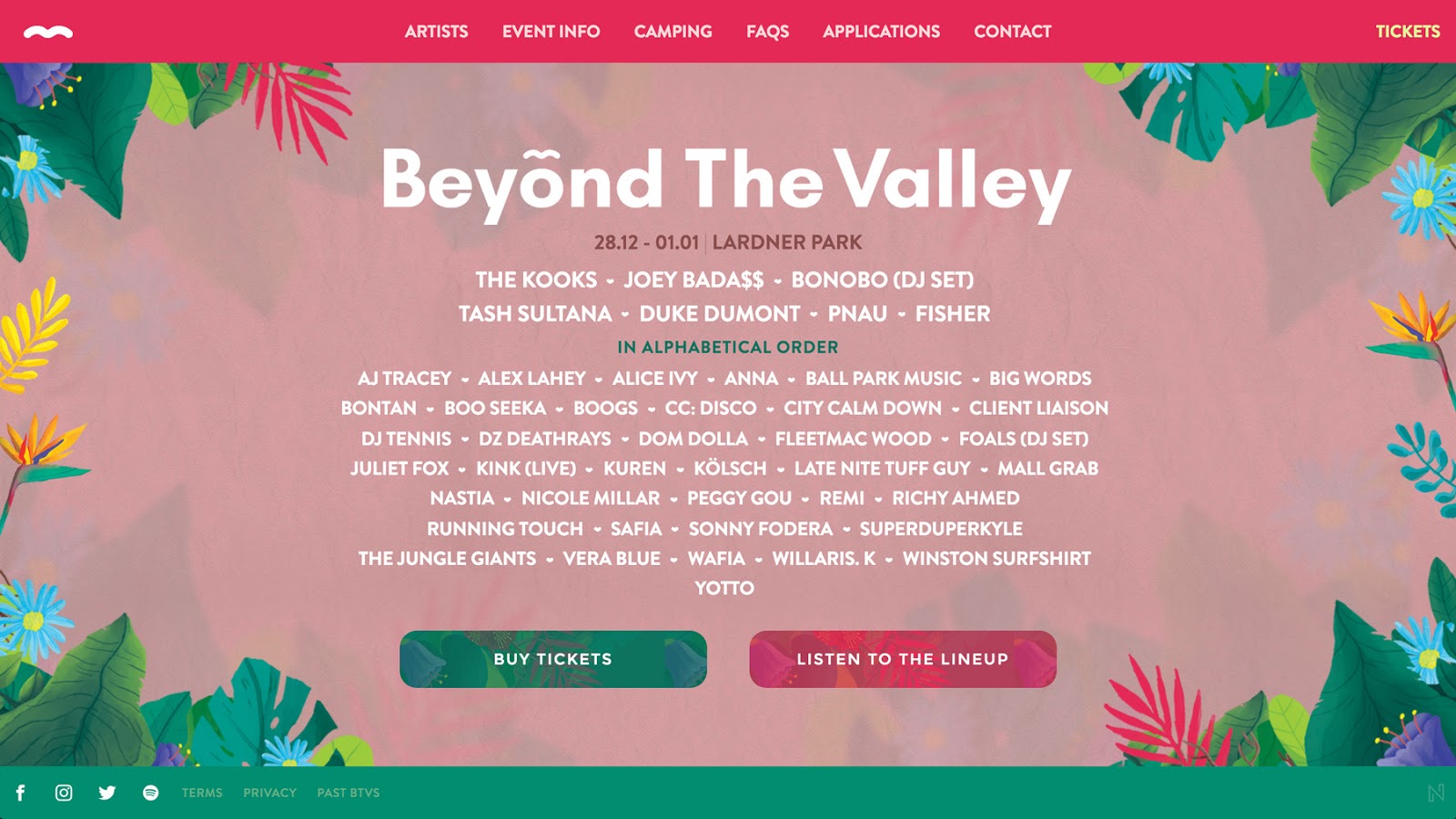
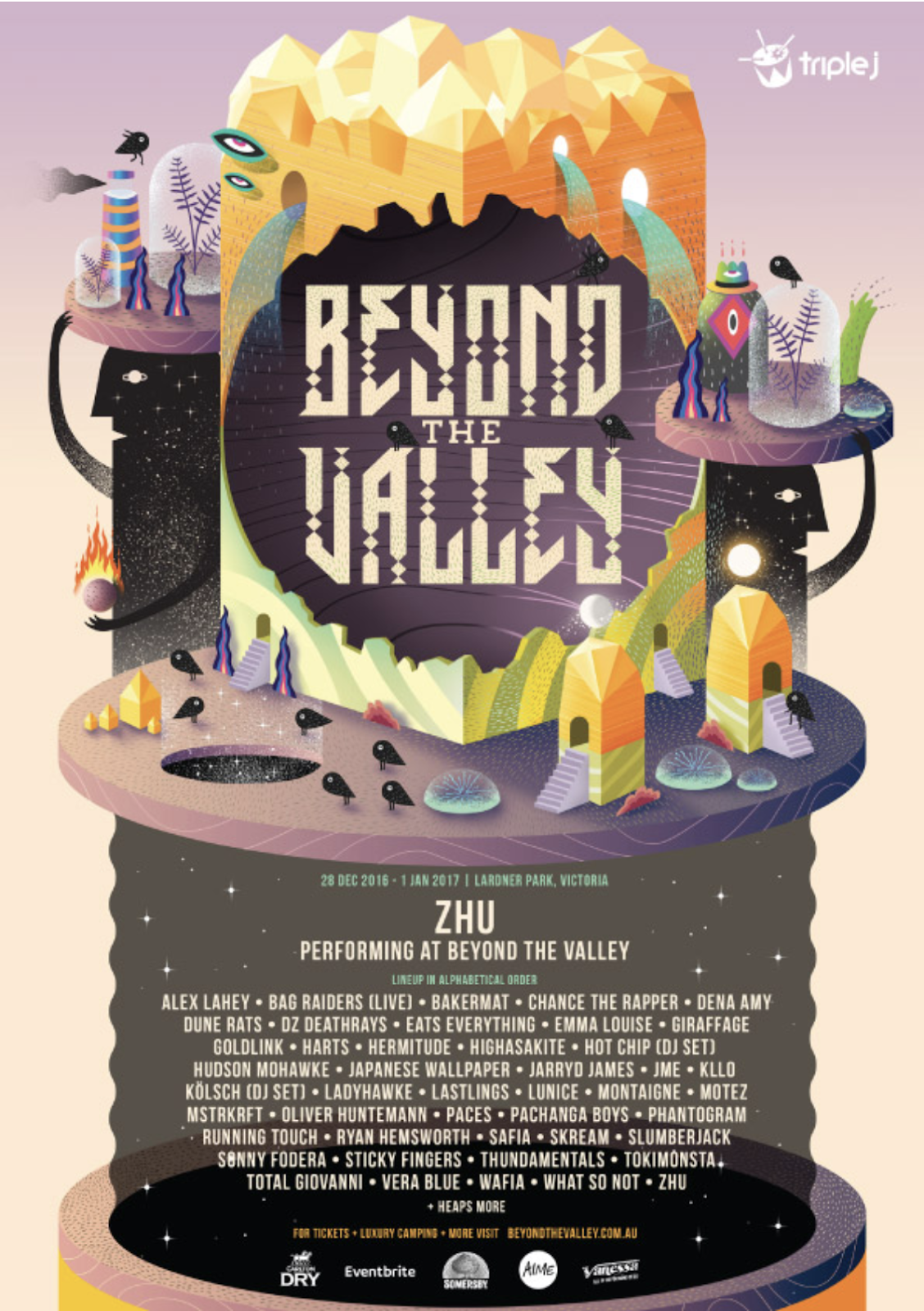
Let’s explore our approach with one of our most recent festival projects: Beyond The Valley.
Create a core identity
Our approach starts with the core identity, or concept. Before we begin custom designs and artwork for the annual music festival, we sit down as a team and align on a core identity robust enough to withstand all the deliverables we’ll need to design. Creating and aligning on a single concept — while navigating multiple decision makers and practical requirements — are perhaps the most challenging and important aspects of the process.
So — where do we start?
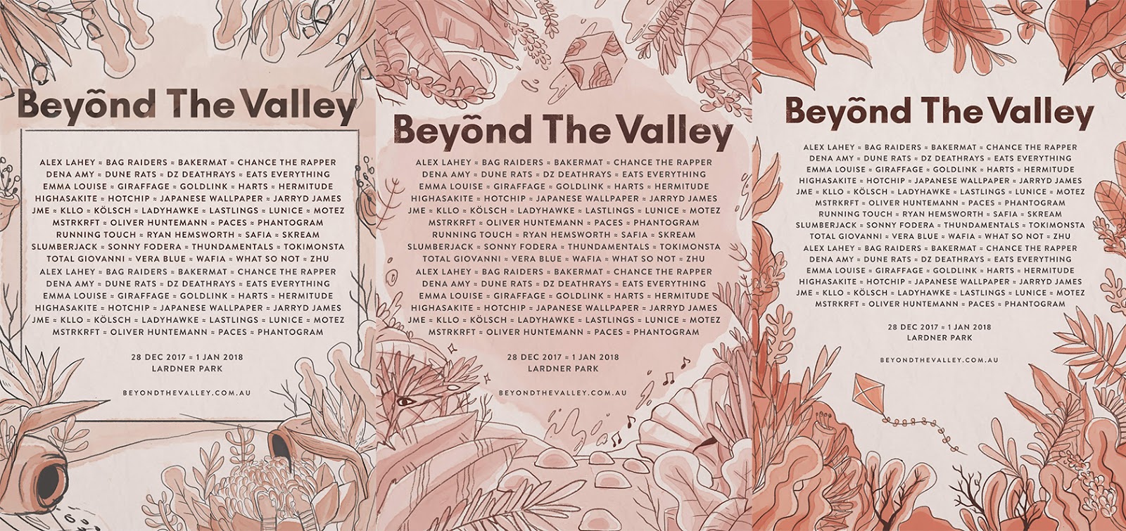
Look, listen, learn
Listening to cultivate a deep understanding of what’s actually required is a practice we apply across all projects — large and small. If you’re curious about how this process informs our work with our clients as a whole, check out our previous piece about client presentations.
Unfortunately for our egos, discovering what’s actually required for a particular project means discovering our “amazing” first idea doesn’t mesh with what the project requires, and never sees the light of day.
Listening to learn what clients need aligns our creative direction and vision with their expectations from the start.
This all sounds simple in theory, but clients don’t always know what they want. Sometimes you’re balancing the desires of multiple decision makers in an organization. If we need to, we actually sit our clients down and run them through reference material and ask how it makes them feel.
If it sounds a little like therapy, it’s because this piece of the core identity puzzle is a lot like therapy. After a close review of the creative brief, we collaborate with our clients to compile inspiration and reference images. We then use those images to ask:
- What they love
- What they don't love
- What they think will/will not work
This essentially lets us map out their hopes and dreams. (Again, a lot like therapy.)
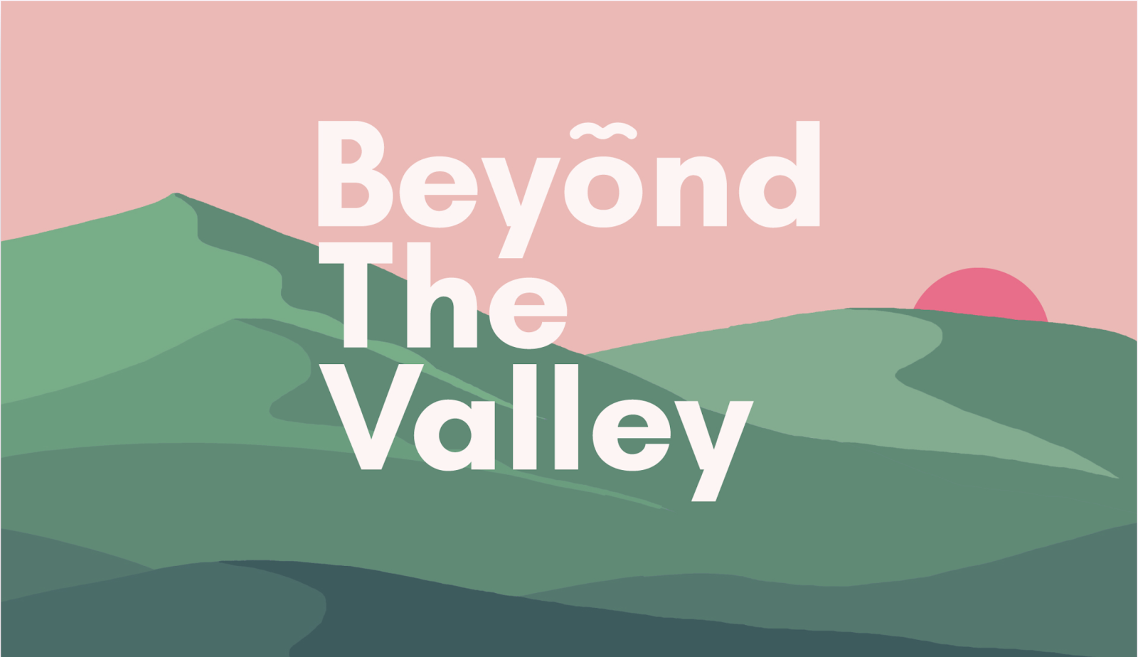
A client’s personal preferences may not actually align with what they want for their brand. We help them understand why certain things will or won't work. Every step of the way we refine our direction based on:
- What most successfully fulfills the requirements laid out in their brief
- What excites our clients
- What excites us
The best core identities are focused less on aesthetics — or how pretty the artwork is — and more on achieving the client's goals (while still looking good). Understanding and aligning these goals with what has the most visual impact is an important balancing act that comes with thorough research, deeper understanding, and experience.
Once we’re confident we understand the brief and we have some ideas, we’ll verbally express our intentions for the creative direction. And then we're ready to design!
Put pen to paper (or pixel to screen)
Now that you’re ready to design, you’re faced with the daunting realization of how large the project is.
And how many magazine covers it may end up on.
And how many times your client will share it on their Facebook page with 50 bazillion followers.
And, oh yeah, how this design will be the face of their page for an entire season.
And let’s not forget the newsletter, website, landing page, posters, business cards, etc.
In short: you’re freaking out. We’ve been there. Don't freak out (not yet at least).
It’s important to take it slow and steady. Rome wasn't built in a day, and neither will this versatile, groundbreaking identity. There's no one-shoe-fits-all approach for handling this process, but we recommend you break it into smaller, manageable chunks.
How do we do this?


The modern web design process
Discover the processes and tools behind high-performing websites in this free ebook.
Make a molehill out of a mountain
- Go back to the drawing board — literally. We start with hand-drawn, black-and-white sketches. If it's going to be a complex, detailed, 3D piece or composition, we sketch just a few of the elements we plan on using.
- Gather feedback (sketches in hand) from the client. We make sure we're moving in the right direction, minimizing large, painful revisions later in the project.
- Add complexity to the artwork with colour, variations, etc.
- Get feedback at every stage of the process until we achieve a happy result!
As you’ll notice, our initial practice of listening, learning, and aligning is baked into our entire design process, start to finish.
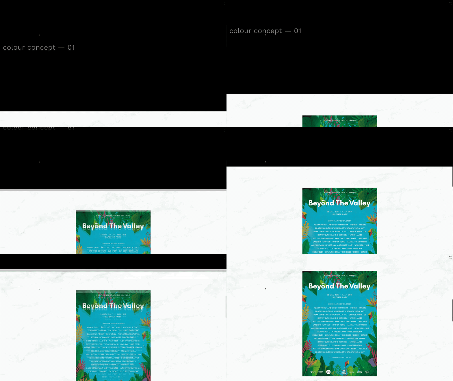
PS: we use Webflow for all of our presentations — including our initial sketches, elements, and more — to show clients how their identity will come to life.
Employ help — but first, make a clean handover
Now that you and your client have aligned on the core identity of the project and your initial designs have passed the test, you’ll be faced with another challenge: sustaining this identity across the myriad of applications that deliver it.
You could place the entire project squarely on the shoulders of your Art Director — and risk overloading one of the hardest-working individuals in your organization.
Good news: this is avoidable and unnecessary! The creation of design assets is far less skill-intensive (while often repetitive and time-consuming) than defining the core identity that weaves them together.
If you’re a small agency like us, consider hiring a freelancer or contractor.
A clean core-identity handover
Clearly communicating the creative direction and core identity makes for a clean handoff. And the delegation of tasks ensures the best possible outcome (read: no burnout) for our team, the client, and the project.
Before we hire a junior graphic designer or trusted freelancer, we make sure to have two things:
- A clearly labeled and properly organized PSD or AI asset pack
- A style guide (or some form of instruction) that can be easily distributed and understood
These resources communicate the core identity of our project and give us peace of mind that everyone involved has the resources to understand and adhere to the project.
The result?
Beautiful assets created by our junior designers and freelancers — all of which scream our beloved core identity loud and clear.
The tl;dr (too long, didn't read)
In summary, our approach to large-scale design projects is:
- Understand the project
- Understand your client
- Break down the project into manageable pieces
- Elicit client buy-in along the way
- Supply files professionally
- Outsource the menial bits
- Give high fives!
This approach has been in the works for a long time and continues to evolve. We hope this breakdown helps you approach your large-scale design projects with confidence, clarity, and, of course, a core identity. :)
In our next article, we'll explain how we evolve a core identity into a beautiful, functional Webflow site. Stay tuned!


