Creating brilliant designs is only half the battle when it comes to client approval. We’re sharing pro client presentation tips that help Niika deliver good presentations with confidence, creativity, and fewer revisions.
Most designers have learned (the hard way) that even with a contract, you may face a client who doesn’t approve of the final creative. To better understand how you can tailor the delivery of your client presentations to yield higher approval rates from your potential clients, we spoke with Niika’s Managing Director, Mark Lipert.
Below, we share Mark’s insights on how you can use Webflow to deliver a client presentation with confidence. As a bonus, Niika created a free, cloneable Webflow template to help you build the wow factor into your next presentation.
Listen first — then design
A winning client presentation begins before you start designing. The first mistake many designers make is jumping into their vision for a project before they review the creative brief. It’s crucial to review the client’s brief before you start designing — even if it’s anything but brief.
Starting with the brief centers the client’s expectations — from start to final product. And when your design directly addresses those expectations, the client’s nephew, who read half a design book once, won’t rattle you. Every design decision will point back to specific elements of the brief.
So, before designers at Niika put pen to paper or pixel to screen, they start with a focus on identifying key points around what the client needs, asking questions like:
- What are the clients’ goals?
- What are their challenges?
- How will our solution help?
Good design starts with great communication, and it takes a strong listener to read between the lines and really understand what a client needs. Be. That. Listener.
Align on inspirations
The language of creativity can be highly subjective. When a new client articulates a vision for the project, such as wanting something to “pop,” it’s crucial to make sure you understand what they mean by “pop.” You may interpret this as a bright pop of color:

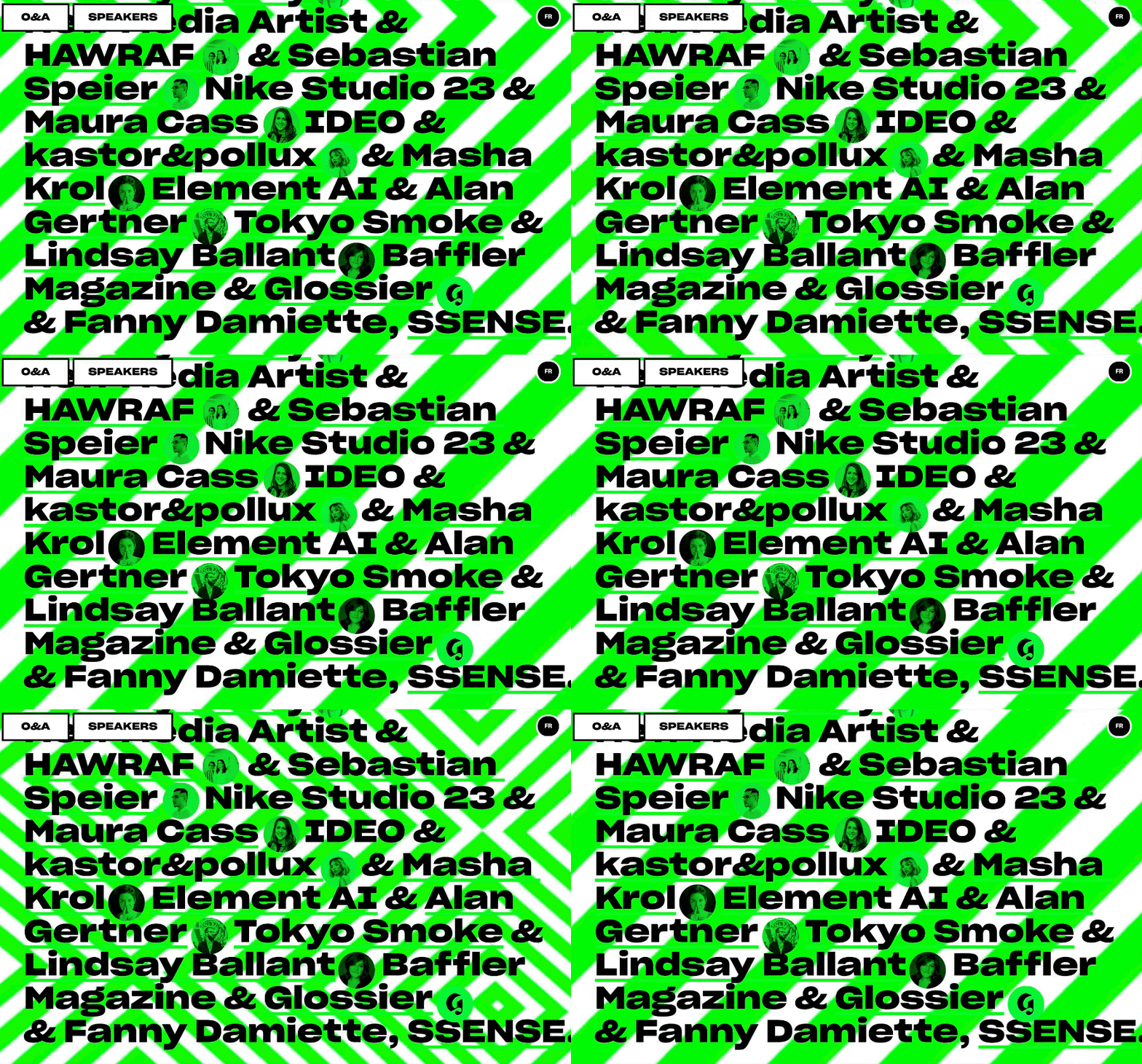
While your client may be expecting neon green — that moves:

Where language fails to overcome the nuances of these creative expectations, images prevail.
During client meetings, ask your client to share designs that inspire them — or even designs that fail to inspire. The use of visuals will help you and your client align on the vision for a design that can’t be articulated in language alone. The result of this alignment? Fewer iterations, mutual understanding, and a collaborative effort to create the perfect design solution.
Talk clients through your design solution
While images prevail, Mark was sure to stress the importance of expressing ideas to clients verbally. Verbal communication allows you to thoroughly explain your design services, strategy, and process, thereby emphasizing your understanding of the client’s needs and preferences.
Niika provides an example of what this conversation may look like:
“We envision a font-based logo with pastel tones. Looking at the designs shared for inspiration, we can see that you like big, bold fonts. Based on your target market, however, we feel a softer approach would achieve more relevancy. What do you think?”
To make this conversation as productive as possible, you’ll always want to link your ideas back to the client’s original goals and business requirements. Relevancy is key, and if you can achieve client buy-in via discussion, you’ve already done half of the job!
Give clients choices — and lead them to the best one
Generally, when you’re presenting three concepts, you’ve already decided which one best suits your client and their needs. The other two options are often just there — let’s be honest — to give your client an illusion of control, and more importantly, buy-in.
It’s important to remember that your role as a designer includes presenting clients with choices and guiding them towards the best one. Unfortunately, pointing clients in the best direction isn’t as easy as … well … pointing:

Where subtle pointing, winking, and highlighting in neon pink fails, lead your client to the ideal solution by telling them which concept adds the most value to their business. Ground your explanation in the business goals from their creative brief — which you read, of course.


Grow your freelance business
Take on more clients and build websites faster. Webflow empowers freelancers to design and deliver with confidence, while keeping full creative control.
Present with confidence
Your client’s confidence in any of the concepts you present is only as strong as your confidence. If you don’t believe in the quality of your work, no one will.
Luckily, you’ve spent the time understanding your client’s vision, goals, unique business challenges, and ultimately, you’ve listened a whole lot. As a result, you’re able to speak and present with confidence.
Show your client that you understand their vision and goals, and that your solution meets — or exceeds — expectations. Communicate your design solutions with confidence and cross the finish line of client approval. Failing to do so leaves room for clients to take over creative control … which will only mean more revisions. Womp womp.
Finally: use Webflow to present your solution
Since Niika started using Webflow to create brand presentations, they’ve been able to sell every single logo concept in one round. Instead of using powerpoint presentations with bullet points, their designers deliver brand concepts in the form of a microsite, built in Webflow, that includes a single page for each concept and explores very basic logo usage, colour variations, and anything else they feel is relevant.
These microsites have been so effective in brand presentations that Niika’s designers have created a branding concepts site that you can clone, personalize, and present to clients.

So … why is presenting in Webflow the real game-changer for Niika?
- A microsite communicates care, attention to detail, effort, and most importantly: confidence. It demonstrates that you’re not only organized and professional, but that you’ve invested time in the design and the presentation.
- It presents logos in a way that allows clients to explore potential applications and expand their visions. The presentation of logos visually is crucial. Logos in isolation tend to be visually unremarkable. Imagine being a client, investing thousands of dollars on your brand and receiving something as simple as the Nike Swoosh on a plain background (especially given how much they paid for it). If you don’t explore a logo’s potential uses visually and contextually, the client might not be able to imagine how it could be used.
- It explores the potential direction of the full style guide that usually comes next in a project lifecycle. This allows you to assess what resonates with and excites the client. When it’s time to work on the style guide (an enormous task), you’ll be on the right path from the get-go.
Mark Lipert stressed the importance of presenting in Webflow as more than just presenting the final creative in a memorable way. At Niika, it enables clients to visualize the application of solutions in the real world, and in the context of their brand, mission, and identity — all of which you read about in that first creative brief, of course.
So — what did we learn?
We hope that Niika’s insights will inspire you to listen to your clients, align your design decisions with their needs, and present your work in a strikingly visual way.
This will help you cut back on revisions and add enormous value to your clients’ lives — and they’ll love you for it.


