


Color is a central component of any website design, but it’s also a form of self — and brand — expression. In 2018, designers are pushing the boundaries of expression by coloring outside the lines.
In the olden days, colorful expressions were bound by screen technologies that could only display a limited number of “safe” web colors. Now, the glory days of technological advancements are upon us and devices are equipped with screens that reproduce richer colors, more vibrant shades, and saturation levels that accommodate expressions previously unimaginable.
In 2018, the question is not what designers are doing with color, but what they’re not doing with color.
1. Palettes and patterns inspired by the 80s and 90s
Everything old is new again — 2018 web design color trends are no exception. And neither are scrunchies. But I digress.
The vibrant color schemes and electric hues that defined the 80s and 90s are making a bold comeback in web design. Designers are abandoning the color safety nets of the past and taking risks with contrasting colors to create memorable visual experiences.
But hold the leg warmers and pause your Madonna cassette. The ribbon reds, violets, and muaves of these decades don’t easily fall in line with every esthetic — take this trip back in time with your brand in mind.
Spotify shows us how to embrace theses wild, unconventional color schemes without completely going off-brand.
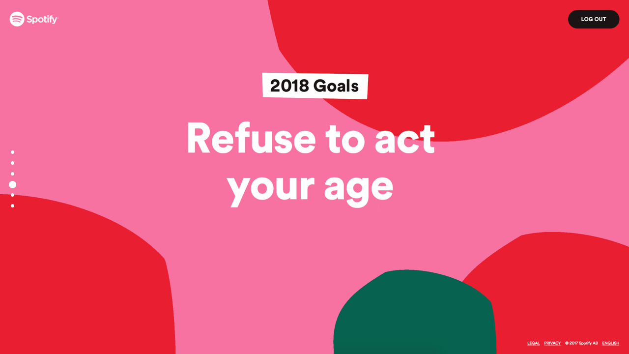
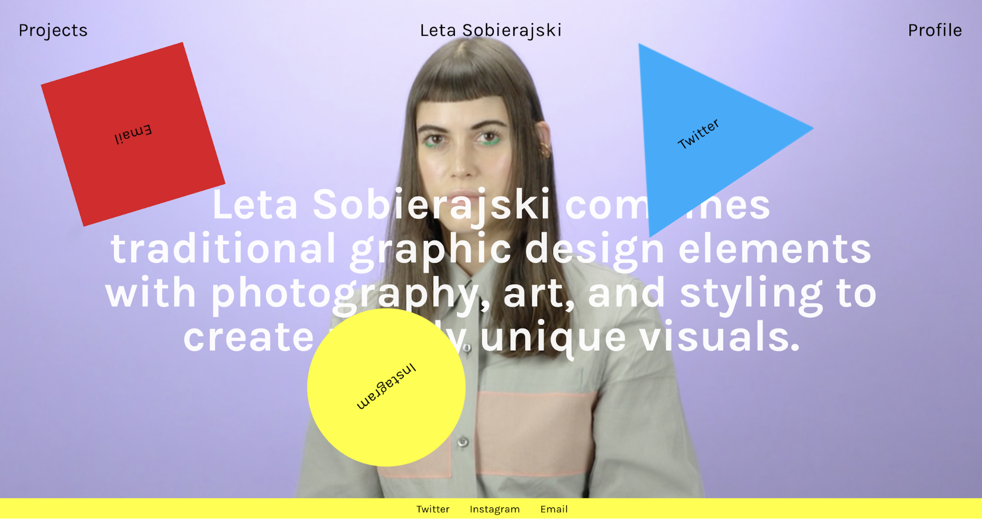
Designers are especially smitten with this trend. In her portfolio, for example, Leta Sobierajski takes visitors on a bold and colorful turn back in time …
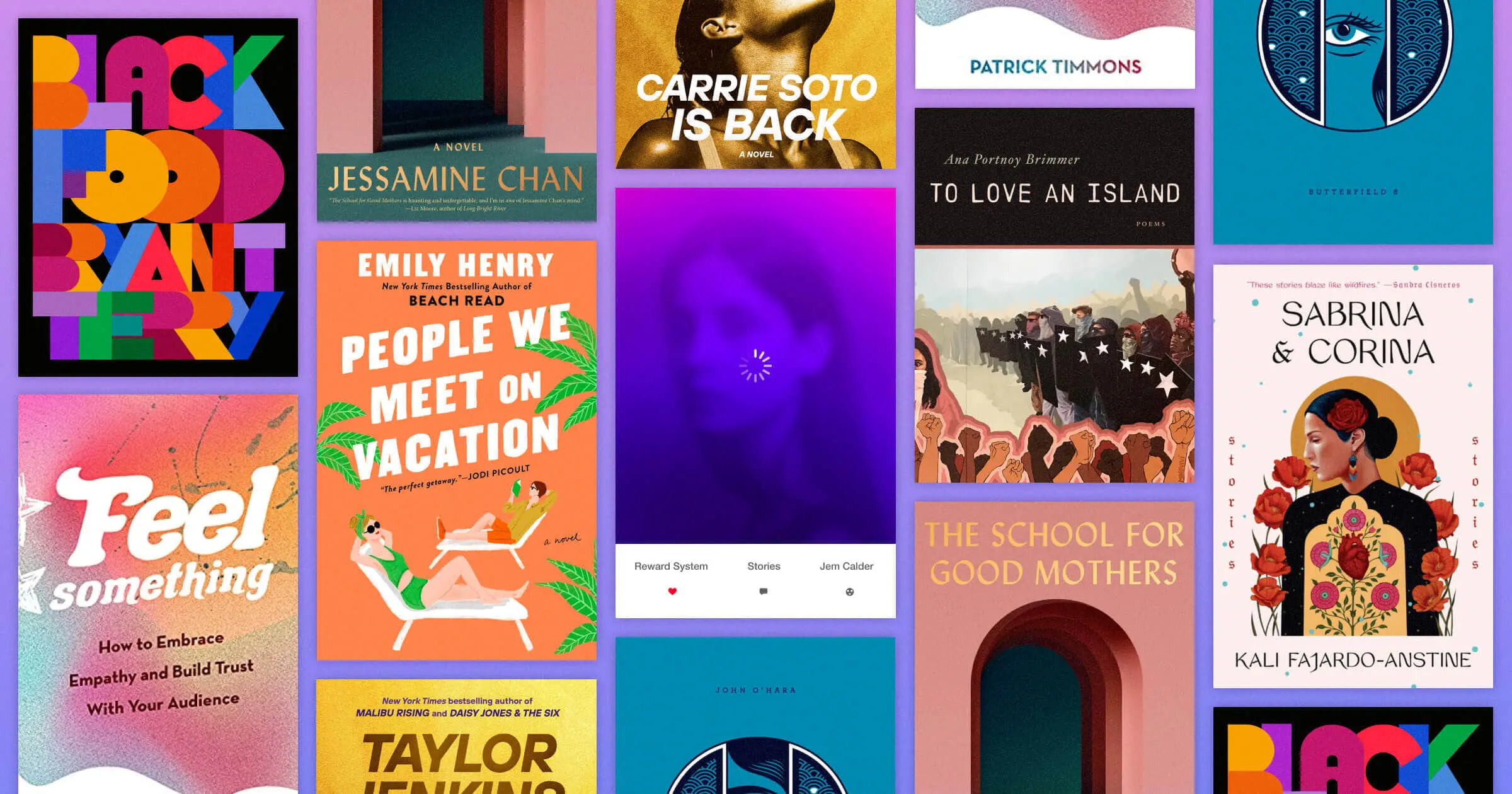
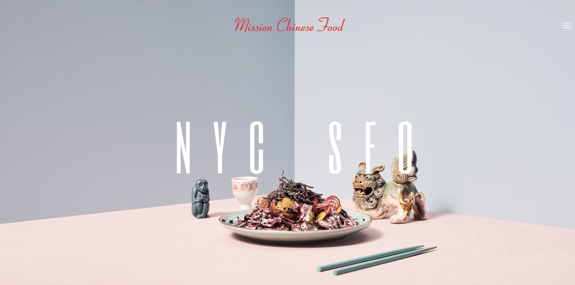
2. 50 shades of … pink
No, pink is not the new black. Why? Because, let’s be honest, no one asked for a new black.
2016 named Roze Quartz and Serenity as colors of the year — but this didn’t mark the peak for pink. Liberated from the shackles of outdated gendered connotations, pink continues its rise to popularity as one of the most versatile colors in the game.
Millennial Pink, for example, is a toned-down version of the polarizing Barbie Pink that’s embraced by an entire generation — proving that in 2018, pink is the new neutral.
So neutral, in fact, that it takes center stage on the homepage for Mission Chinese Food, a San Francisco cult favorite.
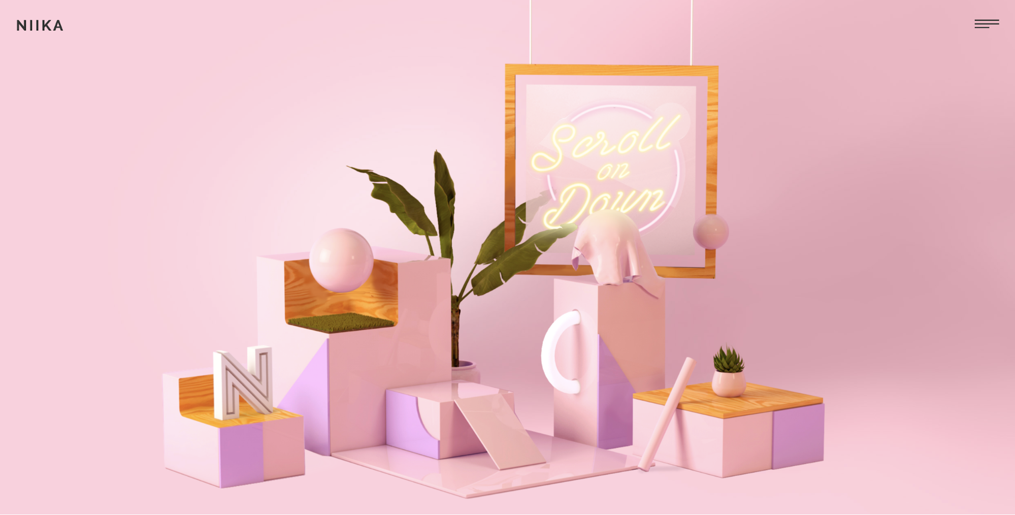
Niika, an agency based in Melbourne, designed its studio page with a brilliant pop of pink, earning them a Site of the Day nod from Awwwards.
We asked Mark Lipert, the managing director at Niika, about the inspiration behind this site:
Regarding our decisions around colour for the Niika site, Paul was inspired by an installation at the MONA art gallery in Tasmania by an artist named James Turrell. You can see some [of] James’ work here and while he doesn't exclusively work with pink we find his use of light, colour and tones to be intrinsically intriguing which is something we hoped to encapsulate. We feel that pink is a nice friendly open colour and we wanted our guest to feel a sense of welcoming playfulness when they first land on the site.
-Mark Lipert, @niika
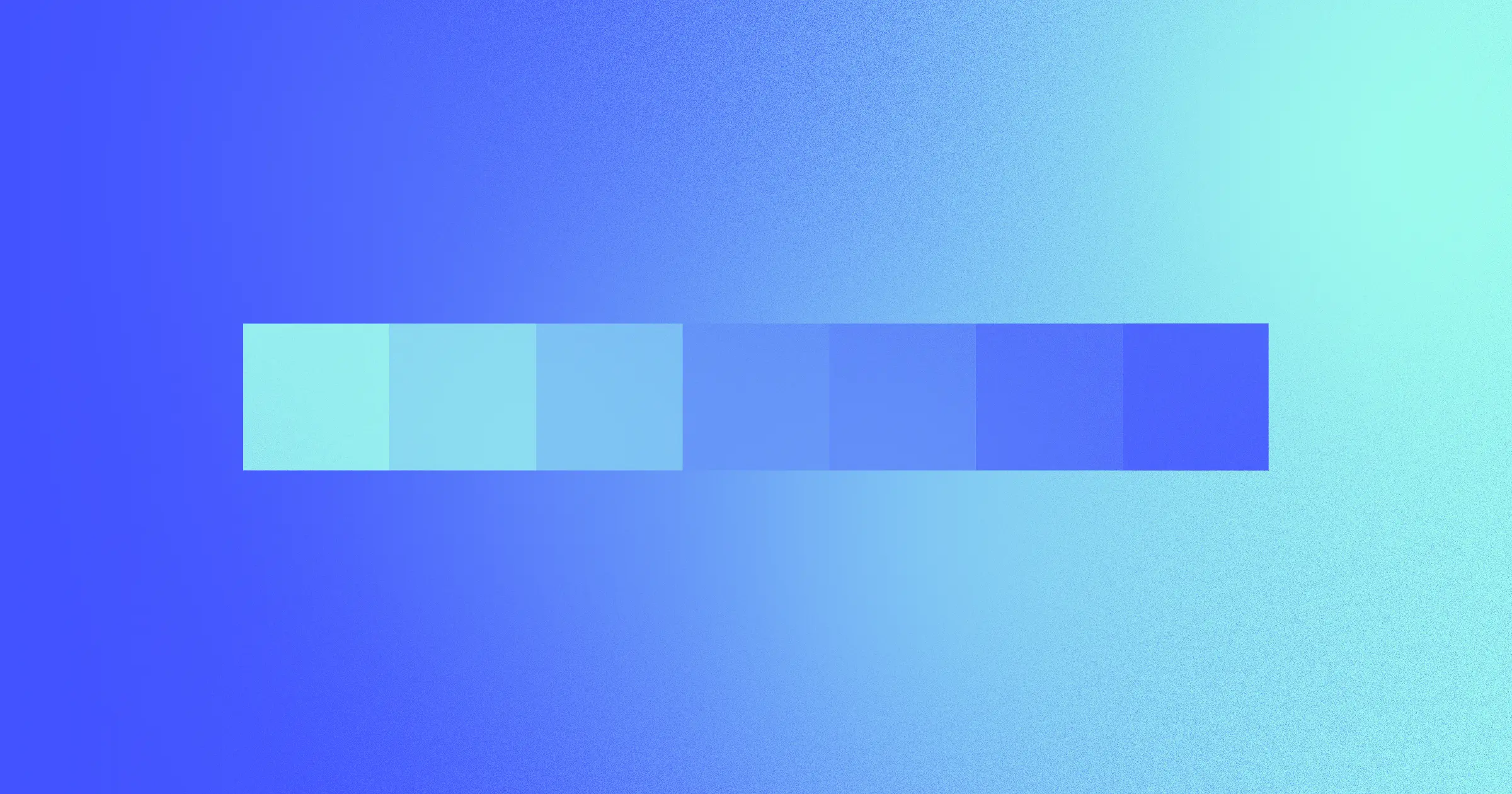
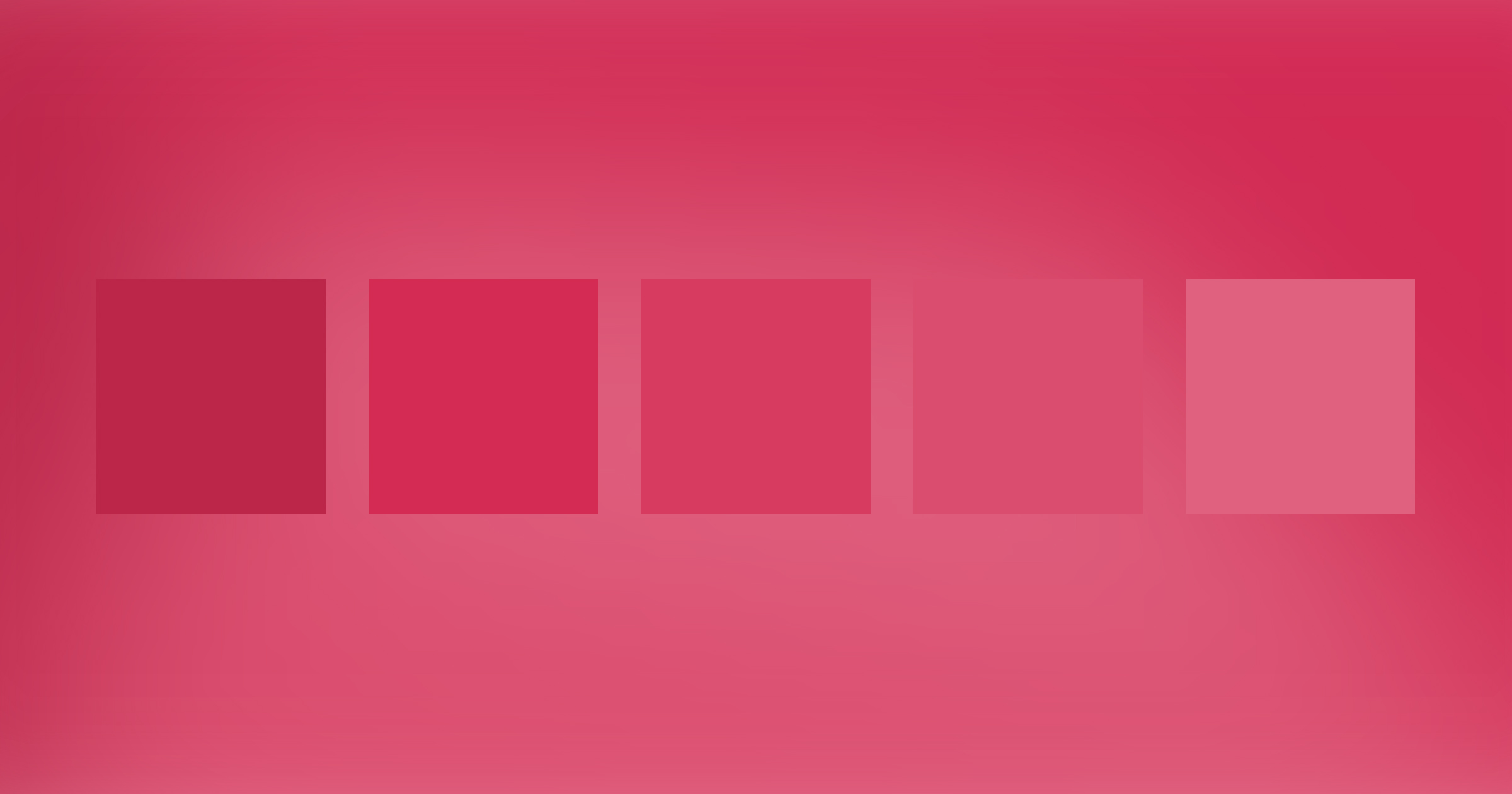
3. Gradients
Gradients are making a graceful, yet rapid, comeback in web design. Designers are making the most of color options in 2018 with gradients in many forms like vibrant UI, backgrounds, illustrations, and even overlays.
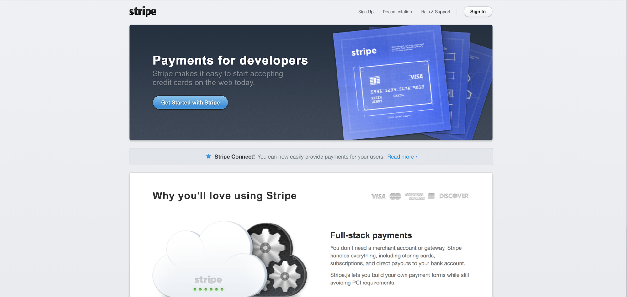
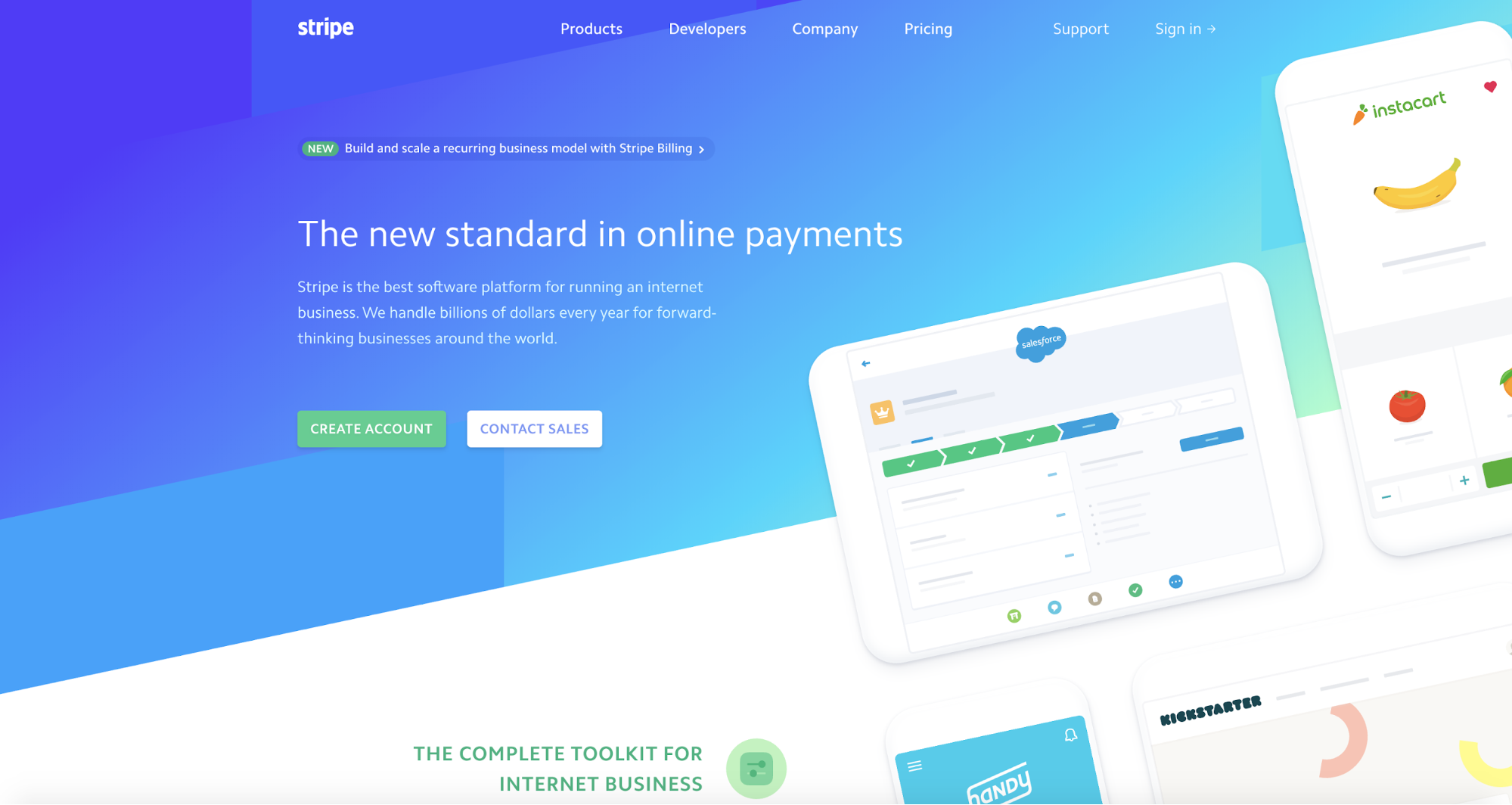
Checkout the colorful turn towards gradients by Stripe, for example:
Then (2013):
Now (2018):
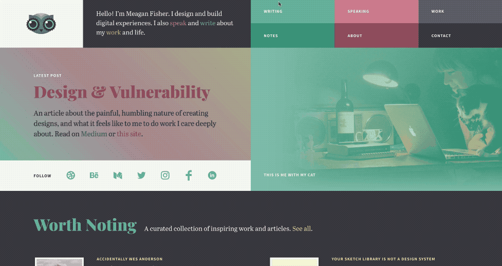
Designer Meagan Fisher applies gradients brilliantly in her portfolio. Multi-color gradients decorate individual elements on the page, and you’ll also get gradient backgrounds on hover.
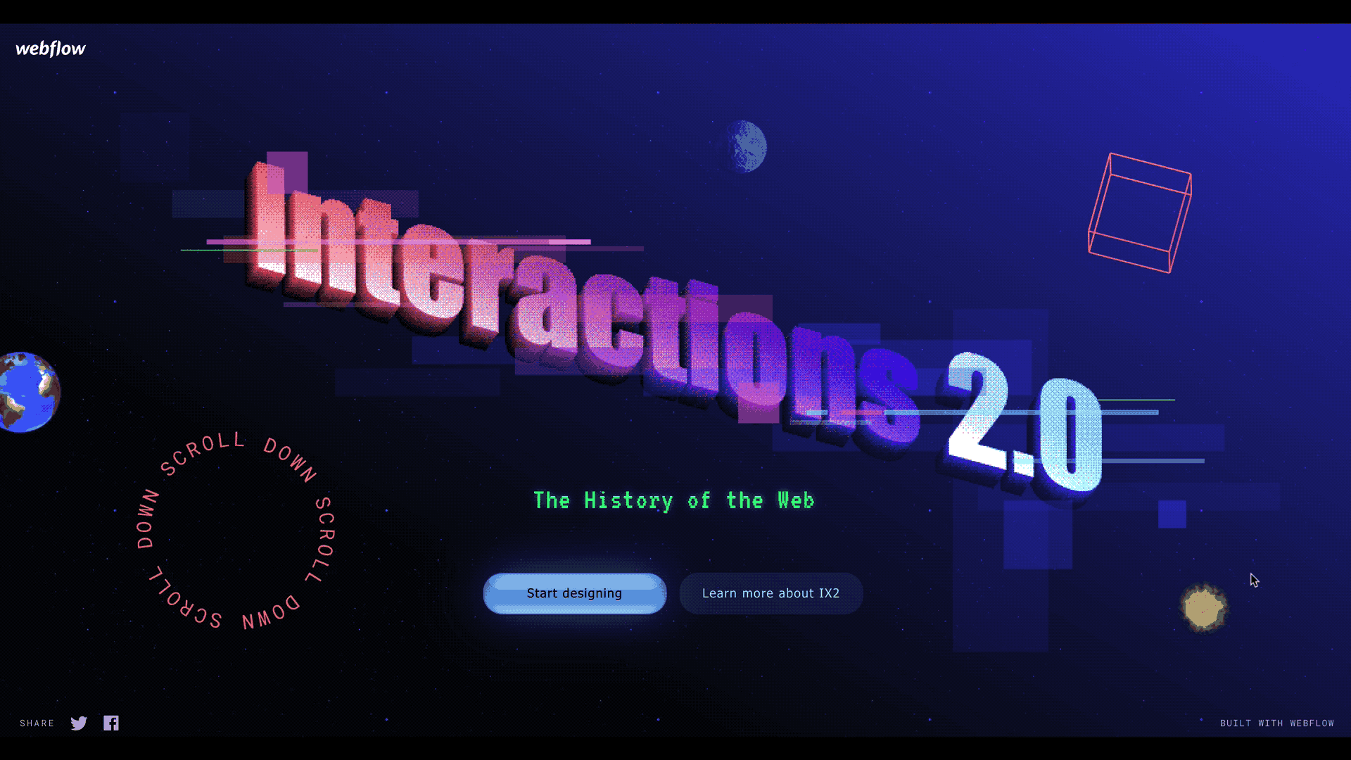
Even our very own Interactions 2.0 landing page champions the good ol’ gradient with transitions from salmon to violet to baby blue.


The modern web design process
Discover the processes and tools behind high-performing websites in this free ebook.
4. Color-based interactions
Color is a powerful ally for designers, not only for appearance, but also for functionality. Designers are now using colors as indicators of how a user should interact with and experience a site.
We’d like to note that it is important to avoid using color alone as an indicator. Approximately 8 percent of men and 0.5 percent of women are affected by some form of color blindness, so color-based cues should not be required to navigate your page.
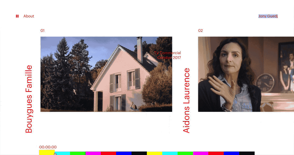
Jony Guedj’s website, for example, transforms standard pagination into an intriguing experience with the use of rainbow colors. You don’t need to be able to distinguish the colors to understand the nav’s functionality, but the varied tones add delight for those who can perceive them.
5. Daring (and delightful) embraces of Ultra Violet
Claiming that the “color of the year” constitutes a color trend in web design may seem obvious, or perhaps lazy, and I assure you, it’s probably both. (Kidding.)
Embracing purple in any form of design is no easy, or safe, task. People have strong reactions to purples, rarely feeling indifferent about the color. This makes the dive into a purple color scheme a bit more daunting and consequential for designers.
That being said, this year, we’ve seen designers fully embrace the depth of Pantone’s Color of the Year: 18-3838 Ultra Violet. Pantone describes it as “[...] symbolic of counterculture, unconventionality, and artistic brilliance. Nuanced and full of emotion [...]”
So, which brands and designers are bravely swimming in the deep end of this Ultra Violet pool and staying afloat? Here are two of our favorite examples:
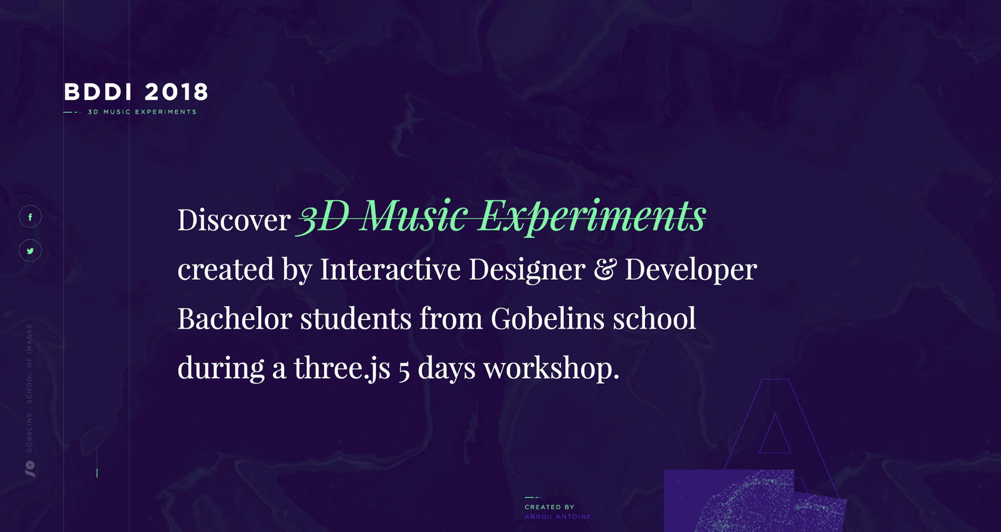
BDDI 2018 3D Music Experiments
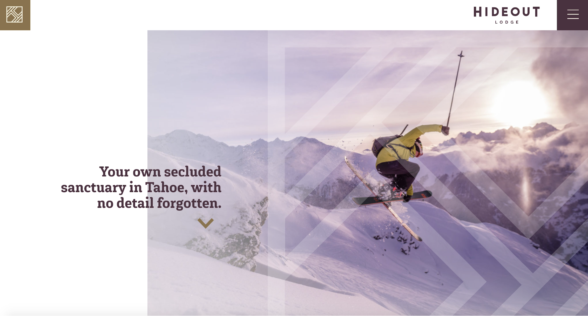
The designer behind Hideout Lodge’s site, Holly Mandarich, shares the reason for her color selection:
We wanted to make sure that our color selection reflected what the lodge and experience had to offer … using the violet, gold, and black really insinuated a high end feel to communicate to users on the site that the experience of Hideout Lodge has luxury beyond anything else offered of its kind.
-Holly Mandarich, 970 Design
6. Duotone
Designers are implementing vibrant and contrasting shades to achieve the powerful effect of duotone. Two-toned images are not only a means of catching attention, but also of using stock photography in a new way.
New Deal Design, for example, gives the old printing technique new life in its eye-catching site:
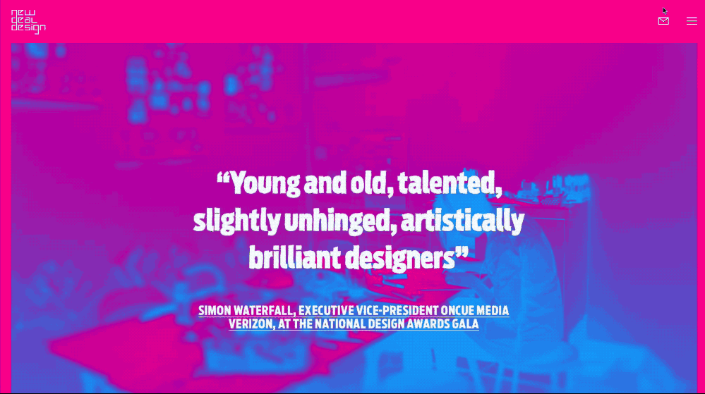
Evoluir’s website colorfully enlivens background images without detracting from the humanity of their photographic subjects.

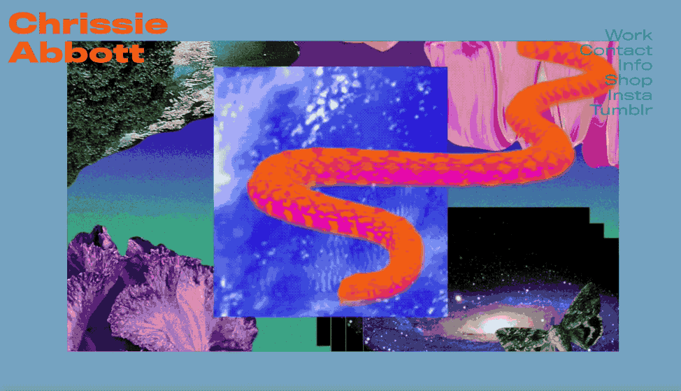
7. Brutal(ist) color palettes (read: no palette at all)
Brutalism, one of the leading design trends of this year, has produced peculiar color palettes. Color, after all, is a key component for making a brutalist website … brutal.
A wide range of colors fill oblique shapes, unexpected layouts, and sometimes-jarring patterns to produce an unforgettable viewing experience; however, jarring color palettes can also pain users.
Dropbox.design, for example, demonstrates the essence of brutalism through color without sacrificing usability. Their design is admittedly a “light” form of brutalism, but the unique and memorable application of color is certainly brutalist-inspired.

Chrissie Abbott’s portfolio is a far cry from “light” Brutalism. The site’s quick movement and mesmerizing visuals are enhanced with a bold color palette.
Dear Color, anything goes! Sincerely, web design, circa 2018.
Colors, liberated from the shackles of “web-safe” constraints, are taking the helm of web design trends this year. Designers, still taking brands into consideration, are going bold and colorful to set their sites apart from the crowd.
With more possibility comes more responsibility: Designers, color your sites with caution. You want your site, and brand, to be remembered by visitors — but not because you cost them a trip to the optometrist.
What are you seeing and loving (or hating) on the color-trend front? We’d love to hear in the comments.