Think about the last enjoyable in-person shopping experience you had.
Chances are it felt enjoyable from the get-go. Your expectations were catered to, things were clearly labeled and demarcated, and you had a salesperson to help you with whatever you needed.
Even if it’s not a shopping experience, this is how your users should feel when coming to your website.If it’s not immediately clear how your business can tend to their needs, they’re outta there. No one wants to feel like they “don’t get it.”
If users can’t navigate seamlessly or find the information they seek, they’re likely to click the “back” button on their browser to seek answers or support elsewhere. That’s why businesses must prioritize intuitive user experiences above all else.
What is intuitive design?
The term “intuitive design” refers to designing digital experiences that your target users find easy to use — be it a website, a product, or an app. This includes visual designs like iconography or functional designs like buttons. The measure of success for an intuitively designed website, for example, is if a user is able to approach the site and understand how to use it with little effort.
That said, “intuitive design” isn’t a catch-all term, nor will it mean the same thing from product to product. While there are best practices of intuitive design for interfaces (more on that in a bit), the bulk of what constitutes “intuitive” is determined by who the user is, as well as their expectations of a given digital experience. As a user of an interface, your nephew who grew up learning everything through videos on YouTube is not going to have the same expectations as your elderly neighbor who can’t figure out how to empty their phone’s full voicemail inbox.
The bottom line: intuitive design is completely determined by the user — and it’s up to you to identify who your core users are and connect with them by making the proper design choices.
Simple templates aren’t enough anymore: digging deeper into user experiences design
The internet, the lifeblood of digital experiences, isn’t what it was twenty, ten, or even five years ago. Out-of-the-box templates aren’t serving internet users the way they used to. While useful as a jumping off point or to get a site up quickly, users ultimately expect more. And the truth is, web designers have come a long way — as evidenced by this retro webpage circa 2001-2002:

Websites have dramatically evolved over the years. Now, improving customer experiences has become the root from which website design decisions begin. McKinsey refers to this focus on customer needs and experience creation as “experience-led growth,” which is when a company starts by “defining their desired financial outcome and then prioritize the [customer experience] improvements that will deliver that outcome.” And intuitive design is one integral piece of this puzzle of experience-led growth.
UX design sits at the heart of intuitive design
User experience design (abbreviated as UX design) is the field of work dedicated to helping a user make their way through a digital process or product with minimal effort and maximum value, and its purpose is to inform the creation of easy-to-use websites. UX design, first and foremost, requires a deep understanding of the user(s), much like a successful product requires a deep understanding of the market. To form this understanding, it’s essential to conduct user research through interviews in order to document personas that represent the main buckets of users to keep top of mind.
The stakes are high if you don’t take your users’ needs into account with intuitive design. You risk seriously frustrating your target audience, sometimes to the point of no return. And no, “intuitive design” doesn’t mean simply sending users to help pages or through tutorial flows — if you lean on those crutch functions to lead your user through the site, you’ve already failed.
Take, for instance, this product page from eBay. Where would you click first? It’s overwhelming, isn’t it?

Needless to say, intuitive design is not in play here and there are a couple of major issues. First, there are 10+ links all competing for attention in the form of call-to-actions and product images, and secondly, there’s not much physical differentiation of information about the product or text to establish a hierarchy that can then guide the user’s eye through the page. It’s hard not to feel paralyzed looking at this. Imagine how much eBay is leaving on the table in terms of serving the user (not to mention revenue).
While it’s most important to examine your user and understand their needs, reference these overall tried-and-true tenets of intuitive design per Everett McKay in your efforts.
What are the eight attributes of intuitive design for user interfaces?
- Discoverability: The user should be able to find information as they need it. The starting point and next steps should be clear and the layout should be straightforward.
- Affordance: The user should get hints as to what elements will take them to a subsequent step. Examples of this are buttons and consistent clickable elements from page to page.
- Comprehensibility: The user should be able to understand the textual and visual information at a glance. This means simple language should be used, avoiding jargon.
- Responsive feedback: The user should be able to tell immediately the success or failure of their actions. The results should be visible.
- Predictability: The user should be able to reliably predict what results will follow an action. The results should meet expectations and not cause confusion.
- Efficiency: The user should be able to complete an action with one try, without repetition or unnecessary steps.
- Forgiveness: The user should be prevented from making mistakes, but if they make one, it should be easy to recover.
- Explorability: The user should feel confident exploring a site. They should never feel lost or afraid of making a mistake.
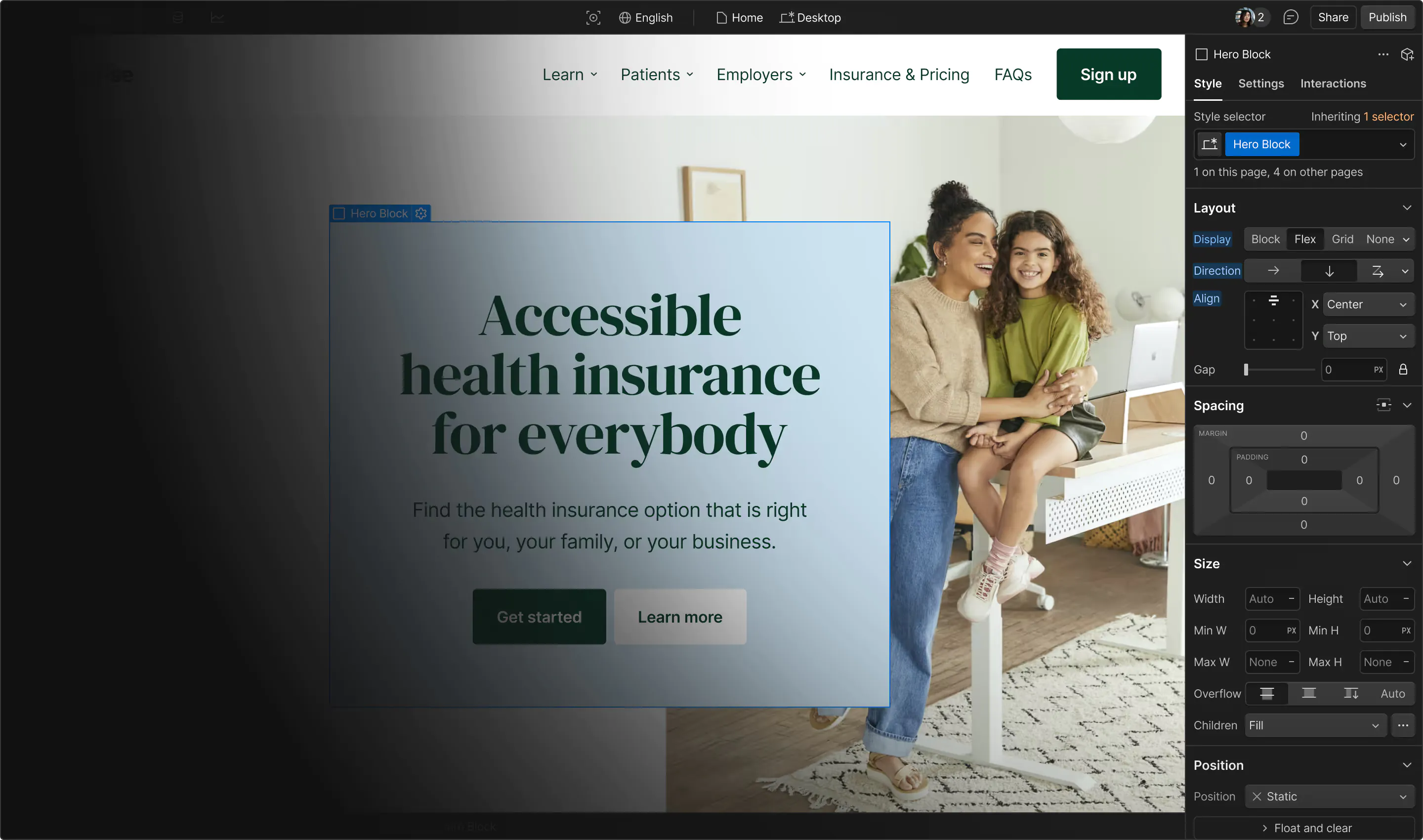
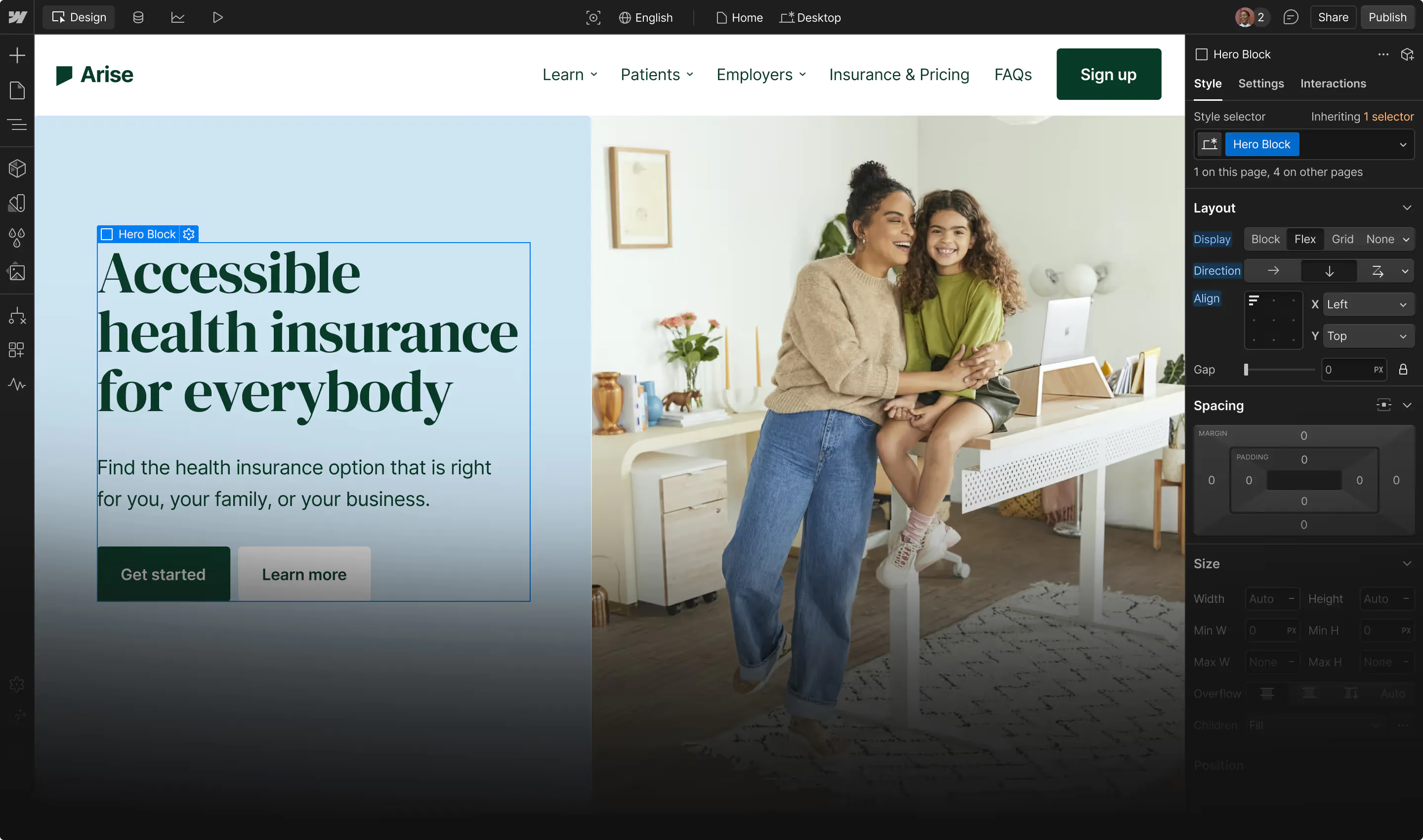
Fortunately, there are plenty of new technologies like visual development that have emerged since the simple templates of yesteryear to open up the possibility to design to anyone (not just people who know how to write code).
Rules of thumb to keep in mind
Looking for some general tried-and-true guidelines for intuitive design? Look no further:.
- Keep your logo in the upper left corner clickable on all pages of your site to allow user to return to homepage
- Maintain a way to navigate to “contact” your company on every page
- Consistent headers & footers on every page, in location on-page and options
- Accessibility must be a consideration to cater to all users and abilities
- Plain language trumps overly clever or branded language every time
- Consider experiences from device to device (depending on your own users’ behaviors, of course)
Want more design inspiration? Check out these web design inspiration resources you’ll love.
Examples of intuitive design
Sometimes it’s best to see good examples in the wild as you curate your understanding of your own users — which in turn will often influence the design of your site, product, or app moving forward. As a best practice, stash designs you admire or are interested in emulating in what designers call a “swipe file”, basically an ever-growing file of inspiration. We’ll get you started with a couple examples.
Dropbox is an outstanding example of intuitive design for their users — who fall on the tech-savvy side of the audience spectrum. Their homepage hits the mark with its clear language for a technical product, visuals that illustrate main use cases of the software, and straightforwardCTAs that move users along the customer journey.

On the more local side, karaoke bar Pitch Karaoke keeps it similarly pared down in terms of options for clicks, boiling the information down to just the must-haves. Further, their ‘Rates and Reservations’ page is elegant and straightforward, complete with FAQs (a slam-dunk in intuitive design) at the bottom of the page for answers to other burning questions not addressed elsewhere.


How to design intuitive experiences for your users
Keeping intuitive design at the top of your list of considerations is necessary to staying relevant to your potential & current base of users. Counterintuitively, the best and most intuitive of designs feel invisible, like second nature to the user — that’s what you’re aiming for.
Webflow’s suite of tools is enough to make any business owner dangerous, regardless of design experience. There’s something for experienced designers and newcomers alike, thanks to Webflow’s visual development tools that put the power of web development in the hands of non-technical users.
In the battle of function vs. flash, function gets results. Function (also known as intuitiveness) wins every single time.


Full site build
Design and develop a CMS-driven website that meets the needs of your client and their audience.
