HTML5 comes with a number of semantic tags that let you define an element’s purpose on your site. They don’t affect how well the site works (for most people), or its SEO. So, should we even bother using HTML5 tags? And if so, how do HTML5’s semantic tags work within Webflow?
The short answer: Yes. Use HTML5’s semantic elements
Semantics tags have many benefits beyond pure efficiency and site performance in search engines. They help us build better site structures, and more importantly, they can seriously improve websites’ accessibility.
And if you’re “not too concerned” about your site’s accessibility, consider for a moment that, according to the U.S. Census Bureau, about 1 in 5 people has some form of disability.
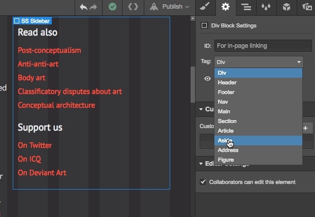
Thankfully, Webflow is well-equipped to work with HTML5 tags and make your site more accessible, improving the user experience for those with a range of disabilities. Defining an HTML5 tag in Webflow is as easy as selecting an element, going to the Settings tab and choosing a tag from the tags list.
HTML5 and semantics
Published in October 2014, the HTML5 standard enjoys almost universal browser support today. All modern browsers support HTML5 — some older browsers like Internet Explorer do not.
It improves and rationalizes the markup available for documents. Plus, it natively handles multimedia and graphical content, with the addition of the new <video>, <audio>, and <canvas> elements, and support for scalable vector graphics (SVGs).
Ok, so what is semantics? And what are semantic elements?
Semantics, put simply, is the study of meanings. For you fans of linguistics, it’s the study of the relationships among signs, signifiers, and signifieds.
So, in web design, a semantic element is an element that has intrinsic meaning, and conveys that meaning to both the browser and the developer.
For example, <div> and <span> are non-semantic elements. They tell us nothing about their contents. But <form>, <table>, and <article> are semantic elements: They clearly define their content.
To enrich the semantic content of documents, HTML5 introduced several new page structure elements web developers and designers should know and use.
HTML5 semantic elements you can use in Webflow
Webflow enables you to easily add semantic HTML5 tags to elements in your design via the Settings tab.
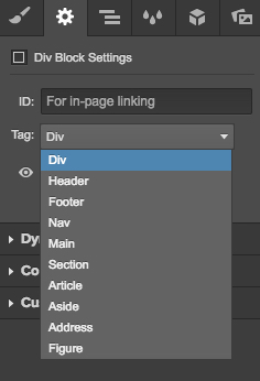
Webflow’s HTML5 tags include:
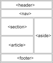
- <header> defines a header for the document or a section
- <footer> defines a footer for the document or a section
- <nav> defines navigation links in the document
- <main> defines the main content of a document
- <section> defines a section in the document—the spec defines this as “a thematic grouping of content, typically with a heading," so you can think of it as being like a chapter
- <article> defines an article in the document
- <aside> defines content aside from the page content
- <address> defines the contact information for the author/owner of a document or an article
- <figure> defines self-contained content, like illustrations, diagrams, photos, code blocks, etc.
Here’s an example of a fairly simple web page divvied up using these elements:
Other HTML5 semantic elements
The HTML5 spec also includes several other tags with more precise uses. With the exception of <figcaption>, which Webflow automatically adds to image captions, these aren’t yet available in Webflow.
- <bdi> defines a section of text that might be formatted in a different direction from other text (for instance, a quote in Hebrew or Arabic in an otherwise-English article)
- <details> defines additional details that people can view or hide (like a tooltip)
- <dialog> defines a dialog box or window
- <figcaption> defines the caption for a <figure>
- <mark> defines marked or highlighted text
- <menuitem> defines a command/menu item that the user can select from a popup menu
- <meter> defines a scalar measurement within a known range (a gauge)
- <progress> defines the progress of a task
- <rp> defines what to show in browsers that do not support ruby annotations
- <rt> defines an explanation/pronunciation of characters (for east asian typography)
- <ruby> defines a ruby annotation (for east asian typography)
- <summary> defines a visible heading for a <details> element
- <time> defines a date/time
- <wbr> defines a possible line-break
So what are semantic elements good for?
As their name implies, semantic tags are only good for semantic purposes. They’re all block-level elements that will render as expected, regardless of their HTML tag.
They have other important benefits that we’ll list below, but if you read about HTML5 semantic elements on the web, you’ll often find this advice:
Don’t spend too much time setting semantic elements at the detriment of more important tasks.
Which is fair. After all, semantic elements don’t affect your site's performance in search engines, and your clients and website visitors probably won’t notice them.
But once you read about how HTML5 affects accessibility (below), you might rethink your site structures and consider semantic elements an important — if not mandatory — aspect of your web design process.
Semantic elements’ benefits for designers and developers
HTML5’s semantic elements help structure the code we create, making it more readable and easier to maintain.
They help us think about the structure of our dynamic data, and to choose titles’ hierarchy properly.
They help us differentiate the semantic elements of our markup from the ones we use solely for layout.
And finally, HTML5 semantic elements push us to learn the meanings of HTML elements and better understand our audiences, particularly those who live with disabilities.
Semantic elements’ benefits for accessibility
For sighted users, it’s easy enough to identify the various parts of a website. Headers and footers, menus, and form elements are all immediately, visually apparent.
But for a machine like Google’s spiders, or a screen reader, these visual semantics aren’t so obvious.
By defining block-level elements as semantic elements, we tell the machines what they are, so the machines can render elements appropriately. For example, we no longer declare italic elements with an <i> for “italics,” (which is a purely visual change, without intrinsic meaning) but with an <em>, for “emphasize.”
On a screen, the browser will display text wrapped in an <em> in italics. But on an audio device for the visually impaired, the text will be pronounced with a corresponding emphasis, just like a friend would say it.
Accessibility and the web
Here’s the W3C.org on accessibility:
Web accessibility means that people with disabilities can use the Web. More specifically, Web accessibility means that people with disabilities can perceive, understand, navigate, and interact with the Web, and that they can contribute to the Web. Web accessibility also benefits others, including older people with changing abilities due to aging.
Operating systems include many accessibility options by default, including text size control, text-to-speech, color and contrast controls, etc. Some people browse the web with assistive devices, machines that translate text and media to audio or braille, for example.
Naming the semantic elements of your sites using HTML5’s tags is one of the most effective ways to make your site more accessible to people using these assistive technologies.
For example, if you’ve properly tagged your site navigation with <nav> and sidebars with <aside>, an assistive device will understand that these elements don’t belong to the main flow of the HTML document, enabling the device’s user to skip straight to the <article>.
Now, making your site more accessible is often up to you. Small and medium clients probably won’t bring up the topic at all, unless they specifically target disabled audiences. But larger projects and those involving civil or governmental organizations will probably require a high standard of accessibility.
Why? Because large sites want maximum visibility and usability, and public sites are often required by law to be compliant with accessibility standards. It’s the same law that says a public place must be accessible to people using wheelchairs and a public site must be accessible to anyone, on any device.
Of course, making your site accessible doesn’t stop at using HTML5 tags. The topic is vast, but here’s a few essentials:
- Use headings to properly structure your content
- Include descriptive alt text for images Webflow makes it easy to add alt text to images in the Designer and the Editor, so be sure to take the time for this. No text-to-speech system can describe an image better than you can.
- Give your links unique and descriptive text — i.e., don’t use “learn more” or “read more” or “here.” Ever.
- Use color with care 8% of the population suffers from red-green color deficiency. That’s a lot of people. And red-green color deficiency is just one of the various forms of color blindness. Never rely on color alone to communicate meaning to users.
- Design your forms for accessibility Forms fields need to be labeled appropriately for screen readers to handle them.
- Use tables for tabular data, not layout
- Ensure that all content can be accessed with the keyboard alone
- Keep your clickable areas obvious and large
For more on accessibility, check out our article “5 ways content can improve your sites’ accessibility — and overall UX.”


Design interactions and animations without code
Build complex interactions and animations without even looking at code.
Using HTML5 semantic elements
Believe it or not, HTML5 tags aren’t an exact science, so there’s room for divergent opinions on their usage.
However there’s enough consensus to allow us to recommend a simple and logical way to name your elements.
So now let’s walk through how you’d do that on two different page types: a classic content page, and a more modular homepage.
#1: HTML5 tagging a classic content page
Let’s consider a standard, common site structure. One with a header element, a menu, an article, a sidebar, and a footer.
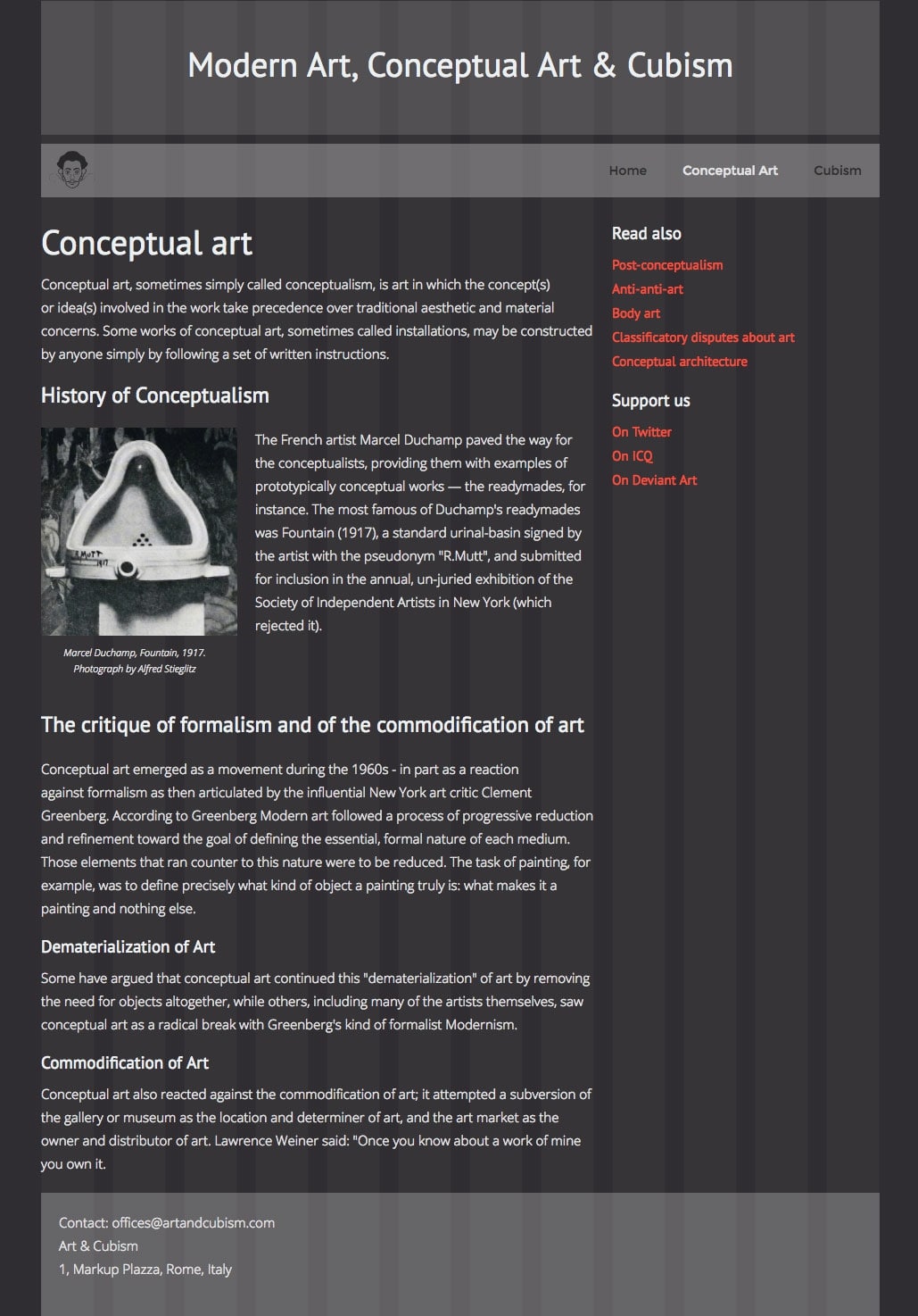
With such a classic page structure, it’s not too challenging to label the sections appropriately. Right away, 4 blocks are evident: header, menu, main area, and footer.
So we can confidently tag these: <header>, <navbar>, <main>, and <footer>.
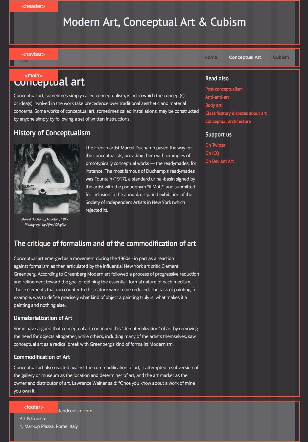
That’s the easy part — what element should get a header tag or footer tag is pretty self-evident Now let’s dig into the <main> element.
On the right, there’s a sidebar listing related articles and ways to support the publisher. None of it’s essential to a reader’s understanding of the page, so it all gets the <aside> tag. On the left, there’s an independent piece of content that makes sense on its own. If you saw it in your RSS feed, you wouldn’t get the feeling you were missing something.
So, no hesitation: it’s an <article>.
<article> is the most important HTML5 tag, because it’s the one that defines what’s essential: the content.
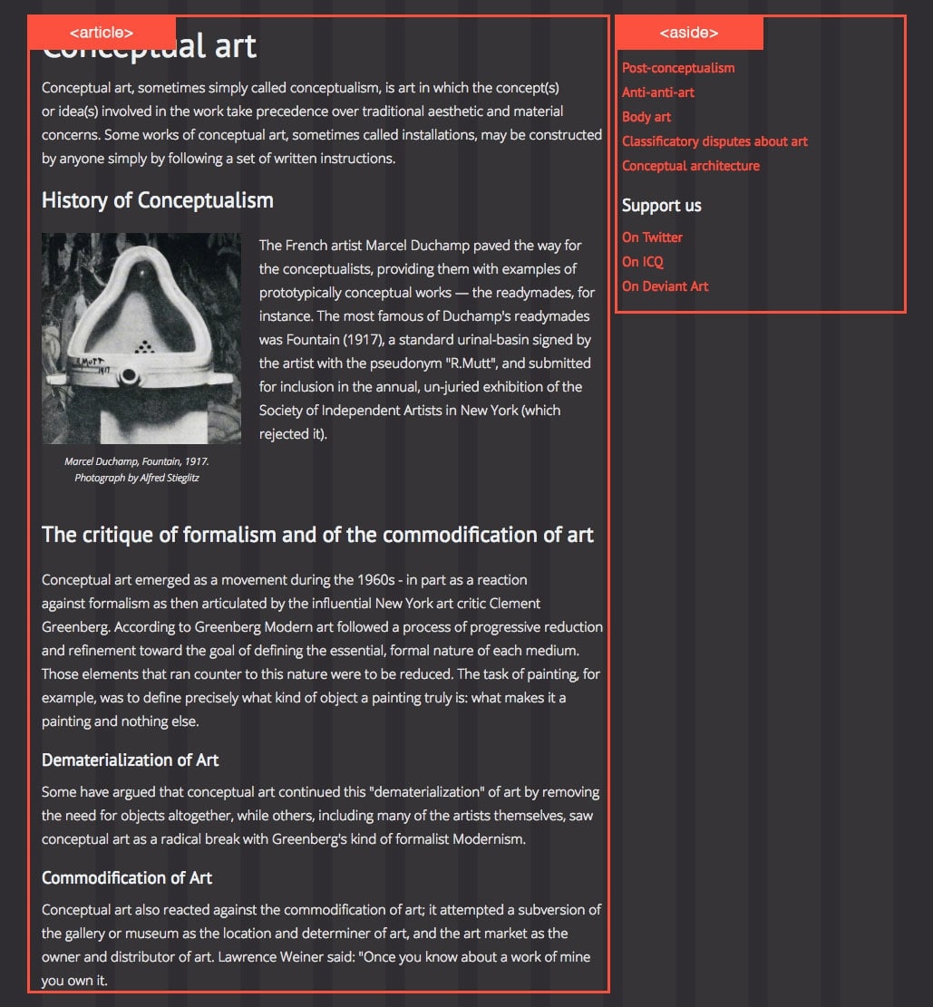
To recap, the <article> element is one of the most important element to identify. You identify it with two simple questions:
- Does this content make sense on its own?
- Would it make sense if it were listed in, say, an RSS feed?
If so, it gets an article tag. Digging deeper, we can now break down the <article> element even further. Since it has two principle parts with their own subheadings, we can wrap these parts with the <section> tag.
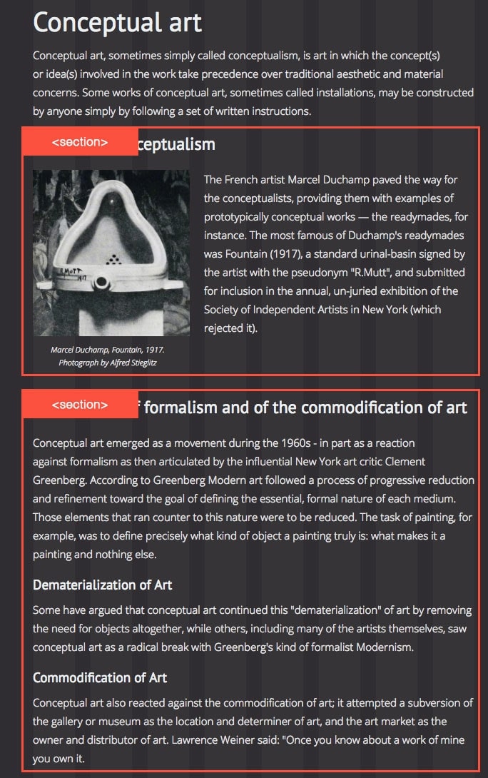
Each section must have one and only one title. In this case, the H2 headings serve as the sections’ titles.
Note that <section> elements shouldn’t be nested in HTML5. They must always have a unique title (only one H1 if it’s an H1, only one H2 if it’s a H2, etc.) and their own internal hierarchy. The first heading element defines the heading of the given section. The following heading tags inside the same section need to be relative to this. So, if the first heading in a section is an H3, use H4, H5, etc.
As the spec puts it:
The theme of each section should be identified, typically by including a heading (h1–h6 element) as a child of the section element.
Okay, so what else can we define?
The image in the first section gets a <figure> tag, for two reasons: 1) it’s an image, and 2) it could be moved into an appendix. And since the image has a caption, we can also add the <figcaption> tag.
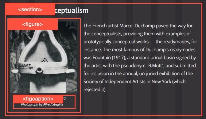
Okay, now we’ve used almost all the semantic HTML5 tags Webflow offers. The only one left is <address>, and we can wrap the information in the footer with it.
Here, our contact info appears in the footer, but it could be anywhere else. Also, there can be multiple <address> tags. If the article included the author’s name and a link to their Twitter account, we’d wrap both in an <address> tag as well.
Homepages are a little less obvious to break down due to the mix of content types they usually contain. Let’s consider the homepage of our example site.
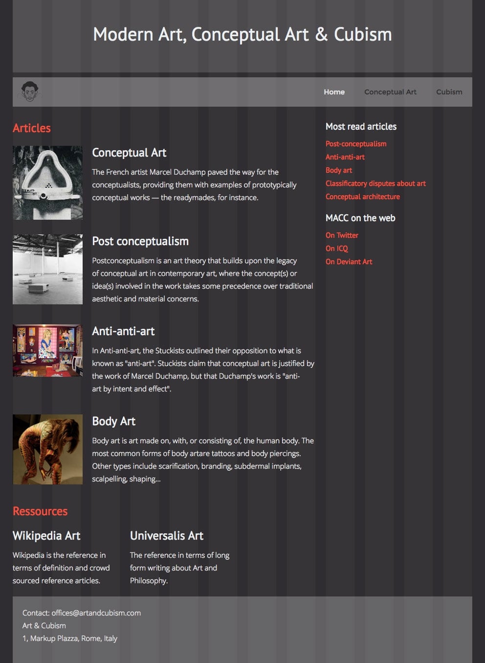
Here, our <header>, <nav>, and <footer> elements remain unchanged.
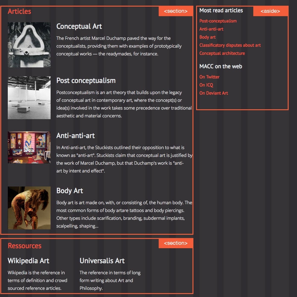
Now for the <main> area. The right-hand column is still an obvious <aside>. But on the left, it’s suddenly not so obvious. Are the areas with orange headings (i.e. Articles and Resources) articles? No, they wouldn’t make sense in an RSS feed. Do they require a title? Kind of, yes. So, they’re <sections>.
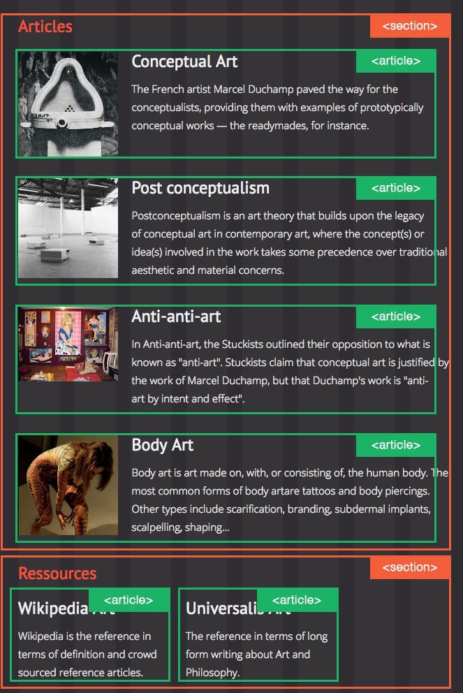
Inside the first section, we have a list of posts teasers. They represent articles, but don’t provide the whole of the article. Should they be <articles>? To decide, let’s ask ourselves the essential question again:
Would they make sense in a RSS feed?
Absolutely!
So they’re definitely <articles>. And for the exact same reasons, the items under the Resources section are <articles> too.
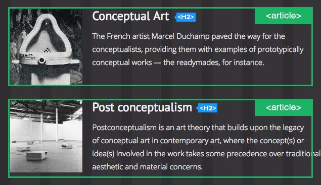
But, should they then really get an <H1> each, as the HTML5 spec originally suggested? No. Because web browsers and screen readers weren't updated to accord with this aspect of the spec, the recommendation of using H1s for each article teaser was removed. So, despite what you may have heard around the web, the old "one H1 per page" rule still applies for browser compatibility purposes.
Webflow helps you get your tagging right in various way. But it can’t do all the work for you.
For example, we’ve seen that you shouldn’t nest <section> elements. Webflow conveniently prevents you from nesting sections. However, you still can manually assign <section> to an object inside a Webflow section, and there will be no warning. So just keep in mind that Webflow’s section component doesn’t correspond directly to the HTML5 <section>.
Another way Webflow helps is by automatically adding the HTML5 tag by itself. Drag a Navbar widget onto your canvas and you’ll see you can’t define a <nav> tag for it. That’s because Webflow already tagged it as a navigation bar for you!
Why you should be using HTML5 semantic tags
HTML5 tags are good for the quality of your sites, for the quality of your workflow, and essential to your sites’ accessibility. Use them, and devote some time to building your structures right.
You'll hear and read a lot of people saying you shouldn’t prioritize them.
Personally, I don’t think that’s OK, at all. Accessibility has always been an essential aspect of development, and it’s required by law for many site types for a reason.
Whether or not you choose to address accessibility by using HTML5 tags is often your choice, and you can decide not to.
But no one should say it’s not important nor essential.
Note: This article originally stated, incorrectly, that <article> teaser headlines should be given H1 tags. That has been corrected to recommend H2s per the current spec.


