Webflow’s symbols are great when you have a recurring layout whose content is exactly the same across each instance — for example, a nav bar, a footer, or a sign up form — but what if you have a recurring layout that has unique content in each instance?
With today’s release, now you’re in luck. Because now you can change images, text, videos, and links in a single instance of a symbol without affecting others — making it easier to create and maintain recurring layouts across your site that have unique content.
Why this is cool: an example in action
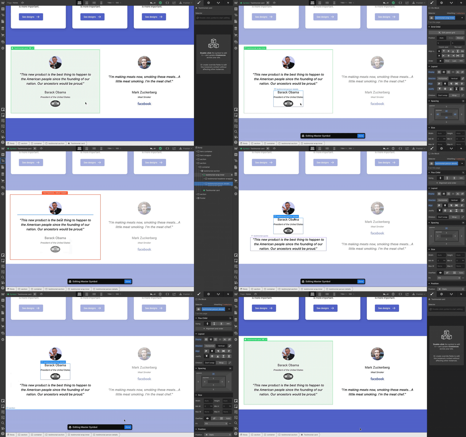
Say you have a section on your homepage with some social proof testimonial cards that have the same structure, but each has its own unique content. This is easy enough to set up with classes in Webflow today, plugging in unique content for each card and managing the layout with reusable styles — but what if you want to completely restructure the layout of those cards down the line?
Before today, you’d have to rearrange the content in each card individually, or simply start from scratch and go through the build process for those cards all over again.
But now, with today’s release, you can turn these recurring cards into a symbol, each with its own content, and as you restructure the layout of that symbol, each instance will preserve its unique content. Let’s look at this in action below:
How this works: a step-by-step look
Ok sure, but how does this work in action? Here’s how:
Step 1: Define a symbol
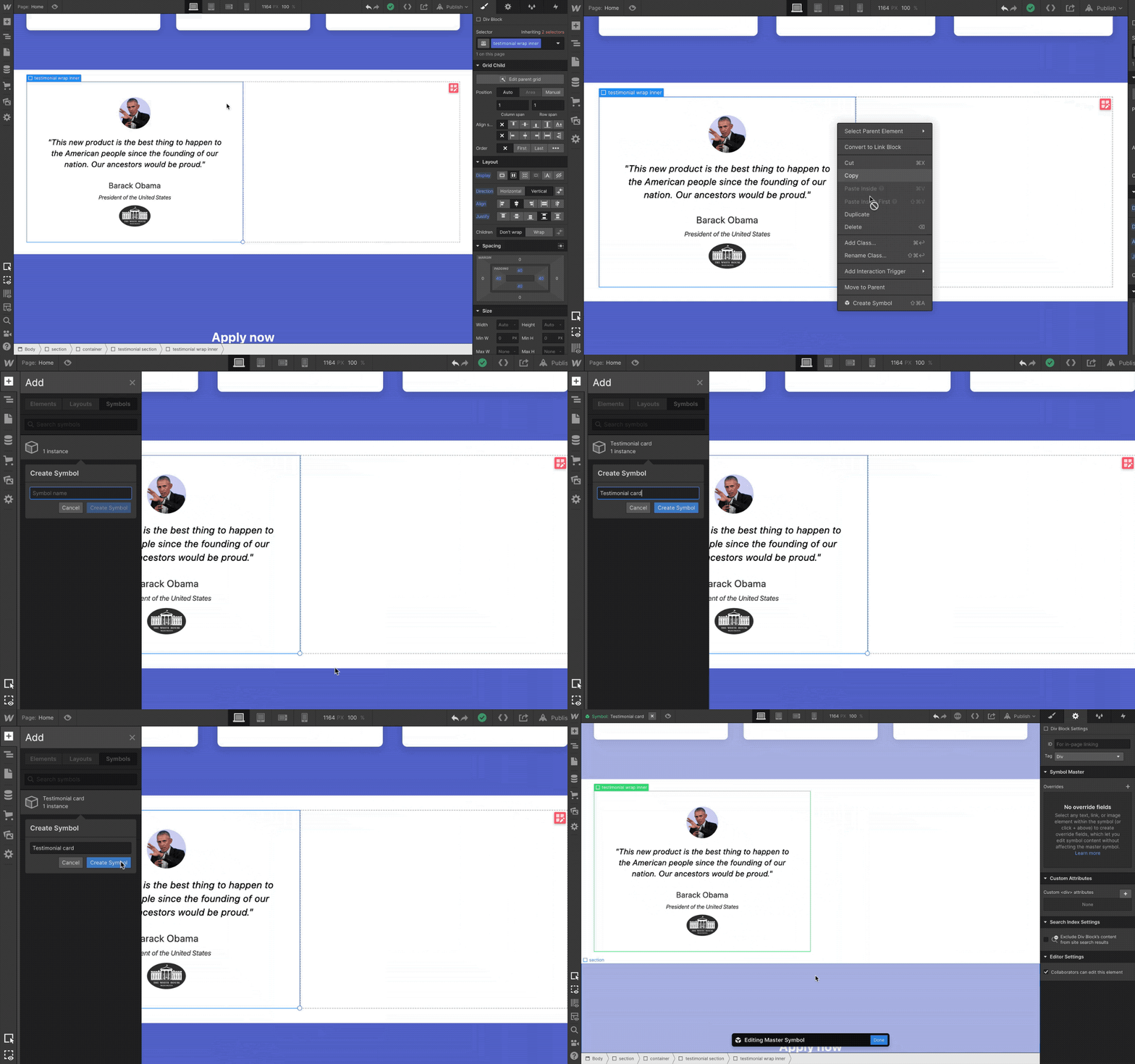
Create the layout you’d like to reuse across your site and convert it to a symbol. In this example, we’ve created the first card and we’ll right click to make it a symbol.
Step 2: Define override fields
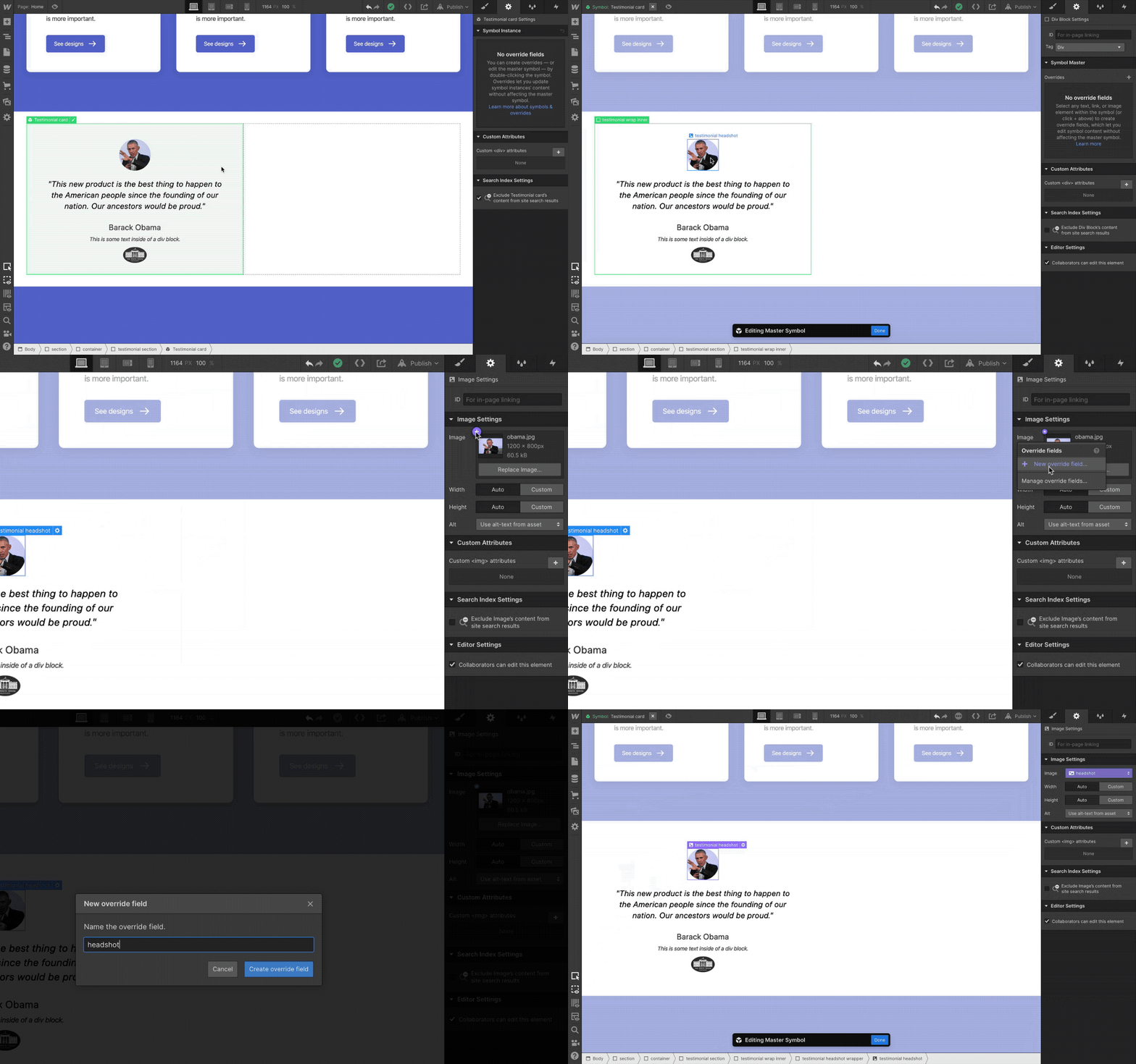
Within the symbol settings panel, define the content elements (text, images, videos, and links) that you’d like to make overridable as “override fields.” (If you’d like an element to have the same exact content in every instance, you should not create a field for it.)
Step 3: Override content fields per instance
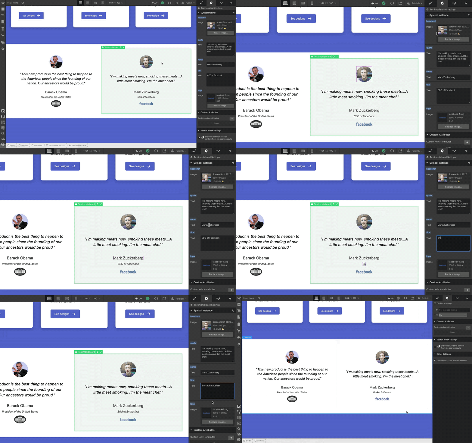
Copy and paste that symbol as needed, and in the symbol settings panel, set unique content overrides for each symbol field.
Step 4: Restructure layout, watch the magic unfold

Double-click on any symbol instance to edit the main symbol. Restructure layout and see every other instance update accordingly, while retaining its unique content overrides.
Step 5: Rejoice, cry tears of happiness

Your symbol’s structure changed across your entire site with a simple edit of the main layout.


Get started for free
Create custom, scalable websites — without writing code. Start building in Webflow.
How you can use content overrides for symbols
With this improvement, symbols can now take on a brand new role in your projects, acting as more of a reusable layout pattern, not simply a single-purpose block of content. Let’s take a look at how content overrides can help you build faster and smarter below.
Create layout and components library for your site
Now that symbols can have unique content in each instance, you can use them to create a library of recurring layouts and content patterns across your site, which you and your teammates can then use as the building blocks for new pages.
Some common layout patterns you might want to create as symbols with overrides include:
- Contact forms. Give each contact form its own headline and call to action based on the context surrounding it.
- Hero sections. Create a standard pattern for hero sections across your website’s core pages.
- Testimonial blocks. Design and manage the layout of recurring customer quote sections from a single place.
- … and anything else that repeats across your site!
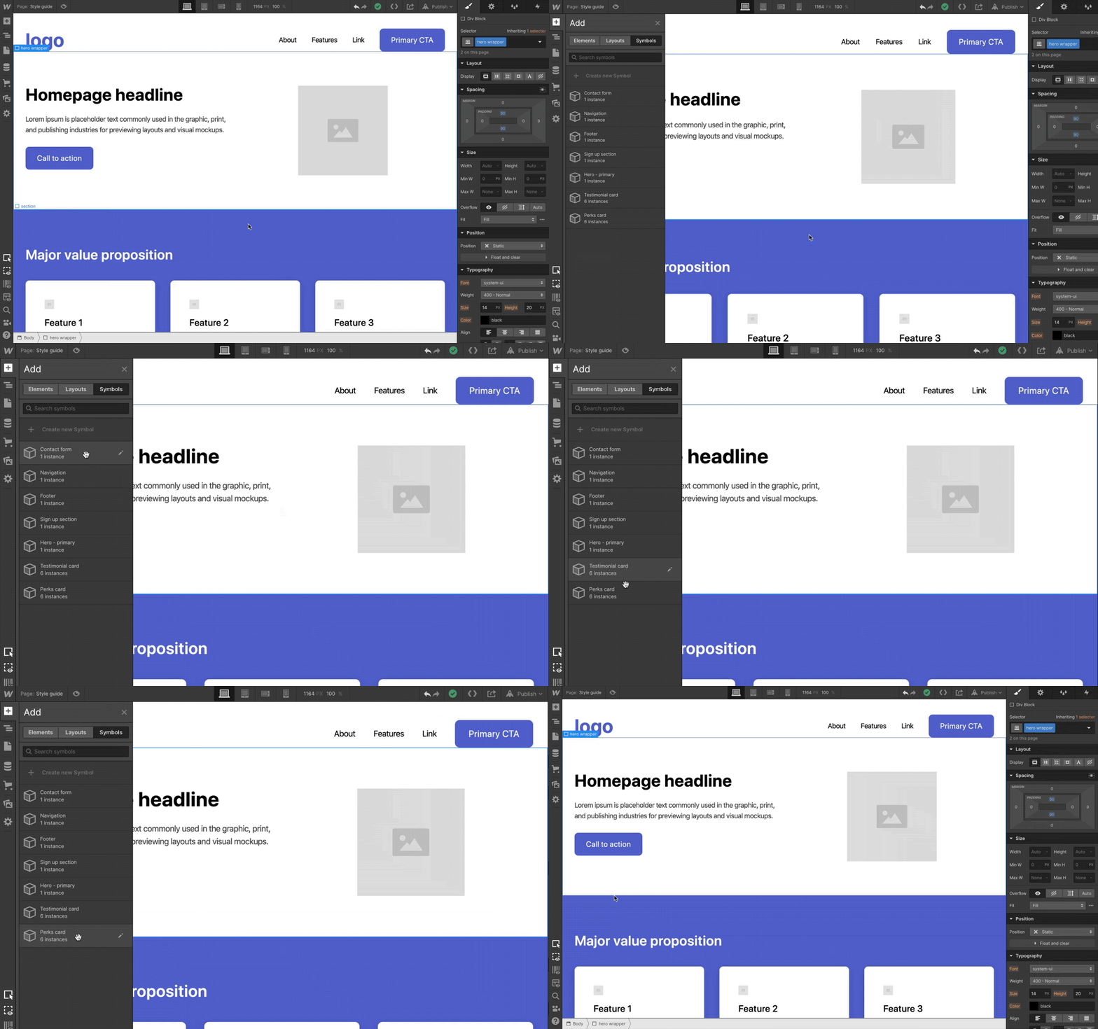
The major benefit of this approach is that as you’re using these symbols to build pages, you’ll know you can always edit and restructure them from a single place, rather than having to edit a bunch of things across a bunch of disparate pages.
Empower teammates to build pages with symbols
Taking this one step further, once you’ve built out a library of common layouts and patterns, you can empower your teammates to build pages with symbols and override the content in each instance to add content to your site without worrying about styles, classes, or any of the more technical elements of building in Webflow.
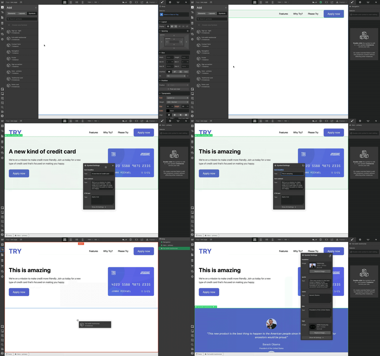
As the builder of the site, you can control what fields they can override and which fields need to stay the same across each instance, which helps you enforce standards and keep things uniform across the site.
Create layout and components library for jumpstarting client projects
If you’re using Webflow for client work and find yourself recreating the same layouts time and again when you start a new project, you can use these new and improved symbols to create a brand-neutral library of layouts that can jumpstart the build for each site.
What’s coming next
This update to symbols is just the first step in a larger plan to evolve symbols (and Webflow in general) toward a future where you’ll have much finer control over creating and managing design systems.
While we can’t reveal all the things we’re working on, here’s a look at some exciting developments on the horizon:
- Nested symbols. Put symbols inside of symbols for hyper-detailed layout control and management.
- Style overrides and variants. Define which element styles (e.g. background color) can be overridden on instances, and create multiple variants (e.g. a dark and a light version).
- Renaming symbols to components. To reflect the dramatic expansion of what “symbols” will be able to do, we’ll be renaming “symbols” to “components” in a future release.
- Much, much more. Suffice to say we’ve got big plans for improving design system creation and reusability at Webflow, and we’ll be sharing more in the coming months.
How will you use symbol content overrides on your projects? Let us know in the comments.


