


Today we’re releasing a new positioning mode for items in a grid layout: grid template areas. In short, template areas makes reusing grid layouts dramatically easier — and introduces a ton more power for making site-wide layout changes in far fewer clicks.
What are grid template areas?

Grid template areas are a new way to define layouts and position elements within a grid container. In essence, they allow you to define regions within a grid that act as “dropzones” for elements within that grid (think: here’s my header content region, here’s my sidebar region, and so on).
Once you’ve defined a template area and added content to it, you can then reposition the area, and watch as your elements automatically move with the area as well.
Finally, as you define these template areas, they become part of the parent grid container’s class, which — as we’ll explore below — gives you a new level of power when it comes to reusing layouts across your site.
How are grid template areas useful?
The usefulness of grid template areas breaks into a handful of key areas:
- Layout reuse. Template areas are part of the parent grid class, so each instance of that grid class includes the same, predefined template areas.
- Layout restructuring. As you adjust template areas in a grid container, those adjustments impact every instance of that parent grid class, making sweeping layout and structure adjustments for static content possible in a few clicks. It’s like a layout-only symbol!
- Responsive design. Adjusting template areas across devices is an easy way to reshuffle your layout for smaller screens.
- Full page layout creation. Just as you can define the layout for a recurring section of a page, you can also define and reuse an entire page’s layout with template areas for a single grid parent class.
Layout reuse
Because the template areas you define become part of the parent grid class, when you reuse that class, the template areas you defined come with it.
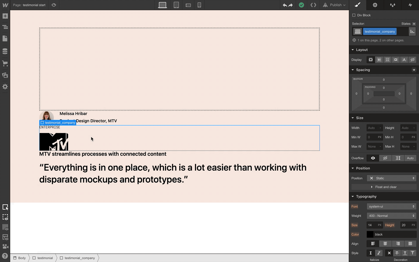
Let’s clarify that with an example. Let’s say you’re designing a section for your marketing pages that features a quote from a customer about how great your product or service is. For each instance of this section, the layout’s going to be the same, but the content will be different.
After you’ve built the first instance of this layout with template areas, you can reuse the parent grid class and all those handy “dropzones” will come with it.
From there, it’s as easy as dragging the right content into the right template area and voila: you’ve got a second instance of that layout.
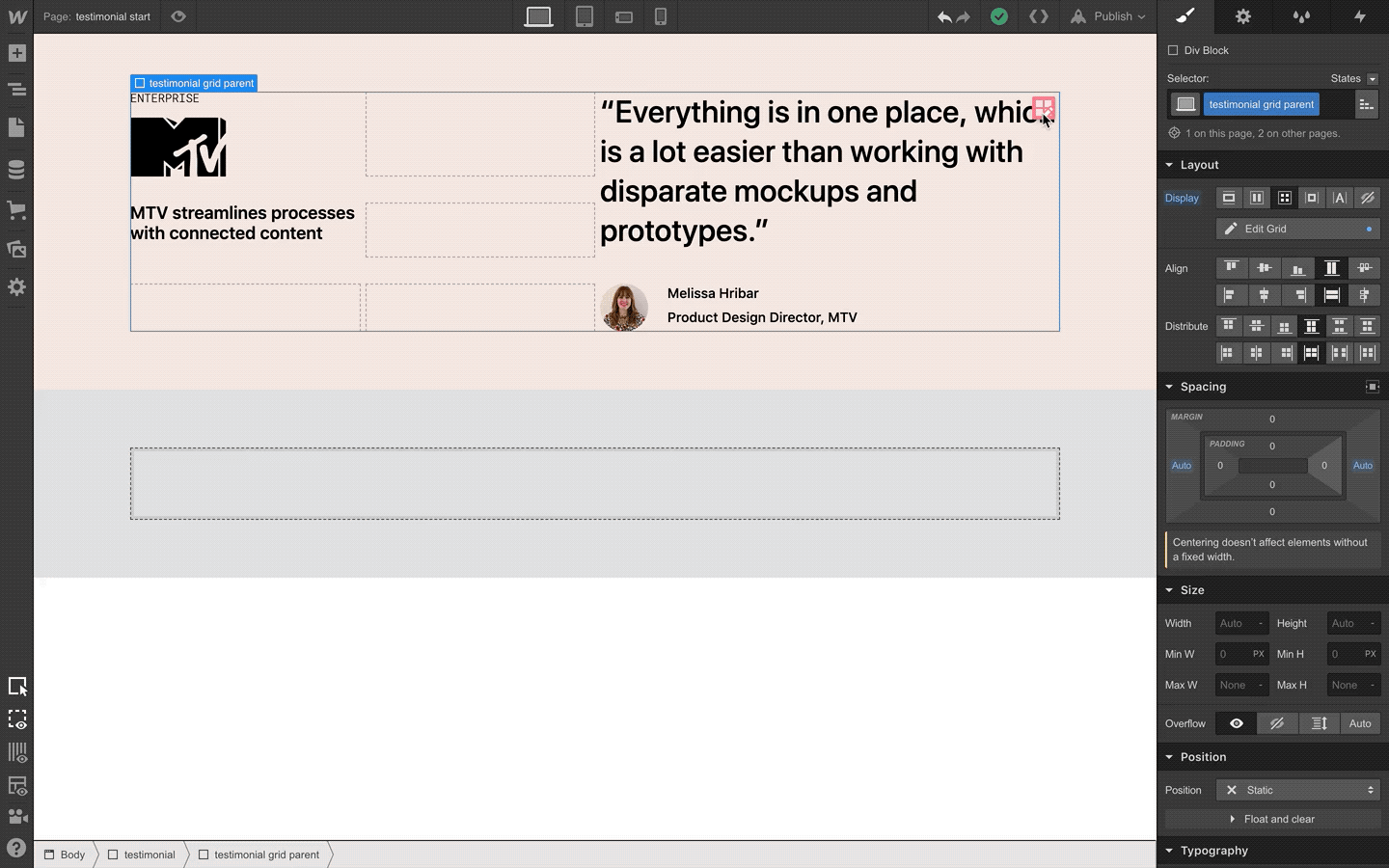
Layout restructuring
Taking this example a step further, a massive benefit of building grid layouts with template areas is how easily you can make sweeping layout changes with a lot less work.
Consider our example of a testimonial section: you want the layout for this section to be the same for each instance, but since the content is going to be different each time, a symbol won’t do the trick.
Cue template areas! Because your content elements are tied to specific template areas, you can simply rework the positioning of the template areas and every instance of that grid layout will adjust accordingly.
Responsive design
When it comes to responsifying your designs, tweaking your layouts for each device is similarly straightforward: simply reposition the template areas and adjust the grid as needed, and those changes will impact every instance where the parent grid class is being used (with changes cascading down devices, per Webflow’s normal responsive design model).
Full page layout creation
Just as you can define grid template areas for a grid parent class and reuse that layout for subsections or pieces of a page, you can also create a full page grid class that uses template areas to define an entire page’s layout.

Consider the example above: a landing page layout you’re using for a series of pages in a marketing campaign. Each page has a hero, a section with some relevant features, and a section including a quote from a customer. If you use grid template areas to define each of these sections, you can rearrange them as you’d like (say, after running some tests, you want to feature the quote first) and see that change impact every other landing page that’s using that grid parent class.


Build CSS grid layouts — visually
Experience the unprecedented ease, speed, and power of CSS grid layout in Webflow — with all-new on-canvas controls.
What can I use them for?
To help you get a clearer sense of how grid template areas can be applied to your projects, we’ve pulled together a series of cloneable mini-projects with example layouts (and pages) that you can use for whatever you’d like. Let’s take a look at each below, with a quick explanation of why grid template areas make building and maintaining these layouts so much easier.
Product feature grids
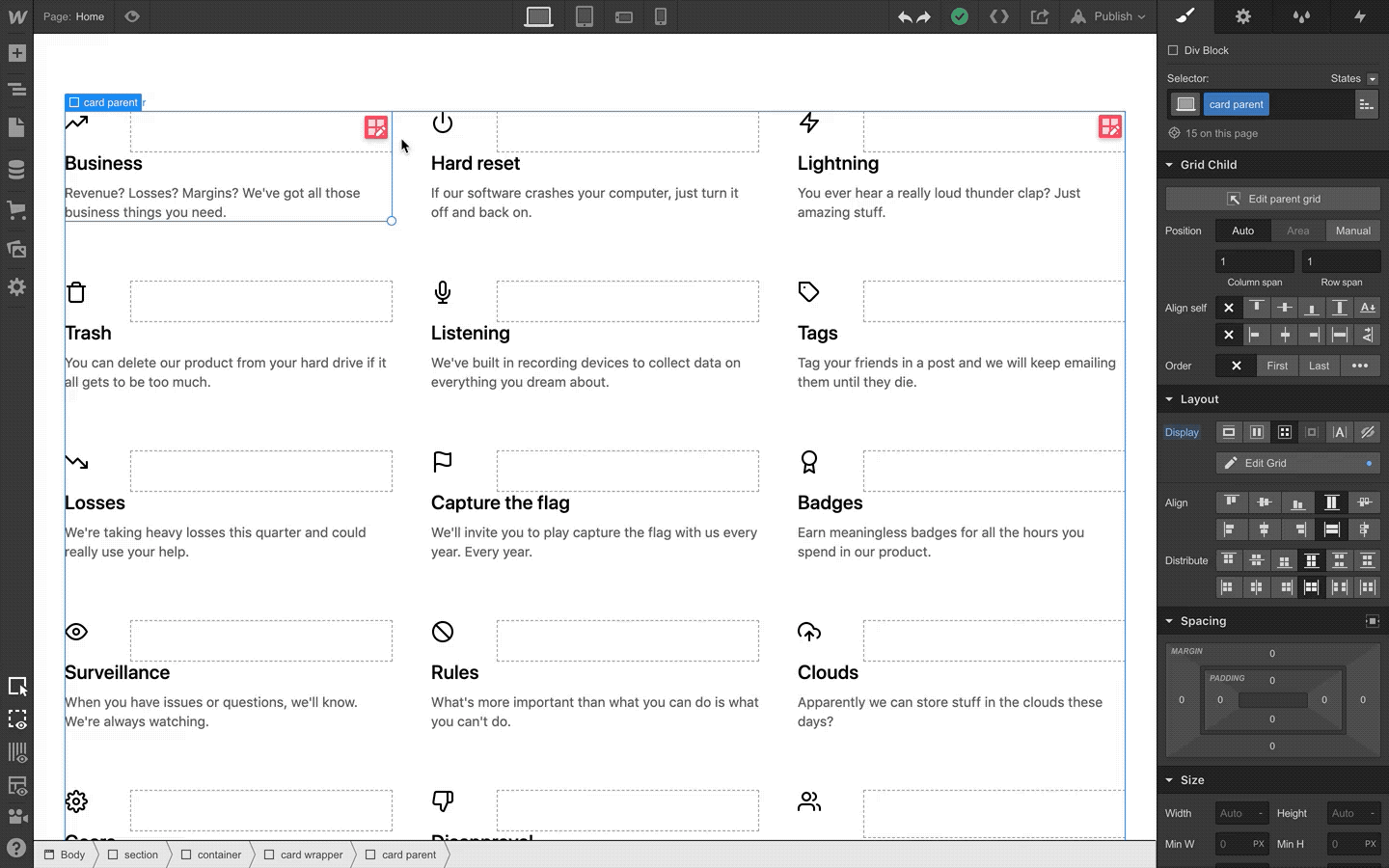
A grid of product features with icons and copy is a fairly common pattern on product and pricing pages, with each unit laying out a different value prop for the product in question. One difficulty these grids can pose, however, is that if you’d like to restructure the layout for all of them, you need to do it one-by-one, since each one is built with static content.*
But, if you build each of these units with grid template areas, you can simply edit the template areas for one of these units and see that layout change across each instance.
*Note that you could build this layout with CMS driven content, but that might not always be the most straightforward approach. Grid template areas can sometimes be a simpler method.
Pricing tables

Because of their complexity and sheer number of elements, pricing tables are notoriously arduous to build, and often equally difficult to maintain or update.
But with grid template areas, you can break each repeating part of a pricing table into its own mini grid layout, then, when you designate each part of that layout to a defined grid area, you can restructure one piece to impact each instance of that layout.
In the example below (clone this layout), that repeating part is the pricing table row. The benefits of using grid areas in this example really pay dividends when it comes to adopting this layout for smaller screens, which is always a challenge for pricing tables.

See how, thanks to grid template areas, you can focus on restructuring just one row, safe with the knowledge that all your changes will impact the other rows in the same way? Real nice.
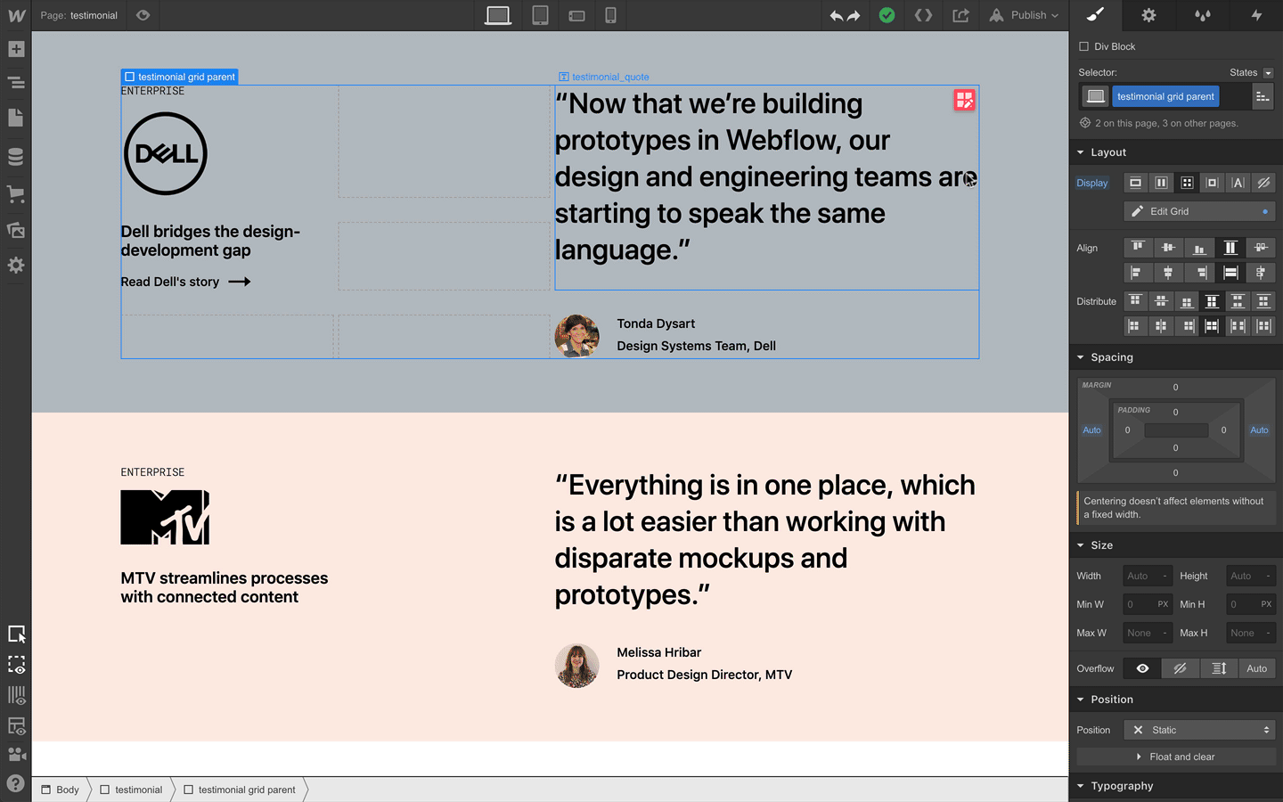
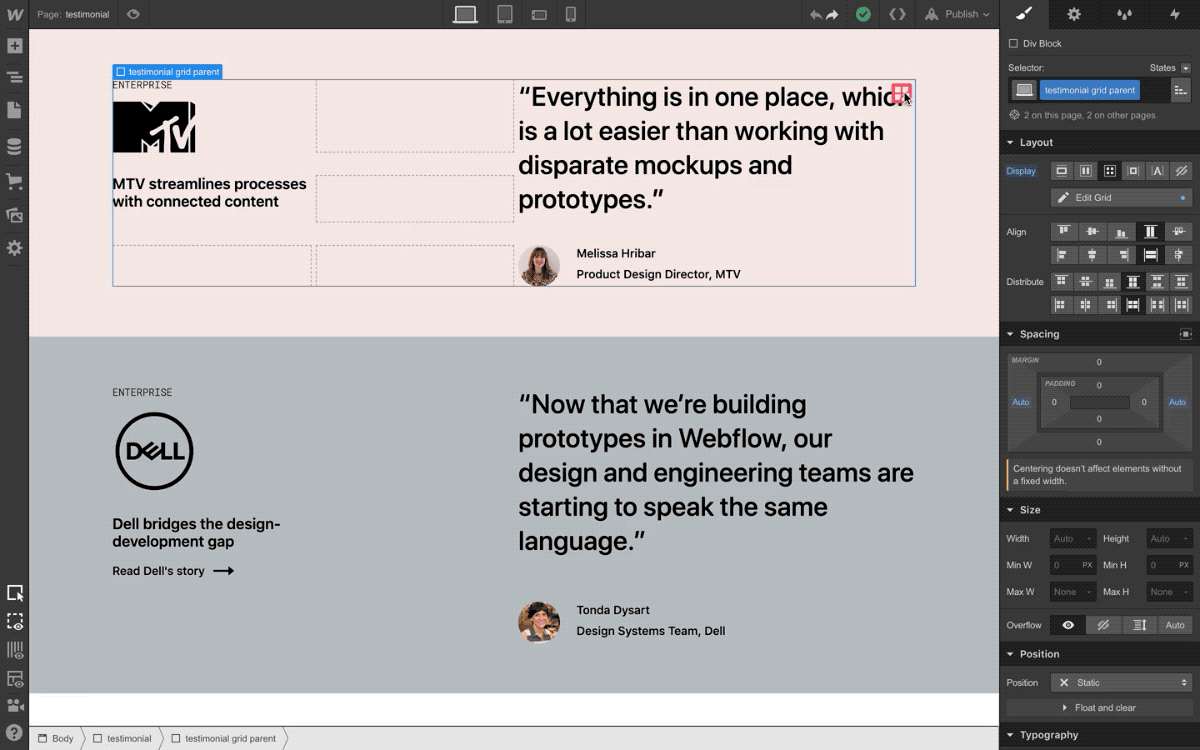
Testimonial sections
As we walked through in the primary example of this post, a recurring layout like a testimonial section is another great candidate for using template areas.
Bonus points: nest the grid layout within a parent grid that you can change the background color for with a simple combo class (as we’ve shown in the cloneable example).
Restaurant menu
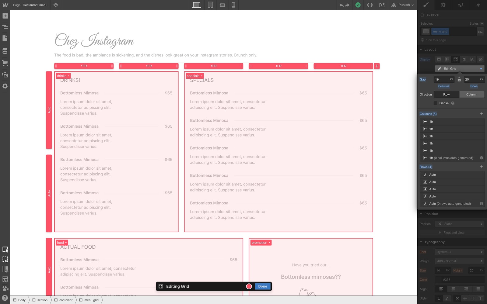
Another example we’ve been playing around with is a restaurant menu, which as you might imagine, lends itself well to a grid-driven layout. If you’re going to be creating menus for multiple meals that use the same structure, you can use grid template areas to reuse that layout and keep it consistent as you update it.
What are you going to build with grid template areas? Let us know in the comments.