If you opened the Designer today, you might have noticed a little toggle at the top of the all-important style panel, along with a message that reads:
The style panel has a new look and some new features. Give it a try before it goes live for everyone. (And switch back when you need to during the beta.)
“So,” you ask, “what’s the deal?” Well, here’s the deal:
We’ve been working on a refreshed version of the style panel for some time now, and after months of using it internally, we’re rolling the change out for everyone using Webflow — first in beta behind a toggle, and then to everyone after Wednesday, February 13th.
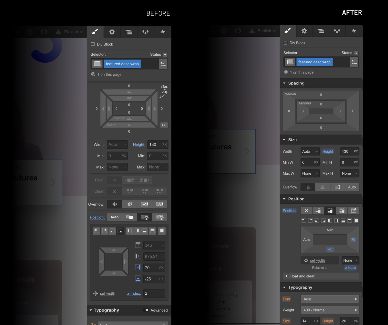
During the beta, you’ll be able to switch between the old and the new style panel as much as you’d like. (The Designer will also remember which version you’ve been using, so you won’t need to switch around once you’re used to the new one.)
At the end of the month in beta, we’ll make a permanent switch and have this new style panel be the norm for everyone using Webflow. If you have any questions or run into unexpected issues during the beta, please join the discussion in our forum.
Why we’re changing the style panel
A fair question comes to mind at this point: why even make this change in the first place? Here are the core motivations, summarized:
Performance improvements
Rebuilding the style panel with a cleaner code base has improved the speed and responsiveness in several areas of the Designer by nearly 2x — and lays the groundwork for substantial performance improvements down the line.
Faster development
This project also standardizes the UI components we’re using to build new pieces in the style panel, which will allow us to maintain and build new features faster, in a more consistent and sustainable way — which means new features in your hands faster. (Fun fact: a lot of it is built with CSS grid.)
Clearer organization
Alongside a bunch of smaller UX improvements (more on these below), we’ve also changed how various style properties are grouped to make styling more intuitive. For example, text shadows now live in the typography section, rather than in the general “shadows” section.
Modernized style
At the same time, we’ve cleaned up the UI of the style panel throughout, relying less on icons, tightening up spacing, and generally improving readability of the various sections.


The modern web design process
Discover the processes and tools behind high-performing websites in this free ebook.
New features
This is more than just a reskinning of the UI though — this new style panel introduces a bunch of small new features and improvements throughout. Here’s a quick rundown of what’s new.
Position: sticky
One of the more exciting parts of this new style panel is a brand new “sticky” property in the positioning section. This property allows you to pin elements at a specific position as you scroll down the page. Longtime Webflow users are all too familiar with how to do this with custom code, but thankfully those days are gone.
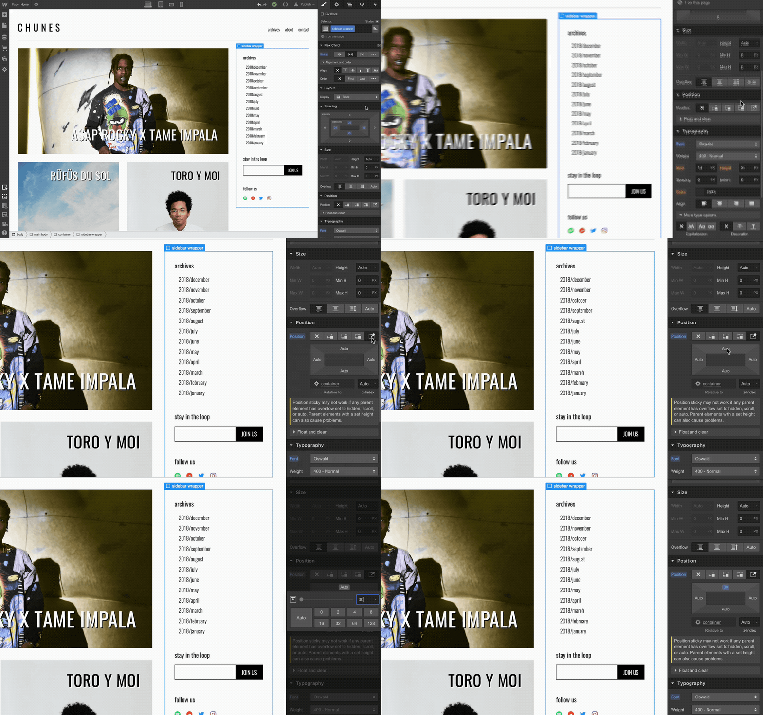
Redesigned spacing and positioning
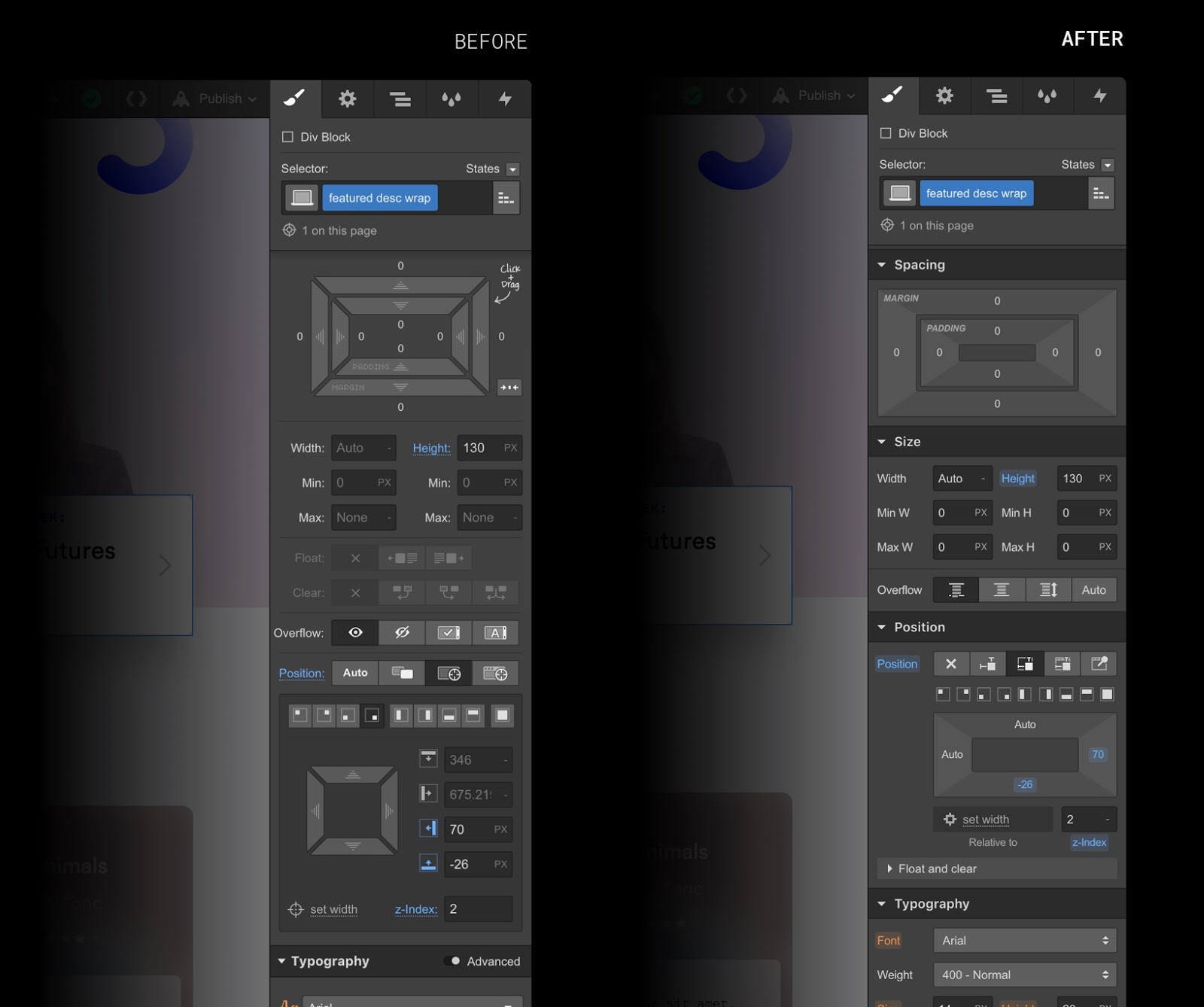
One of the more noticeable changes is how we’ve reorganized and redesigned the layout section, breaking it into three new sections: spacing, size, and position. This makes the UI more legible and organized. We also cleaned up the margin-and-padding UI to give everything a cleaner, more up-to-date look — and enlarged the click targets to make these controls faster and easier to use, per Fitt’s law.
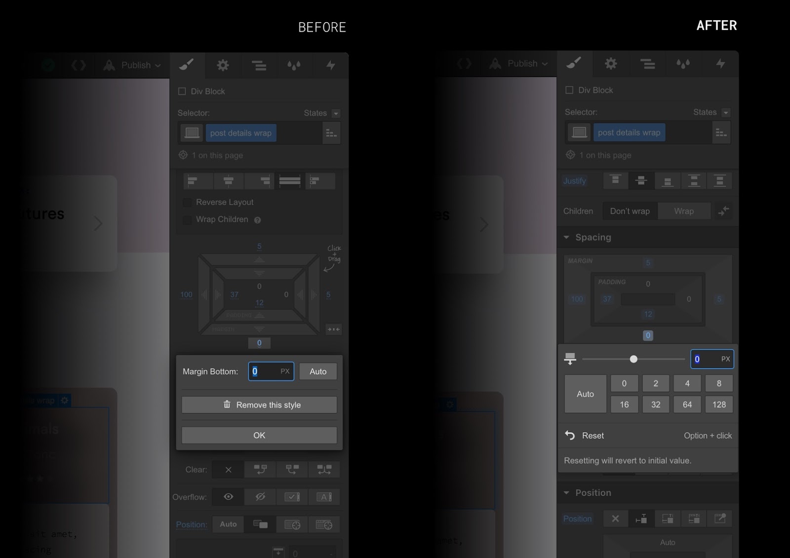
You’ll also notice the padding and margin controls have a new context menu that lets you apply preset spacing values.
Improved dropdown menus
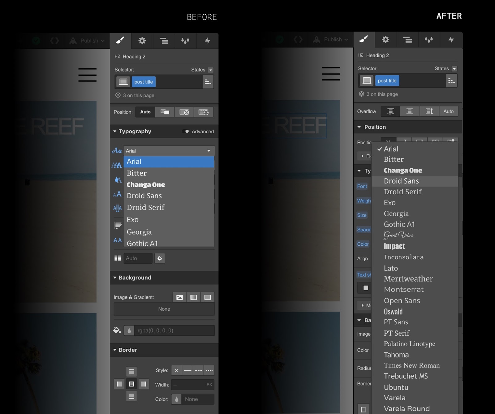
If you’ve ever been frustrated by the amount of scrolling you need to do when choosing things like fonts and filters from a dropdown, we’ve got good news: the new style panel has improved, full-height dropdowns that make it a lot easier to get at what you’re looking for.
Redesigned color picker

Another small improvement: the color picker got some new love, with a new opacity slider and additional support for HSB (hue, saturation, brightness) color values (you can also click to toggle between HSB and RGB).
More precise gradient controls
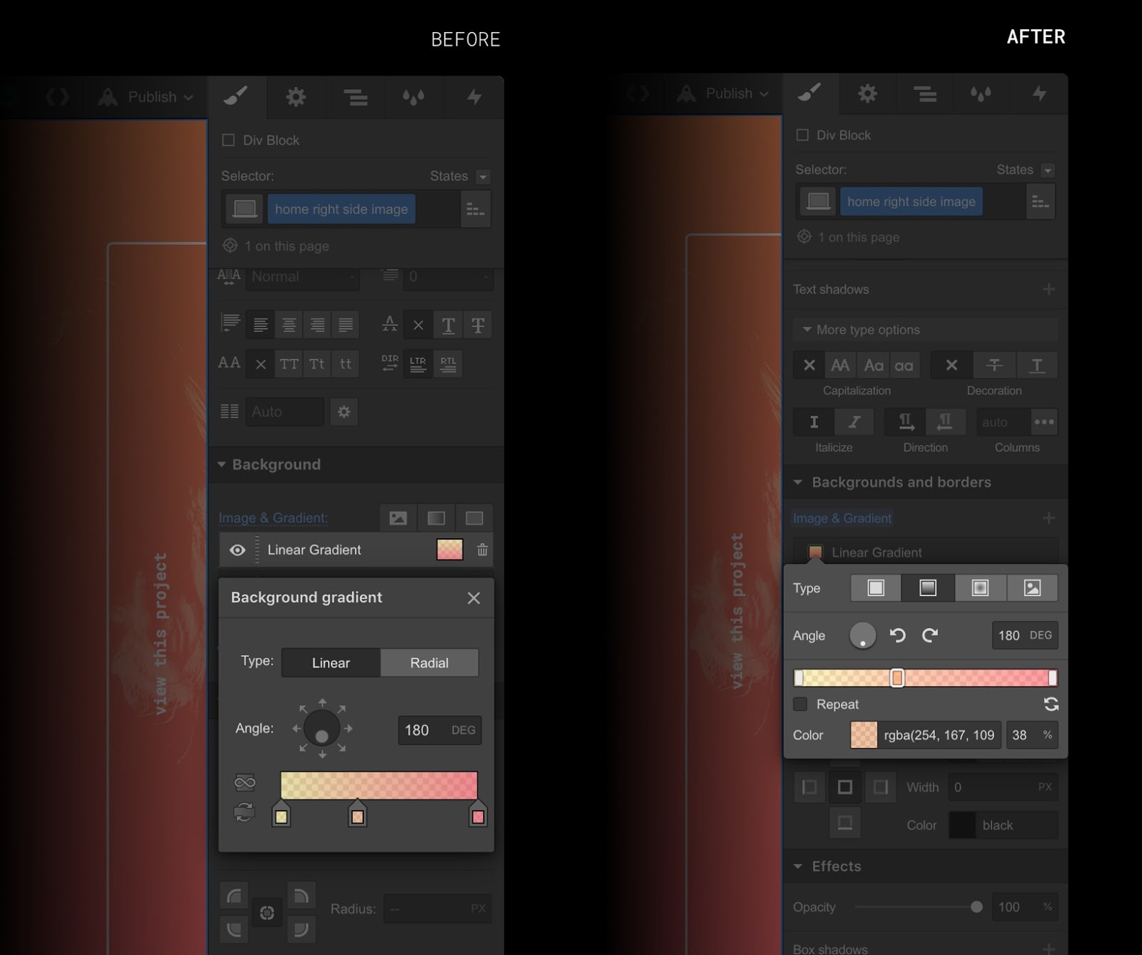
The gradients panel got a redesign too, complete with a new percentage input for greater precision when crafting the different stops in your gradient spectrums.
Redesigned border radius controls

In the realm of border radius, we've added a slider that lets you control all four corners at once, along with a new view that lets you control all the corners individually.
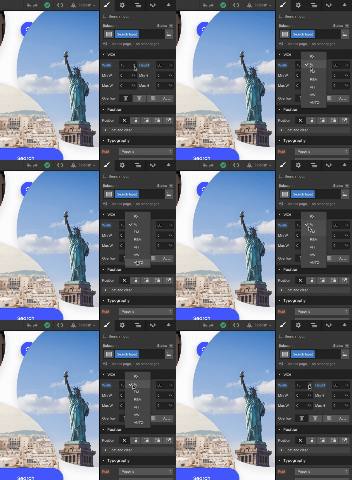
Expanded unit menu
You’ll notice that style inputs have an expanded set of available units, now including vh, vw, em, and rem. While you’ve always been able to enter these units manually, we’re making it a bit more explicit this time around.
How you can help
We’ve been testing this new style panel rigorously, but there’s always the chance that an unexpected bug or two have slipped in that might affect your workflow.
To help everyone make a smooth transition to the new style panel, please report any issues or unexpected behavior that you run into on the forum and we’ll look into it.
(Thanks so much for your help, in advance!)


