It’s hard to name a trend that’s become as all-consuming, and as polarizing, as the illustration style we’ve come to know as Corporate Memphis.
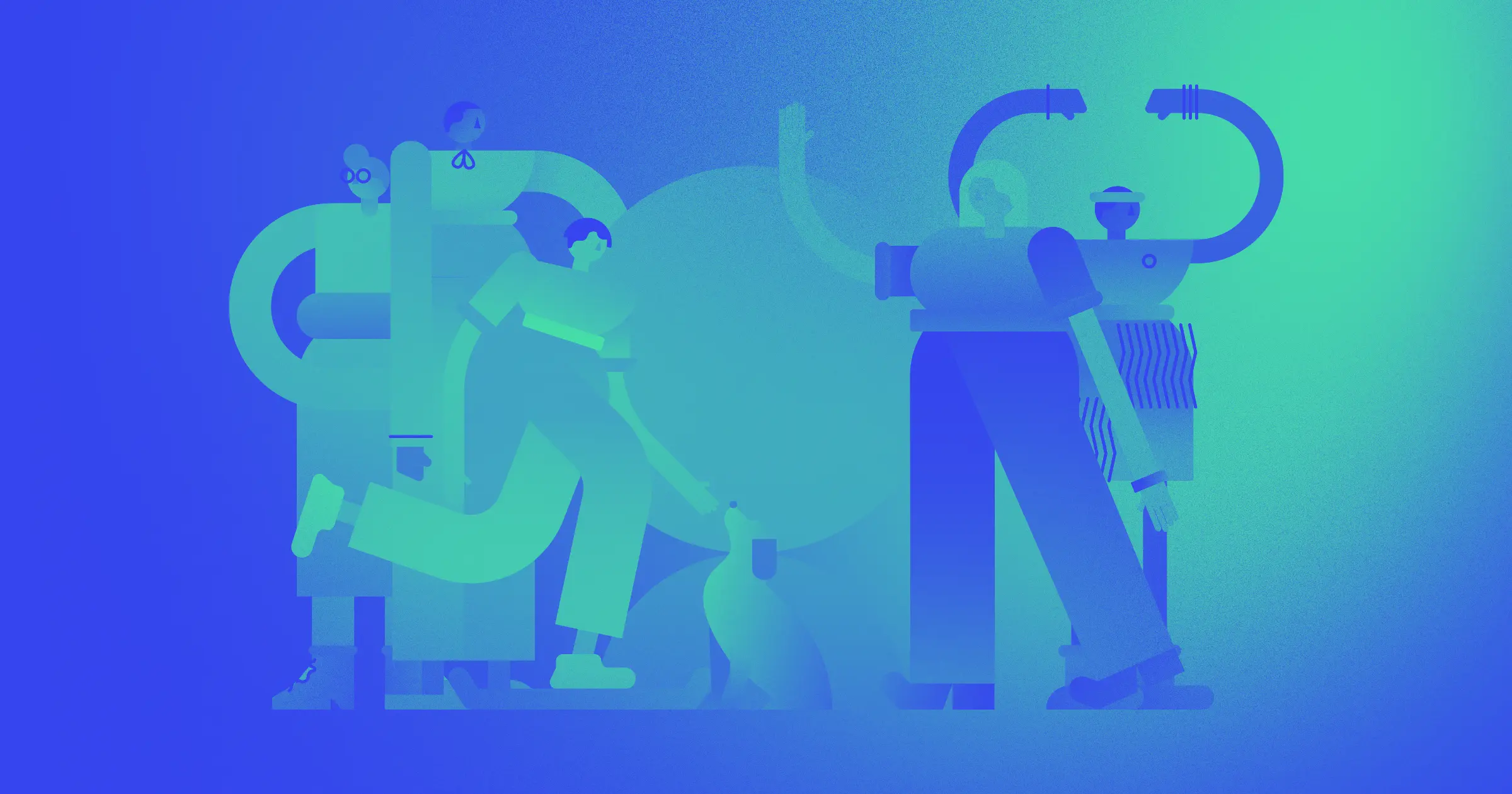
The rubber-limbed, brightly colored human figures who tumble across subway ads, Instagram sponsored posts, and big tech websites are instantly recognizable and have generated a lot of debate.
Their instant and overwhelming dominance of corporate design sparked humorous and derisive names like “Globohomo” (standing for globalized homogenization), “Big Tech Art Style,” “Late Silicon Valley,” “Humans of Flat," "Neoliberal Vector Minimalism, "Bougie Design Aesthetics,” and "Humanist Blandcore.” Despite the criticism, the long-limbed, blue people don’t appear to be going anywhere any time soon.
Today, Corporate Memphis has a bad rap of being considered as thoughtless art. However, the first designers to pioneer the style put thoughtfulness and intention into its creation, and its features are grounded in a rich history of art and design. But the aversion people have to Corporate Memphis also stems from issues that are deeper and more complex than a simple, whimsical illustration design might suggest.
The meteoric rise and just as impressive fall of Corporate Memphis tells us a lot about design — trends, public perceptions, corporate culture, and the future of design itself.
The origins of Corporate Memphis
Trends within art, design, and illustration reflect a lot of our society's changes. This journey through the history of art and design shows some of the ways these movements led into each other and reacted to the times they were created in. Corporate Memphis has its roots in the general nostalgia for the 80s that arose in the late 2010s. It even gets its name from an influential (and equally criticized) design movement called Memphis.
The Memphis Group
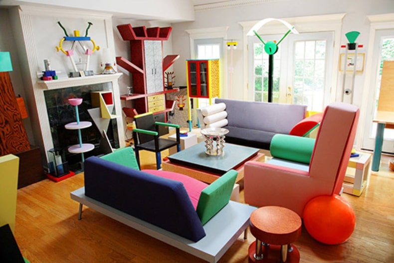
The name Corporate Memphis arises from the style’s resemblance to the iconic 1980s designs of the Memphis Group. The style influence is obvious, with the bright blocks of color, childish patterns, and oversized geometric shapes. Bertrand Pellegrin described Memphis design as "a shotgun wedding between Bauhaus and Fisher-Price" in the San Francisco Chronicle.
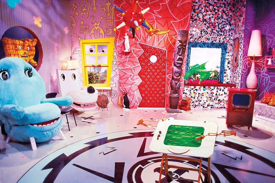
The style rejected the idea of "good taste" and made purposefully flashy and impractical furniture. You might recognize its influence in the design of Pee-wee’s Playhouse or the 1989 show Saved by the Bell. Even David Bowie was a fan. Like the illustration style that took its name, Memphis was criticized during its time for glorifying conspicuous consumption and being a sign of tasteless consumerism.
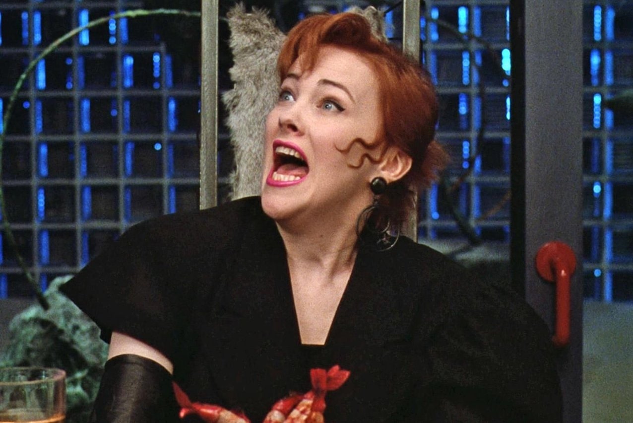
In the 1988 movie Beetlejuice, self-involved artist Delia Deetz antagonizes the main characters post-mortem by stripping their home of its quaint charm and replacing it with tacky Memphis design. The result is iconic. Memphis is also used in 1987’e Wall Street te showcase stockbroker Bud’s tasteless corporate wealth.
Despite the criticism at the time, Memphis came to define the 80s aesthetic. While designers today nostalgically look to the 80s for inspiration, Memphis Group members were also influenced by earlier movements. Their design took cues from the curved lines and bold geometry of the 1920s Art Deco movement, the colorful futurism of 1950s atomic-age interior design, and the bright colors and bold patterns of the 1960s Pop Art movement.
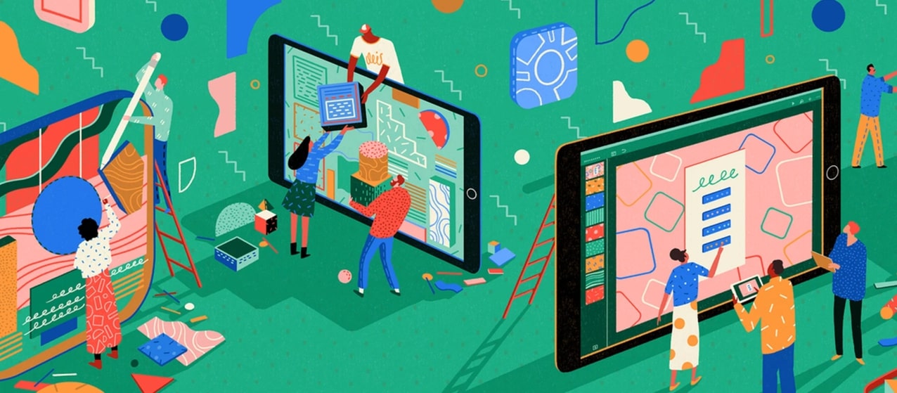
Yukai Du’s illustrations for Apple’s in-store design take a lot of inspiration from the designs that came out of the Memphis group. In an interview with Creative Lives, she describes feeling a lack of connection to popular 3D animation and turning to previous styles of illustration for inspiration instead. “I started doing a secondary course in illustration and illustration books,” she explained, “After that, I started to bring my illustration style into my animation.”
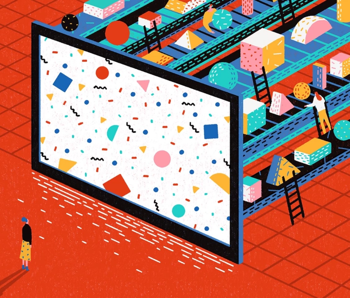
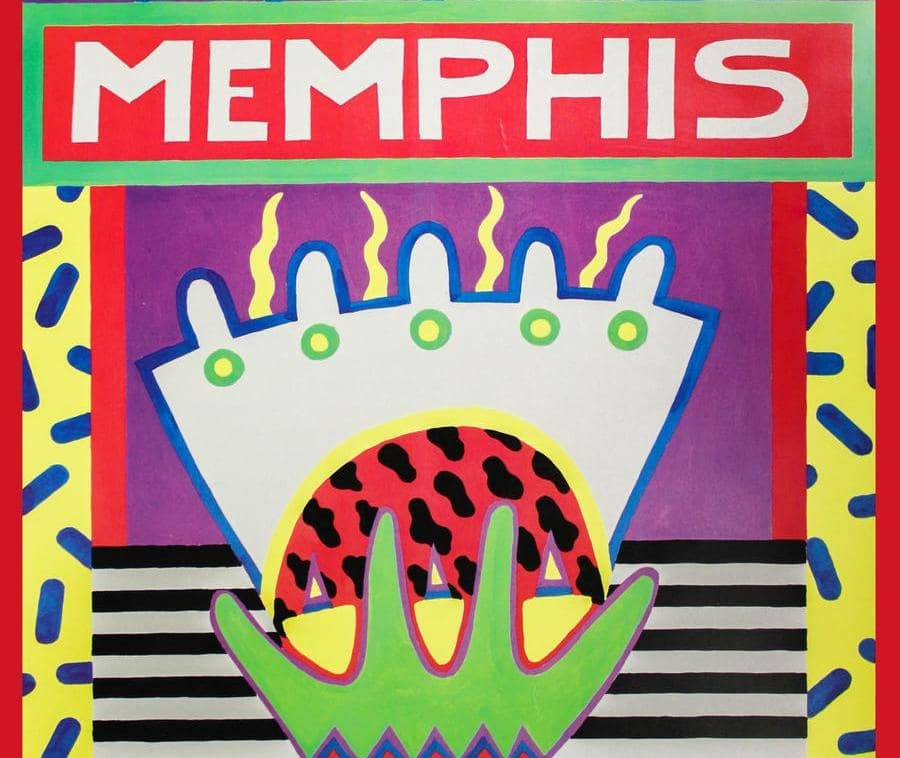
The patterns she uses — grids, dashed lines, and tiny geometric shapes — call to mind Nathalie Du Pasquier’s designs for Memphis-style textiles and prints. The chaos in the tiny repeating patterns brings liveliness to a still image. Du describes her thought process in creating patterns in an interview with Vimeo, “I saw sunlight reflected on the water and the movement was so interesting, like little shiny dashed lines,” she said, “I had tried to use dashed lines to animate some light movement.”
Modernist illustration
In the mid-century era, commercial illustration bloomed as an art form, using a modernist approach to form and color to create spectacular mass-produced images. The Modernist art movement at the end of the 19th century had moved art away from realism. Freed from pure representation, modernism gave rise to Bauhaus’s purity of color and shape, the “carved colors” of Henri Matisse, and Picasso’s cubist portraits, which all became major influences on commercial illustration.
Alice Lee, the designer behind Slack’s illustrations in 2017, cited two modernist illustrators as influences on her blog. “I referenced much of Mary Blair's legendary body of visual development at Disney for designing warm, whimsical characters,” she explained, “And it was hard not to fall in love with the "minimal realist" compositional balance that Charley Harper strikes."
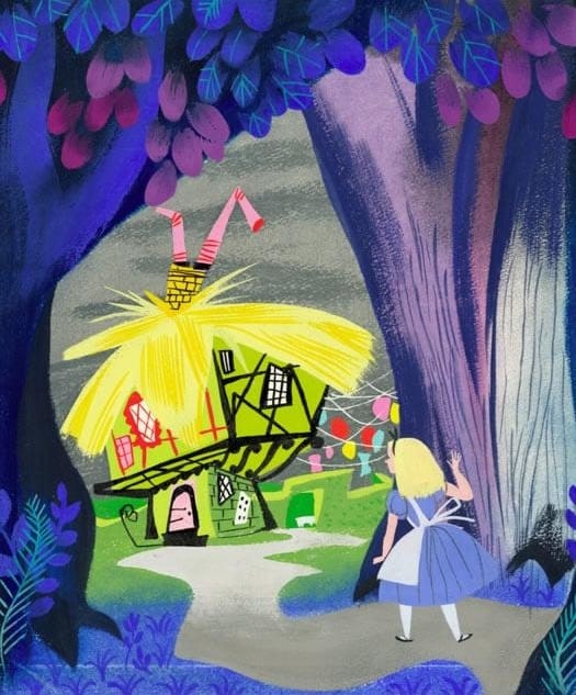

Mary Blair created many of the early concept art for Disney films in the 1940s and 50s. She went on to paint illustrations for many of the Little Golden Books. She was an expert at creating expressive characters with minimal detail. Her influence shows in the soft and sweet human figures Lee designs, as well as the way she incorporates muted textural colors that almost feel like ink.
When asked to describe his approach, Charley Harper explained, “When I look at a wildlife or nature subject, I don't see the feathers in the wings, I just count the wings...herein lies the lure of painting; in a world of chaos, the picture is one small rectangle in which the artist can create an ordered universe.” Like the Memphis designs he inspired, his images are clearly recognizable for what they are — usually birds and other natural subjects — despite reducing form down to its most basic shapes.

Lee brought an intimacy to her work for Slack that makes the characters feel more relatable than some of the examples of Corporate Memphis that get the most hate. “Ultimately, I think you can trace the influences of Mary Blair and Charley Harper, and the principles behind their work,” Lee elaborates, “expressive characters; organic, imperfect shapework; bold colors and warm tone, etc. and I'm happy to have incorporated some of the whimsicality of animation and children's publishing into enterprise tech illustration in this way.”






Get started for free
Create custom, scalable websites — without writing code. Start building in Webflow.
The Millennial Aesthetic
The Millennial Aesthetic is the overwhelmingly dominant design trend of the last decade. It shares clear elements with Corporate Memphis — curved lines, clean white backgrounds, and a dreamy color palette featuring houseplant green and millennial pink, defined in The Cut by Véronique Hyland as “ironic pink, pink without the sugary prettiness. It’s a non-color that doesn’t commit, whose semi-ugliness is proof of its sophistication.”
The resulting designs are childish, bright, and fun. They are relatable but not distinctive. They give a casual and hand-made look while being infinitely replicated. Both styles are also very technically suited to web-based advertising because their white backgrounds, clean lines, and sans-serif fonts read clearly and easily on a smartphone screen. The Millennial Aesthetic is even commonly called “Instagrammable.”
Both design styles have also been criticized for their bland corporate inoffensiveness. “It kind of feels like a binky,” said Deborah Needleman, former editor of Domino Magazine, “It’s like it has no edge or sense of humor or sense of mystery. There’s no weirdness. There’s nothing that clashes. It is very controlled.”
Big Tech popularizes the style in 2017
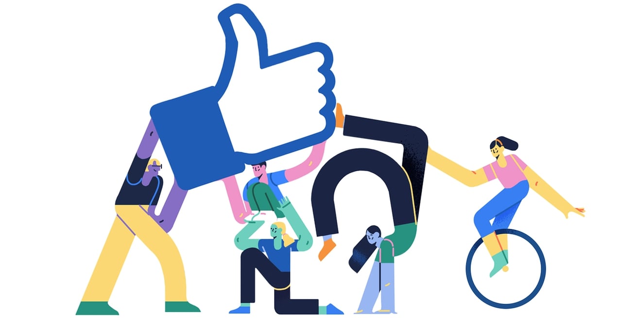
The popularization of Corporate Memphis is generally considered to have started with the launch of Facebook’s Alegria in 2017, accompanied by similar style launches by other big tech companies. Designed by LA-based studio BUCK, the name Alegria came from the Spanish word for joy.
The key features of Corporate Memphis include:
- Exaggerated human figures, often featuring oversized, bendy limbs, small heads, and little to no facial features.
- Movement! Figures are often dancing, jumping, cartwheeling, active.
- Skin tones in unnatural shades like blue, yellow, and green.
- Flat colored geometric shapes (vector graphics).
- Bright, whimsical colors. Either bright primaries or soft pastels.
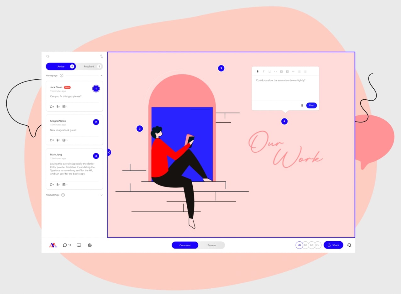
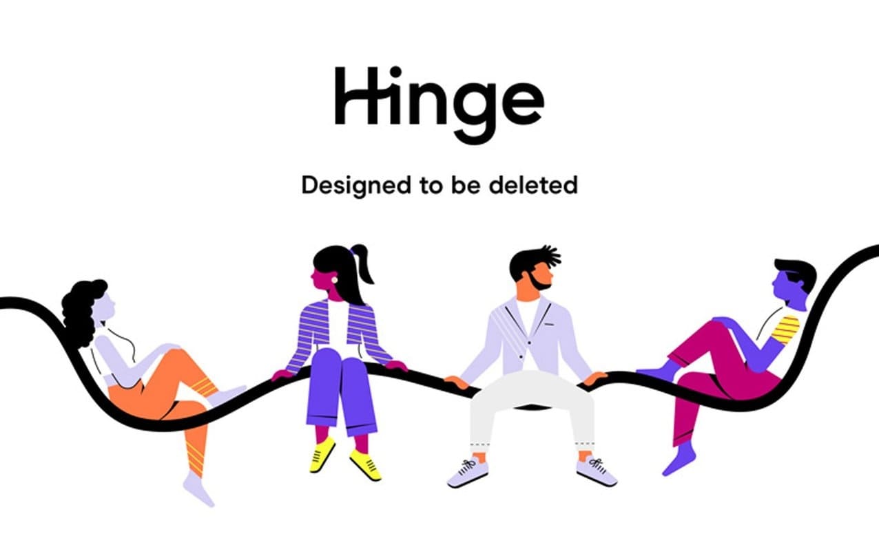
Corporate Memphis hit a perfect sweet spot in the trend cycle, tapping into a rise in nostalgia along with technological shifts that moved trends away from 3D and toward flat design. The aesthetic became especially popular for companies making digital services for consumers such as apps, startups, and SaaS in general. From Google Fi to the dating app Hinge, to B2B services like Markup.io, and even as far as the California DMV, the style started showing up everywhere.
Web design trends and a push for inclusion put Corporate Memphis in the limelight
The inspirations behind the illustration style are interesting, but why did it end up being so overwhelmingly dominant in corporate design? Memphis arose at a time of overall change in web and mobile design that meant it was perfectly positioned to fill a niche.
Web design was abandoning skeuomorphism
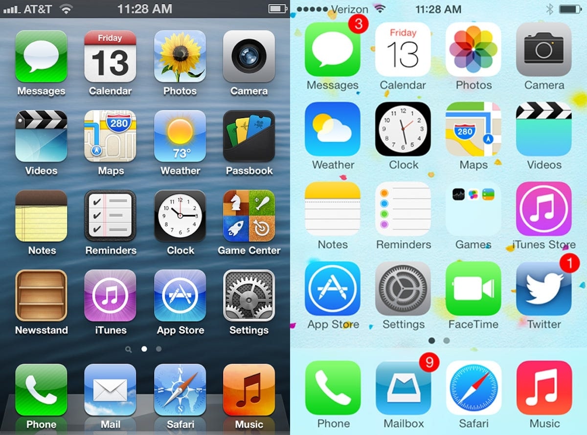
Early smartphone design tended to use skeuomorphic design — apps often visually replicated their real-world counterparts. The glassy camera lens of the old Camera app and the yellow lined Notes icon are examples. That was helpful when the world was still getting used to translating their experiences to digital functionalities.
By 2012, trends turned, as they do. An article from 2012 describes the turn against skeuomorphism at Apple: “There was lots of internal email among UI designers at Apple saying this was just embarrassing, just terrible.” Designers at the time talked about the style just as disparagingly as Corporate Memphis is described today, calling it “tacky,” “unhelpfully ostentatious,” “outmoded,” and “lipstick on a pig.”
By the mid-2010s, the consensus was that skeuomorphic design wasn’t necessary anymore, and the glossy 3D of the old icons just added clutter to the interface. Web design flattened and simplified. The iPhone iOS 7 update in 2013 lost the 3D effect on text bubbles and introduced a simplified design for its icons, and many apps and websites followed suit.
Vector graphics are better for the modern web
Flat design became the dominant style after skeuomorphic design fell out of favor. Illustrations became more popular, often replacing photography, and those illustrations became simpler, flatter, and easier to create. BUCK’s Xoana Herrera talked about the move toward simplicity when designing Alegria. “The style originally started as something more intuitive and complex, but after different reviews, it started to shift towards something simpler to copy and implement.”
The flat geometric shapes in Corporate Memphis are especially suited to being created as vector images. They were scalable, easy to animate, and easy to create and replicate for however many pages or situations a company might need illustrations. Image libraries like Humaaans and Open Peeps even allow non-designers to create their illustrations. Especially for smaller companies with less design budget, this sort of illustration style is a lot cheaper and more accessible.

For web illustration, vector graphics have a lot of advantages over photographs and other raster graphics when building for the modern web. They’re better for creating responsive designs for websites and graphics for multi-channel campaigns because they display better at different sizes and resolutions. Unlike raster illustration, they don’t need breakpoints and won’t get pixelated if the sizing changes.
Corporate Memphis is more inclusive
Human figures with unrealistic proportions and non-human skin colors are able to represent customers and communities without ever explicitly including or excluding one group of people. BUCK studio explains, “We designed and built a scalable system rooted in flat, minimal, geometric shapes. The figures are abstracted — oversized limbs and non-representational skin colors help them instantly achieve a universal feel.”
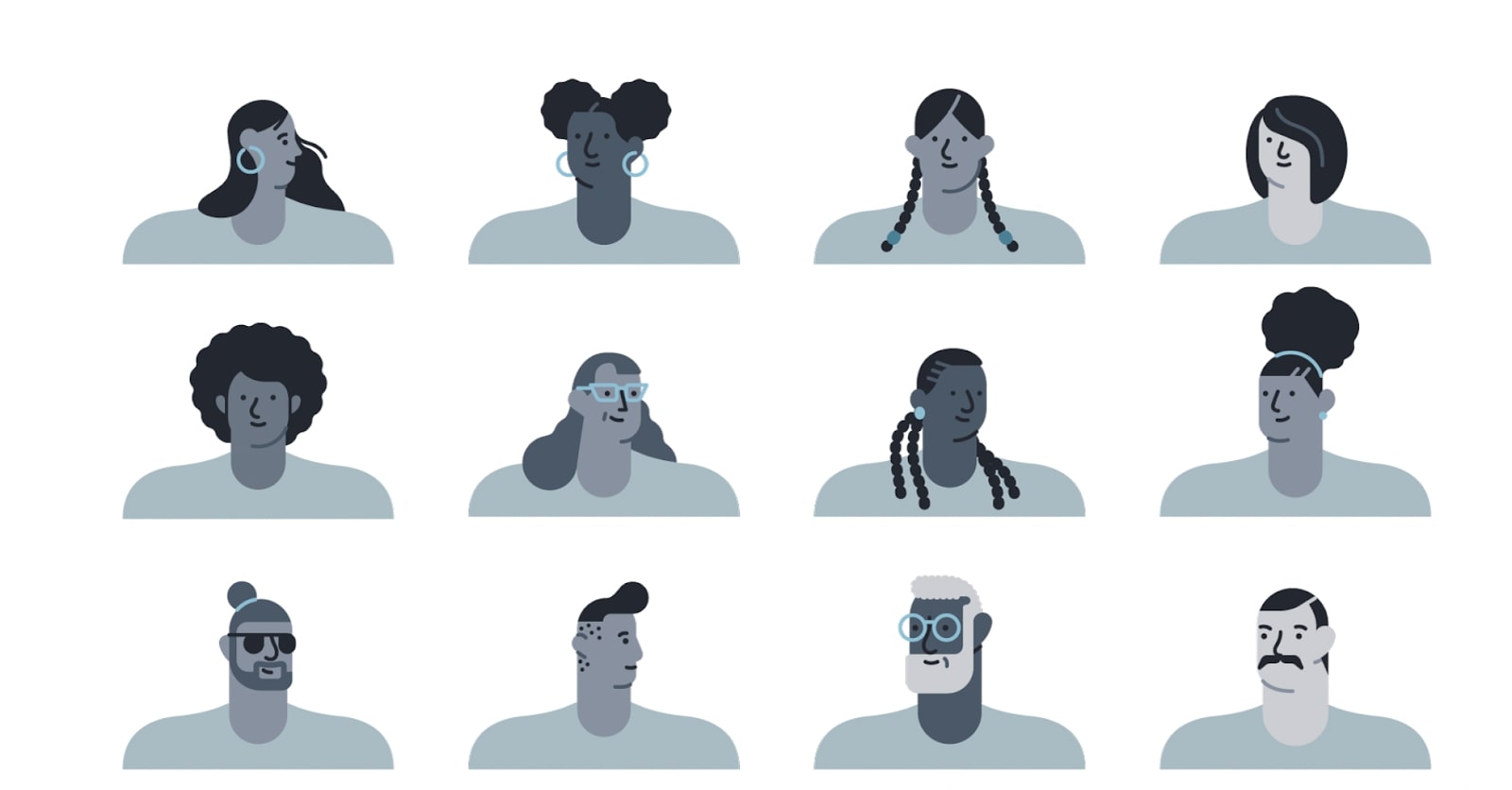
Illustration to represent people rose in popularity during a time when consumers were becoming more critical of the way photographs in advertising were showing diversity. Businesses have made a more conscious effort to depict diversity in their imagery but still struggle to make real inclusion happen behind the scenes. One university was even criticized for relying on a single photograph of a Black student so heavily they photoshopped him into their recruiting materials.
The show Succession captures the dynamic beautifully in this scene where Cousin Greg watches a pointedly diverse corporate training video as a stream of white male employees exits the room behind him. Consumers are media-savvy enough to notice the disconnect. Using illustrated people instead of photographs allowed businesses to sidestep the issue entirely.
BUCK’s Xoana Herrera describes the choice to avoid explicit representation, writing that characters are “designed for expression, rather than individual identity. They are ethnically non-specific to represent diversity.” Without specific identifiers, they can represent any body type, any gender, any race.
Corporate Memphis’ homogenized and bland aesthetic spurred negative reactions
Despite the inclusive intentions of its creators, public reactions to Corporate Memphis have been almost universally negative. The words used to describe it point to some reasons why — corporate, homogenized, big tech, neoliberal, bougie, bland.
Corporate Memphis relates to everyone and no one
As Herrera described above, the figures are designed to be “ethnically non-specific.” But there’s a world of difference between “representing diversity” and actually being diverse.
No one is underrepresented, erased, or tokenized by a blue person...but no one is represented, uplifted, or made to feel seen by them either. “You're trying to make marginalized people feel included...by portraying them as these grotesque colored homunculi," complained one online commentator.
Minority groups as a whole want more than just a lack of non-inclusion. People want to see themselves authentically represented in advertising and media. They want products designed with their specific needs in mind, made by companies that understand and respect their communities and their perspectives. Generic figures are never going to communicate that.

It is possible to approach Memphis-style illustration in a more authentically inclusive manner. Jennifer Hom, the designer behind Airbnb’s illustrations, explains that she, like many designers, had been afraid of getting diversity wrong and had defaulted to genericism instead. She describes it as “a metaphor for diversity through rainbow-colored figures...Put simply, they’re not real.”
To remedy this, she set about ensuring that her illustrations would represent real Airbnb users. “Using real photos for inspiration...ensures authenticity when we depict diversity because it leaves no room for the artist to generalize or stereotype.” She found when she wasn't running away from real representation and instead leaning into it in her work, the resulting images felt warmer and represented their community more authentically.
Corporate Memphis feels sinisterly corporate

The saccharine aesthetic of Corporate Memphis combined with the Big Tech companies who use it is what gives many people a creeped-out or dystopic feeling. Claire L. Evans, the creator of the original Are.na board for the style explained that the illustration style “makes big tech companies look friendly, approachable, and concerned with human-level interaction and community – which is largely the opposite of what they really are.”
The human figures in Corporate Memphis are aggressively happy, always in motion, and portray an image of harmonious utopia within their illustrations. This bleak, dystopian short film captures the effect by contrasting a bright, happy mural against a backdrop of corporate unhappiness and drudgery.
In a Marketplace Morning Report interview, Mike Merrill, who has been credited with coining the term “Corporate Memphis” itself, says, “It is all about this idea of, ‘Trust me. I’m a trustworthy company.’ And let’s not look behind the curtain and see what’s actually going on.” In a time of ongoing data privacy scandals, environmental destruction, and the covering up of safety hazards, the conversation around Big Tech is much more complicated than the illustrations convey.
Corporate Memphis is oversaturated
Overexposure to a trend tends to create annoyance and provoke mockery. A lot of the backlash might simply be due to how overwhelming the Memphis trend is and how utterly surrounded by it consumers and designers are both on and offline. “The desire for individuality rebels against its sameness, even as the sameness feels reassuring, feels good,” says Molly Fischer in The Cut, writing about the ubiquity of Millennial Aesthetics.
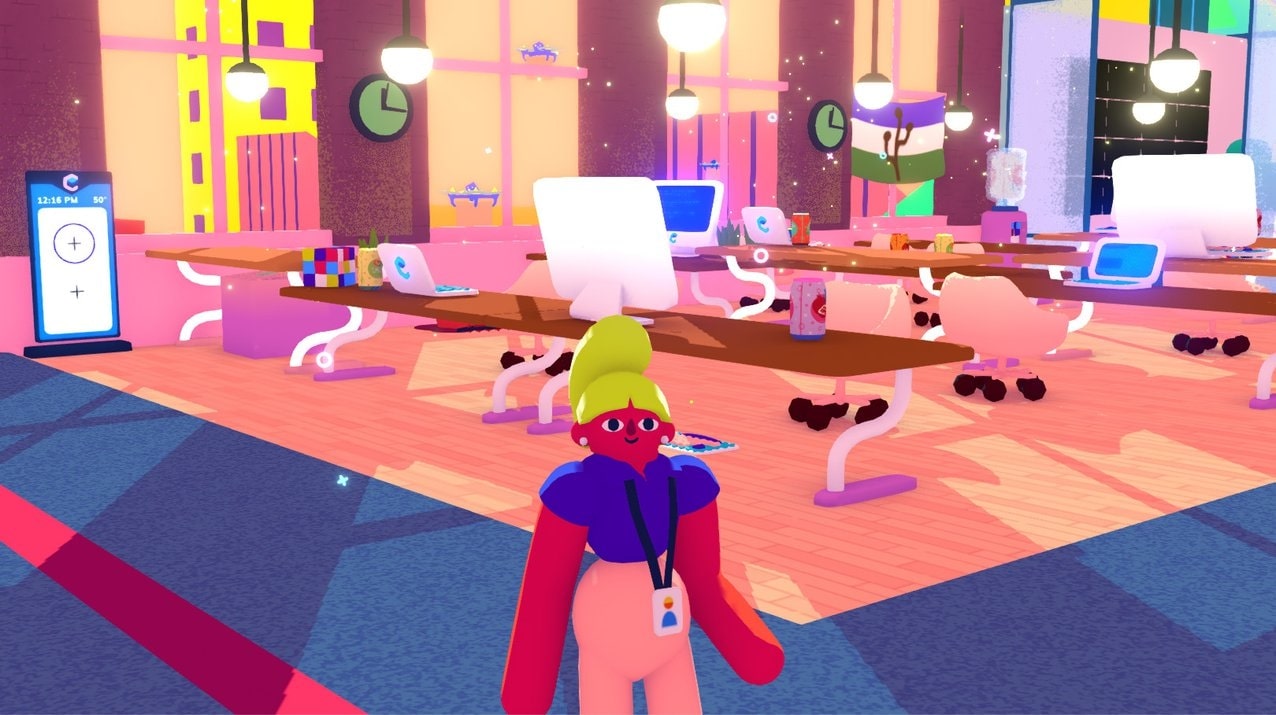
Articles have popped up complaining about it, from Wired’s Why does every advert look the same? Blame Corporate Memphis to t-art mag’s What is Corporate Memphis and Why is it Everywhere?. There are multiple Are.na boards and Twitter accounts collecting hundreds of examples of the style. There’s even a video game called Going Under, which allows you to play as a Corporate Memphis-style intern wreaking havoc at your failing tech startup.
Corporate Memphis doesn’t communicate to consumers what a brand actually does
The other big drawback to the style is a result of its ubiquity and the bland sameness of contemporary marketing imagery. Beyond simply being boring, when visual branding is all so homogenous, consumers end up not being able to tell what any of these companies are actually offering them.
Can you tell what any of the three companies below do from their illustrations?


Aragon is a DAO deployment platform, LinkedIn Learning offers work-training courses, and Pastel is a web design feedback tool. Even though each of the illustrations does feature the characters engaging in their companies’ core activity, the similarities in style make the aesthetic more prominent to a viewer than the content.
Effective marketing connects a need to a product in the customer’s mind. Most Corporate Memphis communicates neither, and if it does, it’s unlikely to stand out against a sea of visually similar brands. When skincare brands, business communication apps, and the DMV all share the same visual branding, how is a customer supposed to connect strongly enough to any of them to commit to using them?
Corporate Memphis is on its way out. What’s next for web design?
The zeitgeist might be over. Corporate Memphis is following the typical long-tail pattern of trends. The blue people are still being seen on lower-budget ads and less trendy companies, but they appear to be on their way out. A trend can’t exactly hold onto its cool shine when the DMV and the health department have jumped onboard.
Designers are now musing about what might come next and imagining possible future design styles. This beautiful Are.na board explores the question by collecting a wide variety of styles that pull from the history of design and contemporary illustration. This sort of inspiration is a good place to start when a singular style has become so all-consuming it’s hard to imagine anything else.
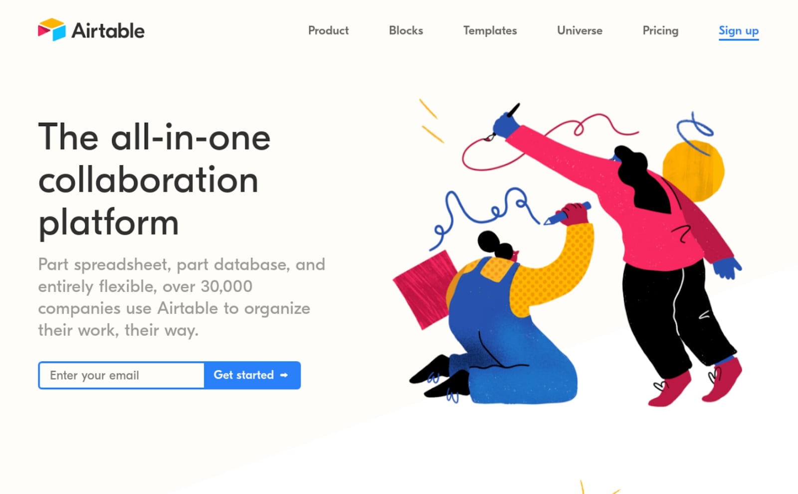

Airtable’s change in the call-to-action pages between 2019 and 2022 suggests what might be the next big design trend. While the bright colors and whimsically drawn shapes have stayed, the focus is now on the interface of the product, giving customers a clear message about exactly what their product does and how.
This style may be a direct response to the lack of specificity of Corporate Memphis’s illustrations. More and more SaaS marketing companies are moving toward using imagery of the product itself in action in their ads and websites. Illustrations are still simplified and stylized for clarity, but the product and the people using it are front and center.

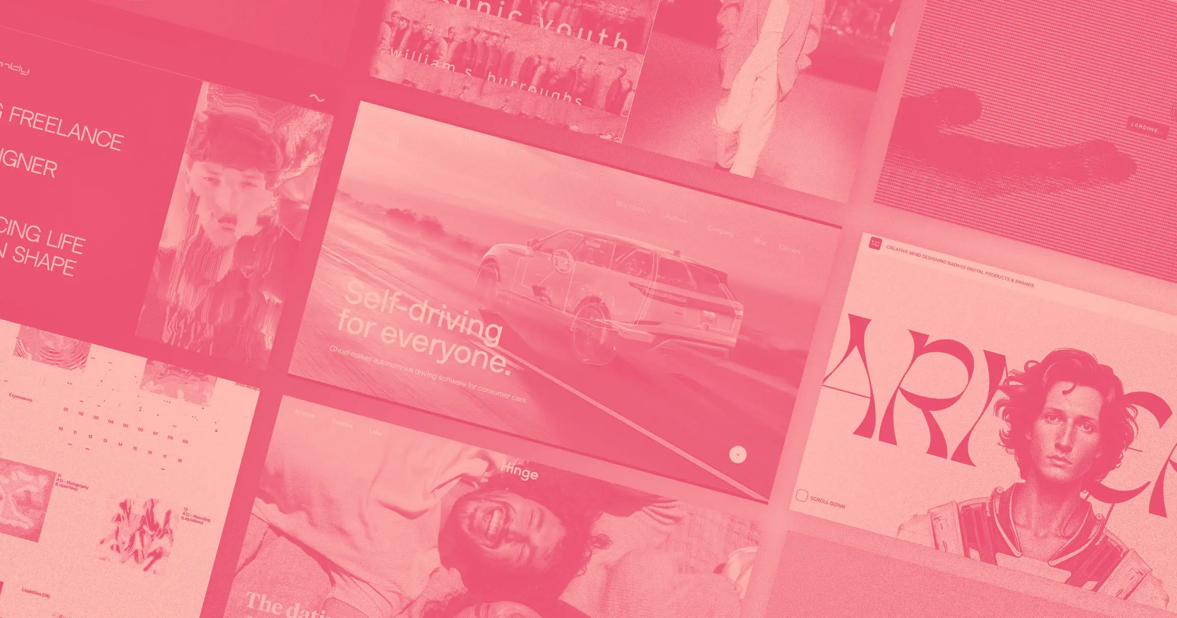
We’re going to see more interface-as-design, more screenshots, more real people and real use-cases, and more graphic elements made up of product components. Grounded imagery that’s truly representative of the product being offered might be the best way for a startup or software company to differentiate their product in the mind of customers in an oversaturated visual marketplace.
With the never-ending nostalgia trend cycle churning on, one might expect a nostalgic resurgence of the style in another 20 years. Make sure you save your Corporate Memphis working files for a retro comeback in 2042.
