


With Y2K-inspired website designs, you can create a throwback that performs as well as modern tech.
Y2K website design is a style that re-creates the look and energy of late 1990s to early 2000s internet culture. It grew out of two simultaneous trends: the early internet becoming mainstream and excitement around what technology would look like in the new millennium.
The combination of trends created a design style that felt digital, spacey, and a little over the top. Compared to today’s minimalist layouts, Y2K sites had bold, maximalist visual choices, like high-gloss user interface (UI) elements, chunky and pixelated typography, and bubbles and blobs in bright colors. At the same time, popular subcultures like hip-hop and rave culture fed into the Y2K aesthetic with metallics and neon glows.
The late ’90s had limited web technologies, slow connections, and low-resolution images (compared to our current standards), but designers still brought big personalities online using simple animations and bold designs in 90s web design. When designers use Y2K today, they’re tapping into a mix of nostalgia and futurism without sacrificing usability.
How to create a Y2K website — with design examples
To make your website feel straight out of Y2K, its entire visual system should work together to create a retrofuturistic user experience (UX). Here are several design principles and best practices to echo the late ’90s and early 2000s aesthetic in your website.
Color schemes
Y2K color palettes are bold, synthetic, and overindulgent. Instead of muted tones, you’ll notice electric blues and teals, neon greens, and hot pinks, as well as silver tones that look like they’re from old media players or iMacs.
Early web graphics also used high-contrast colors so elements were visible on low-resolution screens. When you apply these colors to a modern site, aim for a “digital” palette — bright primary and secondary colors, with metallic or white accents — and add depth with gradients or glassy overlays.
Ideally, the interface should feel energetic and futuristic but still readable, so pair loud background colors with neutral text (or vice versa).
Here are a few examples of Y2K color schemes.
Chrome, metallic, and holographic
One way to recreate the Y2K aesthetic is to make your website look like it’s made of plastic, metal, or glass. In the ’90s and early 2000s, designers were excited about transparent, colorful plastic device exteriors and 3D-looking UI. This made silver panels, chrome borders, and pearlescent buttons with intense highlights and shadows a popular web design trend.

However, making your site’s entire layout reflective might be overwhelming for today’s visitors. Instead, use chrome or holographic accents around important elements like hero cards, feature blocks, or calls to action (CTAs). For example, Toffeenut Design Studio uses a swirling pearly white, blue, and pink design to create a shimmery effect in the hero and prefooter section backgrounds on DigiValet’s website. The page’s minimal UI cards also animate with a metallic finish when you hover over them.
To bring these design principles into your website design idea, start with a dark or neutral background, then layer a gradient that moves between two or three iridescent colors. Add a soft highlight on top to mimic light hitting the surface. UI cards with rounded corners and subtle, glossy inner shadows help sell the look.


Launch with Webflow Templates
Choose from hundreds of professionally designed website templates for any industry or style. Customize visually, launch instantly — no coding required.
Candy brights
Y2K’s bright candy-colored palettes have their origins in rave flyers, toy packaging, and early iPod-era ads. These palettes feature high-saturation colors like aqua, bubblegum pink, and tangerine, often used without neutral buffers. Designers wanted websites to feel fun and futuristic, and louder colors helped elements pop on low-resolution screens.
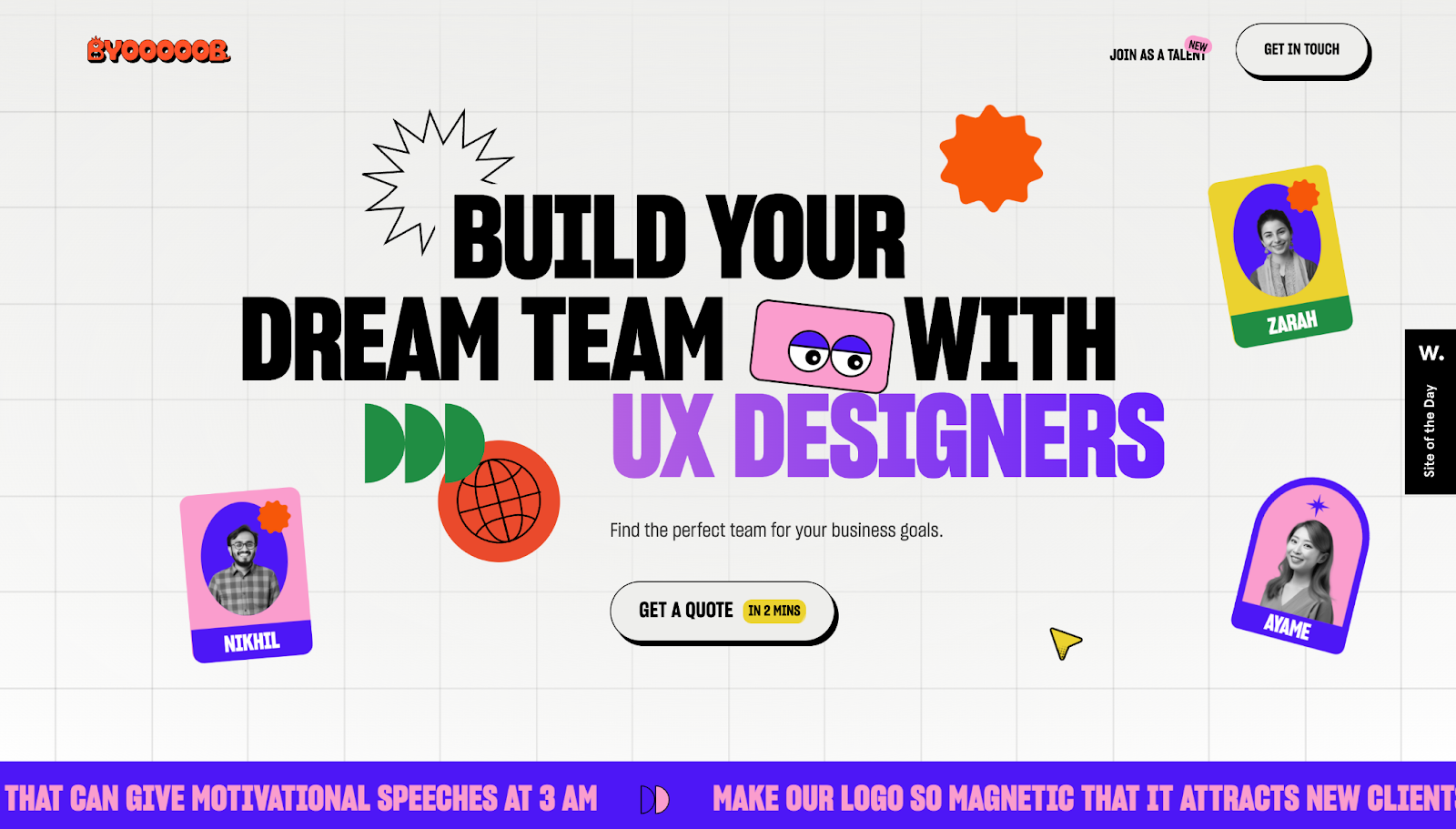
Byooooob’s website, designed by Brand Impetus, goes all-in on vibrant colors. Large blocks of pinks, blues, and yellows feel energetic, adding youthful, playful energy to contemporary corporate monotony. The structure becomes more modern with negative space. When the layout is clear, the color can be loud. If you’re going candy bright, give the palette more room to breathe than designers did in 2000 and balance the bold colors with clean sans-serif fonts.
Blended multichromes
Another popular Y2K graphic design choice is multiple colors on a feature — not simply a two-color blended gradient, but multiple luminous tones flowing into each other like an oil spill. In the early 2000s, these blended multichromes appeared in desktop wallpapers, media player skins, and UIs where designers wanted technology to feel organic and living. As tools improved, designers and artists began experimenting with more complex curves and gradient maps, so smooth, multicolor elements became a visual flex.
If you’re blending multichromes, think of your site’s background as a visual canvas. Take three or four colors from the same side of the color wheel — like teal, electric blue, violet, and magenta — and blend them just enough to avoid harsh banding when placed next to each other. Put your content on top of it in high-contrast cards so the multichrome doesn’t overpower the text.
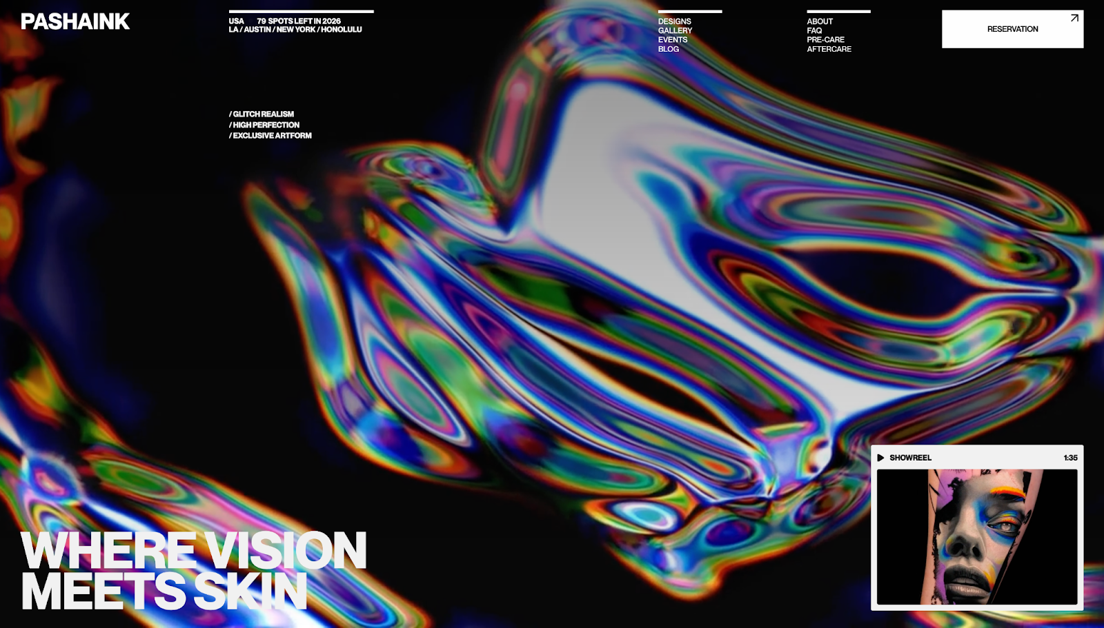
Artemii Lebedev implements colorful chromes well on Pasha Ink’s website: The gradients feel rich and multidimensional, shifting across the rainbow in a way that reads modern but maintains the Y2K glow. The multichrome puts a lot of color on the page, but it remains subtle while other elements are clearly visible and align with today’s design trends.
Monochrome
Y2K-inspired websites don’t have to be covered in neon and chrome. If you want something more editorial, monochrome palettes are another option. In the early 2000s, black-and-white monochrome started showing up in tech, fashion, and music-related pages — think Apple’s design system — because it felt sleek and professional.
A constrained color palette worked well with the technical limitations of the time: Fewer colors meant faster-loading pages and less compression, while UI, typography, and motion elements that pointed visitors toward CTAs remained the most engaging part of the site. If your brand identity is minimalistic but you still want your site to capture Y2K aesthetics, a monochrome color scheme is a modern way to do it.
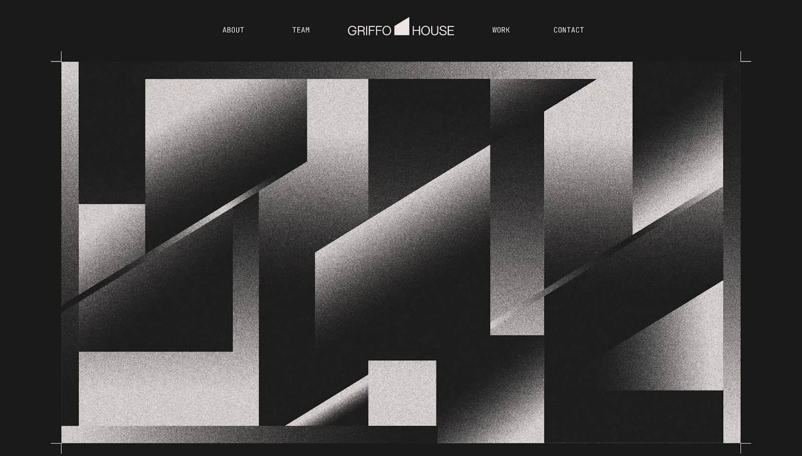
Griffo House uses a gritty, textured black-and-white monochrome aesthetic on their website to put a contemporary spin on Y2K web design. The layout leans on a restrained, monochromatic color scheme, with fonts and subtle surface treatments creating visual interest. The high contrast improves readability, and it demonstrates you can nod to the Y2K aesthetic without covering sites in saturated colors.
Y2K fonts
Typography is one of the fastest ways to make your website feel Y2K because the era had very recognizable type styles: pixelated bitmap fonts (a callback to early computers), techno styles hinting at rave culture and neon signs, and rounded sans-serifs that matched bubbly UI.
Lower resolution monitors meant sites needed blockier text, and designers worked around this limitation by creating thick, pixelated fonts. Brands that wanted to look future-forward often chose fonts that could’ve come from operating systems, game menus, or sci-fi movies.
Those fonts still work today, especially if you emphasize visual hierarchy. Most modern sites use similar sans-serif choices, so introducing a Y2K-style display font in the right places is one way to differentiate your brand. Use more graphic-heavy or particularly stylized typography only where it needs to be — like headings and section titles — and switch to a cleaner, more readable font for paragraphs and longer text.

Walrus’ website is an excellent example of using Y2K bitmap fonts in a modern design: The hero headings use a purposely pixelized font to remind the reader of the computing technologies Walrus works with. All the text around the headings, however, switches to a softer sans-serif font, so the page is still highly readable and easy to scan. The site aligns with contemporary accessibility standards and search engine optimization (SEO) best practices, but visually, it lives in the early 2000s web space.
Effects
Y2K web design was the first time on-screen elements looked like actual objects, whether they were glossy, floating, glowing, or 3D. As designers began discovering what they could do with bevels and shadows, layouts went from flat boxes to futuristic control panels.
The same effects still work today, but you’ll have to thoughtfully apply them so they don’t look dated. They should add depth and create hierarchies, not visual clutter. For example, a subtle outer glow can distinguish a UI card from a busy background, and a gradient can make a CTA button feel tactile.
Here are some of the most common Y2K effects and how websites use them in modern designs.
Glow
In the late ’90s and early 2000s, designers began making elements look like they were lit from within. Glow effects were hugely popular in pop culture, influenced by sci-fi movies and club culture’s lasers and light trails. Aside from their trendy appearances, glow helped elements stand out against dark or noisy backgrounds and made simple shapes feel high-tech.
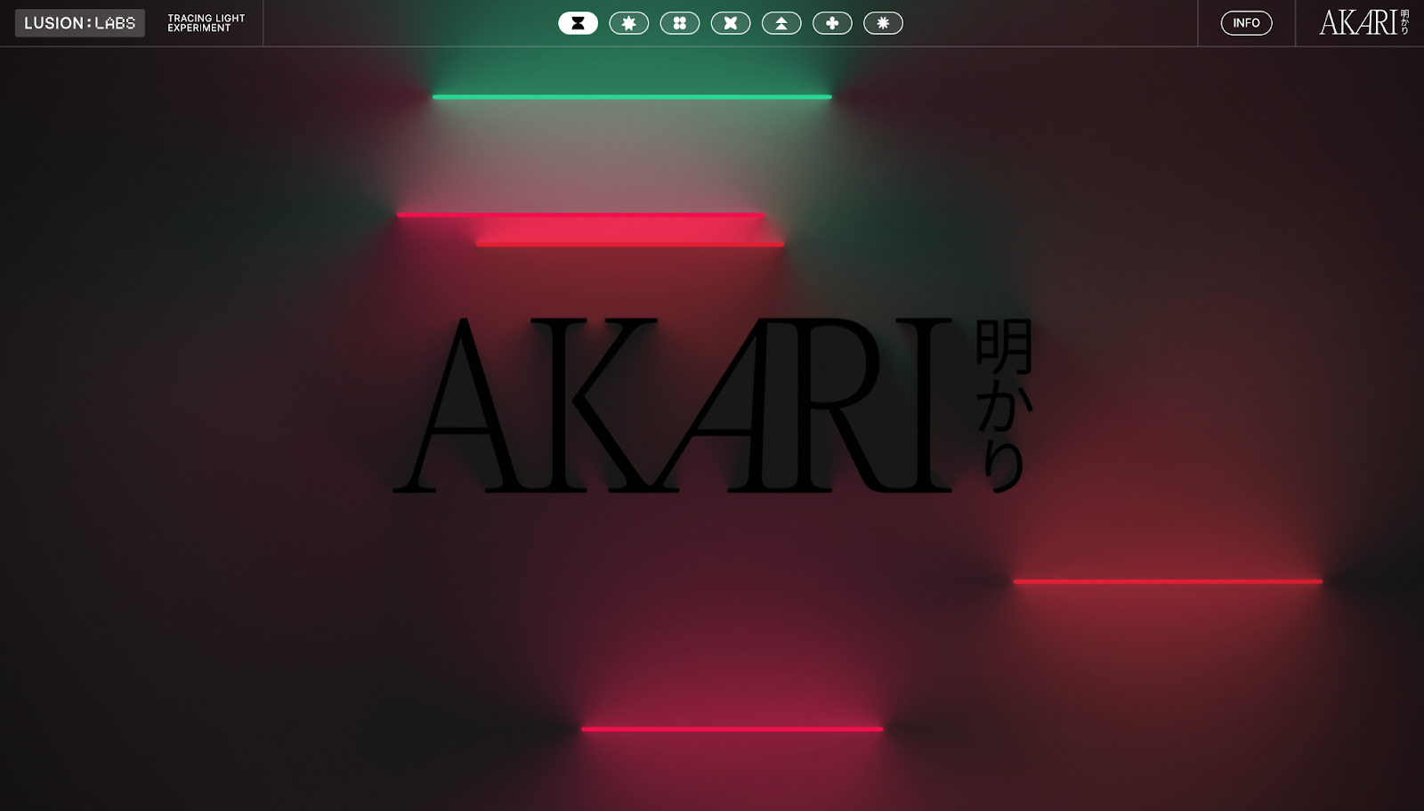
If you want to use the glow effect today, think of it as an accent for specific elements rather than a filter for the entire page: Add buttons with outer flows, text with soft halos, and icons with neon edges. AKARI has a modern version of this principle on their website — luminous tubelights placed against a dark canvas and a darker logo.
The lights aren’t placed on AKARI’s page at random. The glowing sticks are relatively centered on the page in a vertical column to guide the eye, create depth, and curate an atmosphere that makes the page feel like a contemporary club. To make your site glow, use a darker or desaturated background and apply a soft outer glow to a few components, like the hero text or primary CTA.
Glitch
The glitch effect involves intentionally using digital “errors” like RGB channel splits, scan lines, and on-screen jitters to make the interface feel purposefully unstable. In the Y2K era, glitches were everywhere — like VHS tapes and CRT displays — and copying the glitch effect online referenced and, in some cases, created nostalgia for older hardware.

Nifty Portal’s site uses glitch effects well, with the entire page covered by a filter of low-opacity distortion. As you scroll, the site takes on a retro UX with flicker, subtle tearing, and momentary color separation. The glitches are deliberate — short, well-timed flickers draw attention to headlines and transitions before snapping back so the site feels like a time capsule while functioning like modern tech.
When applying glitch effects to your website, make sure the body text stays visible so visitors can read it (especially in important elements like contact forms or navbars). Glitching the entire page can be overwhelming, potentially leading to higher bounce rates, so keep this effect brief and targeted for maximum impact.
Photos and iconography
Y2K visuals made websites feel tactile. Photography involved high-contrast direct flashes and shiny surfaces from the flash’s reflection — think point-and-shoot cameras and Polaroids. But Y2K also saw the rise of early photo editing software, so altered images were everywhere. Iconography took a different stylistic direction, with pixelated icons, emoticon motifs, and 3D pictograms making sites seem just as intuitive as visitors’ desktop and operating systems.
Modern Y2K designs have made grainy film and Internet Explorer iconography trendy again. For photography, pick an early 2000s aesthetic and keep its notable features clear: Use hard flashes, rim glows for portraits, and bold backgrounds to make visuals pop. Adding grain to your photos, whether you’re physically shooting on film or replicating the textures using design tools, nods to the Y2K era without tanking image quality.
For icons, choose one style and use it consistently across your site. A pixel or bitmap icon set instantly sells the Y2K aesthetic for headings and section titles, while beveled 3D icons work well for callouts and CTAs. For a more streamlined look, use wireframe symbols and pair them with neon outlines or subtle glows.
Here are three examples of photos and icons in modern websites that maintain Y2K energy.
Lo-fi computer graphics
Lo-fi computer graphics, like Microsoft Paint-style shapes, hard outlines, and tiny GIF loops, deliberately look plain. But in the early 2000s, this simplicity came from technical limitations. Designers had to use small palettes and simple geometric shapes due to small file size capacities and low-resolution screens. Branding assets loaded faster and still achieved the digital look, so other graphics were added purposefully.
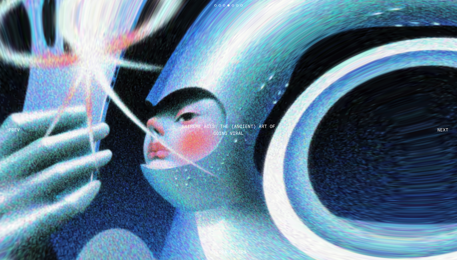
The Y2K lo-fi graphic design is immediately apparent on Chronically Online Magazine’s website. The article covers, which double as header images, have fisheye lens-style stretched appearances with blurred edges and grainy overlays. Some even include metallic shimmers and multichrome blobs, other classic Y2K design elements. While the top of the site nods to the early 2000s, the rest of the website layout stays clean and easy to read.
If you have a content-heavy website, lo-fi graphics are an excellent design choice to add. They’re lightweight and quick to load, plus they cut through dense layouts to give your site a playful, retro personality.
When putting lo-fi graphics on your site, stick to bold outlines to improve legibility and keep shapes simple enough to view on mobile devices. A looping GIF or pixel art piece can add more Y2K charm without sacrificing performance.
Photographs of people
Y2K design put people at the center — not boxed into separate rectangles, but blended into the layout like they were part of the interface. For example, designers would lay cutouts of people with exaggerated proportions (often captured in wide-angle shots from above) over gradients or bubbly shapes. The style was inspired by trends in other media formats at the time, like magazine images and commercials.
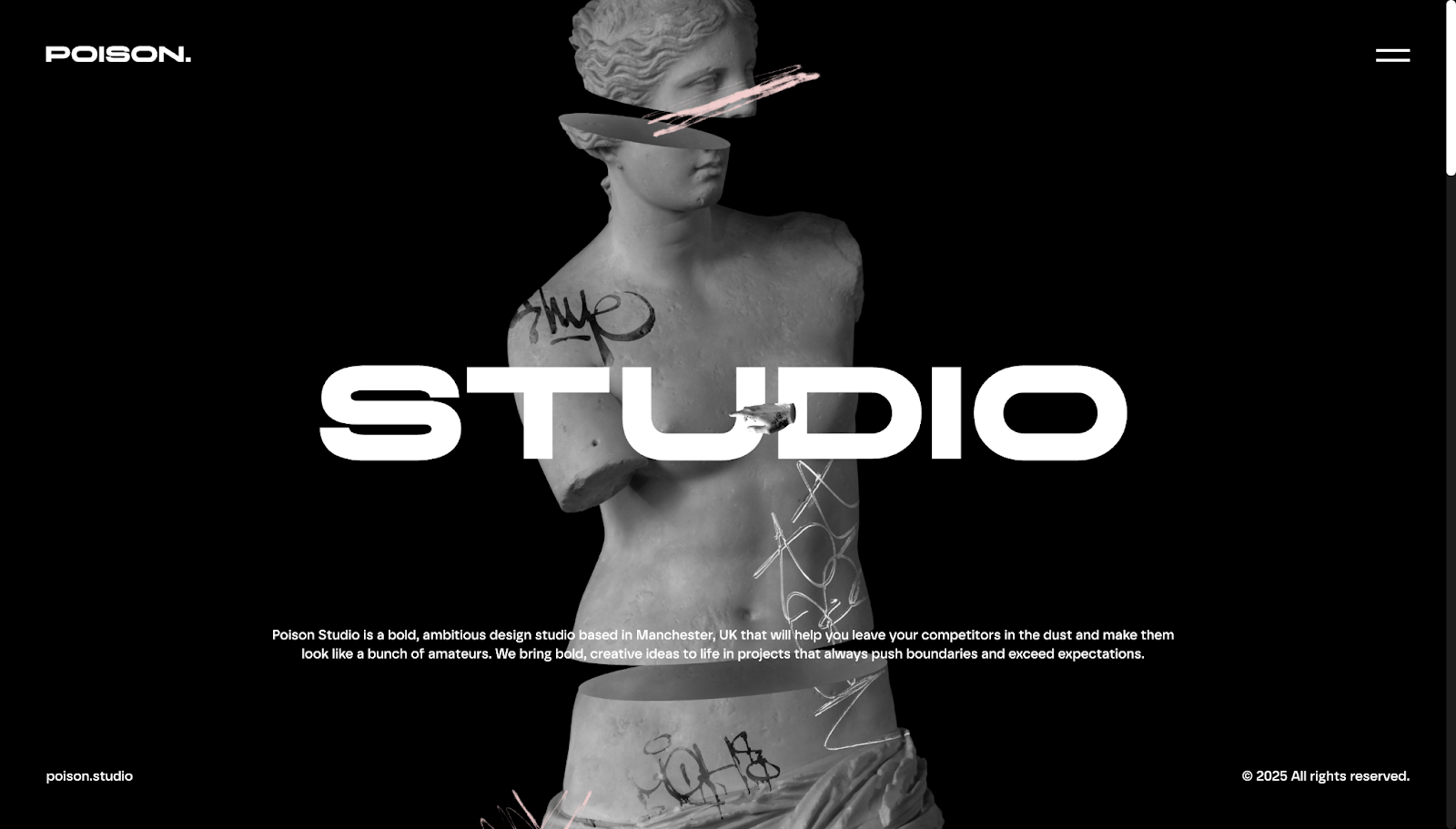
Poison Studio takes a slightly different approach by blending Y2K portraiture into their design agency website. Instead of people, they use cutouts of statues and busts with graffiti and floral overlays. The results are gritty, grungy, and grainy for a unique twist on Y2K vaporwave aesthetics. While the cutouts look Y2K-inspired, the rest of the site maintains a modern appearance with its bold text and hover-triggered animations.
If you’re using custom images for your website, warp their subjects from bold angles (very high or very low) to create a fisheye lens effect. Take photos with flash for the early 2000s digital camera look, and cut out the subject in your digital design tool so they can float over the page. Add a soft outer glow or a thin white stroke to create a sticker-like appearance, and lightly grade toward a duotone so colors feel synthetic.
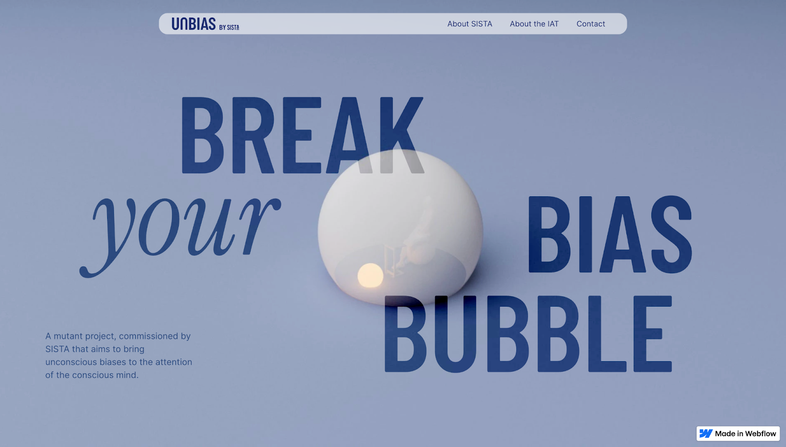
Bubbles and blobs
In the early 2000s, designers loved using gel and liquid forms — pill buttons, bubbly tabs, and blobby backdrops — because new vector software meant smooth curves and shiny highlights were easy to create for the first time.
Today, it’s better to use bubbles and blobs as a supporting layer. Rather than overwhelming the entire interface, place a few large, blurred blobs behind your hero image or text to add depth, like Bolk Studio did for Unbias’ website. The bubble has a soft shadow with a slow-floating animation as you scroll. The high-contrast navy text stays steadily readable against a pale steel-blue background, keeping accessibility high even with a monochromatic palette.
Bring Y2K nostalgia to life with Webflow
Y2K designs are effective because they’re instantly recognizable. Adding web design elements from the late ’90s and early 2000s lets you tap into nostalgia while still hitting modern expectations, like fast-loading pages, accessible layouts, and SEO-friendly structures. When you balance Y2K visuals with current best practices, you’ll curate an aesthetic that converts.
With Webflow, you can quickly prototype and publish a Y2K-inspired site. Choose a template or start from scratch to create a website that uses color schemes, effects, and visuals to offer the best of Y2K using contemporary tools.
Start designing your Y2K website today with Webflow.
Build websites that get results.
Build visually, publish instantly, and scale safely and quickly — without writing a line of code. All with Webflow's website experience platform.

.jpeg)