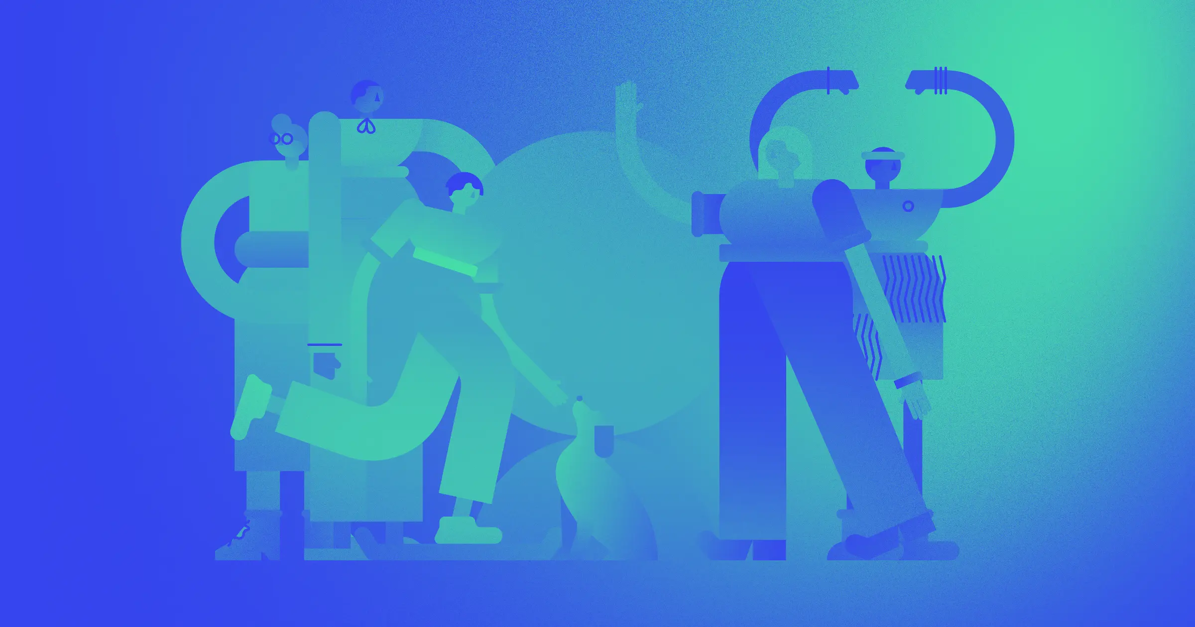


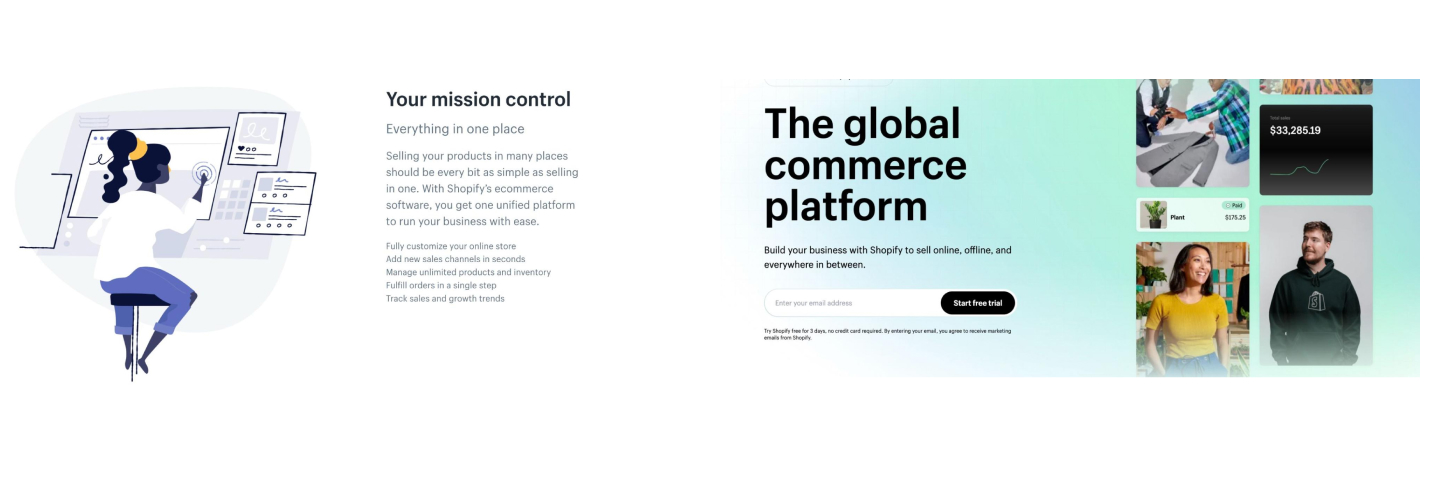
In the spring of 2022, we published Blue people and long limbs, exploring the overwhelmingly popular design style known as Corporate Memphis.
At the time, the exaggerated, rubbery human figures decked out in decidedly unnatural skin tones seemed to be everywhere. Ads and websites were all starting to look the same and critics and customers alike began to get sick of seeing it everywhere. Since then, corporate design seems to have moved on from Corporate Memphis.
But what’s replaced it? The answer is … nothing. Corporate Memphis doesn’t seem to have been taken over by any single design style, but rather by a shift to basic imagery, graphics, and design.
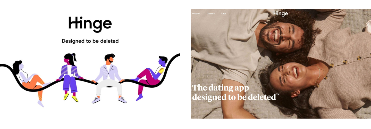
Ads and websites that used to lean heavily on Corporate Memphis illustrations are now bare and simple. Instead of ambiguous blue people, we’ve seen a resurgence in the use of photography along with basic color blocking, shapes, and prominent text.
In short — it doesn't seem like the corporate world is ready to fully commit to a specific new illustration type or aesthetic yet. Nothing stands out as the start of another unique style trends — leaving many of us wondering, what comes next?
Even though we can’t predict the future, we can take a closer look at how past trends have emerged and established themselves through history — making it easier to anticipate what’s on the horizon.
Now, let’s dive in.
Design trends are cyclical and reactionary
Trends don’t form out of nowhere. A look back through the history of fashion, art, and design demonstrates how the styles we choose are often a reaction to the conditions of the world around us.
Likewise, commercial trends in advertising, print, and product design are linked to the wider trends of the time. Corporate designers try to stay ahead of the curve to look cutting-edge and settle into what’s popular to seem relatable. Fashion, art, interior design, and countercultural aesthetics all impact corporate design and vice versa.
Time and time again, the three biggest factors for trends — both commercial and in general — are the nostalgia cycle, the economy and current events, and the evolution of new technologies.
Trends also tend to react against previous trends in order to feel fresh, exciting, and different.
So, when we think about what comes after Corporate Memphis, we need to think about what it represented — bright, colorful, faceless people, and abstract shapes — in order to anticipate how a new trend could push back against it.
Here are some trends that we see popping up in our post-Corporate Memphis world.
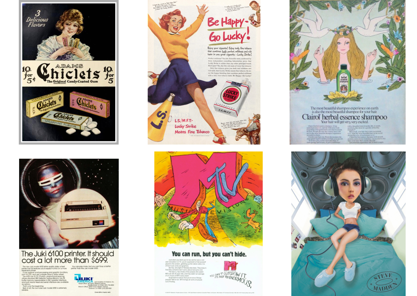
90s anti-design might be due for a comeback
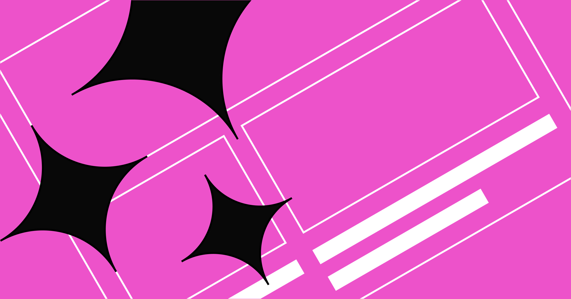
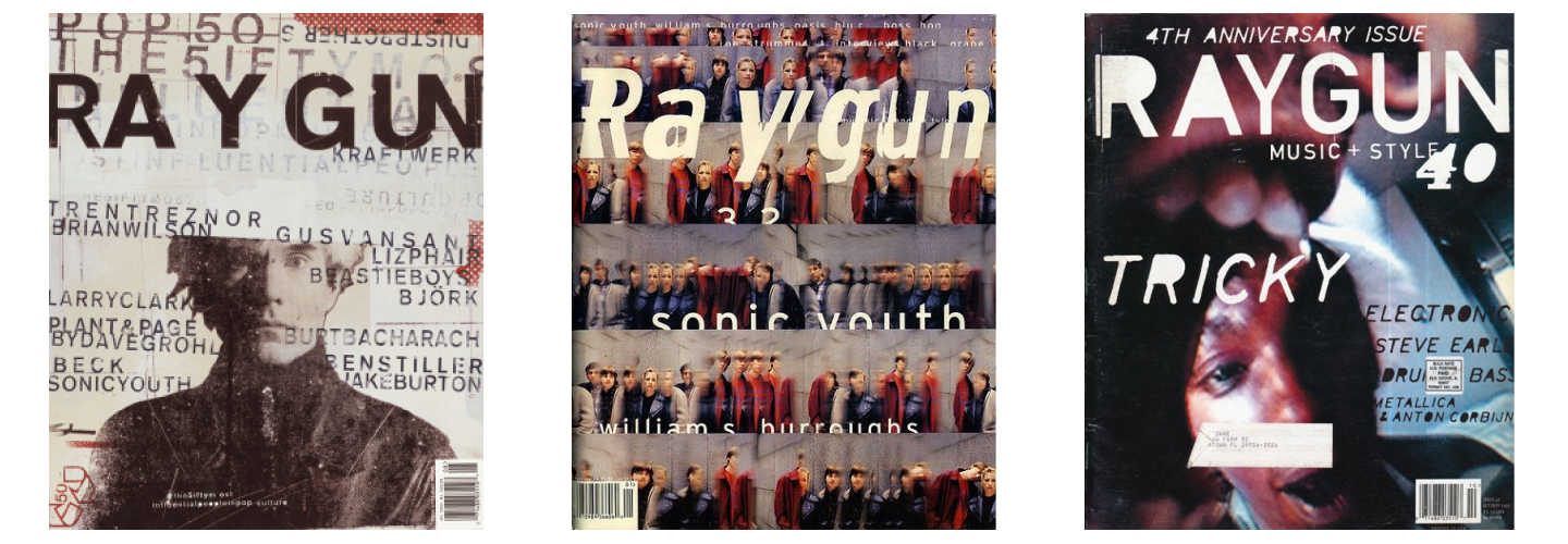
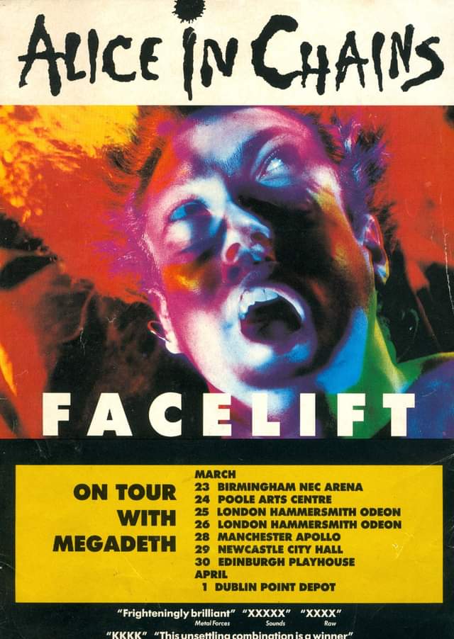
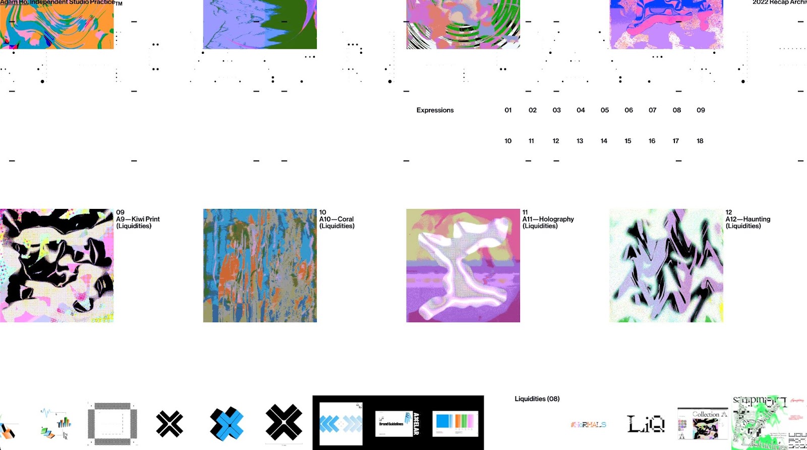
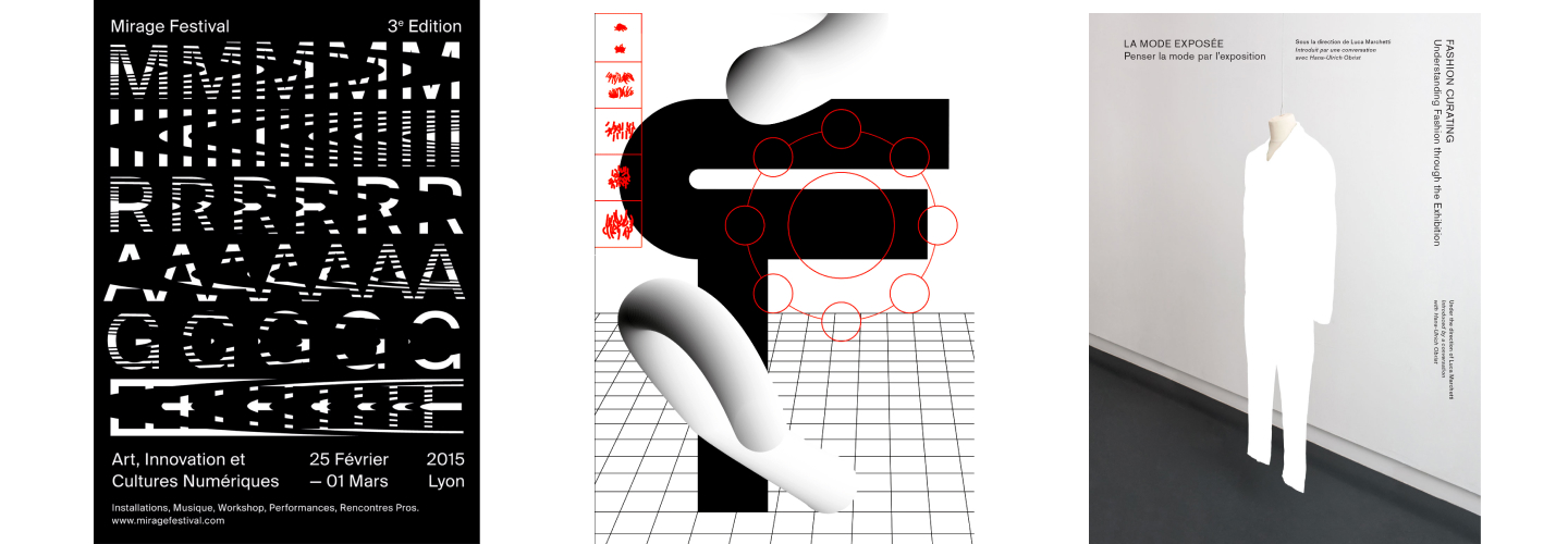
Anti-design is a style that initially began in the 1960s before re-emerging as an iconic 90s trend with alt music and zine aesthetics. It’s rebellious and deliberately plays with ugliness. Grids break, fonts mismatch, images are broken up, and colors clash. It looks pieced together and unfinished, projecting a careless-but-cool vibe.
Unfinished does not translate to minimalist, however. Colors and photographs are often muted, faded, or blended into gradients. Exaggerated blank space and minimalist elements create tension with the more chaotic parts of the designs. It uses bold negative space in a way that reflects the influence of brutalism.
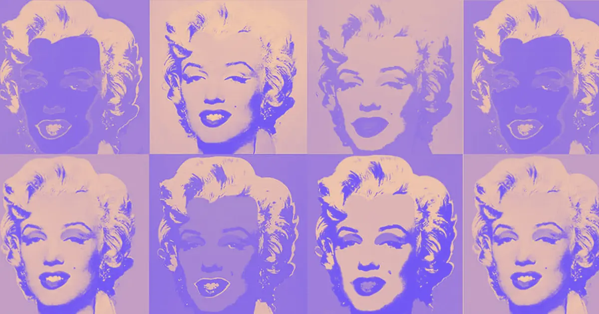
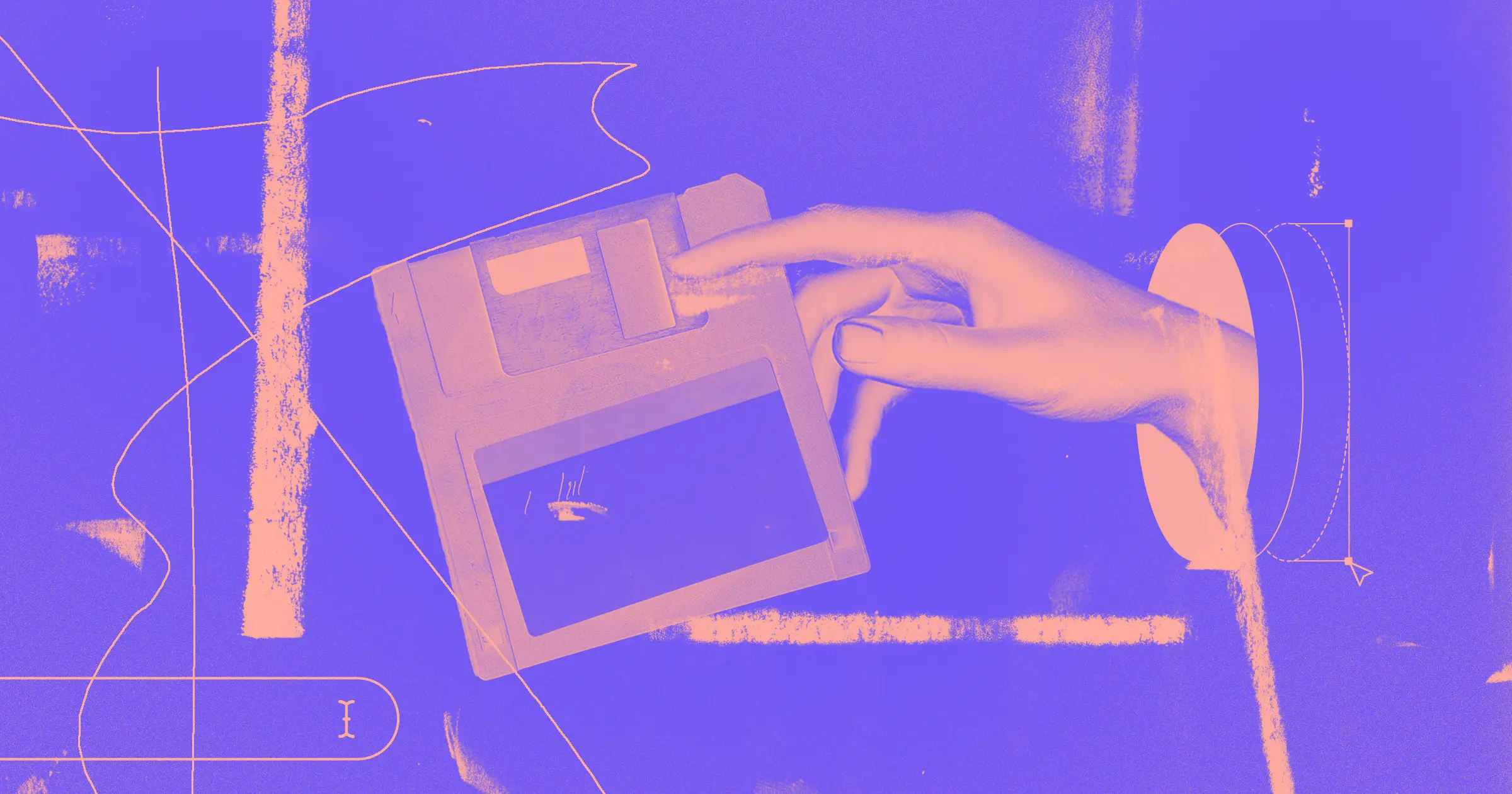
Trends constantly pull from the past for inspiration. The nostalgia cycle tends to run in 30-year cycles, though the internet has sped that up.
Corporate Memphis came directly from the look developed by the Memphis Group in the 1980s, which also pulled inspiration from 1950s-influenced retrofuturist aesthetics. Now, cultural trends are moving on to the 90s and early 2000s for nostalgic inspiration and aesthetic cues
Anti-design hits a few major points to qualify as a potential replacement for Corporate Memphis. It’s a 90s look that still feels modern. It’s also rebellious in a way that stands in opposition to what Corporate Memphis represented in many people’s minds — bland, corporate, non-offensive conformity.
With photographs edging back into popularity over illustrations, the anti-design look makes sense as it blends photographs with uneven edges and textures. It also uses a lot of text-based design and abstract visuals, which have been trending heavily recently.
How you can experiment with contemporary anti-design
The 2023 version of anti-design isn’t just a rehash of the 90s style. Instead, its updated with cleaner lines and more empty space. Going too handmade in the look could seem disingenuous in a digital design, which wouldn’t align with the raw ethos of the style. Plus, movement works well with anti-design sites because you can overlap and reveal elements while still retaining function.
Here are some tips we have when creating your own anti-design style:
- Use uneven borders and overlapping elements in photographs.
- Include gradients in the background and create smaller illustrations with bright colors.
- Text can be oversized or undersized — or even broken up if it’s not essential for understanding the page.
- The color you choose should be extreme — very bright and mixed, totally monochrome, or muted and muddy overall.
When creating your design, try experimenting with these design elements:
- Whitespace
- Clashing colors
- Contrasting hypercolor graphics with minimalist and black & white elements
- Gradients and grain
- Texture (glitches, uneven color, rough edges)
- Small illustrations and graphic elements
- Collage elements
- Abstract forms and geometric patterns
- Text as a graphic element
- Grids, patterns, horizontal movement
- Collage-style overlapping graphics
Anti-design is a great option for brands that want to appeal to a young audience or evoke nostalgia in those who lived through the 90s. It’s a good fit for a technology company that wants to give the impression of disruption or a product that wants to tap into a countercultural feeling.
One issue for businesses using anti-design aesthetics is that they risk making their ads, websites, and other materials inaccessible. Businesses' designs need accessibility, so their audience can use and understand their services. It’s a necessity from a business, ethical, and legal standpoint and often wasn’t a consideration in the 1990s. To make anti-design accessible, make sure it remains legible. Be sure to craft designs carefully so they feel chaotic while still leaving text and navigation clearly visible.


Discover inspiring design work from the Webflow community
Made in Webflow is the place to browse, clone, and customize the latest websites built by the Webflow community.
Shrinking economies may herald a return to minimalism
Fashion trends respond strongly to economic signals. “The hemline index” was proposed by economist George Taylor in 1926, who observed that women’s skirt lengths rose and fell with the state of the economy.
In 2023, the fashion world is reflecting economic uncertainty by reflecting more conservatism and minimalist looks and moving away from the flashy logomania that had been popular. SHOWstudio describes Milan’s Fall/Winter 2023 (FW23) season as “Recession Fashion,” saying, “we are officially reminded of the difficult economic and social status of the world and its current state of crisis.”
In their panel discussion of Gucci’s runway, stylist Andrew Davis remarks, “How many more times can we see Memphis witchy goth princess…this is a really nice modern palette cleanser.”
If design trends reflect these same economic influences, the next big design style could feature muted palettes, clean layouts, and restrained aesthetics. Minimalism was also popular in the 90s, and it can tap into that same nostalgic cultural influence. The pared-down look could be a relief after the vibrant vector graphics of Corporate Memphis.
How you can design with minimalism
Minimalism strips design down to its most basic elements. It can be incredibly visually arresting, using contrast, shape, and color to create tension and visual interest. Black and white or monochrome color palettes work well, and a pop of contrasting color or a photograph added to a design will draw attention to that element.
Try experimenting with these design elements:
- Limited color palette
- Text as a primary graphic element
- Subtle movement
- Focusing on contrast, value, shape, and composition
- Geometric shapes, lines, and grids
- Points of interest — including photographs, pops of color, or patterns within an otherwise homogeneous design
- An illusion of depth of field
- Keeping designs entirely flat and constrained to a standard grid
The best part of minimalism is that it’s easy to make it legible and accessible for viewers. Plus, it works well to make a brand stand out when the competition is using more vibrant branding. But beware, minimalism may also become boring quickly if it becomes too much of a trend since it doesn’t have as many specific visual elements to cue consumers.
AI art inspires a strange new aesthetic
The AI aesthetic is perfectly set up to spark the next visual trend in art and design for two reasons. First, it makes it possible to generate realistic-looking imagery that would otherwise have required a lot of skill and expense to create. And second, AI is incredibly distinct with its rubbery smoothness,strange iridescent blurs, pearlescent sheens, and usually the wrong number of fingers.
So while AI will give teams with limited creative budgets some options, those same teams willl also have to embrace the tell-tale signs of AI-generated images.
AI is a big technological shift, and culturally, it’s on the public’s mind. It also aligns with the look of the metaverse, with hyper-real and surreal 3D images and immersive visual worlds.
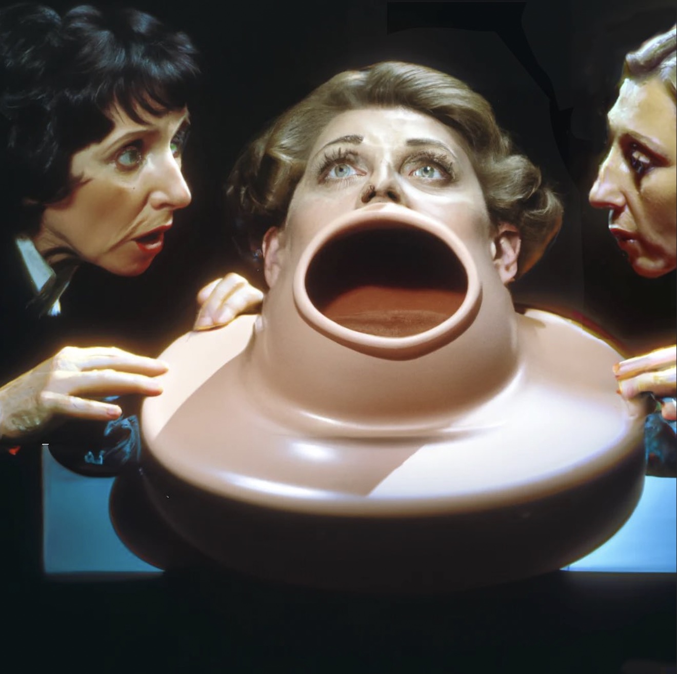
A great example of AI imagery comes from Canadian artist Beth Frey. She’s captured the public’s imagination with her surreal AI art posted under the Sentient Muppet Factory Instagram account. At first glance, many of the images could be photographs, but it quickly becomes clear that something is very off. The work is hilarious, unsettling, and deeply compelling.
AI could also influence design through its humor. The post-internet world already has a love for memes and the humor of the absurd. Perhaps, we will see a wild Dadaist deconstruction of corporate aesthetics, using AI to reconfigure traditional forms.
In architecture and product design, designers are using AI to imagine things that can’t exist yet and illustrate places that will never be. If using AI to generate prototypes and renderings becomes common enough, it’s inevitable that the “look” of AI-generated images will become one of the defining features of 2020s corporate design.
How you can design with the AI look
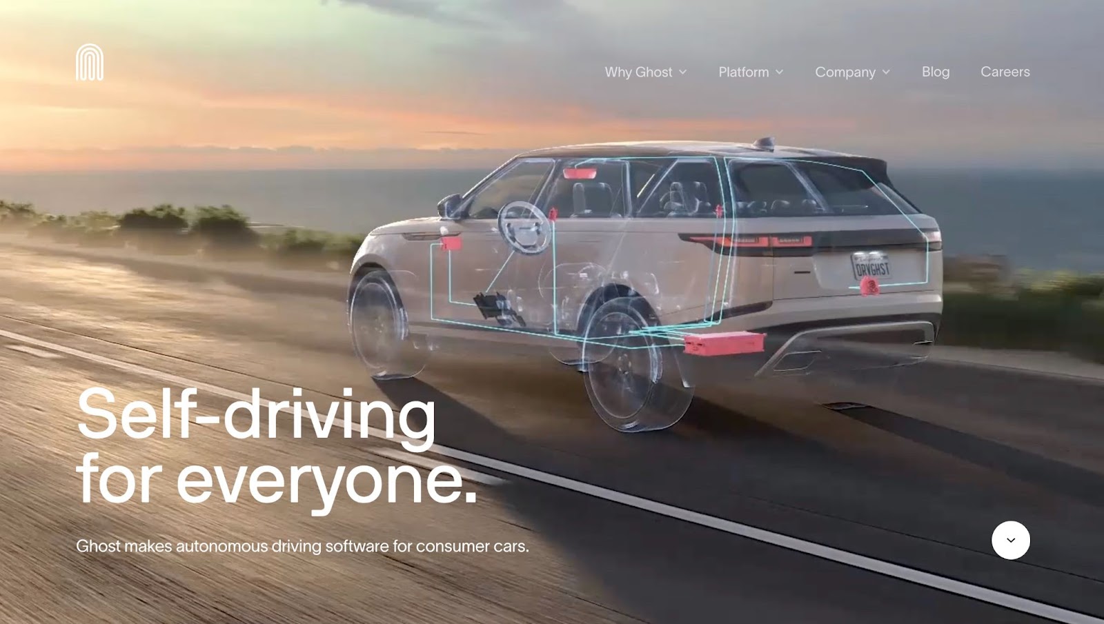
AI aesthetics could be used in professional design by illustrating with 3D-rendered graphics that don’t try to hide their computer-generated nature. The website that Webflow agency Edgar Allan built for Ghost, a company making software for self-driving cars, is a great example of what AI-influenced aesthetics could look like.
It’s lush, visually immersive, and photograph-like. However, the graphics have that pearlescent, smooth look of AI-generated art. The site leans into the digital look of its renderings instead of fighting it, and as a result, it feels beautifully hyper-real.
Try experimenting with these design elements:
- Low contrast/high dynamic range look
- Smooth, shiny textures
- Diffused glow
- Pearlescent colors — muted warm and cool tones within the same image
- Surreal imagery — include graphic elements that couldn’t exist in a photograph
- Hyperreal imagery — too in focus, too well lit, too vivid, or too high definition
AI-influenced and 3D imagery are going to be best for businesses that want to project a futuristic image. It’s great for digital businesses, anyone in the metaverse, or technology, design, and architecture firms.
What turns a design style into an era-defining trend?
What made Corporate Memphis so instantly recognizable and accordingly divisive was how distinctive it was. It had a very defined look, and it wasn’t similar to anything else that was popular at the time. It fit into the millennial pink aesthetic perfectly, but as an illustration style, it stood on its own.
Its downfall was how completely ubiquitous it became. People quickly became sick of seeing it. For designers and businesses, that’s the trick. How do you choose a trend that feels of the moment without just jumping on the bandwagon? How do you capitalize on the moment without getting lost in a sea of imitators?
While most of the styles above may indeed become the next big trend, they may not end up reaching the same level of saturation as Corporate Memphis. Maybe that’s a good thing. There’s a broader range of directions designers can take with anti-design, minimalism, and 3D art. With more variety, audiences are less likely to get tired of it.
A skillful brand designer can tap into the trends around them and interpret them creatively. Just look at how drastically Apple’s design ethos has changed over the years and how relevant their designs have been the entire time. The next design movement will be pushed forward by designers who are aware of the trends and can create something that feels new and unique.