Design systems have evolved from optional toolkits to essential strategic assets that empower businesses to scale their creative vision with efficiency and human touch.
Teams use design systems to create products and digital experiences that feel consistently on-brand. Every design element should be harmonious with your brand’s ethos, but different teams, design preferences, muddled guidelines, interface designs, and touch points often lead to inconsistent brand experiences. And what’s a brand when it’s not consistent?
Design systems aren’t just web design tools; they are the scaffolding you need to build your brand. They streamline your approach to design, empowering designers and developers to capture the full essence of your brand in every interaction.
Design systems can bring new levels of consistency and scalability to product and web design. But this starts with alignment — a shared understanding of what design systems are, why they are essential, and how to craft them with purpose.
Below, we’ll explain everything you need to know about design systems to fully utilize them and build more consistent on-brand experiences.
What is a design system?
Design systems are ever-evolving sets of reusable components, principles, and guidelines that give designers and engineers a shared language for consistent product and web design.
It’s a common misconception that design systems are synonymous with pattern libraries or style guides. While these UI element guides and UX design patterns are certainly important components of the overarching system, they’re just that — key pieces of a more robust whole.
The real value of a design system lies in its ability to give designers and engineers the guidance they need to create smoother user experiences and digital products. Good design systems help designers understand what to make and how to make it, but they also provide the rationale and motivation behind the design.
Key components of a design system
There’s no standard list of design system components to include, but there are common elements that the most effective design systems tend to feature:
- Design principles are the rules and values that drive your design team. They will differ from company to company, and they will likely reflect the brand’s core values.
- Design pattern library, or a central repository of approved and commonly used patterns. According to the Interaction Design Foundation, a pattern is “a repetition of more than one design element working in concert with each other.” Those elements can be shapes, lines, colors, etc.
- UI kit/component library, or a collection of UI-focused components like buttons, widgets, and more. These assets allow teams to create consistent, UI-friendly designs more quickly.
- Design tokens or components help standardize color, spacing, and fonts.
- Design process guidelines help designers interpret design principles as they execute a task.
- Accessibility elements and guidelines are key rules and recommendations that help teams create designs that are more accessible to all users and that comply with the Web Content Accessibility Guidelines.
Key benefits of a design system
Creating a design system isn’t just a step toward better design practices — it’s a leap toward redefining how your business approaches creation, collaboration, and innovation. A well-thought-out design system can transform and influence every design element of your brand (for the better).
There are a handful of main benefits that make building a design system worthwhile for your business:
- Consistency to product and web design: A consistent approach makes work easier for your team, builds brand recognition, and creates a better customer experience. In fact, customers need to see your brand at least seven times before they are ready to commit to purchasing.
- Cross-functional collaboration: A good design system helps you say goodbye to operational silos. With a comprehensive approach to design and execution, your design and product teams can collaborate cohesively from start to finish on each new project.
- Speed and scalability: A design system mitigates duplicative work — like repeatedly creating the same elements and concepts — so your team can move more quickly and stretch their creative muscles.
- Cost efficiency: Reducing the need for brand-new designs for every new project minimizes costly inconsistencies, editing, and redesigns. They streamline production processes, allowing for more efficient use of resources.
- Design quality: Design systems raise the bar for design quality by providing a framework of best practices and proven design patterns. This leads to higher-quality outputs that are not only aesthetically pleasing but also functionally superior.
- Easier onboarding: For new team members, a comprehensive design system acts as a valuable learning resource, shortening the onboarding process and enabling them to contribute more effectively. It also simplifies collaboration with external partners by offering clear guidelines and expectations.
- Future-proofing: As digital standards and technologies evolve, having a design system in place makes it easier to adapt and update your products. This flexibility ensures your brand remains relevant and can quickly embrace new opportunities or changes in the market.


Build with Webflow
Webflow Enterprise gives your teams the power to build, ship, and manage sites collaboratively at scale.
When to consider a design system
Design systems deliver the most value when your organization faces complexity and scale challenges. Consider implementing one when you notice:
- Designers repeatedly solving the same problems
- Developers rebuilding similar components
- Inconsistencies emerging across your digital products
The investment makes sense when you have multiple products, platforms, or teams that need alignment, or when your organization is growing quickly and onboarding new team members frequently. If design decisions are slowing down your development process, or if maintaining visual consistency requires constant attention, a design system will provide significant returns.
Remember: design systems aren't just for enterprise companies — even small teams can benefit once they need to maintain multiple products or anticipate substantial growth.
How to create a design system (7 steps)
While every design system will have its differences, there are a few steps you’ll want to follow to make sure it’s the right fit for your brand and designs. Here’s the step-by-step on creating a design system process that’ll work (and last) for your organization:
1. Get stakeholders involved
Creating a design system is a strategic choice that transforms the way your brand designs, develops, and maintains its digital products. An investment like this requires a clear roadmap and buy-in from your entire organization. Your design systems won’t do you much good if certain departments refuse to use them.
Before building your design system, bring together stakeholders from across your organization to form a design systems team. This should include product managers, marketing professionals, content creators, and even executives to create a multidisciplinary team that represents the full spectrum of your business.
When everyone has a stake in the game, the commitment to maintaining and evolving the system is stronger, making it more likely to succeed and deliver value over time. Plus, this collective engagement can help you uncover unique insights and perspectives that help shape your design system.
2. Audit the existing product
Go through your product and review all of its various front-end design elements. From there, you can build a catalog of UI components and visual elements that will form the foundation of your design system.
Moreover, you can identify any inconsistencies that may have emerged and make the appropriate design decisions for the future.
3. Define your design language
Establish clear principles on how you think about your product, and create guidelines on how you’ll bring those principles to life. Design principles lay out the branding vision for your product, including how you want customers to feel while using it.
Do you want customers to feel calm? Excited? Curious? Do you want your brand to feel friendly? Quirky? Cerebral? Your design system should lay out how you can make customers feel the way you want with your design.
The visual design language you choose for your overall design system includes guidelines for color palettes, typography, iconography, and imagery. These elements work together to create the feel of your brand — and instill the desired emotion in your customers.
4. Build a pattern library of common design elements
Your pattern library is a collection of reusable UI components that will streamline design in the future. There are two main types of patterns — functional and perceptual — that work together to form the building blocks of your designs. According to VIA Studio, “[f]unctional patterns define the structure of your design, like the backend layout, while perceptual patterns define the visuals like typography, spacing, interactions, etc.”
At the foundation of these patterns lie design tokens, which store visual design decisions such as colors, typography, and spacing. Design tokens create a critical bridge between design intent and implementation by transforming abstract design decisions into concrete, named values that can be used across platforms.
With design tokens, you ensure consistency at scale while enabling flexibility. Changing a primary brand color, for instance, becomes a single token update rather than hundreds of manual adjustments across files. These tokens feed directly into both functional and perceptual patterns, creating a cohesive system where design decisions cascade throughout your entire product ecosystem.
Together, these patterns form a library that is structurally sound and evocative of the appropriate emotion and brand aesthetic.
5. Document guidelines on how and when to use design elements
Without clear guidelines on how and when to use design elements, you don’t have a true design system — rather, you have a collection of elements and libraries. As you create your design system, be sure to document shared practices on how teams can effectively use and maintain it.
Key guidelines to incorporate into your documentation include instructions on:
- How team members can contribute to the design system
- How to report an issue with the design system
- How the team plans to address ongoing maintenance issues
- How you will govern consistency between the design side and the production code side
Clear guidelines and recommendations allow teams to work more quickly and efficiently right away.
6. Provide design system examples and resources
Add real-world examples and resources to illustrate the practical application of your design systems. Direct users (and people brand-new to your systems) to look at these examples and model their own designs after them. Visual examples can provide much-needed guidance over text-based documentation, especially for visual learners.
7. Regularly review and update your design systems
Your design system isn’t a one-and-done project. You should regularly review your design systems and update them to evolve with your brand, processes, and trends. Here’s how to make it happen:
- Schedule periodic audits: Establish a regular schedule for auditing your design system. This could be semi-annually, annually, or aligned with major product release cycles. Use these audits to assess the system’s current efficacy, relevance, and alignment with user needs and business objectives.
- Gather and incorporate feedback: Create channels for collecting feedback from designers, developers, product managers, and users. This feedback helps identify pain points, emerging needs, and opportunities for enhancement.
- Monitor industry trends and technologies: Stay updated on the latest design trends, technologies, and best practices. This ensures your design system remains cutting-edge and can leverage new tools or methodologies that enhance efficiency and creativity.
- Implement a governance model: This includes defining roles and responsibilities, setting standards for proposing and reviewing updates, and establishing a process for integrating and documenting these changes.
- Document and communicate updates: Every update or change to the design system should be thoroughly documented and communicated across the organization. This ensures all team members are aware of the latest guidelines and can apply them consistently in their work.
- Leverage version control: Use version control tools to manage changes to your design system. This allows you to track updates, revert changes if necessary, and maintain a clear history of the system’s evolution.
Common challenges of building a design system
It’s not easy to build a single source of truth design system, and there are a few common challenges that cause many initiatives to fail. Here are some of the obstacles you can anticipate (and ways to overcome them):
Choosing a starting point
The scope of creating a design system initiative can be overwhelming, and it’s tough to know where to start. If you don’t have a clear plan of attack, leaders may not buy into the process. That’s why it helps to outline your approach and know where you plan to begin well before you get started.
Moreover, if you’re currently a Figma user, you can transform your static designs into Webflow. Sync your design system — components, variables, and styles — to give your team the power to launch sophisticated sites quickly.
Organizing the team
In the early stages, you need to assemble the right combination of designers and engineers to champion the initiative and drive it forward. Don’t invite too many cooks into your proverbial kitchen — begin with a core group whose work you trust and who will advocate for the design system.
Managing documentation
Clear documentation on how to use various elements of the design system saves your team time and ensures consistency. Managing documentation, however, can be a challenge.
As you’re getting started, make sure you don’t separate the codebase from your documentation, as this can lead to duplicate work and inconsistencies that could derail your entire design system.
Bridging the gap from design to development
Your design system may look and feel beautiful, but it must also be easy for engineers to bring to life. The handoff from the UI designers to the engineers is a common friction point that reveals flaws in a design system.
As you’re building your system, be sure to keep the end users — both your engineers and your customers — front of mind. You can make your design system part of your workflow by building it in a visual-first environment like Webflow’s. You can also take advantage of Webflow’s templates.
For example, when you change the color of a button in Webflow’s Style Manager, that change will ripple across the CSS behind the scenes and change other buttons with the same class too — it’s your design system in action.
Our favorite design system examples
Check out these design system examples to inspire your own.
Atlassian
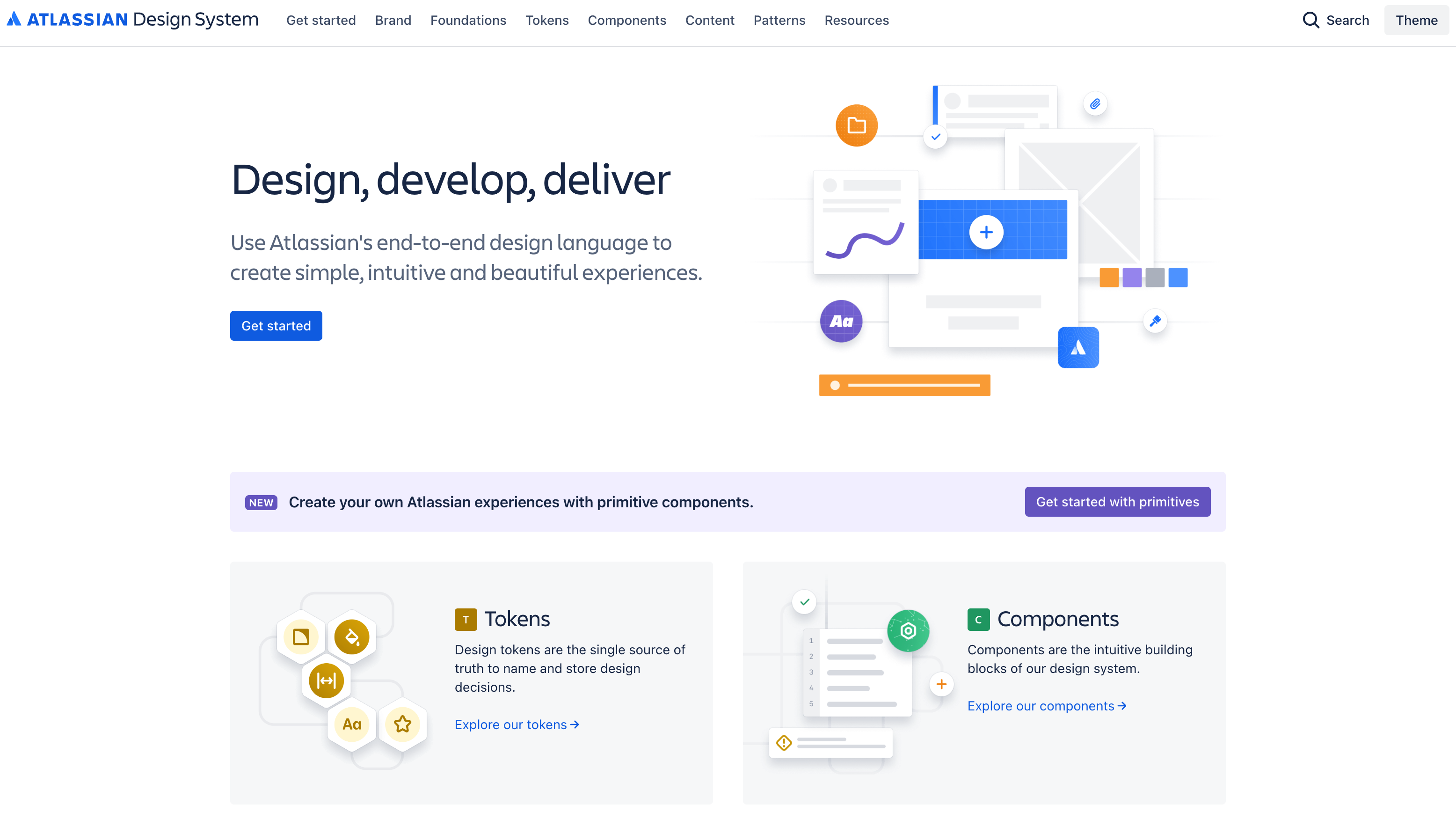
Atlassian’s design system is often cited as exemplary, and for good reason: it includes everything a design team could possibly need, from component and pattern libraries to in-depth insights on Atlassian’s brand, stylistic foundations, and content.
Salesforce
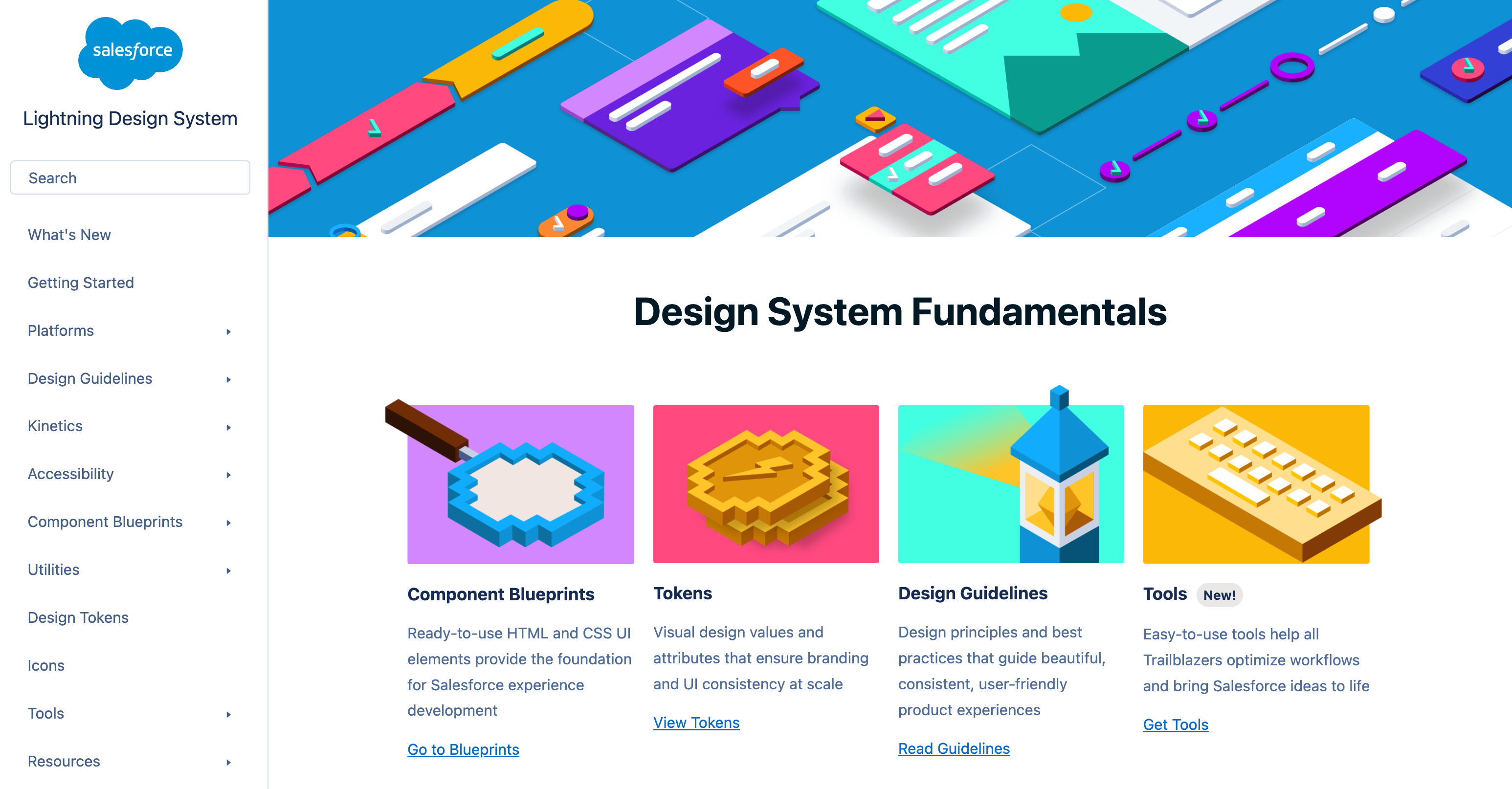
Salesforce’s Lightning Design System puts the company’s design principles front and center. The system is easily searchable, and it provides all necessary assets and components, as well as articles, downloads, and FAQs, so designers can work efficiently.
GOV.UK
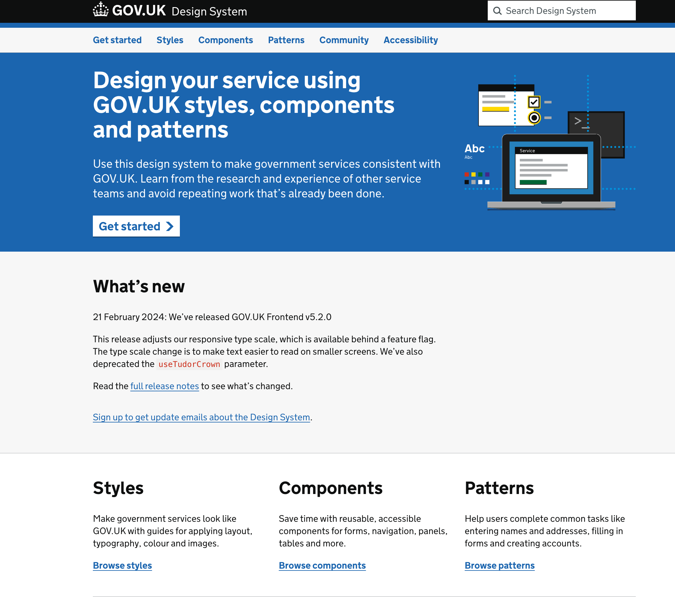
The GOV.UK design system is clear, concise, and comprehensive. The system stresses its community focus and encourages contributions of new components and patterns. This, in turn, helps democratize the design process.
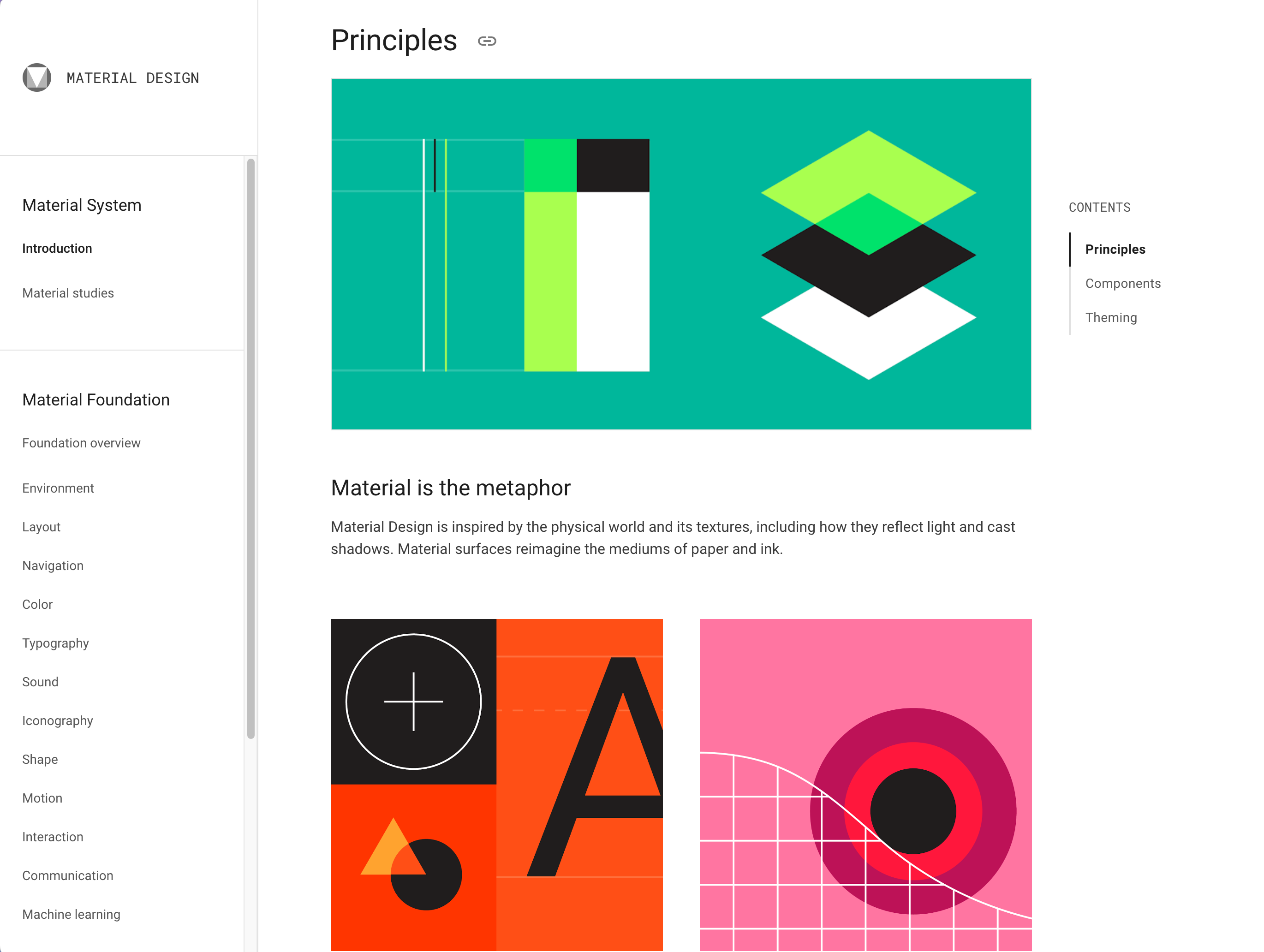
A Webflow team favorite, Google Material Design, keeps things clear and simple. The system is divided into three main parts: Principles, Components, and Theming, which helps designers of Google products learn the thought process behind its designs, understand when to use various components, and learn how to customize designs appropriately.
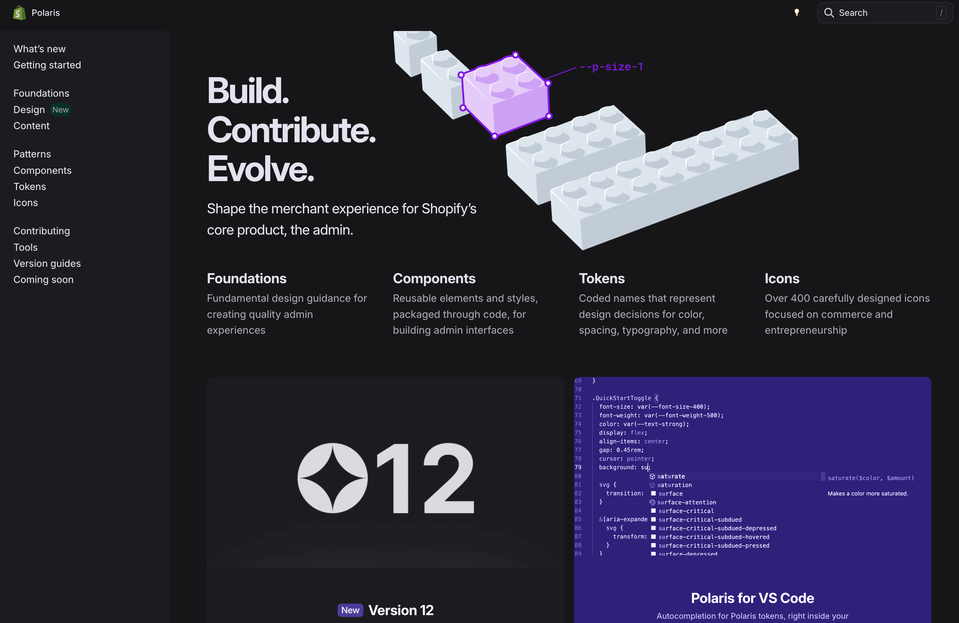
Shopify
Shopify Polaris offers practical guides that help designers get started on the range of tasks needed to design for Shopify. The system also includes content and design guidelines, as well as a component library and guidance for creating Shopify-specific experiences.
The best design systems are always evolving
Good design systems are dynamic entities that adapt seamlessly to a company’s growth and changes. The real magic of a design system is in minimizing the duplication of effort by the designers and engineers who bring a product to life.
That’s why the future of design systems is bright when built and managed in web tools like Webflow — one where the roles of designers and engineers are blended, eliminating the friction of the traditional handoff.


