


Optimize for consistency with a website design system that organizes your UI elements, typography, and style guide in one place.
A great design process prioritizes consistency, accessibility, and a cohesive user experience, and there’s no better way to achieve that than with a robust website design system.
A website design system is the best way to lay out all the components you need to assemble in your layouts, from UI elements like icons and buttons to typography styles for headings and body text. It creates a library of building blocks you can use to piece together your UI design.
Below are several examples of popular design systems like Google’s Material Design and IBM’s Carbon Design System. These established systems help these companies maintain a consistent design pattern for their brands’ digital products. And when you’re ready to make your own, you can start with any of the cloneable design systems we’ve provided.
What’s a design system?
A design system is a library of components you plan to use when building your website. Designers generally organize them into UI elements, typography, and a style guide, so they can quickly access these elements whenever they need to create a new web page.
For example, if you need to make a landing page for a new feature, you’d open your design system, then copy and paste all needed UI elements from it, such as icons, buttons, and menus. You’d also do the same with heading styles, containers, and even code snippets if necessary.
Since you already pre-configured these components, they should work together seamlessly. If you use the same design system for your whole website, you’ll achieve a cohesive user experience with a UI that follows the same consistent design pattern.
Key components of a website design system
Website design systems generally follow the atomic design methodology, where designers break down every needed component into its smallest parts. That way, they can assemble those pieces in any way they see fit without diverging from established design patterns.
Here are some of the high-level categories most designers use in their website design systems:
- UI elements: Reusable items like buttons and icons that designers can drag and drop into their layouts, organized by size, platform, and color scheme.
- Typography: Text styles for headings, body text, and UI text, with variations for different platforms and content types.
- Modals: Complete windows, such as contact forms, that combine UI elements and text styles to create pre-assembled, reusable assets.
- Style guide: A list of UX/UI design principles that designers should follow, such as accessibility guidelines.
Why use a design system?
It might seem like a hassle to create a design system, especially for a smaller website, but it’s well worth the effort. Doing so provides the following benefits:
- Faster design and development: With pre-configured building blocks, you can create or update layouts in less time than it would take to recreate UI elements from scratch.
- Consistency across pages and teams: Having a single source for all reusable components ensures that your layouts follow consistent design principles.
- Better UX: A design system with a clear visual hierarchy enhances the user experience and creates more intuitive navigation.
- Improved collaboration and reference: Designers can show developers precisely how each component in the finished product design should look.
- Scalability for future growth: The design system grows as you add new components and guidelines, steadily supporting your website as it scales up in size and complexity.
10 popular website design system examples
Before you start building your own design system or UI kit, it’s smart to review examples of systems from other digital products. Your design system likely won’t need to be as complex as all these examples, but it’s helpful to know what you’re building toward.
1. Webflow

Webflow’s brand design system offers design guidelines and user interface components that establish how Webflow branding works. It’s a library that uses visual examples and concise descriptions to demonstrate how to make digital experiences that accurately convey Webflow’s style.
You don’t need to be a Webflow developer to understand it; anyone with a passing interest in UI/UX design can use Webflow’s tools. That makes it a great resource for onboarding new designers and teaching veterans design trends.
2. Google’s Material Design
Google’s Material Design system is an open-source design library that’s optimized for accessibility and versatility. It takes atomic design to the extreme, with reusable components for everything from UI elements like sliders and buttons to text styles for headings and code snippets.
Google built its Material Design system over several years, making it the most comprehensive one on this list. Yours will likely never need to get as complex, but Google demonstrates how far you can take a project when designing it for a massive audience.
3. The Atlassian Design System
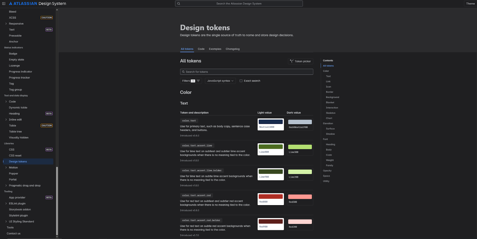
Keeping with the theme of massive, comprehensive design libraries is the Atlassian Design System. It’s a vast collection of components and features you can use on apps and websites.
While it offers a great deal of versatility, it’s also very dense, with every page presenting over a dozen code snippets for different variations. Its saving grace is the search function at the top, which you should include in your design system to help users find precisely what they’re looking for.
4. IBM’s Carbon Design System
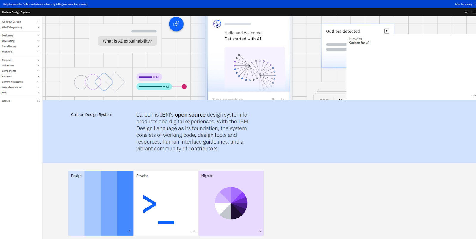
The standout feature of IBM’s Carbon Design System is its intuitive navigation. The homepage showcases high-level categories you might be looking for, like migration guidelines, UI kits, and design principles. This streamlined user experience helps designers quickly navigate the design system. If anyone aside from yourself will be using your design system, consider creating a UX like this.
5. Apple’s Human Interface Guidelines
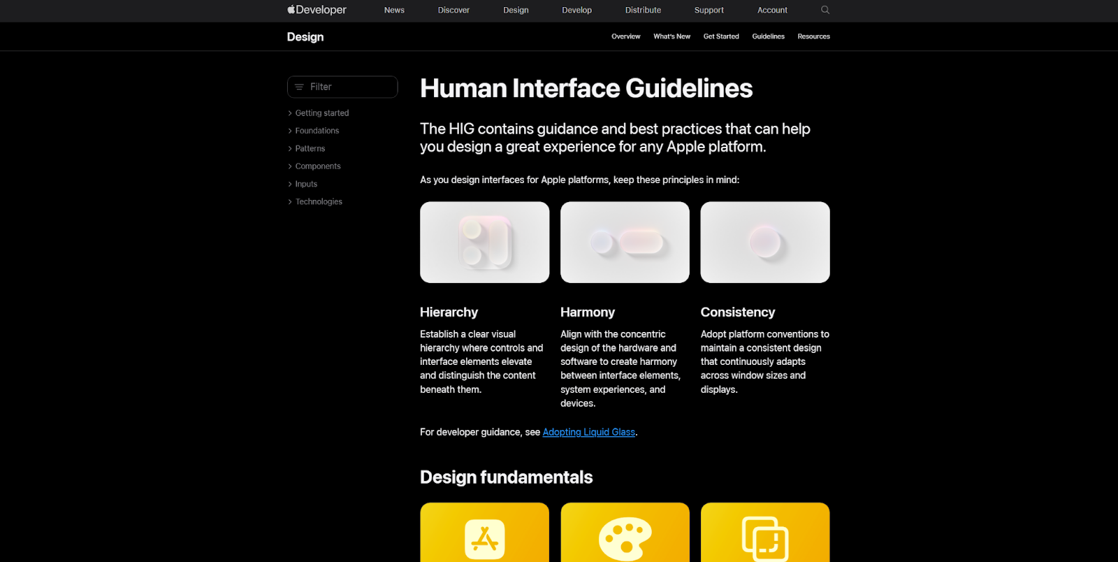
Apple’s Human Interface Guidelines are a design library for all things Apple. They demonstrate what makes the Apple software ecosystem a well-kept garden: unique design choices, a strong visual style, and all the documentation you could ever need.
With such clear guidelines and an inviting, action-oriented tone, it’s very approachable and gives designers the confidence to deliver on Apple’s design patterns.
6. Salesforce’s Lightning Design System
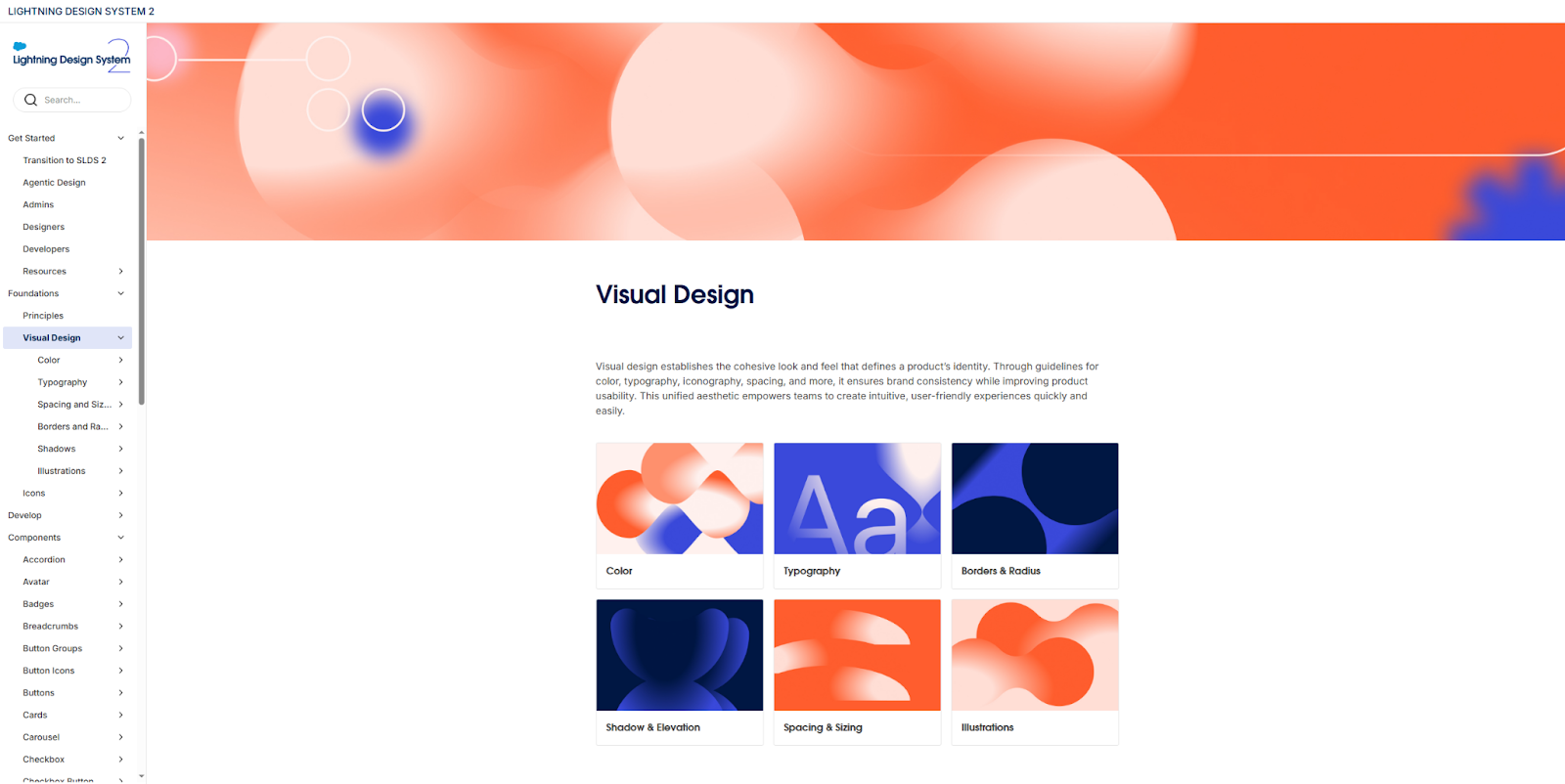
Salesforce’s Lightning Design System provides a wealth of guidelines to maintain a consistent, accessible, and visual-first user experience. Every example offers useful visuals that show how components fit into the user interface, adding valuable context for everything designers and developers do.
This level of detail is harder to scale, but it’s well worth it to create an enterprise design system, which is a single source of truth for all the visual design principles that a large product design team should understand.
7. eBay Playbook

With a brand history as extensive as eBay’s, it’s a great idea to treat a design system as a living document. The eBay Playbook design system is just that, helping usher designers and developers into a new future for the brand. In 2024, they radically updated their brand guidelines, and their new design system provides all the documentation needed to transform their existing digital experiences.
Treating your design system as a living, flexible document is important even when you’re not fully re-branding. Set an audit schedule for approximately every six months to make sure all your guidelines are up to date.


Evolving design systems
In our ebook, learn why experts are investing in scalable design systems and how they are thinking about the future of design systems.
8. Dropbox Brand Guidelines
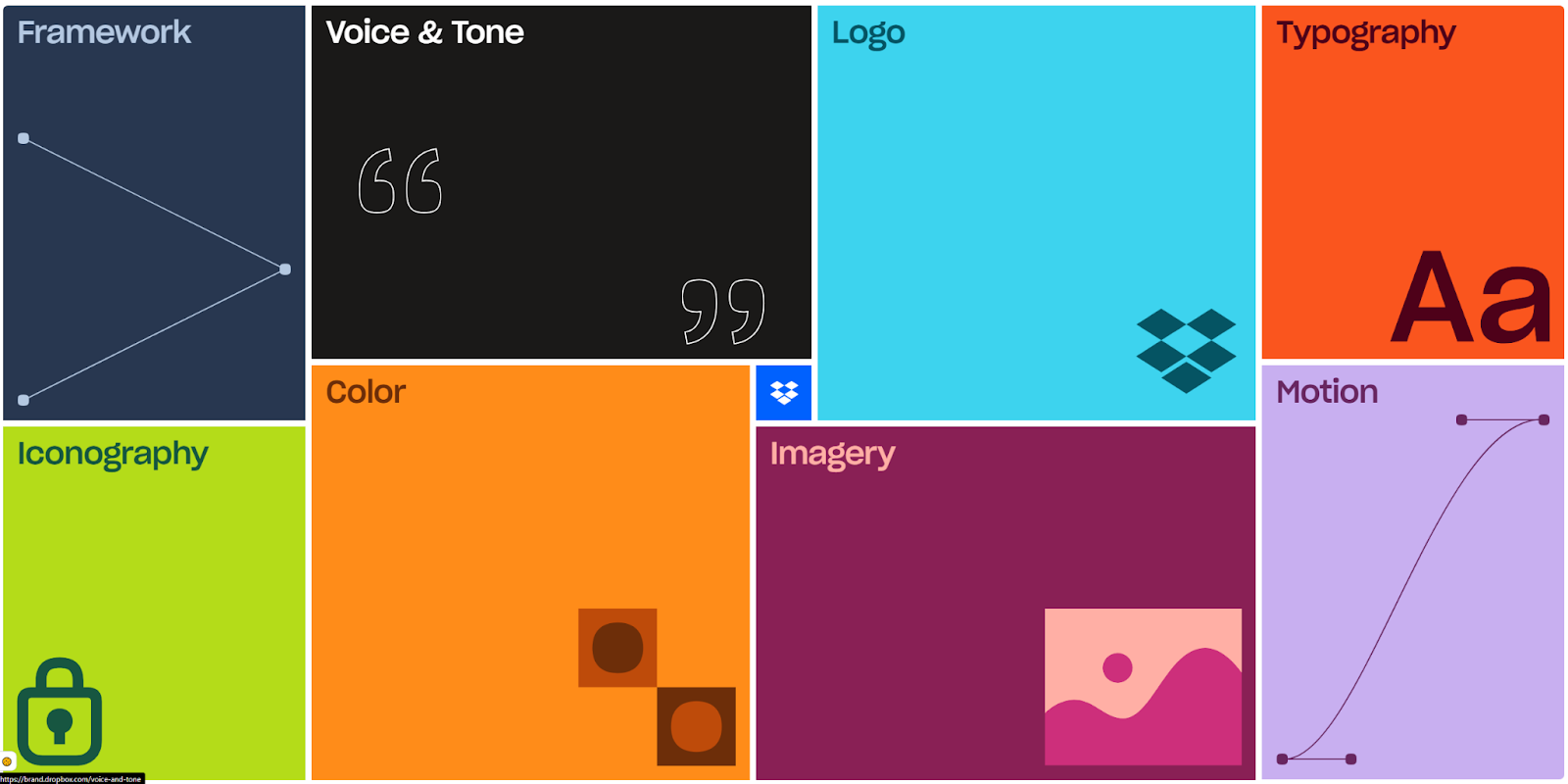
The Dropbox Brand Guidelines website provides an inviting user experience that guides designers and developers through all the components of their design system. However, it can be a little convoluted and doesn’t earn high marks for accessibility; there’s no search bar, too much motion, and not enough content.
Still, they deserve credit for thinking outside the box to create something unique and memorable that readers want to explore. It’s a good example of how to incorporate brand design into the system itself.
9. Adobe’s Spectrum
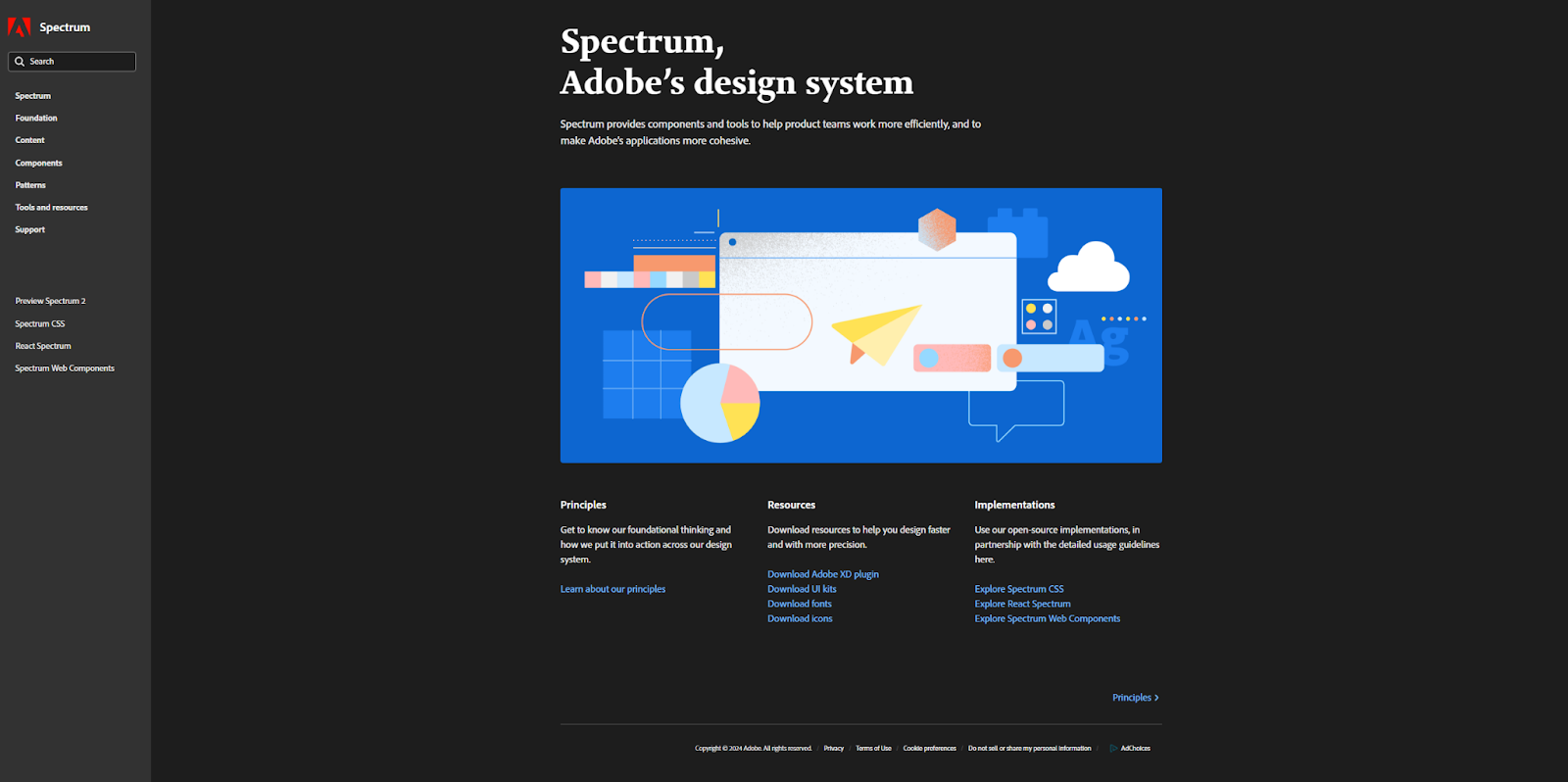
Adobe built its Spectrum design system for advanced designers and developers, offering guidelines and documentation for visual and backend features. Everything comes with screenshots and diagrams that show how a finished interface should look and where each component should live.
Scaling this amount of documentation presents a significant challenge. To make this smoother, Adobe included changelogs and known issue pages that keep everything current and help with troubleshooting. You should do the same if you intend to add highly detailed documentation.
10. GitLab’s Pajamas Design System
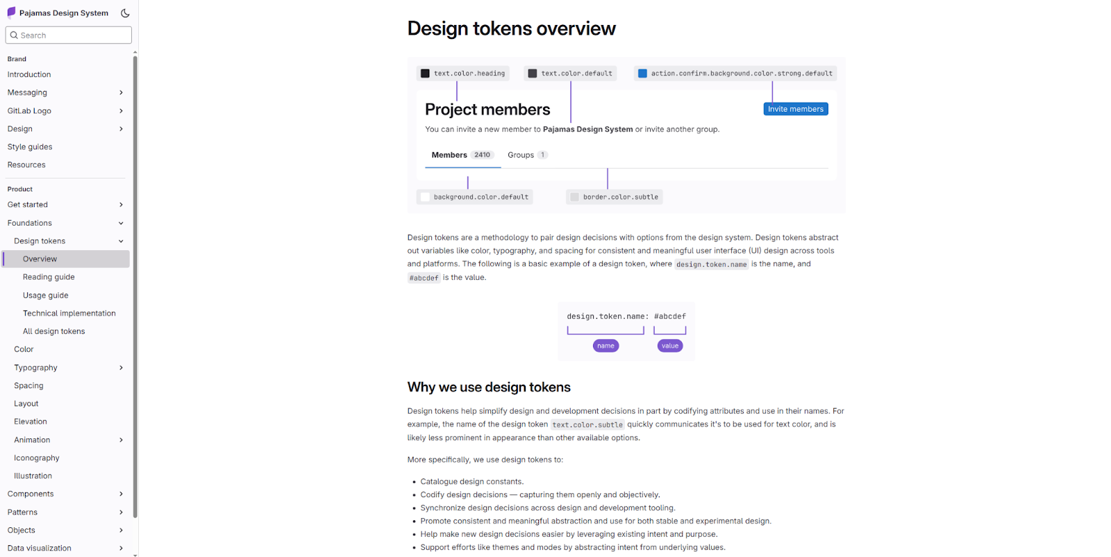
Pajamas is GitLab’s open-source design system, which contains all the patterns, components, and brand guidelines they use. It’s helpful for both internal and external developers who need a single source of truth for design decisions, as well as GitHub enthusiasts interested in their code.
By writing it for a broad audience, GitLab created a versatile design system that adds to their brand appeal and recognition, inviting third-party developers and fans alike.
Why clone an existing design system?
While it’s great to have guidelines to follow, not every design system warrants the complexity of the above examples. But as you’re building, you can clone an existing design system that provides a strong foundation. It should come prepared with UI elements, design tokens, and text styles optimized for accessibility and visual cohesion.
Of course, you can also change everything about the design system you clone. But starting with a pre-made template means you won’t miss any crucial components, like a navigation menu or content guidelines, when adding customization.
5 cloneable design systems for your next Webflow project
Here are five cloneable design systems that include all the design tokens, text styles, and reusable components you need to begin a website design project. Explore them all to find one that closely resembles your site’s visual style.
1. Carbon Design System

The Carbon Design System from CJ Hersh provides a comprehensive design library for Webflow designers. The components are rather plain, but they’d work well for a minimalist site with few embellishments.
What’s especially impressive is the breadth of what CJ has baked into this design system example: a UI kit, style guide, changelog, grid examples, and all the reusable components you might need.
2. Simple Design System
This Simple Design System by Benjamin Prigent offers an excellent starting point for a colorful, visual design that’s still optimized for accessibility. Striking this balance is tricky, but the color contrasts and text styles found here are all pre-configured for maximum usability. It’s a great design system to start with if you want a shortcut to a highly usable toolset right out of the box.
3. Starter Design System

The Starter Design System from Yuriy Sharunov is a versatile and consistent UI kit for mobile apps and websites. It includes platform-agnostic design tokens that you can quickly adapt for many use cases. Best of all, it comes with downloadable component files that’ll immediately set you up for success.
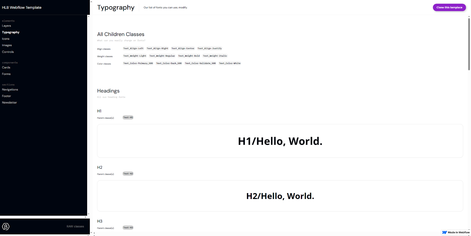
4. Startr Style Guide
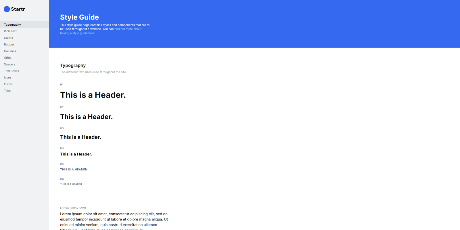
The Startr Style Guide, created by Nikolai Bain, is lightweight but well-curated. It’s a tight library of compatible visual styles and components that prioritize consistency and accessibility.
The text styles are readable, the color contrasts pass WCAG tests with flying colors, and the patterns are recognizable. This sturdy foundation makes it a great starting point for building your own design system.
5. basicsam Style Guide
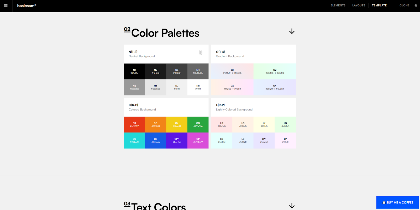
Sam Basic created a Webflow Style Guide that’s more than a simple design system — it also includes guidelines about rich text and CSS classes with sources for more components. However, you’ll likely want to trim it down once you decide on a direction, since many of the components offer competing styles and patterns. Everything you need is there; select what you want to keep and get rid of the rest.
Build smarter and scale faster with Webflow
Cloneable designs help whether you’re building something as complex as the Atlassian Design System or a small-scale library of interface components. Whatever your goal, a strong starting point and the right design tools let you establish and maintain the design patterns you intend to follow.
As you discover the need for new icons, text styles, and other UI elements, you’ll want a platform that lets you scale up your design system. Webflow’s reusable components provide modular additions to any web design style, and its Shared Libraries let you carry those components over to all your sites.
Check out Webflow University to explore more resources on creating an effective design system.

Build websites that get results.
Build visually, publish instantly, and scale safely and quickly — without writing a line of code. All with Webflow's website experience platform.