

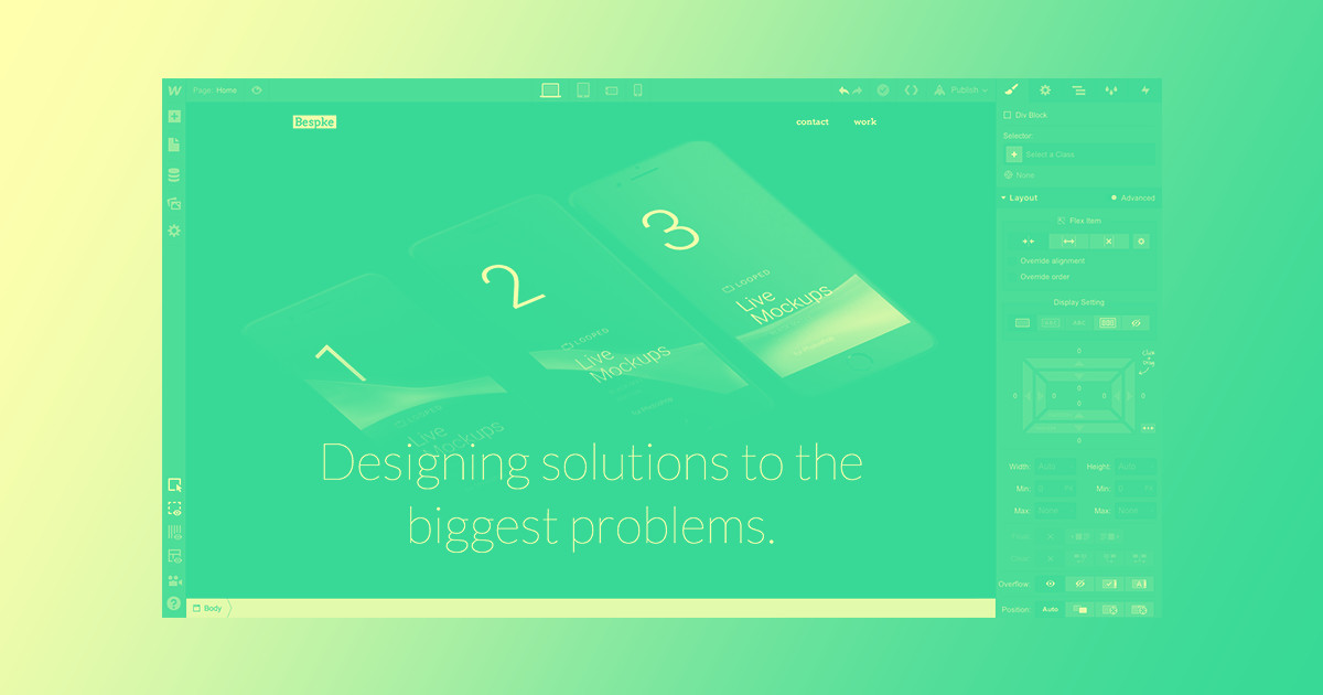
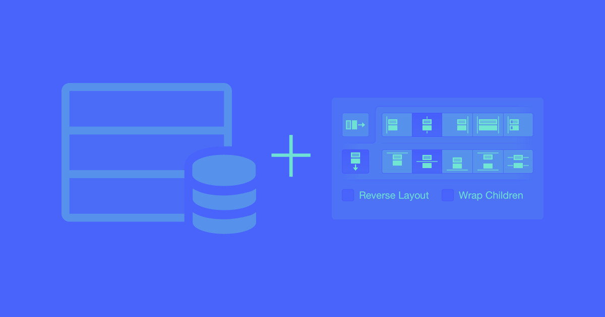
When you’re laying out content pulled in via a Collection List, you might notice content of different lengths breaking your tidy grid. Thankfully, flexbox can help you fix this problem, giving you more control over your layout, especially on different devices.
This quick tutorial will show you how easy it is to convert your existing Collection List layouts to a more fluid, flexbox-powered grid layout.
Step 1: Set your Collection List layout to full width
We’ll be styling three different elements throughout this tutorial:
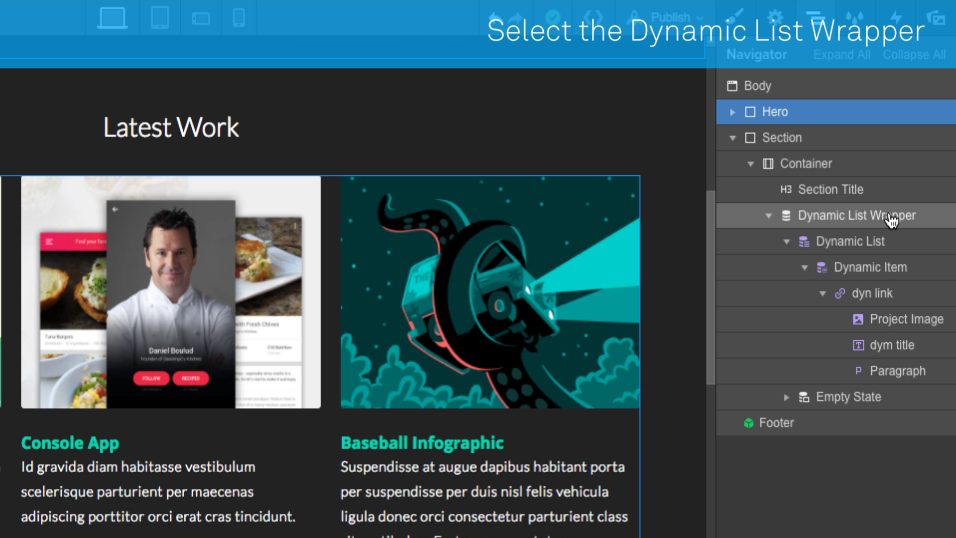
- Collection List Wrapper
- Collection List
- Collection item
First, select your Collection List Wrapper, then go to the Settings tab.
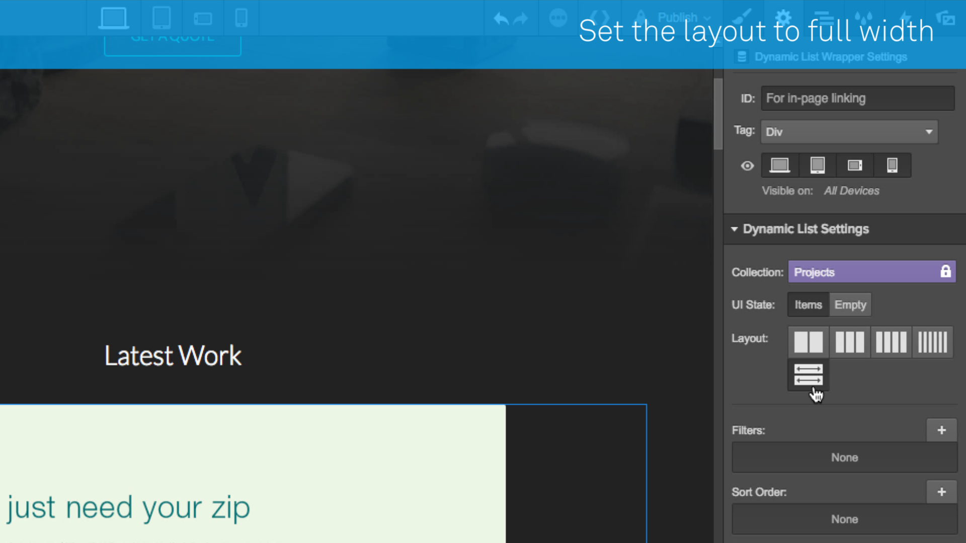
Then set the layout to full-width. This clears out the the floating columns applied to your Collection items, allowing each item to stretch across its own row.
Step 2: Flex your Collection List
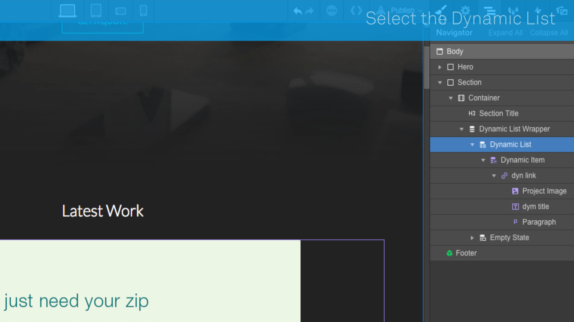
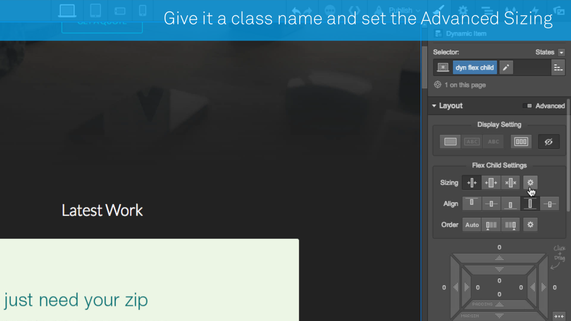
Next, select your Collection List, then switch over to the Styles panel.
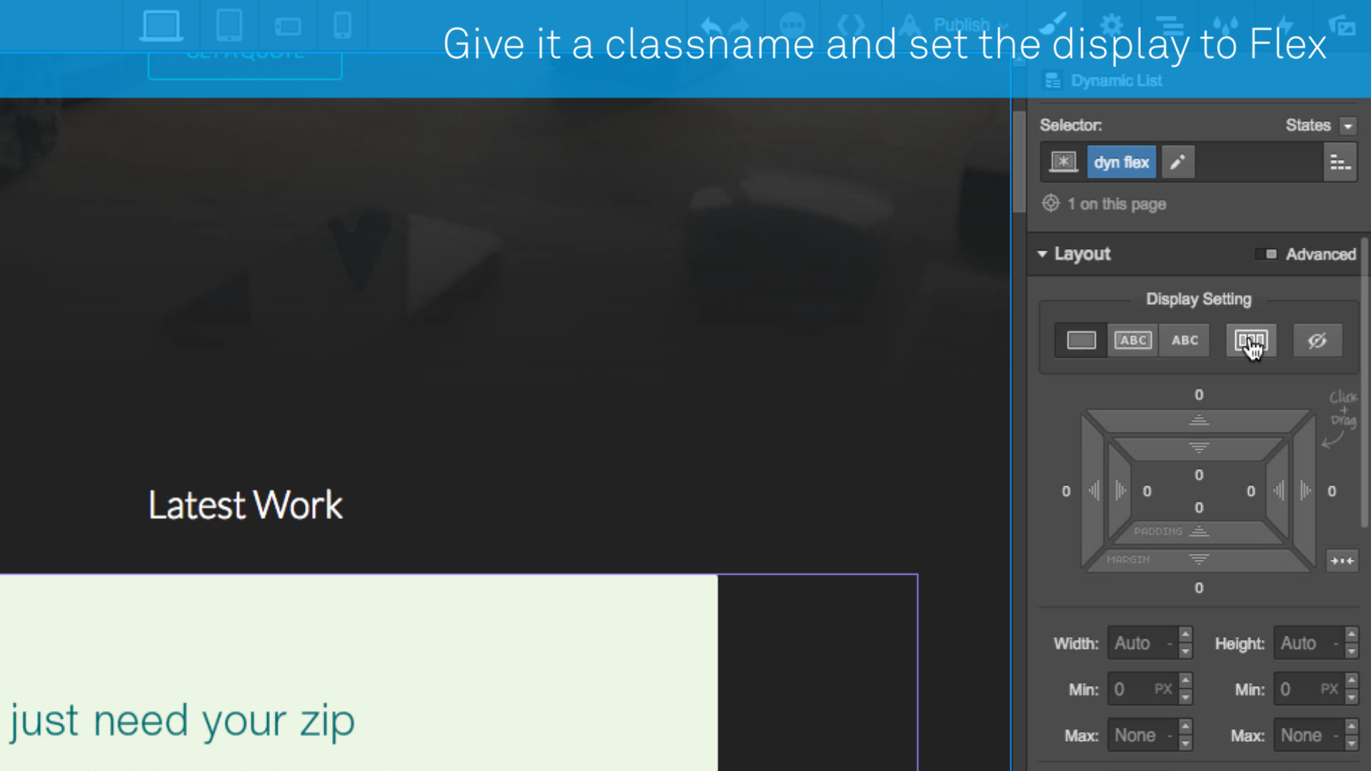
Give your Collection List a class name, then give it the flex display setting. This will cause all of your Collection items to bunch up together, each in their own column, in one row.
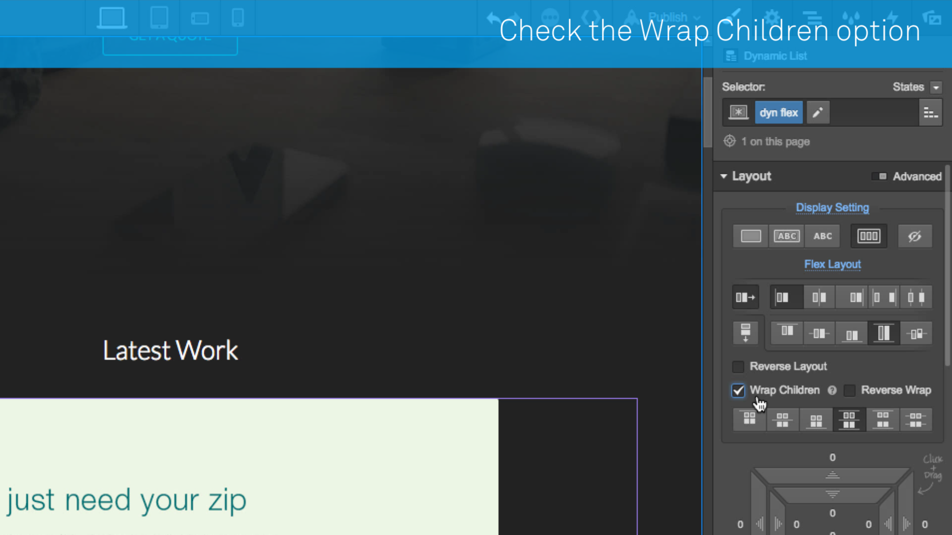
Now tick the the Wrap Children checkbox.


Learn flexbox the fun way...
Master the basics of flexbox in 28 increasingly challenging — and fun!— levels, without writing a line of code.
Step 3: Add fluid widths to your Collection Items
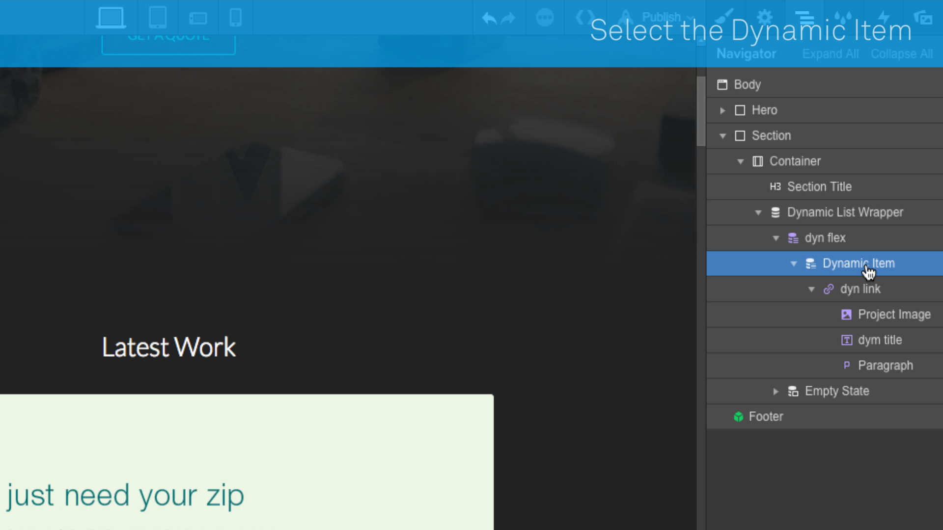
Now let’s style those Collection items themselves. Select the Collection Item in the Navigator, then switch to the Styles tab and create a new class.
Next, under the Flex Child Settings, click the cog icon to access the Advanced Sizing settings. In the third field, you can set a percentage for the width of your columns.
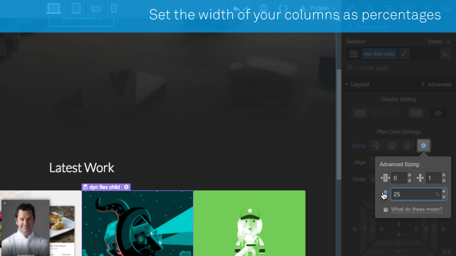
You can set your fluid grid to have any number of columns per row. For example:
- 20% = 5 columns
- 25% = 4 columns
- 33.3333% = 3 columns
- 50% = 2 columns
- 100% = 1 column
Finally, toggle through each breakpoint to set the right width for each viewport.
Step 5: Preview your work and enjoy
Switch to preview mode and enjoy your new, more flexible layout!
This lesson explains how Flexbox works in Webflow and how to use it to create flexible, CMS-powered layouts that adapt seamlessly across screen sizes.