


In this tutorial, using an external clipboard library, we’ll build a CMS Collection of gradients. This Collection will let users copy the hex code to the clipboard by simply clicking it. Don’t worry if you’ve never worked with an external library — it’s simpler than it sounds!
The users experience is such an important part of the design process. Always jump at the chance to go the extra mile to make an interaction more exciting and user-friendly.
Inspired by Luke Davies’ Gradients.io, we’re going to push his brilliant work a little further and increase the user experience. We’ll use clipboard.js to build our CMS collection of gradients in Webflow.
Here’s a demo of what we’ll be building
Step1: Create your CMS Collection
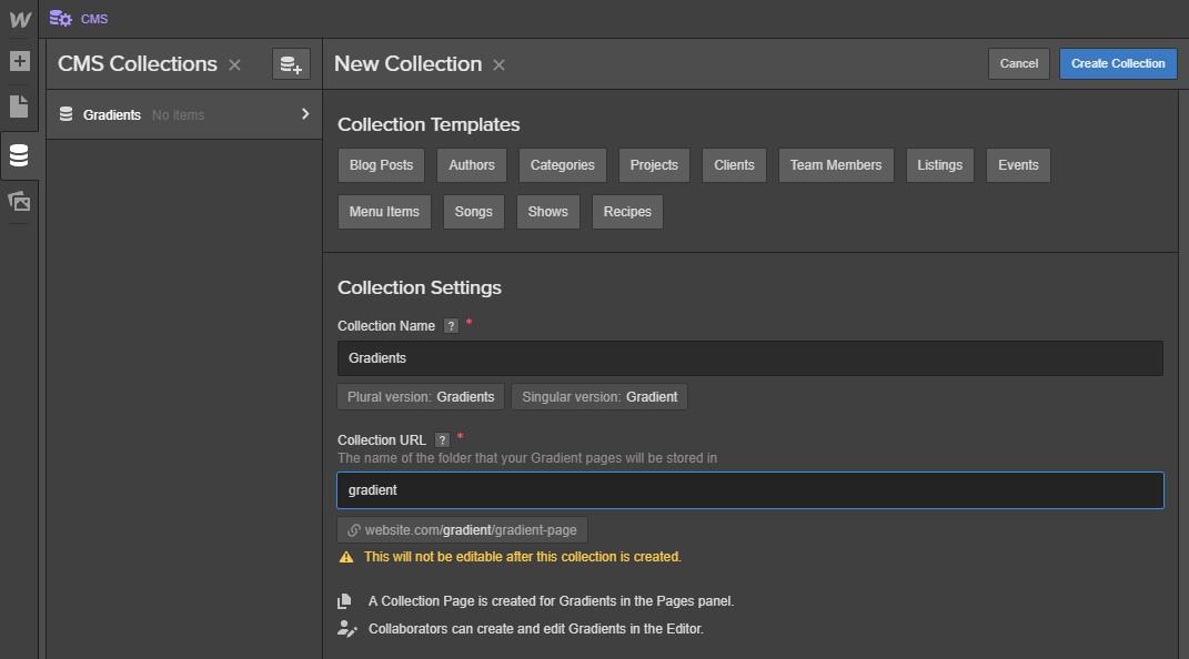
Open the designer and click the CMS tab on the left menu. Click Create New Collection.

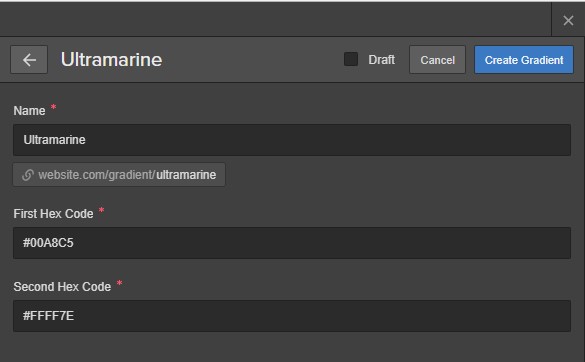
Name the collection “Gradients” and set the Collection URL as “Gradient.”
Click the Add New Field and select Plain Text from the field type options.
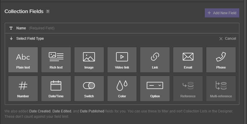
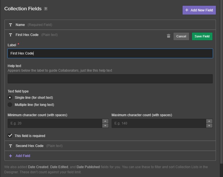
Name it “First Hex Code.” Set the field as required, by checking This field is required. Repeat this and call your new field “Second Hex Code.”
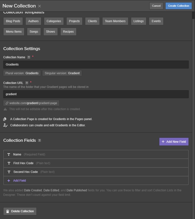
We’re done here, click Create Collection in the top right.
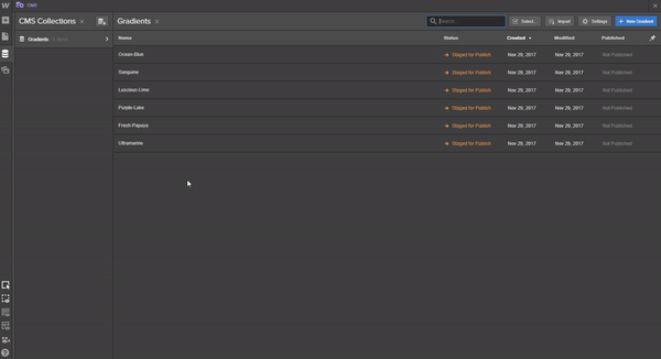
Now we’re going to add our CMS Items. In the top right, click the New Gradient button.
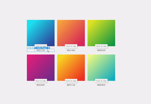
Below is a list of the details I’ve used for each CMS item:
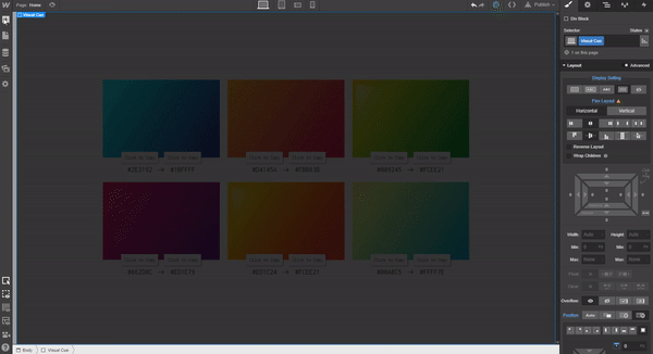
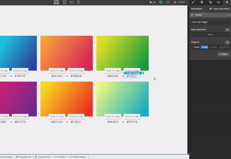
- Ultramarine #00A8C5 #FFFF7E
- Ocean-Blue #2E3192 #1BFFFF
- Sanguine #D4145A #FBB03B
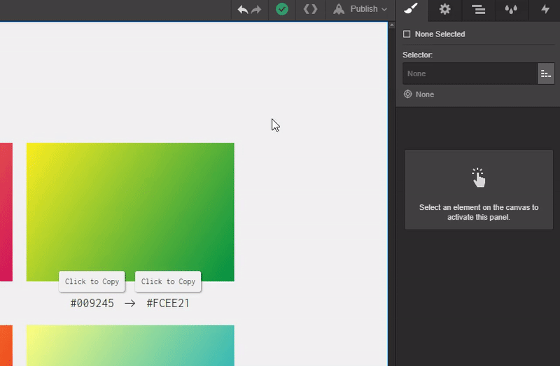
- Luscious-Lime #009245 #FCEE21
- Purple-Lake #662D8C #ED1E79
- Fresh-Papaya #ED1C24 #FCEE21
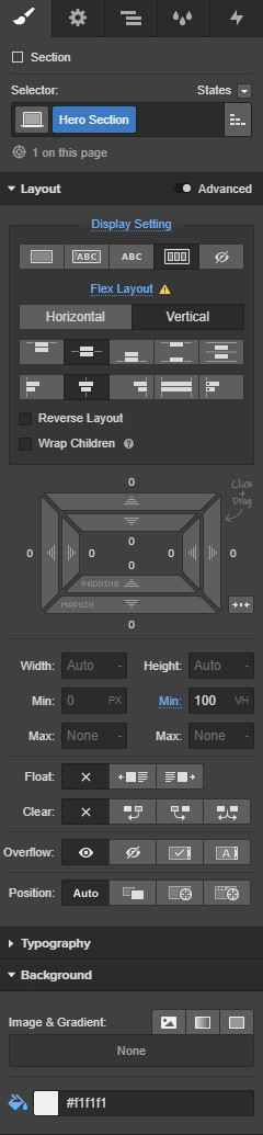
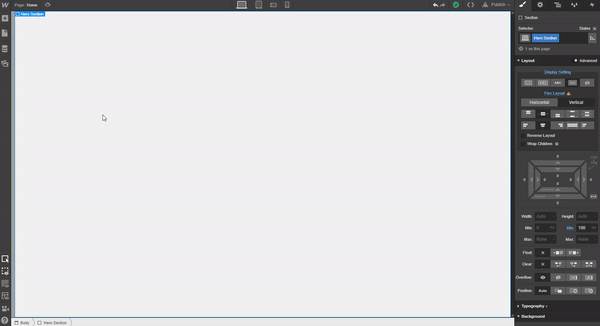
Once you’ve entered each CMS item into the collection, go to the left hand tabs panel in the designer, click on the Add Element(s) tab. Place a Section on the canvas, give it a class of “Hero Section,” and use the following settings:
- Display: Flex, Vertical, Justify:Center, Align:Center
- Min Height: 100vh
- Background Color: #f1f1f1
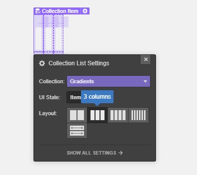
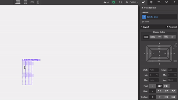
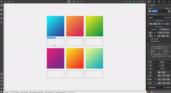
Next place a container on the canvas — no need to give it a class name. Add a CMS collection list and bind it to the Gradients Collection. Do this by selecting it from the dropdown in the collection list settings flyout. Select 3 Columns from the layout section of the flyout.
Select one of the collection items, give it a class of “Collection Item,” and add a top and bottom margin of 10px (the left and right have 10px by default).
Step 2: Add content and HTML Embeds
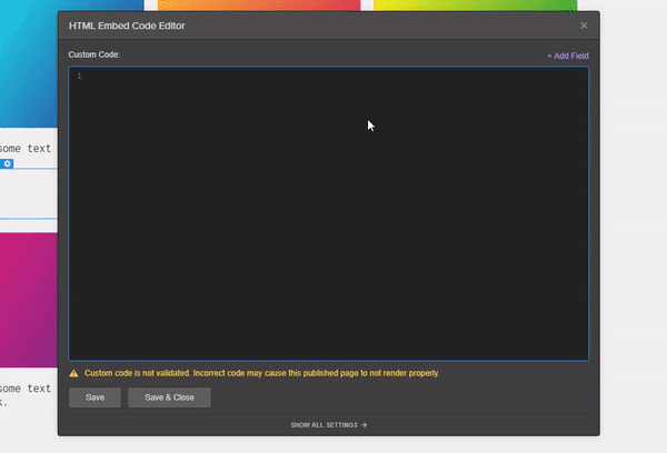
Select the elements tab on the left, scroll all the way to the bottom, and place an HTML Embed widget in one of the Collection items. When the HTML dialogue modal opens, copy and paste thisCSS snippet:
<style>
. {
background: ; /* For browsers that do not support gradients */
background: -webkit-linear-gradient(bottom right, , ); /* For Safari 5.1 to 6.0 */
background: -o-linear-gradient (bottom right, , ); /* For Opera 11.1 to 12.0 */
background: -moz-linear-gradient(bottom right, , ); /* For Firefox 3.6 to 15 */
background: linear-gradient(bottom right, , ); /* Standard syntax */
}
</style>
Now we’ll add our dynamic content to the CSS snippet. The finished snippet should look exactly like this:


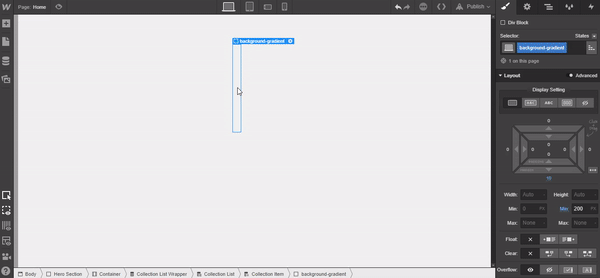
Click the Save & Close button. With the HTML Embed highlighted in the navigator panel, open the elements panel and place a div below. Give it a class of “background-gradient” and add the following settings:
- Padding bottom: 10px
- Min Height: 200px

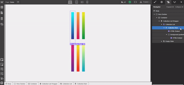
Now add another HTML Embed to the background-gradient div. When the HTML panel opens, add the following snippet:
<div class="background-gradient "></div>
In the space next to the last quotation mark, add the dynamic field of “Name.” Make sure there’s a space between background-gradient and the dynamic field.
When you hit Save & Close, you’ll see the dynamic gradients fill the previously created divs. Next, add a div to the collection item container and give it a class of “Flex Row” using the following settings:
- Display: Flex, Horizontal, Justify:Center, Align:Center
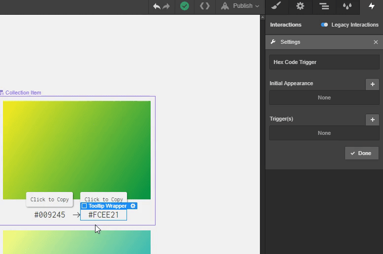
Add a div to the newly created flex row, give it a class of “Tooltip Wrapper,” and set the display to Position: Relative.
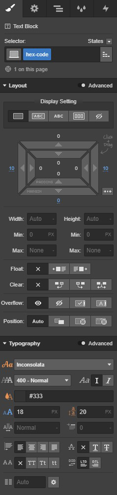
Place a Text Block in the tooltip wrapper div, give it a class of “hex-code,” and use the following settings:
- Left and Right Margin: 10px
- Font Size: 18px
- Background Color: Transparent (This is necessary, as we’re adding HTML Embeds some default styles add a background color a little further on.)
Now place another HTML Embed widget next to the text block. Copy and paste the following markup snippet in the HTML Embed modal.
<button id="btn" class="btn hex-code" data-clipboard-text=""></button>
Click Save & Close.
You can now delete the hex code text block from the collection item — we simply needed it to style the HTML Embed text.
Place a new text block under the Hex Code HTML Embed, give it a class of “Tooltip” with the following settings:
- Padding (All Sides): 5px
- Position: Absolute, Top, -150%
- Font Size: 12px
- Text Align: Center
- Background Color: #f1f1f1
- Border Radius: 3px
Box Shadow Settings:
- Color: rgba(0, 0, 0, 0.48)
- Distance: 1px
- Blur: 3px
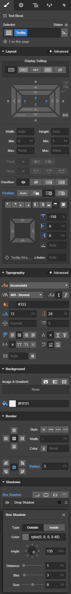
Change the copy to “Click to Copy” and you’ll have a tooltip that looks like this:

We’re going to leave the tooltips here for now, but we’ll come back to add legacy interactions later.


Design interactions and animations without code
Build complex interactions and animations without even looking at code.
Now, going back to the Tooltip Wrapper divs, let’s duplicate the Tooltip Wrapper. To do this, right click and select Duplicate from the flyout menu — you should have two side-by-side. Double click the new HTML Embed and adjust the dynamic fields by clicking and choosing Second Hex Code. Click Save & Close.
Now you’ll see both the Hex Codes displayed in each Collection Item respectively.
For aesthetic purposes, I’ve added an arrow SVG icon from Flaticon between the two hex codes. Simply download the icon, put it in the assets panel, and place it between two of the tooltip wrapper divs. Resize the image width to 15px. There’s no need to add a class name.
Step 3: Add the external JS library
So to make this work, we’ll point to the externally hosted Javascript library. To do this, navigate to your projects Settings by clicking on the hamburger menu in the top left corner of the designer.
From here, go to the Custom Code tab and place the following snippet into the Footer Code section:
<script src="https://cdnjs.cloudflare.com/ajax/libs/clipboard.js/1.7.1/clipboard.min.js"></script>
<script>
new Clipboard('.btn');
</script>

If you publish the site now, you can test it out!
Step 4: Add a visual cue
At this stage, our user is wondering if what they’ve done has worked — there’s no feedback until they paste. And we all know how aggravating this can be, so let’s fix it with a visual cue! We’ll create an interaction that shows the tooltip on hover and add a “Click to Copy” call-to-action. Let’s also add a big modal message that confirms they’ve copied the content to their clipboard.
Let’s do it!
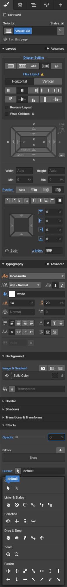
Grab a div, and place it in the body of your page and give it a class of “Visual Cue” with these settings:
- Display: Flex Layout, Justify:Center, Align:center
- Position: Fixed, Full
- Z-index: 999
- Font Color: #ffffff
- Background Color: rgba(0, 0, 0, 0.78)
- Cursor: Default
Add an H1 text block to the Visual Cue div and give it a class of “Copied Text” with the following settings:
- Margin (Top and Bottom): 0px
- Margin (Left): 10px
- Font Size: 50px
Next we’ll add a copy icon from Flaticon, download the icon, and place it in your assets panel. Then place it on the canvas beside your text — again, no need to add a class — and set the width to 50px.
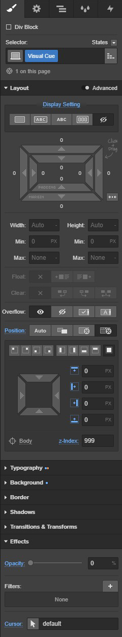
Now that we have the visual cue modal in place, we’re going to adjust a couple of settings. This is so that in the designer and on the finished site, it won’t be visible.
- Display: None
- Opacity: 0%
Step 5: Add interactions
We’re on the home stretch — we just need to add interactions!
Open the interactions tab and click the Legacy Interactions toggle. We have to use legacy interactions because interactions 2.0 currently doesn’t work with CMS content.
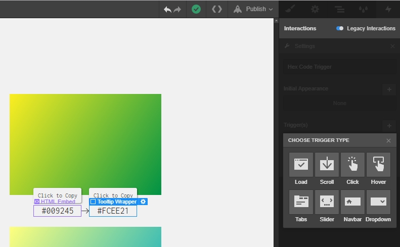
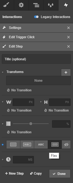
Select a tooltip wrapper from the canvas, click the Plus icon in the interactions panel, and name your new interaction “Tooltip On Load.” Click the plus icon on the “Initial Appearance” panel and add these settings:
- Transform: Move Down 20px
- Opacity: 0%


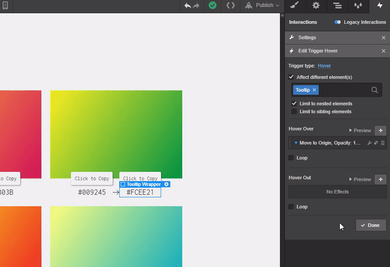
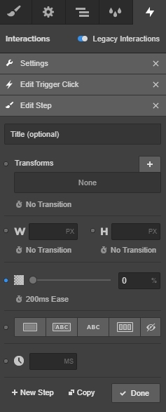
Now select the one of the tooltip wrappers, add a new interaction, and name it “Hex Code Trigger.”

Click the plus icon in the triggers panel and choose Hover. Check the Affect different element(s) box, search for the class “Tooltip,” and select it from the dropdown menu. Check the box for Limit to nested elements.
Change the opacity to 100% and leave the default 200ms for the duration. Click the plus icon on the Hover Over panel, leave all the settings as they are, and simply close the flyout.
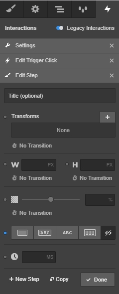
Navigate to the Hover Out section, click the plus icon, and apply the following settings:
- Move Down: 20px
- Opacity: 0%
Now we’re going to add the last interaction for the pop-up modal with the copied message. Keep a Tooltip Wrapper highlighted and navigate back to the legacy interactions panel. Add another interaction by clicking the plus icon and select Click.
Select the Affect different element(s) checkbox and search for the “Visual Cue” class. Choose it from the dropdown list.

Next, click the plus icon next to the First Click text. Select the display setting of Flex and click + New Step.
In this step, change the opacity to 100% and leave the default 200ms. Click + New Step again.

Add 500ms of wait time and another step.

Change the opacity to 0% — again leaving the default 200ms animation time. Add one last new step.
Change the display setting to none.
Select done… Because we’re done here! Just one last thing: we need to add the legacy interactions to the other tooltip wrapper.
Simply select the other tooltip wrapper, open the legacy interactions panel, and select the Hex Code Trigger interaction.

Now we’re done. Publish and enjoy!


