Horizontal navigation bars have become the norm in web design, so if your audience isn’t exactly web-savvy, they’re a safe bet. But if you’re looking to do something a bit different, sidebar navigation can help keep your site looking clean while still providing easy access to links.
In this, my second Webflow Bit, I’ll show you how quick and easy it is to make a sidebar navigation menu for your Webflow websites.
Step 1: Drag in a navbar component
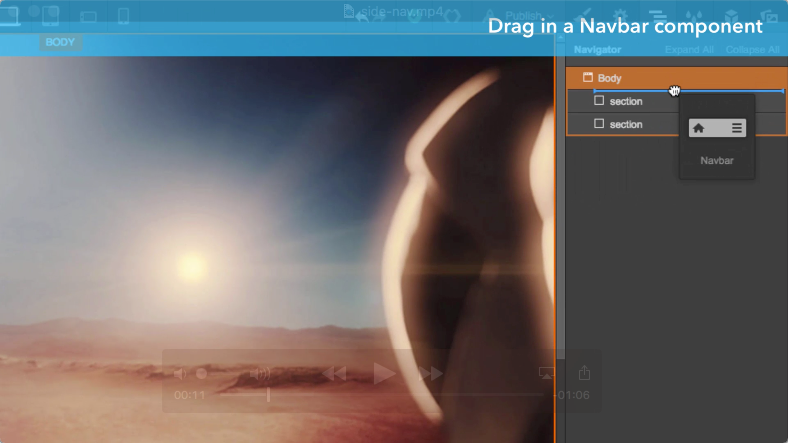
Open the Add panel on the left, scroll down to the Components section, then drag the navbar component onto your canvas (or use the Navigator tab if you need more precision).
Step 2: Style your navbar
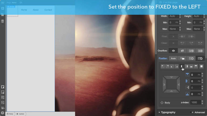
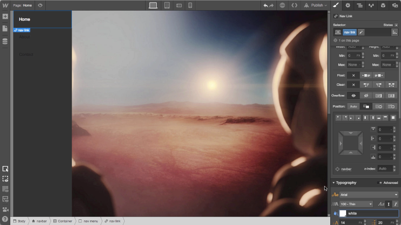
Set the position to fixed left and set the top, left, and bottom to 0px. (Or put it on the right, with top, right, and bottom set to 0px.) You can also add a background color if you’d like.
Step 3: Define your navbar settings
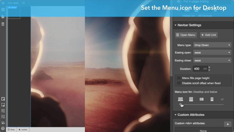
With your navbar selected, go to the Settings tab, then set the menu icon to “Desktop and below” so it displays at all breakpoints. (Though, of course, you can set the sidebar nav to start displaying at whatever breakpoint you want.) Then tick the “Menu fills page height” box and set the menu type to “over left.”
Optional: Style your menu icon
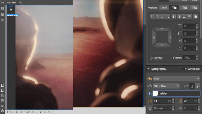
If you changed the background color of your navbar component, you may need to change the menu icon’s color too. To do that, switch to the Navigator tab, select the menu button, give it a class name, then change the font color. You may need to do this for the links in your nav as well.
Pro tip: check your text color contrast
Check the legibility of your text links with WebAIM’s Color Contrast Checker so those with vision problems can still navigate your website.
Step 4: Preview and enjoy!
Click the preview button at the top left of the Designer to see your work in action.


The modern web design process
Discover the processes and tools behind high-performing websites in this free ebook.


