


In your wanderings across the web, you may have seen some sites with typography that scales beautifully as you resize your browser window. Or full-screen sections that remain that way no matter how big the viewport gets.
Here’s a few examples from CodePen:
Here's a simple example I built in Webflow: http://vh-and-vw.webflow.io/
Now the “old-school” way of setting element and font sizes was with pixel-based widths and heights. Try using pixels to set height and width nowadays and you’ll see a lot of shaking heads.

Modern devices have so much variability in screen size that it's crucial to design every web layout with maximum flexibility in mind. Similarly, a simple window resize should not leave your user bewildered by unreadable text. Users increasingly expect websites not just to function well but to provide a fully pleasing aesthetic experience regardless of device. Elegantly scaling typography is one way to provide your users with a seamless experience whenever they visit your site.
To achieve real responsiveness, you need to start thinking beyond absolute or fixed length units. Moving to relative units to express length and using vh and vw style settings lets you control the widths and heights of elements no matter the viewport size.
You can also use percentage-based units, but keep in mind that they’re based on the parent element, while vh and vw style units are based on the viewport.
Vh and vw units are ideal for responsive design because they are completely independent of the base font size.
vh and vw defined
vw and vh are length units representing 1% of the viewport size for viewport width (vw) and height (vh), respectively.
Wondering what browsers support vh and vw? Browser support for vh and vw units is generally good — all the newest major browser versions are compatible. Check can I use? for the latest!
vh and vw in action
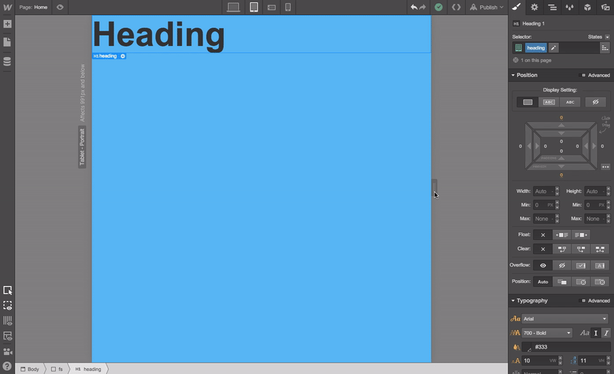
You can achieve vh and vw based typography sizing in Webflow easily. To use vh and vw values, just type “Nvh” or “Nvw” (where “N” represents the percentage of the viewport you’d like to cover) into any width or height field.

So to cover 100% of the viewport, you’d set 100% for the width and 100vh for the height. To cover half of the viewport height, you’d set a height of 50vh. You may be asking, why not use 100vw for the width? The answer is because the vw style doesn't take into account the scroll bar width, it could cause side scrolling on browsers with wide scroll bars such as Internet Explorer.
Responsive typography with vh and vw
You can also use the vh and vw as font sizes to make text scale with the size of the browser window. This is a great way to keep your content sized just right no matter the window or viewport dimensions.
Are you using vh and/or vw yet?
If so, we’d love to see what you’ve done with them! Share your links below, on Twitter, or on Facebook.


Free ebook: Web design 101
Master the fundamental concepts of web design, including typography, color theory, visual design, and so much more.