

As we see in photography’s rule of thirds and on the front page of every newspaper, grids provide a visual logic that brings order to layout, especially in web design.
CSS grid used to be a pain to put together, even if you were familiar with CSS. Webflow's CSS grid feature makes it easy to tackle this design technique — even without knowing how to code. Check out these 12 designs, all made in Webflow, that harness the design power of CSS grid.
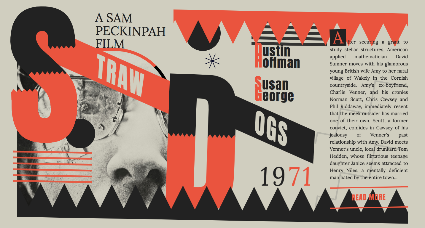
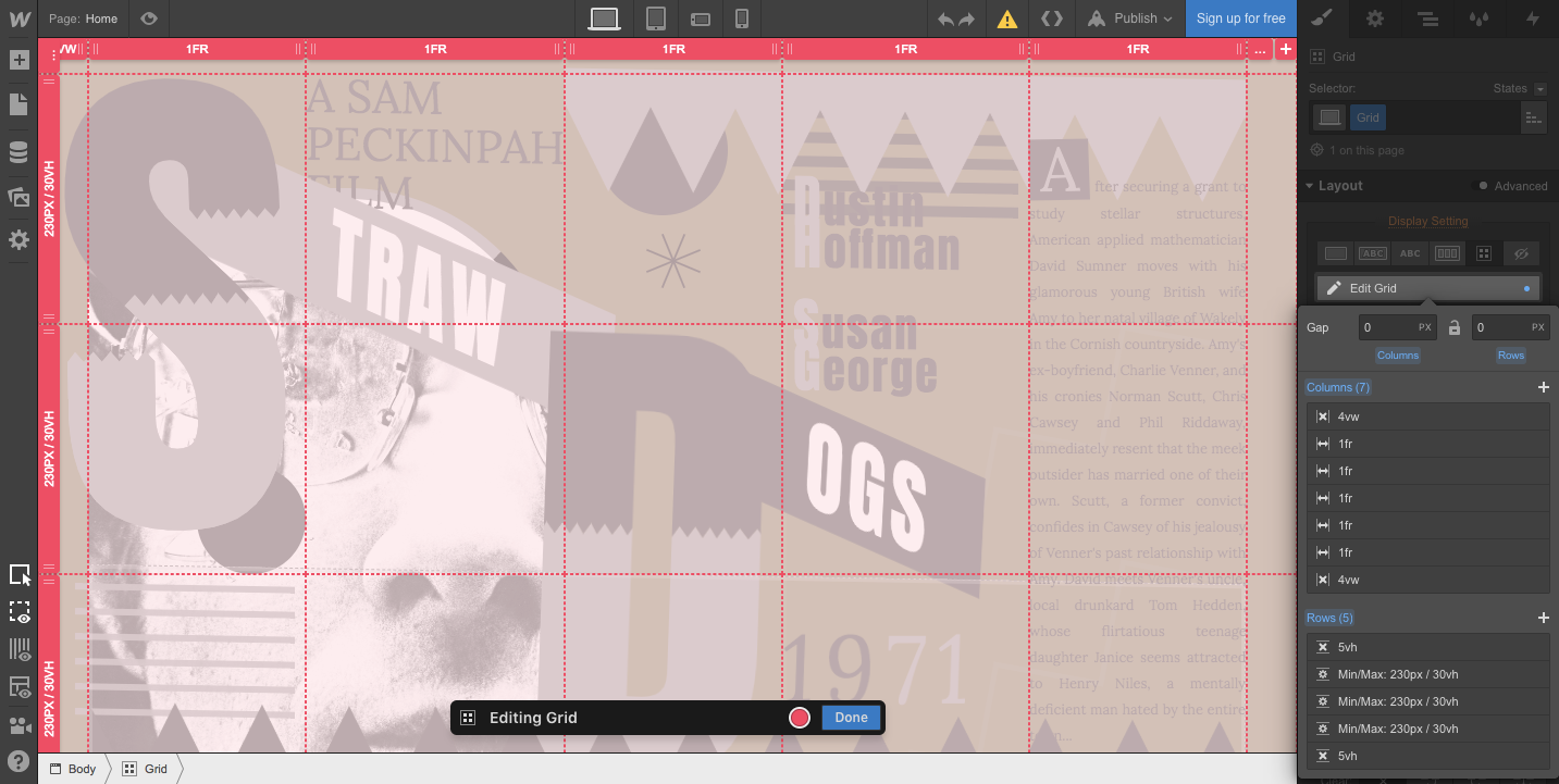
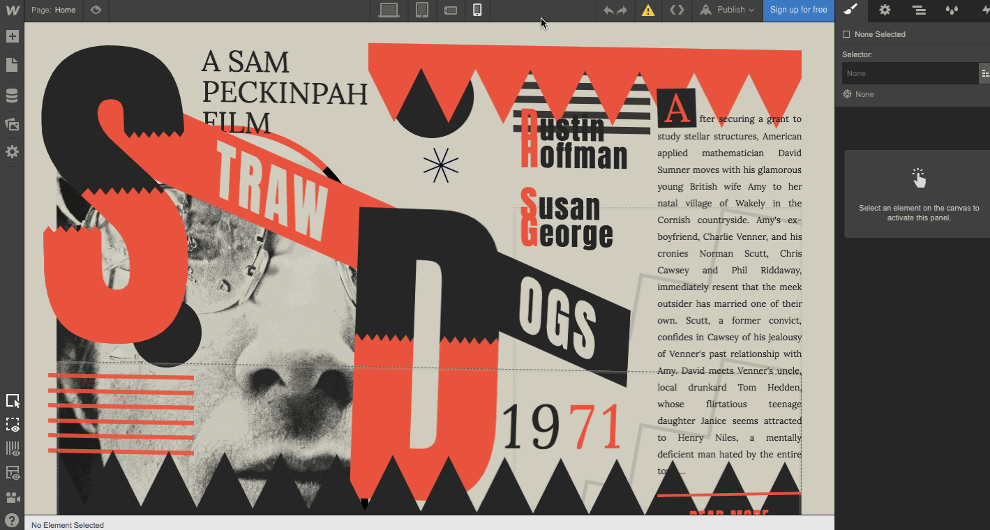
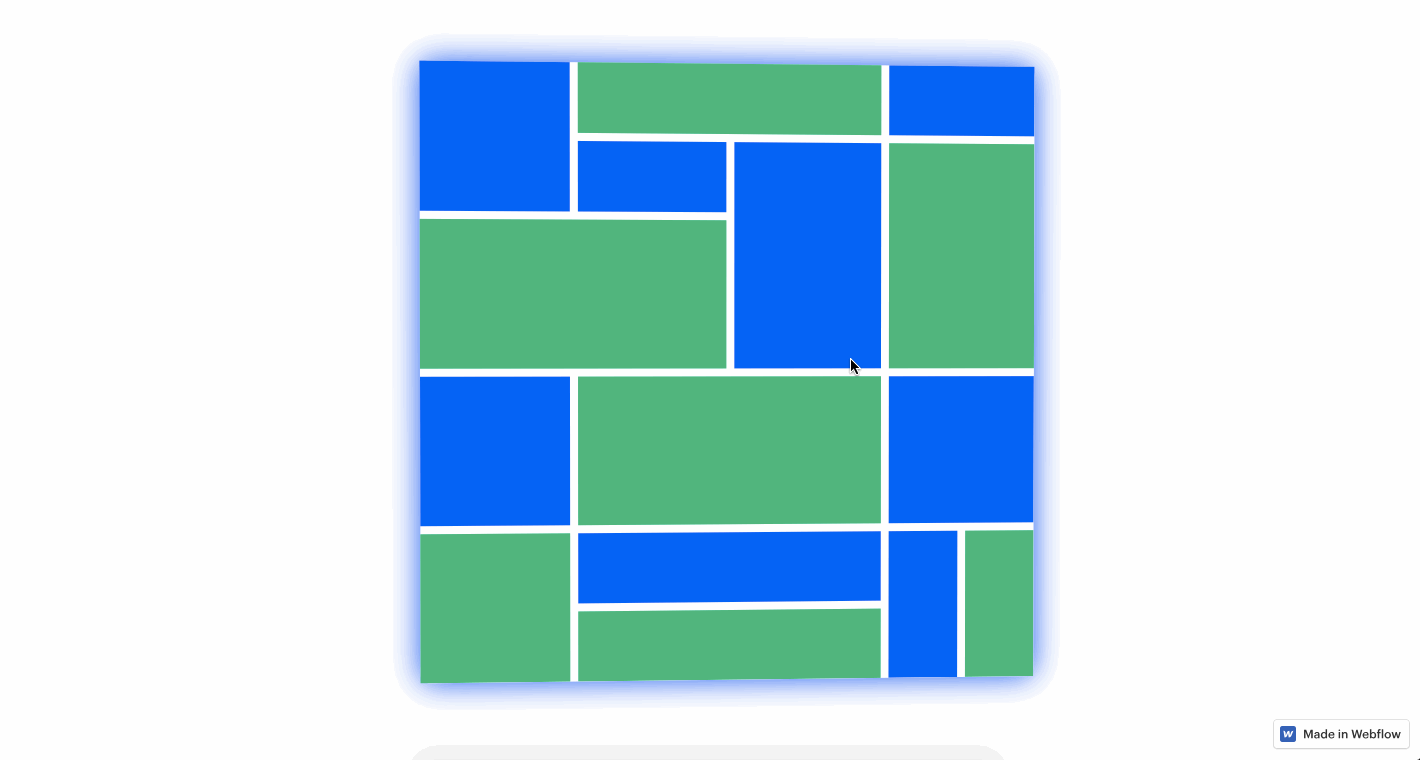
1.Straw Dogs
A great way to learn a new design practice is to apply it to a personal project. The stakes are low and it gives you a chance to understand the process before you dive in and start using it in your client work.
This Straw Dogs website is just a landing page that points to the Wikipedia page of this 1971 film (which inspired Tarantino’s Reservoir Dogs), but it’s a good example of starting small.
This site features a grid with seven columns (a narrow column bookends each side) and five rows. There are also div blocks within the grid for the larger block letters, lines, and shapes that make up the layout. Take a closer look at how this was put together in the Webflow Designer.
Grid also works beautifully for responsive design, as you can manually reposition elements as needed — right on the canvas! — for each screen size.
2. Japanese grid
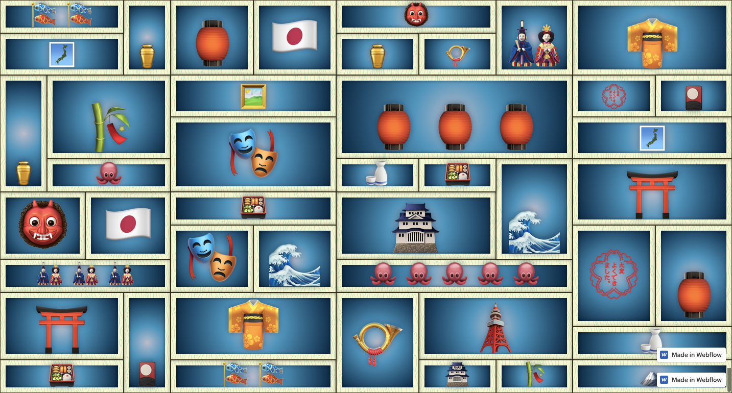
Grids are everywhere you look. This Japanese-styled grid was inspired by a display wall in a retail space. It mimics shelving, translating a real-world layout into a digital design. Next time you notice a grid — snap a photo and use it for inspiration in your own design work.
Clone this Japanese grid and make it your own.
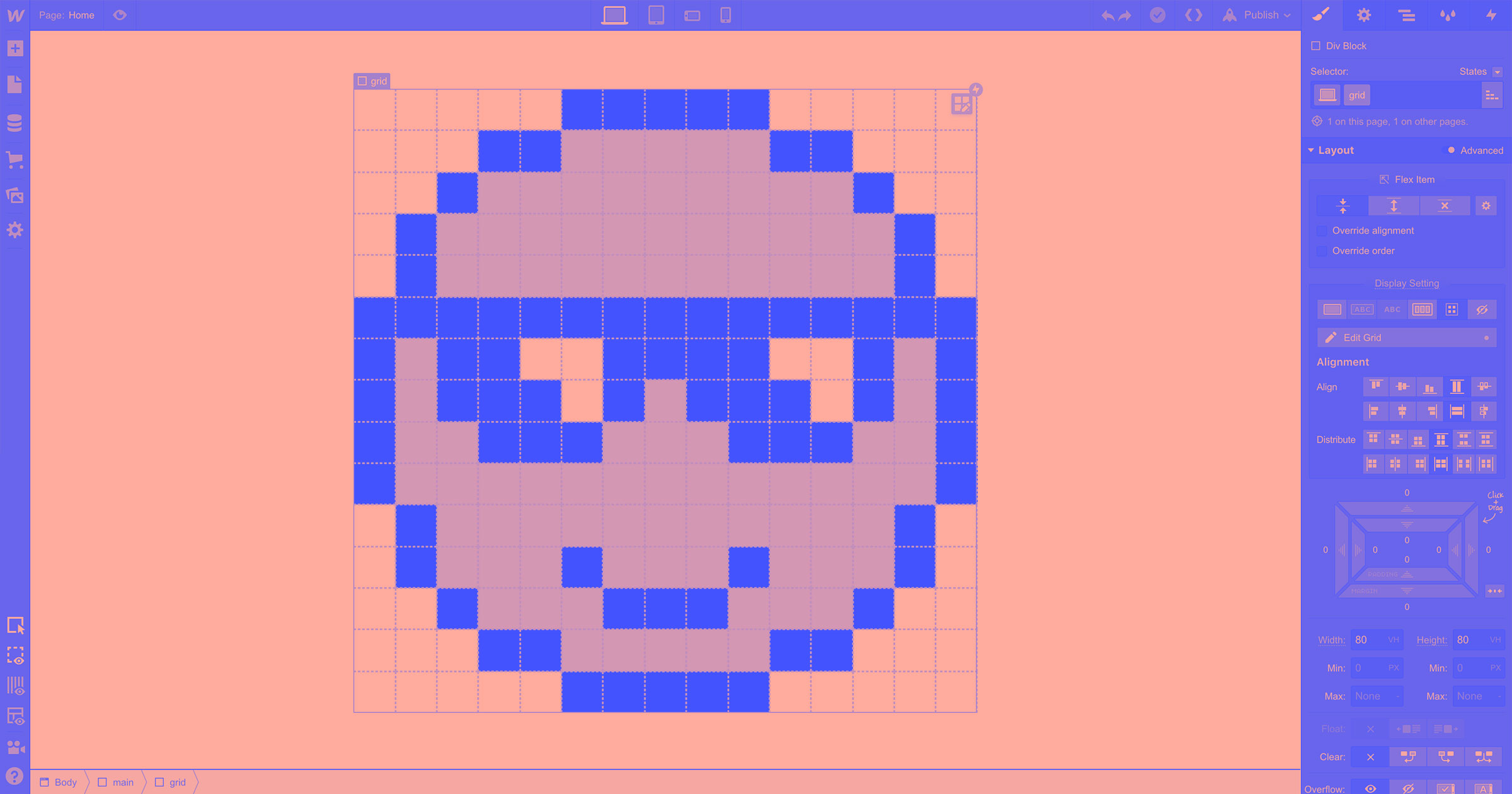
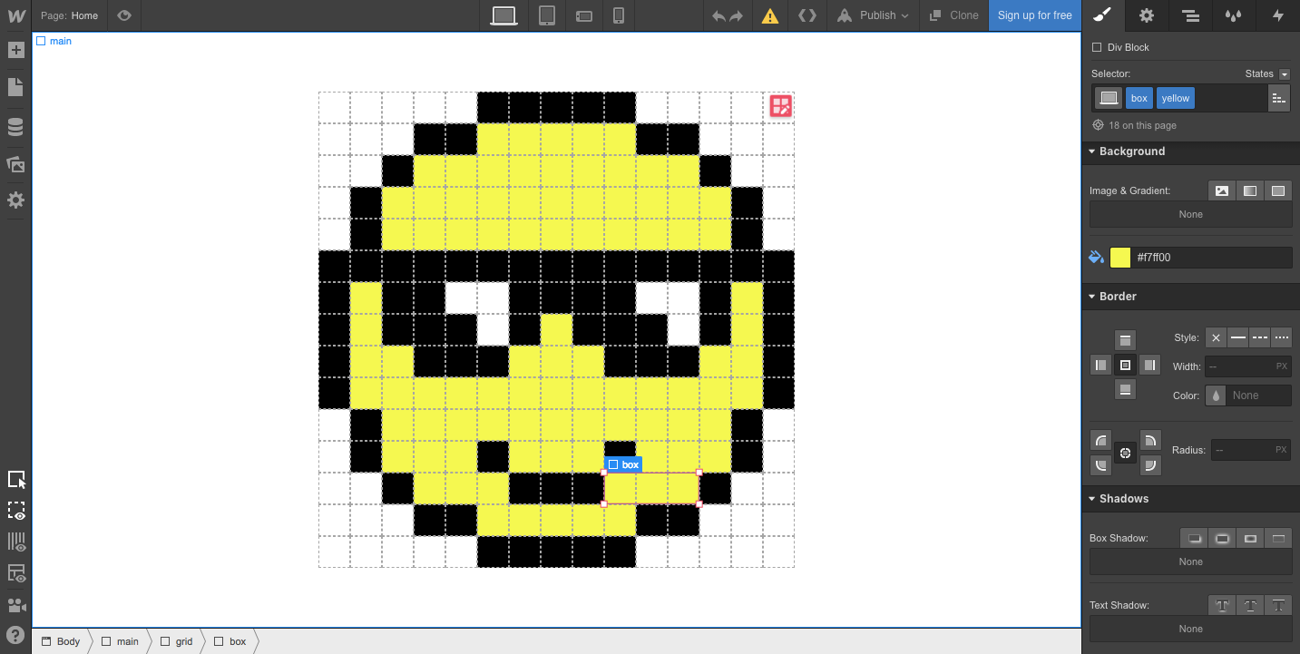
3. Smiley face
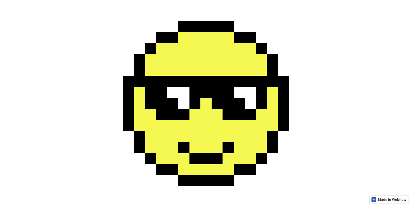
Okay, we've mentioned how CSS grid anchors elements to both horizontal and vertical positions. So why not have some fun and take advantage of the grid to create some retro-styled graphics? This smiley face is both big pixel nostalgia and an example of CSS grid.
The image is just a 15 x 15 grid, referred to as “boxes” in the design. Each box has a different background color indicated by its combo class. This might sound difficult, but it’s really not — check out the Webflow University tutorial on combo classes.
Feeling inspired to express yourself through pixels? Clone this grid-based design as a template for your own 8-bit creations.
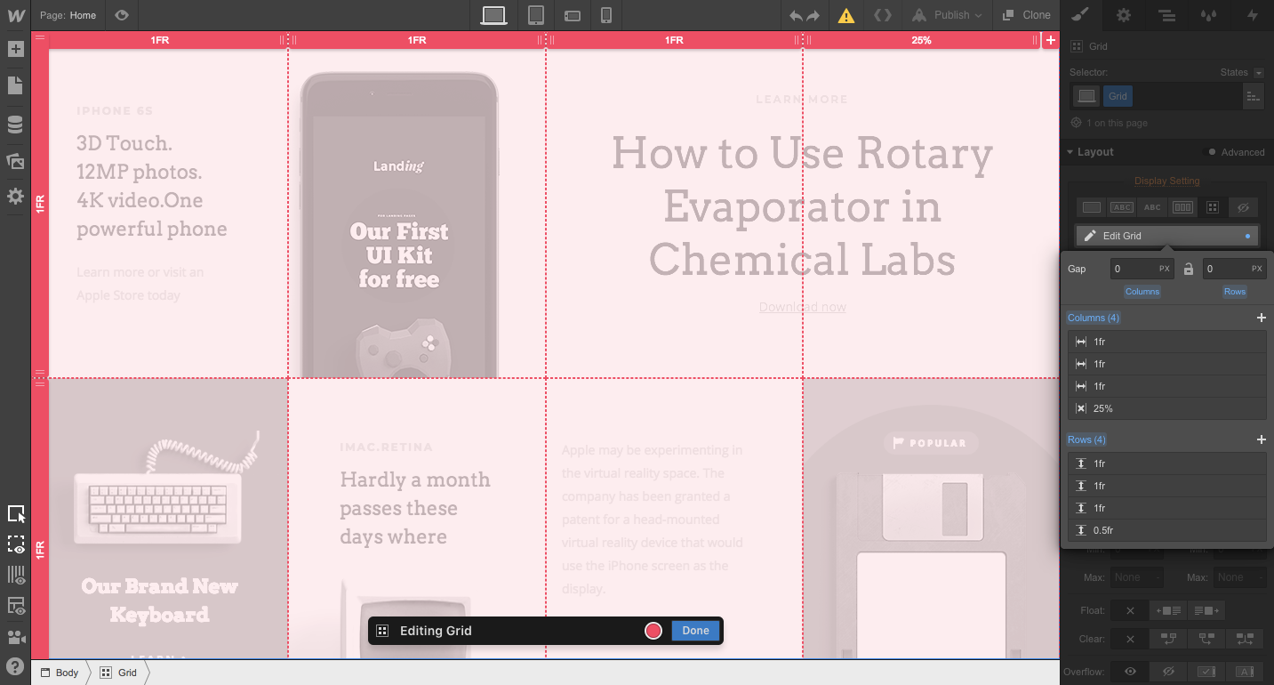
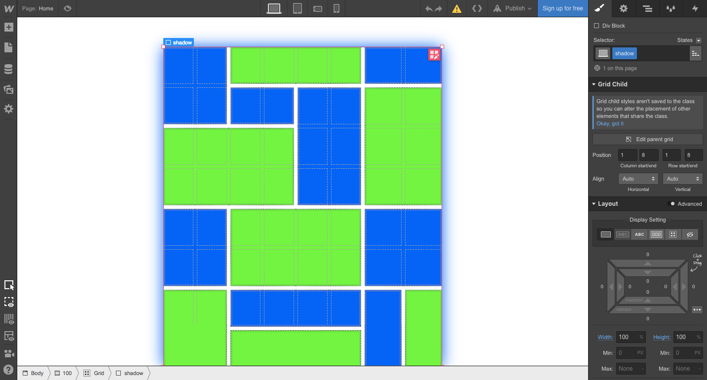
4. Grid masterclass

Claiming that your grid is a “masterclass” is a pretty bold statement. And if you're thinking about using CSS grid on your own, grid masterclass is a great place to begin your studies.
Though it looks like there’s a lot going on in this design, it’s not complicated — it’s just a 4 x 4 grid with div blocks containing the images and text. The divs vary in the number of spaces they occupy, creating a variety of content block sizes. Pretty easy, right?
This is another CSS grid-based design you can clone and use in your own design.
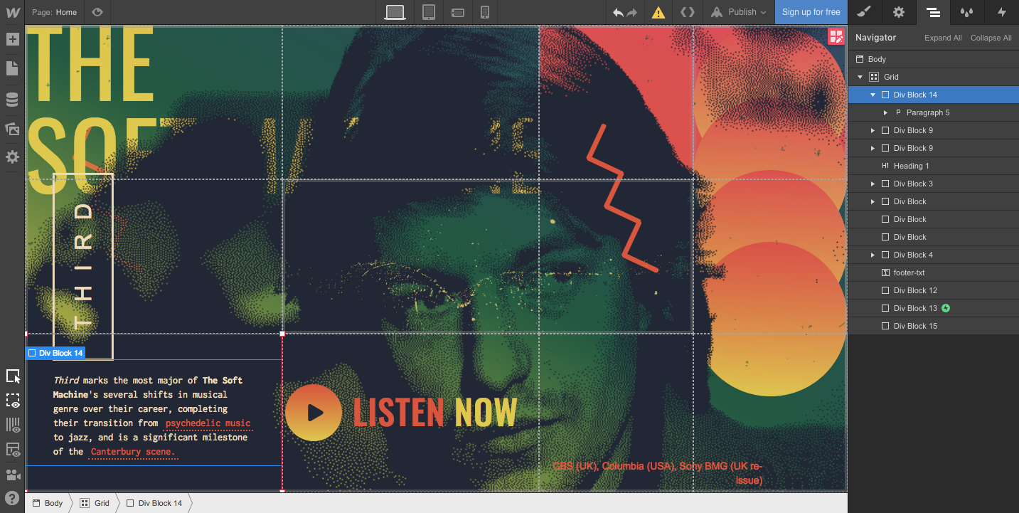
5. The Soft Machine, Third
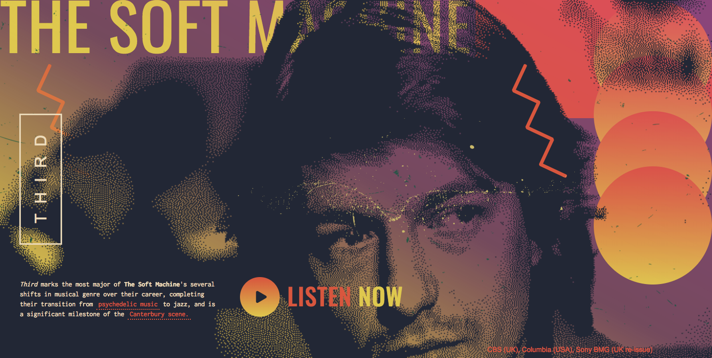
As a fan of both CSS grid and the psychedelic, fusion-inspired music of The Soft Machine, I was excited to see this pop up in the showcase.
This design is based on a 4 x 3 grid. As seen in the previous example, div blocks are used. The div blocks contain the images and textures that make up the graphics. Div blocks are also used for elements like the LISTEN NOW animation and the band description on the bottom left.
Check out The Soft Machine design on Webflow to see how the grid and div blocks come together.
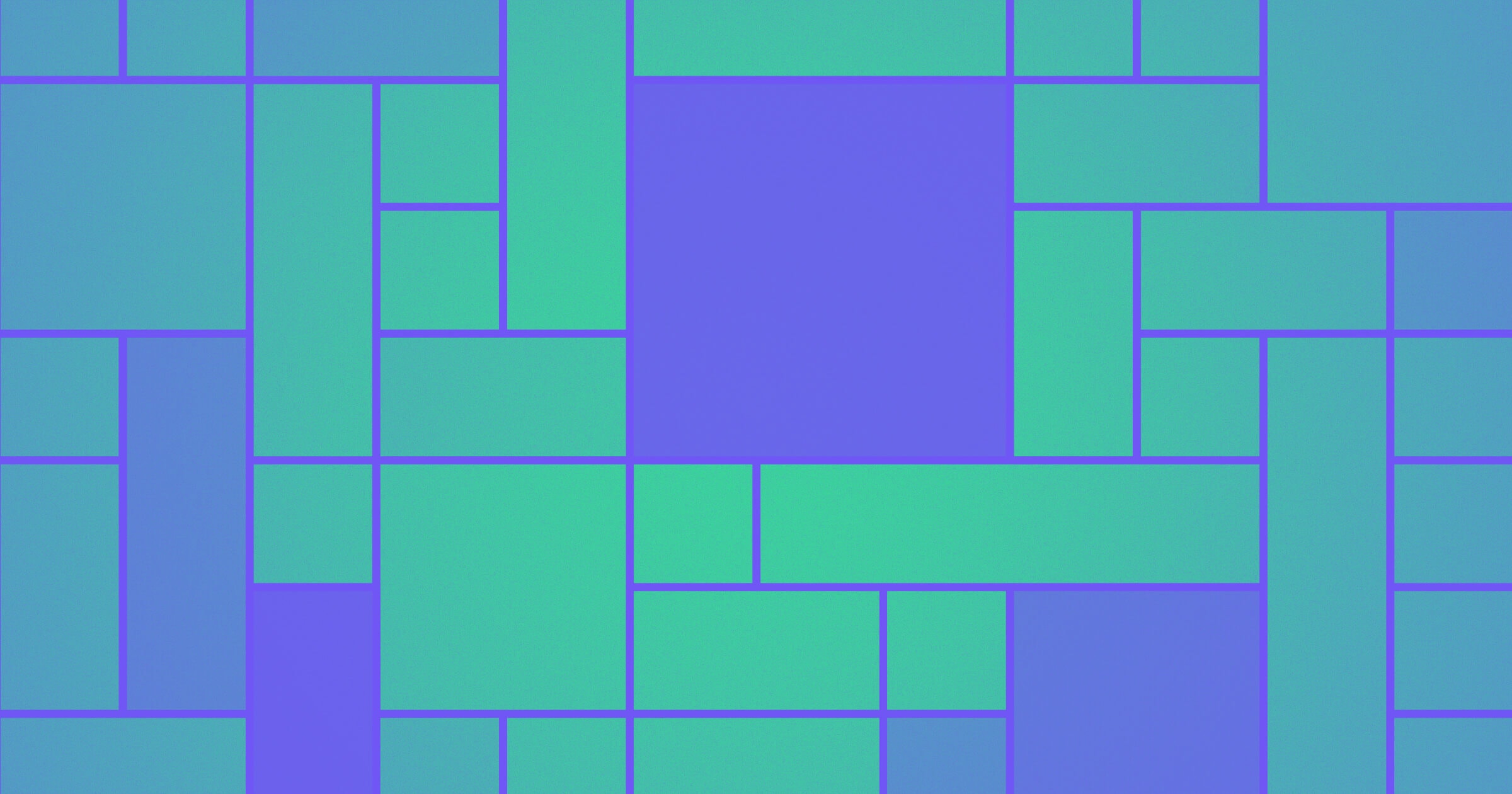
6.Mondrian recreation
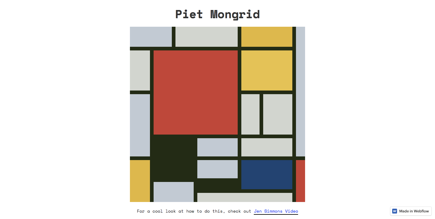
As design nerds, who among us hasn't stood in front of one of Piet Mondrian's abstract paintings and thought, "Hey — that would make a great website layout!"
Piet Mongrid is a recreation of Piet Mondrian's painting “Composition with Large Red Plane, Yellow, Black, Gray, and Blue” — all constructed using a CSS grid.
Div blocks make up each square on this 16 x 16 grid. Each of these div blocks are a different size, with varying background colors and a dark green border.
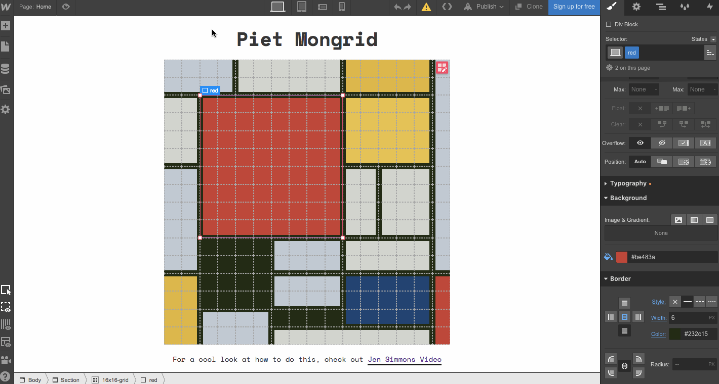
Curious? Take a look at how Piet Mongrid was made in Webflow. You can also clone it and create some of your own minimalistic creations. And check out Responsive Mondrian — a demo of CSS grid by Jen Simmons of Layout Land.


Design interactions and animations without code
Build complex interactions and animations without even looking at code.
7. Color Blocks
This is looking a bit like the Mondrian grid above, right? But here the colors change as a mouseover effect swivels its position. Color Blocks brings some movement to the CSS grid.
Though this design packs a huge visual punch, it’s based on a simple 8 x 8 grid. The shifting colors from green to blue are a timed action that can be set up with Webflow interactions. The hover animation is created with Webflow transitions and transforms. All these dynamic elements are simple to set up.
To take a closer look how Color Blocks was put together in Webflow.
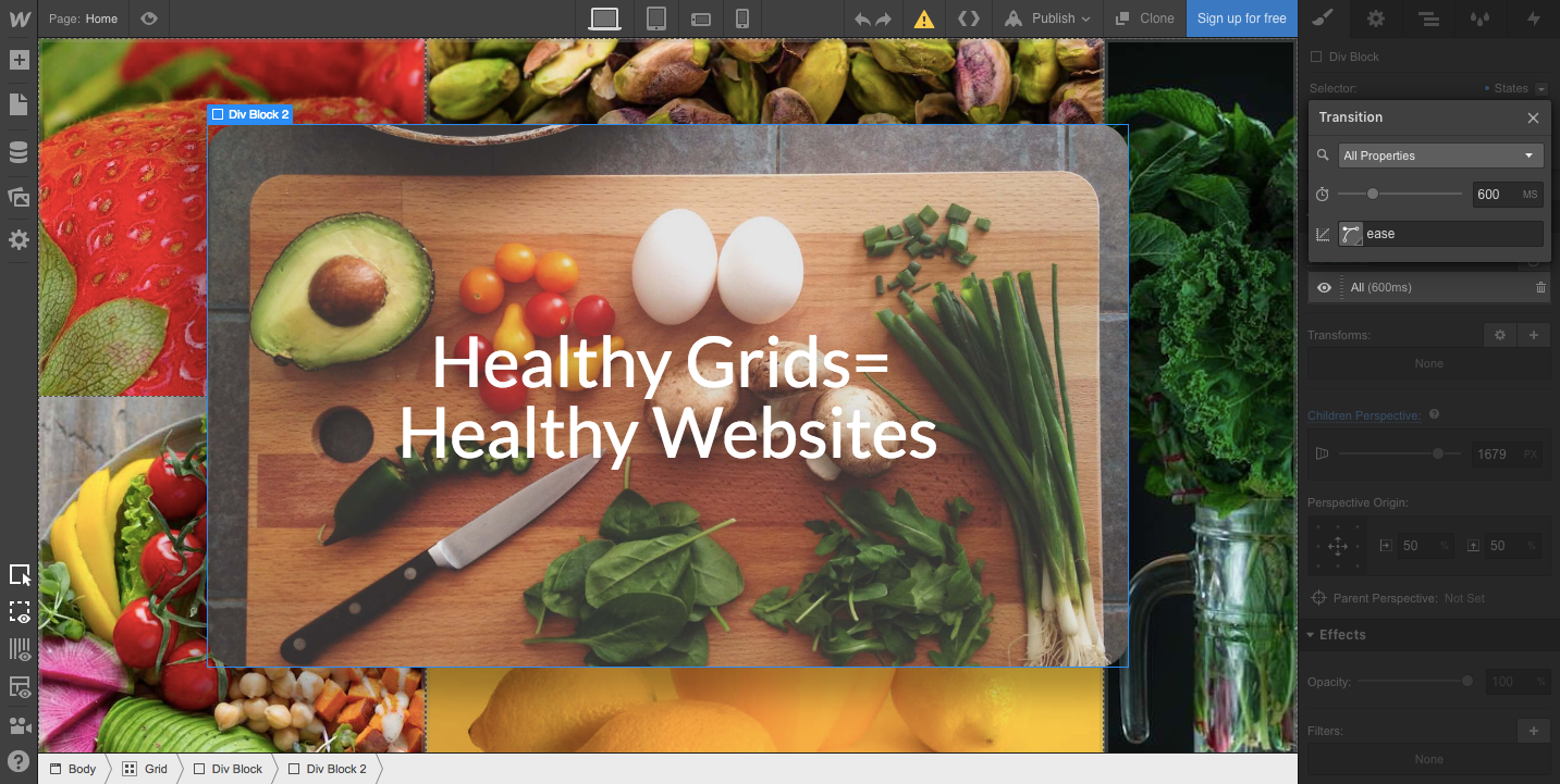
8. Grids and veggies

Though we can’t verify the science behind the claim that healthy grids equal healthy websites, Grids and veggies certainly makes a strong case for correlation.
The rows in the 4 x 3 grid each have a different width. The text block with “Healthy Grids = Healthy Websites” is in a div block within the grid and uses an interactive ease effect that shifts it into place.
Have a peek at the Grids and veggies showcase page.
9. Modernist grid
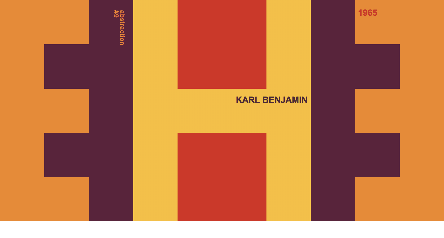
Modernist CSS grid is another another CSS grid experiment informed by minimalist art. Karl Benjamin’s Abstraction #9 is the muse behind this design. Much like the Mondrian grid and the video-game-inspired CSS grid example mentioned earlier, this design is pulled off by painting with pixels. Each frame of this 10 x 6 grid is made with orange, purple, yellow, or red div blocks.
See how Modernist CSS grid was build in Webflow.
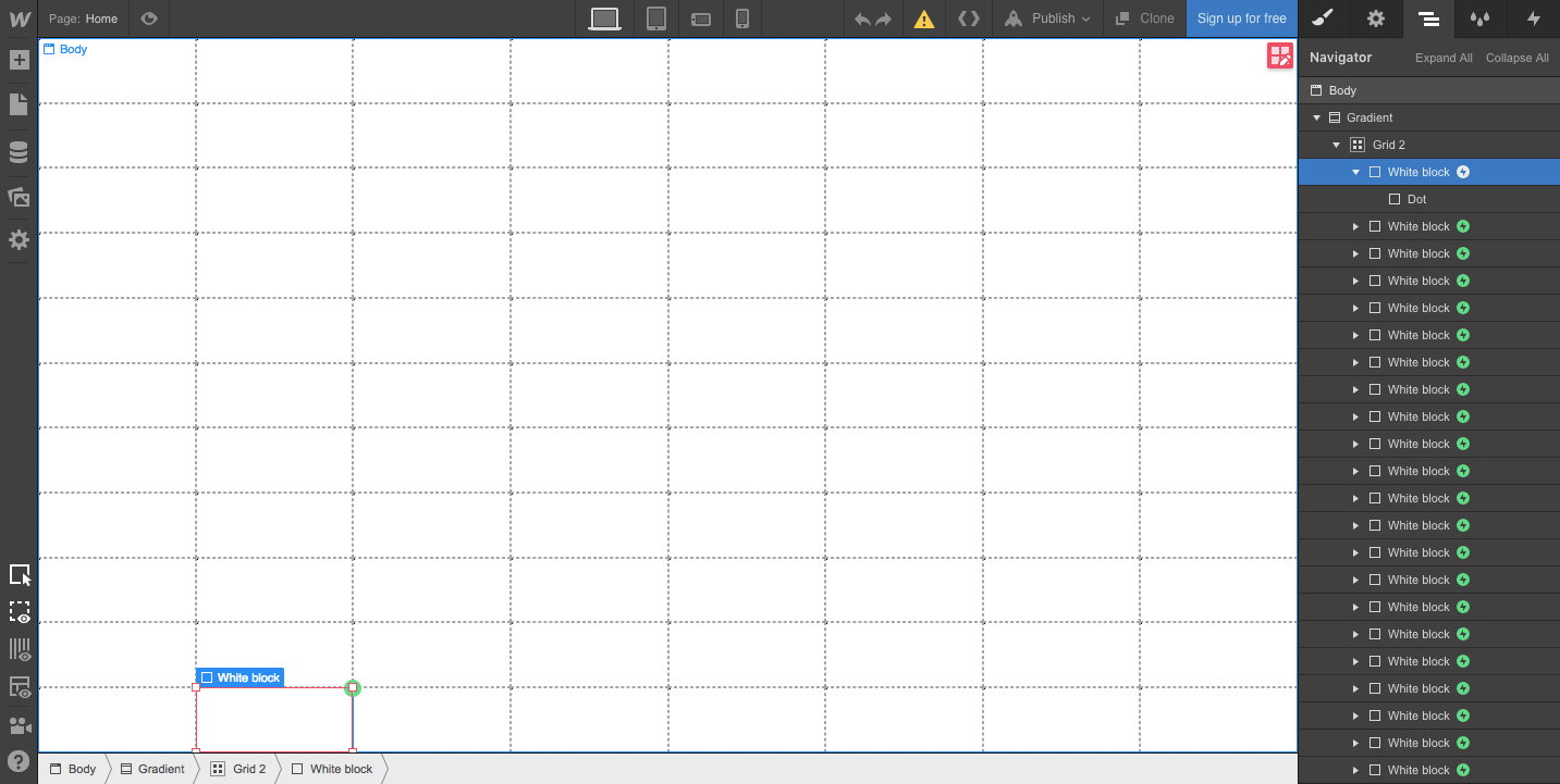
10. Grid mouseover gradient
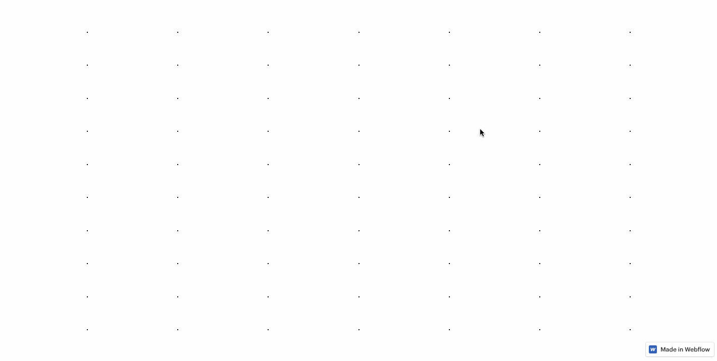
Were you wowed by the mouseover gradient effect on Webflow's CSS launch page? I was! Gently fading blocks of color is a dazzling effect that doesn’t take much effort to pull off.
This mouseover gradient is just an 8 x 11 white grid of blocks that overlay a linear gradient with a fade effect. Each block is a window that reveals a slice of the linear gradient.
See how the the Grid Mouseover Gradient works. Or clone it, if you fancy.
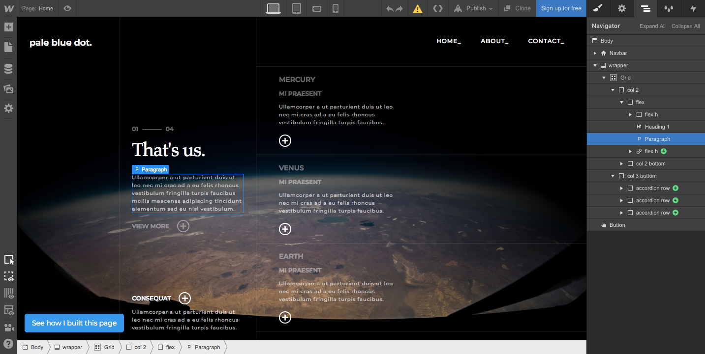
11. Planet grid
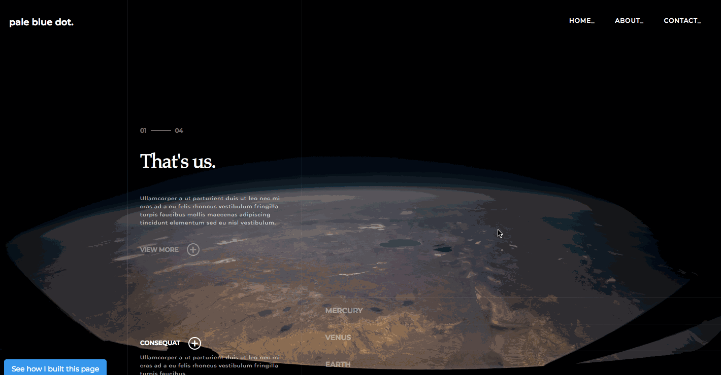
From Webflow's very own Nelson Abalos Jr., Planet grid is an excellent example of how CSS grids keep content organized.
The main elements of this design are held by a 3 x 1 grid. That's it — three columns and one row. There’s a flexbox tucked inside the grid for the “That's us” block of content on the left. And tucked inside the far-right column are three accordion rows. Interactions add a nice touch to this straightforward design.
Nelson was nice enough to create a tutorial video. And you can clone it — for free!
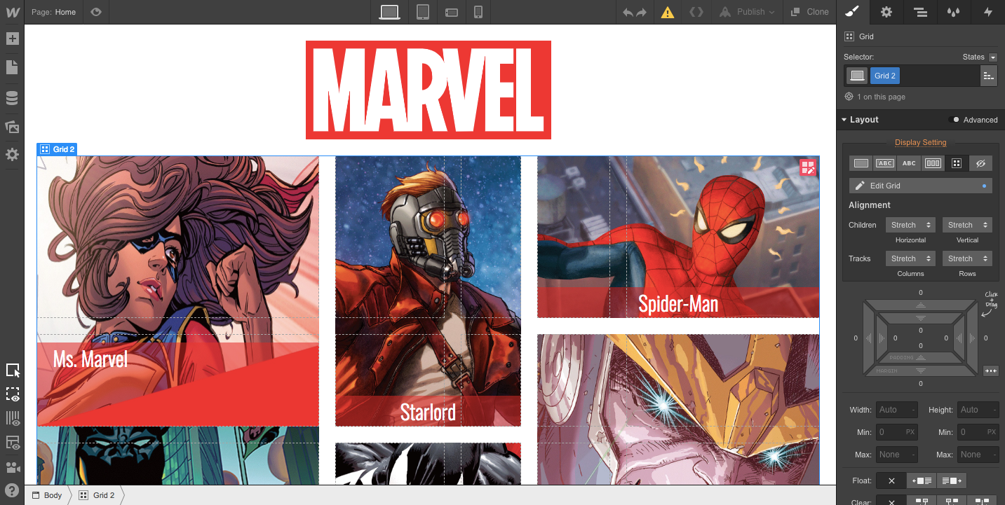
12. Marvel comics
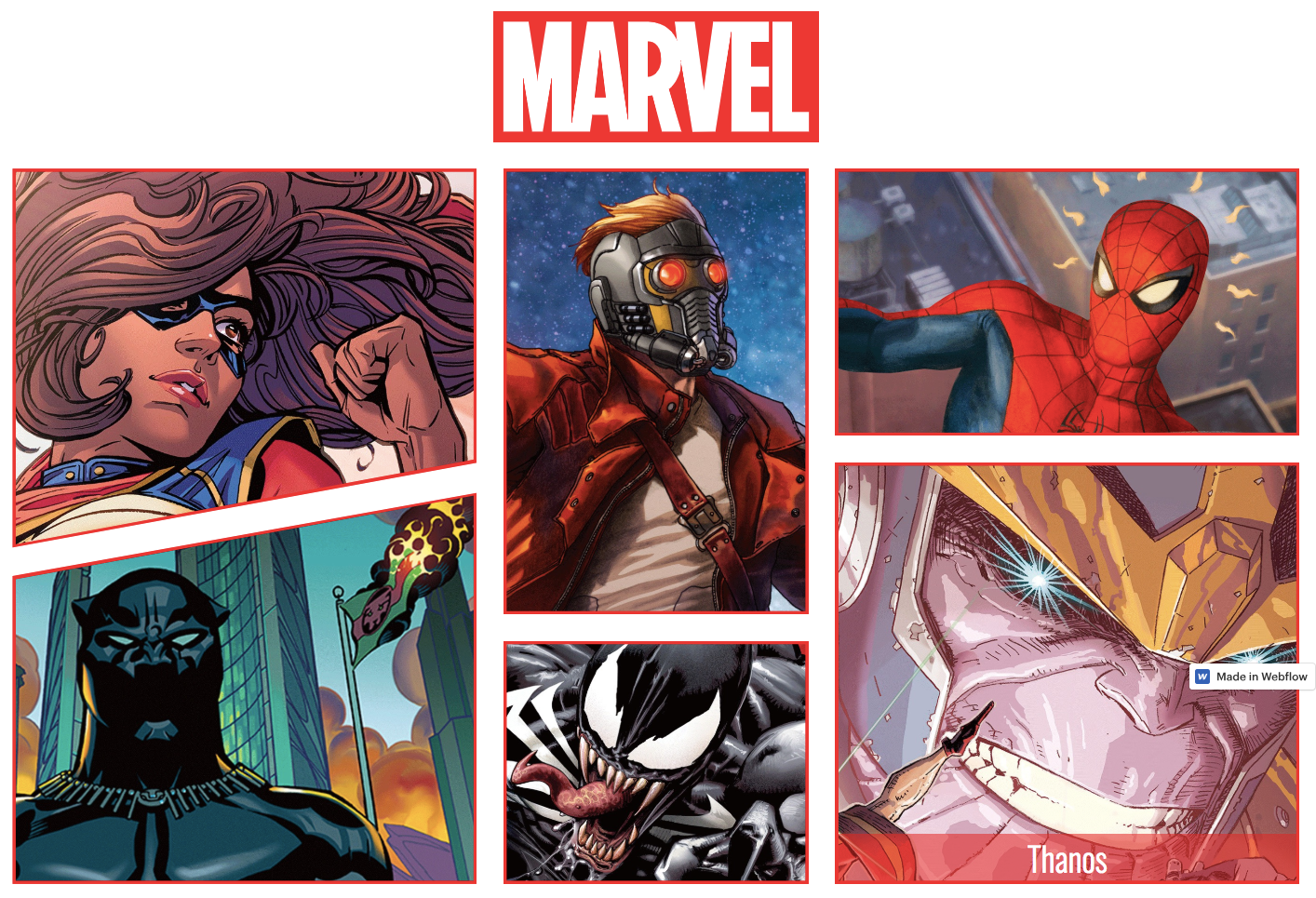
Though not an official Marvel website, this is another example of someone creating a mock website for something close to their heart.
Comics are all about grids. Each panel is a single frame in the visual narrative. This design recreates the feel of a comic-book page. Each panel is part of a 5 x 4 grid that uses custom CSS to accomplish the clip paths.
Clone this Marvel-inspired site or preview it in Webflow to see how it was done.
Let CSS grids be your guide
CSS grid gives you the power to add structure to your design, create responsive layouts, and fix elements to horizontal and vertical positions.
If you've ever felt intimidated by CSS grid, building grid layouts in Webflow is a great place to start. We encourage you to jump in and start experimenting. If you have any questions, we’d love to answer them in the comments below.
Happy gridding!