
A website header is your audience’s first impression of your brand.
Headers are the introductory element of any website, typically appearing at the top of every page. It’s not just a design element — it’s your chance to captivate your audience and convey your brand and messaging.
Most website headers double as a navigational and branding element with a logo, menu, search bar, and call to action (CTA) buttons. Effective header designs provide quick access to essential site areas while reinforcing your brand identity.
Read on to find inspiration from several stunning headers and learn how to create your own stand-out design.
What makes a good website header design?
A well-designed website header creates a positive user experience by remaining functional as visitors explore. Here are four essential design components that make a good header:
- Call to action — Headers with CTAs direct website visitors to take specific actions, like exploring a new product, signing up for a newsletter, or booking a consultation. Using contrasting colors for CTA buttons and their backgrounds improves visibility, while action-oriented language encourages clicks.
- Navigation tools — Readily available navigation options help people explore different sections without wasting time. A well-structured navigation menu is intuitive with a logical hierarchy and allows quick access to key pages without overwhelming visitors.
- Search bars — Including search functionality helps visitors quickly find products or services by matching content with specific keywords. Search bars are great additions to content-heavy websites with extensive listings, reducing the time spent searching for information.
- Minimal text — Using limited text keeps your design clean so essential elements like the logo, navigation, and CTAs stand out. Overloading the header with text can overwhelm visitors and detract from its functionality.
Keep in mind that there’s no set parameter for how large your header should be. Whether you opt for a narrow navigation bar or a tall banner image, this section simply needs to convey your site’s essential information as soon as readers open the homepage.
How to design a website header: Best practices
Here are five best practices to make your header functional and visually appealing.
Keep it simple
A clutter-free header limits distractions and improves usability. Uncomplicated elements help visitors focus on the essential aspects, like navbars and CTAs, without overwhelming them.
Limit the number of items in the navigation menu to the most important pages, and consider using fewer colors, fonts, and graphics. Following these design principles helps you create a functional header that looks appealing and feels intuitive, improving the user experience.
Guide users effectively
Your website header should help people navigate instead of confusing them with complicated design elements. Readers easily finding what they want can reduce bounce rates and boost conversion rates.
To guide website visitors, include a well-organized navigation menu with clear labels for your most important sections. Consider using a sticky menu to keep navigation options visible as users scroll.
Establish a visual hierarchy
Creating a clear visual hierarchy helps people understand the most important elements at a glance. That way, they don’t miss critical information like navigation options and CTAs.
Use contrasting font sizes and color combinations to distinguish between components like your logo, social media links, and CTA buttons. Add whitespace to avoid cluttering the page, making the layout visually digestible.
Design for mobile
With more people accessing websites on mobile devices, it’s important to tailor your design for smaller screens. A responsive header creates a consistent user experience across all devices, regardless of screen size or operating system.
Use a website builder that adjusts the layout based on screen size. Adding a mobile menu, such as a hamburger or mega menu, saves space while keeping navigation accessible. Also, ensure that buttons and links are large enough to tap on touch screens.
Optimize for speed
A fast-loading header allows people to access your site content quickly, which is crucial for retaining visitors and improving SEO rankings.
To optimize for speed, consider compressing images and using modern image formats like WebP to reduce file sizes. And to further improve page loading times, implement asynchronous loading for nonessential resources. Following these best practices creates a fluid and efficient browsing experience from the moment visitors land on your website.
11 creative website header examples
Here are 11 excellent website headers in different styles to inspire your own designs.
1. Sabina met een A
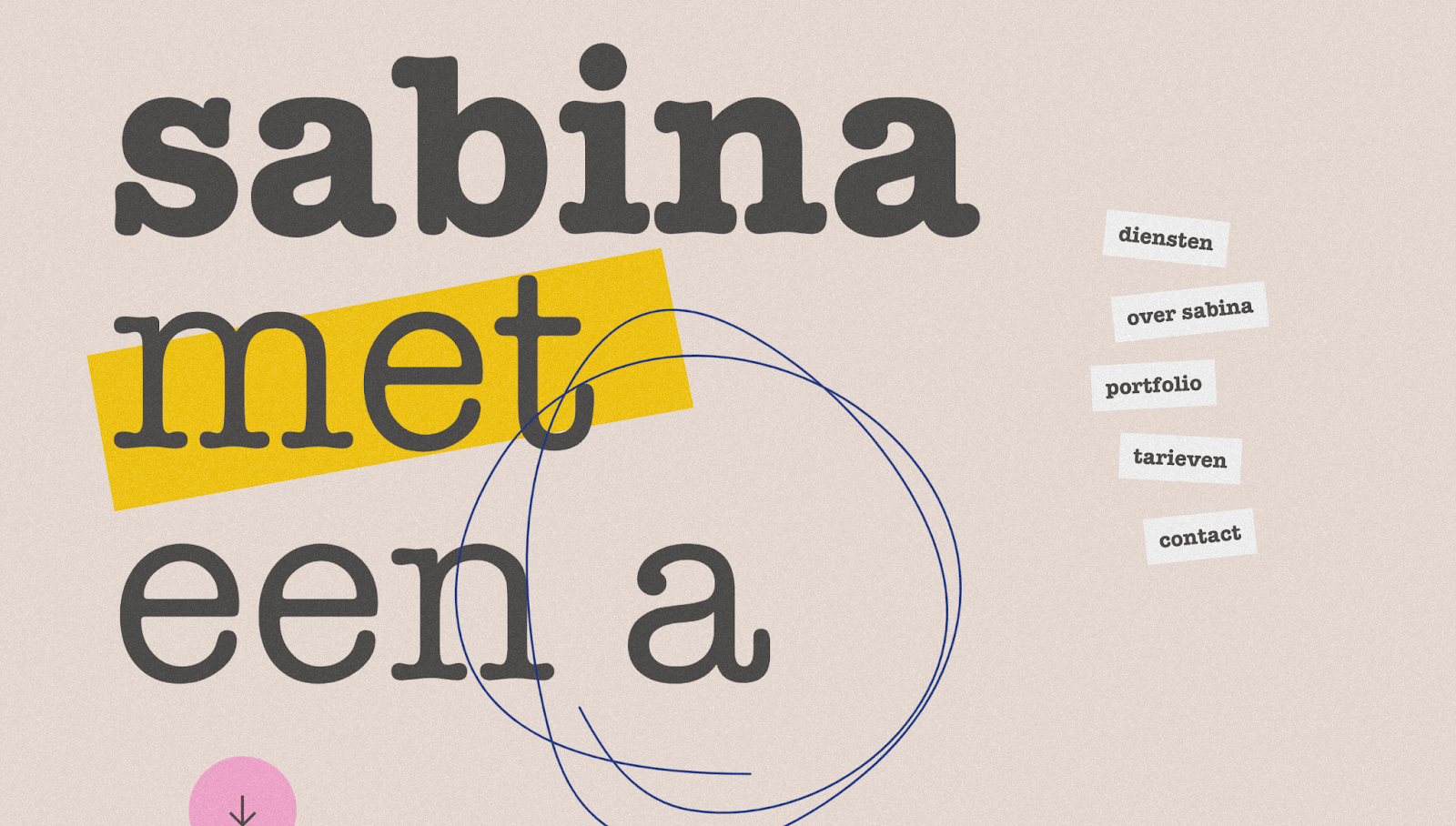
Sabina met een A's website header, made by Überhaupt, stands out with its bold, playful typography and sticker-like designs. The large, eye-catching text immediately grabs attention, while the contrasting colors improve readability. And a pink circular arrow invites you to scroll down and explore the rest of the website.
The right-sided menu is a unique take on the navigation bar, as its uncommon placement catches your eye and sticks to the side of the page as you scroll. Artistic elements, like the hand-drawn circle, add a personal touch and make the site feel more approachable — as if someone is waiting to collaborate on the other side.
2. GSAP FLIP Column Hovers
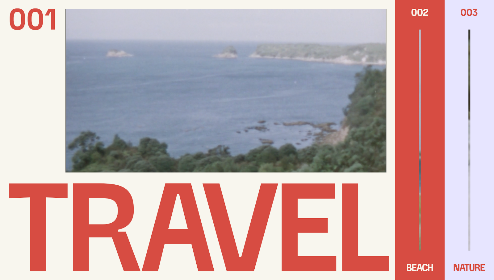
The GSAP FLIP Column Hovers site is a cloneable template designed by Timothy Ricks. He splits the header into three sections: travel, beach, and nature. When you hover over a section, it dynamically expands to fill the screen while the others shrink.
This immersive interaction encourages you to play with the layout and watch each section's video to understand their respective themes. The bold typography beneath the video background improves readability to help people navigate around the page.
3. Light Factory
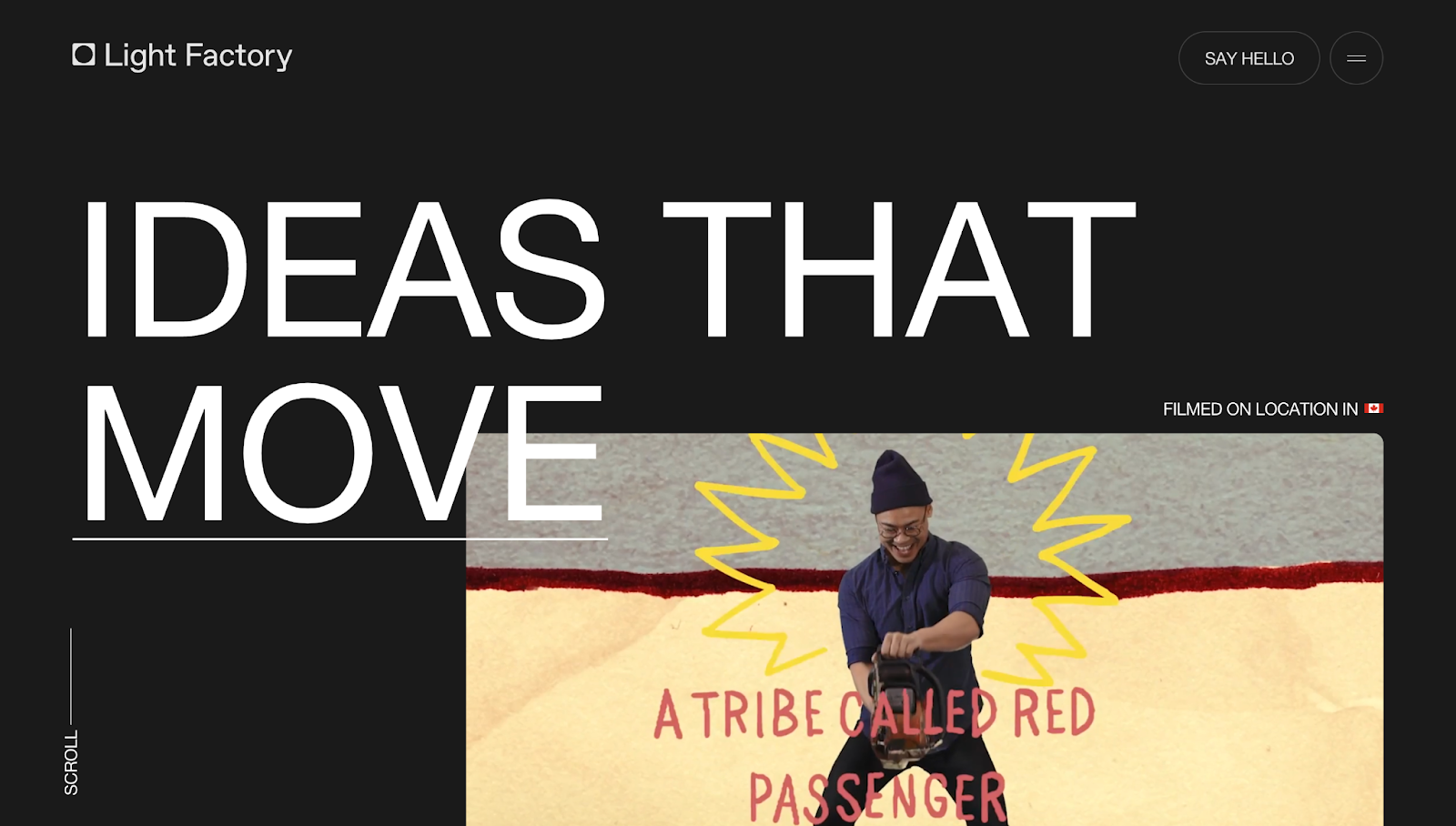
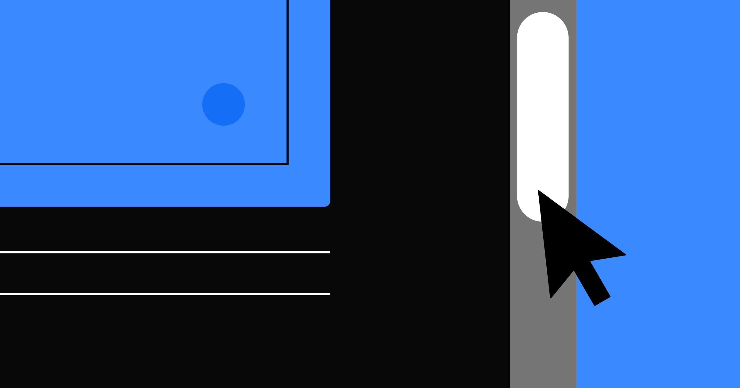
Light Factory's header features generous negative space and a monochromatic color palette, which prepares visitors for the dynamic visuals on the rest of the site. Static elements like the logo and hamburger menu stay in place as you scroll, providing quick access to essential information at any time.
Rather than a typical CTA asking website visitors to submit a contact form, the header features the more personal “Say hello” to make a connection with potential clients. To reinforce the agency's focus on innovative and impactful work, Joseph Berry’s minimal design allows the bold, oversized "IDEAS THAT MOVE" text to have a strong visual presence.
4. Bells Comedy Club
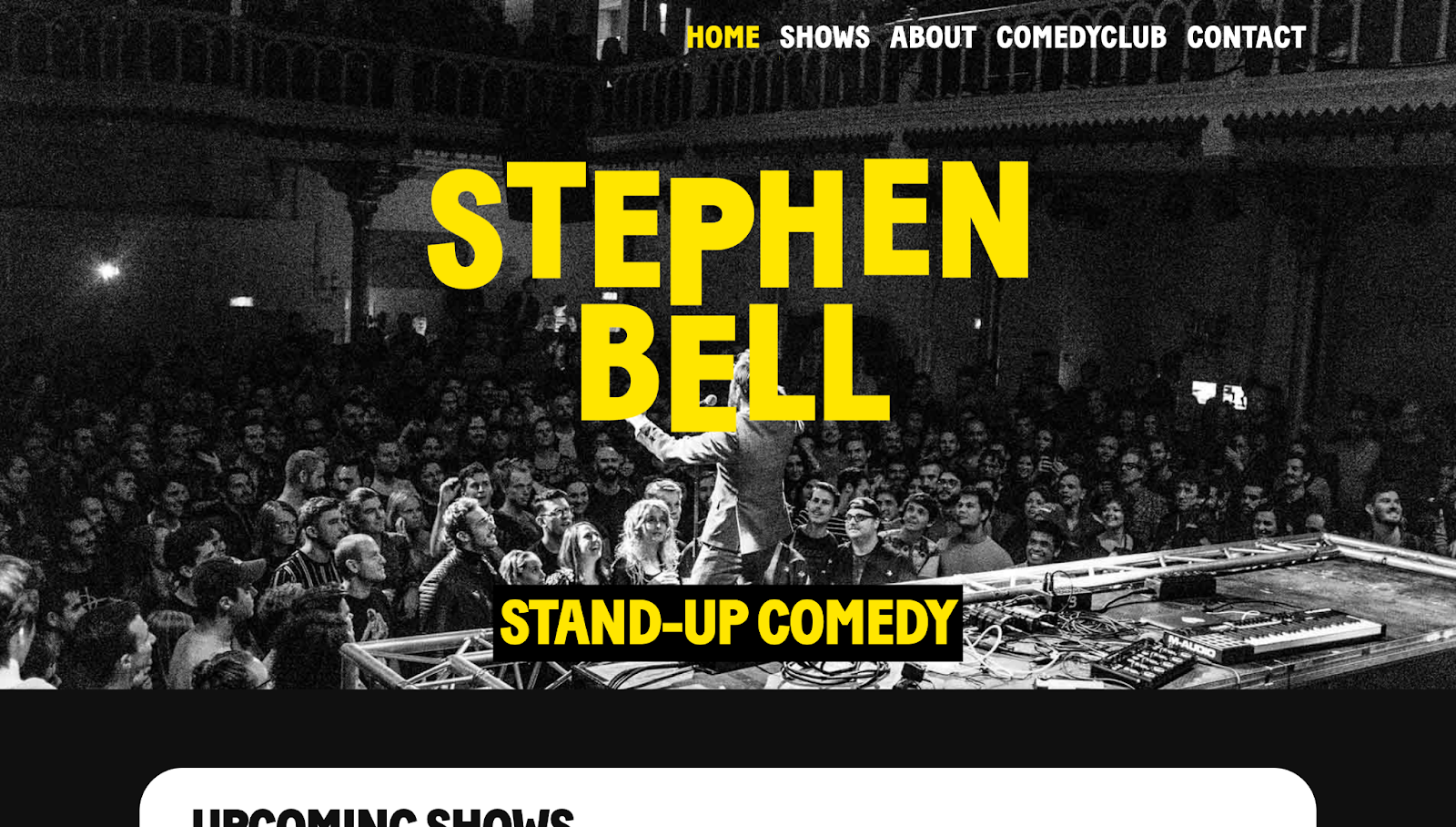
Stephen Bell's personal website, designed by Fresh Frames, has a header with striking contrast to grab attention. The bright yellow "STEPHEN BELL" text dominates the page, with the subtext "Stand-Up Comedy" immediately telling you who Stephen is and what he does. Animated letters expand and contract in a loop, adding a lively touch and reflecting stand-up comedy's energetic nature.
Using a monochrome background image of a live audience adds to the contrast and highlights the vibrant text. It also makes you feel like you're part of a show, inviting you to participate and explore the rest of the site. When you do, an interactive yellow underline appears below the menu items and provides clear navigation cues.
5. Shuuga

Shuuga is a vegan candy company, and Floyd van Joost created their website. The header features floating candy that changes color as it moves across the screen. Underneath, the text “Universe Friendly Vegan Candy” scrolls in the opposite direction. This creative approach showcases the product and the company's focus on vegan-friendly values.
Meanwhile, the rotating cursor with the text "Bounce that" adds a fun touch of interactivity, making the candy bounce when you hover over it. Behind these elements, the background has a split-screen design with Shuuga's branding. These components reinforce the company's brand identity while showing off their products and maintaining visual interest.


Ultimate web design
From 101 to advanced, learn how to build sites in Webflow with over 100 lessons — including the basics of HTML and CSS.
6. Studiopresto
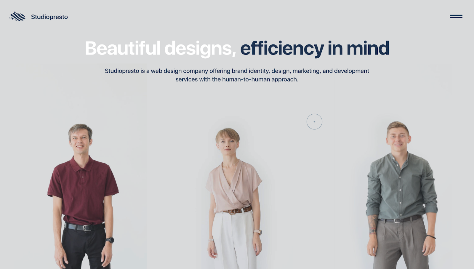
Studiopresto's website header is seemingly static at first glance. It has a clean, minimalist design and the tagline "Beautiful designs, efficiency in mind," which immediately conveys the company's focus.
But hovering over the images of the three individuals reveals the header's interactivity — speech bubbles appear, asking if you're a CEO, startup founder, or business owner. The team’s clever use of hover effects creates a personalized experience as if Studiopresto's employees are asking questions directly, humanizing the website.
7. Max Martinez
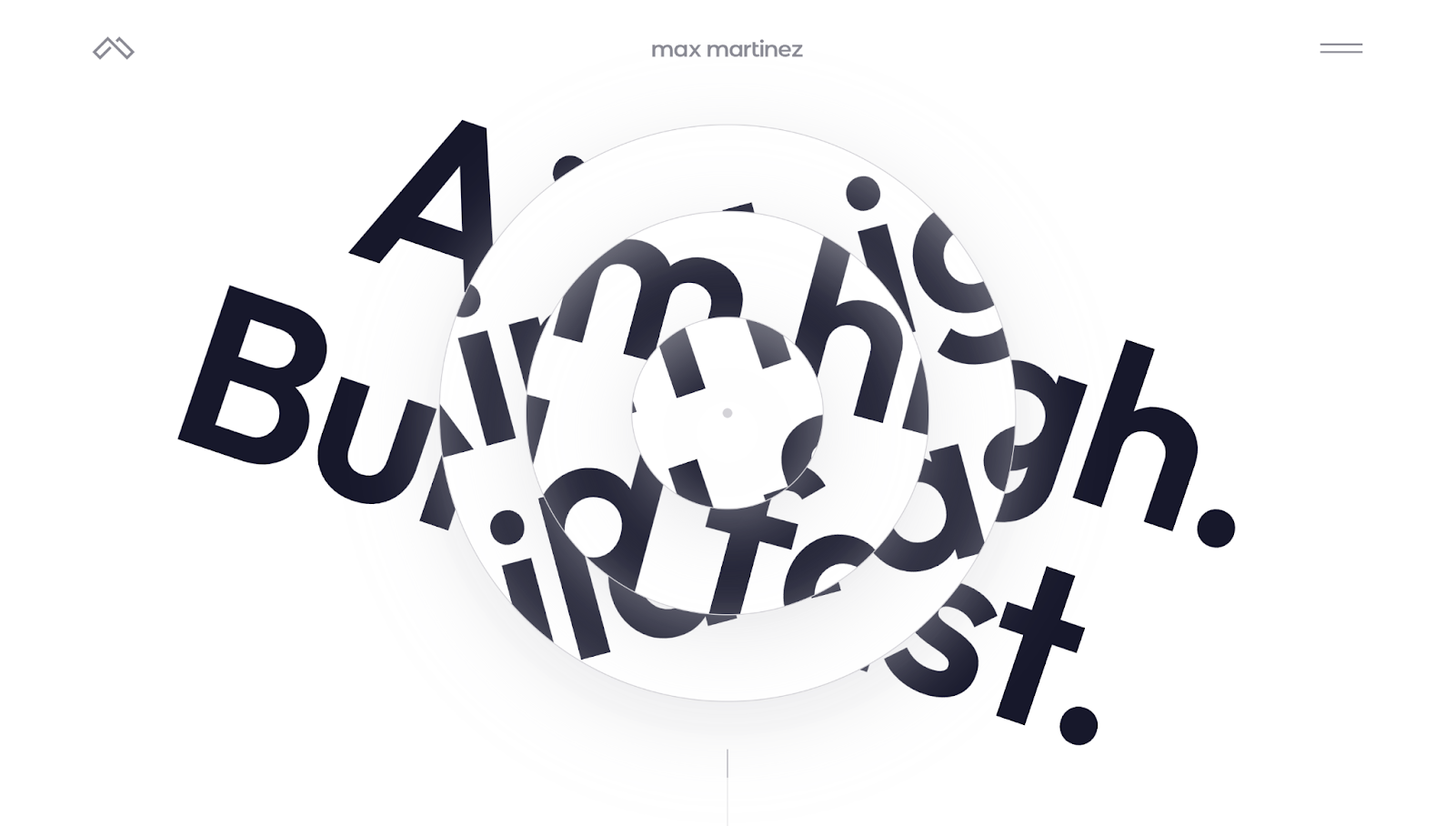
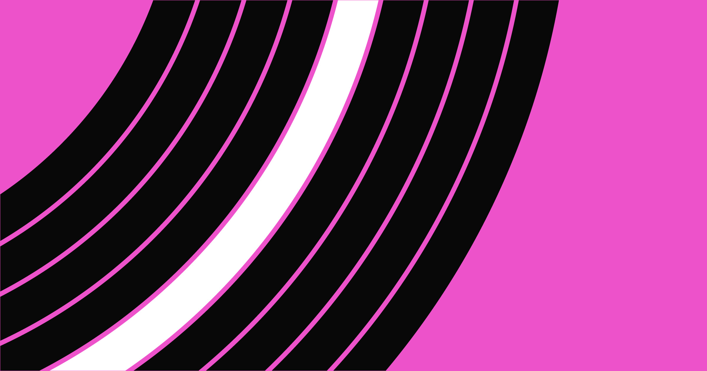
Max Martinez's website is a visually captivating example of minimalist yet interactive design. The header section features a series of concentric circles with partially obscured text. Scrolling makes the circles rotate, revealing the message, "Aim high. Build fast." This interaction engages visitors and visually reinforces Max's message as a web developer and designer.
He also added clean, bold typography against a plain white background with a mega menu to keep the design sleek and modern. Despite the ample whitespace, the subtle animation adds a layer of fun, breaking monotony and making the site more memorable.
8. Inflatable 3D Alphabet
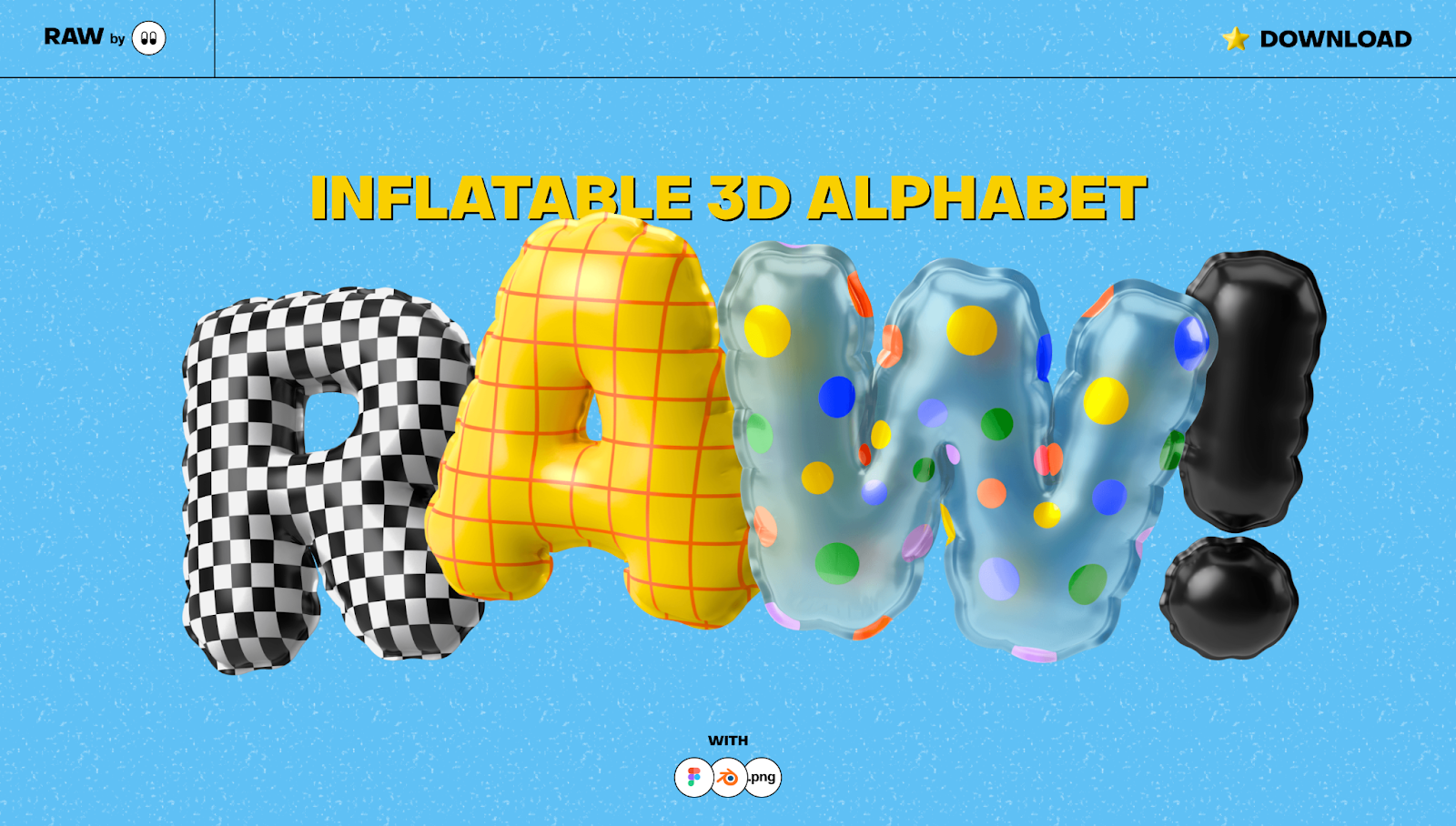
The Inflatable 3D Alphabet website header has a playful appearance, with realistic 3D balloon letters spelling out the word "RAW!" Vibrant colors and unique textures instantly capture your attention, inviting you to interact with the page. Moving the cursor over a letter makes it rise, creating a fun and tactile experience.
Behind the balloons, the yellow "Inflatable 3D Alphabet" text communicates the site's offerings, and a "Download" button in the right corner encourages you to install the pack. To improve legibility, the bright blue background adds contrast, making the text and visual elements pop.
9. Sous Amsterdam
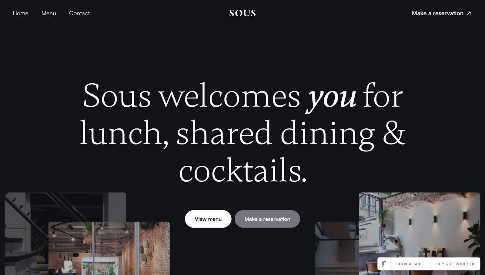
Sous Amsterdam's website header, designed by RVB, radiates elegance, with a minimalist background and crisp white typography befitting a high-end bistro. Inviting header text reads, "Sous welcomes you for lunch, shared dining & cocktails." Emphasizing "you" in bold and italics addresses site visitors directly, welcoming them to the page.
RVB also strategically placed the CTA buttons, such as "View menu," "Make a reservation," and "Book a table," beneath the main header. Putting CTAs front and center like this immediately prompts you to take action and learn more about the restaurant.
10. Berlin Communications
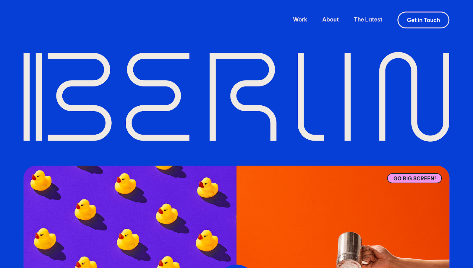
Berlin Communications' website, made by Marc-Antoine Gagnon, is bold and vibrant with a striking blue background that immediately draws attention. The initial static header features a stylized "BERLIN" logo. Upon scrolling, the logo minimizes and moves to the top-left corner, maintaining brand presence while freeing up space for the website’s main content.
When you hover over the navigation buttons, a squiggly underline moves beneath your selection, a small touch that demonstrates the company’s attention to detail. And navigation options remain consistent across the site so you’ll always have access to each page, creating a smooth customer journey.
11. A-Smith
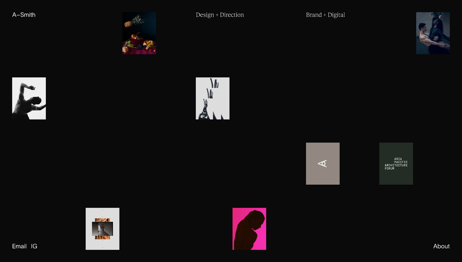
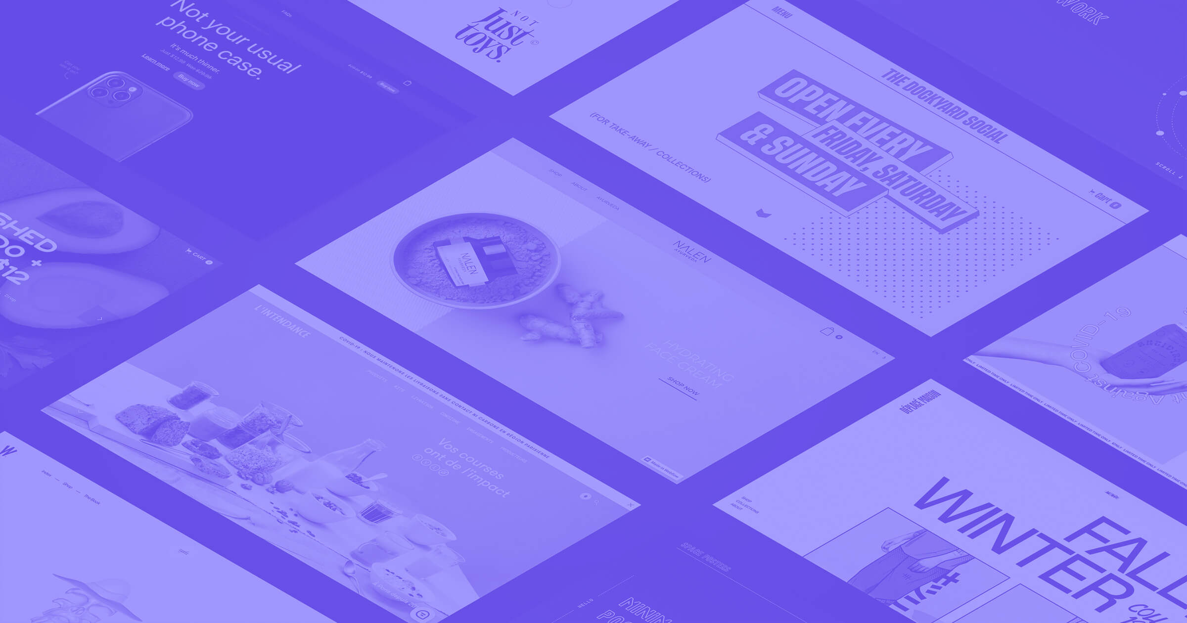
Anthony Smith's portfolio website showcases an innovative approach to web design by turning the site's header into the entire website. His page features an asymmetrical grid of animated rectangles displaying snippets of past work. With its stark background, the minimal layout directs readers’ full attention to the moving visuals.
Rather than having a clear-cut navigation bar, Anthony put his bio page and social media contacts in the corners of the site. Unusual placement like this draws your eye across the entire page, encouraging visitors to check out the thumbnail for each design project.
Get a head start with your website design
Whether you're building a personal website or a client project, a header introduces this website to the world. It should be unique and make a positive first impression that encourages visitors to explore.
With Webflow, you can use customizable pre-built elements to create visually appealing, functional website headers. Our extensive library of header templates and components can inspire your next design. Plus, you can update your site content to create responsive headers that look good on any device.
Start building your website from the top and grow your online presence with Webflow today.
Get started for free
Create custom, scalable websites — without writing code. Start building in Webflow.