Over the last few months, I’ve been working (part time) on a project with the incredibly talented designer Adam Ho, of Zendesk. Dubbed the Graphic Design Archive, it explores 3 key moments in graphic design history to answer the question: when we’re designing for the future, what can we pull from the past?
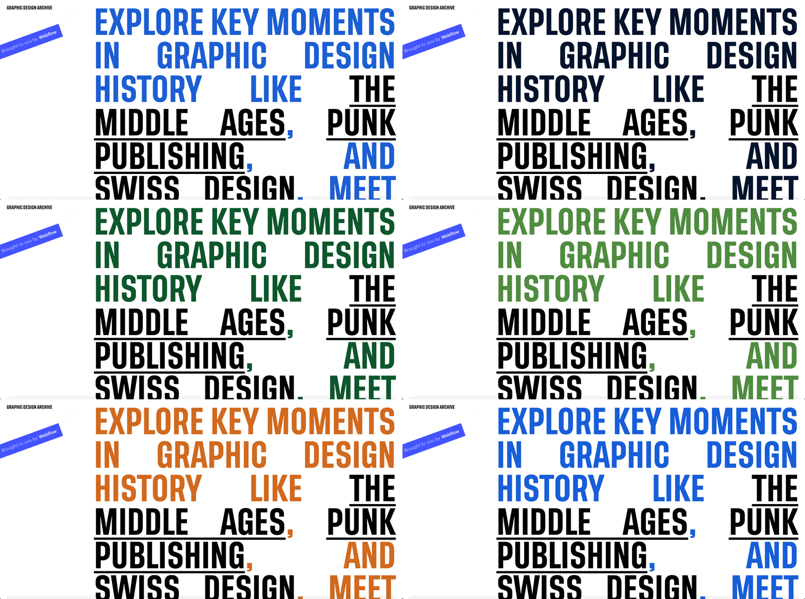
In this post, I’ll cover the why behind the project, but I don’t want to hold you back from checking it out now:
In her article on her work for Slack, illustrator Alice Lee wrote something that really struck me, as a watcher of trends in the tech and digital design industries:
Really awesome things happen when we look beyond our immediate peers, competitors, and industry for sources of illustration inspiration.
–Alice Lee, from “Two approaches to illustration”
So often, the world of tech can feel like a constant, cyclical rehashing of things we’ve seen before. Borders sharpen, become right angles, then round out again. Gradients wax and wane, going in and out of vogue like the color stops they traverse. Brands converge on sans serifs as the mark of friendliness, break the mold with a bold serif or two, then slink back to the safety of familiar geometries with almost whiplash-inducing speed.
And it all seems to happen almost in isolation, veiled in the myths of disruption and innovation that are already wearing on the people — the “users” — we create for.
As if medieval calligraphers hadn’t plotted out the geometries of the page centuries ago. As if leather-clad and mohawked kids hadn’t turned Xerox machines and Xacto knives into tools of creation far less precise, but just as expressive as Photoshop, Sketch, or Figma — if not more so. As if the grid and the dream of universal communication that guide modern design work hadn’t been championed, explored, and ultimately broken by the Swiss designers whose work still adorns the United States’ national parks, classic book series, and more logos than you can wave your money at.
These days, you see references to design’s power to shape politics, discourse, and culture everywhere. But all too often, that narrative is founded on vague presumptions and idealistic fantasies. Design gets credit for wins as inspiring as Alexandria Ocasio-Cortez’ triumphant Senate campaign — and the blame, if indirectly, for the prevalence of “negative behavior” (their word) on Twitter.


The modern web design process
Discover the processes and tools behind high-performing websites in this free ebook.
And yet, when we cast our eyes back over the centuries — and when we loosen our definitions of who a designer is — we find no shortage of powerful examples:
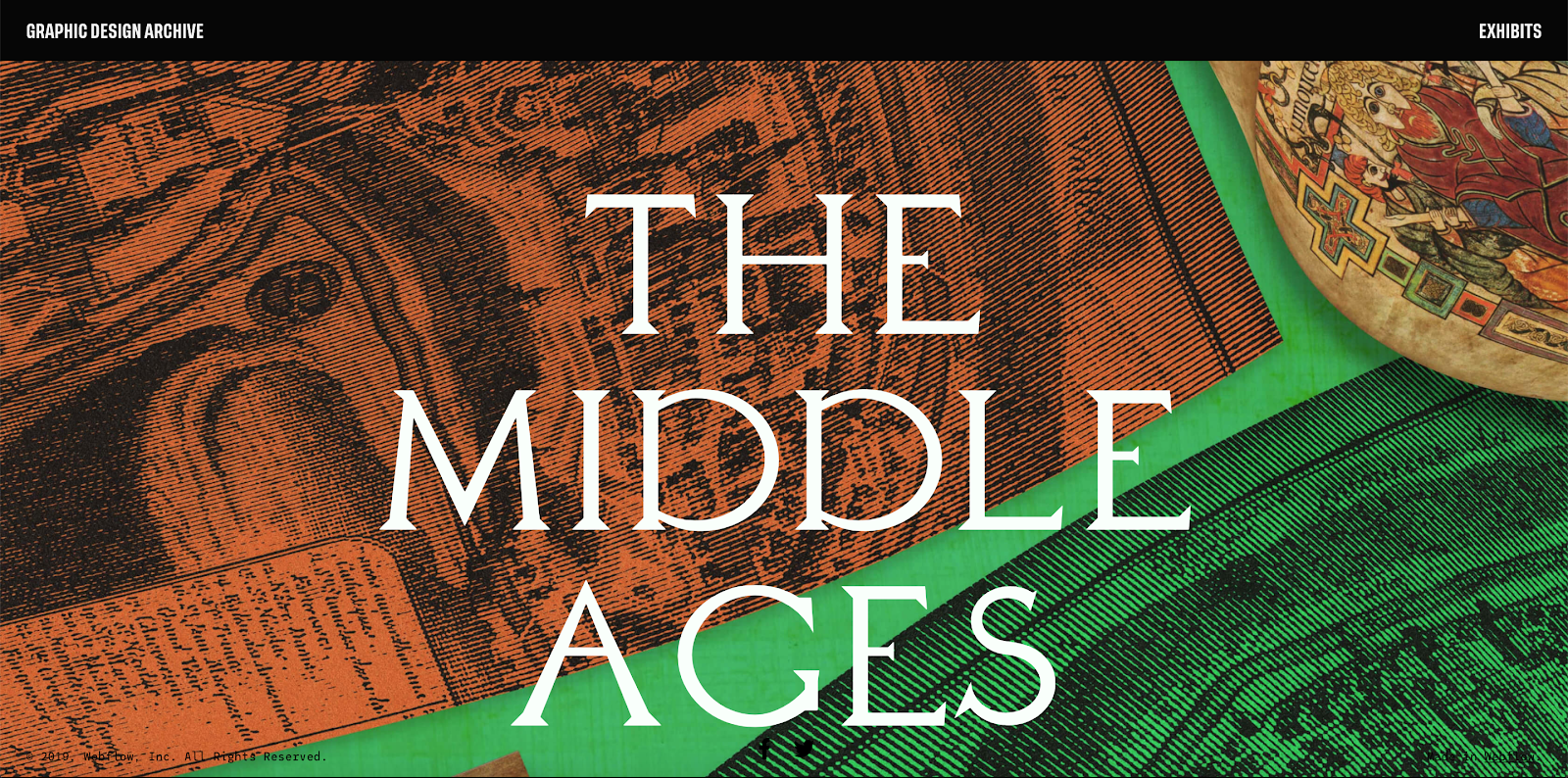
- The monks of Ireland, whose scriptoria not only produced some of the world’s most beautiful books, but also preserved many of the classical manuscripts that keep names like Plato, Aristotle, and Socrates on our minds and tongues to this day
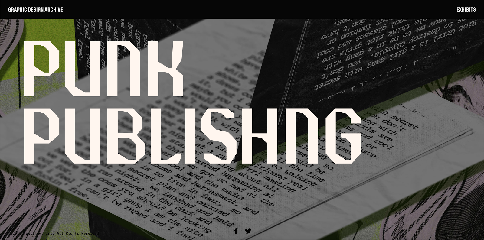
- The riot grrls, whose powerful manifestos — typewritten, Xeroxed, and hand-bound — brought feminism out of academia and rose-tinted visions of 60s rebellion and into the hands of young women everywhere, and played a vital role in a publishing revolution predating LiveJournal, Blogger, and Typepad by a good two decades
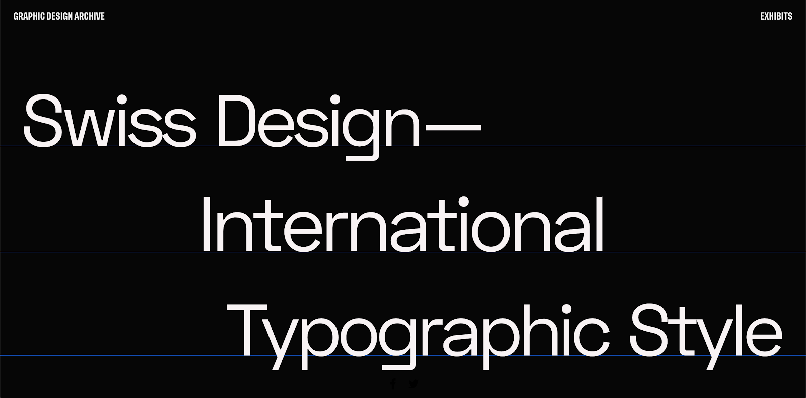
- The educators and typesetters of the International Typographic Style, who, in the wake of a propaganda-drenched World War, aspired to “represent information objectively, free from the influence of associated meaning” — a dream that still haunts us in a world struggling to determine how to think of “the media” that we all now play a part in (via Twitter, comments sections, and online forums)
So, when I presented the idea for the Graphic Design Archive to the team, this question was foremost on my mind:
What might we design if — instead of looking around at what our peers are doing for inspiration, instead of another roundup of slick new interactions and animations (which we also do, for the record) — we looked to seminal moments in graphic design’s history and considered what these moments had to show us?
Hence, the Graphic Design Archive, written by me, and made in Webflow by the talented Adam Ho. Enjoy.


