


As you might imagine from a head of content, I spend a whole lot of time trawling the web for great stuff to read and share. Here’s some of the best stuff I found this month.
Note: I'm 100% certain I've left off a whole bunch of great stuff. If you feel like sharing your favorite web news from October, feel free to comment!
Google and Monotype release Noto, a font for all languages
If you’ve ever been cruising the web and come across a series of empty boxes where you expected text, it was because the site’s font didn’t support characters from the language the text was written in.
Those boxes? They’re called “tofu.” And Google wants you to never see tofu again. Hence, Noto, the first font to ever support over 800 languages.
Want to use it in your next Webflow site? Awesome.
If you want to support languages in any of the following languages/scripts, you can simply add it to your site from the Fonts tab in your Site Settings:
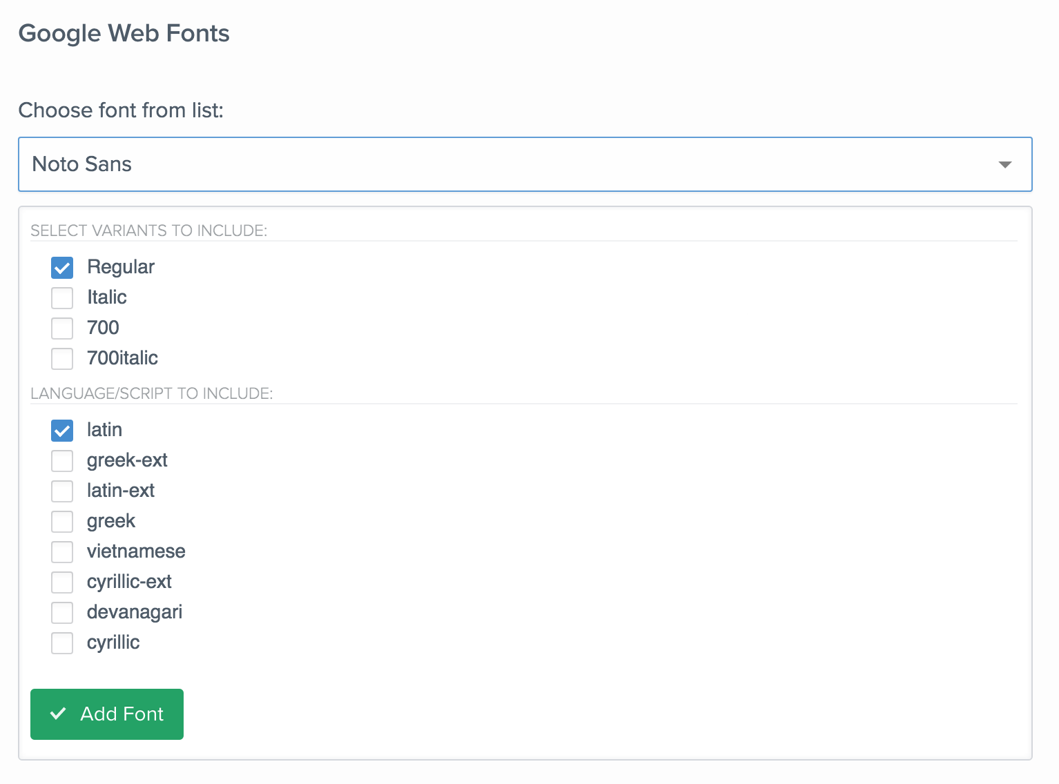
Otherwise, you’ll want to download the right set from Google’s Noto Fonts page, then upload from the Custom Fonts area of the Fonts tab.
Enjoy!
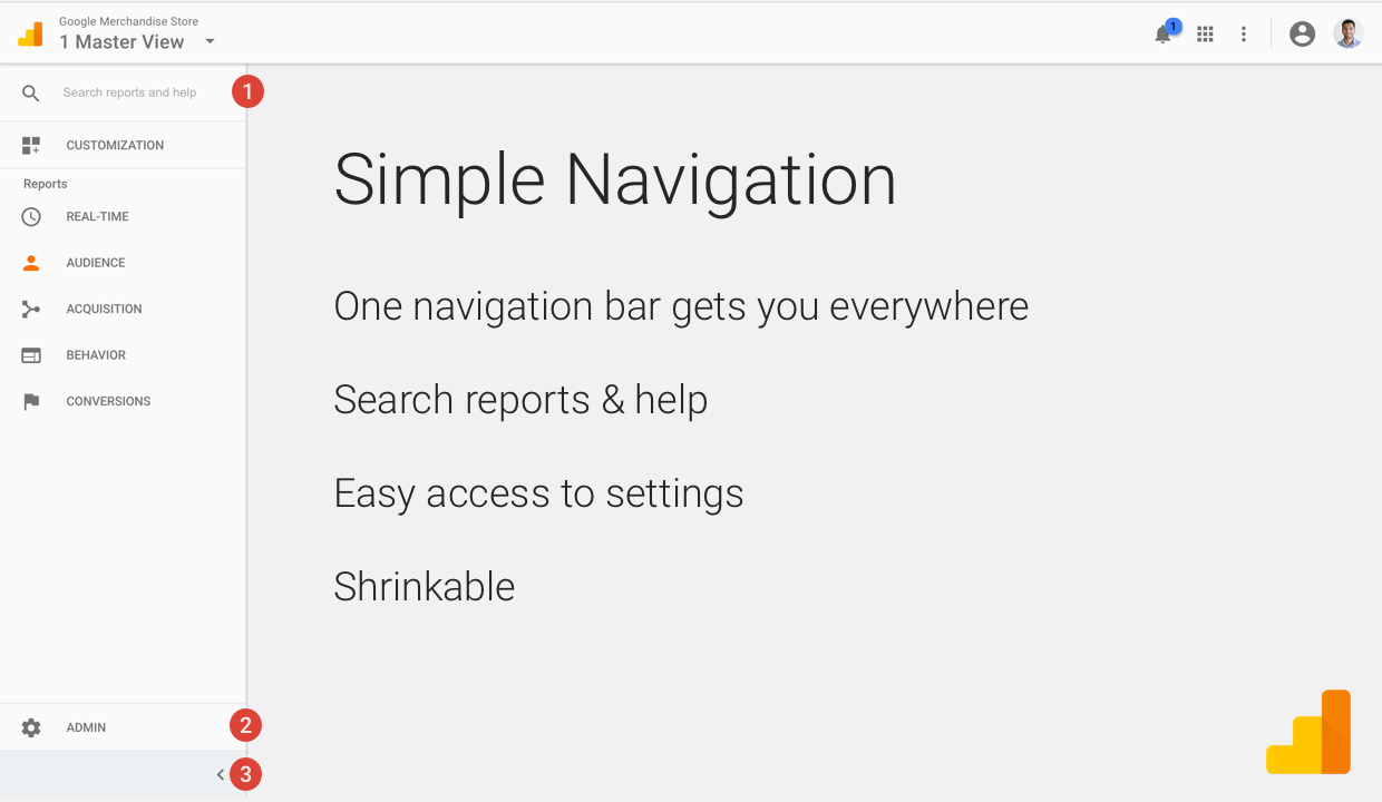
Improvements on the way for Google Analytics
Hillary Clinton pronounces GIF properly. Internet goes wild.
And yes, I know the format’s creators would disagree. I also enjoyed that Hillary does not refer to “the cyber,” as her competitor has done on more than occasion.
DevTips dives into Webflow
DevTips’ Travis Neilsen has launched a series of videos capturing his first experiences of Webflow as he builds a new landing page for his podcast. So you get to watch his travails and triumphs as he experiences them. And maybe learn a bit about Webflow too.
(Oh, and there’s a chance you could win a free Webflow Pro subscription for 1 year, so be on the look out for the next installment early next week.)
Luke Wroblewski continues to explain why obvious always wins
Fewer mantras are more well-known or powerful in the world of digital design than Luke Wroblewski’s “obvious always wins.” And know you can watch his 3-hour seminar on how to create obvious designs for mobile. It’s an obvious must-watch.
Part 1. And part 2:
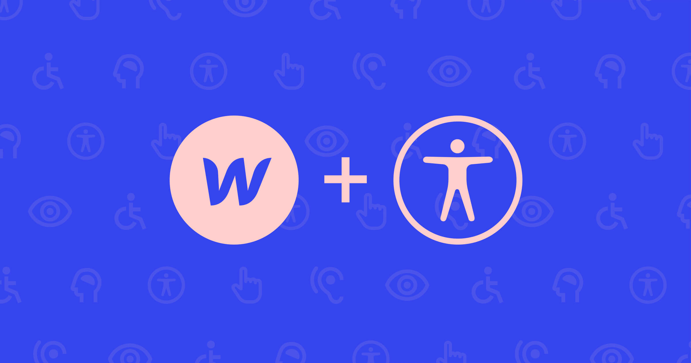
Microsoft Design releases its inclusive design toolkit
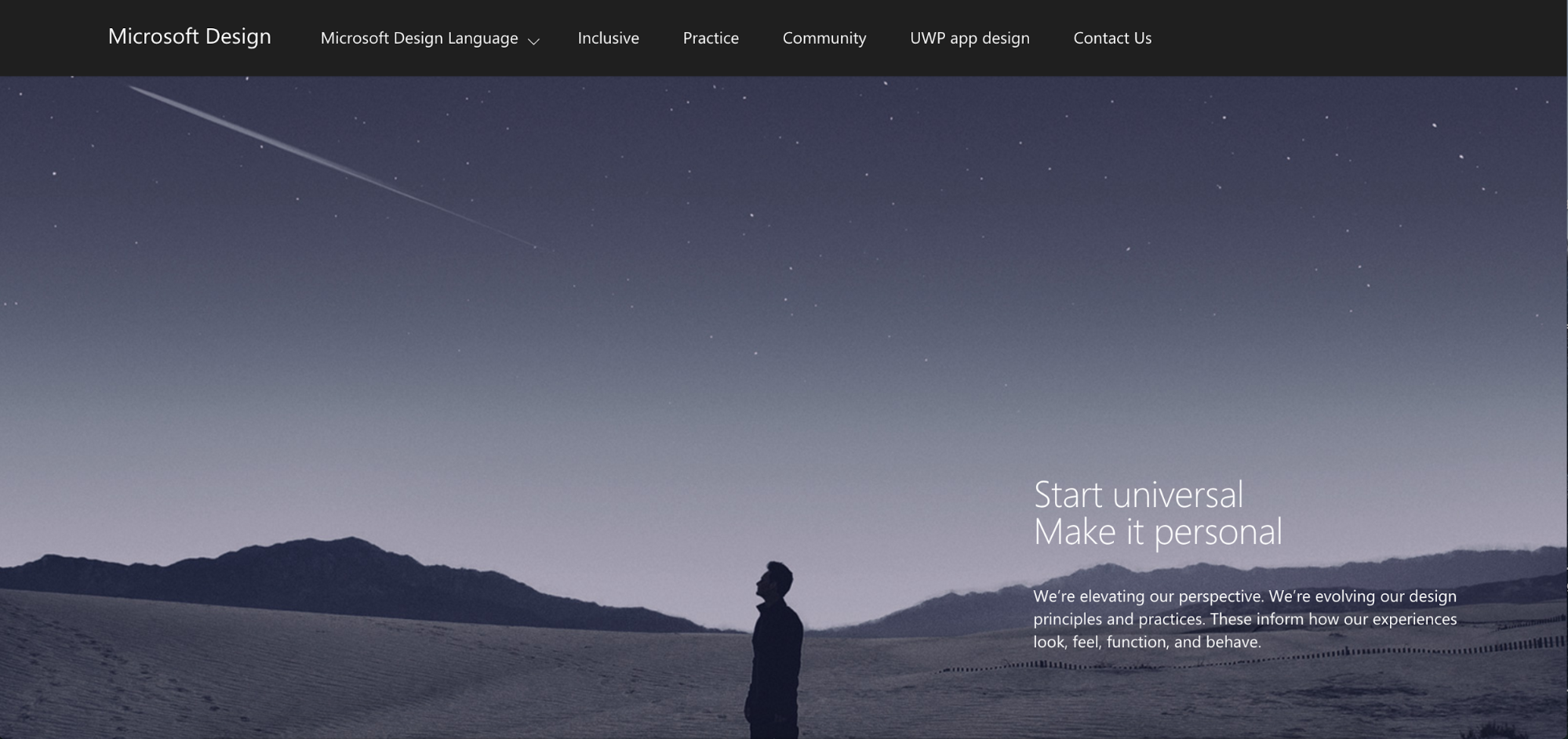
When you think of high-quality design, you might not think of Microsoft first. Or second. But there’s a lot to click around and check out on Microsoft Design’s site, but if you’re interested in building accessible designs, you’ll definitely want to grab the PDF of their inclusive design toolkit.
I was personally super-happy to see that their Design Language section includes basic voice and tone principles. IMHO, Microsoft has made great strides in their content over the last few years, so it’s worth checking out.
Affinity launches a UI-focused update
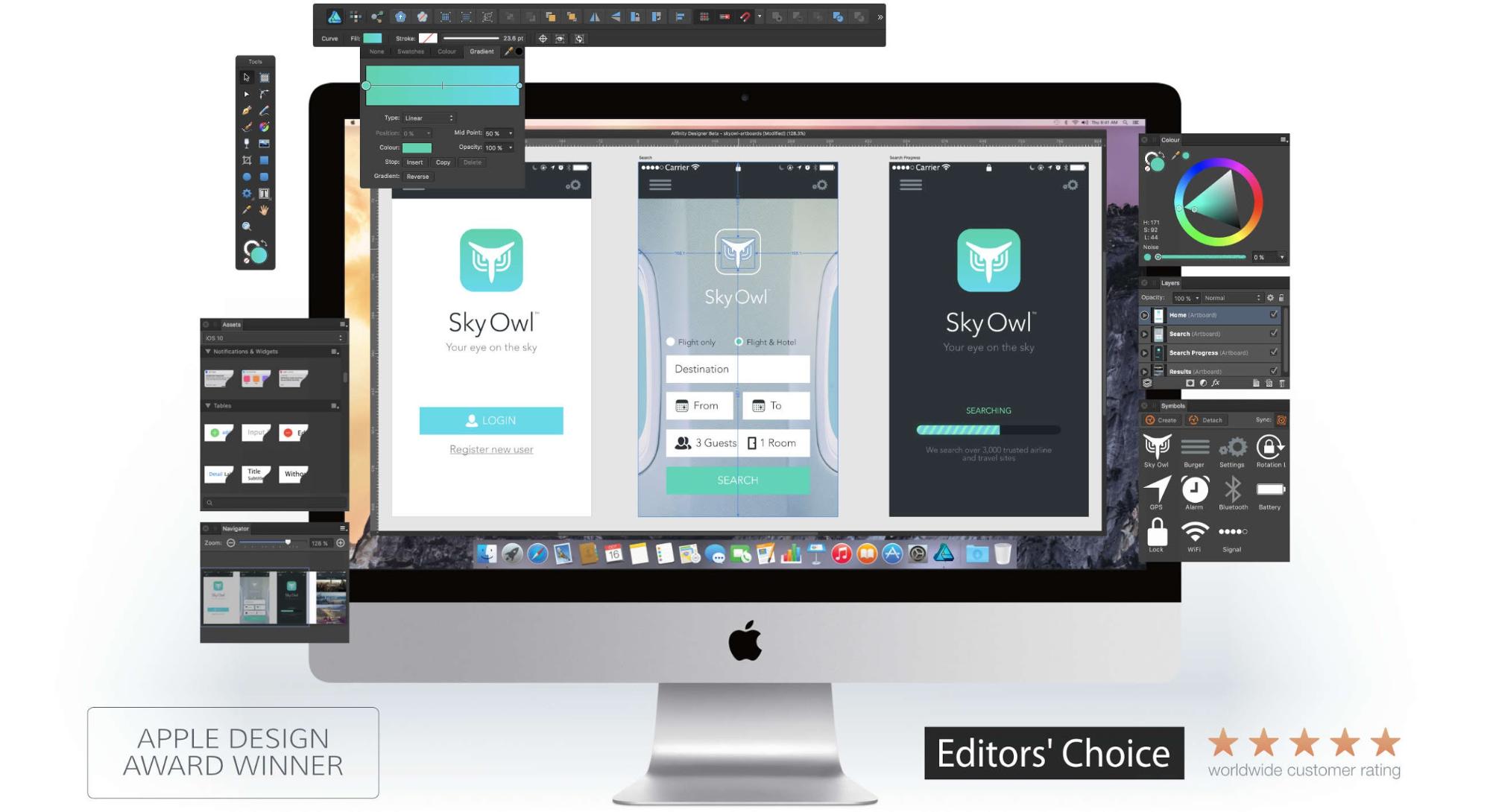
If you’re looking for an alternative to Adobe or Sketch for desktop design work, Serif has a solid alternative in Affinity Designer, which just got a few UI-focused updates. Oh, and if you happen to be a Windows guy or gal, they’ve got a beta version of Designer for Windows that you can download for free.
Spaaaaaace in desiiiiiiign
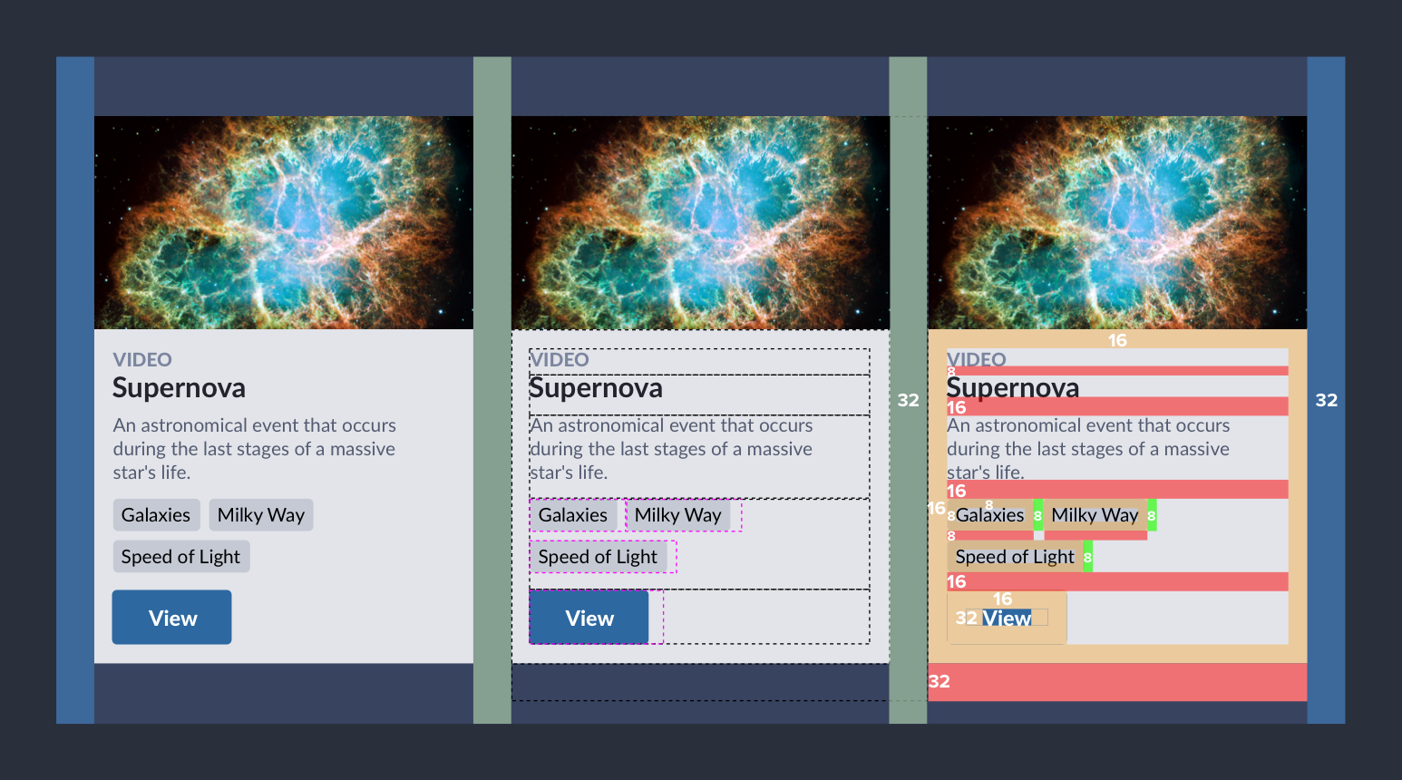
When I'm writing, I like to think that silence shapes my words. And the same goes for space in design. Nathan Curtis of Eight Shapes offers a detailed walkthrough of the role of space in design systems.
A critical analysis of the iOS 10 lockscreen
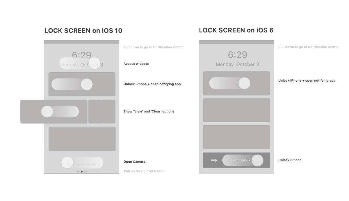
Whether or not you’re a fan of iOS 10’s new lockscreen, you might like Shankar’s critical analysis of the iOS 10 lockscreen on uxdesign.cc. Or as he puts it:
iOS said, “Ok clarity, let’s not be friends anymore.”


Free ebook: Web design 101
Master the fundamental concepts of web design, including typography, color theory, visual design, and so much more.
MailChimp shares 40 tips for holiday marketing
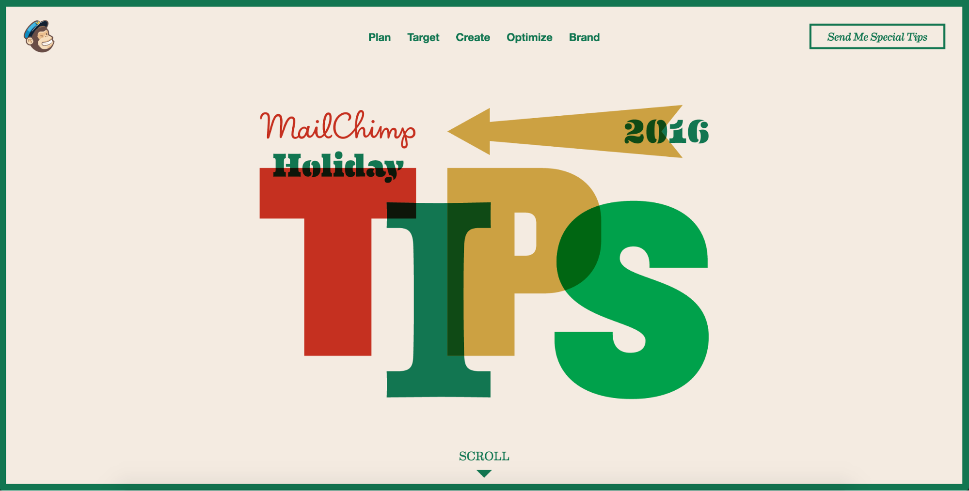
While the holidays might mean a bit of relaxing for most people, marketing goes into overdrive around this time of year. Thankfully, MailChimp’s got a whopping 40 tips on how to do it right.
So head on over, and maybe sit down with some of your clients to start planning that next bit campaign, eh?
See what the rest of the world thinks about the US presidential race
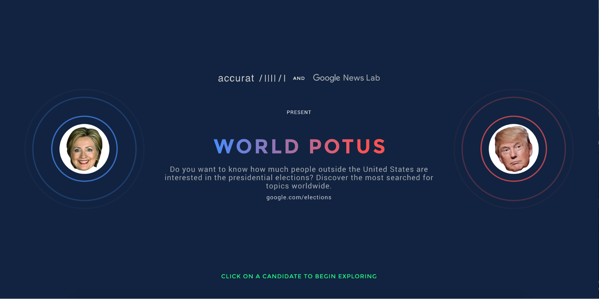
The United States has a tendency to get a little wrapped in itself, especially around presidential election race time. Which makes it a perfect time to see what the rest of the world thinks about this pivotal (and quite possibly historical) election.
Google announces 2016’s Material Design Award winners
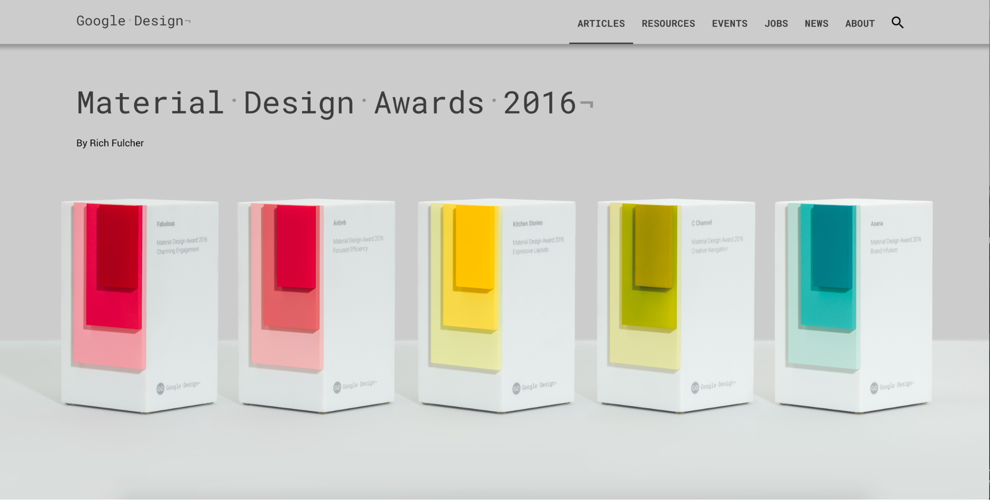
This year’s Material Design Award winners include big tech names like Asana and Airbnb, but some lesser-known properties get the nod as well.
How design killed readability on the web
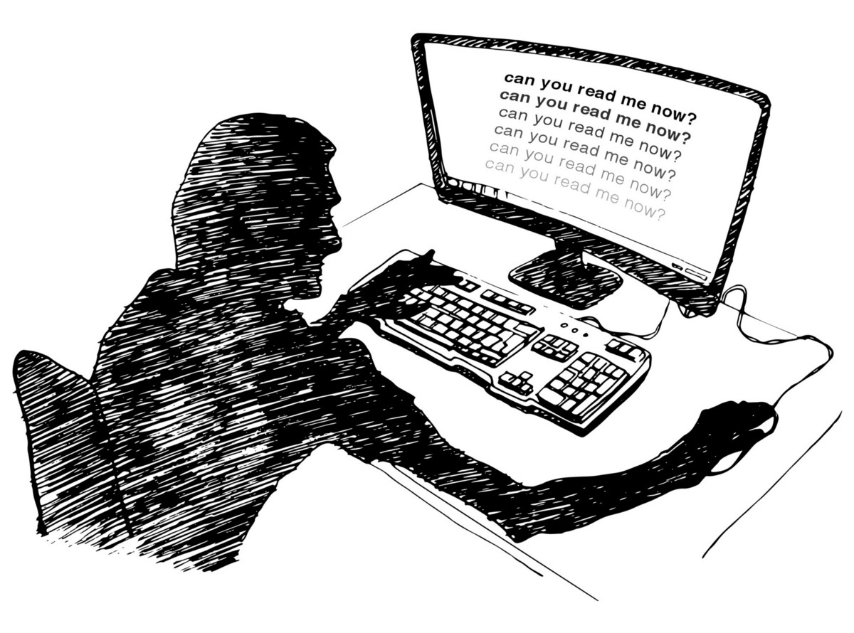
At first Kevin Marks wondered if he was losing his eyesight. Then he realized: the web’s become unreadable … by design.
Find yourself some more great links
LaBlacklist offers a curated list of great links, without all the usual razzle-dazzle.
Say hello to Material.io
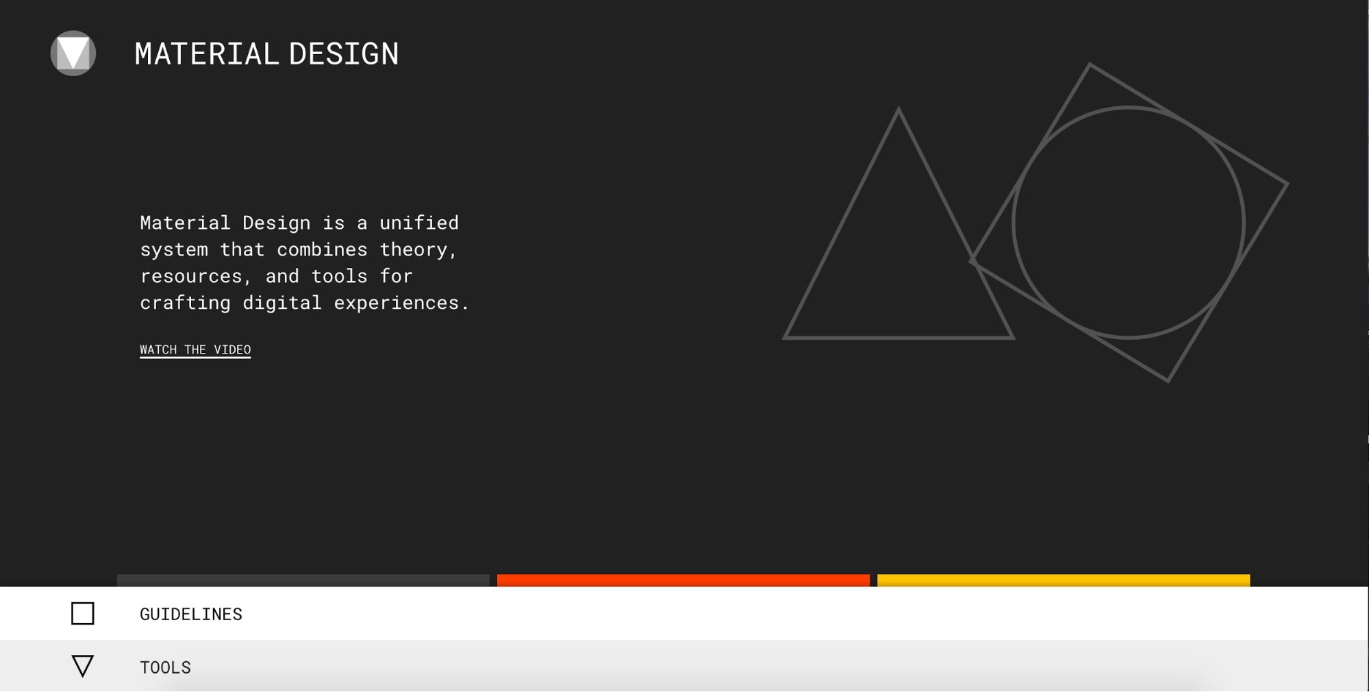
Google launches Material.io, a one-stop shop for all things Material design — and sneaks in a couple “new product coming soon” announcements, too.
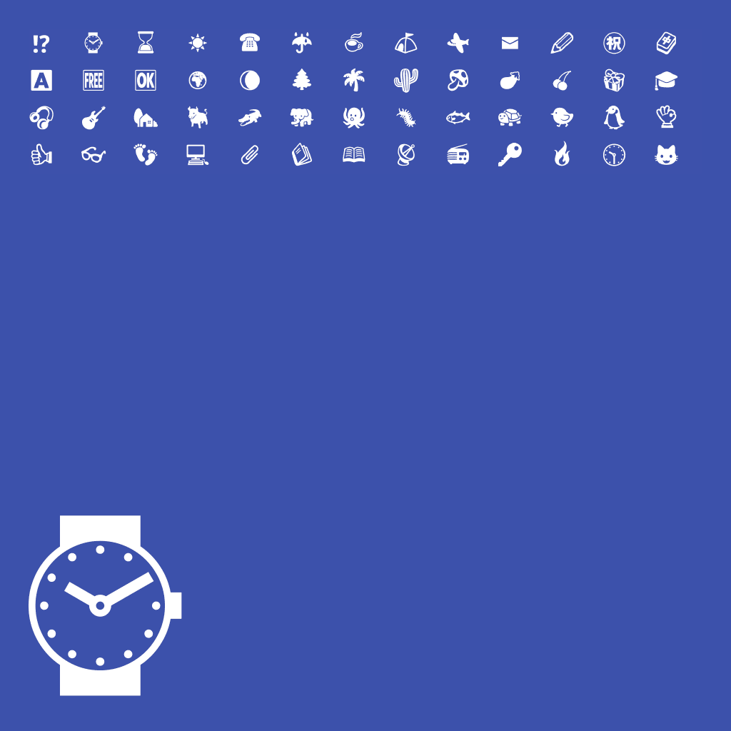
Emoji finally earn their place in art history
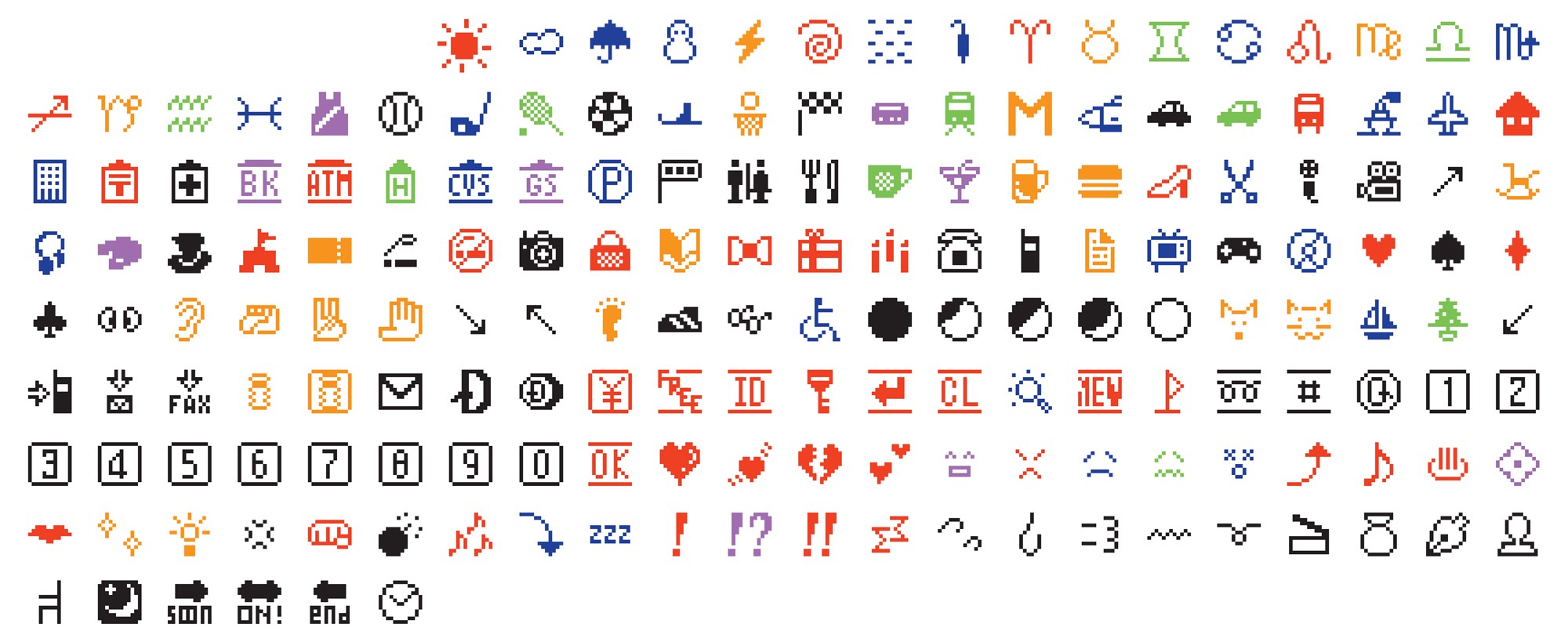
Whatever you feel about emoji, there’s no doubt they’ve become a new form of visual language. Guess that’s why the Museum of Modern Art has added the original emoji set to their collection. Though, to be honest, I’m super relieved that 23 fonts joined the collection first (in 2011).
Discover one crazy Jedi mind trick for getting what you want out of clients and stakeholders

If you’ve never heard of the role "hairy arms" play in graphic design and illustration, you’ll want to check out this quick NPR interview with graphic designer Jessica Frease.
Tips on reading about design

Khoi Vinh shares some much-needed critical thinking about how to think about design writing on the web.
Two new computers!
Oh, and I guess there was something about two new new computers from these two really big companies. Not sure what all the fuss is about. ¯\_(ツ)_/¯