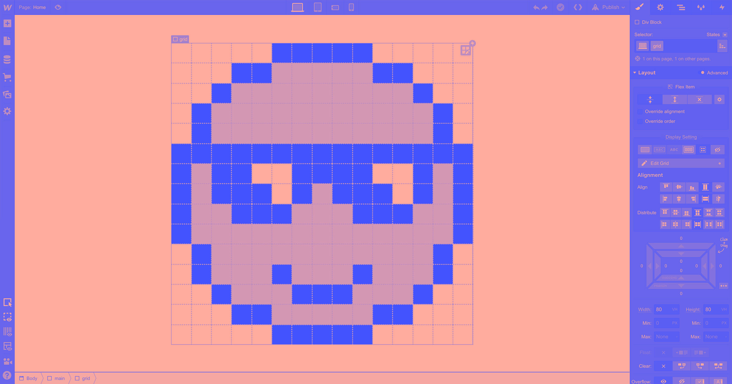
Grids give designers an intuitive method of organization. From the rule of threes, which guides composition in photography, to the rows of products on an ecommerce website like Amazon, grids provide a visual logic that helps us quickly and easily understand what we’re seeing. Join us as we take a look at the history of grids, from their earliest incarnations to their modern applications on the web.
Grids are the building blocks of order
We don't have to look any further than our everyday environments to see the beauty and balance that grids bring. From the office file cabinets to the aisles of a grocery store, grids make navigating our world easier.
Grids work a kind of geometric magic, guiding visual elements to adhere to vertical and horizontal lines. Designers are the wizards who wield them, bringing order and organization to what would otherwise be chaos. Alignment, spacing, and proportion are all important ingredients in creating a visual sense of harmony.
Grids act as the concealed framework guiding design from the ink and papyrus scrolls of ancient history to the pixels of today’s increasingly digital world.
The hands of early graphic designers were guided by notions of the divine
As with so many early cultural works, the earliest (preserved) published works were often religious. Drawing, writing, and binding these books was time-consuming, so why waste these efforts on anything less than what came from above? Historical romances and self-help books would have to wait hundreds of years, when the publication bar would be much, much lower.
The proto-graphic designers producing these texts didn’t have formal training, but their work shows an incredible attention to visual harmony, and a deep awareness of the power of visuals to communicate with a largely illiterate audience.
In the example from the Book of Kells below, created around 800 C.E. and containing the Four Gospels of the New Testament, we see both symmetry and balance. Grids are intuitive in laying out information and these early religious scholars had the innate sensibilities to arrange these holy texts following the grace of these invisible guidelines.

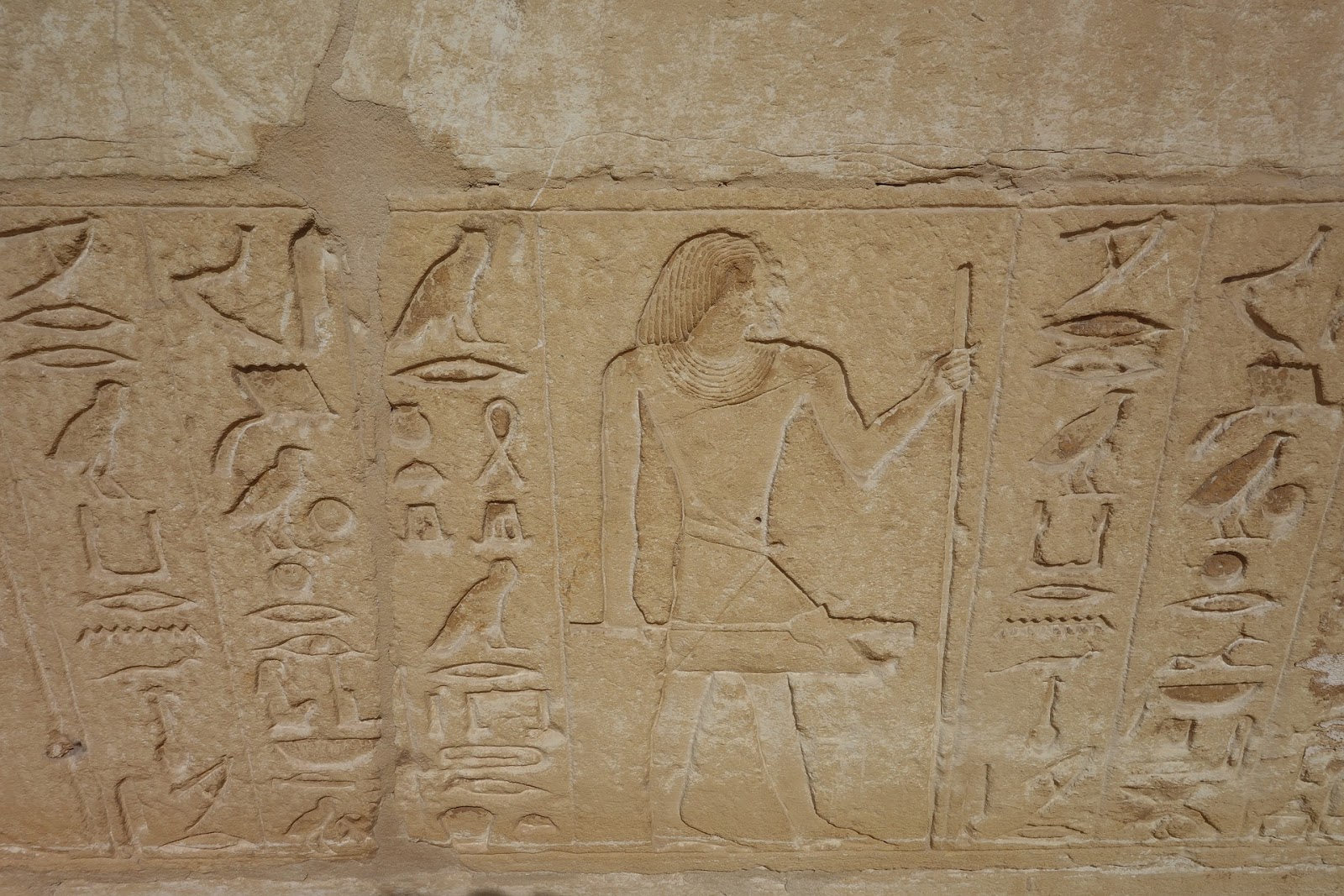
We can go back even further. The ancient Egyptians followed what we call the Canon of Proportions. The figures depicted in their carvings and paintings followed this grid rule. The Egyptians based their canon of proportions as a human fist, measuring 18 fists from the ground to the forehead of a standing figure. Their hieroglyphics also show a distinct grid layout. Just imagine what these early creators working in stone could have done with CSS grid and flexbox!
From manual to the mechanical
Movable type was first developed in China about 1040 C.E., with porcelain used for its characters. In the West, movable metal type would emerge around 1450, and the release of the Gutenberg Bible around 1455 would be one of the first massive milestones in publishing.
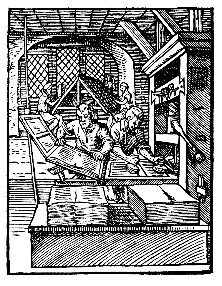
The nature of working with metal type made grids a necessity.
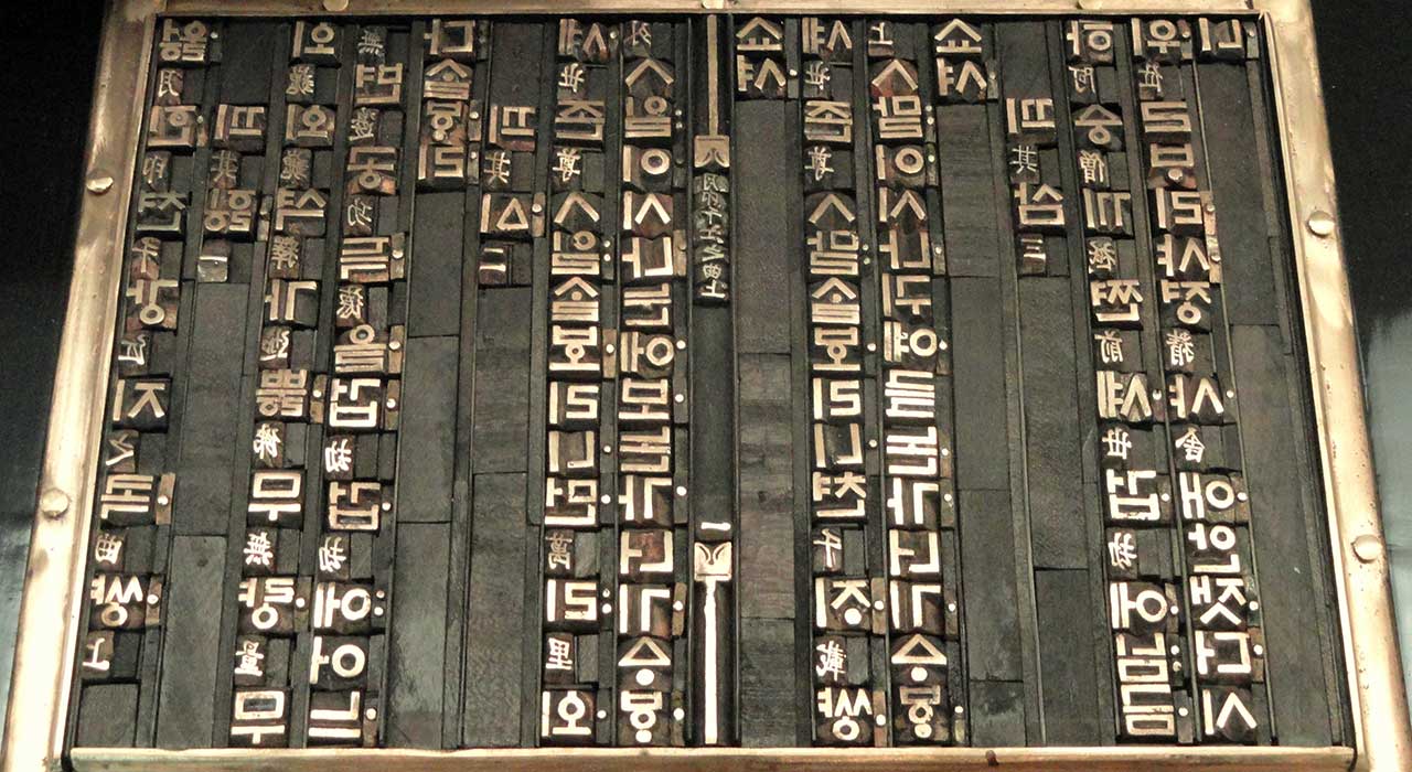
Printing presses allowed for the mass production of books, and unlike the handmade religious texts that came long before, the metal plates that they used made for uniformity. The Gutenberg Bible presents its text in a simple two-column layout.

The refinement and (relative) affordability of printing presses, as compared to hand-production, led to books of non-religious topics being printed and the creation of newspapers. Grids changed with the advancements in printing technologies, making complicated layouts with variably sized columns, rows, text, and photos all possible.


The modern web design process
Discover the processes and tools behind high-performing websites in this free ebook.
Grids get arty: the influence of Piet Mondrian and the De Stijil Movement
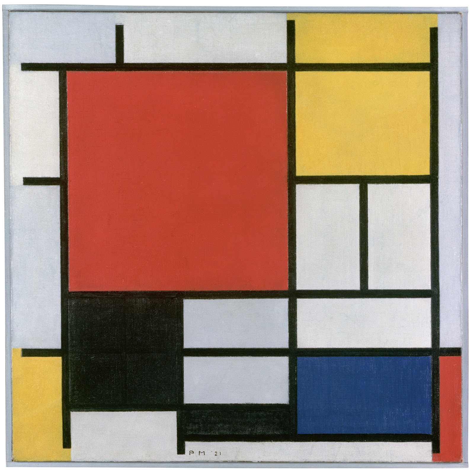
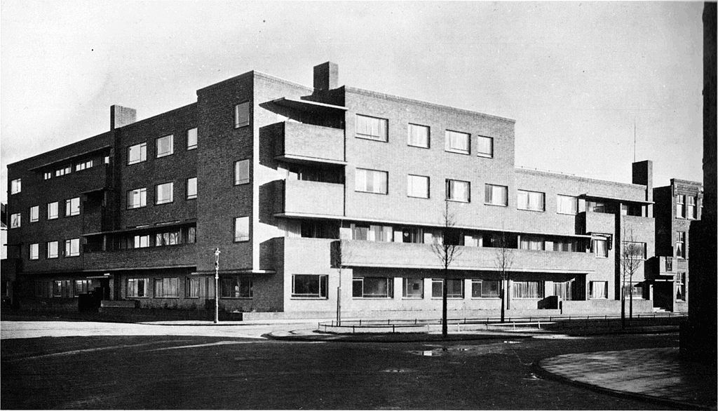
Sparked in the Netherlands in 1917 and lasting until 1931, De Stijil was a modern art movement rooted in both minimalism and abstraction. Simplicity replaced the intricacies of realism, with a linear approach that touched both art and architecture. Where Art Deco was marked by excess, De Stijil was about stripping away to the bare bones of practicality.

With the illusion of stability shattered by World War I, De Stijil offered a new promise, a sense of hope that order could be restored.
Piet Mondrian co-founded this movement along with Theo van Doesburg. Mondrian’s paintings are known for their grids of straight lines and squares of color, which are uncomplicated yet almost mysteriously engaging.
Following this adherence to simplicity, he worked with a basic color palette using yellow, blue, and red along with gray, black, and white. This equation of 3 primary colors plus 3 primary values yielded works rooted in restraint, yet marked with experimental sophistication.
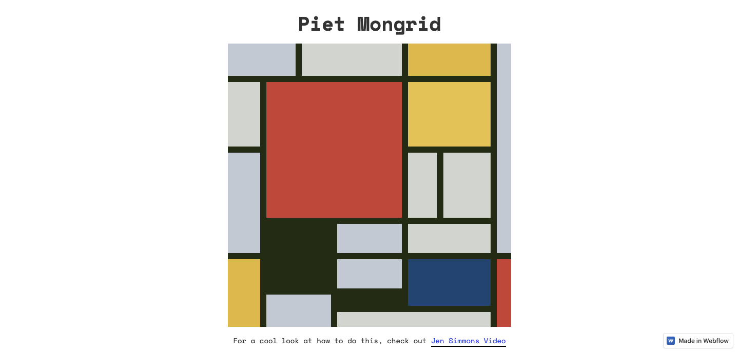
Mondrian’s stacked blocks of colors are easy to identify from afar and his influence is equally obvious in modern web design. And with tools like CSS grid, creating your own Mondrian-inspired layouts for websites is an easy process.
Commercialism and the grid: marketing in the 1940s
With World War II over, and a formidable evil vanquished, optimism replaced fear and a new consumerism arose. Advertising latched onto this exuberance, along with a rapid pace towards economic expansion.
Considered by many to be one of the forefathers of modern marketing, Paul Rand implemented marketing strategies and a sense of branding that hadn’t been used prior. And grids played an instrumental role in this new way of advertising.
Grids shaped the faces of soap boxes, magazine advertisements, and television commercials. They were even used to create neat rows of houses in emerging suburbs. Grids were omnipresent, bringing order and efficiency to this new consumerism.

Grids and modernism
The 1940s and 50s brought about the Swiss Movement, which has shaped so much of graphic and web design. The Swiss Movement shook free from rigid guidelines, but grids were what floated just beneath their often asymmetric layouts.
It emphasized the more emotional components of design. It paid particular attention to how typography can shape meaning, dropping the ornamentation of serifs for fonts that deliver text unaffected by stylization. From this utilitarian philosophy came the universally used and sometimes despised font, Helvetica.
Out of the Swiss Design movement would come one of the grid’s strongest advocates: Emil Ruder, whose book Typographie: A Manual of Design, espouses the good that grids do in a three-column layout, with each column holding a different translation of his writing.
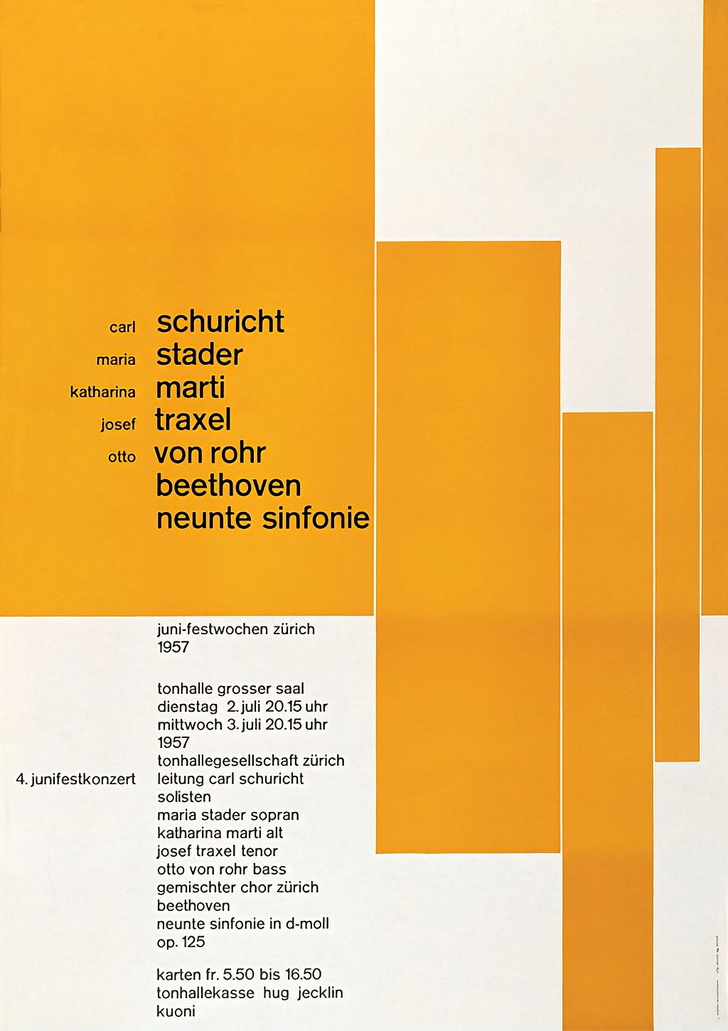
Joseph Müller-Brockmann was another important member of the Swiss Movement who brought grids to the forefront. His poster work, as well as book designs, were aligned by grids, with a visual aesthetic inspired by the Bauhaus art movement and a direct descendant of De Stijil.
Breaking free from grids with the power of computers
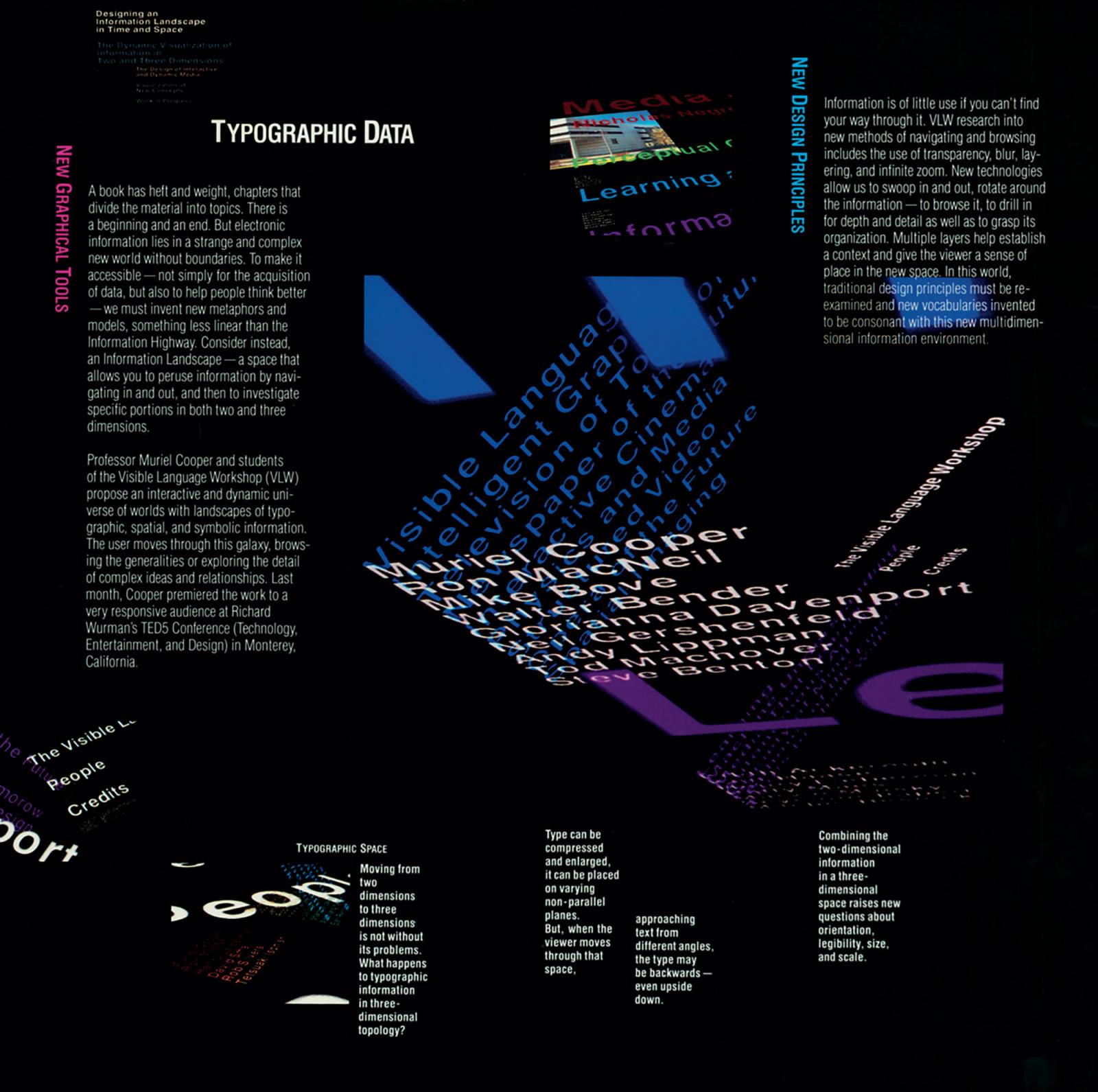
Before computers, a graphic designer’s drawing table held X-acto knives, rubber cement, and tweezers. The process of placing type and visuals was a physical experience. Mistakes couldn’t be changed with a command from a computer keyboard.
The advent of computers ushered in a whole new approach to design. Type could be replaced, borders shrunk or enlarged, and elements of a layout dragged to different spaces — all in an instant. And with this ease came a new appetite for experimentation. With this liberation from the constraints of physical media, the stakes were low to take chances with something new.

The introduction of computers for design led to the California Graphic Design movement, which emerged in 1975. The movement brought avante-garde sensibilities only possible with the assistance of computers. Computers have helped designers shape their creative visions with a less time-consuming process. Today, it’s hard to imagine a world without their digital assistance.
Grids in modern web design
Grids guide almost everything. Though their essence of being a framework of vertical and horizontal lines remains unchanged, they can be used in a multitude of ways.
Baseline grids: Grids are about imparting consistency, and baseline grids bring uniformity to how elements like text are vertically aligned. Think of the pages of a lined day planner. Each line is a part of a bigger baseline grid that lets you jot down things in an organized way instead of a scattered, unorganized mess of writing.
In web design, these baselines don’t have to be solid lines, but are usually transparent guides for aligning elements.
Manuscript grids: This is just a single large column containing all of the text as well as images. This blog post you’re reading now follows a manuscript grid.
Multicolumn grids: These are common in web design. Multicolumn grids organize content into vertical blocks. These grids are everywhere from standard two-column header layouts to featured projects in a design portfolio.

Modular grid: Modular grids feature an organized division of horizontal blocks, with guidelines dividing it vertically. We mentioned the Swiss School earlier, and using modular grids to align visuals on posters was a common practice for them.
CSS grid gives web designers the power to fix elements on both the vertical and horizontal axis in almost any way they can imagine.
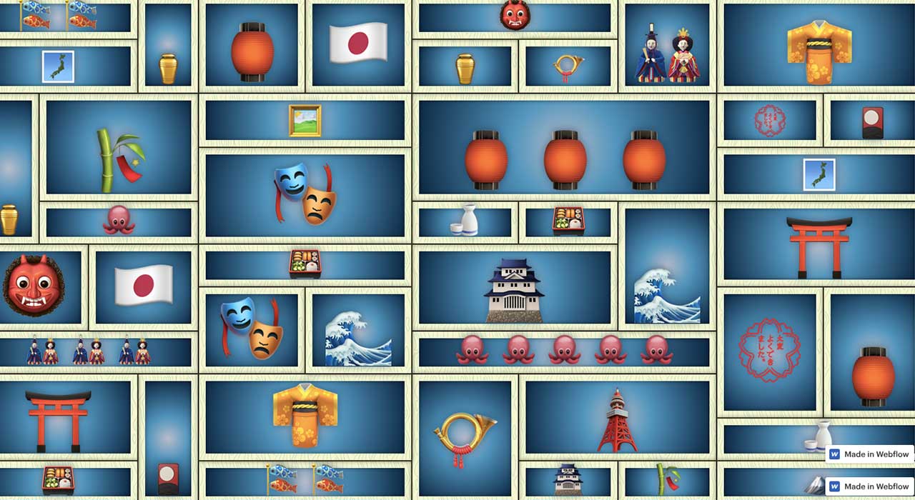
Irregular grids: This style subverts the strict lines of regular grids. Overlaying elements, skewing items into irregular positions and unique shapes can break up the monotony of these grids, without devolving a layout into a free-form disaster.
CSS grid is also a great tool for bringing a bit of variety to layout, making irregular grids easy to pull off.
This example below for the Momentum Conference made in Webflow has both overlapping visual elements and text that still follow a logical organization, but aren’t tethered to a traditional grid.

Grids will never go out of style
From prehistory to the 21st century, grids have guided so much in design. They make for a linear approach, where elements can be arranged with ease into a visually pleasing organization. Whether you're following a traditional layout or subverting to fit your own artistic sensibilities, they make for designs that are easy to understand and simple to navigate.


