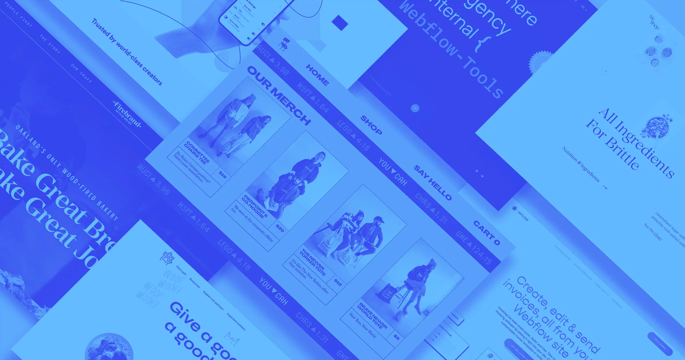
This month is all about variety.
Recently, we’ve seen the Webflow community use wonderful combinations of color, unique typography, and clean layouts for their projects.
From tech startup templates to artisanal bread, here are 11 of our favorite websites from the month of July that show some of the most interesting and creative examples of these elements. Let’s dive in.
1. Refokus
If you’re looking to add CMS filters, page transitions, interactions, masonry layouts, and other helpful tools, be sure to check out Refokus tools for Webflow, which are now available to the public.
.jpeg)
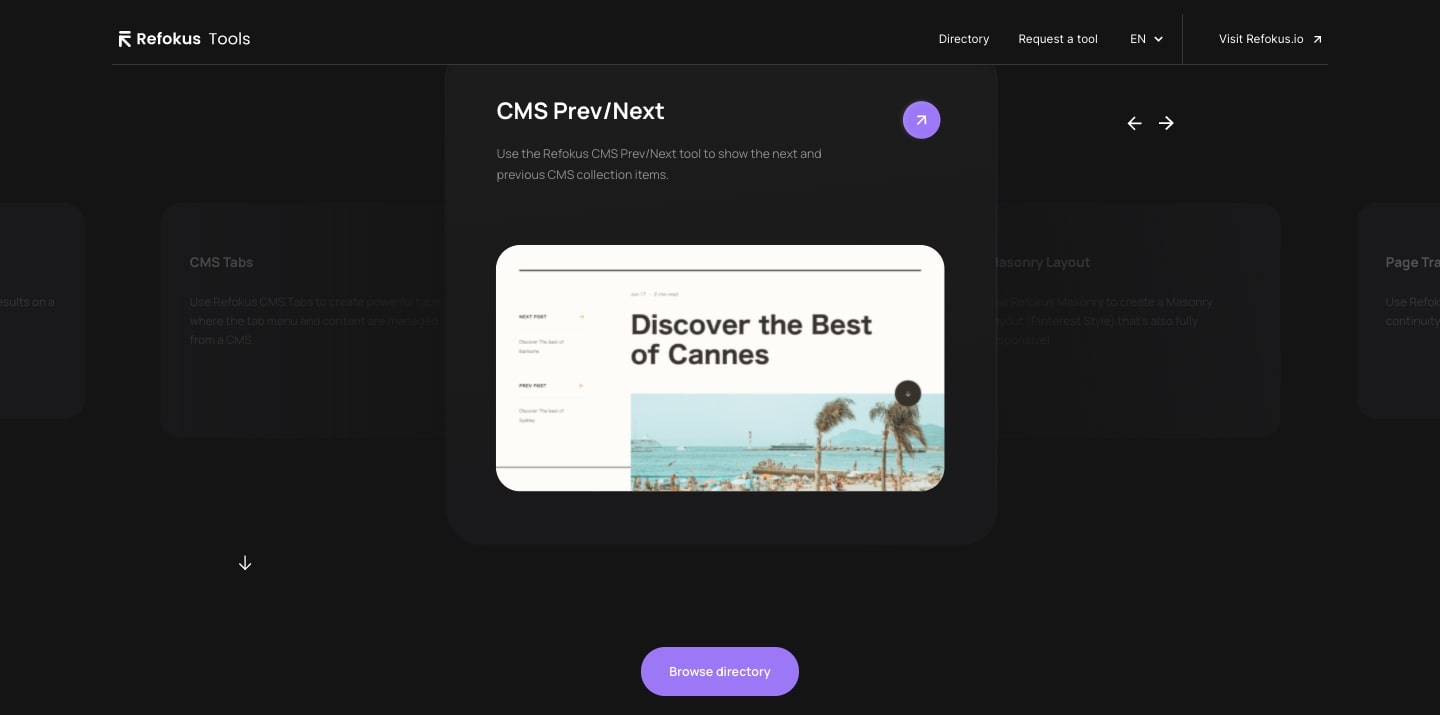
The Refokus site offers great tools while showcasing a clean layout and stellar design.
The gallery is worth highlighting — it can be scrolled through manually and also moves automatically. A click of the purple circular arrow icon (found on each individual tool) brings you to a new section that gives you step-by-step instructions on how to integrate that tool in Webflow.
The interactive gallery uses sleek visuals and a user-friendly design to show off their tools and demonstrate how easy they are to use.
2. Candy Brittle template
Candy Brittle, a free Webflow template, is truly a delight.
It offers a spacious layout that has plenty of room for product photos and other imagery. This template features a tasteful and eye-catching color palette of light pink and deep purple as well as a unique and elegant typeface.
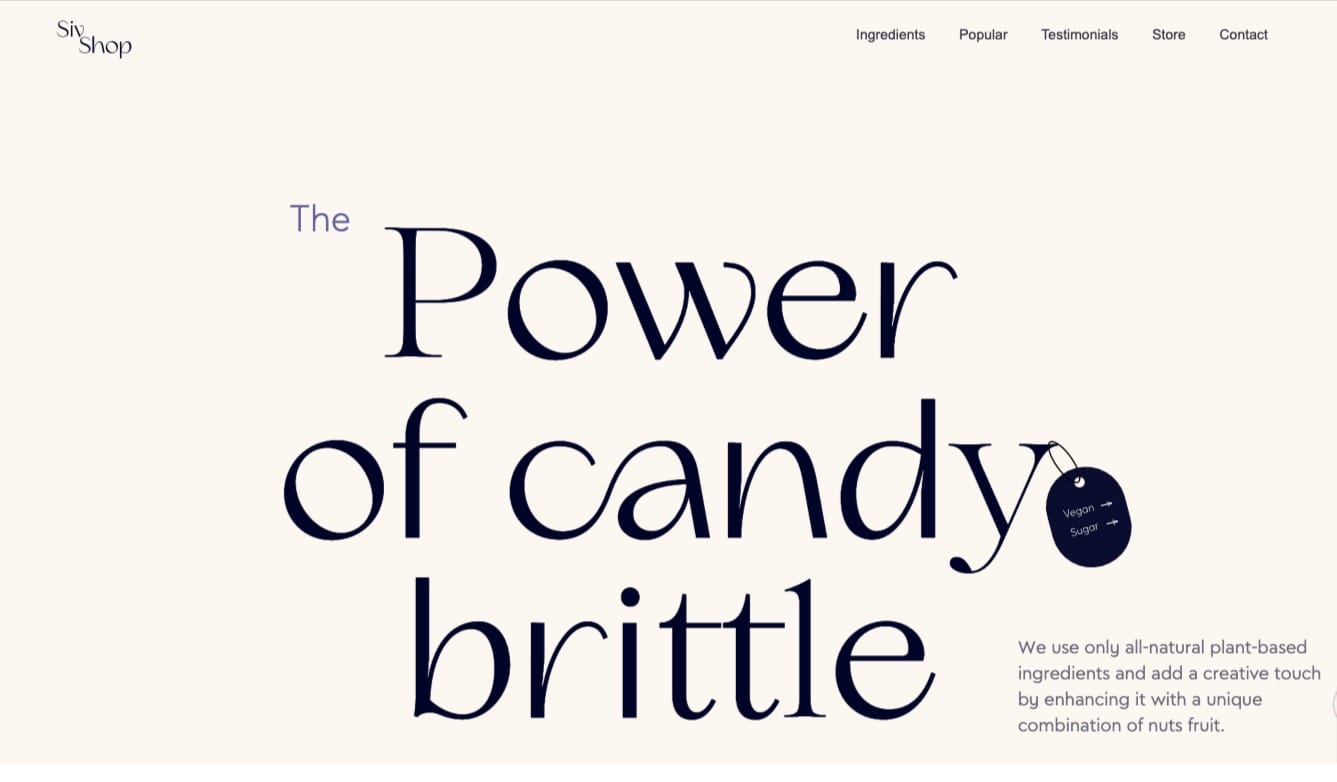

Most notably, this template features a great product slider that allows your visitors to seamlessly scroll through a selection of products. We love built-in components like this as it allows you to include unique elements on your website without having to build them from scratch.
3. Firebrand Artisan Breads
In this site’s background video, we see a baker shaking out powdered sugar over trays of golden and flaky croissants. We can almost taste the sugar in the air and smell the inviting aroma of bread baking in Firebrand’s wood-fired ovens.
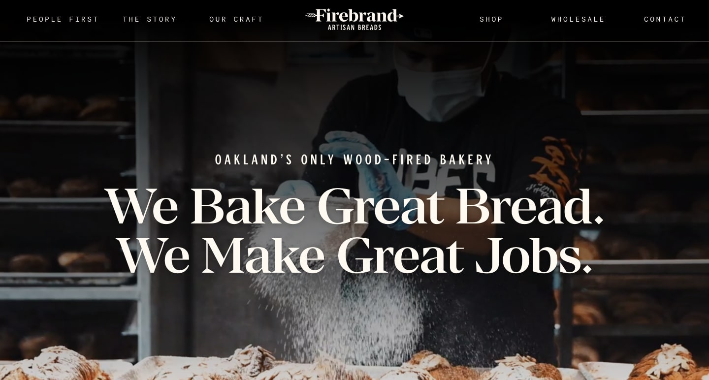
Oakland-based Firebrand is passionate about crafting quality breads and pastries while also supporting the greater community.
With a guiding principle of “People First, Purpose Driven,” Firebrand makes sure that their web design reflects their powerful mission statement. Alongside delectable images of bread and pastries, they emphasize the people who work at Firebrand and the community that they support.

4. Ivette Felix Uy portfolio
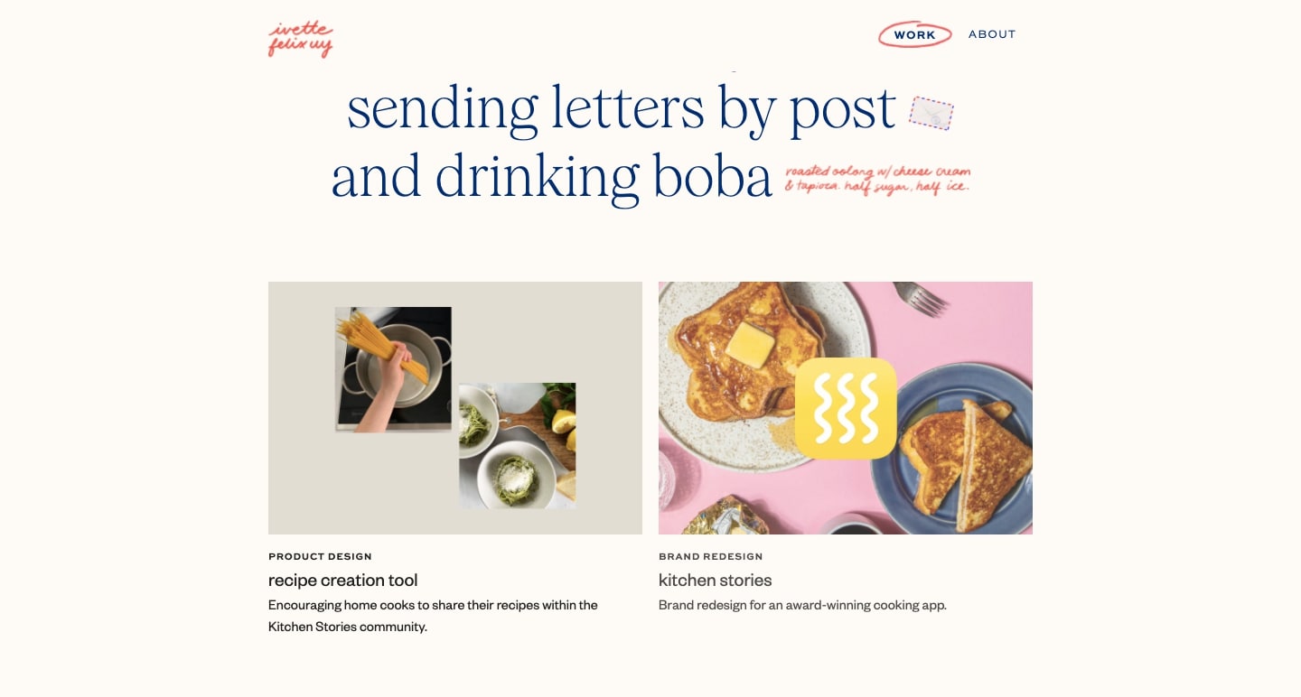
Anyone who has attempted to design or revamp their portfolio knows it can be difficult to come up with something that you’re completely satisfied with. Portfolios like Ivette Felix Uy’s are a great place to find inspiration when designing your own personal website.
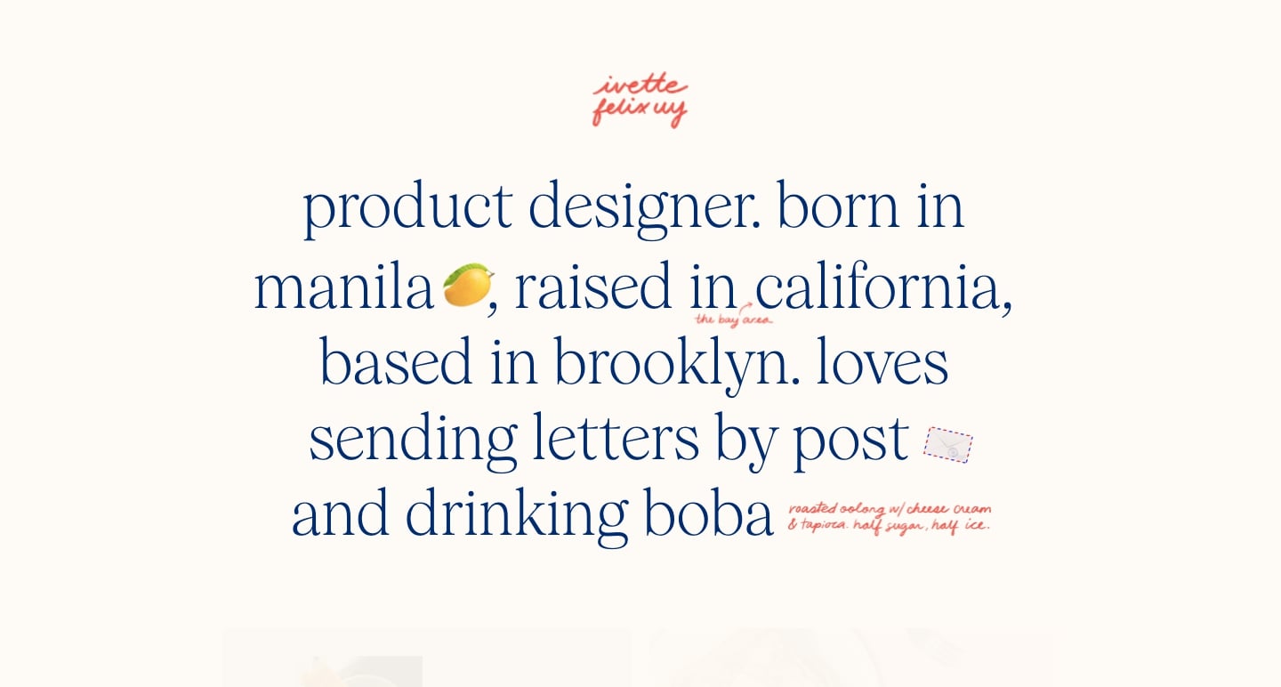
Starting with the hero text, we get an immediate sense of who Ivette is and what she’s all about. The homepage tells us that Ivette is a Brooklyn-based product designer as well as a fan of snail mail and boba. While these things may not directly translate to her work, they give potential clients an idea of who they’d be working with.


Build websites that get results.
Build visually, publish instantly, and scale safely and quickly — without writing a line of code. All with Webflow's website experience platform.
5. Committee Chairs
Committee Chairs opens their website with the cheeky statement, “Capitalism killed the dream job; dress for the part.” This paired with a simulated video meeting of people dancing, wearing a bag over their heads, or lying on the floor sets the tone for Committee Chairs.
Web design that makes fun of work culture pairs perfectly with the anti-corporate t-shirts, hoodies, and tote bags that Committee Chairs sells in their shop.
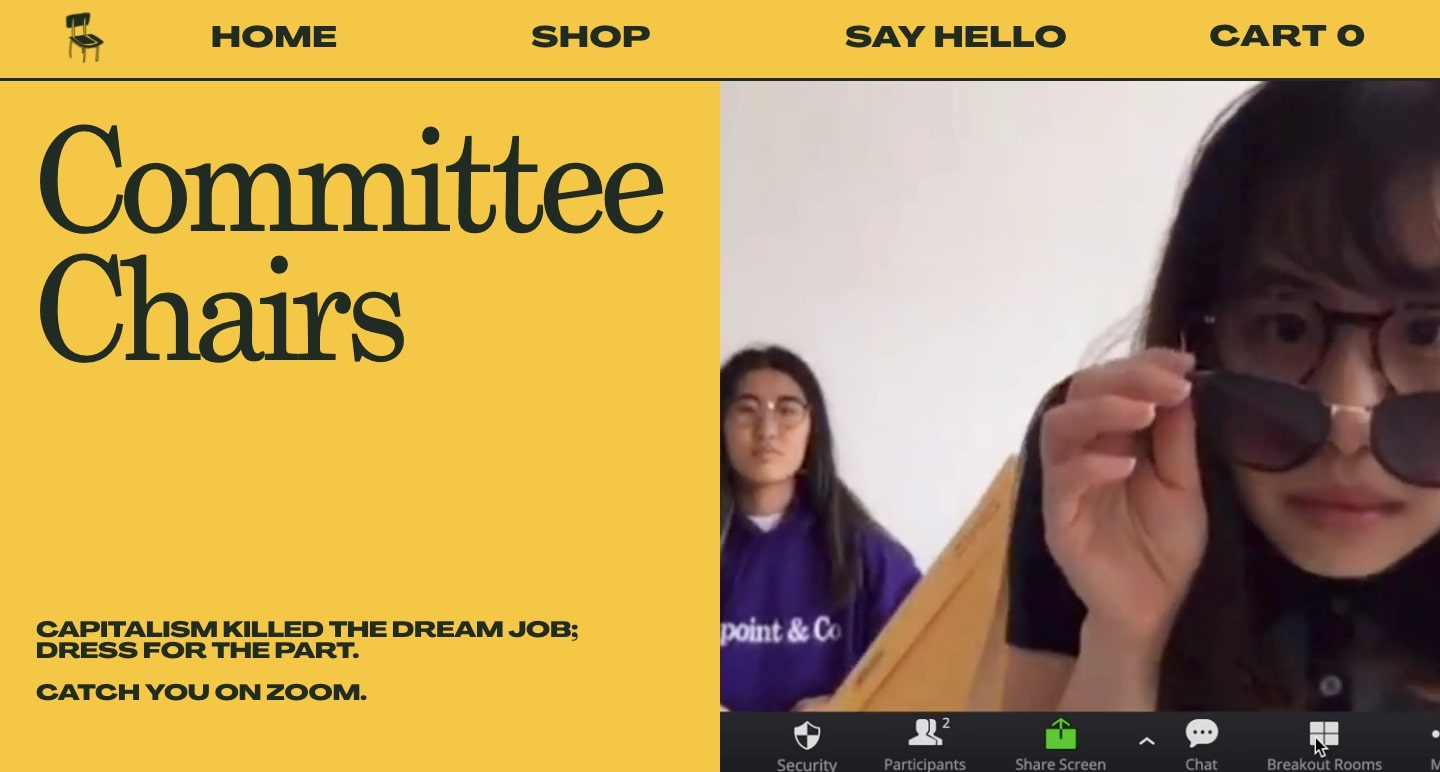
Though they’re pushing an absurdist take on consumerism with products like the Brave Newer World tote bag, Committee Chairs still puts good web design first. Content blocks organize everything in a cohesive way and the gold background pairs well with bold, black text.
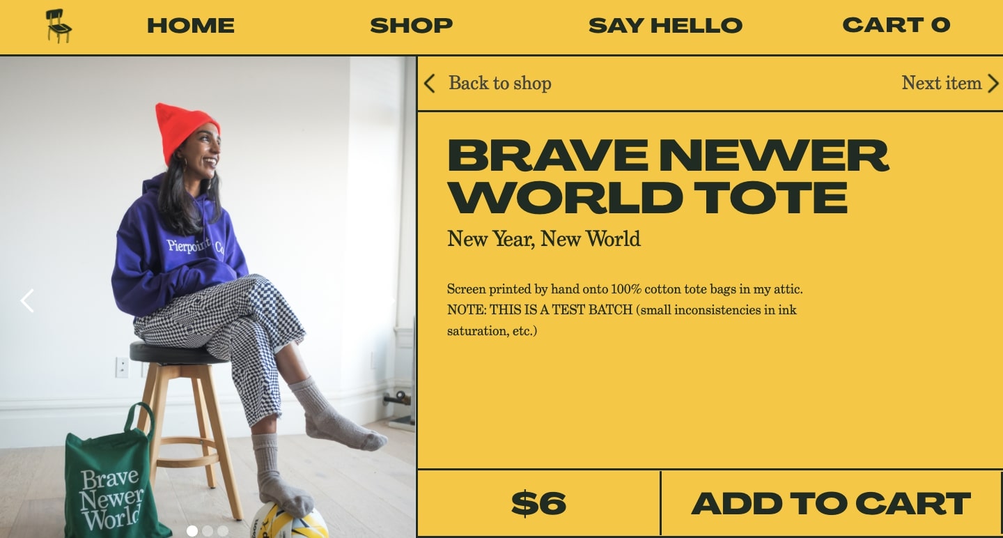
Committee Chairs shows that even if you’re pushing the ridiculous, you can still be serious about how your website looks and functions.
6. Friends with Four Legs
We always like seeing web design being used for good — and Friends with Four Legs is a great example of using websites and design to create change in the world. This website spreads the word about adoptable pets in Malta and Gozo and creates a platform for the animals who need additional support in finding their forever home.
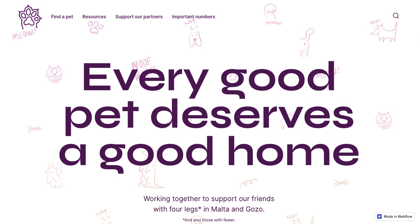
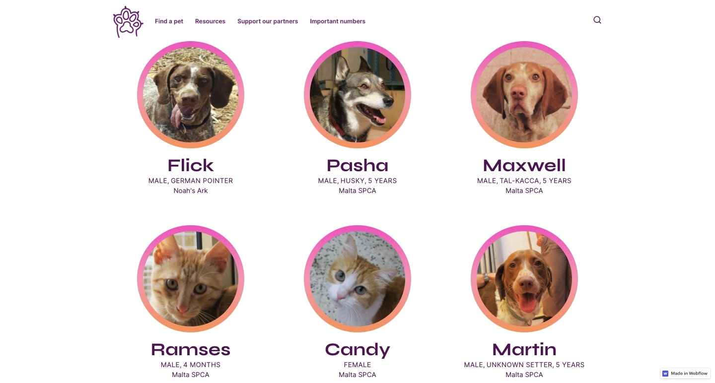
The Friends with Four Legs website leans into exceptional design to showcase their animals. On their adoptable pets page, every cat and dog is featured individually and surrounded by an eye-catching gradient. Thanks to the high-quality headshots, each animal appears to be looking directly at the viewer — making it difficult not to fall in love with them.
7. Portal Journey
Portal Journey’s site is a great example of how to use AR and other 3D effects in Webflow with the help of custom code including CSS, HTML, and Javascript.
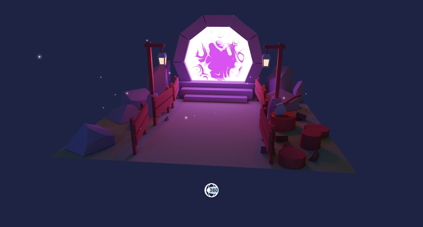
Portal Journey starts with a lighted path that leads the way to a swirling purple and white opening to another dimension. A cursor rotates the scene 360 degrees, allowing visitors to view the portal from multiple angles. It’s beautifully animated and full of wonderful colors and details.
Want to know how JP Dionisio put this together? Check out the associated code on CodePen.
8. K72 Menu
K72 knocks the menu bar out of the park with this reimagined version that you can clone for your next project.
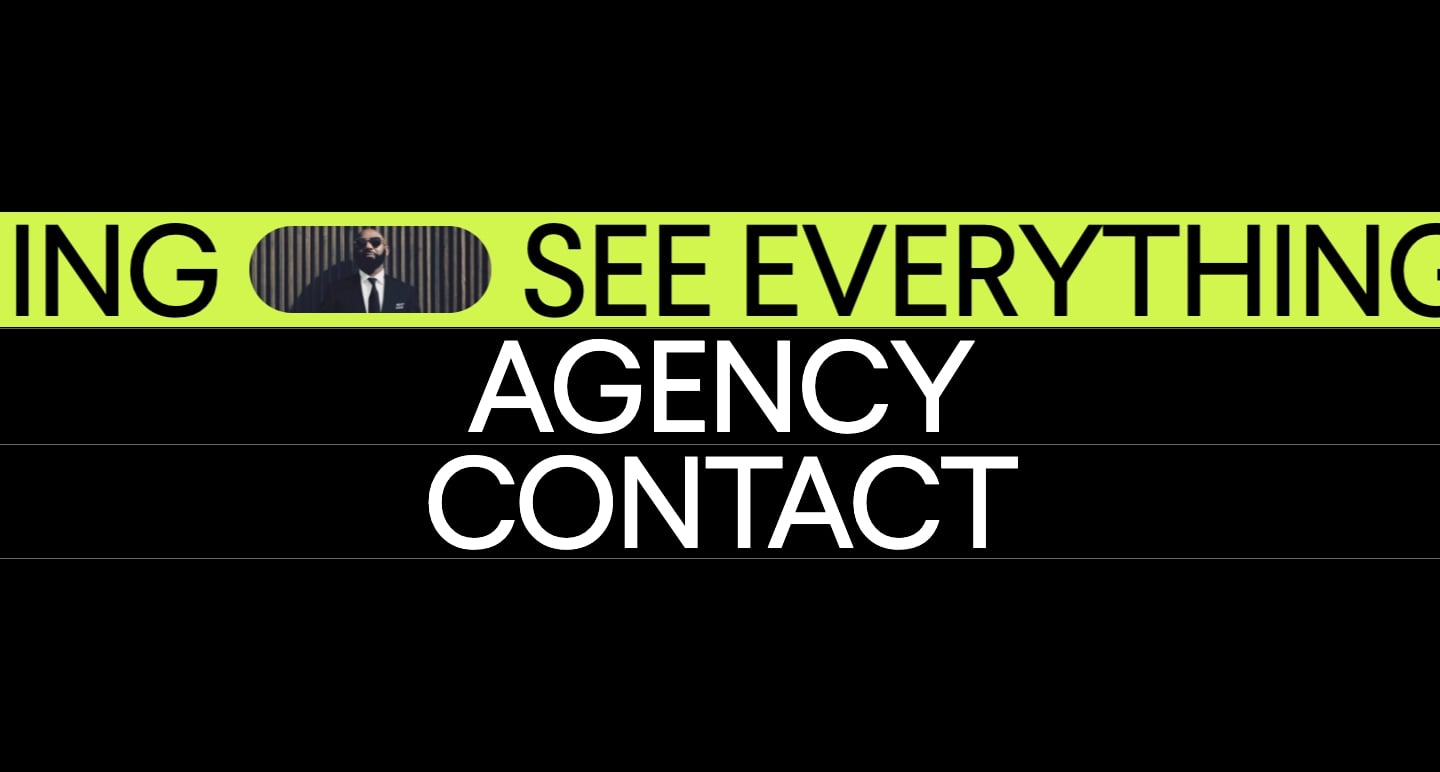
Hovering over any of the menu options opens up an animated green band. As you scroll, text darts across the screen and provides more details. Unlike standard menus with static text, these options come alive with motion and color.
9. Six Eastern
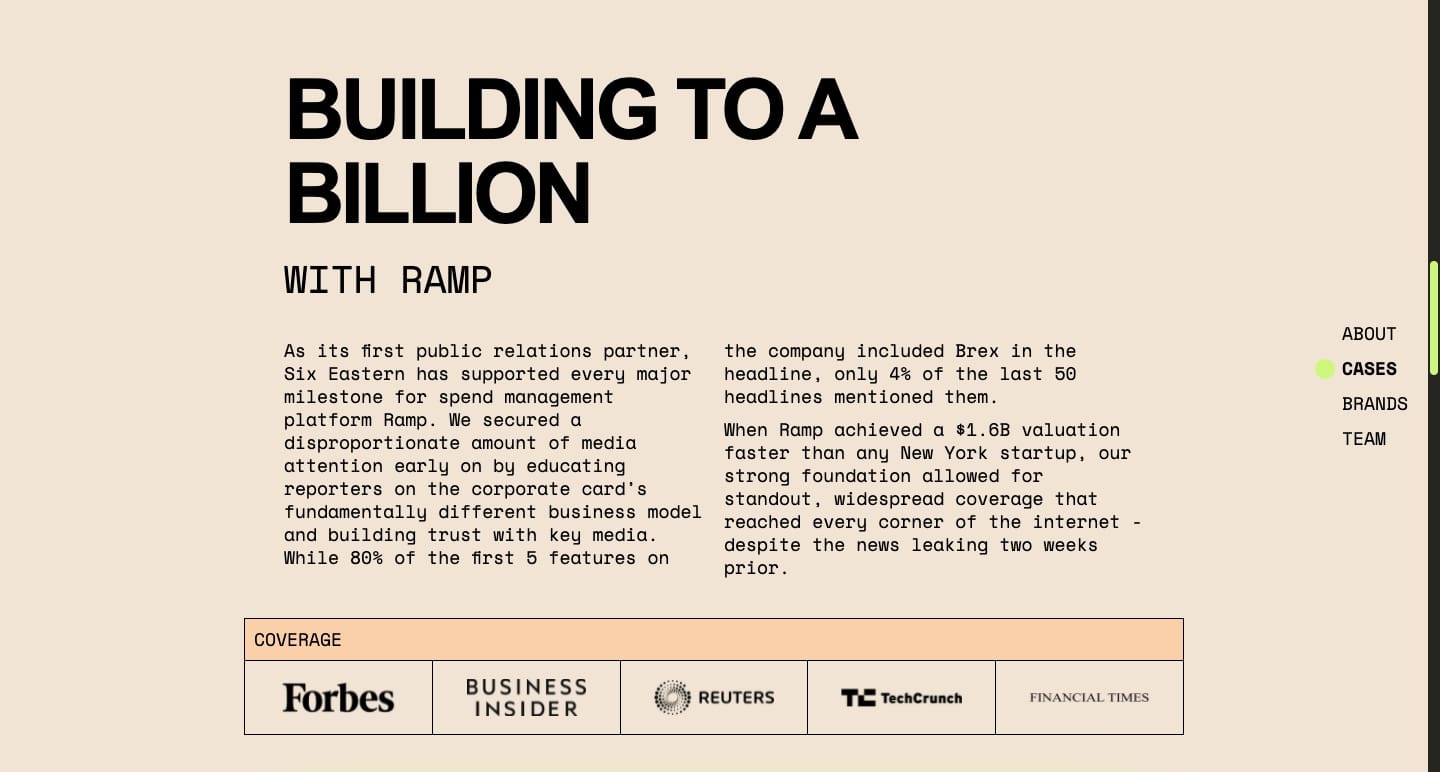
Six Eastern’s website shows how effective minimalism and typography can be in design.
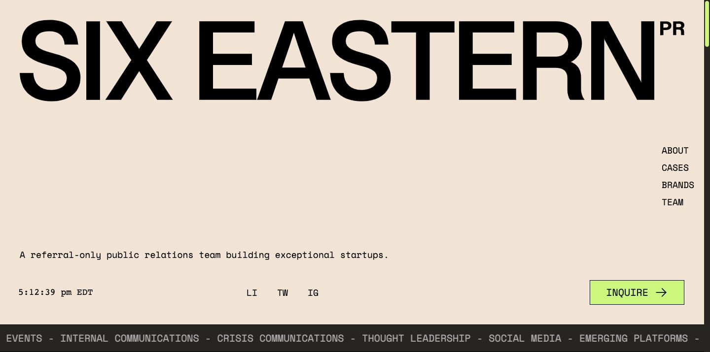
This one-page website distinguishes every block with a muted background color. Each content section gets a headline in Helvetica Neue, which makes for a strong and definitive design. The website couples the headers with the font Space Mono in the body text — giving it all a typewritten feel.
This is all balanced out with lots of negative space to let the words take center stage in this design.
10. Inflow
Inflow is another great app that works on top of Webflow. With the help of Zapier, Inflow allows you to send an invoice directly from a Webflow website. They showcase their invoicing app with a design that offers a rich and visually engaging user experience.

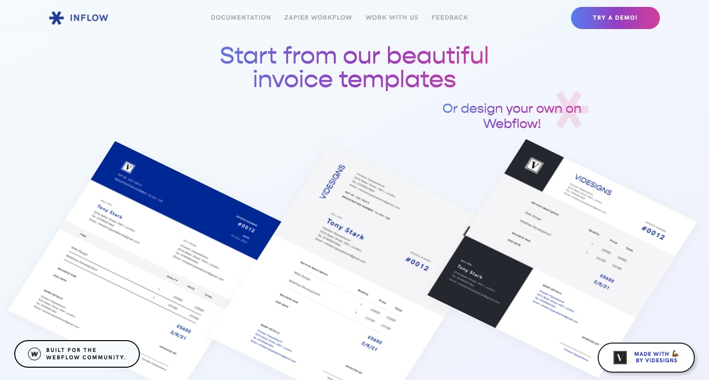
From the churning blue and purple of the circular icons, to the scroll-triggered visuals that slide text and visuals into place, there’s nothing here that feels stuffy or stagnant. Each page is alive with interesting visuals that not only explain the product, but also draw the viewer in.
11. Social Connect template
For startups and others in the tech realm, Social Connect is a handsome and well-constructed template you can use to build your next project.
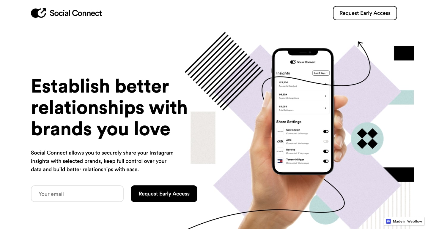
Layered images and parallax scrolling effects give this cloneable template a nice sense of dimensionality and movement. Social Connect’s template demonstrates how stacking visuals and adding in a bit of movement can transform the two-dimensional space of a computer screen into something more visually engaging.
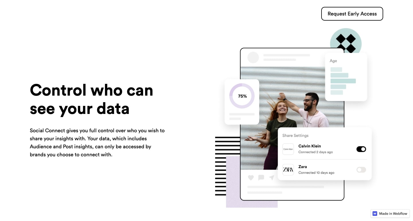
Social Connect is available to clone for free — try it out and see what you can create with it.
Get outside of your design comfort zone
It’s always good to expand your skills by trying out something new. Webflow makes it easy to express your creativity and experiment with different styles and approaches. We hope that you’ve seen something here that will inspire you and help you explore new possibilities for your next website.


