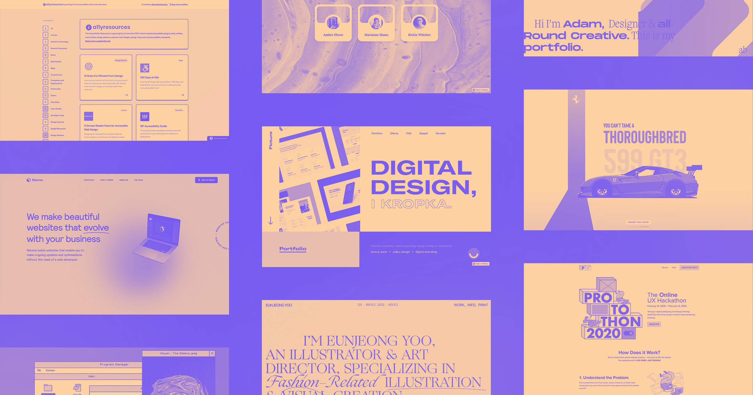
Webflow empowers designers to build any type of website, all without code. We’re going to look at 15 websites created with Webflow, showing you the variety of ways it can be used to create professional websites.
Anytime we scroll through the Webflow Showcase we’re always amazed at the variety of websites and designs that continually appear. We love seeing people use Webflow in creative ways.
15 favorite Webflow websites from February 2021
From Brooklyn apartment complexes to accessibility resources, here are 15 websites that caught our attention in February.
1. Clubpad
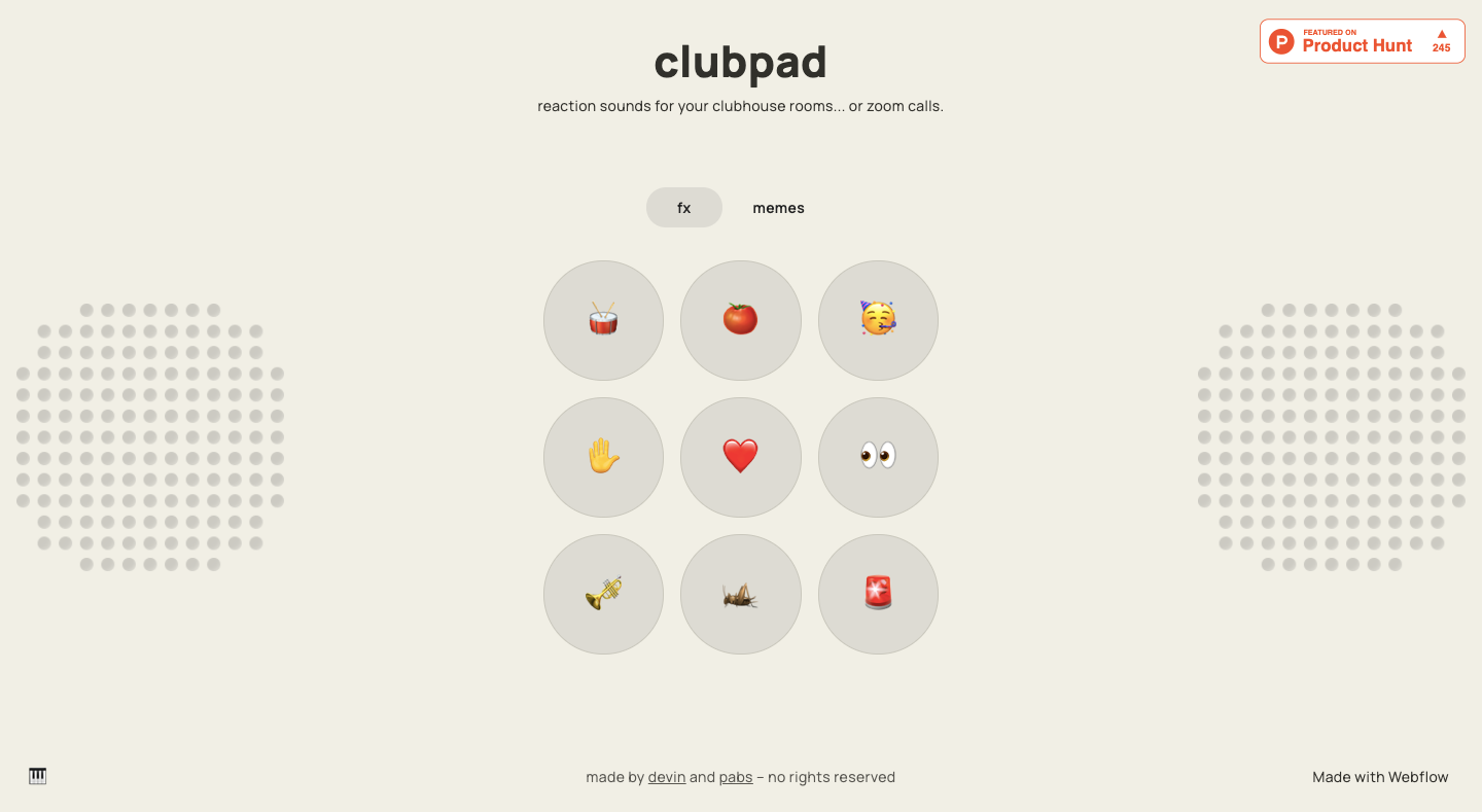
What if you could liven up Zoom or other video meetings up with a few well-placed sound effects? Clubpad puts at your fingertips two entire grids of sound clips. From audio of a sad trombone to Jeopardy’s familiar twinkling background music, these sounds will either make you the life of the video meeting or the recipient of a sternly worded email from HR.
All joking aside, we’re always excited to see what Pablo Stanley rolls out. This soundboard is such a fun exercise in web design. If we were to pick one audio clip to hit on this soundboard to express our excitement about it, it would certainly be the DJ airhorn.
There is some custom code involved, but Pablo has been generous enough to make this available to clone for free, allowing you to construct a soundboard of your own.
2. non-os
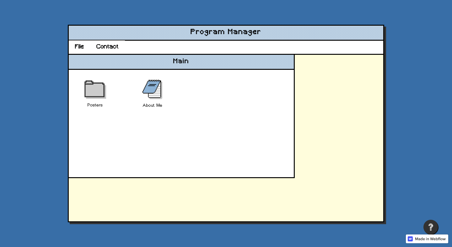
We’re always fans of unconventional portfolio designs. With this portfolio website, non-os takes us on a time machine to the early 90s, with a vintage-inspired design that looks like it’s straight from the days when AOL, Netscape, and Ask Jeeves reigned supreme.
Avinilay, the designer behind this portfolio, includes a few great examples of their poster work, as well as a way to get in touch. There’s quite a bit involved in pulling off a retro-inspired website like this, and they certainly show their skills as a web designer with this accurate recreation of a desktop from the past.
If you’d like to see how Avinilay put together this old-school design, it’s available to clone.
3. 1010 Rogers
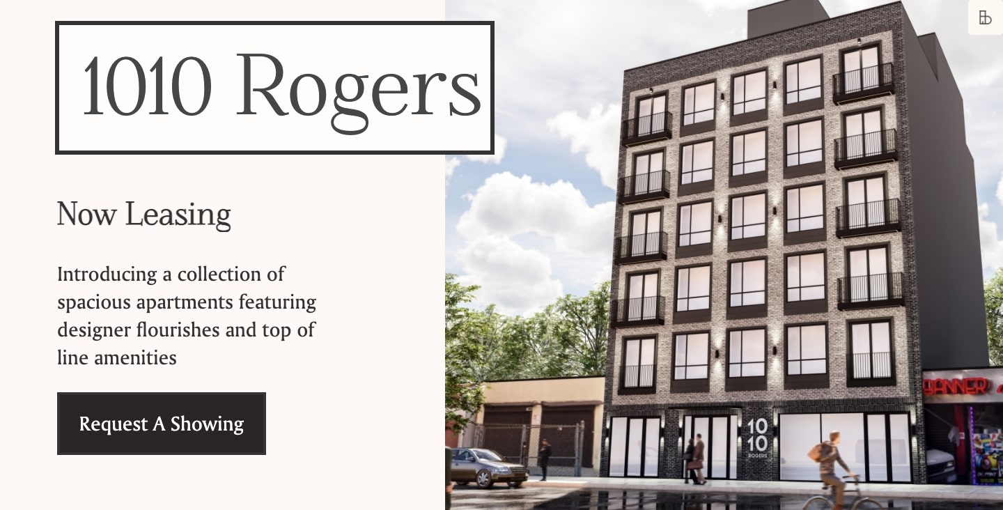
1010 Rogers is a modern apartment complex located in Brooklyn, New York. With touches of light colors, the regal typefaces Playfair and Oswald, as well as brilliant photography, this website shows a low-key elegance and sense of modernism.
City life can be a crowded and busy experience, but this design is about calm. We see plenty of skyline and trees in its photos as well as negative space in the design. One gets the sense that living in this complex offers a peaceful respite from the more tiring aspects of living in New York City
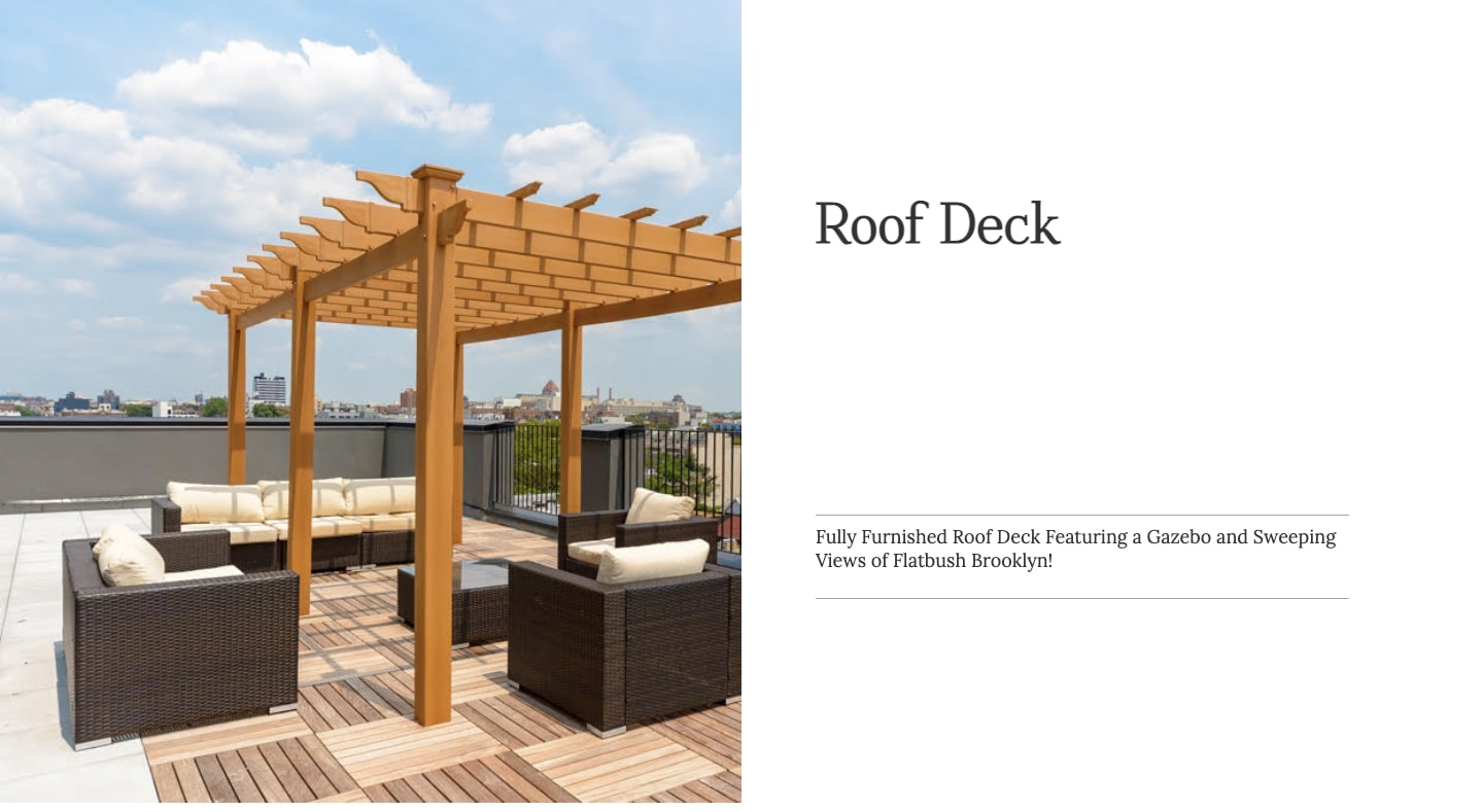
It’s so important for a website to match the tone of what’s featured, and this design is the perfect pairing to the contemporary urban lifestyle 1010 Rogers offers its residents. If you find this an inspiring design, it’s available to clone for free in our showcase.
4. Bite-sized Fun Cards
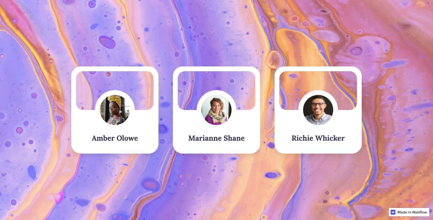
Cards have been around for a while, and one might think that they’ve been exhausted as far as creativity goes. But with a few animations and a partially transparent background, Bite-sized Cards offers a welcome twist on this design mainstay.
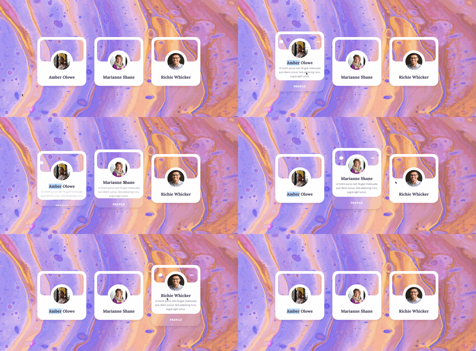
If you’re looking for an original take on cards for your work, you can clone these for free. Also, check out the YouTube video designer Mubarak Marafa put together showing how he created them.
5. Protothon
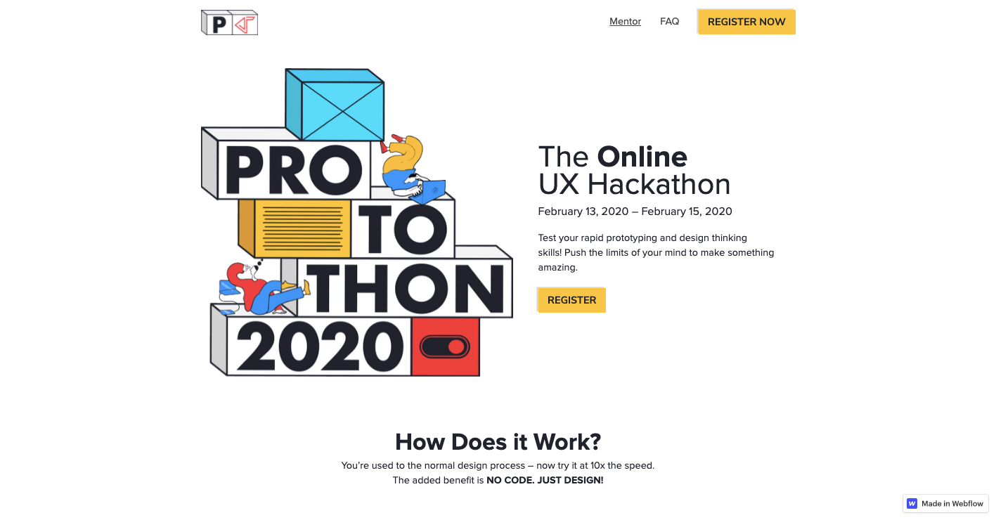
Protothon is a UX design contest where designers pick a prompt and deliver a high-fidelity prototype by a deadline. With a speedy timeline to build out something, it’s a great practice in putting one’s skills to the test.
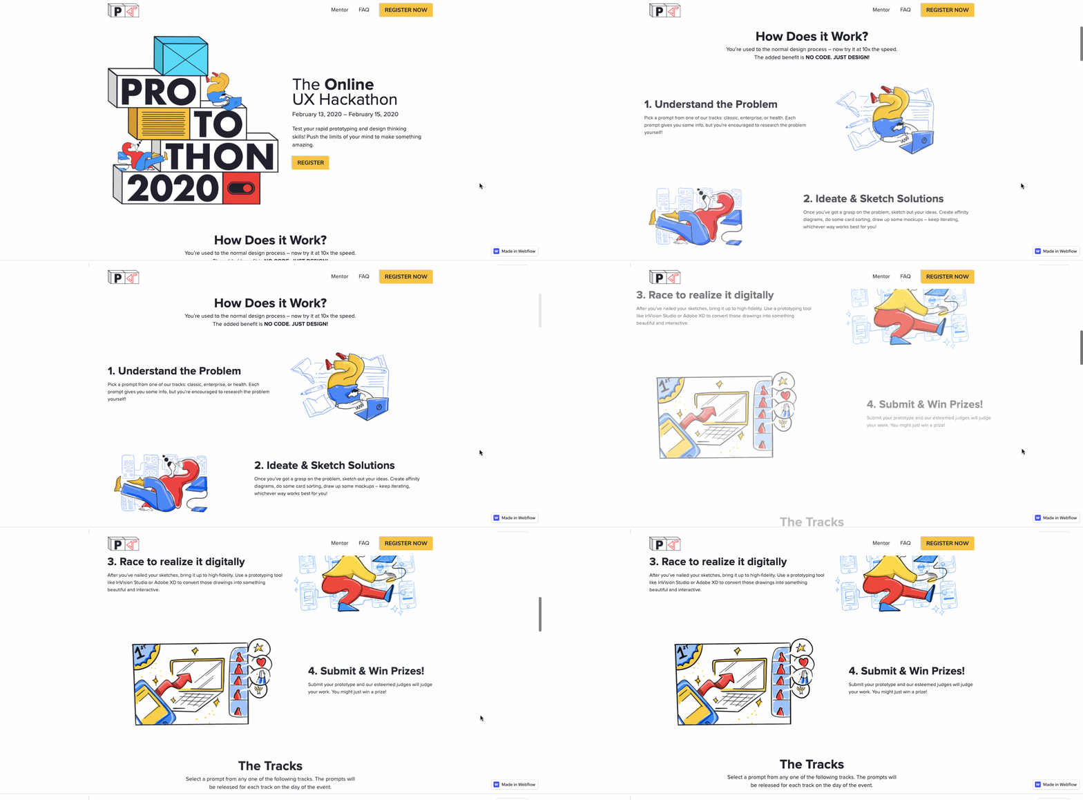
The design itself offers an interesting and engaging experience. From the opening image of three-dimensional stacked blocks to the gentle scroll-triggered animations, there’s plenty of great design elements sprucing up the layout. The copy here also does an excellent job in building excitement about this UX competition.
To check out how this wonderful design came together and to clone it for your next web design project, please visit its project page in the Webflow Showcase.
6. Ferrari GT
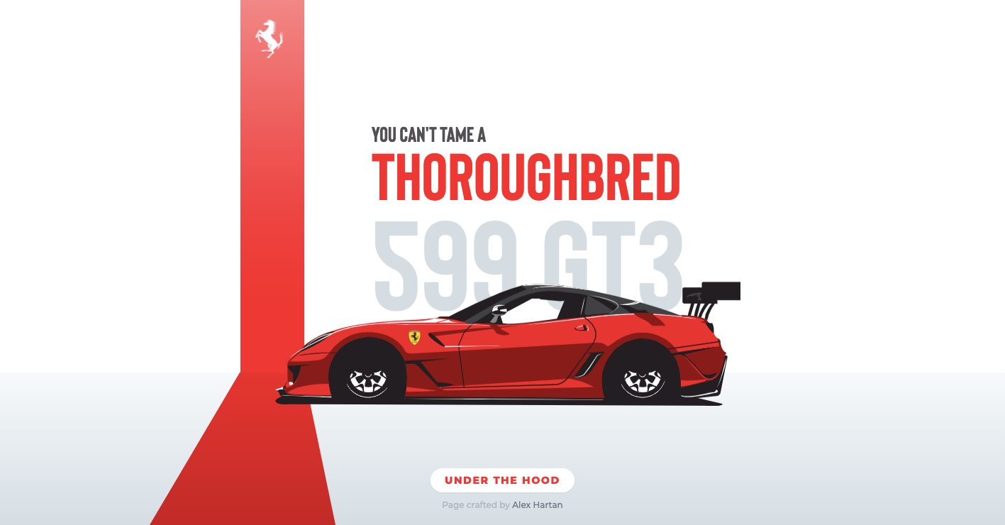
Building your portfolio can be difficult if you haven’t done many paid gigs. Creating a design around something you’re passionate about is a great way to build your body of work. Alex Hartan has always loved the power and sophistication of Ferrari and created this design as a homage to these Italian sports cars.
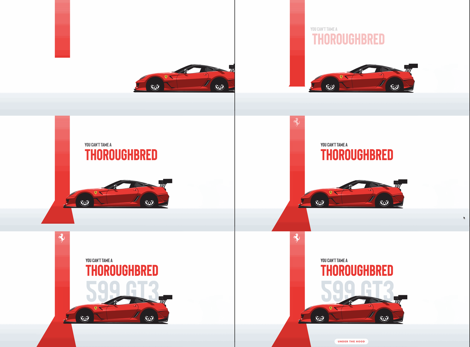
Alex has created an opening page as dynamic and powerful as the namesake Ferrari it celebrates. The animation of the sports car roaring into place is bold, but he hasn’t missed any nuances, with a subtle bounce of the car as it brakes. Getting the details right is so important as a designer, and Alex shows a keen eye with this convincing animation.
If you’re looking to go “under the hood” and clone it for your web design, Alex has made this stunning design available to clone in the Webflow Showcase.
7. Adam Bradley
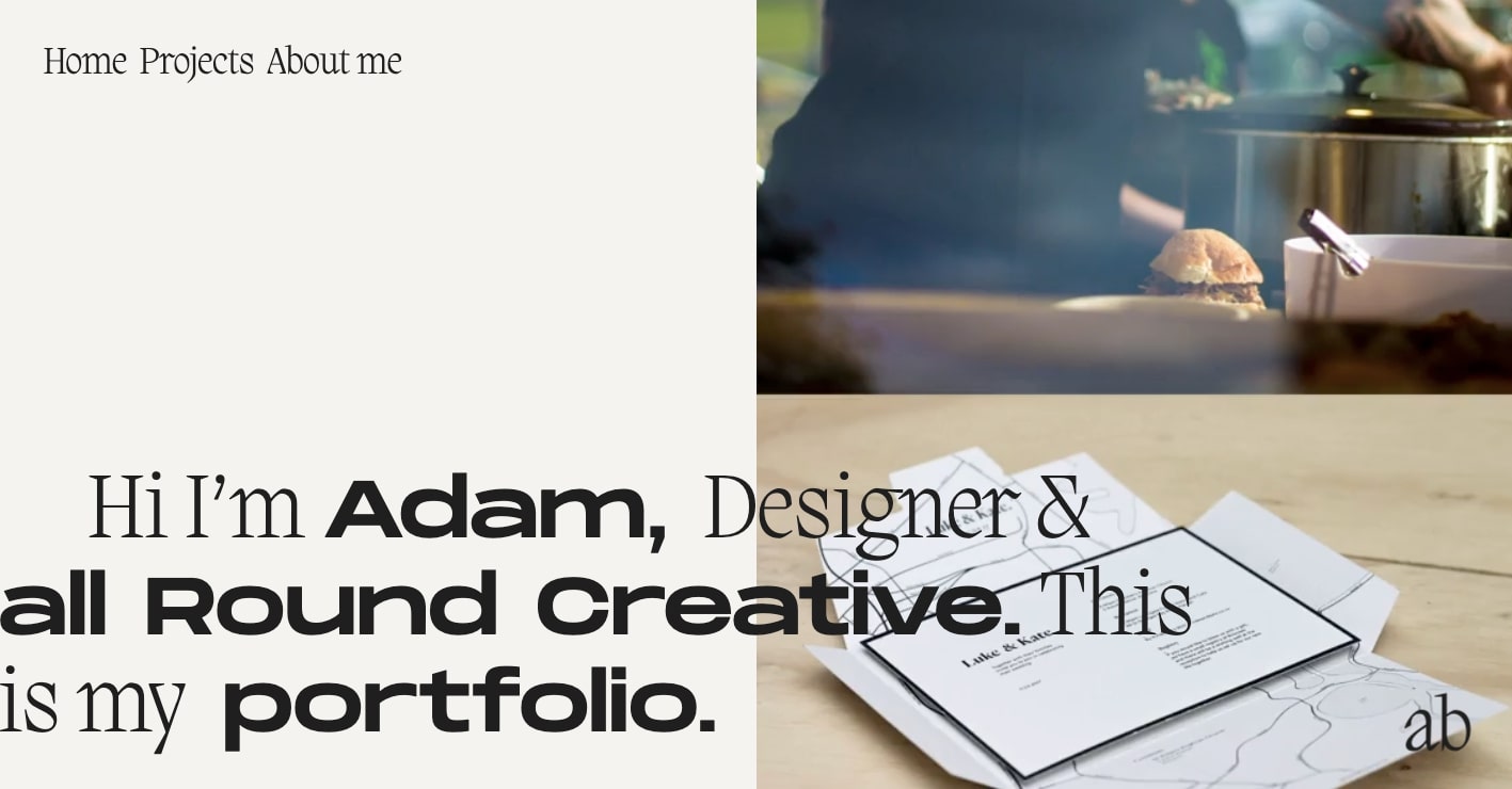
Occupying the right-hand side of the screen of Adam Bradley’s portfolio there’s a quick cut of projects he’s worked on. This is a nice juxtaposition to the huge text occupying the hero screen and functions so well in showing that he’s an “all-around creative.”
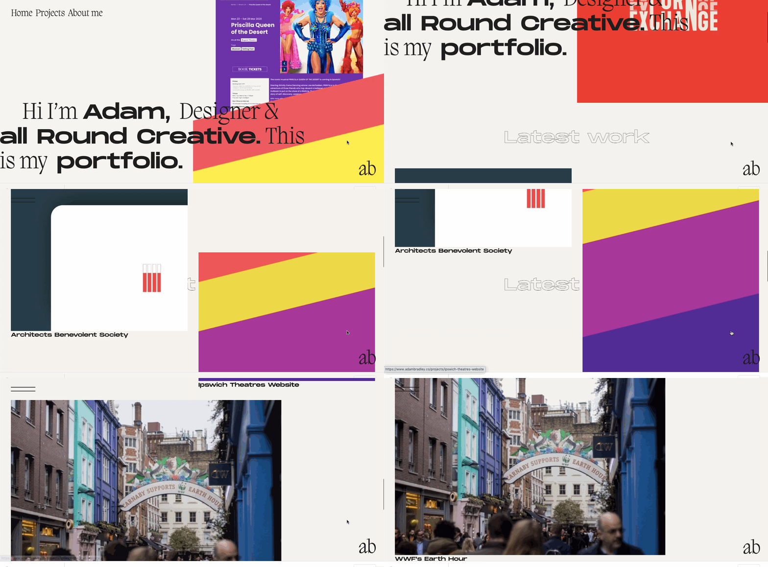
This portfolio features an eclectic mix of typefaces, colors, and visuals. Though he takes some chances with this design, they all work in his favor. Along with a dazzling design, he also shows his range with the clients he’s worked with. From architectural firms to theaters, Adam applies this same sense of creativity balanced with a smart sense of design.
8. Forage Studios
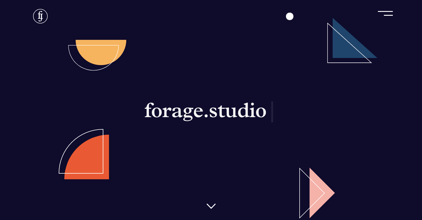
The UK design agency Forage studio introduces themselves as, “We’re a design agency for brands with a story to tell.” And in a tidy amount of pages, they’re able to communicate their narrative in what makes them unique. Starting with this opening page above, with its colorful shapes and fine lines set against a deep blue background, we know right away that they take an artful approach to what they do.
We further see this strong sense of creativity in the individual project pages. There’s nothing here that feels mediocre or cliche but instead shines with a clever sense of sophistication.
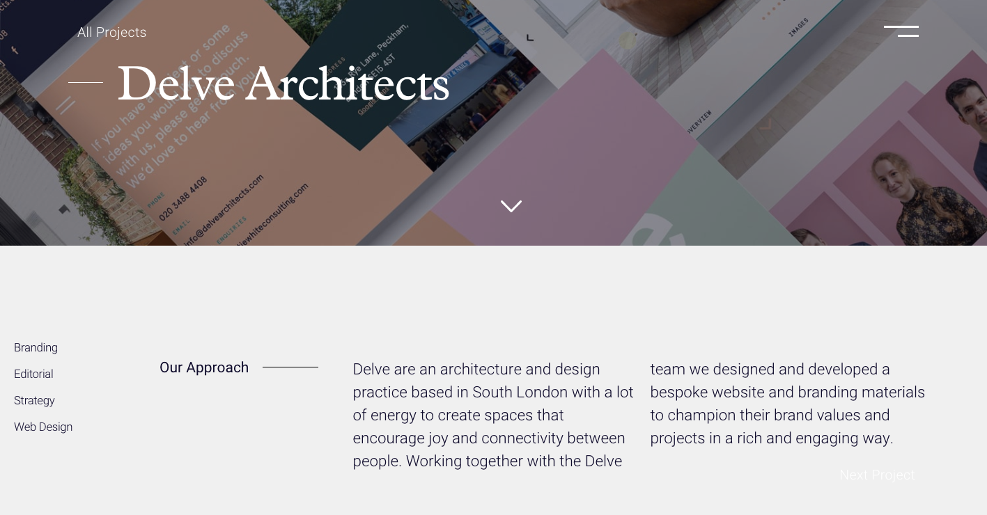
Keep an eye on their Webflow showcase profile for more great work in the future.
9. Relume
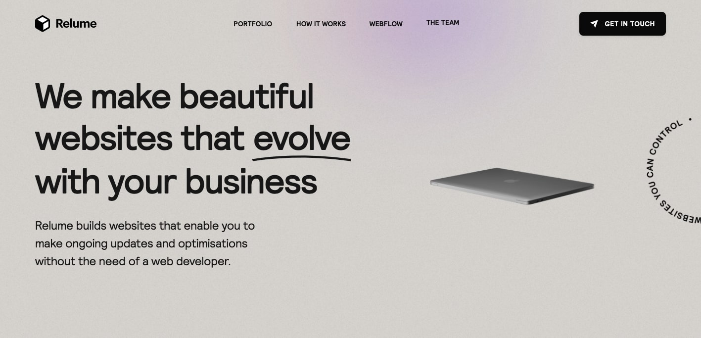
We are always honored that there are design agencies who utilize Webflow as their primary means of creation.We set out to make Webflow accessible to everyone, and it’s so nice to see an agency like Relume taking the steps to include their clients as active participants in overseeing their websites.

This agency website is full of snappy scroll-triggered animations, an eye-catching gaussian blur (which never translates the fine particulates in a screengrab as we’d like) tied to scroll movement, and other creative embellishments that make it an engaging work of design.
To check out more great Webflow projects they’ve done for their clients, head over to their profile in the Webflow showcase.
10. EunJeong Yoo
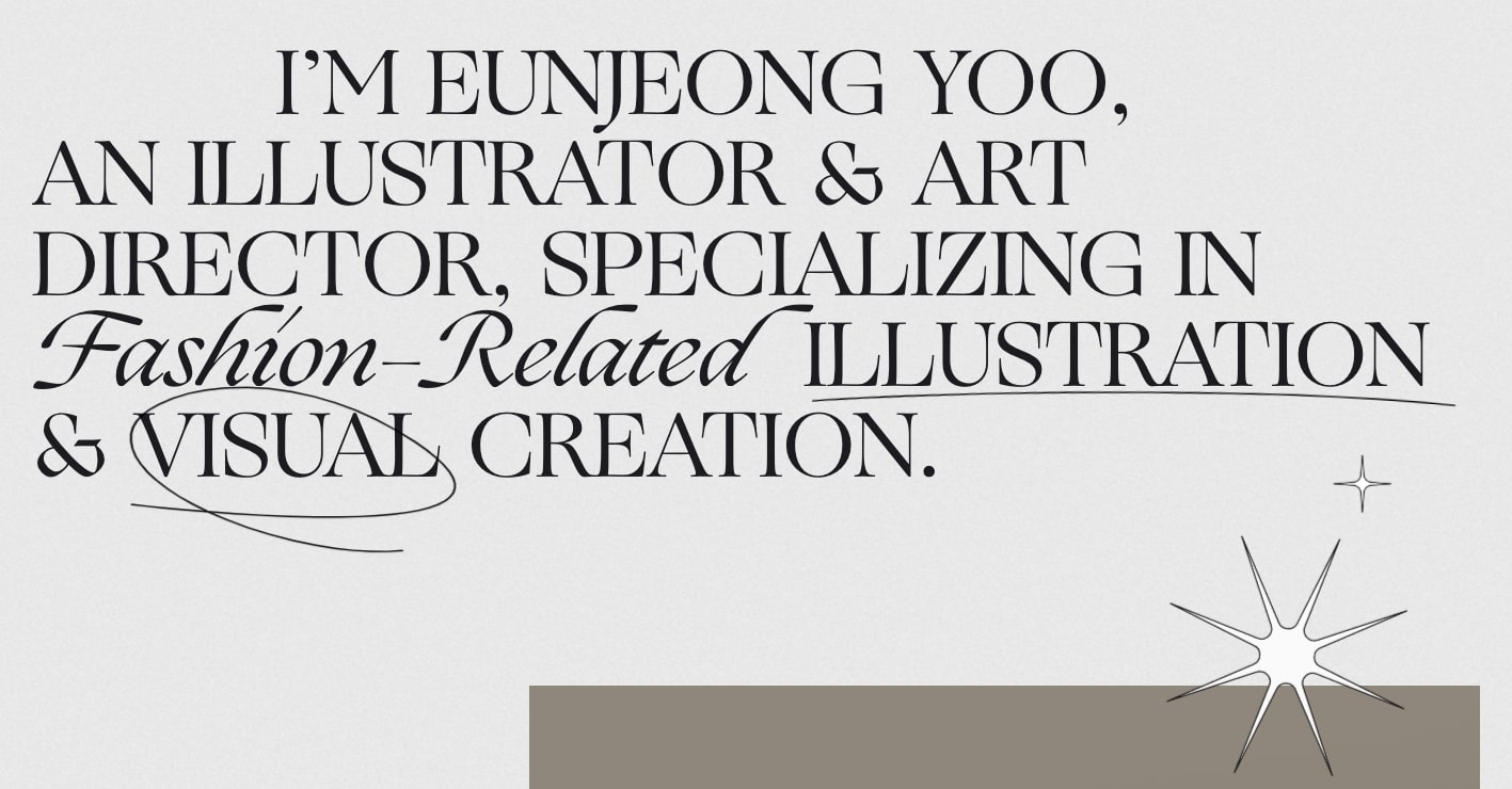
EunJeong Yoo is an illustrator, art director, and designer based out of Seoul. Working in a specialized niche is a way to set yourself apart as a designer and EunJeong focuses on the area of fashion. The look and feel of this design fit in perfectly with their interests in this industry.
With a classic combination of fonts like Times New Roman, Montserrat, and Aktiv Grotesk, this layout looks like it could be taken from a fancy fashion magazine. This nod to graphic design can be further seen in the thin dividing lines and liberal use of space throughout.
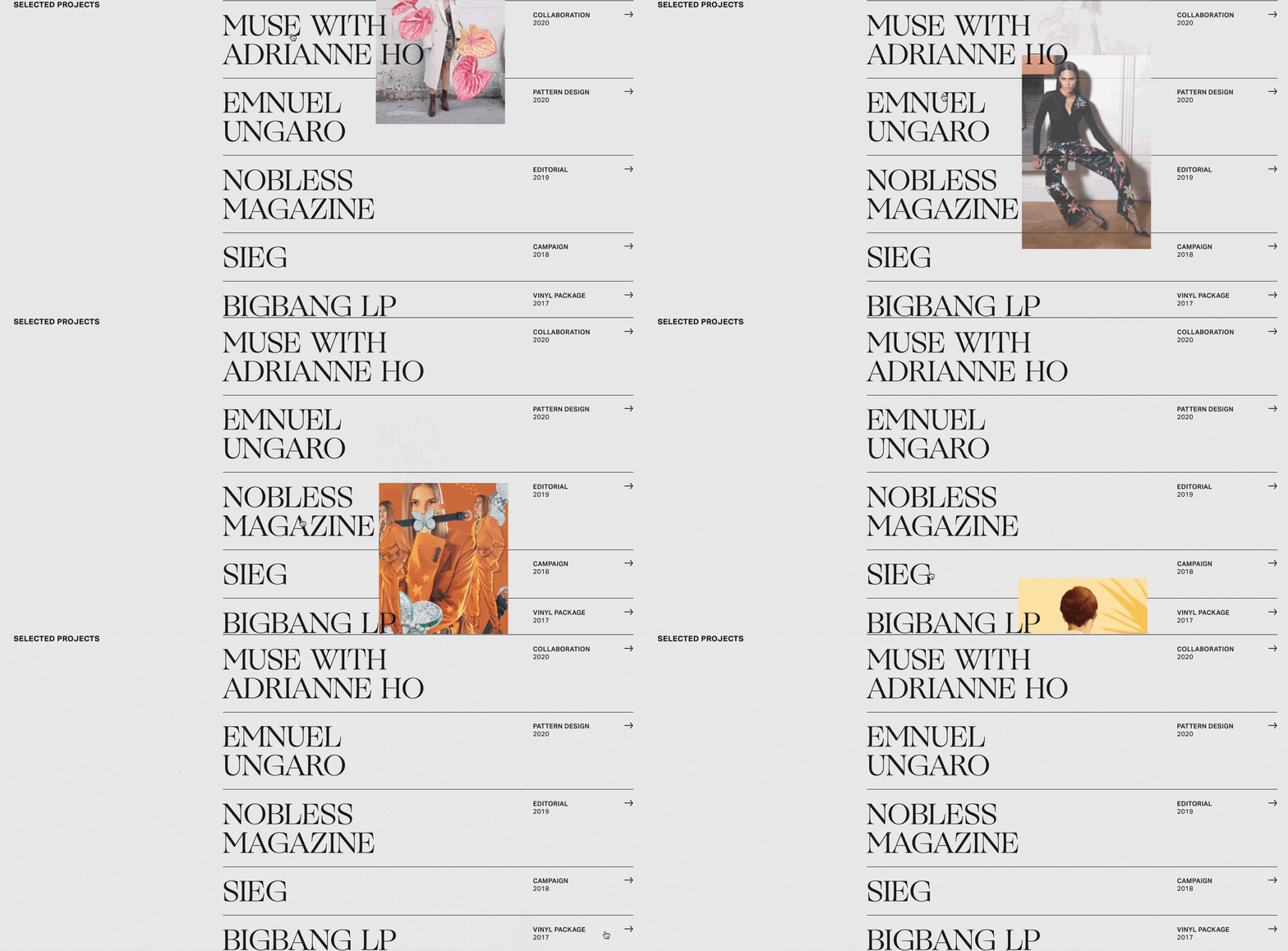
Though much of the inspiration here comes from print, EunJeong also takes advantage of what can be done in a digital medium, with this hover-triggered effect above bringing some color to the minimalist palette of this webspace.
This is such a great example of personal branding done right, with a portfolio that captures her skills and talents, showing potential clients in the fashion world just what she’s capable of.
Be sure to follow EunJeong Yoo in the Webflow Showcase to see what they're up to.
11. Portfolio Placeholder
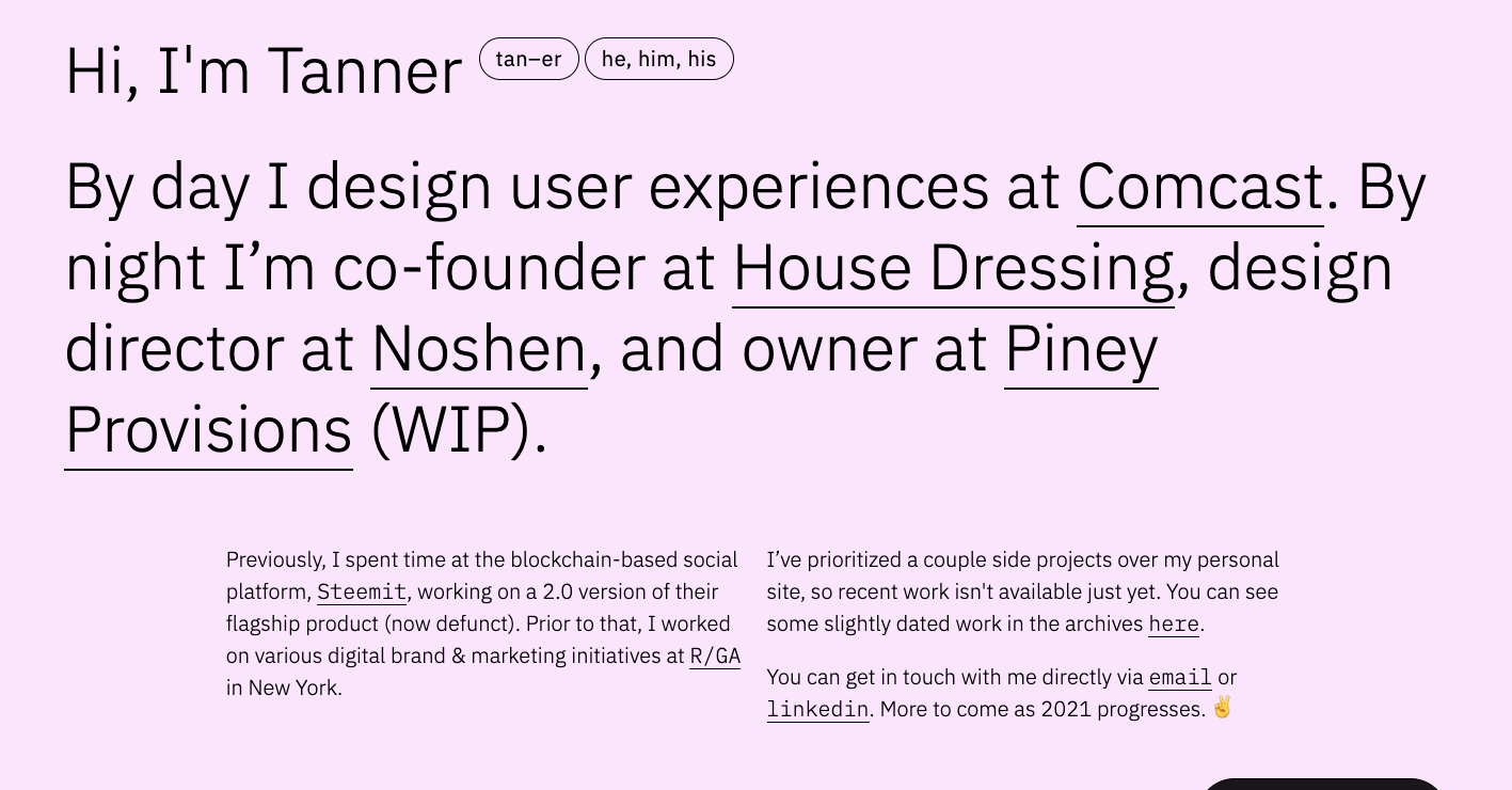
Tanner Panetta shows that some of the most intriguing and well-put-together designs are rooted in simplicity. This portfolio, with its carefully spaced layout, simple typography, and color palette of purples, greys, white, and black is pleasing to look at and has a smooth user experience. There’s a sense of calm, and a projection of confidence that comes from its careful arrangement of visuals and text. It shows that a little restraint can go a long way in producing an effective design.
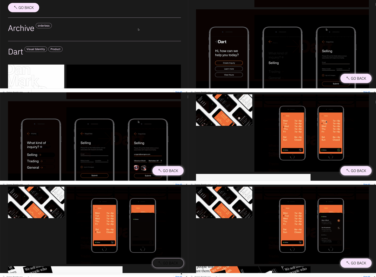
We hope to see more from Tanner in the Webflow Showcase soon.
12. Amanda Lee Peers
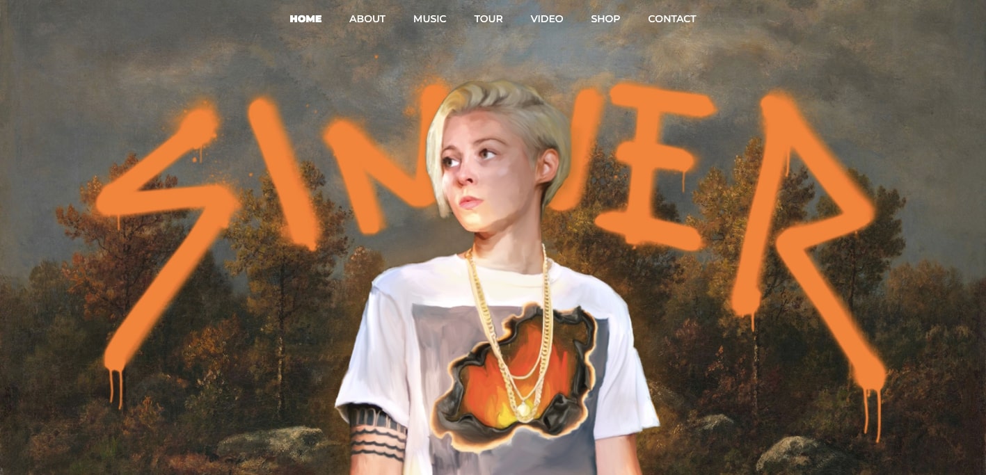
Amanda Lee Peers not only puts her talents as a songwriter on display in this website for her music but shows her skilled hands as a designer. We love seeing people who take the DIY approach, Webflow gives anyone the tools they need to bring their creativity to fruition.
This design goes far beyond the average musician website. Along with captivating visuals, there’s also plenty of great content.
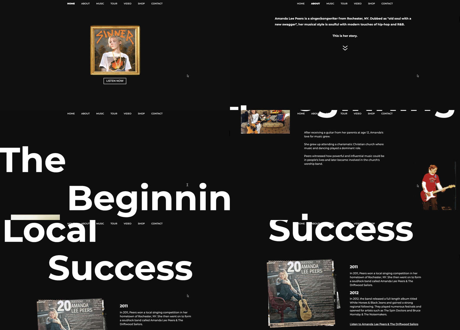
What’s impressive is how she tells her own story. With scroll-triggered text sliding into place, images that flip and move, and a timeline of her musical accomplishments one gets a great idea about who she is as an artist.
Amanda has also launched a website to start 12 startup websites in 2021. We’re looking forward to seeing all these projects on her Webflow Showcase profile.
13. Ficturo
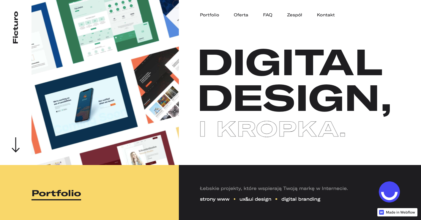
Paulina Jarosz shows a tasteful sense for color, space, and modern typography in this website for the Polish design firm Ficturo. With a solid grid arrangement, there’s a strong sense of order and a nice balance of elements.
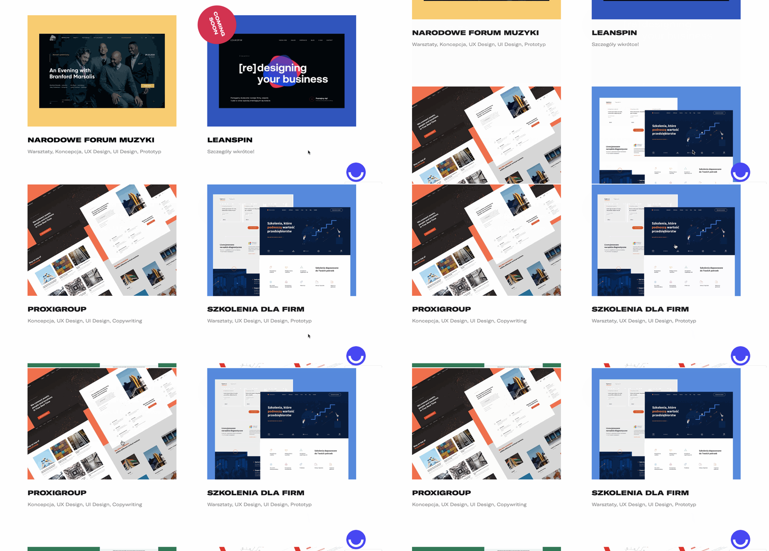
There are several different projects featured here, but with an eclectic selection of background colors, nothing gets lost in the whitespace of the design. The subtle hover effect also goes far in keeping the page engaging.
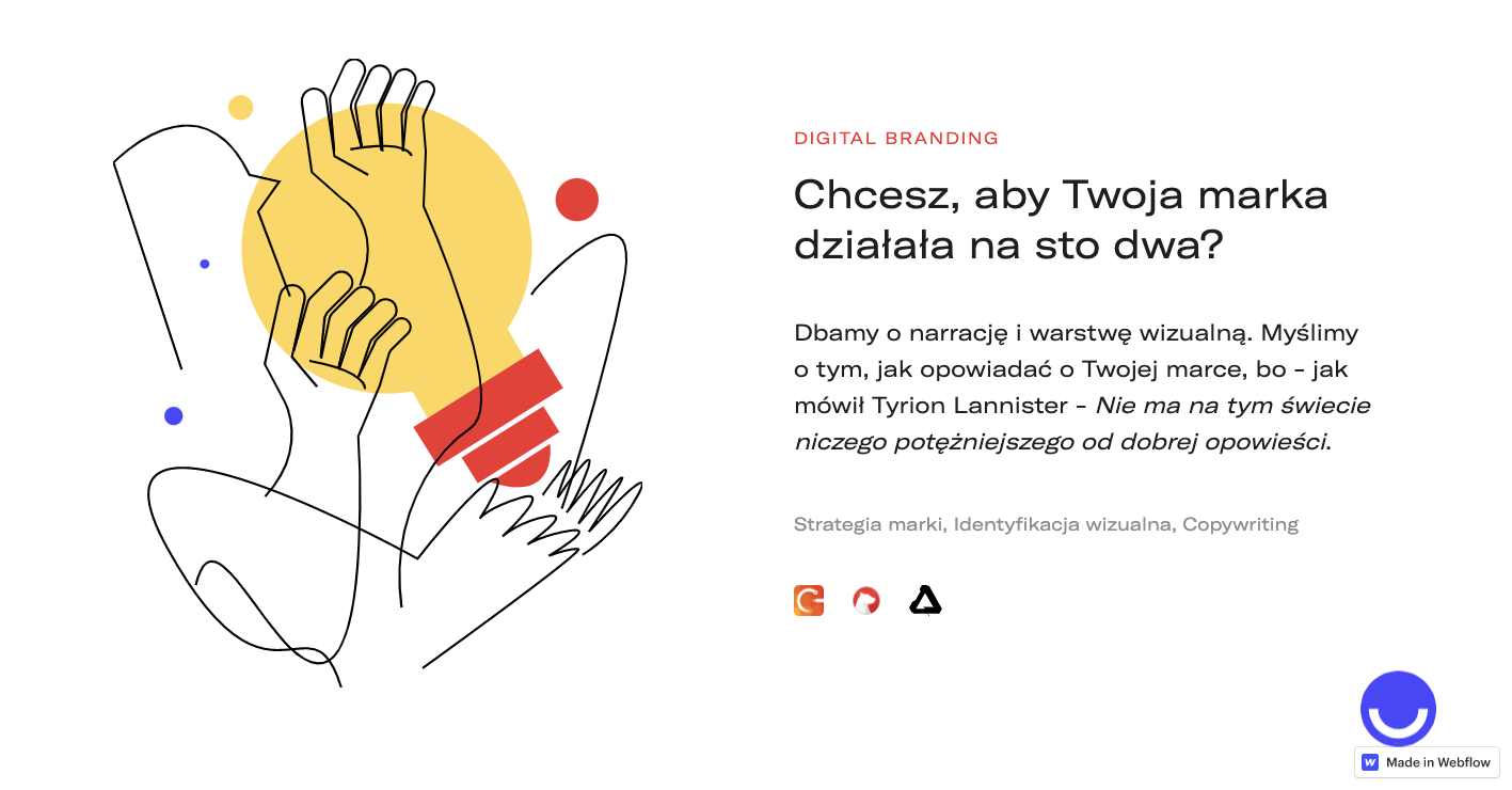
There are other creative flourishes that occupy this design. We especially love this line illustration. It doesn’t serve any utilitarian purpose but fits in so well with the eclectic vibe of this agency website.
Paulina lists her skills as “moving pixels” on her Webflow designer page. We’re hoping to see more of her pushing around of pixels in the future!
14. Italic candles
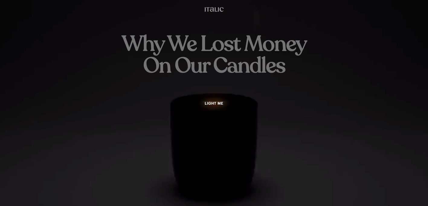
This has one of the most interesting opening pages we’ve seen in a while. First of all, who starts their design with, “Why we lost money?” One is immediately drawn in to find out what the story is about Italic candles. Then there’s the call to action to “light me” with the delicately flickering flame that has taken over your cursor.
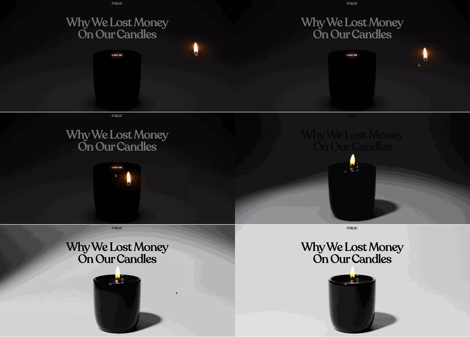
What was once darkness becomes illuminated with the placement of this tiny spark of fire. This opening page alone would have been enough to make this website stand out, but there’s plenty of other compelling animations and visuals throughout.
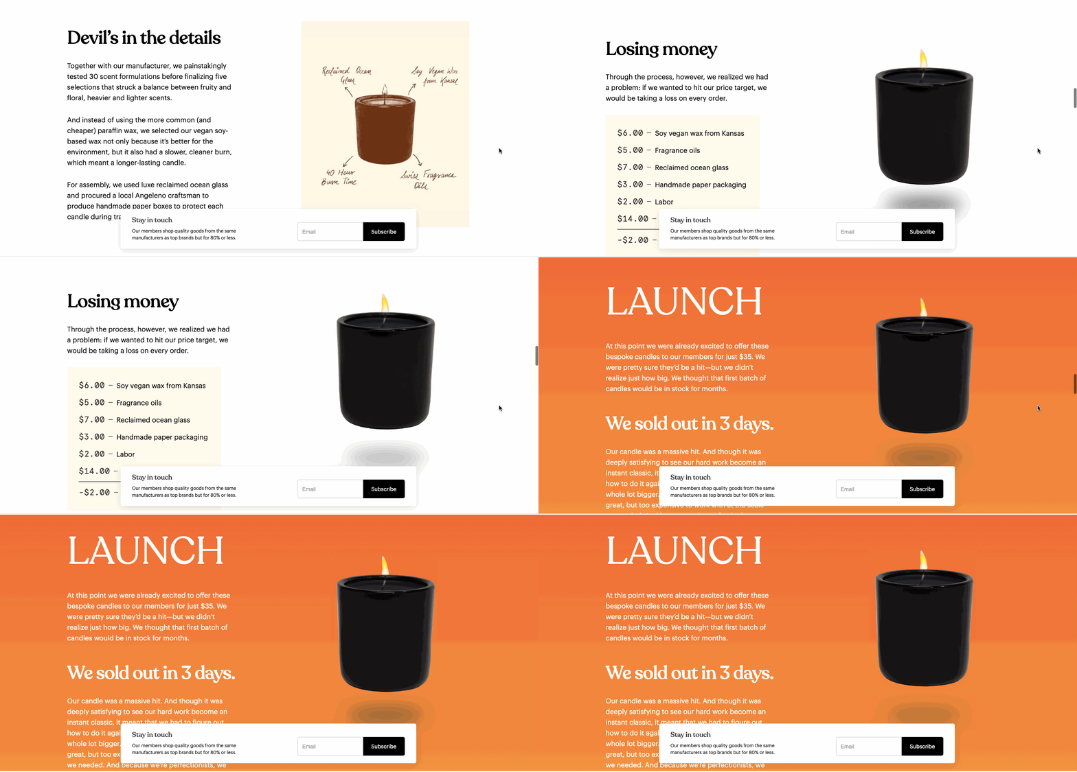
15. a11yresources

Muted colors made it onto our top trends for 2021 and it’s so great to see this beautiful palette of pastels on a11yresources. This design certainly looks splendid, but the content is what makes this a must visit for any designer. Their whole aim is in increasing accessibility. With a wide array of tools, browser extensions, plugins, and other resources they want to help designers in creating friendlier designs that are open to everyone, no matter the disabilities they may face.
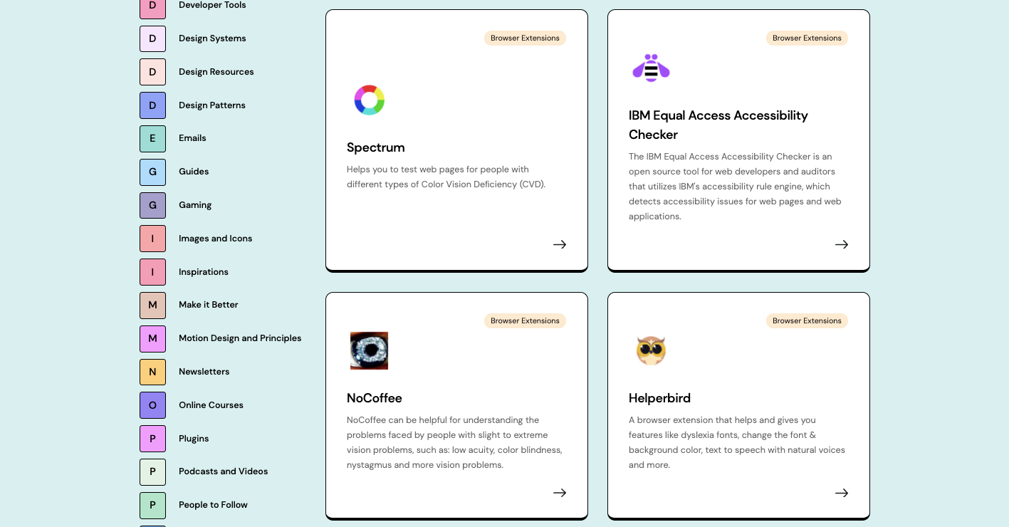
There’s no lack of content either in helping designers learn how to make their work more accessible. With links to articles that cover such things as friendlier design patterns, designing for those with visual impairments, and other topics, every designer should bookmark a11yresources to keep in touch with what’s going on in the realm of accessibility.
We want to see what you create
We may be early into 2021, yet there’s already been so much great work we’ve been seeing in the Webflow Showcase. If you haven’t set up your own Webflow profile, we hope you do soon, and we’re excited to see what you create. You may see your project featured in next months roundup!













Get started for free
Create custom, scalable websites — without writing code. Start building in Webflow.
