Product Hunt is where the tech industry goes to launch new products, making it an excellent curated collection of tools, apps, and other resources. And guess what? Several were designed in and/or hosted by Webflow. Here are 11 of our favorites — including a few perfect for designers like you.
1. Humaaans
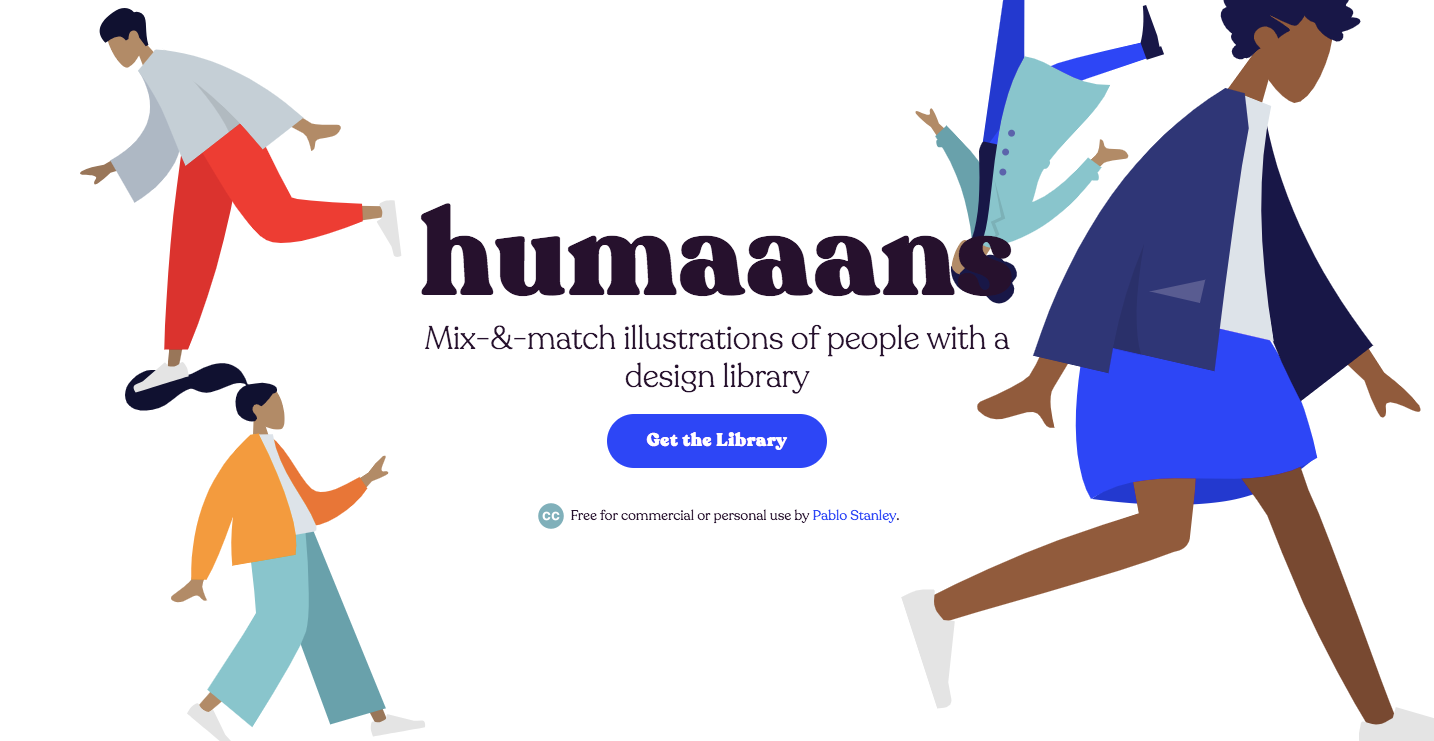
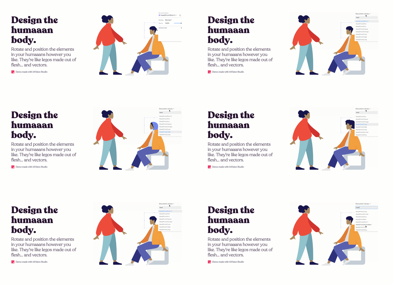
Custom illustrations free a design from becoming a rigid assortment of images and text, while adding a zing of personality. But not everyone can draw or has the budget to hire an artist. That's where Humaaans comes in.
Pablo Stanley, the designer and artist responsible for the hilarious comic “The Design Team,” created a free library of stylized illustrations of human beings. You can customize their postures, clothing, colors, and hairstyles, add backgrounds, and combine several illustrations to create scenes.
And we’re happy to see Pablo used Webflow to build their website. Take a closer look or clone the site from the Webflow Showcase.
2. Outsite
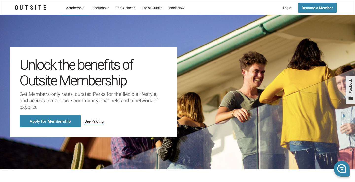
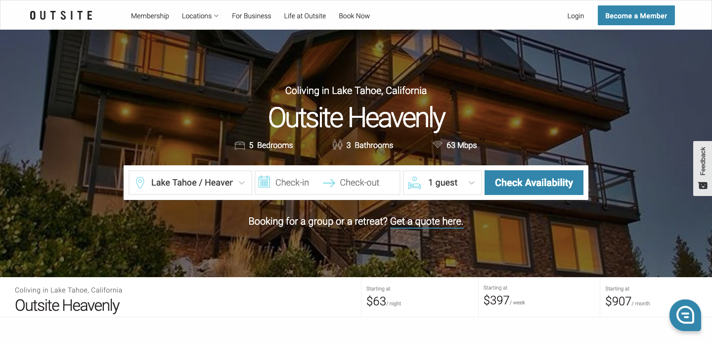
Being a freelancer means having the flexibility to take off and work wherever you'd like. The problem with this is that it can be hard finding a space to crash where you can also be productive. Outsite takes care of this problem with accommodations in various cities that aren't only places to get a good night's sleep, but are also equipped with proper workspaces. They've set up a nice network of coliving spaces, and access to resources like Facebook groups and Slack channels, that make living the life of a nomadic creative easy.
With a light and fun palette, this design captures the breezy freedom of travel while never losing focus on the more practical side of making sure that you’ll have what you need to get your remote work done.
3. Paste by WeTransfer

Launched by 53, makers of Paper by 53, before they joined WeTransfer, Paste is a handy slideshow app that focuses on collaboration and simplifying creativity. They make it easy for team members to contribute and include a handy Slack integration to facilitate collaboration.
The site design uses video and animations to show how their app works. The accompanying copy gets straight to the point and ties everything together to clearly communicate the benefits of using their app.

4. Podia

We love entrepreneurs and those who support them. One of our all-time favorites is Mackenzie Child, whose Podia platform gives people the tools to generate new revenue sources through paid online courses, memberships, and digital downloads.
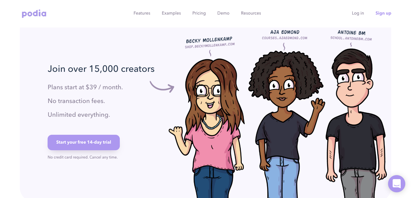
The landing page has a big call-to-action box to start a 14-day trial. They give just enough information and a video teaser to make us want to sign up. The rest of the design offers more specific details on what sets their product apart.
The site’s simple aesthetic is supplemented with Mackenzie’s quirky hand-drawn illustrations to showcase the brand’s personality.
5. Cards Webflow UI Kit
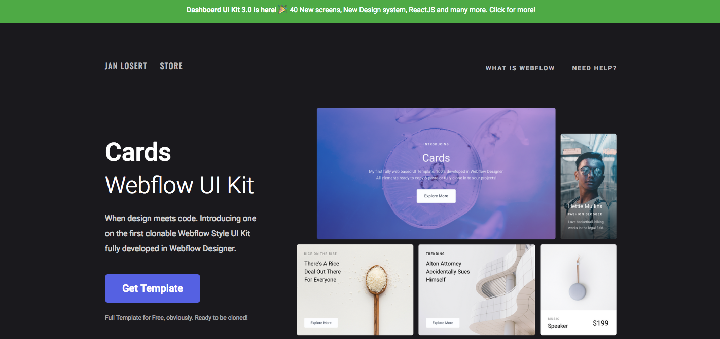
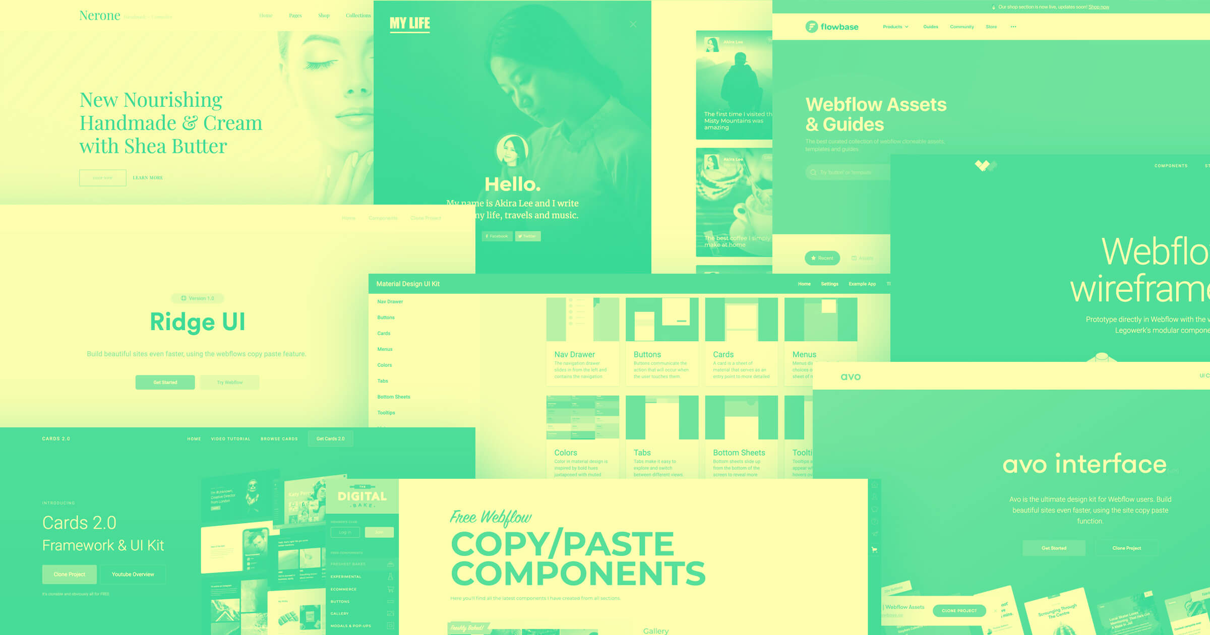
Card-based layouts give designers a straightforward way to present and organize content, but if you're new to design, building them can be daunting. The Cards Weflow UI Kit by Jan Losert — who just joined the Webflow team! — gives you a variety of cards, along with all the usual suspects of a web style guide, free to copy and paste into your own work. This is what we love about the Webflow community: it’s full of people helping each other get better at the craft of design.
Who doesn’t love something that’s free? Clone your own card templates from the Webflow Showcase page.
6. Payable
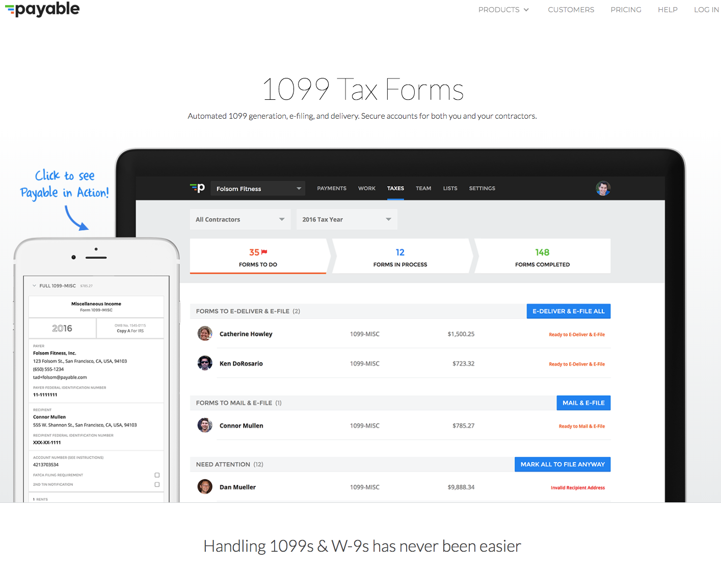
If you employ contractors or freelancers, it can be tough to manage payments and other financial information you’ll need for tax time. Payable offers a software solution that streamlines the process of paying your employees and keeping track of important details.
Their design features plenty of white space to give the screenshots of their app in action more impact. The straightforward layout shows how Payable works in a logical way. And for any design that features an app or software, the how is one of the most important pieces to communicate.


The modern web design process
Discover the processes and tools behind high-performing websites in this free ebook.
7. Homerun
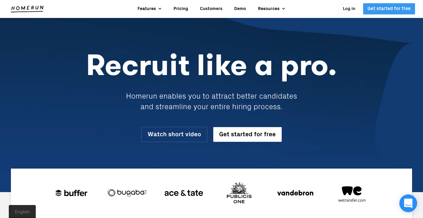
Technology, regardless of your field, is here to make things easier. Homerun, based out of Amsterdam, gives recruiters the tools they need to land new candidates.
This design — full of color, bold typography, simple icons, and bright photos — strikes the right balance between the visual side of things and providing practical information about their software. There’s also a few nice microinteractions to keep us engaged with the design.
8. Torch
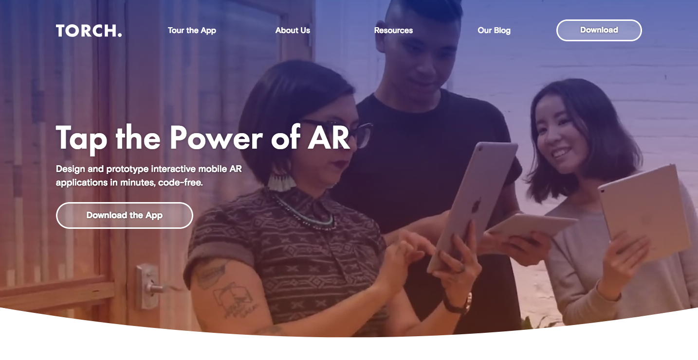
Augmented reality (AR) has resulted in the creation of a lot of neat games and apps, and more reasons to be consumed by that glowing screen in the palm of your hand. The Torch AR app lets designers prototype and build apps without knowing how to code — which we’re big fans of!
The site design has a lot of video content showing people engaged with AR animations and the types of apps you can create. Section headlines are clear and body copy explains and complements the video. This design is all about action and movement, just like AR.

9. AltSchool

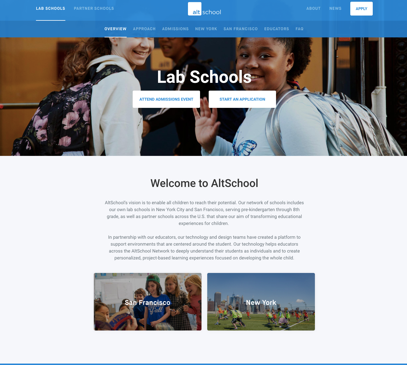
Technology has allowed for the reconceptualization of many long-standing institutions, including education. AltSchool is an educational platform for schools to enrich students’ educational experience through new methods of learning.
Education is all about people and this website does much to personalize their product as a student-centered learning solution. They include plenty of images of students along with concrete reasons how their platform will benefit schools.
10. Markforged
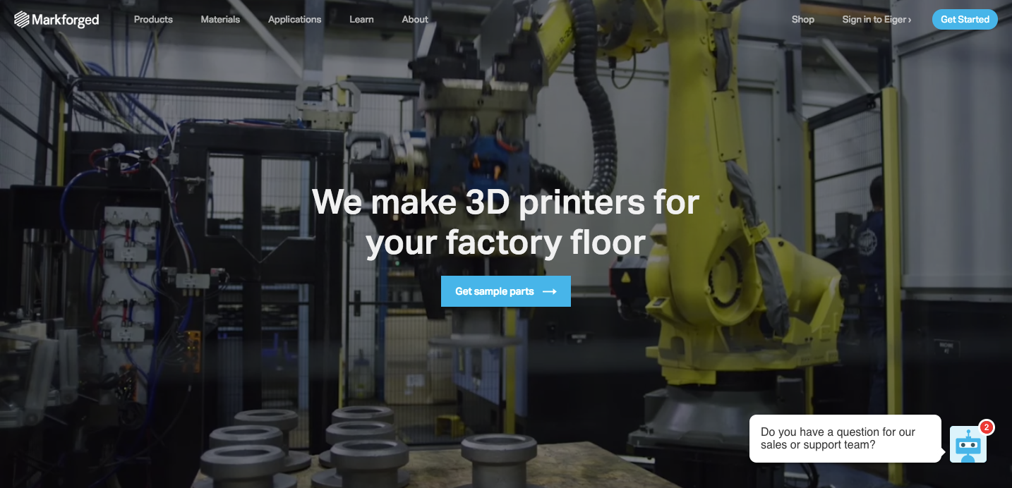
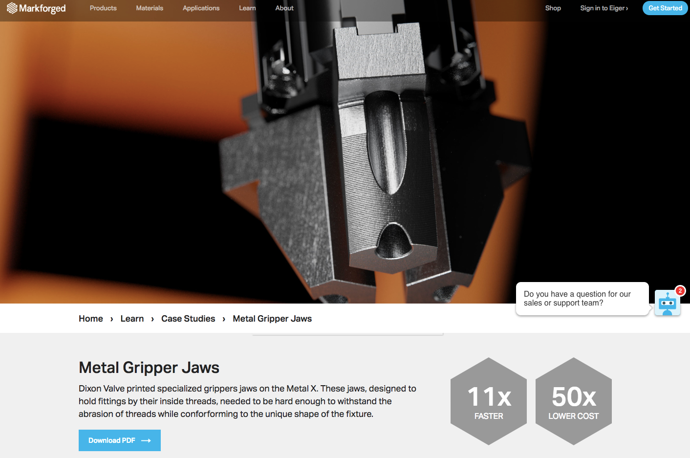
3D printers have advanced to the point where they’re now practical for industrial applications. Markforged makes 3D printers that can create parts that once had to be machined. With images of machinery and liberal use of grey, the layout brings to mind metals and the fabrication process. Along with the graphic side of things, there’s plenty of background information and case studies on how their 3D printers have provided solutions for customers.
Even for those who don’t have a need for an industrial-grade 3D printer, the various examples of machinery are sure to delight any technology nerd.
11. WritKit

There’s a lot that goes into crafting a quality blog — researching the subject, writing a cohesive draft, and integrating relevant keywords. WritKit is a website that curates tools to help make blogging a smoother process.
The landing page is a simple one-page design, listing the steps of the blog-writing process. Hovering over each block brings up the specific tools they’ve collected to support each step. It’s a well-organized collection of tools that are immediately accessible regardless of what stage you’re in.
Webflow gives you the tools to help your audience
Do you have a product or service, or want to curate your own collection of content for those with similar interests? Webflow levels the playing field of web design, equipping you with the tools to launch a website that fits your creative vision.
We’re so happy to see sites built with Webflow making their way to platforms like Product Hunt — and we can’t wait to see what made-in-Webflow sites get hunted next!


