Within fintech, your website is your most important marketing asset.
From fingerprint logins to contactless payments, many steps forward in technology in the last 20 years have made accessing financial services easier and more seamlessly integrated into our daily lives and habits. “The new financial service is ambient,” explains Brian Chevalier-Jordan, the VP of marketing at Bond. “People don't want to have to think about it.
“Financial service is no longer you walking into a bank or even you opening a financial app. It's really about you doing your everyday life and financial services come to you. It's woven into your experiences.” That expectation for an ambient experience — what is beginning to be referred to as Fintech 3.0 — should be reflected in the way your marketing team crafts your website.
“Financial services is... really about you doing your everyday life.”
Bond is a company that has built its business helping brands flourish in the fintech space, and Brian has shared his insight into how fintech marketers can design a website that empowers your marketing team and effectively serves the needs of the modern financial customer.
Build a seamless user experience for your fintech marketing site
“Money is emotional.”
The main focus of building your website should be crafting a frictionless experience for the people visiting it. “Financial decisions are not often deep. I know that sounds counterintuitive but money is emotional,” says Brian. The easier and more enjoyable your site is, the more open to using your financial service visitors will be.
Know your audience and design for their access needs
As a fintech company, it’s crucial to know when, where, and with what tool people are accessing your technology. They might use a desktop site, mobile web, or mobile app, or all three at different times, and that balance will change depending on the type of product you offer
Use Google Analytics to see which devices your customers habitually use to access your technology rather than relying on assumptions. Since Bond is primarily B2B, they found the majority of their customers were accessing their site on desktops at work.
“There's this belief that everyone is on a mobile device all the time,” explains Brian, “We're used to hearing mobile-first. For us, the majority of our users are on desktops. It needs to be mobile-enabled in our case. So knowing your audience and paying attention to the metrics is always really important for fintech. Keep an open mind and look at the data. Google Analytics is your friend.”
“Keep an open mind and look at the data.”
If your product is something people use when socializing, shopping, or traveling, they might access it via mobile more often, but that doesn’t necessarily mean all your focus should be on your app. “People do not want to download an app for the first-time experience,” says Brian. A mobile website can feel more accessible to new customers and less of a commitment to a product they might not fully trust yet. Focus on crafting an easy-to-use mobile site to draw those users in and build a relationship.
You want to make sure your mobile site is as well developed as your app, even for serving more established customers. “Many people think about it as an either-or, and they stop realizing that people are in charge of their own destiny. They may or may not want to use your app right now.” Give your customers options to make your product easier and more engaging for day-to-day use.
Keep your users’ goals in mind and know how your product is facilitating those goals. Financial technologies are not the end result for a customer — they are the tool they use to get what they want. “They just want these things to be seamless. You just know that you got money or you can buy that thing or go on that trip. You want to live your life. You don't want to have to use financial instruments,” says Brian. A financial technology succeeds when its users have their needs met effortlessly.
Make it easy for people
Ease of use and a positive emotional experience are important for financial services. You want your site to be easy rather than onerous and satisfying rather than frustrating. Generally, people find money stressful and financial tasks boring or burdensome, so you need to reduce as much friction as possible for users. The less friction customers experience using your product, the more willing they will be to make a habit of using it, becoming more likely to convert to long-term or regular users.
“If this is a task that I don't like doing, like budgeting, if you put the least bit of resistance in front of somebody, they're going to just not do that thing,” Brian explains. “There's a reason people don't actively manage their finances — just because they don't like it. So you have to make it really easy.” To do this, make sure you are testing your site for user experience and removing any friction points or blockers from the process for both potential and existing customers.
“Your website needs to give somebody the impression that this is not going to be a chore.”
Create clear, straightforward site architecture and navigation. Give users the information they need when they need it. Don’t make users work to get their needs met, and they will be much more likely to use your product regularly. “It needs to be engaging and fun and easy...your website needs to give somebody the impression that this is not going to be a chore,” says Brian.
Be in tune with the other tools your customers are familiar with
Know what other kinds of similar products your customers are using, and make sure your site aligns with the expectations they have created. “[Your site] needs to be in tune with all the other experiences that I have. I can very quickly and easily order a car on Uber, or get groceries delivered. I'm used to those experiences and if you're not in step with those things that I use every day, then you're making it hard for me to learn your system, use your tool, and trust you,” explains Brian.
“If you're not in step with those things that I use every day, then you're making it hard for me to learn your system,”
This is a good opportunity to conduct user research in order to understand which other tools, apps, and financial services your customers use and get familiar with how those products’ interfaces work. “Most people log into their bank accounts at least once a day. So if they're used to using those kinds of UIs, then you should too as a fintech,” says Brian. That doesn't necessarily mean copying the design or even the navigation, but it does mean understanding the expectations they have built for users.
Create seamless handoffs between the experiences on your website
Your job is to make your customer’s journey seamless while still delivering the specific information visitors need at each step. “I think about building experiences the way that you would build a house,” says Brian. “When you first walk into a house, what sets the stage? That's the entryway. But then you want to walk into the kitchen and the things you're going to do in the kitchen are going to be radically different than what you were doing in the front of the house. You need to not be constrained by that, but you need to give easy access to what is next along the way.”
“Each one of those experiences needs to be tied to the last experience, but it can't be tied down by the last experience.”
Design each landing page of your site to optimize for the specific audience you’re addressing, but link those pages with unified branding and navigation. User journey mapping will help make sure your navigation is logical and easy to use. Incorporate clearly visible chatbots and FAQs to assist visitors when they need further help.
Give visitors opportunities to take the next step, but also allow their frame of reference to shift along the way. Brian elaborates, “When you're building a website, you need to easily allow that person to progress from one stage to the next, but don't forget that they're in that stage for a reason. Each one of those experiences needs to be tied to the last experience, but it can't be tied down by the last experience.”
Allow visitors to walk at their own pace. Provide clear navigation and well-labeled, segmented information. Give visitors to your site the freedom to follow the path that appeals to them and learn about your product on their own timeline.
Communicate your marketing to customers with visual design
The design choices you make tell visitors about your product from the minute they open your homepage. You may have as short as 50 milliseconds to catch a visitor's attention when they load your website. Once you catch their attention, design can help communicate your brand identity and introduce the experience of using your product to potential new customers without overwhelming them with text.
Create an approachable site
Financial products can be intimidating, and visual design is a good tool to use to communicate your product’s positioning without overwhelming potential customers. The traditional financial website — for something like a bank or advising firm — is static, information-dense, and serious in tone. Fintechs might be tempted to reproduce these features in order to communicate credibility. However, a lighter, more accessible aesthetic can be more effective for modern financial tools.
“Knowing that you're dealing with money doesn't mean that you have to be really serious and moody. You can be much more thoughtful — and playful even — if you want to,” says Brian. He uses Bond's website as an example.
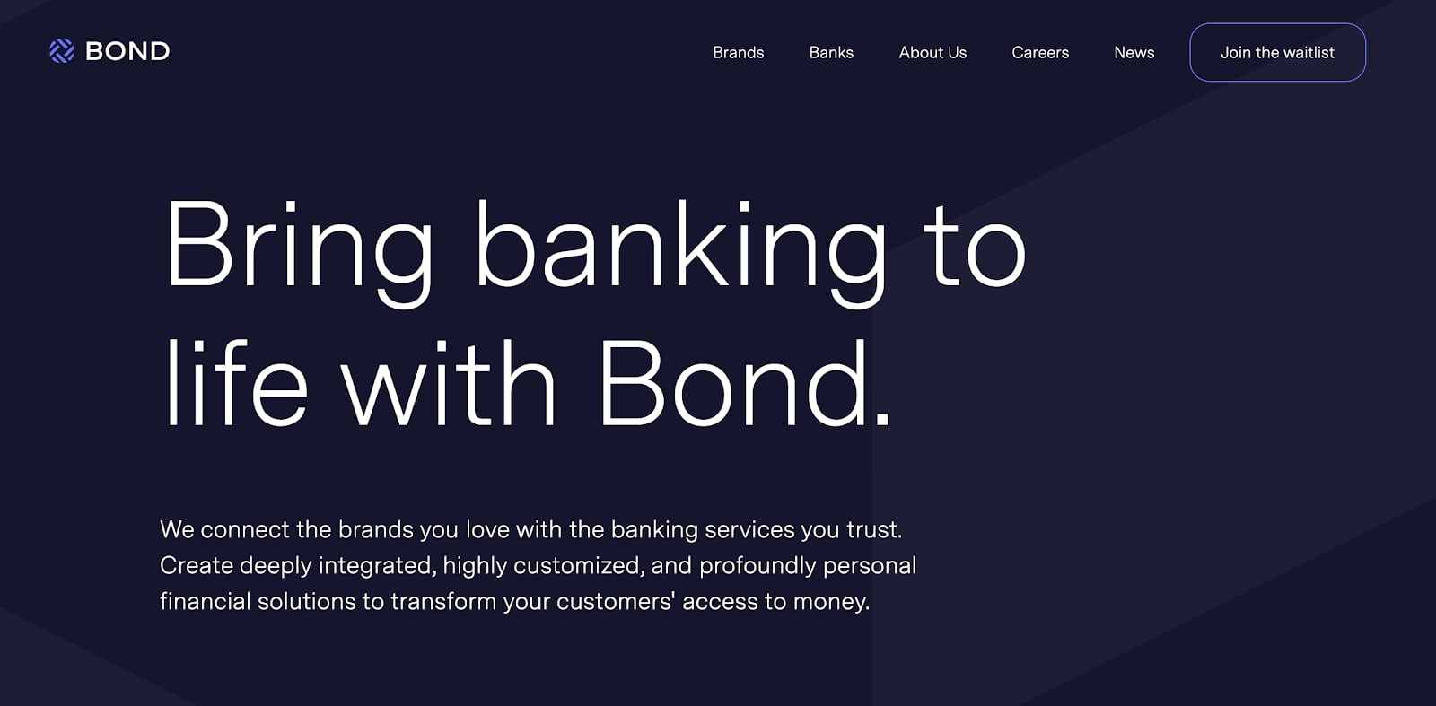
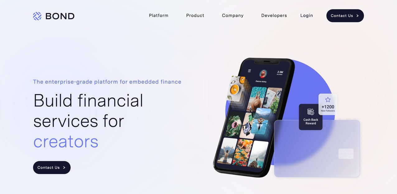
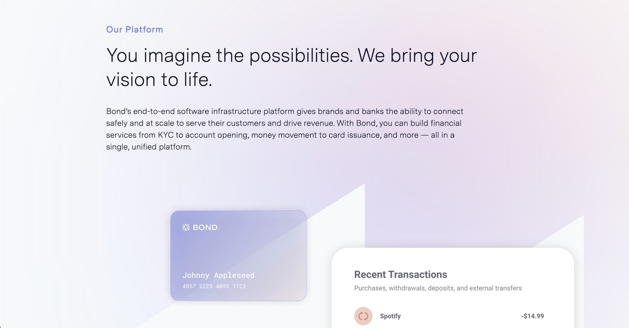
“We started out with a very dark website. The company was trying to go for this ‘we take things seriously’ tone, and that was fine, but it also kind of gave a negative vibe. We lightened up the website so it becomes more approachable. Now our site is definitely lighter. It still has that blue in there, but we brought in other colors too, to make it a little bit more playful.”


Use design to show the strengths of your product
When your product is a software or a technology, the design of your website should communicate to visitors your sophistication, modernity, and your programming competence. Beyond communicating what you do, you want to show that you know the software and can use that expertise in crafting your website.
“You're trying to get people to understand what you do.”
While you want your site to be easy to use, you don’t want it to be overly simple or basic. Adding more advanced features such as page movement and animation will demonstrate your company is keeping up to date. “Motion graphics is something that we wanted to bring into (our site) as well because it signals modernity,” explains Brian. “You're trying to get people to understand what you do. You need to be able to show I know software and I know how to do some of these things on my website. That means we don't want it to be super basic or simple. It needs to be a bit more sophisticated so that the buyers realize you know what you're doing.”
Users need to see that you are continuously keeping your technology up-to-date for them to trust you with their money and personal information. Cyber attackers are constantly learning and improving their methods for cracking financial privacy — 281.5 million people have been affected by data breaches just in 2021 — and anyone handling people’s money needs to continuously stay ahead of security threats. Show that you are dedicated to keeping up with modern standards through the design of your website.

Help visitors imagine the possibilities of your product
The new fintech is being dreamed up right now. Your audience might not know what is possible with it. Both financial services and software can be somewhat intimidating to the general public, so they may not immediately see why they need your product or how it could fit into their life.
Your team knows the potential applications of your technology and its features and strengths. You can use visual design to show clear examples of how your product might be used in the real world. Those examples help visitors make a clear and easy connection to their own needs.
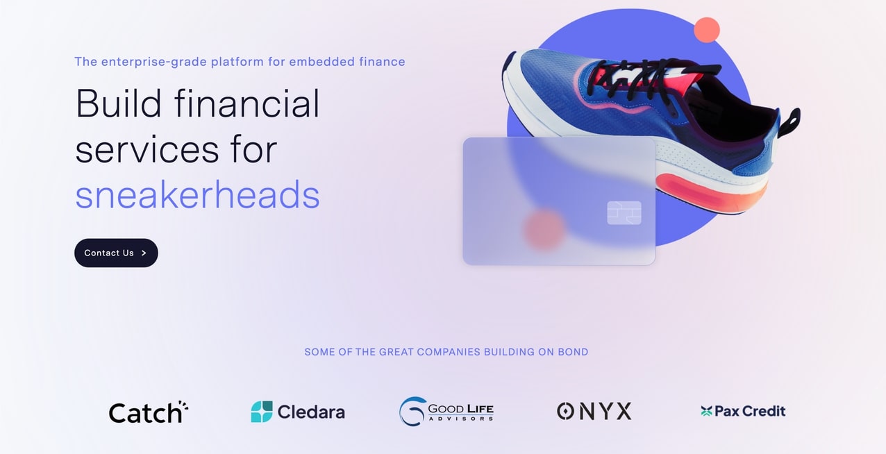
Bond has designed its entire homepage around a series of graphics illustrating a wide range of use cases — from serving landlords and barbers to CFOs — followed by the logos of real-life clients. The unexpected nature of some of these examples sparks curiosity. “We wanted people to realize, if you come to this website, it isn't just a one-size-fits-all thing. We were trying to invite you into imagining yourself in that space,” said Brian.

Design a process that meets the needs of fintech marketers
Since your website is a centrally important marketing asset, it only makes sense to build your site in a way that empowers your marketing team to engage directly with your site’s creation and maintenance. The right process and the right tools will allow your team to be dynamic in their marketing approach.
Collaborate effectively with your security and engineering teams
A fintech website serves as the front door for your company’s product. Collaboration between security, engineering, and marketing will help make the transition into the product feel seamless for users. According to Brian, “We see this demarcation between the marketing website and logging in. So after you log in, it is totally out of my hands. That's when our security personnel and our other folks take over. I provide the door to get into that part of the product, but from there on then it's all them.”
Make sure the roles and responsibilities for each team are clear and that there are open lines of communication between all of you. “My job is to provide smooth access to that secure site. It is not to tell them what to do and vice versa," continues Brian. This is another part of the process where having a brand design system can be helpful in aligning teams. It’s important to also choose a platform that keeps your marketing team’s part of the site secure, even if the financial side of your business's site has its own security protocols.
Choose a site-building platform that marketers can use themselves
As a fintech marketer, your website is your team’s asset and an important one. You want to be involved in the process of building it and making changes, so you can use your site to its best effect. “I'm not a software developer. I am a marketer. I need to be able to make changes to my website. I can't just rely on talking to somebody else, like an engineer, to do this thing. I want to be able to get in there, get my hands dirty, make the change myself,” says Brian.
“I am a marketer. I need to be able to make changes to my website.”
Bond uses Webflow for its website for specifically that reason. No-code platforms like Webflow make it possible for non-programmers to build for the web within a visual design interface. You’ll want to avoid using headless CMS or similarly developer-heavy platforms that will slow down your marketing team.
It is useful to have features like a “polite handover” that make it possible for multiple team members to work on a site without interfering with each other’s work. A brand design system will also help keep a site’s design unified and consistent no matter how many people are contributing to it, and you’ll want to make sure your platform empowers you to manage your SEO effectively.
Features like the Editor are also useful to have for non-technical team members since they enable you to change the content of the site without worrying about breaking the design. “[It's helpful to have] permissions and the ability to sequester certain people so that they can't unpublish the website. So even though I'm the head of marketing, I should not be given that power!” laughs Brian.
Make sure you can update your site quickly and easily
Your website needs to be able to change, grow, and stay up-to-date as an organic part of your marketing process. You want to be able to keep your site relevant and exciting, reflecting changes in the world at large, your product, and your marketing approach. This could be small copy changes that need to be reflected on the website, such as a change in language from “customer” to “client” or larger, more sweeping product or brand updates.
“I do see people who rarely change their websites,” says Brian. “And I think that's because they think that it's perfect, but the world changes. It's not just your product changes...If you're not doing something that's cool and interesting, then I'm just going to blow past it.”
This means choosing a platform that is quick and easy to update. You want a platform that uses repeatable elements, such as classes, which will make it faster to make simultaneous changes across the site. You also want the ability to use dynamic content to create templates for common pages, so you don’t have to build from scratch every time you add a landing page.
Make your fintech marketing site an ambient experience
“The new financial service is ambient.”
That ambient experience isn’t just for your users. It can be applied to the way your marketing team engages with your website over its lifetime. This idea of ambient technology — technology that is an easy and natural part of your daily workflow — is what we talk about when we refer to the no-code revolution.
When making changes is easy and quick to do, your website becomes a living part of your team’s process rather than a separate entity that is updated externally and periodically. Make your website an active site of collaboration, experimentation, and customer engagement, opening doors for the success of your product.


Webflow Enterprise
Security and scalability you can rely on.


