The Gestalt principles help us understand how we process visual information by either starting with the whole and then working our way to the parts, or by attempting to break a confusing whole into its simpler component parts.
In this article, we break down what is Gestalt psychology, the seven Gestalt principles of design, and how to apply it to your work.
What is Gestalt psychology?
Gestalt psychology is a theory that looks at human perception. It originated in Austria and Germany during the early 20th century as a counter to the principles of elementalist and structuralist psychology. Max Wertheimer, Wolfgang Köhler, and Kurt Koffka are the pioneers of Gestalt psychology.
Why these principles matter for modern web design
These principles are crucial for ensuring that modern websites effectively deliver information and engage users. By applying Gestalt theories, web designers can craft visually coherent layouts that guide user attention and enhance overall usability.
What are the key Gestalt principles of design?
When it comes to our interpretation of visual stimuli, we’re always looking for the simplest possible way to understand a thing. The Gestalt psychologists called this the: Law of Prägnanz (aka “good figure” or “law of simplicity”).
People interpret ambiguous or complex images as the simplest form(s) possible.
So instead of seeing the design of the Olympic logo as a bunch of clipped circles and leaf shapes, we just see an arrangement of interlocking rings.

You can try to see the more complex arrangement, but it takes more effort — your eyes just want to return to the simpler pattern.
There are seven Gestalt web design principles:
- Principle of proximity
- Principle of closure
- Principle of similarity
- Principle of continuity
- Principles of perception
- Principle of organization
- Principle of symmetry
Now that you have a general idea of the seven Gestalt principles of design, let’s take a deeper dive into each one.
Gestalt principle of proximity
The Gestalt principle of proximity is when we see objects that are close to each other as more related than objects that are far apart.
Visually, distance defines relatedness. Objects that are close together are seen as related, while objects that are far apart … aren’t.
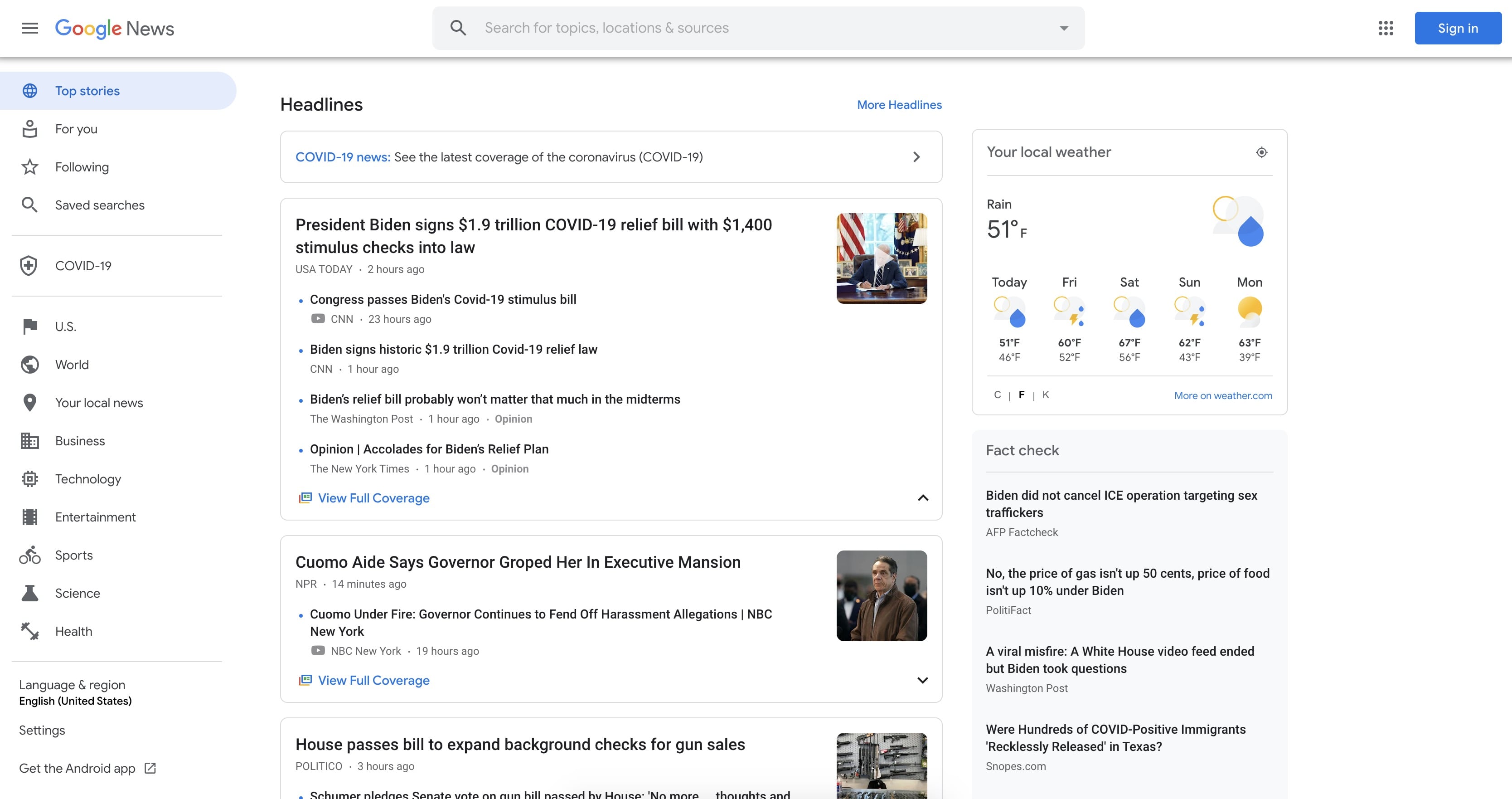
For example, take a look at Google’s News site, below. The text “Headlines” is clearly related to all the content in the card below — even though it’s not enclosed within the card.
Gestalt principle of closure
The Gestalt principle of closure is when we see a complex arrangement, we look for a single, recognizable pattern.
We’re always trying to bring meaning and order to meaningless chaos (and we’re not talking about your last relationship), and our eyes do that via reification: the filling in of missing data to make sense of something we see.
You can see this in action in this (sadly rejected) design for OneFund by Mike Erickson of Logomotive.

Here, we aren’t given all the visual information we need to form the letter F, but we extrapolate the missing information provided by the shadows to create the letter. We do that because, otherwise, the image is just a few seemingly random blocks of black with some type below.
Closure is basically what makes all minimal logos work.
Gestalt principle of similarity
The Gestalt principle of similarity is when we see elements that share characteristics as more related than those that don’t.
You’ve already seen a few examples of similarity in action (see the uniform connectedness section, and in MailChimp’s design in the invariance section). But to zoom in a little more, take a look at this design from Designer News:

Here, the web page icon with the yellow background serves to connect the two Site Design posts, making it clear that they are the same type of post. The fact that the same color appears in the Subscribe button to the right might make you think it’s also related somehow, but the different shape and the text help differentiate it.
Gestalt principle of continuity
The Gestalt principle of continuity is when we see elements that are on a line or curve as more related than elements that aren’t on the line or curve.
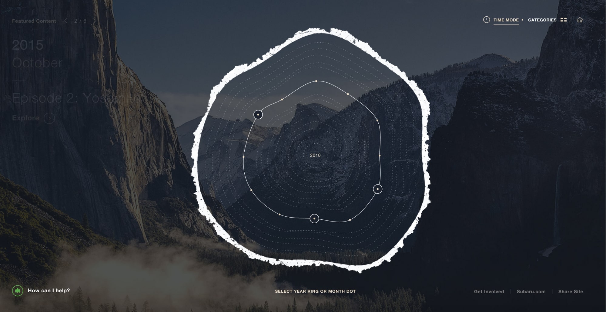
As Subaru’s Zero Landfill site illustrates, lines and curves help us understand relationships too. As you can see in the screenshot above, it’s obvious that the dots on that rough ring are closely related to each other — at least, more so than they are to the text in other areas of the page.
Gestalt principle of perception
The Gestalt principle of perception is when people instinctively perceive objects as either figure (the focal point) or ground (background).
When several objects are juxtaposed, we naturally create a sense of spatial relationships between them, even in the absence of overt visual cues. That means that even very simple arrangements of objects can be used to create a sense of relationship, and hence, even a hint of narrative.

One of the ways we do that is by comparing the two (or more) objects’ size, automatically judging the smaller object to the figure, and the larger to be the ground. You can see that in the images above — whatever its color, we always see the smaller rectangle as the figure, the larger as the background.
We also tend to be pretty creative in interpreting such relationships, using past experiences to instill visual content with a narrative. For example, in the image above, I can’t help but see the little rectangle as a person, looking out toward a view of a darkening sky.
You can take advantage of this in your website designs to draw focus away from larger elements and toward smaller ones. That’s one reason that a copy plus button combo laid on top of a full-bleed image draws attention to the button.
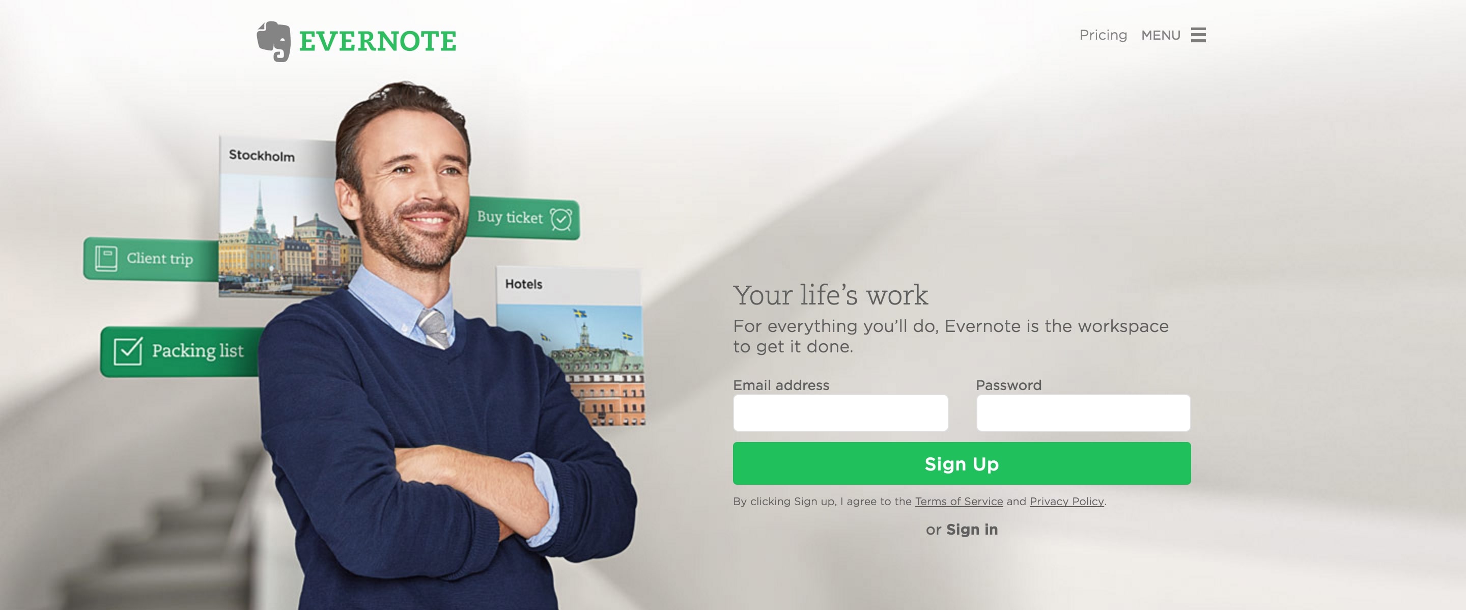
You can also use visual cues like drop shadows to clarify spatial relationships between different elements. It’s why you’ll find so many shadows in Google’s material design guidelines
Gestalt principles of organization
There are five principles that fall under the umbrella of organization: uniform connectedness, common regions, common fate (synchrony), parallelism, and focal points
Uniform connectedness
Uniformed connectedness happens when we see elements that are visually connected as more related than elements with no connection.

In the image above, the large blue rectangle and the smaller blue circle on the left seem more related than the shapes on the right — even though the repetition of blue also suggests a connection.
Note that the connecting element (the small rectangle above) doesn’t have to actually touch the other objects to create this sense of relationship. That explains why arrows are often used to connect text to an image, as you can see in the image below.

Without the arrows, it’s possible to connect “it looks good here & here” to the corresponding images, but that would require some inference on the viewer’s part to understand that one “here” refers to the tablet, the other to the phone. The arrows make the connections between copy and image clearer, making the whole thing easier to grok.
Common regions
Common regions happen when you see elements as part of a group if they’re enclosed within the same region.
You see websites using this visual trick all the time. In fact, it’s become one of the hallmarks of what many people decry as the increasing homogeneity of web design. But that doesn’t lessen the technique’s power in clarifying relationships between various groups of design elements.
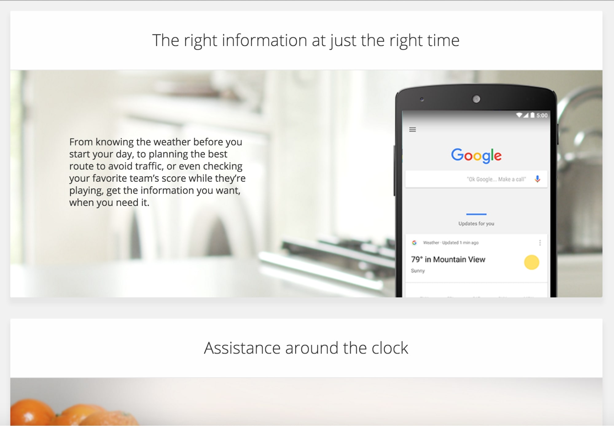
In the screenshot above (taken from Google’s Now site), the designer uses giant cards to help us understand that the headline, image, and paragraph are all related. We immediately get that “The right information at just the right time” defines the topic of both the image and the copy below and that “Assistance around the clock” is introducing a new group of elements.
Common fate (synchrony)
Common fate happens when we see elements that move in the same direction as more related than elements that are stationary or move in different directions.
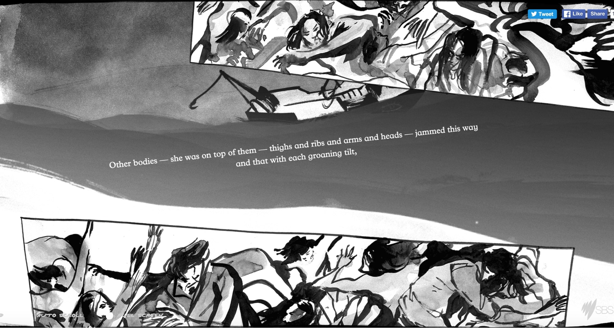
You can see the principle of common fate play out with beautiful dramatism on The Boat, which uses parallax scroll to both convey the chaotic tossings of a storm and the forward momentum of the story it tells.
With all that motion going on, you’d be forgiven for missing the fact that the text in the center of the screen above is related to the two foreground images it sits between. But as the boat and storm-tossed waves move generally to the right of the screen, the relationship between foreground text and images becomes clearer —because they move up the screen. (Though the designers added drama by having text and image tilt and shift as you scroll.)
Parallelism
Parallelism happens when we see parallel elements as more related than non-parallel elements.
To see parallelism in action, I can’t think of a better example than Italian Futurist F.T. Marinetti’s classic visual poem “Parole in liberta” (“Free words” or “Words in liberty”).
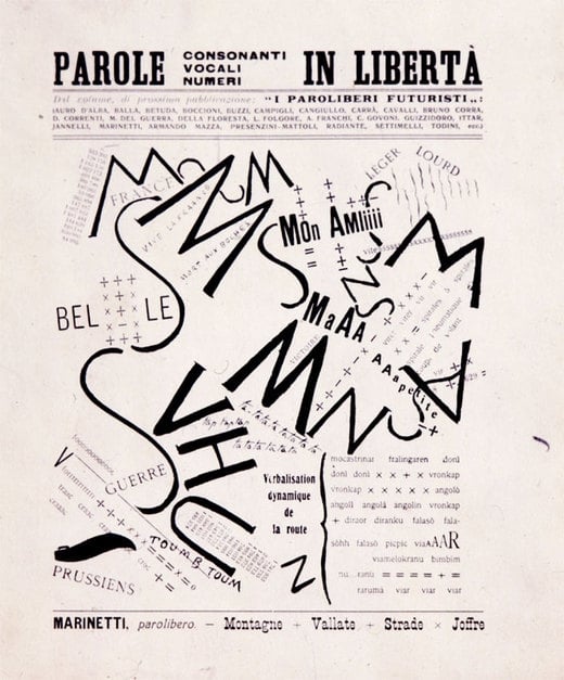
Amidst this chaotic jumble of text, Marinetti offers occasional breathers of (relative) clarity and relatedness by setting a few lines of type parallel to each other. These parallel lines create tension with the otherwise scattered text, but also create relief by momentarily restoring a normal reading experience to the dynamic composition.
Focal points
Focal points are points of interest, emphasis, or difference capture and hold our attention.
Focal points serve as the key to so many elements of web design that it almost feels odd to point it out. But that centrality makes it all the more important to intelligently and purposefully apply emphasis and difference — after all, as the saying goes, “if everything’s emphasized, nothing is.”
Of course, there are all kinds of ways to create emphasis in a design, including:
- Dramatic color changes , such as when a CTA button or other link is given a highly contrasting color
- Dramatic size changes , such as a hero headline set at 72pt
- Typographic emphasis , like bolding, italics, all caps, etc.
- Dramatic whitespace , like when you place a focal point in total isolation from other elements
Two additional concepts often discussed alongside these organizational principles are invariance and multistability. Invariance describes our ability to recognize objects despite variations in scale, rotation, or perspective, while multistability explores how ambiguous images can flip between multiple interpretations. Incorporating these ideas can give you deeper insight into how users perceive and interact with your designs.
Gestalt principle of symmetry
The Gestalt principle of symmetry is when people perceive symmetrical elements as part of a unified group.
It should come as no surprise that people tend to look for order in objects, and symmetry is one means of doing that. That’s why symmetry is so satisfying to us: it’s a simple, harmonious rule that conveys a sense of order and rightness in things. That’s probably why symmetry proves so popular in governmental buildings throughout the world. (And why 3-column designs are all the rage.) Studies have also shown that our standard for “beauty” in faces depends largely on symmetry.
While symmetrical shapes are satisfying, they can also seem a bit static or stale due to all that harmoniousness. Sometimes they lack a sense of movement or dynamism. That problem offers designers an opportunity: by adding an element of imbalance to an otherwise symmetrical design, you can draw attention to the point of imbalance. Might just be the perfect place for your call to action, no?


Ultimate web design
From 101 to advanced, learn how to build sites in Webflow with over 100 lessons — including the basics of HTML and CSS.
How to use the Gestalt principles of design
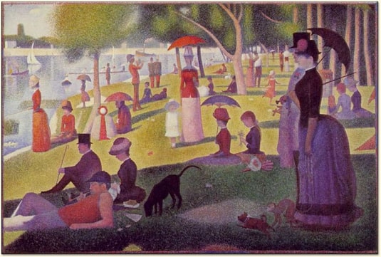
To apply these concepts in your own design work, experiment with complex arrangements of simple shapes that come together as an easily understood whole. This is reminiscent of Georges Seurat’s approach with pointillist paintings, where countless small dots form a cohesive image.
To summarize:
- Gestalt principles help users quickly interpret visual information.
- Proximity, closure, similarity, continuity, perception, organization, and symmetry form a powerful design framework.
- Applying these principles strategically encourages intuitive navigation and user engagement.
- Experimenting with Gestalt theories in a visual platform can strengthen your creative process.
Webflow is a flexible visual web development platform that enables you to build and launch websites without writing code. With Webflow, you can work directly with CMS data to build your site with real content.
Put the Gestalt principles to the test. Sign up for Webflow for free .

Build websites that get results.
Build visually, publish instantly, and scale safely and quickly — without writing a line of code. All with Webflow's website experience platform.


