Just like any creative discipline, web design has its rules.
Content, navigation, and visuals must all work together to make sure your design strikes the perfect balance. But how does one approach the foundations of good website design? Let's find out.
10 principles of good web design
Here are 10 principles to help guide your next website design.
1. Purpose sets the foundation
A website’s messaging and calls to action (CTAs) are key to supporting its goals. A site’s purpose can be as simple as promoting purchases, telling a company’s story, or providing tutorials. You should be able to capture your site’s intent in a sentence or two — think mission statement.
A site design isn't something you make up as you go along. A purpose will give you a clear plan and guide the design and content creation. Winging it isn't a practical design philosophy.
Part of solidifying your site’s purpose is knowing who it's for — who is your audience, what information do they need, and how will your site provide it? Knowing your audience’s demographics and pain points will help you find the right direction for your site.
There are the broad intentions of a design and there are the specifics of a marketing strategy to beat the competition.
How will visuals and content reinforce your brand and make it stand out? And how can your site provide more value than your competitors?
Building a brand and building an audience is important.
2. Content gives meaning
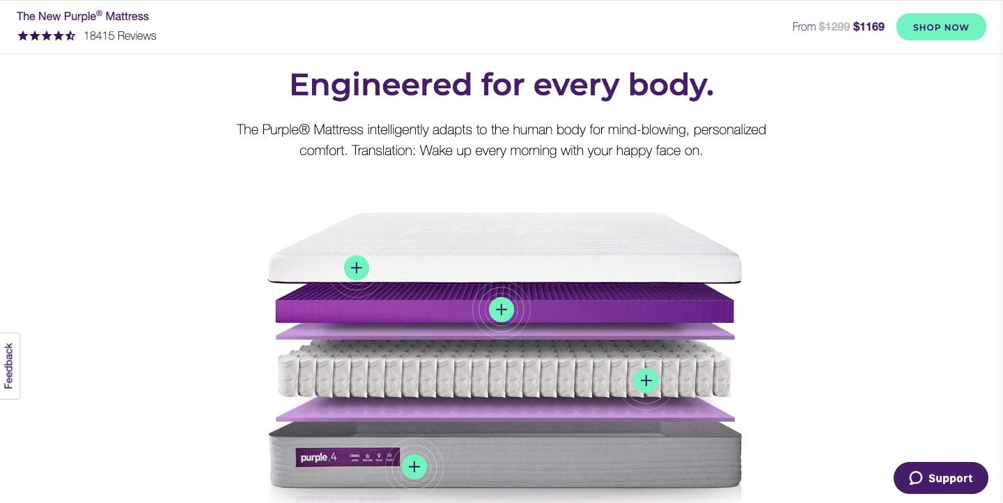
Purple Mattress communicates the benefits of their brand in a simple, upbeat way.
Their site design makes for a pretty package, but what's inside is what really matters. A site needs to have substance — not thoughtless filler content.
The system should speak the users’ language, with words, phrases and concepts familiar to the user, rather than system-oriented terms. Follow real-world conventions, making information appear in a natural and logical order.
— Jakob Nielsen, “10 Usability Heuristics for User Interface Design”
Quality content is useful, clear, and guides your audience toward actions you want them to take. Search engine optimization (SEO) should be planned for and woven into the content. SEO can be thoughtfully and tastefully executed with a conversational tone that integrates keywords and phrases that don’t distract from your message.
Defining your site’s purpose helps inform the content you need and adopting a content-first approach means working with real content from the beginning of the design process. Real content makes it easier to spot changes that need to be made along the way instead of drowning in adjustments and overhauls at the end.
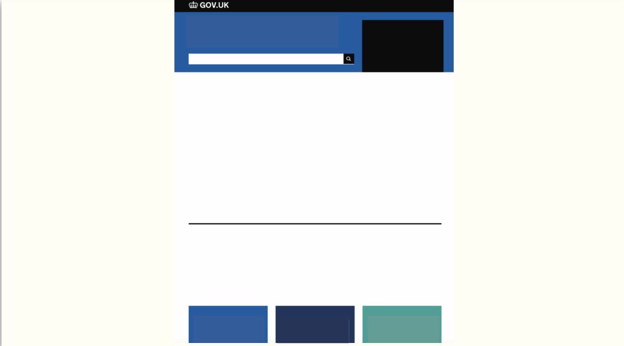
Delight your audience with great content that meets their needs. Otherwise, your site might as well be like this:
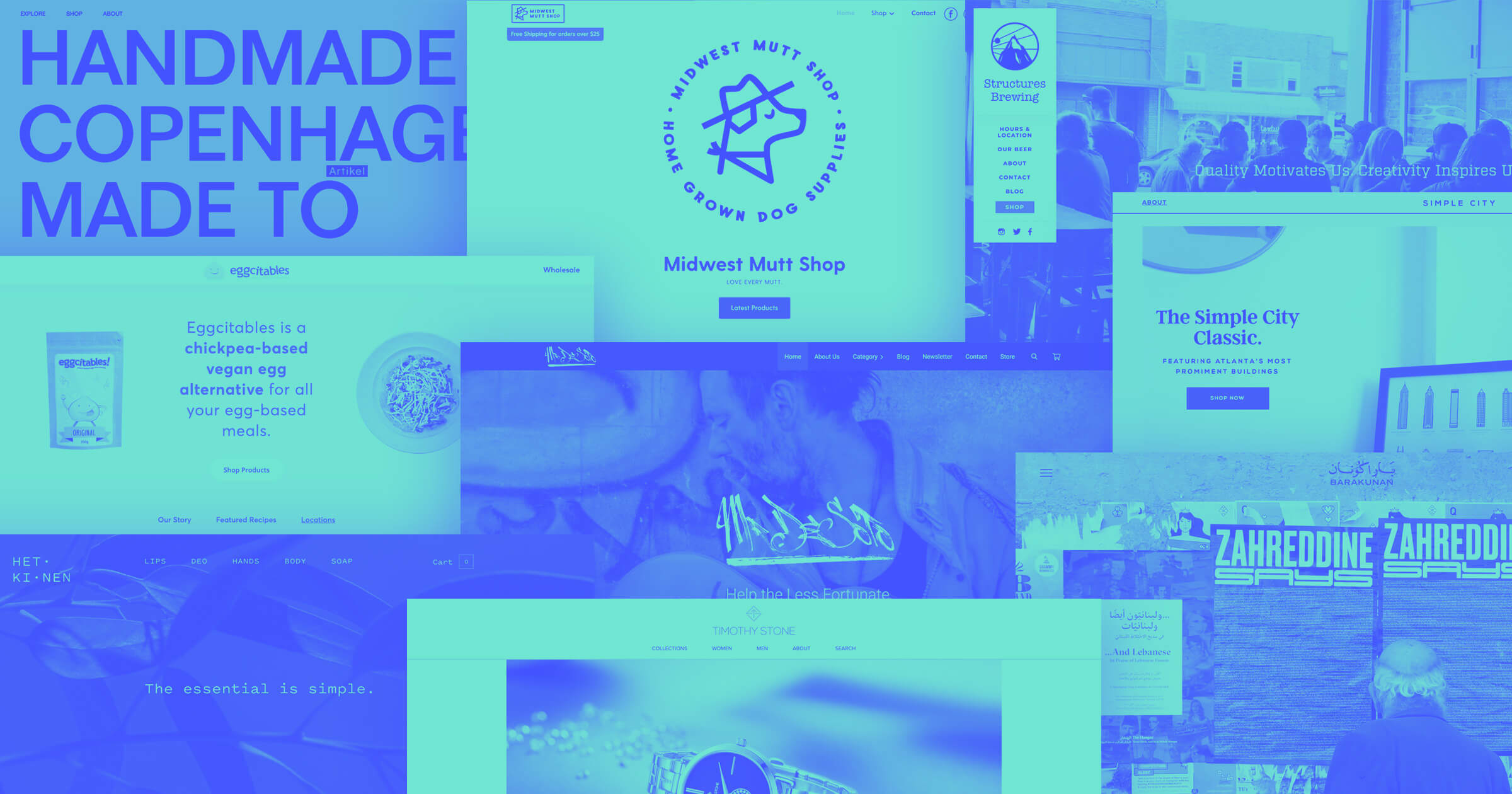
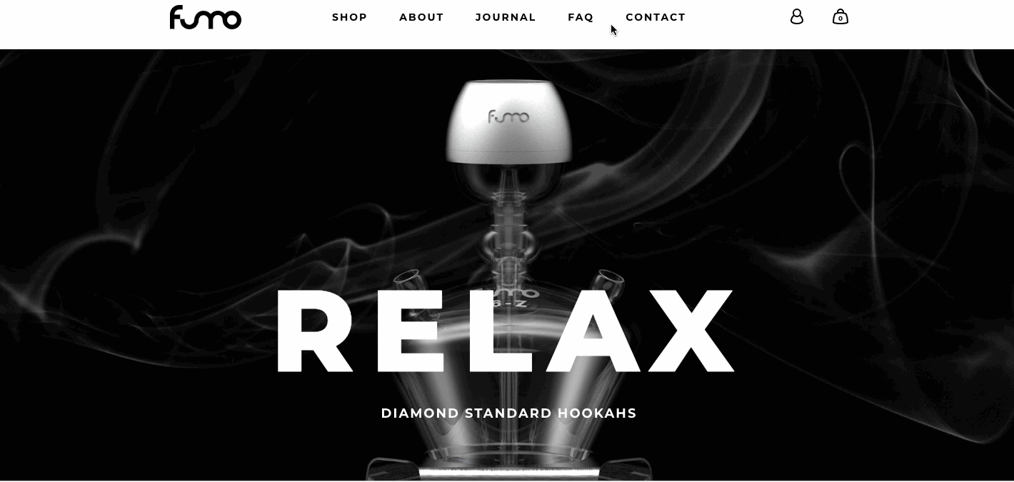
3. Visuals keep people engaged
Every design element should reflect and communicate a brand's identity. Photos, illustrations, and other graphics balance out text and break up the web page, giving the eyes a rest from reading.
An exciting hero image makes a good first impression. Animated transitions and scroll-triggered effects keep people moving and take navigation from a mindless necessity to an interactive experience. Regardless of a brand’s style, visuals should add energy to a design instead of just taking up space.
Software companies, food trucks, and accountants can all be creative with their site’s graphics while staying on-brand.
Your visuals should be high-quality and look good — use clear, color-balanced photos and graphics with appropriate size and resolution. Bad visuals can ruin a great design.
4. Every design element works in harmony
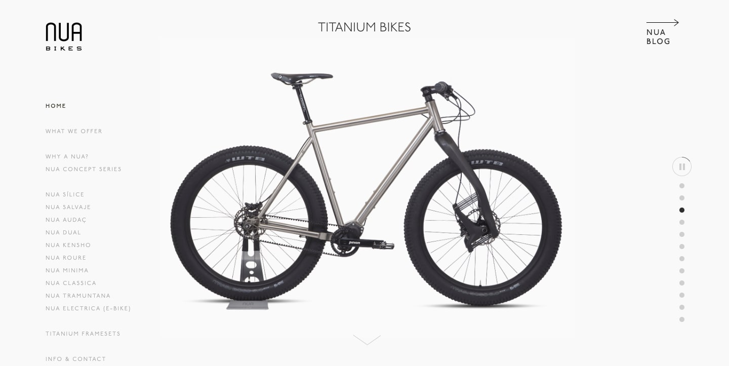
NUA Bikes uses a grey color palette, ample white space, and sparse text to focus our attention on their bicycles.
Every important element of a layout should work together — right down to its HTML and CSS. If the oversized button in a contrasting color doesn’t have good reasons for its nonconformity, it won’t feel right.
Incongruities distract and interrupt the user experience. It’s hard to see the overall great when something feels off. On the same token, bad user experience can cause website visitors to bounce — hurting your chances of ranking in Google.
A good designer makes things user-friendly and knows what fonts, visuals, and types of navigation capture attention. They have a vision for how they all fit together.
New designers are often tempted to cram as much excitement they can into a layout. But when too many elements are demanding our attention, we lose focus.
Skilled web designers are thoughtful about the weight of each element and they know when to use restraint. They know how to create a page design that’s effortless to navigate.
This sense of harmony also extends to the brand identity. Everything from the site’s voice and tone to the color palette should be consistent.
Brand guidelines and a website style guide can help with consistency. Brand guidelines serve as a comprehensive explanation for everything from content to colors. And a living style guide shows how everything looks together and makes site-wide changes easy and immediate.
5. Typography shapes perception
The most important thing about printing is that it conveys thought, ideas, images, from one mind to other minds.
— Beatrice Warde, “The Crystal Goblet”
Typography is a vessel for thoughts. Along with the actual words, the shapes and stylization of letters convey meaning. Typography is like a decoder ring, translating an author’s ideas into a visual representation.
Fonts should suit both the placement choice and tone of a design. Cursive typefaces may work well for headings or decorative purposes, but they’re impractical for large blocks of text.
The wrong font can undermine important content. Just ask the scientists who announced the discovery of the Higgs boson particle with a slideshow featuring Comic Sans. People had quite a bit to say about this choice of typography.
And who knows — maybe the naysayers were wrong? Be sure to know and like your reason for choosing a font.
There’s room in a design for traditional typefaces and ones with more personality. For large blocks of content and other important information, a straightforward font makes for better readability. Stylized typography should be treated like strong spices — add a little here and there for a bit of flavor.


Get started for free
Create custom, scalable websites — without writing code. Start building in Webflow.
6. Organization unifies
Content should have logic, flow, and fit into a hierarchy. Your content should guide your audience to an inevitable conclusion, each piece building on what came before it. Each sentence should offer more clarity about your brand and purpose, keeping readers reading in anticipation of what’s next.
Header tags should be used to structure content and help web crawlers rank your site for web searches. If you don’t have all the finalized content before starting a design, at least use headers to help frame what you’re building.
Visual elements should also be organized. Define sections with images and graphics that complement the written content.
Simple adjustments like color contrast, descriptive alt text, and readable fonts make a difference for visitors with varied abilities.
7. Colors set the tone
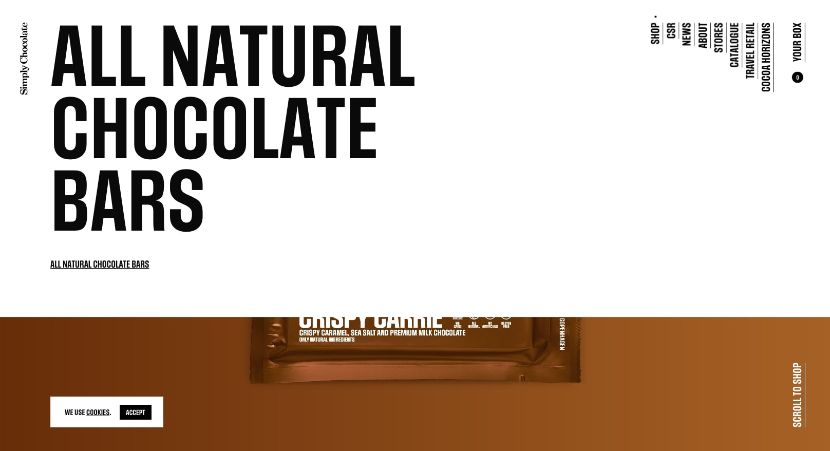
Using their product’s packaging and ingredients to inform the site’s color palette, Simply Chocolate’s design flows with their brand and shows off their tasty chocolate bars.
The palette you choose for a design communicates so much. It can be playful, like a toy company, or more serious for a site offering financial services. A color scheme can do a lot to reflect a brand’s spirit and message.
Choose colors that communicate your identity and — most importantly — make the content easy to read. With that in mind, always run your color combinations through a color contrast checker to ensure readability.
Fast load times keep visitors engaged and show you respect their time. Even a few seconds' delay can lead to higher bounce rates.
8. White space creates balance

White space, buttons, and other visual design elements help images and content stand out, and keep a layout from being cluttered. White space, also known as negative space, is an important aspect of any utilitarian design. Without it, messaging can turn into an indistinct blob.
9. Visual hierarchy keeps navigation simple
The visual hierarchy of your site’s navigation should make it easy to access your content in just a few steps. Of course, you don’t want any content to be missed, but endless dropdowns, buttons, and internal links will overwhelm people.
The pathways to your site’s sections and content should be clear and easy to use. Imagine an intersection with 3 street options versus 10 — simplicity makes for a better journey.
10. Authenticity fosters trust
“Good design is honest. It does not make a product more innovative, powerful or valuable than it really is. It does not attempt to manipulate the consumer with promises that cannot be kept.”
— From Vitsoe’s “The power of good design.”
Consumers are savvy. They can see through shallow marketing jargon — they want and expect brands to be real. Along with a site’s visual sizzle, there should also be depth and authenticity.
If you’ve ever landed on a site with fake testimonials, you’ve probably immediately bounced. We know when someone’s trying to pull one over on us, and it never feels good.
Cliches and vague marketing copy won’t help you connect with people. Position your brand as a voice of authenticity by providing information that has value and communicates the humanity behind your brand.
A few simple rules will guide your endless design possibilities
These guiding principles inform almost any website you'll visit. There are always exceptions, but knowing the rules makes it easier to bend them without breaking your design.
Build websites that get results.
Build visually, publish instantly, and scale safely and quickly — without writing a line of code. All with Webflow's website experience platform.