


After pouring time and energy into developing a website, you’re likely keen to see it go live — but complete a final review first.
You owe it to yourself to check (and double-check) your site to prevent complicated fixes down the road.
Don’t know where to start? We’ve compiled a six-part website launch checklist to help developers like you cover the key details of a stunning website ready for publishing.
Planning your website checklist
Before diving into design and development, establish a solid foundation for your website with these essential planning steps. A thoughtful strategy at the beginning prevents headaches later and ensures your site will effectively serve its purpose.
Clarify goals and audience
Define your website's objectives and identify your primary audience to guide the entire development process.
Choose domain and hosting
Decide on a memorable domain name and reliable hosting service during the initial planning phase.
1. Design and build
It's all too easy to miss (or break) something during design iterations and feedback sessions with clients. Here's a design checklist to ensure everything's in order before launching:
- Spacing: Is spacing consistent across the site? Do all elements have enough breathing room?
- Colors: Is there a consistent, harmonious color palette? Do you have clearly defined brand colors?
- Shadows: If you used drop shadows, is the light source consistent across each one? Do they have the same blur, opacity, and spread values?
- Typography: Is the font stack logical and consistent? If fonts are italic or bold, is it obvious why? Are heading sizes consistent? Is all text readable and web safe?
- Imagery: Do any images look blurry or pixelated? Are any images broken or a drastically different file size? Do all non-decorative images have alt-text?
- Logo: It's an image, but it's so important it warrants its own step. Is the latest and most up-to-date version used throughout the site? Does it appear crisp and sharp (not blurry or pixelated)?
Consider implementing a design system to maintain consistency across your site. A well-documented design system serves as a single source of truth for your design elements, component styles, and usage guidelines — making it easier to ensure visual coherence and streamline future updates.
Cross-browser and cross-device checks
Beyond those initial visual checks, verify your site delivers consistent experiences and functionality across all browsing environments.
Each browser (Chrome, Firefox, Safari, Opera, Edge) interprets and renders designs with subtle differences, making thorough cross-browser testing non-negotiable. Testing on just your preferred browser or two leaves you vulnerable to display issues that could frustrate users and damage credibility.
When testing across browsers, pay special attention to:
- Layout integrity
- Font rendering
- Color accuracy and gradient smoothness
- Image display quality
- Logo clarity and positioning
Your site needs to flex and adapt to countless screen dimensions through thoughtful responsive web design. Navigation becomes particularly critical here — visitors should flow naturally between pages, finding information without friction or confusion.
After you're confident in your development environment, run real-world tests across desktop, smartphone, and tablet to confirm the experience remains cohesive and functional across the device spectrum.
Image optimization
Images and graphics enhance user experience, improve SEO, and affect a site’s loading times.
Mobile devices now have ultra-high-definition displays with high refresh rates, so having high-quality graphics is crucial. Grainy images look unprofessional.
Upload graphics at twice the size they display on your site. If your site is equipped to optimize images — like sites created on Webflow — you can resize and compress images for lower-resolution devices while maintaining larger files for high-resolution devices. This approach maintains high-quality imagery plus support with slower devices or internet speeds.
Check out our responsive images and read our article on site performance to learn more about the impact of image optimization.
2. Edit content
Quality content engages visitors and encourages conversions. Visitors are also more likely to share content if they find it valuable.
Content testing typically involves combing through all content on the site to ensure it’s accurate, free of typos, and up-to-date. Be thorough — you don’t want a section of your website to have a lorem ipsum paragraph still lying around or your brand name spelled incorrectly. Spelling and grammar mistakes lower the value of content, so if you’re not a strong editor, outsource this to a professional.
It’s perfectly fine to change content after the site goes live. You or the client can continuously adjust text and images through a content management system like Webflow even after a site’s been published. Content testing ensures the first batch of content presents the website and brand in a professional way.
Consider performing competitor analysis to identify content gaps or opportunities for improvement as you refine your text and visuals.
3. Test website functionality
It’s key to strike a balance between design and usability to ensure your website looks like you imagined and performs as intended. Otherwise, you could end up with an aesthetically pleasing website that doesn’t function smoothly or a well-functioning site that looks unprofessional. Neither option provides a positive user experience.
Functionality testing usually involves two aspects: integration and link testing.
Integration testing
Website integration is when your site shares information with another application, system, or website. Integration testing analyzes the individual integrations of your website as a group to make sure they’re all functioning. How long this testing takes depends on how many integrations you have.
Some common integrations to test include:
- Web forms: Web forms collect volunteered user information, like a visitor’s name, number, and email address.
- Autoresponders: Autoresponders automatically reply to incoming messages and emails collected through a site.
- Ecommerce tools: These integrations enable a website to connect multiple tools together such as product listings, cart additions, and payments to manage ecommerce functionality.
- CRMs: Customer relationship management (CRM) tools monitor interactions between an online business and its clients with the aim of improving customer relationships for growth.
- CMS: A content management system (CMS) allows authors to create, edit, and maintain digital content on a website.
We recommend keeping a list of any integrations during the design stages so that you don’t forget to test any later.
Link testing
Checking links can be tedious due to the number of links on an average web page. An ecommerce site, for example, requires links on calls-to-action (CTAs), navigation, and to all product pages. It’s common to find a link or two that goes nowhere, but it’s important to find these before customers do, as broken links negatively impact both SEO and user experience.
Some of the most important links to check are:
- Top navigation links
- Footer links
- Links to social media profiles
- Links placed on logos
Rather than performing each check manually, use a link crawler like the W3C Link Checker, the Chrome plugin Check My Links, or Screaming Frog. These crawlers work through your site and flag broken links for you to double-check and repair.
Performance checks
Evaluate your site’s speed and responsiveness to give visitors a fast, efficient user experience.


Elevate your web strategy
In our ebook, experts from Slalom, HubSpot, Microsoft Clarity, Zapier, and more weigh in on the marketing strategies and Webflow Apps teams can integrate across the customer journey to build powerful web experiences.
4. Optimize your site for search
Search engine optimization (SEO) is the process of optimizing the quality and quantity of website traffic driven to a site by search engines. Appearing higher on result pages improves your website's visibility, which can increase visits and conversions.
Analyzing and optimizing your website after publishing is a never-ending process, but considering semantic site structure and content quality before launch reduces the amount of tweaking required later on.
Proper semantic structure
Web crawlers scan your site to understand its content and determine when to show it in search results. Help these crawlers navigate by using semantic HTML — code that clearly defines what each element on your page represents.
Start with these essential semantic tags:
- <h1> to <h6> for headings
- <p> for paragraphs
- <ul>/<ol> for lists
Elevate your SEO with these powerful HTML5 semantic elements:
- <header> , <footer> , and <nav> for page structure
- <main> and <section> for primary content
- <article> and <aside> for content organization
- <figure> and <figcaption> for visual content
These tags help search engines connect searchers with your content. The good news? Webflow automatically handles much of this semantic structure for you, no manual coding required.
SEO meta tags
Aside from on-page structure, you can help web crawlers understand a site by titling and describing its pages.
Meta title
A page’s meta title is the linked text that appears on search engine result pages (SERPs). It usually displays on the browser tab when users click through to the page, unless you choose to code a separate title for blog content.
A stellar meta title:
- Defines the page’s central topic
- Is under 70 characters in length (including spaces)
- Uses relevant keywords
- Appeals to and engages a searcher
Meta description
The meta description is a short snippet that describes what a site’s page has to offer in more detail than the title. It appears below the meta title on a SERP, unless the search engine selects an excerpt from the page it finds more relevant. Google rewrites 70% of meta descriptions to offer searchers a more accurate summary of the site.
An effective meta description:
- Uses relevant keywords to describe the page and its value
- Stays within 135-160 characters (including spaces)
- Appeals to people, not web crawlers
Open Graph settings
Social media plays a crucial role in your SEO strategy. To maximize visibility and engagement across platforms, implement proper Open Graph (OG) tags that transform plain links into rich, compelling previews when your content is shared. These metadata elements ensure your brand's first impression remains under your control, even when others are doing the sharing.
Indexing and structured data
Consider submitting your sitemap to search engines and implementing structured data markup for richer search results.
5. Set up analytics
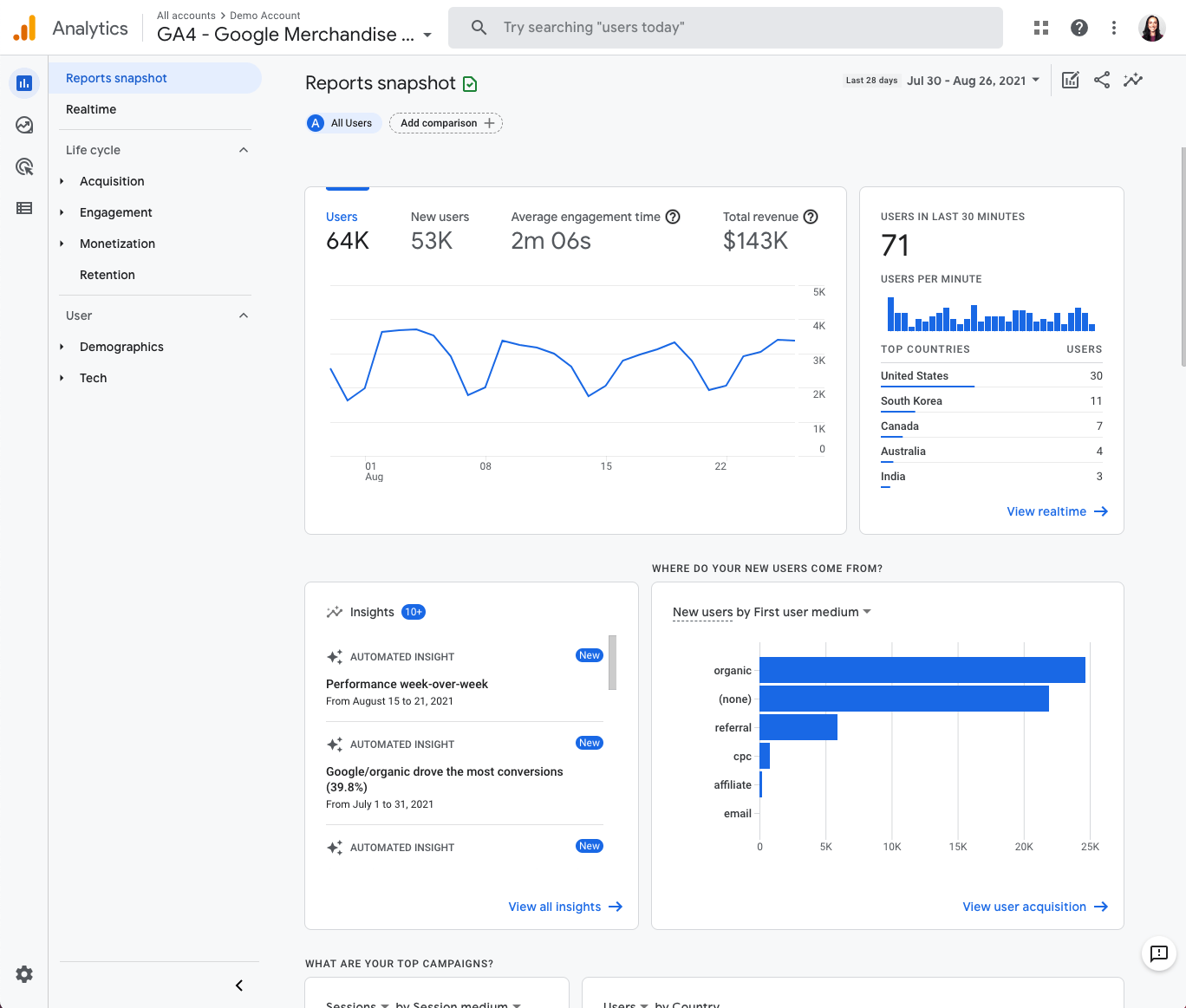
Connect your site to an analytics tool before launch to gain immediate insight into your website's performance. Setting up a Google Analytics account is free and seamlessly integrates with Webflow, allowing you to track visitors and engagement from day one.
Analytics, performance, and SEO work together as a powerful trio. Google prioritizes sites that deliver exceptional user experiences, with factors like hosting speed, size, and responsiveness directly impacting your search rankings. Today's users expect instant loading — slow sites lead to high bounce rates and search engine penalties.
Take advantage of tools that help you measure performance and identify improvement opportunities. For a deeper dive, explore our guide to website performance test tools and put analytics to work for your site's success.
6. Test your site before and after launch
Once you’ve checked the site’s design, functionality, content, and SEO elements, take on the final step: testing your site. We recommend three testing phases: before, during, and after. Testing in waves makes it easier to pinpoint mistakes and when they occurred. Plus, it keeps testing more organized.
Before launch
Before hitting “publish,” browse through the website yourself to search for any bugs or other issues with performance you may have missed. Have colleagues and the client click through, too.
Once you, your team, and the client are happy with the pre-launch tests, make the website live.
During launch
As soon as you publish the website, immediately look for any glitches or mistakes that might have crept in due to technical errors. Once again, involve other members of your team in this process to catch anything that you may have missed.
Check your notes and the site blueprint to ensure your live website runs the same way as your pre-launch tests did, and double-check navigation and functionality.
Once live, it’s also vital to keep your website’s security intact. The minimum is to install a Secure Sockets Layer (SSL) certificate — which enables a site to move from HTTP to the more secure HTTPS — before upgrading to higher defense protocols as your traffic grows.
Post-launch
Remember, maintaining your website is just as important as creating it.
- Maintain design consistency across your entire site
- Regularly update content to keep visitors engaged
- Track performance metrics to guide improvements
- Implement robust security measures and backup routines
Consistently verify if your site is working properly or needs maintenance. Run regular checks for bugs or security breaches, and ensure webpages load as quickly as they did on day one. Adapt to changing SEO strategies by tailoring new and existing content to provide more value to visitors to stay relevant.
Gather feedback and fix issues
Encourage users to share their feedback after launch and address any issues promptly. It's also a good idea to schedule regular site backups so you can quickly recover from unexpected data loss or technical issues.
Launch day: Time to celebrate your success
Creating a website involves considerable collaboration and careful attention to detail. When your site finally goes live, take a moment to celebrate this achievement with your team and client.
Consider holding a website retrospective to reflect on the process and identify opportunities for improvement in future projects. Then maintain your momentum by regularly monitoring analytics to guide ongoing optimization.
Webflow simplifies your pre-launch process with built-in tools that streamline development and testing. Our visual web development platform lets you preview your site across devices without complex coding, while automatically optimizing images for performance across all screen sizes. Experience how Webflow can transform your web development workflow — start building your next project with us today.

Build websites that get results.
Build visually, publish instantly, and scale safely and quickly — without writing a line of code. All with Webflow's website experience platform.