

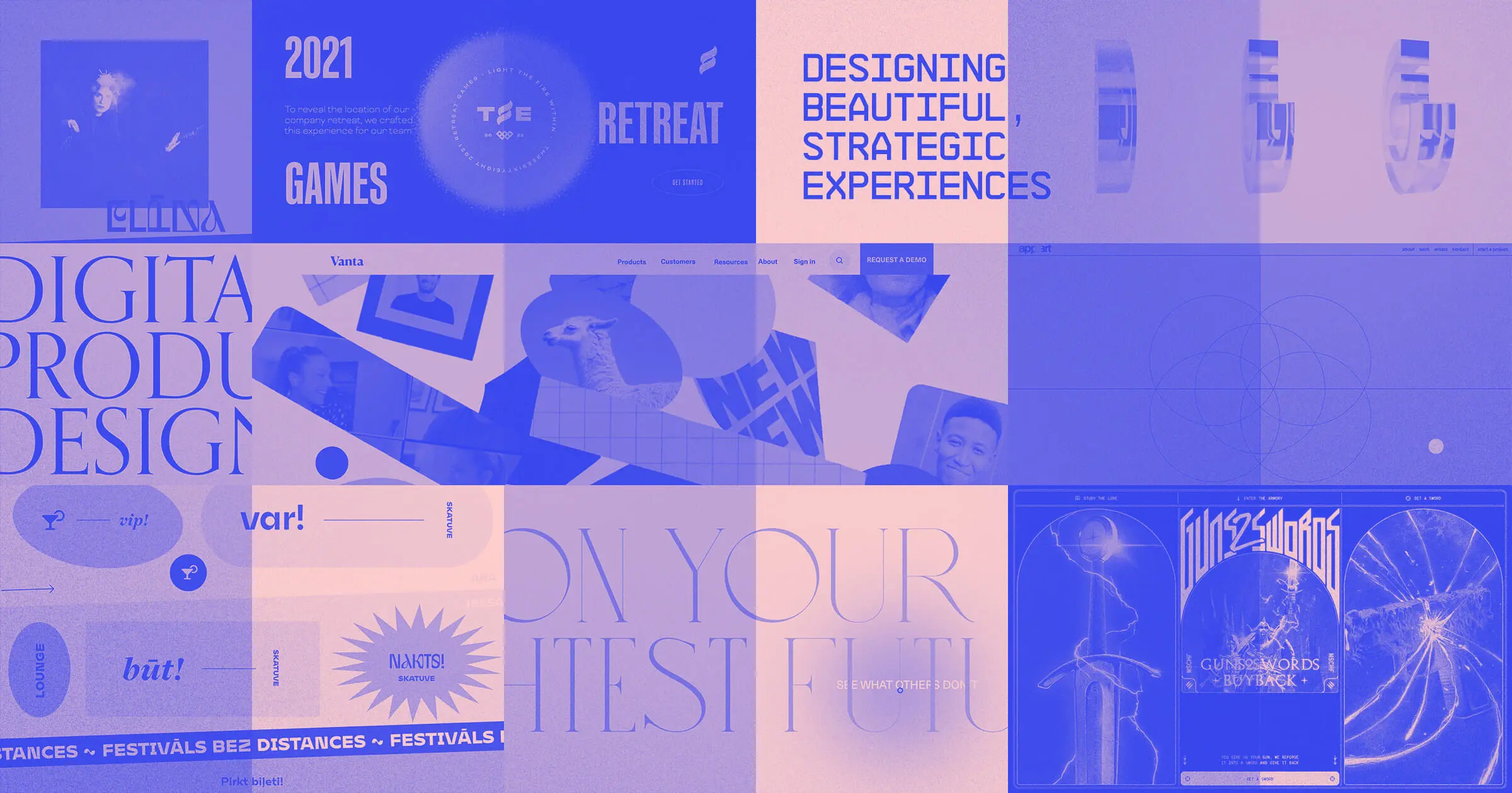
Welcome to our annual round-up of web design trends. From retro typography to the ever-growing no code movement, there’s a lot to look forward to in 2021.
Check out our latest post: 11 engaging web design trends for 2024.
2020 wasn't easy. With its gallons of hand sanitizer, awkward Zoom meetings, and the looming anxiety of uncertainty, we're all feeling a bit frazzled. Despite the circumstances, we all did our best to move forward through it all. Many of us took the time to learn new design skills. And some of us just made sourdough bread. We all have our coping skills.
When it came to design, we kept an eye on the never ending trends on the web. After talking to the Brand Studio team at Webflow, and a handful of other designers, we put together a comprehensive list of some of the web design trends we expect to see well into 2021. We hope this list not only inspires you, but makes you approach the web in a more inclusive and accessible way.
21 modern web design trends for 2021
Here are 21 web design trends that will also help make 2021 a bit brighter.
1. Retro fonts
We’ve seen many old things become cool again, and then in turn become even more uncool. Think handlebar mustaches and mom jeans. Irony has a short shelf life.
Retro fonts have experienced this same ebb and flow in their popularity, and many designs featuring vintage typography haven’t aged well.
However, throwback typography has gone through a bit of a resurgence. We’re not seeing the same tired fonts. Rather, stylization and a bit of artistry are reimagining what retro fonts can be.
We see this merging of old and new on the page for Spotify’s Carnival promotion. Instead of feeling stale and cliche, they breathe new life into traditional bold fonts with a bit of experimentation. This is a good example of taking traditional fonts and giving them a bit of a cool and modern spin, while maintaining legibility.

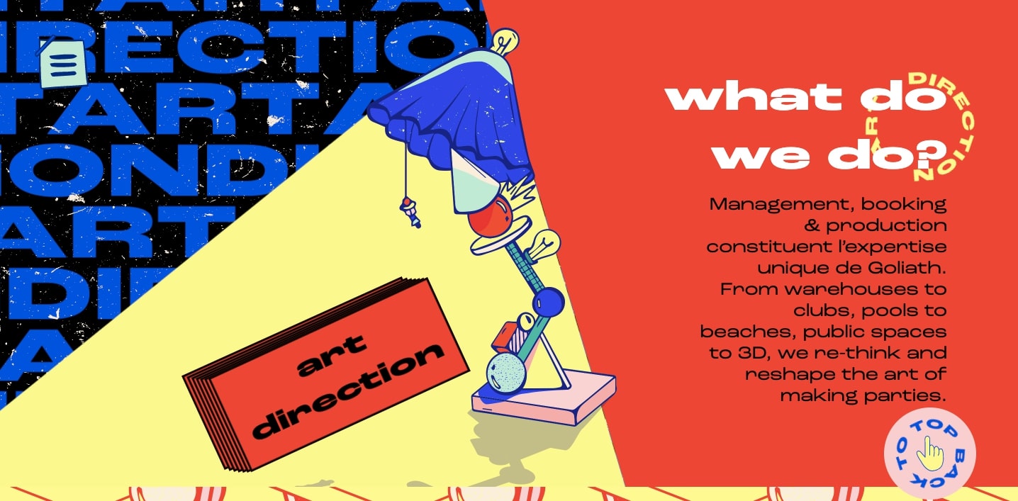
There’s a sense of retro-futurism here on this website for the event planning company Goliath Entertainment. The bold typography gives a nod to the past while still feeling very of the moment.
As 2021 unfolds, we’re looking forward to seeing more creative typographic reimagining.
2. Parallax scroll animations
Parallax scroll effects have been a trend in website design for years, and in 2021 we hope to see more subtle and creative explorations of what can be accomplished with parallax.
Remember that too much movement in parallax effects can be harmful to people with vestibular disorders because the illusion of depth and movement can cause disorientation and dizziness. Here are some guidelines we see more designers taking into account to ensure they incorporate parallax minimally and without causing harm:
- Don’t let parallax effects distract from important information
- Don’t make it harder for the user to complete an important task
- Keep the number of parallax effects to a minimum
- Minimize the amount of parallax movement within each instance
- Constraining parallax effects within a small area of the screen
- Include an option for users to turn off parallax effects
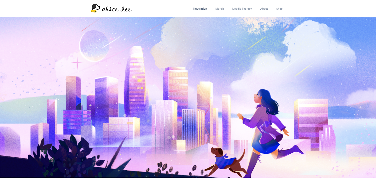
Alice Lee’s portfolio site uses parallax effects that respond to mouse position to bring her illustration to life. The amount of movement is small and contained within the bounds of the hero. This is a great example of using parallax with constraint and intention.
Not every parallax animation has to make grand gestures across the screen. We’ve also seen more subtle applications. In this web design for Green Meadow, one could almost miss this effect entirely. But this gentle unveiling of text creates enough of a juxtaposition to bring attention to each block of text as it appears.
Next year we’re excited to see parallax scroll used subtly, not for flashy effect but as a tool to emphasize or highlight important bits of content.
3. Horizontal scrolling
Previously regarded as a web design faux-pas, horizontal scroll is having a comeback.
We’re seeing more web designers continuing to experiment with horizontal scroll. Those who do it best break the pattern not for the sake of being different but as a practical way to disclose secondary information progressively, like in an image gallery.
Designers employing horizontal scroll successfully in 2021 will keep in mind these considerations:
- Don’t force users to navigate through horizontal content: allow alternate ways to navigate, like arrow buttons with clear labels
- Use clear visual cues to indicate where content uses horizontal scroll, and don’t hide these cues behind hovers
- Be thoughtful about what content would benefit from being displayed in a horizontal scroll — a photo gallery is a good contender as horizontal scroll would show users a small preview, and allow them the option to view more or keep moving down the page
- Avoid requiring horizontal scroll for text that needs to be read
On our own Designer feature page, we’ve used a small amount of horizontal scroll to zoom in on a large image, and show more relevant bits of the image at a bigger size, to accompany the relevant content.
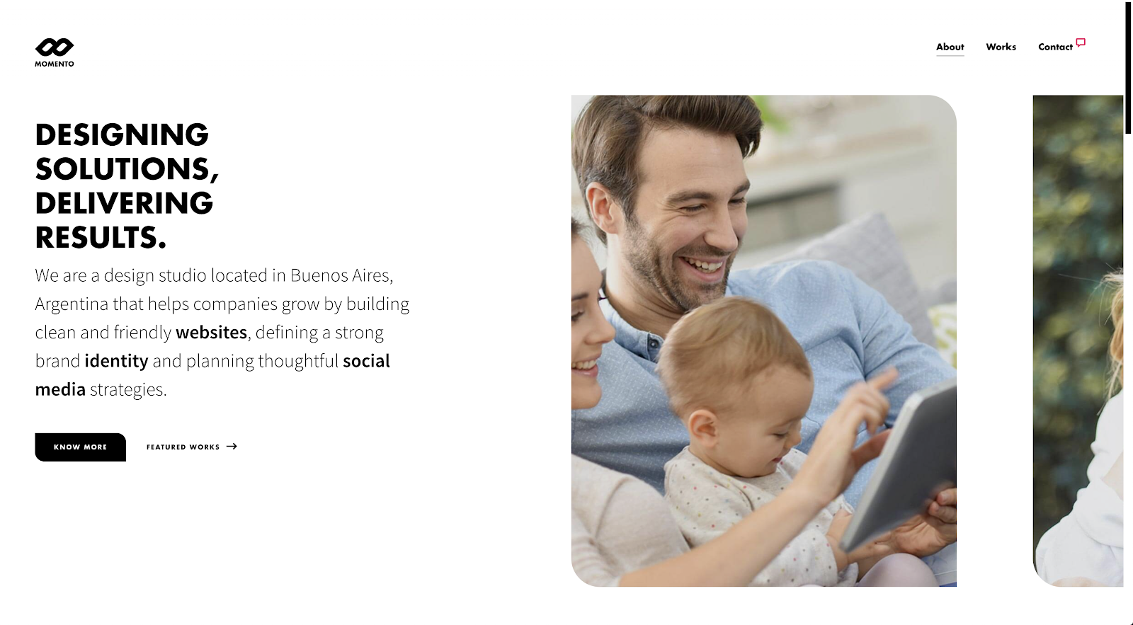
Momento Design Studio’s home page includes a clear cue next to the primary button that also acts as a link, slowly sliding you over to the featured works on click. The scroll motion is well-paced and not too long, letting the featured images shine.
McBride Design uses horizontal scroll to showcase large photos of their work without taking up too much space on the page. They also include a clear indicator in the bottom right that sets the expectation that the page will scroll horizontally.

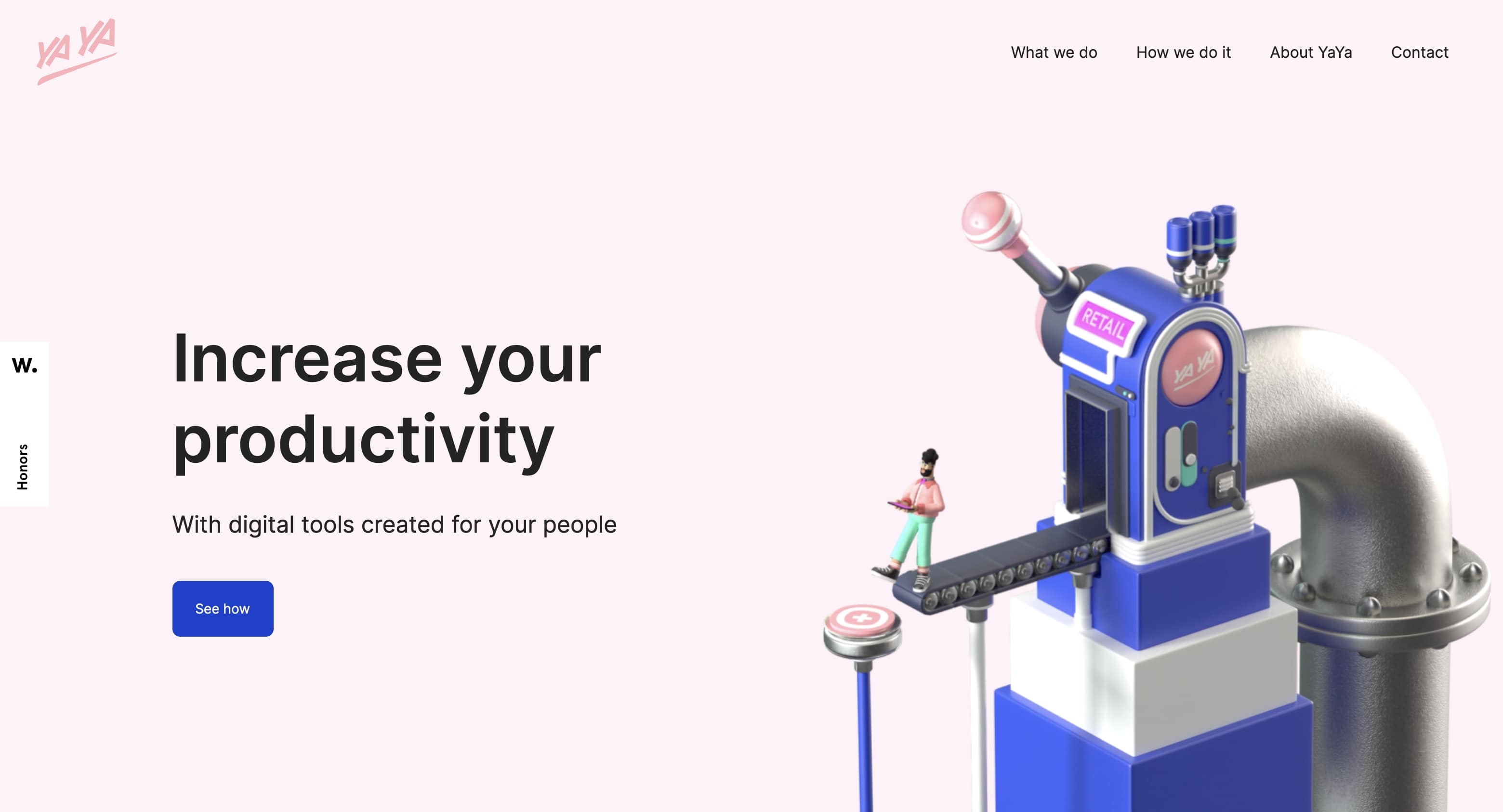
4. 3D visuals everywhere
With the advent of higher resolution screens, 3D design has come a long way from the blocky and beveled edges of Geocities. We’ve been seeing high-quality 3D visuals weaved seamlessly into web designs. Instead of being garish distractions, they’re adding to the overall user experience.
The creative agency Sennep throws in dashes of depth with 3D elements throughout their website. There’s a nice sense of harmony here between all of the design elements. This is a perfect example of how in more minimalist layouts, 3D can make an ever bigger impression.
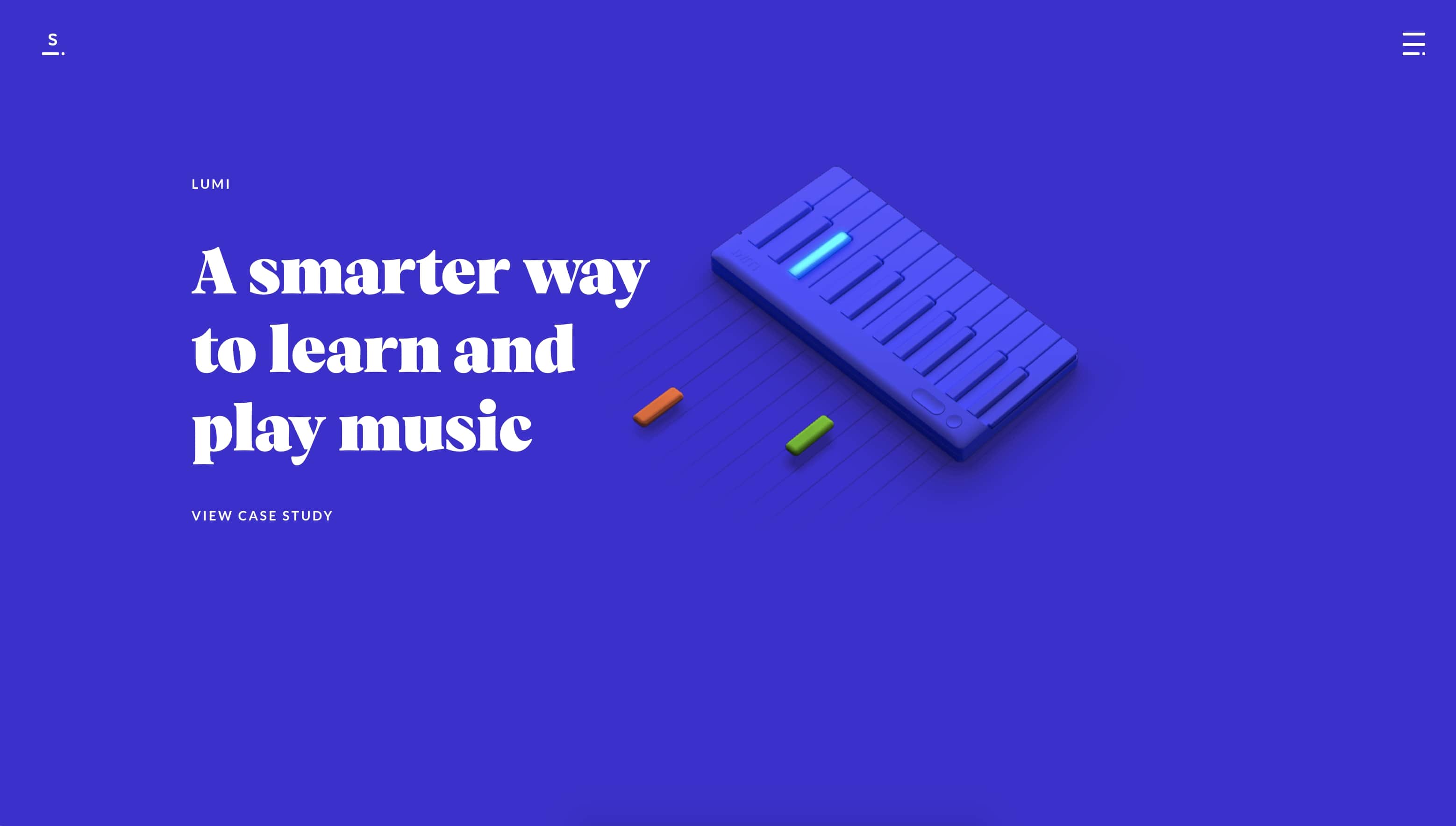
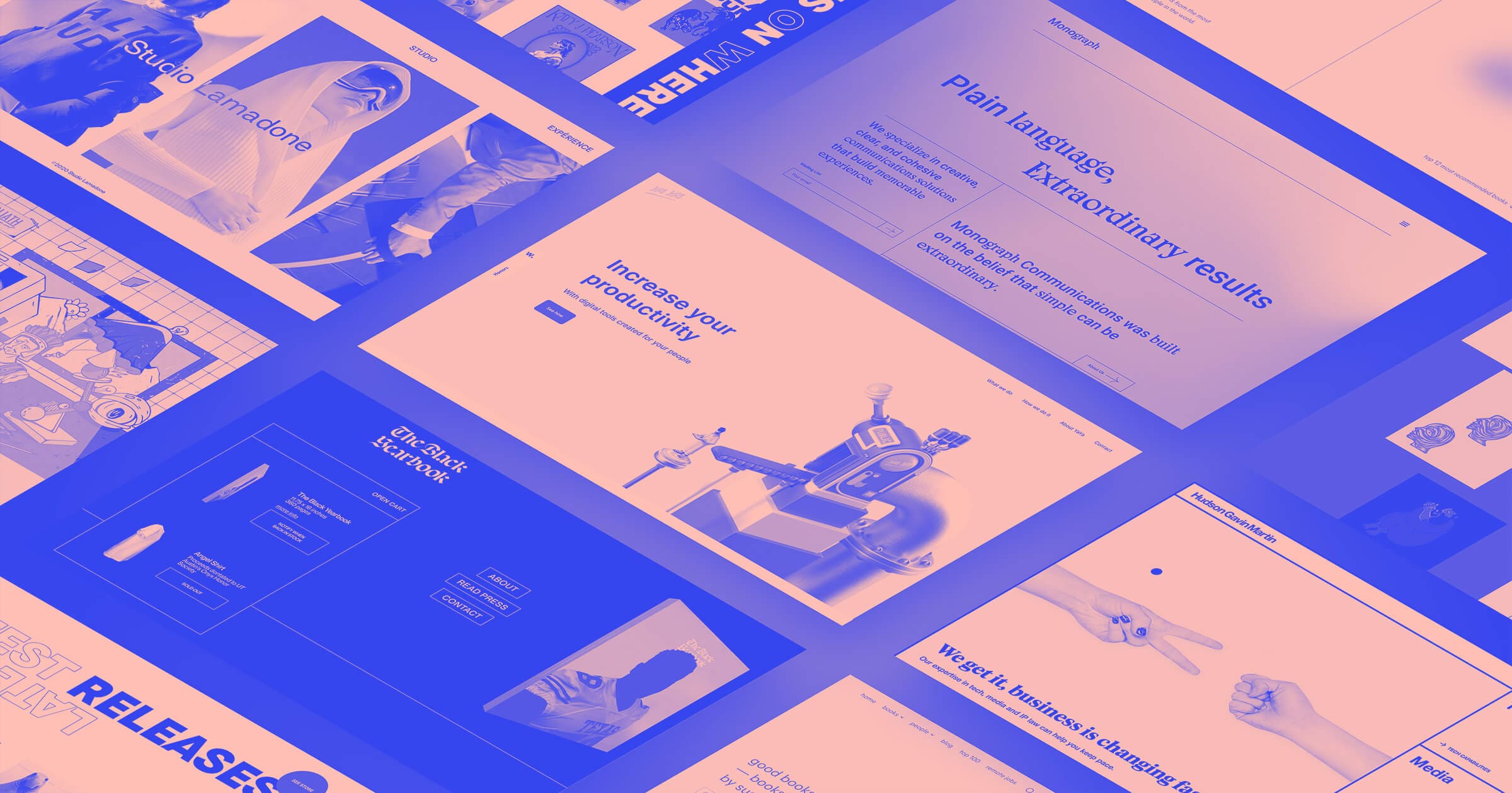
Yaya put their love for 3D at the front and center of their homepage with this quirky and cool hero animation.
And in this example below from the presentation software company Pitch, they have a colorful layout full of three-dimensional shapes, drop shadows, gradients, and layered elements. These 3D design elements bring this design to life.

3D elements add a sense of uniqueness and dimensionality to any webpage.
5. Multimedia experiences
With most people having access to faster internet speeds multimedia web experiences are popping up everywhere. Bringing together visuals, text, video, and audio makes for a rich user experience.
Successful designs in 2021 will use constraint with multimedia experiences:
- Prioritize simplicity, like when combining motion and audio. Too much going on can be distracting or overwhelming to people with cognitive disorders.
- Use different media formats thoughtfully as a way to maximize accessibility of content.
- Include closed captioning and transcripts for all pre-recorded multimedia.
- Include alt text for images, and accompany complex images with longer descriptive text.
- Ensure that all text is made with HTML rather than rendered inside images.
- Avoid autoplaying video or motion content: instead, provide a clear “play” button that affords the user the option to play and pause the content.
Using multimedia effectively and accessibly comes with a responsibility to address a variety of factors. Here are more resources on video accessibility.
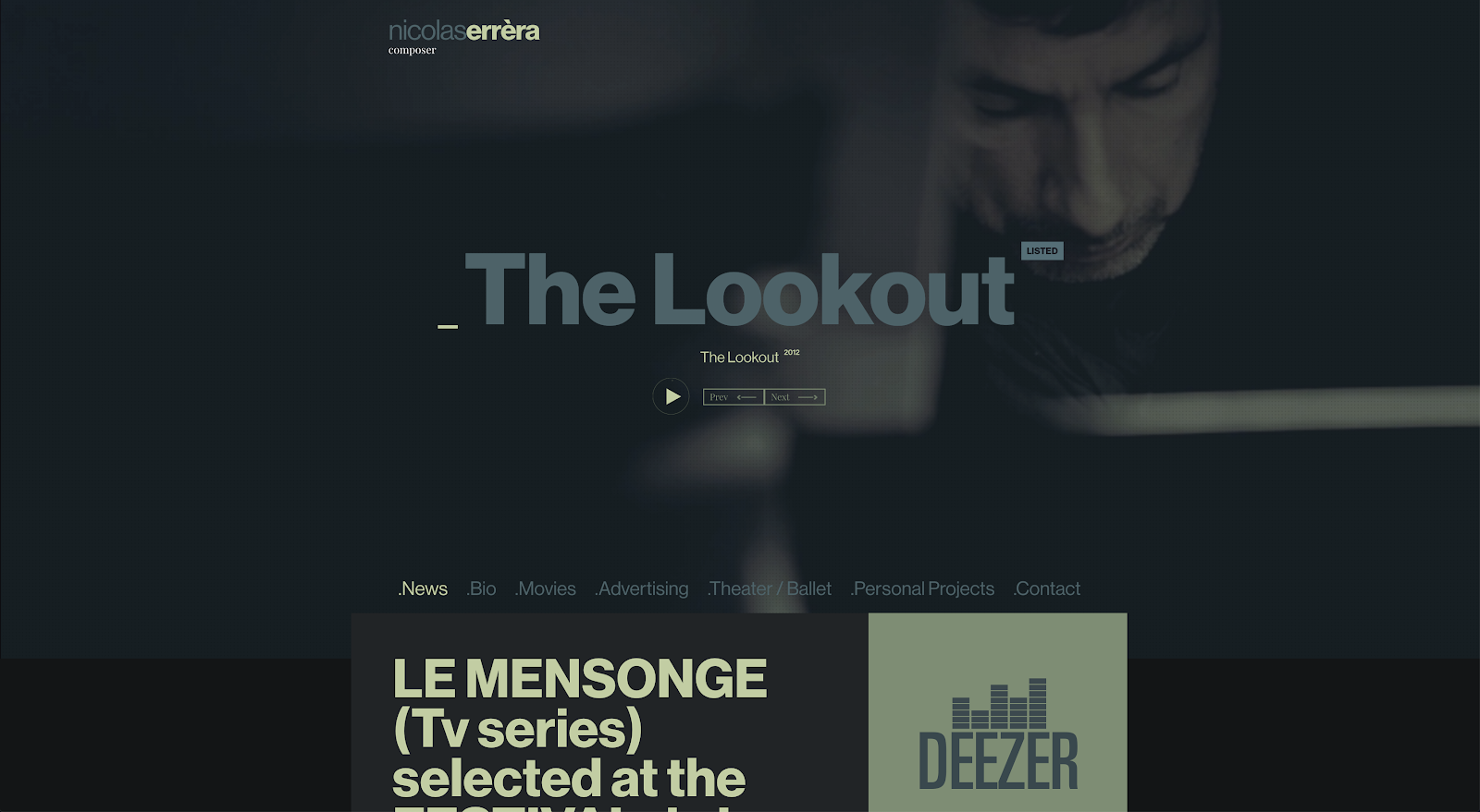
Nicolas Errera’s site includes playback controls for a beautiful background video: it plays on click, and can also be paused. It also incorporates a subtle animation that indicates how far into the video you are.
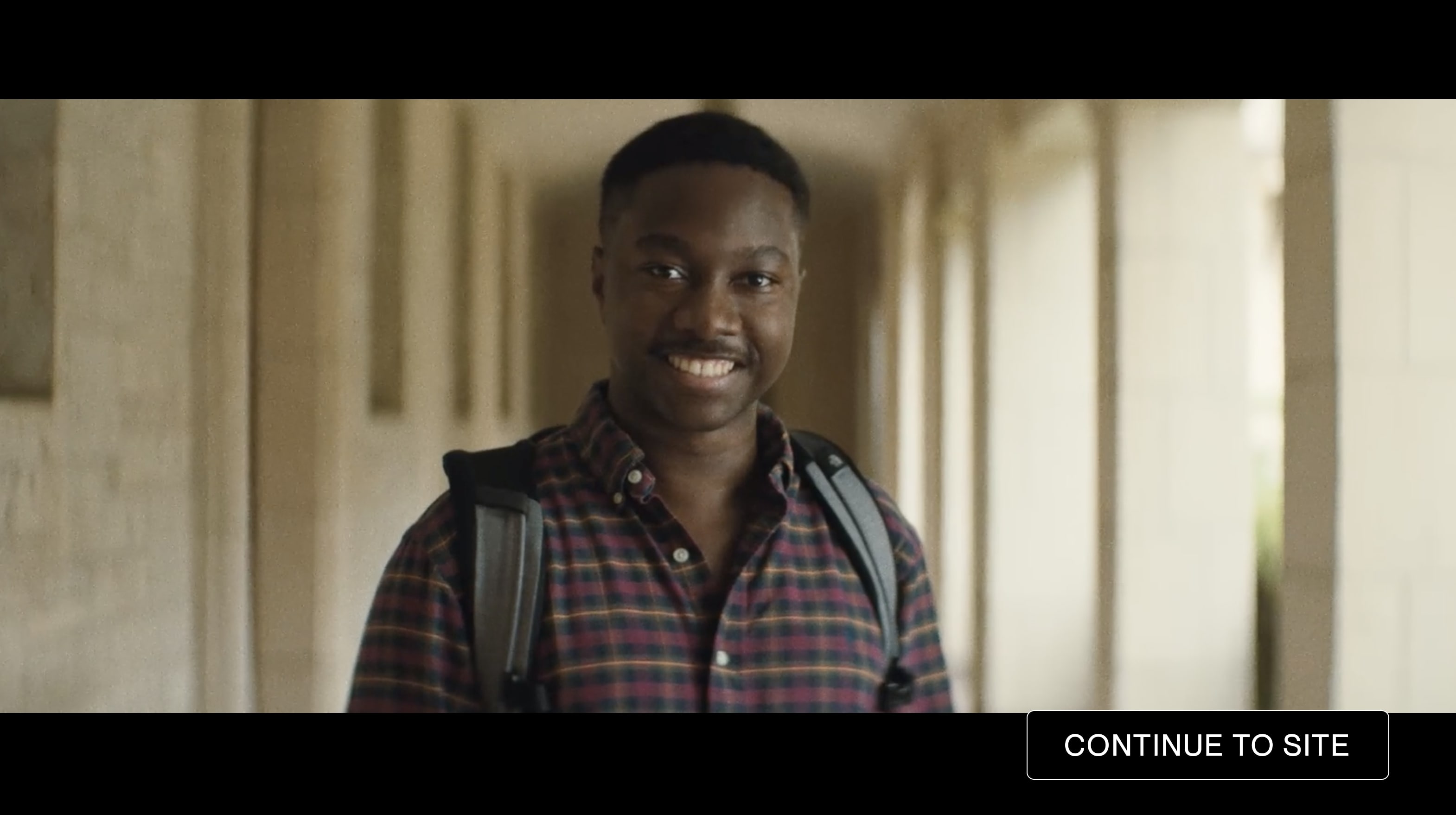
Multimedia experiences work in so many different areas. In the example below, we see a screenshot from Black Yearbook. This is a crowdfunded book put together by Adraint Bereal and his friends to show what it’s like to be an African American student attending predominantly white schools. Full playback controls are clearly visible on all videos. Beautifully shot cinematography cuts from one scene to the next at the beginning of the design with a hypnotic soundtrack playing in the background, feeling very much like the trailer for a film. There’s a passion behind this introduction, making you want to go further in learning about the book and the movement behind it.
And for something out of the ordinary, we’re going to round out this list of multimedia examples with MSCHF, the infamous company behind many viral web-based drops. MSCHF’s out-there design straddles the line of brutalism, with an almost absurdist design that brings together stark typography, SMS text messages, and other elements.
6. Augmented reality (AR) experiences
And with multimedia experiences, let’s not forget all of the amazing immersive experiences using augmented reality (AR). AR means more now than just hunting for Pokémon on your Apple or Android mobile device. New technologies like the WebXR API and software made by Wayfair Technologies have opened this realm up for almost everybody.
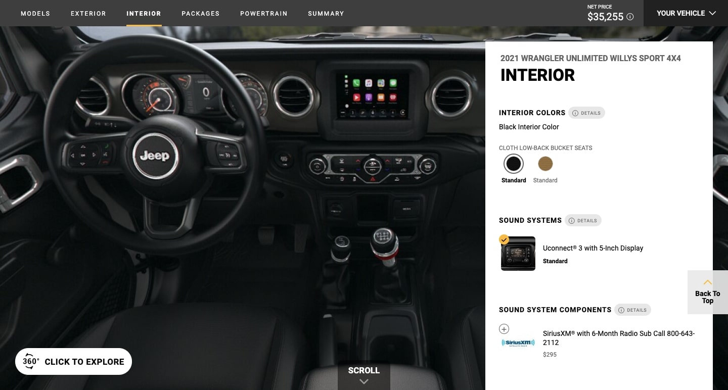
Jeep utilizes AR for this “Build & Price a Jeep” page. For those who hate stepping foot into car dealerships, this makes for a breezy and pressure free experience. More retail and ecommerce websites are tapping into the power of AR to help sell their products, and empower potential customers in the buying process.
7. A focus on grain
Rigid grids and flat blocks of solid color can really drain the personality from a web design. Grainy textures can give them a more natural feel.
We see the beauty of graininess in this website for Studio Gusto. It uses lo-fi design elements for a rougher user experience that feels more natural than the slick perfection that’s commonplace in many web designs.

8. A focus on muted colors
Just like grains can give a design a more natural feel, so can subdued colors.
Magic Theater Studio, uses a light color palette, along with dark blocks of green, making for a distinct contrast between sections of this web design. These muted colors are the perfect backdrop to the hand-drawn styled text and illustrations. In the background, there’s a slightly buzzing grain that’s almost indiscernible, and a subtle distortion to the light and dark backgrounds, making the design feel very much alive.

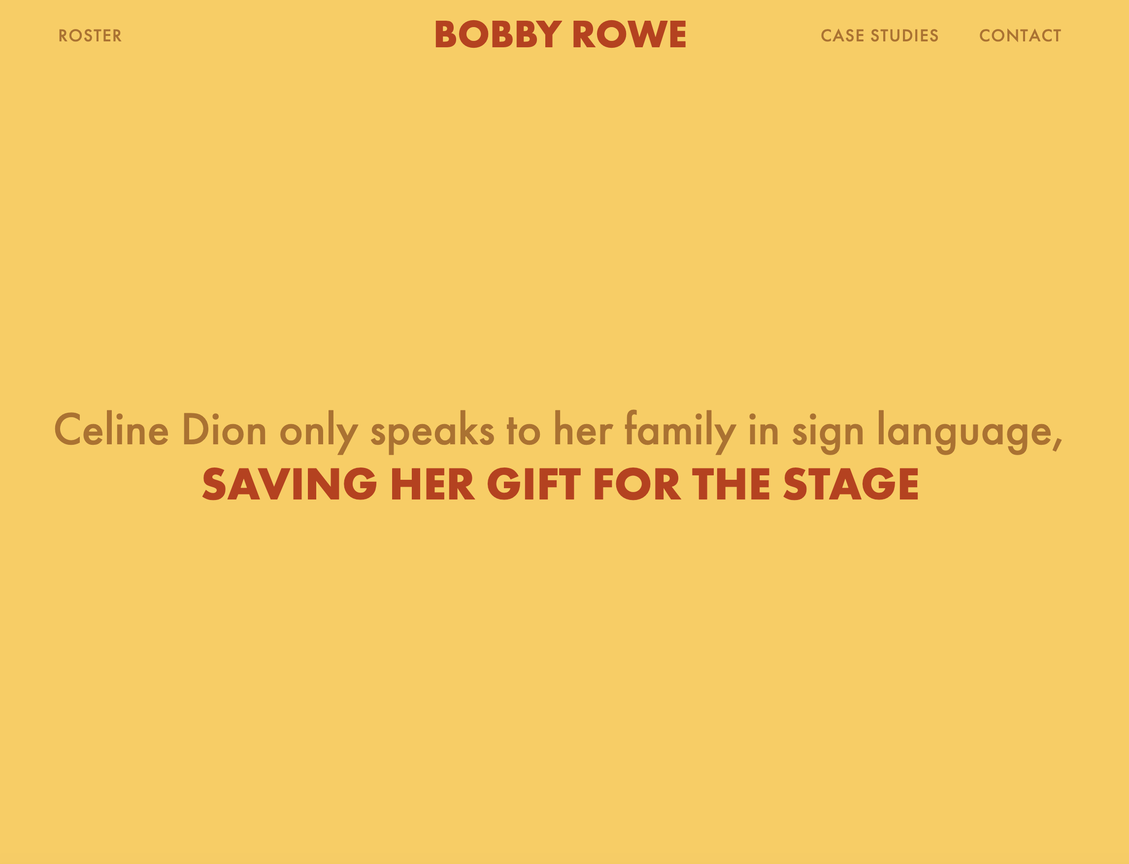
This marketing portfolio below for Bobby Rowe is a celebration of color, and features informative and funny writing about the work he does. It can be hard to create a web design that’s well rounded in its awesomeness, but Bobby Rowe comes through with this web design. There’s a nice variety of subdued colors along with those that are bolder.
9. Designs based on preference
Web development has made great strides in offering more personalized experiences. This can be anything from including a toggle between dark/light mode and other ways of changing a site’s appearance and navigation to offering content custom-tailored to one’s taste like the custom playlists generated by Spotify.
New design practices and algorithms are making the internet less of a passive user experience and more user-centered. The future will bring even more of a focus on meeting the needs, wants, and tastes of those navigating through websites.
10. Gaussian blur
Gaussian blur works so well in providing a swirl of soft focus to images and gradients. This effect has been around for a while, but designers have been using this in more prominent spaces in web designs.
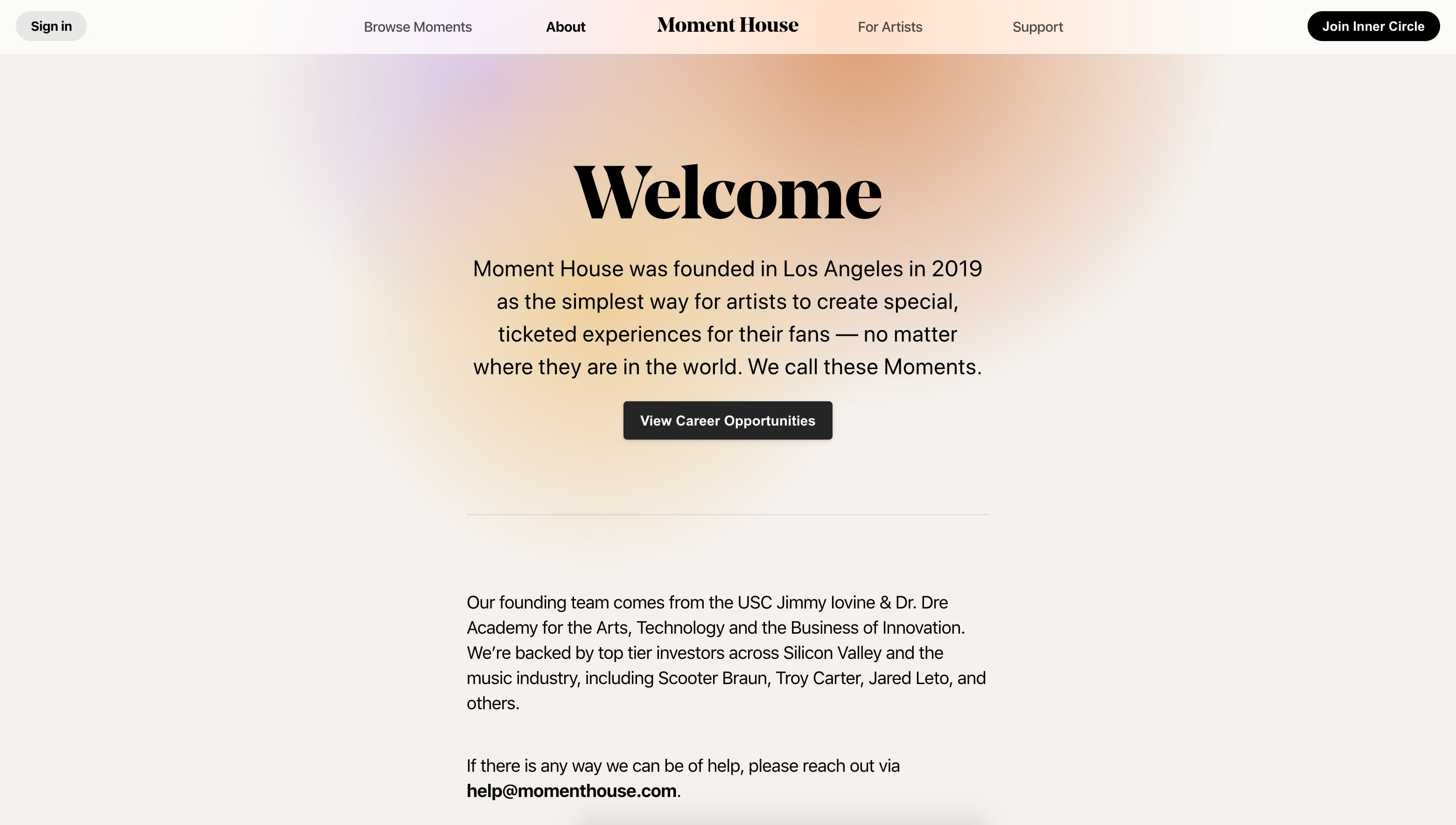
Moment House begins their homepage not with a hero image, but with a pleasing gaussian blur of color. This lends an atmospheric feel and ties directly into the Los Angeles cityscape photo that follows it. It perfectly captures the lens of golden light and haze that Los Angeles is viewed through.
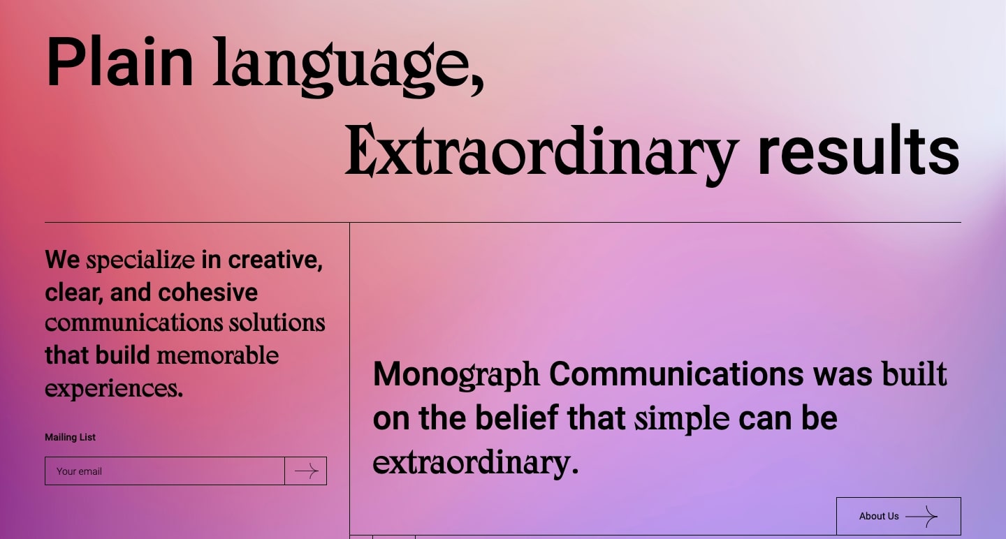
We see a gaussian blur in the background of Monograph Communications. This fluffy blending of red, purple, and blue, strikes a nice contrast between the straight lines and bold typography that overlays it.
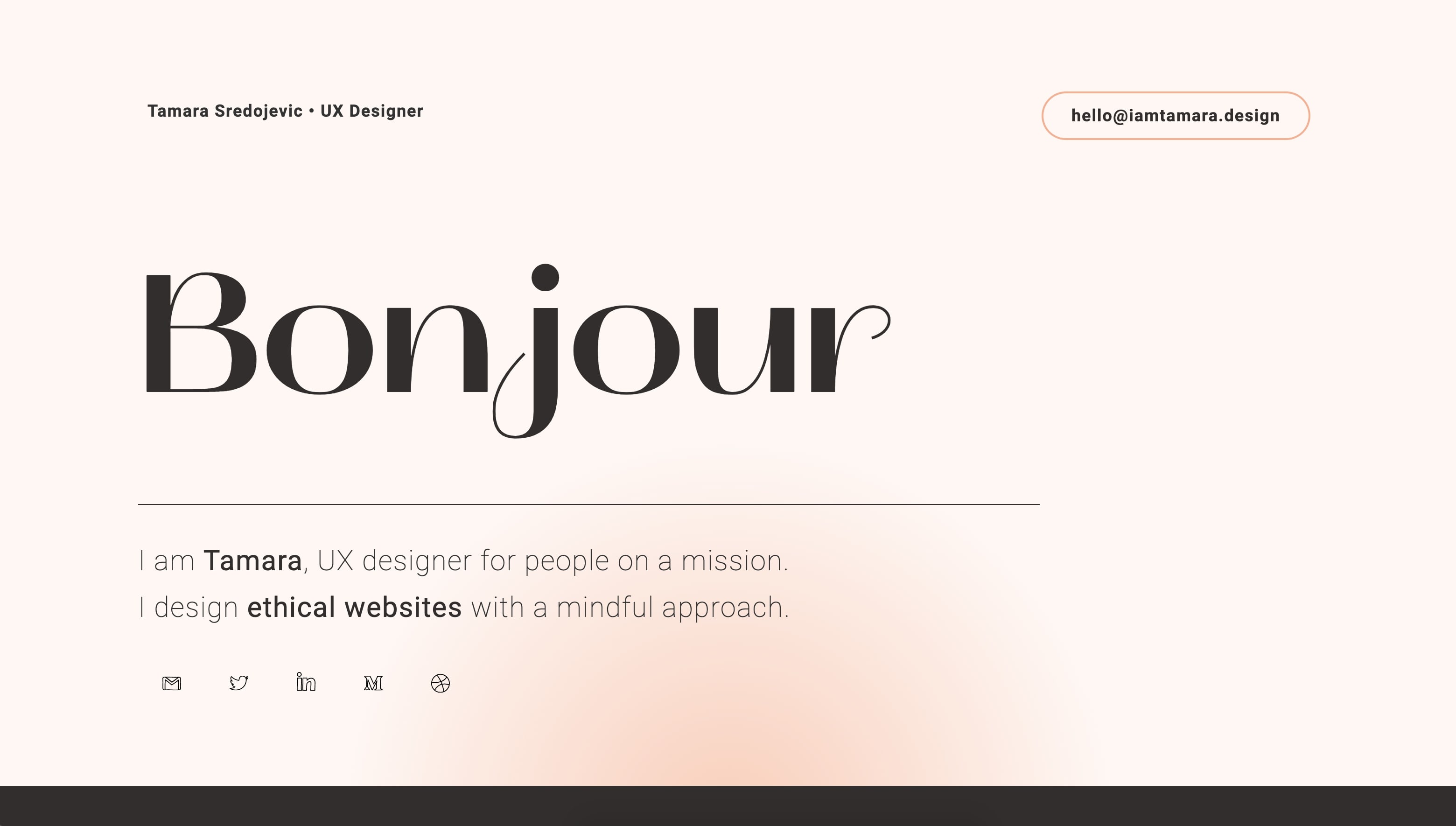
The UX portfolio I am Tamara takes this same approach in throwing a bit of gaussian blur into the background.
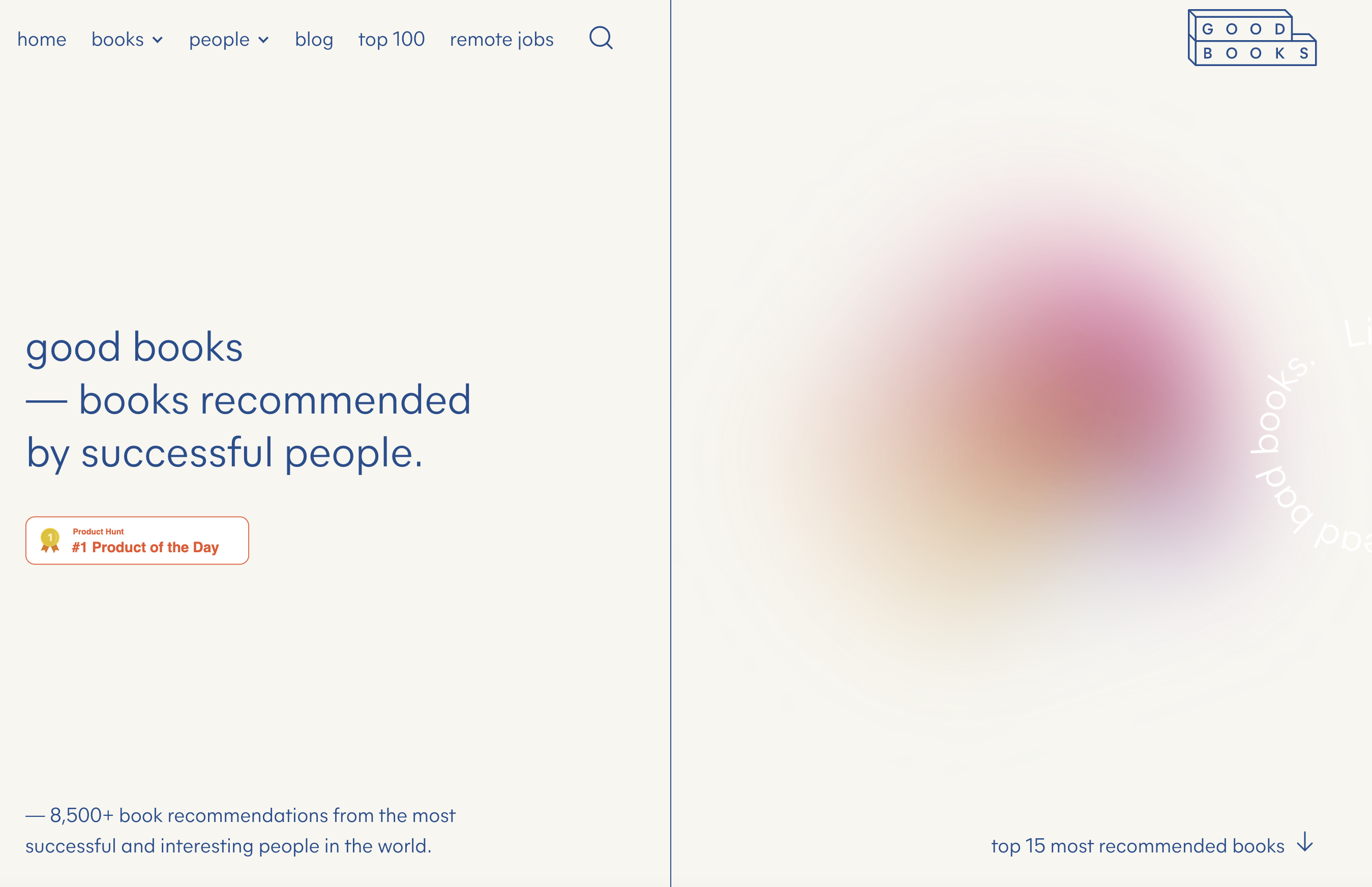
Goodbooks integrates a vapor-like bubble of a gaussian blur. The screengrab below doesn’t really do this justice, but it feels like something that’s hidden behind a white screen. We see the shape shift and revolve, but never see fully what it is. This makes for such a wonderful visual anchor and brings attention to the call to action below it to check out their top 12 recommended books.
We love seeing things that have been around forever, like gaussian blur, become more popular in the hands of designers who are using them in new and interesting ways.
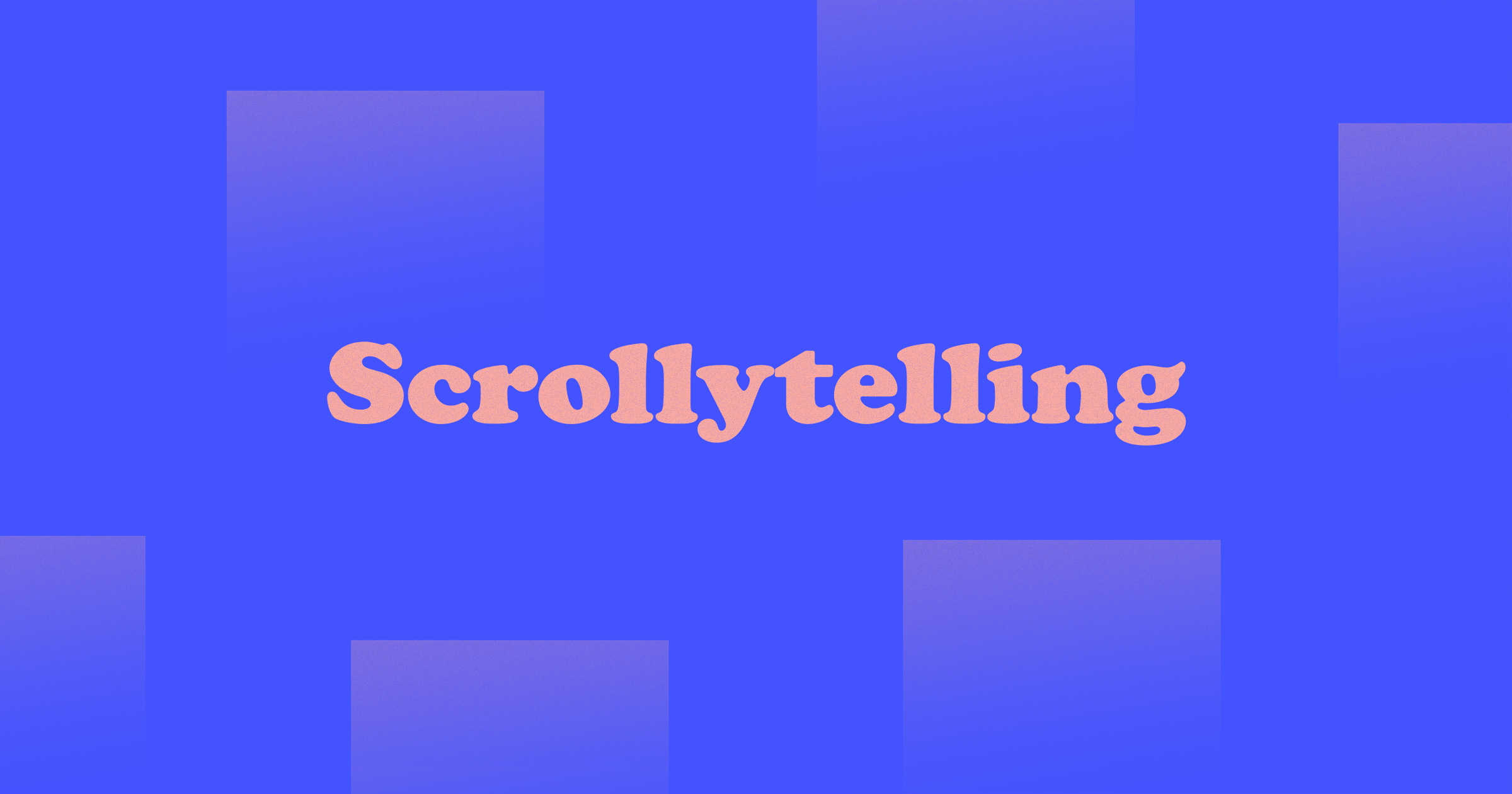
11. Scrollytelling
We've seen a growing trend in designers telling stories through web experiences. This is where scrollytelling comes in — visual storytelling that heightens story and hooks you into its narrative.
The best applications of scrollytelling practice restraint:
- Keep motion within a small area.
- Provide interactions on the user’s terms: provide obvious playback controls to play / pause / stop interactions and motions.
- Make sure that any scrollytelling elements help to emphasize the story, rather than distracting from important text.
Our own Web Design Art History site uses small, subtle animations and beautiful illustrations to support the story of how art history informs web design.
12. Dark mode
Cue up AC DC’s “Back in Black” because dark mode is hitting more screens in 2021. More designers are embracing the dark mode aesthetic, with black providing the perfect dark backdrop to make design elements pop from the screen.
In the example below, Obys Agency designed a beautiful tribute to fashion designer Peter Lindbergh, pairing a subtly textured black background with a beautiful serif typeface.
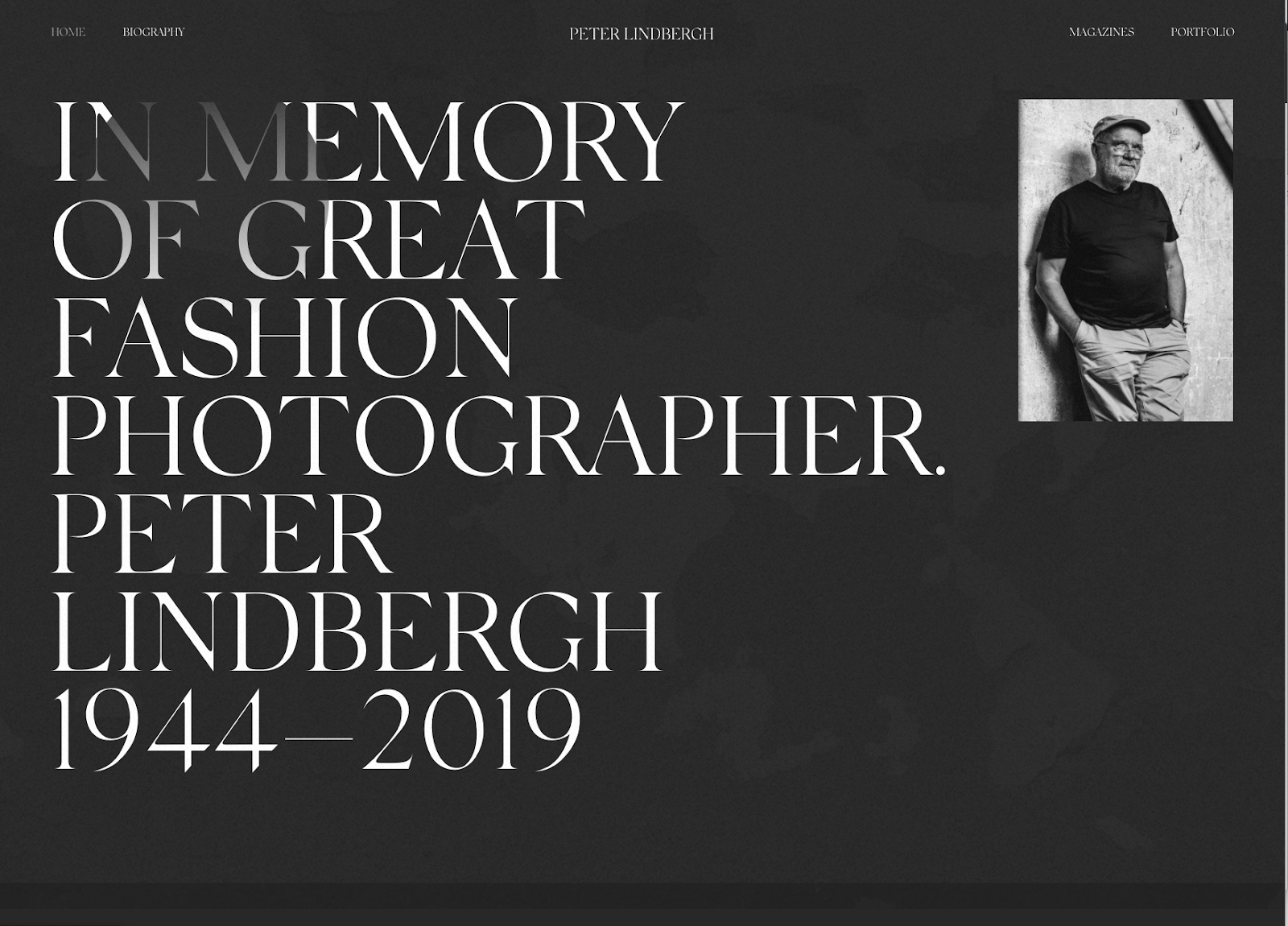
Don’t be afraid to go dark in 2021 with your own design work.
13. Cartoon illustrations
There was a time not that long ago when websites were just text and a few images or graphics. Web design has evolved, with designers now creating work that connects with people on a more personal level. Cartoon illustrations have gained popularity as a way of transforming websites with a healthy dash of humanity.
There are so many sources out there and artists crafting fantastic cartoon illustrations. Blush is a great platform to find custom character illustrations, like this great set from Vijay Verma.

Cartoon illustrations offer so much in terms of creativity and making a brand more personable. We’re looking forward to seeing a growing cast of characters throughout web designs in the coming year.
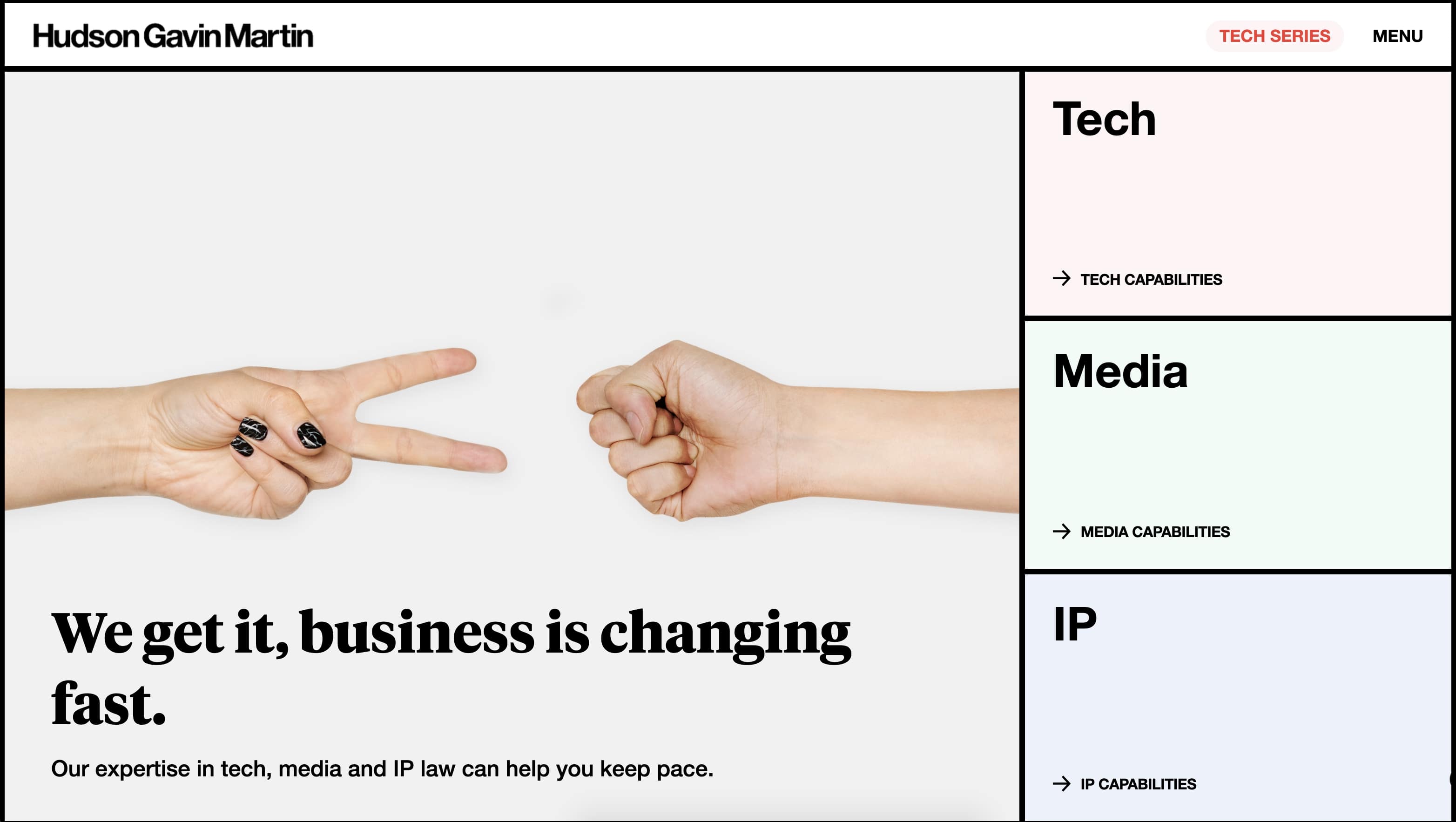
14. Geometric grids
Grids are simple but have a lot of flexibility in how they can be integrated into a design. Geometric grids are gaining traction as a way to structure a layout, with a clean and bold look.
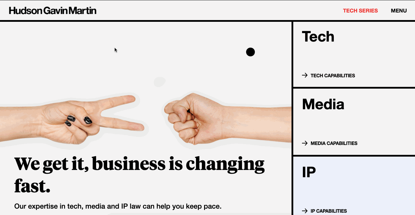
This design from Hudson Gavin and Martin uses blocks both for navigational elements and as well as for content. These big squares of color are fun to navigate through and work so well in keeping your attention.
Geometric grids don’t have to be in a uniform arrangement. Flowmingo uses a more asymmetrical geometric grid, but with squares and lines being the foundation of their layout. The thicker weighted lines emphasize the square shapes throughout.

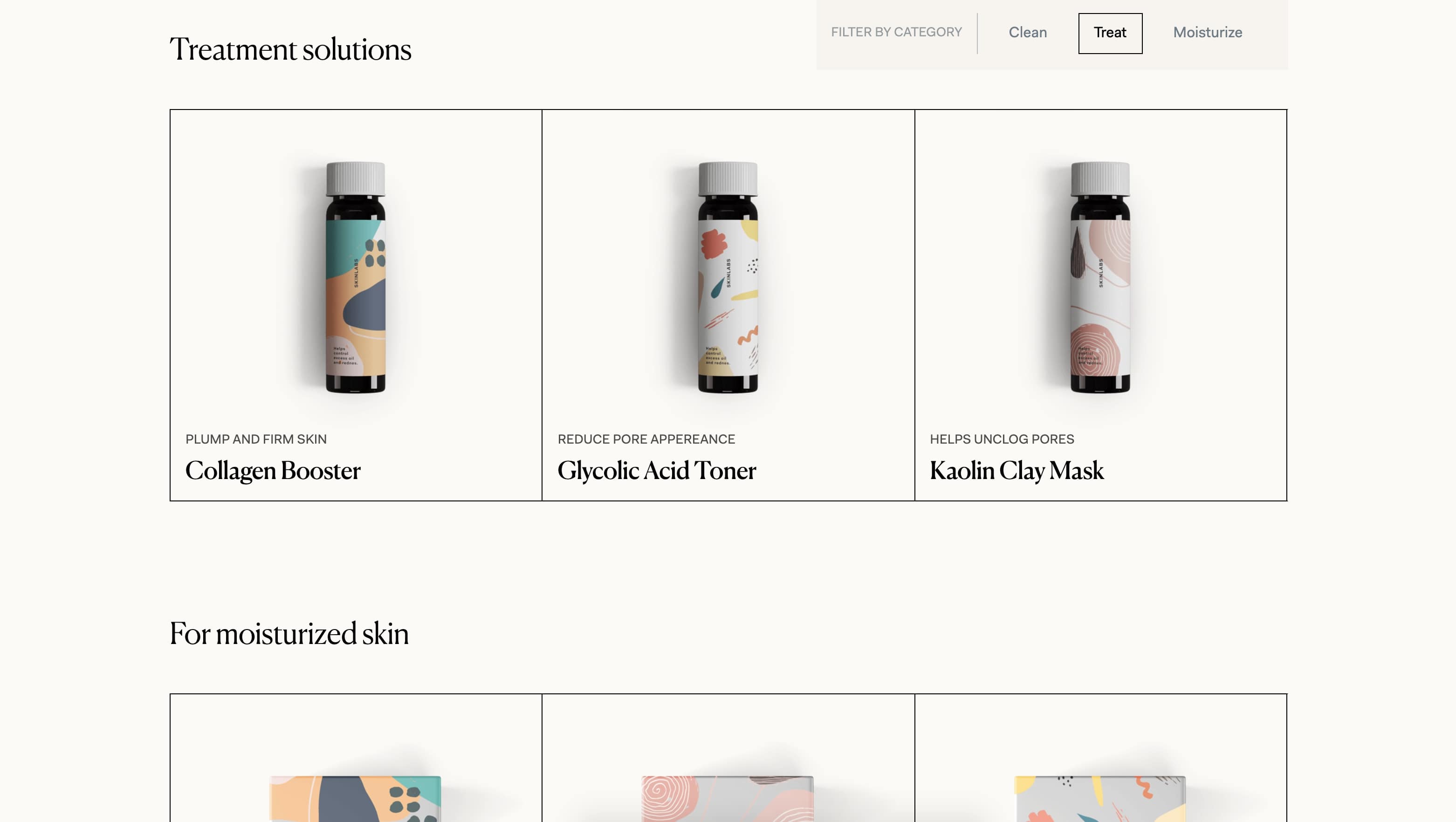
And for a bit of a lighter touch, we get a nice arrangement of squares and crisp lines in this geometric grid layout for the cosmetic company Skin Labs.
Lending a solid structure and straightforward presentation, geometric grids should be in the toolbox for any web designer.
15. Custom cursors
Cursors are probably one of the most overlooked aspects of web design, with most of us content with a plain old arrow. When a designer can take this insignificant part of a website and turn it into something cool, this is quite the achievement.
We just talked about HGM Legal and their use of geometric grids, but they also have this off-the-wall bold black cursor.
The Pen Tool takes their circular cursor one step further, with animation and text coming together for an almost psychedelic effect.
Or check out this morphing circular cursor from Büro, that changes its appearance depending on what design element it’s hovering over.
In 2021, we hope to see more original takes on just what a cursor can be.
16. Scrolling cards
We’ve been excited to see scrolling cards becoming integral parts of designs. Whether scrolling horizontally or vertically, they add snappy action to a website and are a great way to present information.
This website for Ofcina uses an eye-catching array of colors for their scrolling cards.
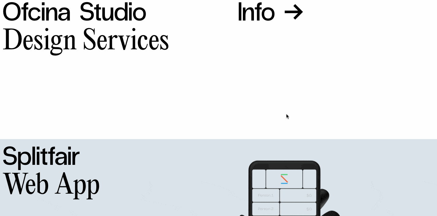
Card layouts have been around for quite a while and we enjoy seeing them being taken in new scrolling directions.
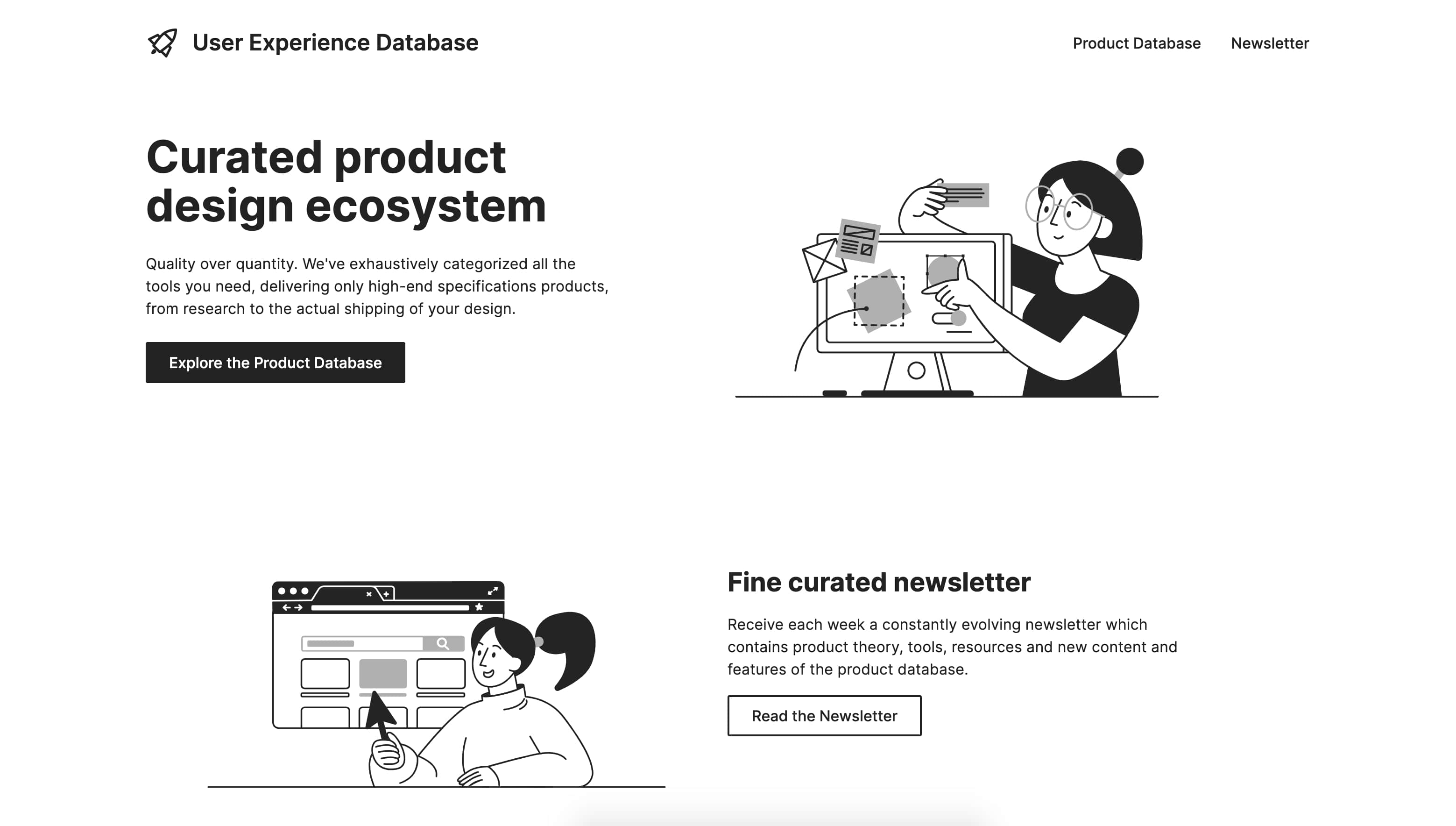
17. Color-less design
Sparse white makes for a clean design, and any elements that have color get even more attention.
This design for Latinxs Who Design has a lot of white space, with a hover effect that transforms the black and white image of each designer into full color.

Even something like a minimal plain design can still be an engaging experience with micro-interactions, animations, and other dynamic effects.
User Experience Database also takes a color-less design approach, making it minimal and easy to read.
18. Audio
Offering audio as an integral part of a design removes accessibility barriers for those with visual impairments, and also benefits those who prefer to listen to a large chunk of text on a website,
The New York Times does a fantastic job of providing accompanying audio to some of their featured articles.
We’re hoping to see more audio options on websites in the future, giving people a choice in how they want to experience content.
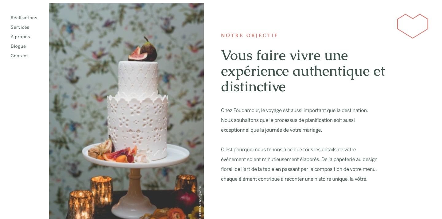
19. Web inspired by print
With digital technology replacing so much that were once physical objects, there has been a rebirth of old media. The popularity of vinyl albums is proof that people want to experience something that isn’t just a bunch of zeros and ones.
Layouts that get their inspiration from print fulfill people’s desire to connect with something in the real world. Magazine styled layouts and other elements of traditional graphic design provide a link to the tactile experience of print on paper.

The example above from Home Run Studio, and the one below for Foundamour, both take inspiration from print, giving them a familiarity and connection to publishing.
20. Design systems for consistency
Design systems are powerful. By using a CMS to create repeatable layouts and related collections, it’s easy to make updates or edits as well as to create duplicate websites fast. Whether they’re being used on a small scale, or for a bigger one, they’re useful for any organization in creating and managing their designs.
We’ve also seen seem really useful apps out there developed to make design system workflows even easier. Zeroheight acts as a centralized space to manage tasks and collaborate. Figma offers templates as well as other design systems tools. And Webflow’s CMS collection can power a design system no matter what the size.
21. No code
No code doesn’t mean the complete elimination of code. Programmers and developers will always be important. No code signifies opening up these areas of expertise to those who would otherwise be exempt. It lets anyone with an idea or vision to create.
Through no code, designers get to become front-end developers. Writers get to become web designers. And small business owners get to jump into the world of ecommerce. Whoever you are, no code empowers you to become something more. It removes the dividing lines between non-designers, those who only design, and those who are developers. It brings people together in collaboration.
It has been exciting to see the development of new no code platforms, and for design courses that include teachings about it in their curriculum. We can’t wait to see what happens with the no code movement in 2021.
We’re looking forward to 2021
It’s always exciting to see how web design continues to change, and the continuing momentum of the no code movement.
We also can’t wait to see what you're going to create in the new year. Post up your latest work in our showcase and don’t forget to join the supportive and growing community in our message forum.
Have a happy new year — keep on designing!
Note: Our original post included accessibility as a web design trend, but listing it as a trend undermines its importance. We sincerely apologize for and acknowledge the harm we caused by listing web accessibility as a trend like others in this list. Accessibility isn’t a fleeting design trend — it’s a standard our industry should be trending towards.
We also added some considerations and guidelines to keep in mind to use these trends without causing harm. We hope to continue educating and building accessibility awareness at Webflow, and hope to encourage our community of designers to do the same.


Build your online portfolio
Build and visually design a full portfolio website in just 21 days — with our free online course.

.jpeg)