Yeah, we know: It's almost May of 2019! We know you've already taken stock of the previous year and have jumped into new projects and other creative pursuits. We've also had time to reflect on the good things of 2018, with a huge part of that being the many fantastic designs shared in the Webflow showcase. It wasn't easy, but according to your likes, and our own discerning eyes, here are the 10 websites (in no particular order) by Webflow designers that rose to the top. Better late than never, right?
1. Humaaans
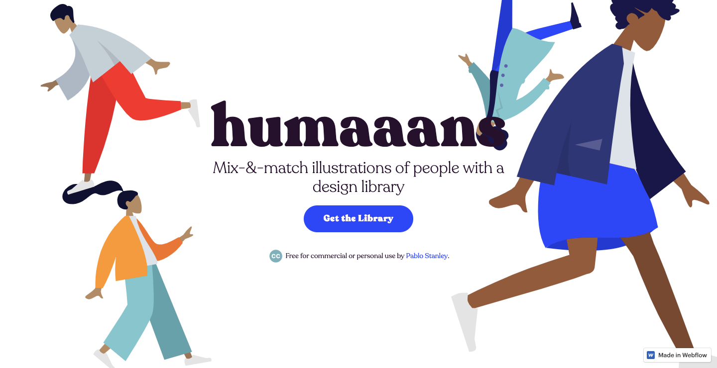
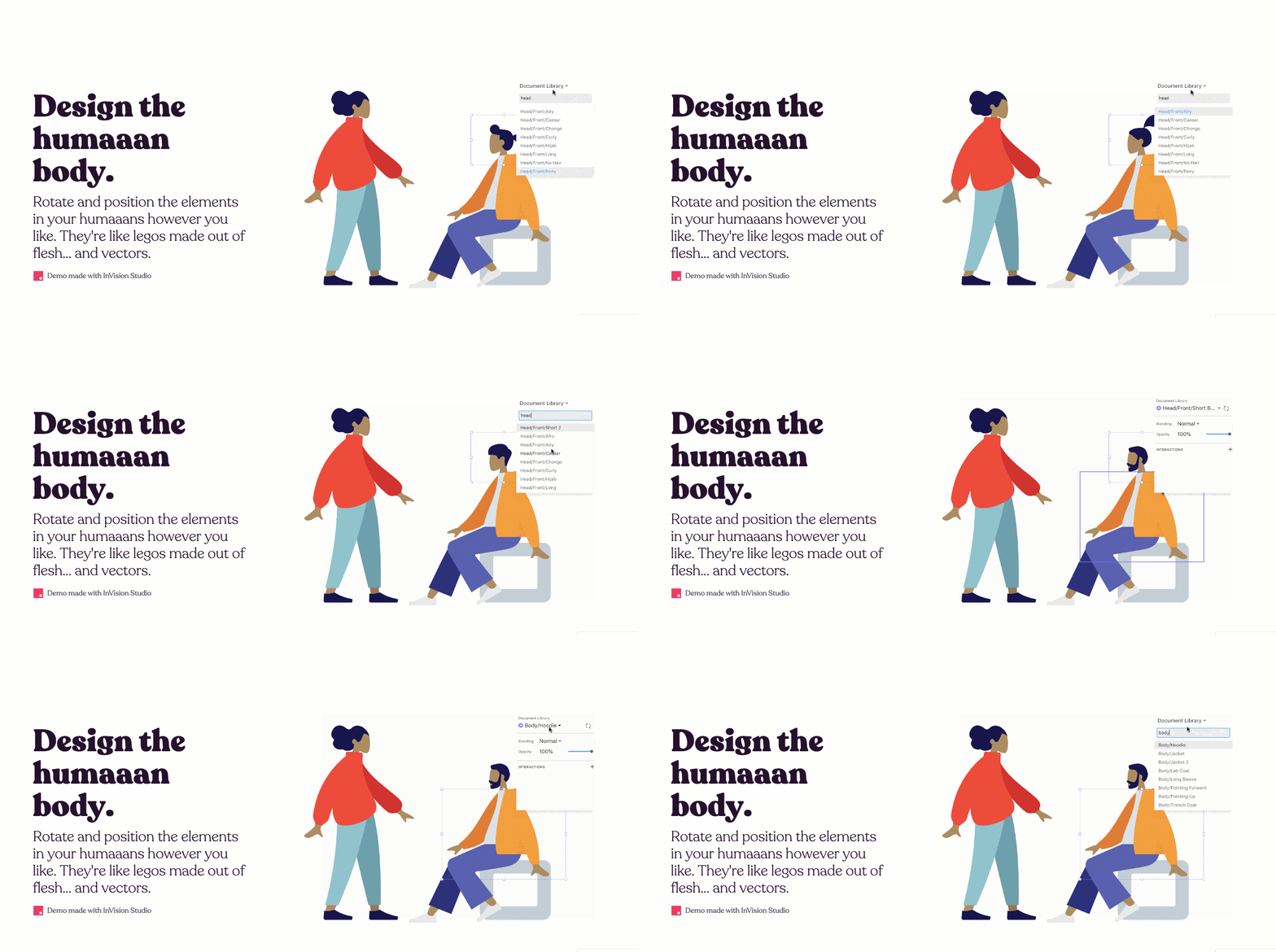
Humaaans offers a free library of vector-based graphics that lets you bring your designs to life with a diverse crowd of characters.
You can mix and match the hairdos, tops, and pants with different human forms, creating your own custom folks and scenes. Pablo Stanley's layout leaves enough space for these characters to breathe, along with splashes of pleasing colors and animations. Not only is the library free, but he’s also made the site itself available to clone.
2. OnCorps
Even a specialized, highly technical company can have an artistic site. OnCorps does data analysis to help businesses perform better. They look at numbers that affect the bottom line and suggest ways to improve.
JT Helms, founder of design agency Heco Partners, jumps outside the confines of stuffy design work that sometimes plagues companies specializing in something like data analysis. He delights visitors with a layout full of shapes, movement, and textures.
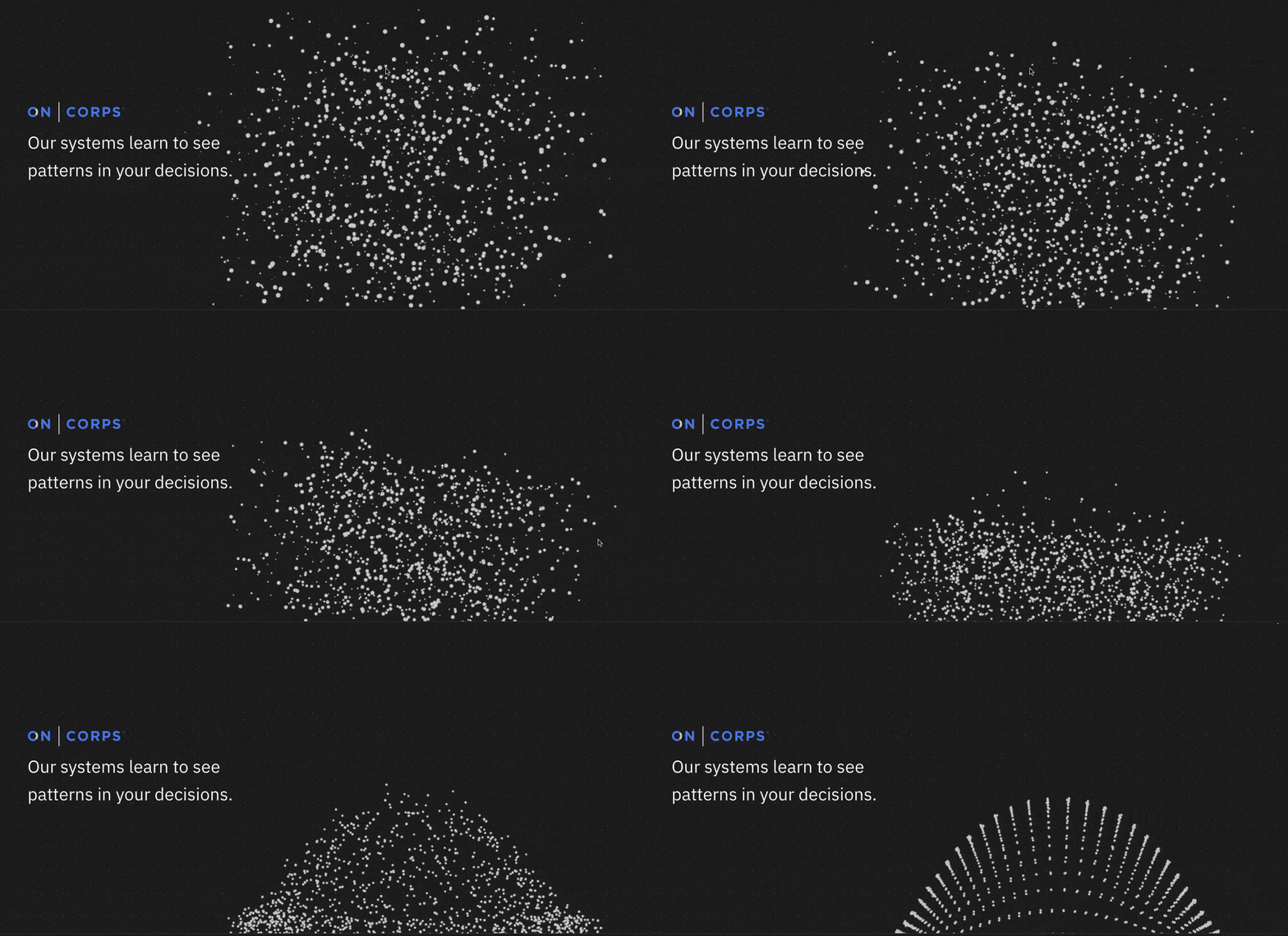
The landing page opens with a scattering of blinking stars floating in space, coming together to form a bell curve. This strong visual animates the way OnCorps analyzes data and finds patterns.
This site bursts with artistic embellishments and bright sparkles of inspired design. It strikes the right balance between creative and technical to communicate who they are.
Want to see how JT did it? Check out the design right inside Webflow.

3. Alice Lee’s portfolio
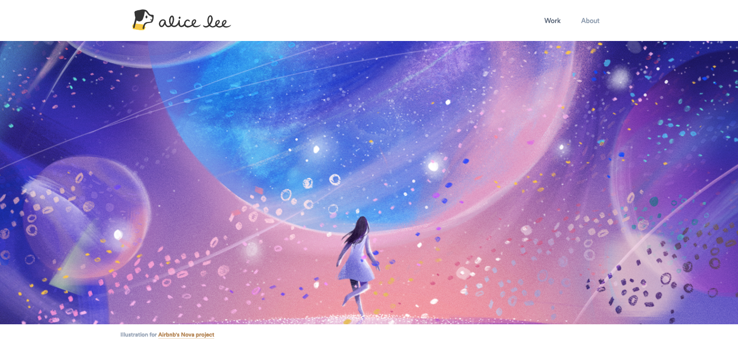
At the center of Alice Lee's portfolio, a lone figure stares out into a sky full of floating planets, stars, and shapes — an illustration she created for Airbnb's Nova project. It has a subtle parallax hover effect, but instead of a radical shift that splits the layers, it’s a slight poke at the swirling clouds of matter that make up this galaxy.
Alice says her work aims to “combine code and art in ways that bring the latter to life.” Often thought of as two independent, parallel pursuits, the merging of code and art in her portfolio shows her strengths in both.
She developed Slack’s visual brand identity and you’ve probably seen the influence of this across the web. She’s done a wonderful job of documenting her creative process in designing for Slack that’s an essential read for anyone in a creative field.
If you’ve found yourself inspired by this design (and we know you are), you’ll want to see how Alice created it in Webflow.
4. Digital Bake
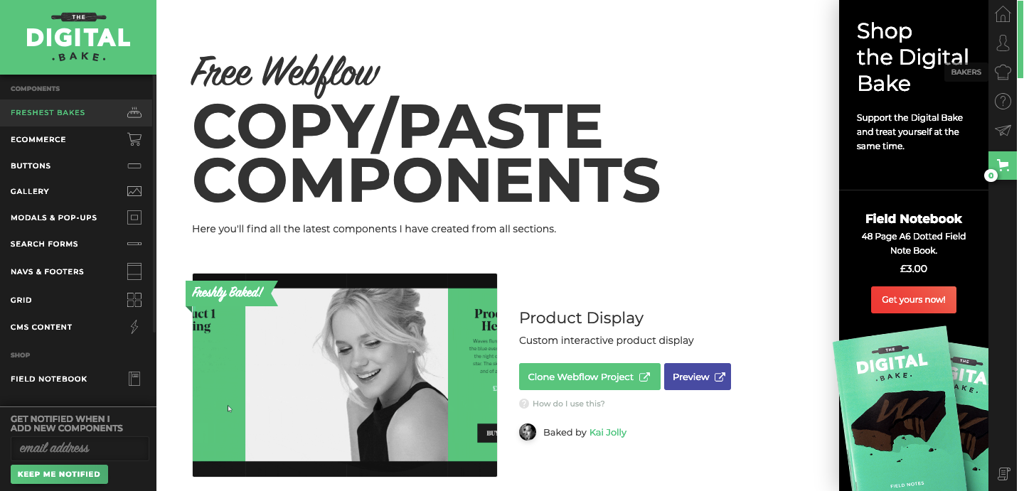
Digital Bake offers us Webflow-using designers an incredibly diverse and useful collection of elements ready to copy and paste into your own design. With choices like interactive product-display pages for ecommerce and blog post templates, there's a lot to choose from — all free!
Webflow designer Aaron Grieve created a well-ordered design that makes finding the component you need a simple process. Have a peek at how he created this smart, organized website for all of us.
5. Rok Bračko’s portfolio
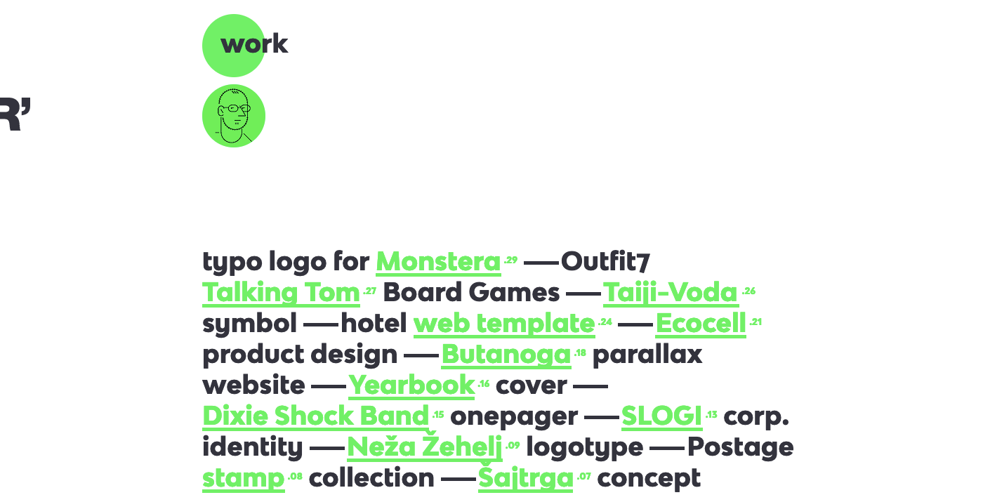
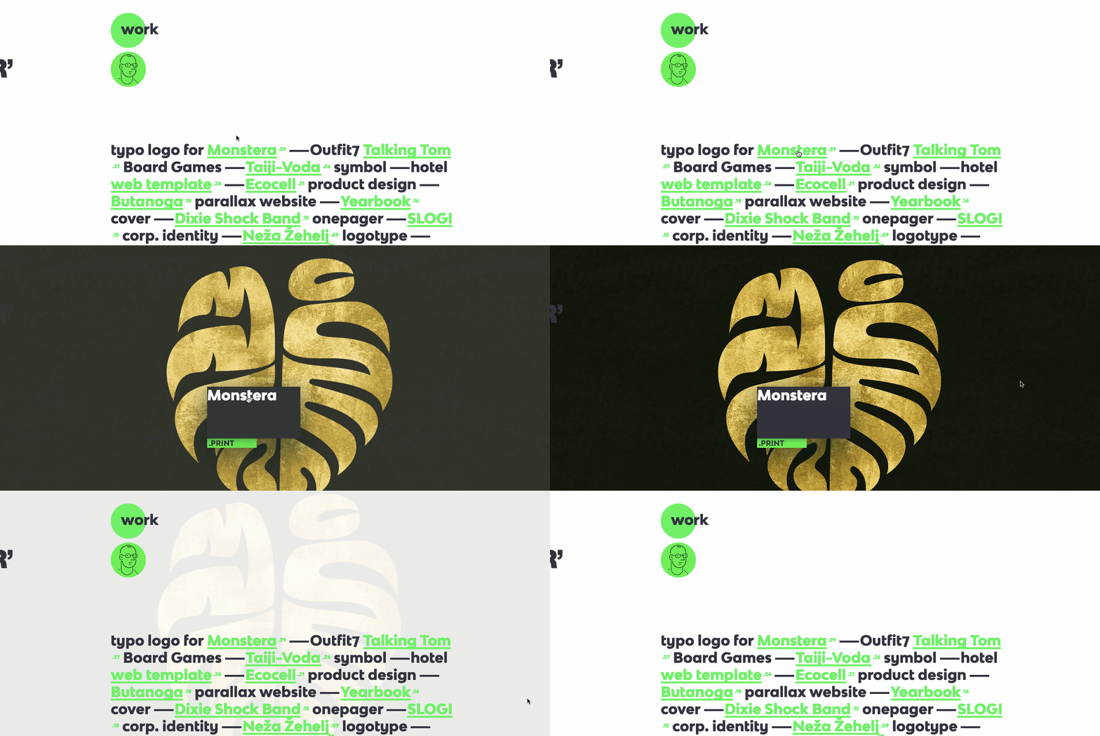
Rok Bračko’s portfolio might be unorthodox, but its weirdness isn’t a flaw — instead, it demonstrates Rok’s inventiveness and commitment to breaking design norms.
Each project expands into full display on hover. Creating a click-free way to see his work makes everything more immediate. There’s no wading through blocks of content or submenus — it’s all right there in front of you.
I had a bit of a problem at first with the top left menu — it requires a click to go further into the content. But it only took a second to figure out, which doesn’t detract from a design where almost everything can be accessed in an instant.
Take a look at the inner workings of Rok Bračko’s near-clickless design.


The modern web design process
Discover the processes and tools behind high-performing websites in this free ebook.
6. Latinxs Who Design

Latinxs Who Design stands out as another great entry to 2018’s best-of, and the second from Pablo Stanley. This page integrates a nice directory of CMS cards, each one featuring an individual designer. There’s a concise block of biographical info, as well as links to their Twitter and personal websites.
The black and white layout shows off an eye for simplicity and organization. A hover effect transforms each photo from grayscale to color, making it jump off the page. By keeping the rest of design simple, he lets the focus remain on what’s important — the designers.
To explore how Pablo integrated CMS cards and put together the rest of this design, head over to Webflow and have a peek.
7. Webflow showcase search
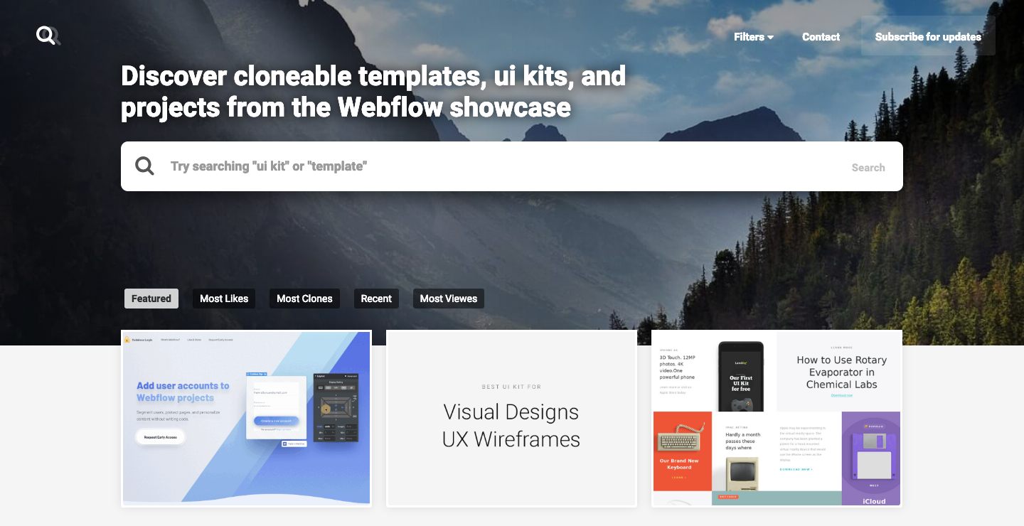
There’s many famous duos in history where one would be lost without the other. Think Batman and Robin, peanut butter and jelly, and now ... the Webflow showcase and Webflow showcase search.
Okay — the Webflow showcase search isn’t an official Webflow website, but we’re happy to have them on our side. They’ve created another way to navigate the fantastic work in our showcase, including search!
We love seeing the tools and resources people have created to help the Webflow community — the Webflow showcase search is another great addition. Thank you Duncan Hamra, we appreciate your hard work!
Take a look at how the Webflow showcase search was designed or clone it for your own use.
8. Okalpha

Animation studio Okalpha set out to create a design that feels, in their own words, "a little like Lego." With a strong color palette and bold type, every element has its place. And unlike the plastic building blocks they take their inspiration from, there isn't anything in the design to trip over and cause pain.
Though there’s plenty of straight lines and strong geometry, there’s also movement. Animations and interactions keep the design from being a rigid set of interlocked elements and give it a vibe that’s loose and fun to navigate.
Head over to its Webflow page to see how this Lego-inspired design was put together.

9. Torch AR
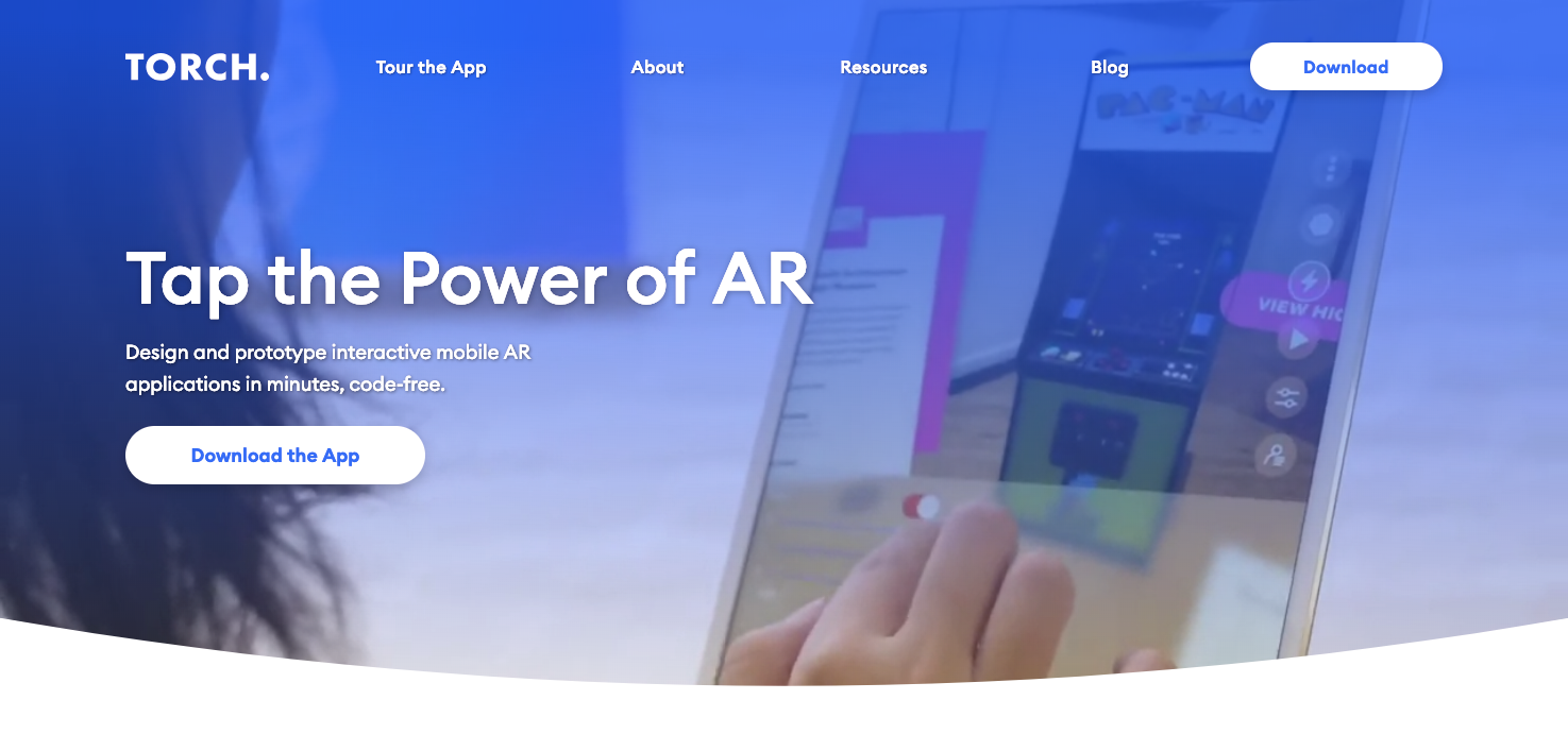
A design that relies on autoplaying videos can be difficult to pull off. But Torch AR wields video content for the greater good, with every clip being a relevant part of communicating how their code-free AR building app works. Each video clip shows their app in action and every design element has a purpose.
There’s also a great section that gives us a tour of their app with animated screenshots demonstrating its functionality. They kick things off by showing the design environment, which provides a great introduction to their intuitive interface.
The content hits you fast — for an app where efficiency is one of the key selling points, this reflects well on their brand. Webflow designer Tony Falco has been able to break down what could have been a complicated website into something simple, yet sophisticated.
To dig into this design, head over to Webflow.
10. Artefact
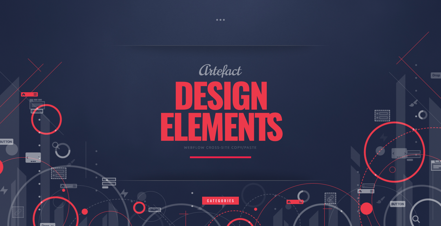
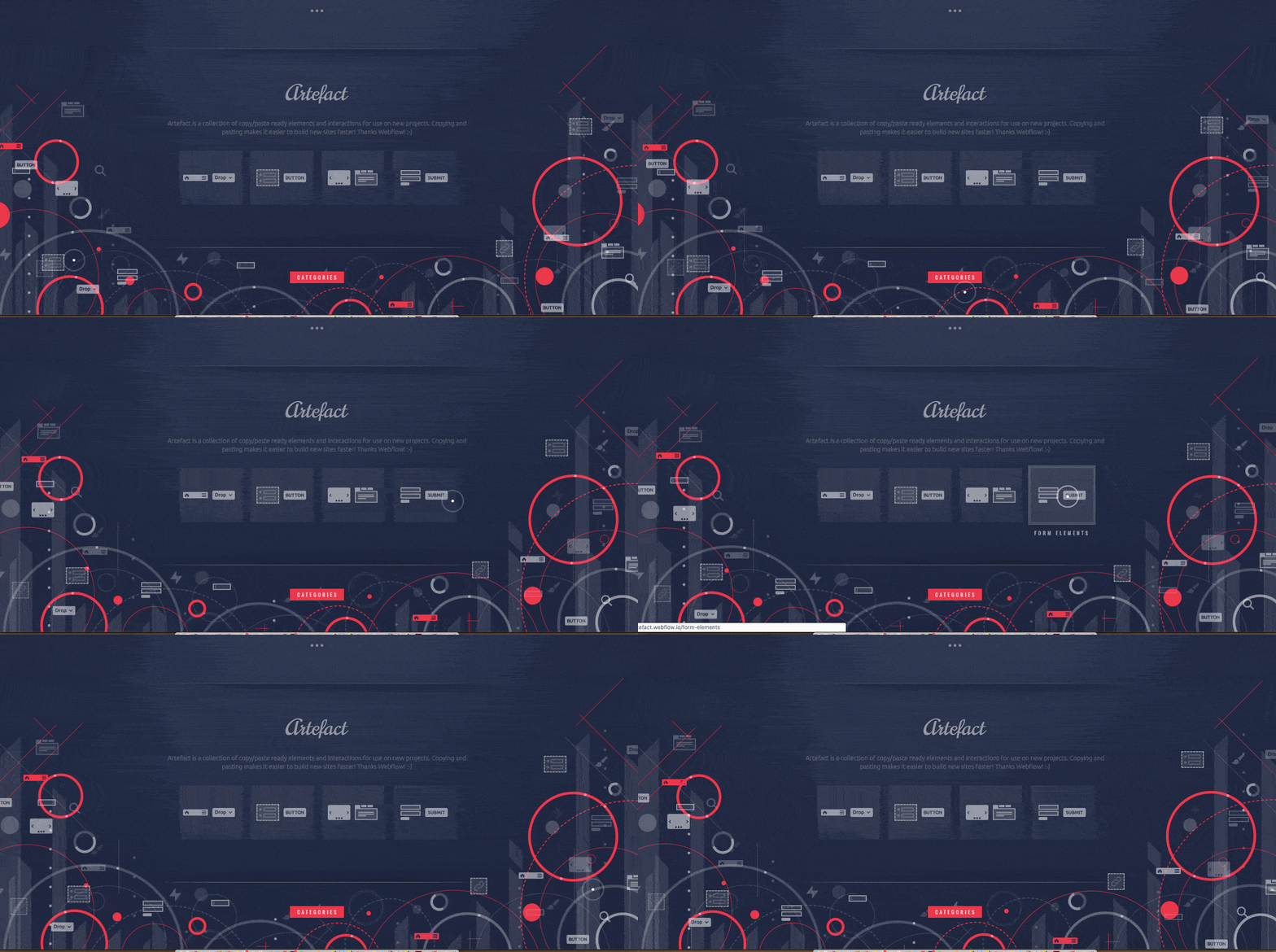
Artefact offers free Webflow components like nav, link, pane, and form elements that can be integrated into any Webflow design. They offer a handy library of resources in a layout with an abstract sensibility and dreamy animations.
Here’s to a great new year of design work
There it is: 2018’s top 10 websites from the Webflow showcase. Did we miss anything? Please share any Webflow designs that were your personal favorites of the year in the comments below — we’d love to know.
We’re excited to see what new creations will show up in our 2019 showcase, especially since we launched Webflow Ecommerce. Have fun designing!


