Interactions 2.0 is the culmination of months of research, user testing, design revisions, and engineering ingenuity. And while we’re already working on improvements and additional features, Interactions 2.0 already offers more than enough for you to build some truly innovative interactions and animations.
For more on what IX2 offers, check out:
- New course: Website Animations and Interactions
- Interactions 2.0 feature overview
- Interactions 2.0 launch page
Interactions 2.0’s features
Here’s what today’s release includes:
Timeline-driven animations
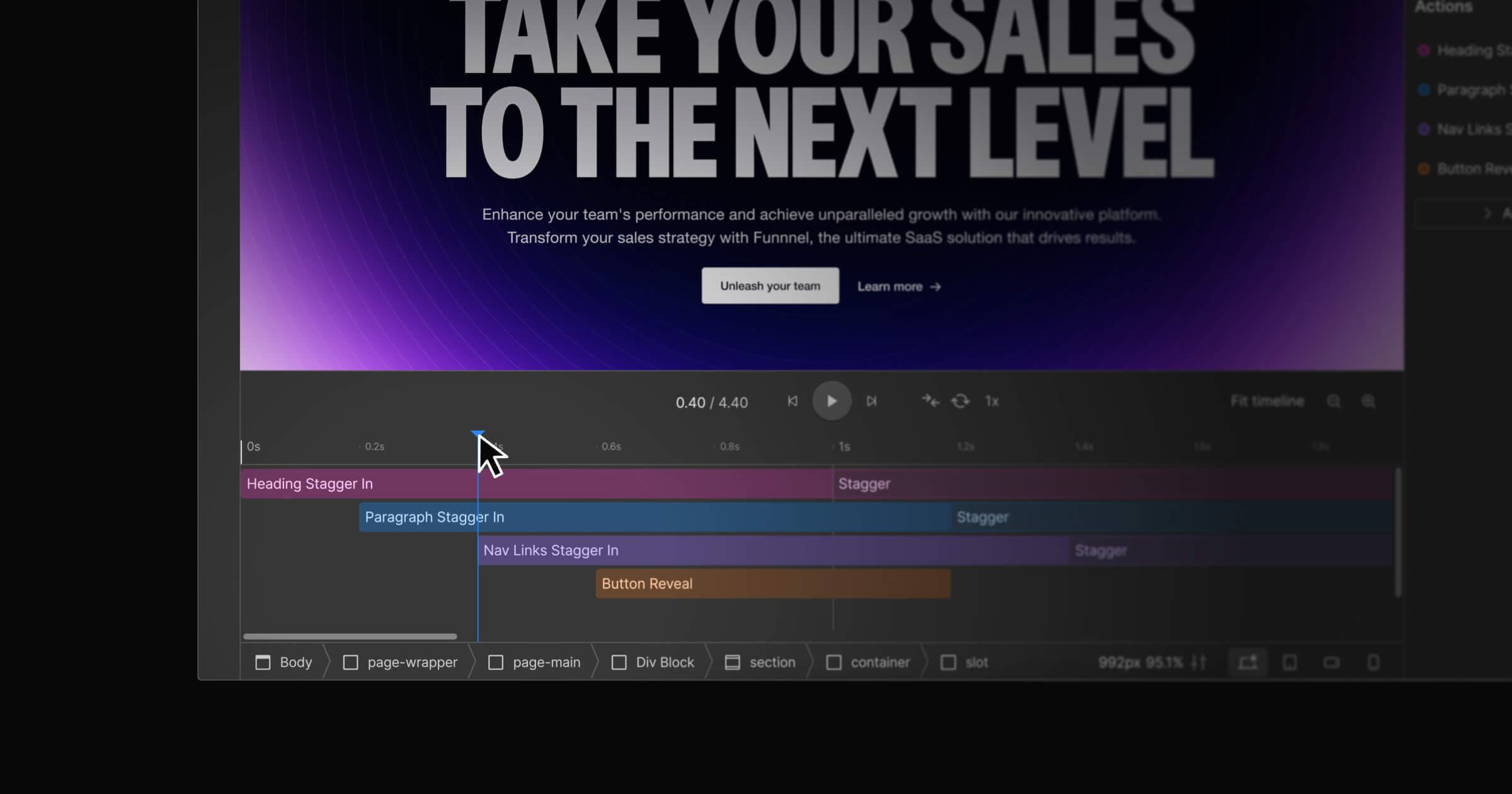
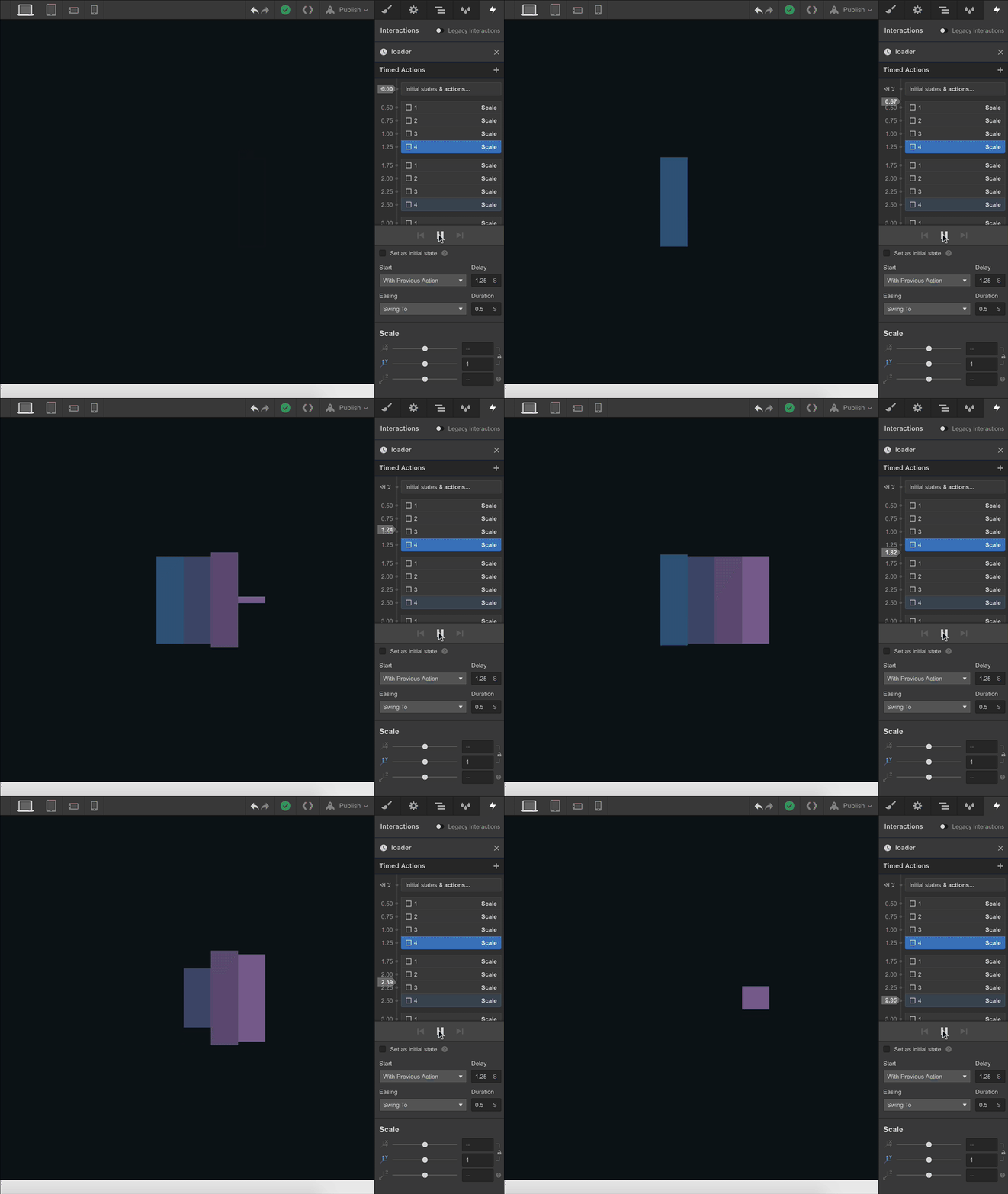
Building rich, sequenced animations is easier than ever with our new approach, which allows you to animate multiple elements on your site and manage it all in a single, unified timeline. Besides simplifying the initial build and iterations, the new timeline makes maintaining complex animations a lot faster and smoother. It also lets you preview your animation right there in the Interactions panel.
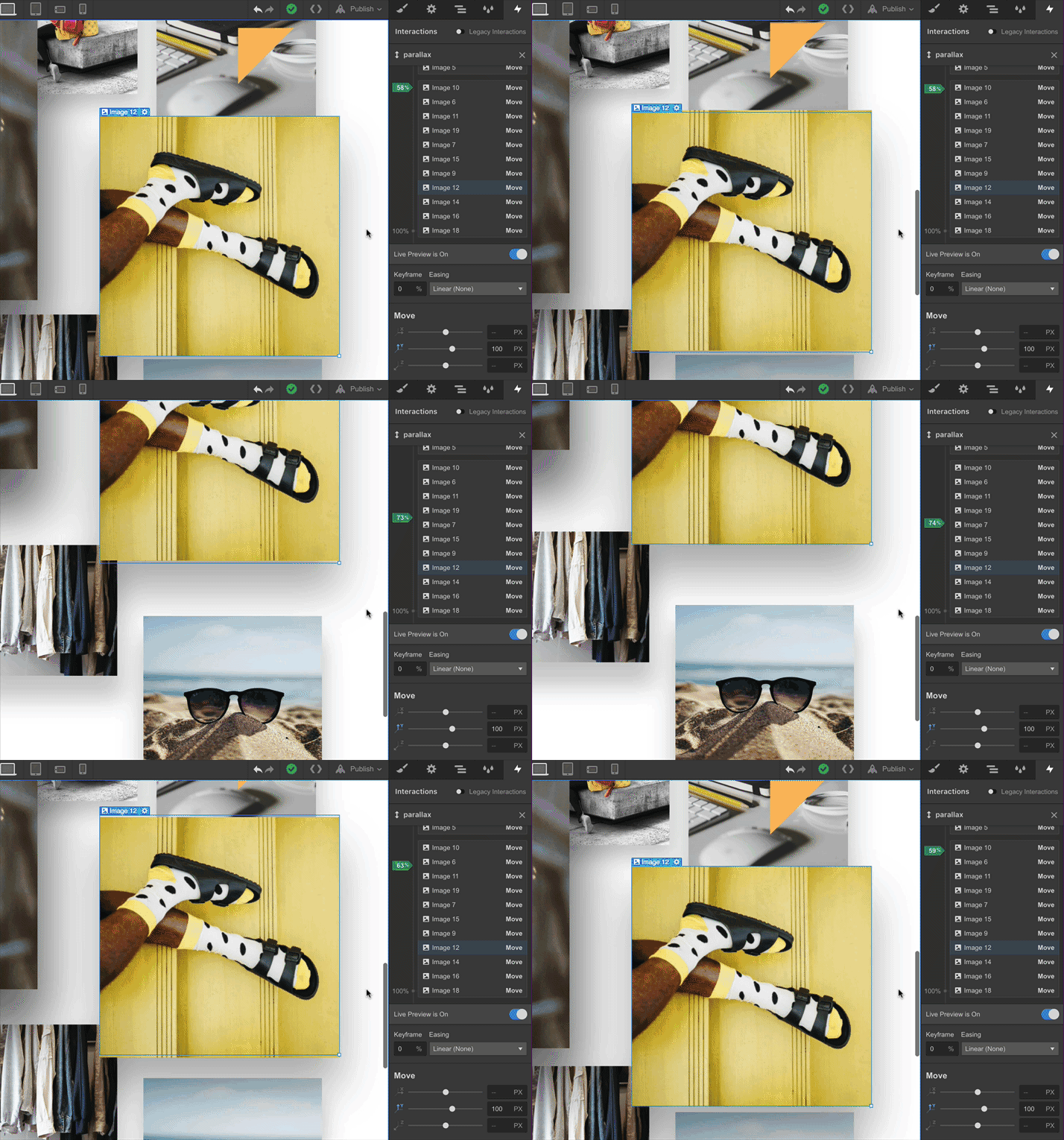
Scroll progress interactions
Tie animations and motion to scroll progress to create fluid, dynamic effects like parallax — and preview your live interactions as you design.
Mouse position interactions
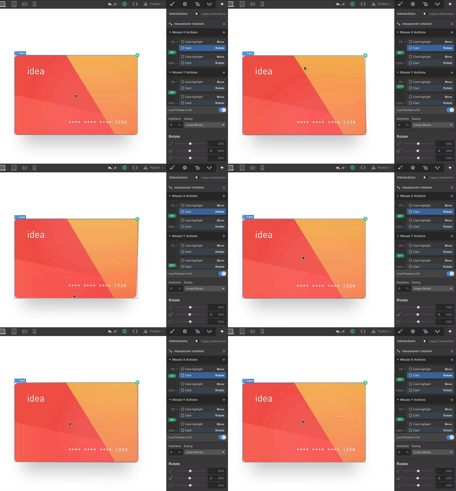
Link motion to cursor position along both the X and Y axes to bring a new level of interactivity to your sites.
Breakpoint-specific visibility
Now you can turn specific interactions and animations on and off at specific breakpoints to optimize your site for visitors on every device.
New styles to transform
Interactions 2.0 also introduces a new set of style properties to transform, including background color, border color, and text color.
How Interactions 2.0 affects existing interactions
Any site that has old interactions set up will always have access to the legacy interactions toggle, so you’ll never lose your existing work. In addition, unless there are conflicts between old and new interactions (multiple interactions affecting the same element), the two systems will peacefully coexist, meaning your sites can have a mix of both as you make the transition between systems.


Design interactions and animations without code
Build complex interactions and animations without even looking at code.
Ready to learn Interactions 2.0?
Our new Webflow University course will get you up to speed with Interactions 2.0 in about an hour. It walks you through several awesome animations and interactions, and offers tips on when and where to bring them into your site.

What’s next for Interactions 2.0
We’re already full steam ahead on building more features and refinements for IX2.0, including:
Adding interactions to Symbols, Collection Lists, and Collection Pages
In this initial release, you won’t be able to apply interactions and animations to Symbols, Collection Lists, or elements on a Collection Page — but this is first on our list of improvements.
Making it easier to reuse animations
We’re also working to make animations easier to reuse, so that when you add an animation to a class, every other element with that class will automatically get the same animation. In the meantime, you can use the legacy interactions panel for interactions you want to reuse across a large number of elements.
Performance improvements
We’ve already built in extensive performance optimizations to make your interactions clean and speedy — for example, applying the will-change property in your site’s source CSS — but we’ll continue to look for ways to optimize performance, especially on interaction-heavy sites.
Scroll offset controls
We’ll also be building in support for scroll offset controls, which will allow you to precisely define when your scroll-based interactions begin.
“Quick effects” library
Finally, we’re planning to build a library of “quick effects” — such as fade in and move up, fade out, emphasis, and other common animation patterns — to dramatically speed up your interaction design work.
We’re excited to see what you create! Be sure to share your creations on Twitter using the hashtag #WebflowIX2.


