


Since the introduction of the original spec for CSS grid in 2012 — and in the last year as grid has reached widespread browser support — designers and developers have been reimagining what we can build for the web. Today, we’re bringing the power of this layout system to Webflow, so you can help drive that frontier forward.
What is CSS grid?
There’s been a lot of talk about CSS grid over the past year and half or so, but many of you may still be wondering, “What the heck is grid?”
In short, it’s an entirely new layout system, similar in some ways to flexbox but offering much more control over both the horizontal and vertical aspects of your layout.
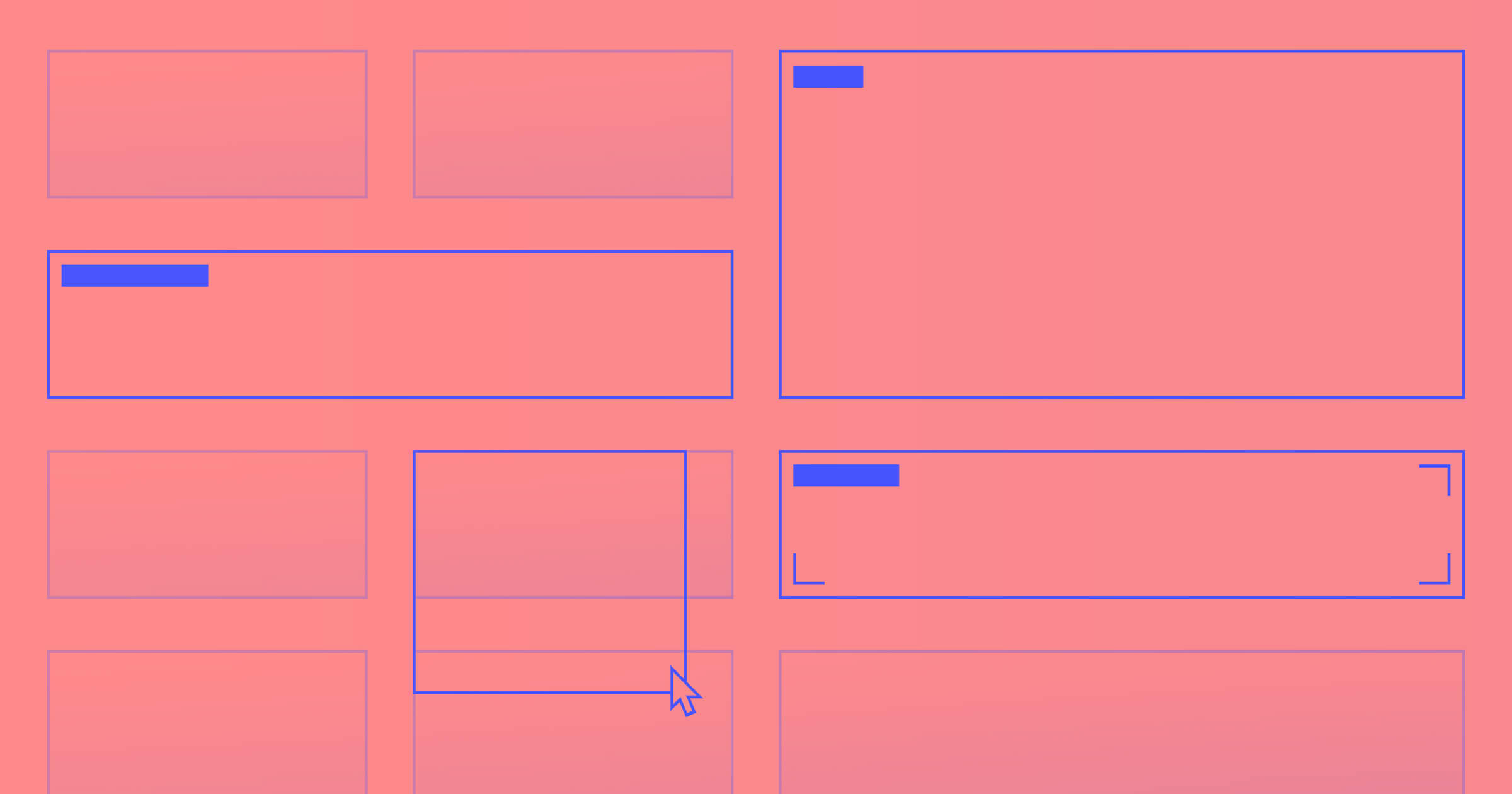
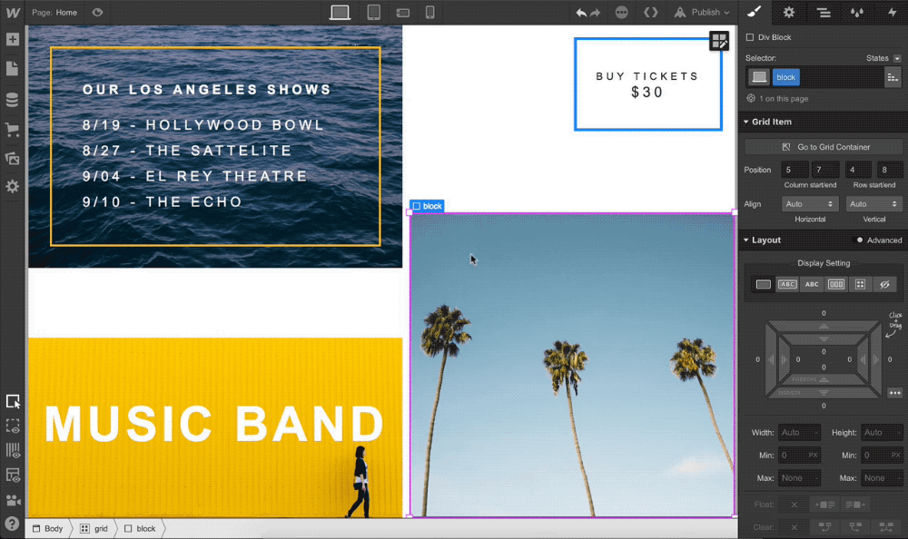
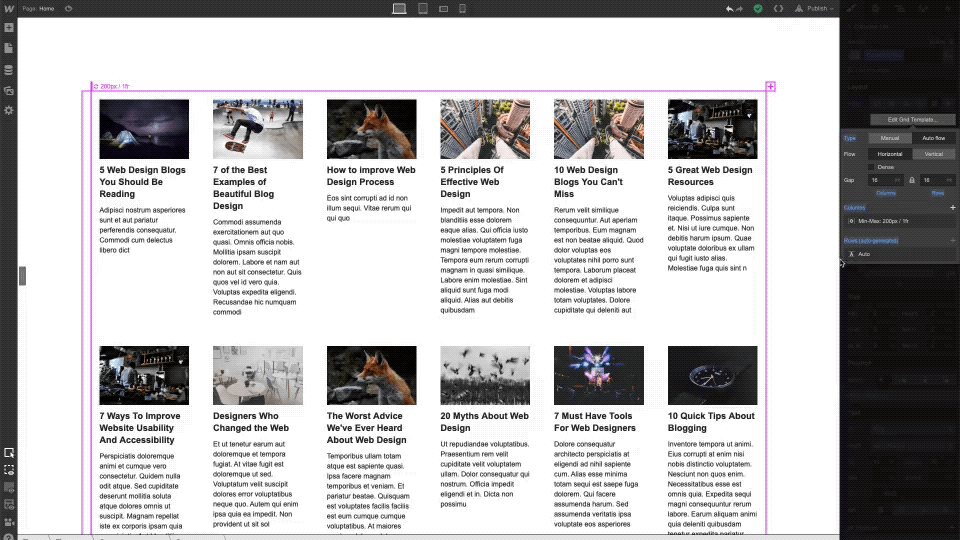
Grid layout in Webflow borrows directly from CSS grid, introducing a brand-new system for arranging design elements within a page, and it comes with a whole new set of on-canvas controls that truly set it apart from Webflow’s existing layout options.
The result is an easier, faster, more intuitive way to build layouts — without sacrificing code quality.
If you want to take a close look at how grid works in Webflow, check out this demo from last month’s sneak peek workshop.
Grid vs. flexbox: what’s the deal?
First, grid is not meant to replace flexbox — as you’ll learn, the two systems can work quite nicely together.
Instead, the core benefit of building CSS grid layouts is that you can create positioning rules along two dimensions (horizontal and vertical) as opposed to the one dimension you can control in flexbox (horizontal or vertical).

The flexibility of grid layout
The two-dimensionality of CSS grid allows you to build complex, responsive layouts faster, because you’ll be able to reposition and resize items anywhere within the grid you define, instead of needing to nest div after div after div to achieve the same effect.
Grid layout across breakpoints
This flexibility in positioning also pays huge dividends when it comes to designing across breakpoints, as you can completely redesign your layouts without changing the actual order/markup of the elements.
Resources for the technically inclined
For a deeper dive into the nitty-gritty of the CSS grid spec (read: code), we recommend checking out Jen Simmons’ YouTube channel, specifically the Basics of CSS Grid and Flexbox vs. Grid. Or if you want to learn more about the history behind this new system, check out The Story of CSS Grid, from Its Creators on A List Apart.


Design interactions and animations without code
Build complex interactions and animations without even looking at code.
How to learn grid in Webflow
OK, we know that’s a lot to take in. Deep breaths on three: one, two, three … Ok, feel better?
Good. We got you. Here’s where you can go if you want to learn how to build with this new grid layout system in Webflow.
New course on Webflow University
Our new Webflow University course introduces you to the basic concepts of grid and helps you understand some of the new terms and units unique to CSS grid. But what you see now is only the start: we’ll be releasing eight example layout rebuild videos in the next few weeks, so keep an eye out for those.
Cloneable grid layouts
In addition to the course on Webflow University, we’ve built out four cloneable layouts that showcase some of the unique advantages that grid offers.
Feel free to clone these to reverse engineer how they’re built, reuse pieces, or get some inspiration.
Grid playground
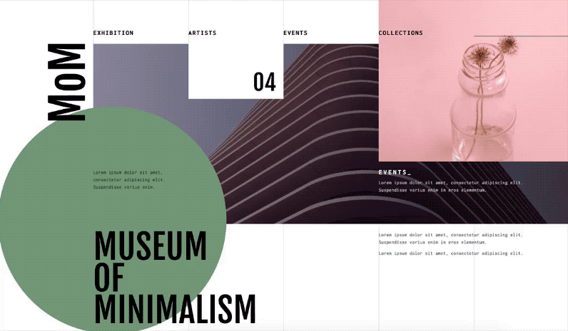
Curious about grid but don't know where to start? Head over to our grid playground for a fun, interactive way to experience the power of grid. Here, you'll be challenged to recreate four iconic grid-based designs in Webflow. Because every good playground comes with fun — and games — right?

A bit of backstory: when we researched famous grid-based designs to recreate, we found a number of examples by women in design who have pioneered the use of grid within the industry.
As a female product manager in Silicon Valley, seeing their work and recreating it in the product we built was inspiring. Paula Scher, Susan Kare, Muriel Cooper, and Elaine Lustig Cohen each used grids as the foundation of some of their most famous works, and it’s an honor to celebrate them in our feature.
What’s next for grid in Webflow
While today’s release brings much of the CSS grid spec under your control in Webflow, we have a lot more planned. Here’s what’s still coming down the pipeline for grid.
Even more power from CSS grid
In the next few releases, we’ll be adding additional features like auto-placement, autofit, dense, and the repeat notation. These advanced features will make it even easier for you to create responsive designs that work almost like magic.
Support for grid on Collection lists
Because the number of items in a Collection list is dynamic, laying these items out as you might arrange a set of static elements … simply doesn’t work. For this reason, grid is not yet available as a display mode for Collection lists.
That said, we’re working on adding this support in, using the auto-placement algorithm in CSS grid, which automatically places grid children in successive grid cells and adds rows as needed to keep content flowing within the page.
More on-canvas grid controls
In addition to the on-canvas controls we’ve introduced for adding rows and columns, and resizing and repositioning grid children, we’ll soon release drag handles for resizing rows, columns, and gaps right on the canvas (for now, you can control these in the style panel on the right of the Designer).
Define your own grid areas
Grid areas allows you to create a visualization of your layout without having to add any content. This will make it much easier to create reusable grid layouts that can be made responsive without having to fuss with the position of each grid child.
Get involved
What are you looking forward to building? Let us know in the comment, and share your creations on Twitter with the hashtag #WebflowGrid. We can’t wait to see what you create!