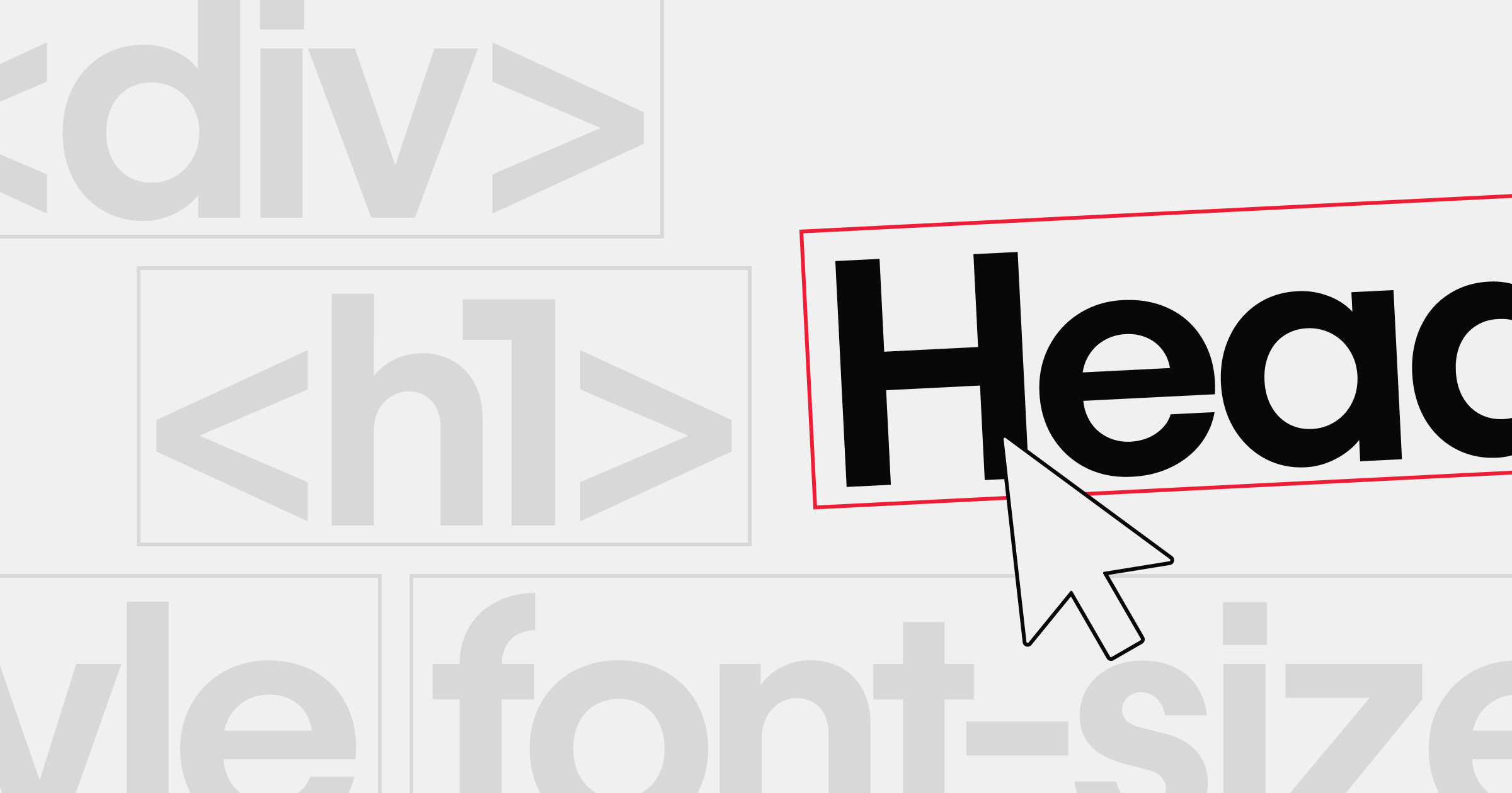


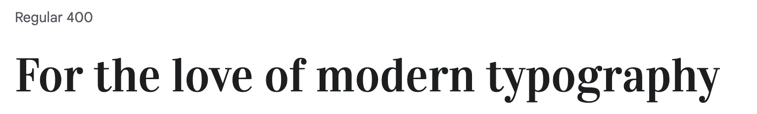
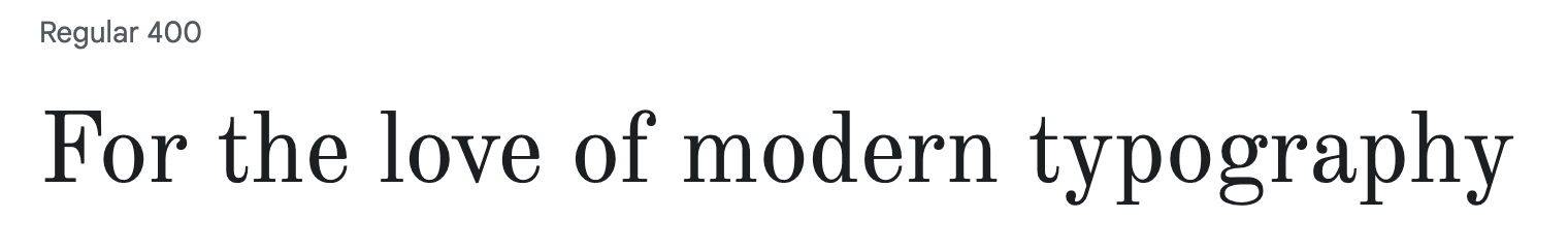
Contemporary fonts combine elegance and legibility.
There's a vast selection of modern fonts today that have resulted from many font iterations throughout history. Some use decorative embellishments — serifs — that evoke a classical appeal. Others prioritize legibility with plain, unadorned lines — sans serif.
Despite their unique distinctions, various font styles often pair well together, and selecting the best styles can make all the difference in your modern web designs. Read on to learn how to use these styles in your website, and 14 modern fonts to elevate your design.
A brief history of modern fonts
As the act of writing has changed, so, too, has typography. From the illuminated manuscripts of the 12th–17th centuries to the modern fonts you see in print and online, numerous small changes have made text more appealing and readable in its published medium.
Serif fonts, those with small embellishments on each letter, were the reigning norm for much of history. They included ligatures and slanted letters to emulate the handwritten styles that were popular before Gutenberg’s printing press arrived in the mid-15th century. Gutenberg’s original typeface was called Blackletter, but it quickly gave way to an Italian Humanist style that introduced italics.
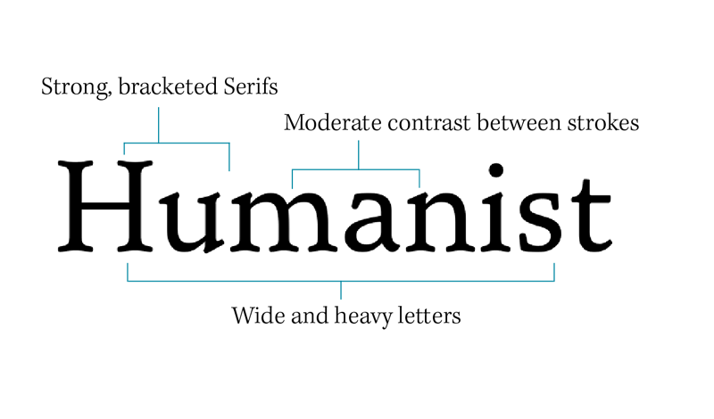
Humanist styles were popular until transitional fonts like Times New Roman, New York, and Cambria appeared in the mid-18th century. These fonts were still serif typefaces, but their embellishments were more angular, their letters more vertically aligned, and their strokes more variable.
These fonts represent the moment of transition from the slanted, handwritten styles of the past to a vertical form that uses contrasting stroke weights. This period is also when ligatures that connect letters disappeared.
Tips for choosing a modern font
When you're selecting a modern font, it's important to consider your brand's style, the message you want to convey, and overall readability. A well-chosen font can elevate your design's aesthetics without sacrificing clarity.
Here are a few typography tips: make sure your headline fonts stand out with unique details, and keep your body text simple and legible. This balance lets you pair different fonts cohesively, resulting in engaging and visually harmonious web pages.

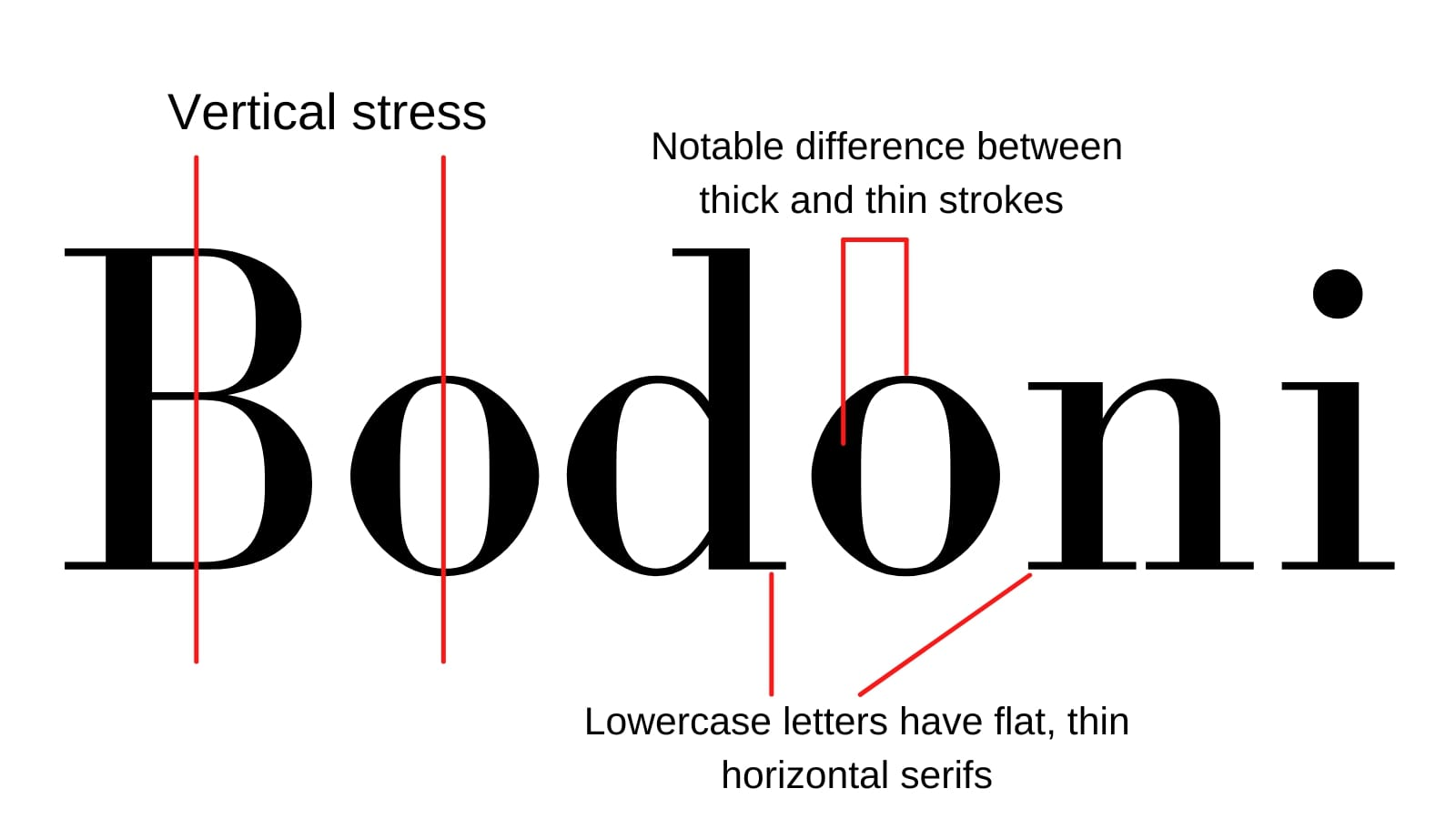
Just as transitional fonts evolved from humanist fonts, modern fonts further drove the popularity of simpler serifs, vertical alignment, and contrasting stroke weights. Bodoni Moda is a popular modern font demonstrating these developments.
Some modern fonts, such as Arial and Helvetica, remove serifs entirely, which is why they’re called “sans serif” fonts. These typefaces work well in minimalist designs that seek to remove extraneous details and unnecessary embellishments. They’re also considered more legible for visually impaired readers.
How to use modern fonts
Adjusting weight and style for headlines
Modern fonts work well on printed and online pages, as long as you’re thoughtful about which fonts you use where. The variable stroke weights and playful details of a serif typeface look best in headings and titles, where their unique decorations don’t detract from legibility. In body text, however, it’s best to use sans serif modern fonts that prioritize legibility over style.
Pairing a serif and a sans serif
Finding the right serif and sans serif font pairings can enhance your designs’ readability and aesthetic appeal.
Use font pairing tools and experiment with different pairings to find combinations that complement each other.


Ultimate web design
From 101 to advanced, learn how to build sites in Webflow with over 100 lessons — including the basics of HTML and CSS.
14 modern font choices for contemporary web design
Here are 14 modern typefaces that are excellent font choices for web designs.
1. Bodoni Moda

Giambattista Bondoni was a famous typographer whose work gained popularity in the late 18th century, right around when transitional typefaces became the norm. In fact, many cite his work as the link between transitional and modern typography.
The Bodoni Moda font is a modernization of his work, featuring ball-end serifs and many thin strokes. It’s a great font choice for titles and headings if you like a subtle nod to the past.
Pairing suggestions: Bodoni Moda's high-contrast style pairs well with a minimalist sans serif like Proxima Nova for body copy.
Where to find it: You can get Bodoni Moda for free on Google Fonts.
2. Abril Fatface

Abril Fatface blends broad and thin strokes with unique serifs, like the lowercase “g,” creating modern letterforms. The hooks and curves that lead to ball-end and bracketed serifs, seen in letters like “p” and “h,” fuse traditional and contemporary styles into a unified typography.
This font works exceptionally well in bold headlines and titles, such as those that appear on posters and advertisements. It has a classic appeal with mostly thick lines that are easy to print. But the few thin strokes it uses run the risk of getting lost on the page, so avoid using it as body text.
Pairing suggestions: Abril Fatface works best with a lightweight sans serif like Lufga to keep headlines bold and body text legible.
Where to find it: You can get Abril Fatface on Google Fonts.
3. Prata
Prata features many sharp triangles and less contrast between stroke weights, which makes it suitable for print or digital media. The serifs are played down to suit minimalists who don’t want to remove embellishments from their text altogether. That said, it’s still best to use this typeface for headlines and titles and pair it with a sans serif for a more legible body text.
Pairing suggestions: Prata's delicate serif details are balanced by a clean sans serif, such as Canela, for a polished look.
Where to find it: You can get Prata on Google Fonts.
4. Kepler
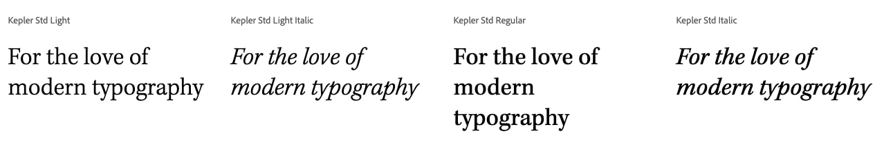
Kepler takes Prata's minimalist design choices a step further. It features very little difference in stroke weights and further simplifies the serifs to create a typeface that only uses a touch of decoration. It’s also available in a wide variety of styles, so designers have all the options they need to emphasize or vary text.
Pairing suggestions: Because Kepler is so versatile, try pairing it with a geometric sans serif like Proxima Nova for contrast.
Where to find it: Kepler is available through Adobe Fonts.
5. Cantata One
Cantata One uses thick lines and consistent stroke weights to create a serif typeface that works well in print or digital media. The serifs are symmetrical, and there are few thin lines like the one in the lowercase “y.” You can get away with using this serif font as body text because it remains legible on a page or computer screen.
Pairing suggestions: Cantata One's thick strokes work well alongside a thinner sans serif like Lufga to keep your layouts balanced.
Where to find it: You can get Cantata One on Google Fonts.
6. Vidaloka
The main feature that sets Vidaloka apart from other modern fonts is its minimal kerning, which refers to the spacing between letters. Letters are closely crowded together so that you can fit more in a line. This makes it an excellent fit for long headlines but not for body text, where a little more padding between letters helps with legibility.
Pairing suggestions: Vidaloka's closely spaced letters make a statement in headlines, so pair it with a more open sans serif like Amasis.
Where to find it: Vidaloka is available on Google Fonts.
7. Old Standard TT
Despite its name, Old Standard TT is a modern font with a touch of contemporary appeal. The triangular serifs, selective brackets, and ball-end decorations are a nice throwback to humanist fonts. The relatively consistent stroke weights, generous kerning, and simplistic letterforms still work well in headlines or body text.
Pairing suggestions: Old Standard TT offers a timeless vibe; combine it with a modern sans serif like Lufga for a balanced reading experience.
Where to find it: You can get Old Standard TT on Google Fonts.
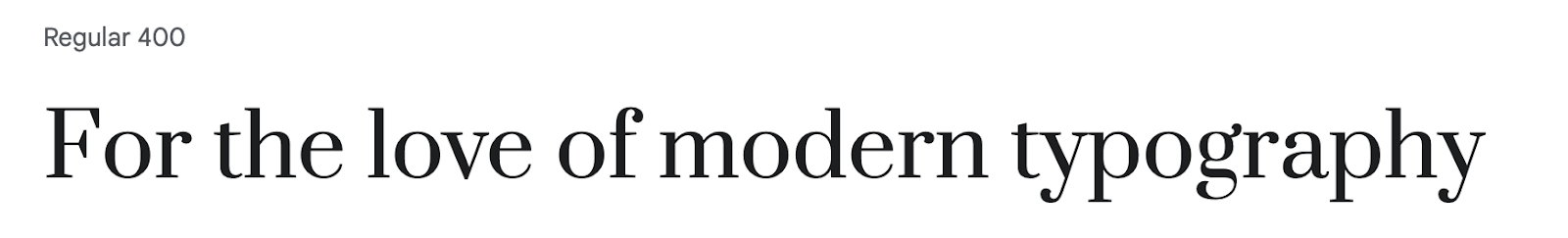
8. Ratio Modern
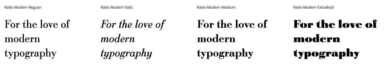
The key benefit of Ratio Modern is its versatility. It’s available in several styles, from a regular, modern font for websites to a slab serif font perfect for bold, printed headlines. It pairs well with a sans serif body text that lacks thin strokes, which make a typeface challenging to read at smaller sizes.
Pairing suggestions: Ratio Modern's subtle slab serif option complements clean sans serifs like Proxima Nova for an engaging layout.
Where to find it: Ratio Modern can be found on various font repositories, like MyFonts.
9. ITC Lubalin Graph
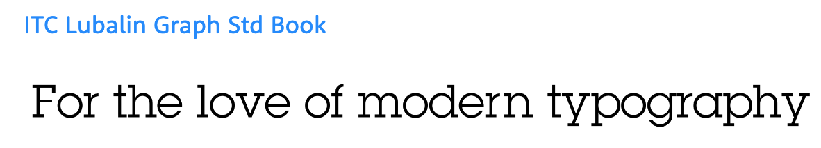
ITC Lubalin Graph draws much inspiration from the Gothic font family, including a complete lack of kerning. This makes it a poor choice for body text, where all the letters can easily run together, but an excellent option for headlines and titles, where space is at a premium.
The modern letterforms include just a hint of serifs to keep them classy, but the geometric shapes of the lowercase “g” and “e” are an indicator of a modern, minimalist design.
Pairing suggestions: ITC Lubalin Graph's geometric shapes pair nicely with a classic serif like Bodoni Moda for striking contrast.
Where to find it: You can purchase ITC Lubalin Graph from platforms like Adobe Fonts or MyFonts.
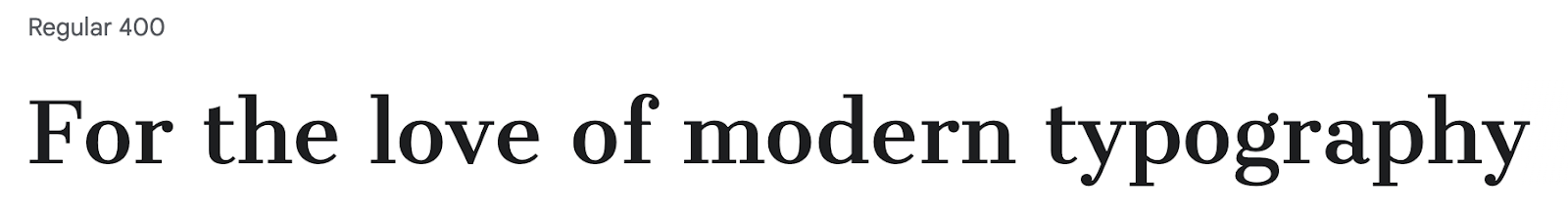
10. Bodoni Egyptian

Bodoni Egyptian is a great option for pairing with other fonts on this list if you prefer serifs in your body text. Its consistent stroke weight and light curvature create a font that’s as useful for classic literature as it is for futuristic designs. This font is legible even at smaller font sizes and includes enough geometric shapes to remain visually digestible without being boring.
Pairing suggestions: Bodoni Egyptian brings a consistent stroke weight that's perfect alongside condensed sans serifs like Abril Fatface for an eye-catching design.
Where to find it: Bodoni Egyptian is available from commercial font libraries such as MyFonts.
11. Amasis
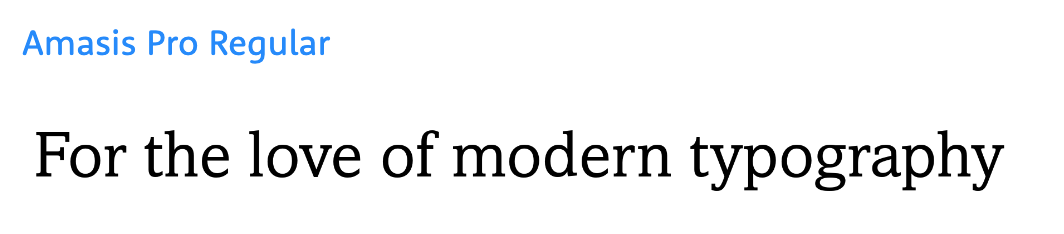
Amasis is a very legible modern font that keeps its decorations to a minimum and its stroke weights consistent. This combination makes it perfect for minimalist body text, especially when paired with a slab serif font for headlines and titles. That mix maintains the legibility of consistent line weights and the delicate adornment of small serifs.
Pairing suggestions: Amasis's simplicity is well-suited to classic serif fonts like Old Standard TT for a harmonious yet readable layout.
Where to find it: You can get Amasis through several font retailers, including Adobe Fonts.
12. Canela

Canela uses varying stroke weights, but they’re never illegibly thin. With subtle serifs, this font conveys a classic, transitional look, but the vertical alignment and clean geometry place it firmly in the modern font category. It’s a great choice for body text since it prints well.
Pairing suggestions: Canela's subtle serifs make it a great heading font alongside Proxima Nova or Lufga in body text for modern contrast.
Where to find it: Canela is available from Commercial Type and other font marketplaces.
13. Proxima Nova

Proxima Nova is a sans serif geometric font, which means it relies on only the simplest geometric shapes to create letterforms. For example, the lowercase “e” looks like an interrupted circle. The stroke width is uniform, and the bottom tail perfectly lines up with the right side. This simplicity makes Proxima Nova a favored sans serif typeface among minimalists who aim for a stripped-down, uncomplicated look.
Pairing suggestions: Proxima Nova's clean geometry complements ornate serif fonts like Bodoni Egyptian or Prata to highlight their decorative details.
Where to find it: Proxima Nova can be purchased from Mark Simonson Studio and Adobe Fonts.
14. Lufga

Lufga is an unusual font that’s almost entirely without serifs save for one exception. The only letter that includes a small serif is the lowercase “g,” while the rest of the letterforms use no serifs and have simple geometry. It makes a great choice for minimalist designs since the entire typeface maintains consistent stroke weights without any distracting variations.
Pairing suggestions: Lufga's minimal shapes pair seamlessly with bolder serifs like Abril Fatface for a contemporary, striking visual.
Where to find it: Lufga is available through independent type foundries and font marketplaces.
Additional modern font resources
If you're looking to learn more, check out Webflow University for in-depth lessons on typography. You can also explore free libraries like Google Fonts or consider premium alternatives from foundries like Adobe Fonts.
Improve your modern web designs with Webflow
Modern fonts can add a touch of class to any minimalist design system, by infusing appeal and accessibility in your website. Best of all, many of these fonts are freely available in online libraries or font generator tools.
Webflow allows you to upload custom fonts so you can meet every client’s unique website needs. With variable fonts and reusable components, Webflow enables you to experiment with custom styles and quickly apply and revert changes across a site.
Build websites that get results.
Build visually, publish instantly, and scale safely and quickly — without writing a line of code. All with Webflow's website experience platform.