.jpeg)


The worst fonts for web design aren’t necessarily designed poorly.
Many look great and are ones we constantly encounter. But their popularity is also their undoing. When we see the same fonts over and over, we become numb to them, driving us to be far less engaged with the content before us.
Context is also key. A playful font will look out of place in a design that requires a sense of professionalism. An all too serious font, on the other hand, will bring down a website whose tone is more playful.
And of course, some fonts just don’t read well on a screen.
Before we get started, let’s talk about the qualities that qualify a font as good for web design.
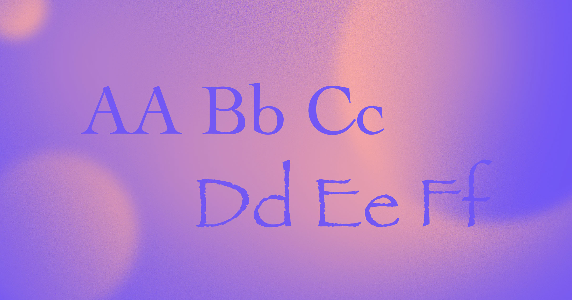
Legibility
Legibility is a subjective term that comes down to how easy it is to differentiate one letterform from the next. Less legible fonts tend to have letters that are too similar to one another, as well as ones where there isn’t clear delineation between lowercase and uppercase letters. When text isn’t in a legible font, it’s harder to read. This makes for a worse — and more importantly, less accessible — user experience.
Other factors that can determine legibility include:
- Stroke weight: Both heavy fonts and ones that are too thin can be tough to read. Fonts that fall somewhere in the middle tend to be most legible.
- Stroke contrast: The ratio between the number of thick strokes to thin strokes, which can be problematic when it’s too high. With a jumble of different-sized strokes, words look chaotic and are frustrating to read.
- Counter: The negative space found in a letterform, which can impede legibility if it’s too small. With a lack of negative space, letters such as ‘e’ or ‘o’ get squished and are hard to tell apart from one another.
- Font personality: Decorative and quirky fonts may only be suitable as display fonts, and while those that are muted and more reserved may work great in body text, they may also be boring or uninteresting at larger scales.
Readability
Legibility and readability are two different characteristics of type. A font’s legibility comes from how it was designed. The readability of a font is almost entirely in the hands of designers, with styling choices like color, sizing, and spacing all contributing to how they’re perceived.
Fonts that you should avoid in web design
The most overused fonts
Impact
Released in 1965, Impact had a crispness that translated well to metal type. It took hold in the digital age in the mid-1990s, starting with Windows 98, and Microsoft pushed its adoption in their efforts to standardize web type.
Impact has clean letterforms that make it easy to scan through. The problem is that it’s too common and can be seen everywhere — from that note on the office refrigerator to clipart and memes. Given its over-saturation, Impact can often look clumsy and over-simple.
Helvetica
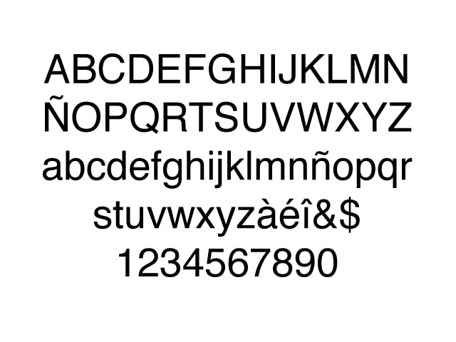
Helvetica has its roots in Swiss design, with a sense of neutrality that never gets in the way. It’s been used by brands like Apple, Target, and Panasonic, and there’s even a documentary about it.
It may be a great example of sleek typeface design, but now that it’s everywhere, Helvetica can feel too safe. Helvetica certainly has its place, but with so many fonts out there, why not try something that sets you apart from the crowd?
Copperplate Gothic
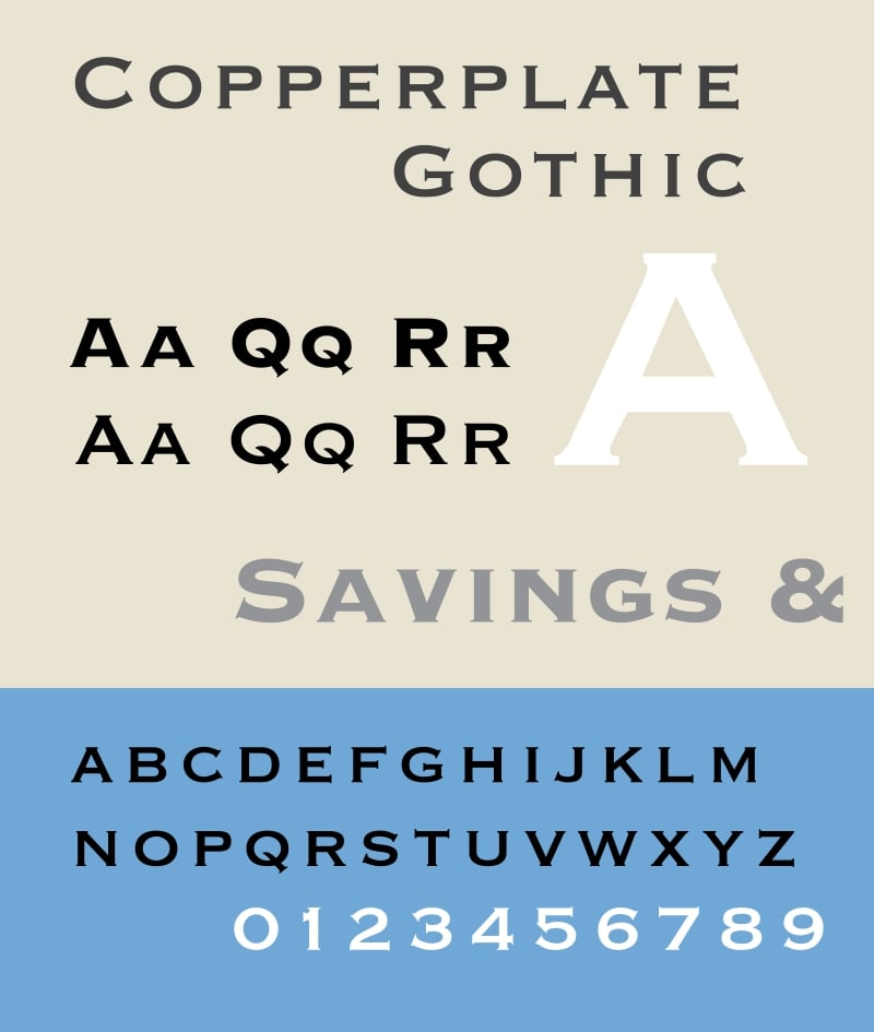
Copperplate Gothic seems to be all over websites that are related to law, accounting, or other traditional realms of business. This overuse has made it a bit of a typographic cliche. Copperplate Gothic also has stumpy serifs set against thick stroke weights, making it a tough one to get sizing just right.


Get started for free
Create custom, scalable websites — without writing code. Start building in Webflow.
The hardest to get right in web design
Vivaldi
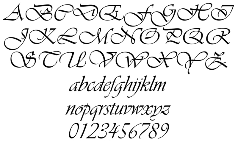
Vivaldi lures you in with its inky and fanciful flourishes — and though it can be great for aesthetics, its legibility is poor and can be too distracting to work into most website layouts.
Bleeding Cowboy
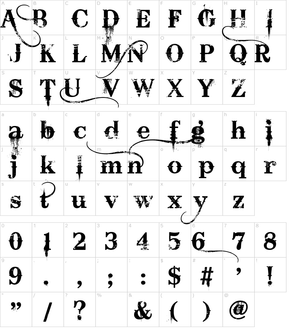
Bleeding Cowboy wasn’t always a reviled font. Its “wild west meets grunge” vibe used to feel new and dangerous. But its uneven letterforms are illegible at smaller scales, posing a big problem for user readability.
Bleeding Cowboy is also one of those fonts that are a bit too specific — making it hard to incorporate in most, if not all, designs.
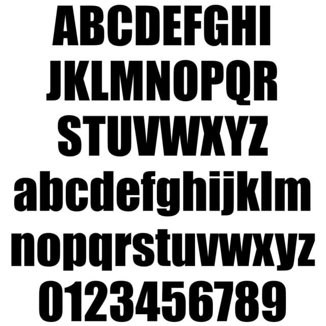
Stencil
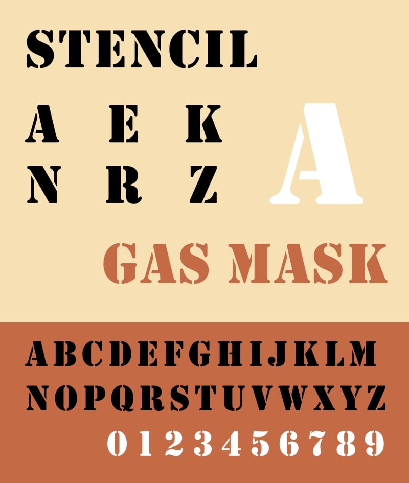
Stencil tends to feel incredibly bold. Unless you’re designing a website that fits this typeface just right, it’s best to avoid. Additionally, there’s no option for lowercase lettering with this typeface, making it inaccessible for many people.
Find the right fonts for your designs
Fonts are essential in presenting content in a way that people can read through comfortably. The fonts web designers should avoid are ultimately the ones that can be confusing, inaccessible, or overused.
Learning more about typography will help you out as a designer. Check out Webflow’s typography reading list to expand your knowledge and give you a better perspective on how to choose the best fonts for your work.