Fonts may not always be top of mind, but they’re critical in creating the right impression for your website.
Colors, images, and animations often steal the spotlight in web design, but fonts play a decisive role in how people experience your content. Text is often one of the first things people notice, and the right font gives visitors an idea of what to expect from your website and brand.
The right font can guide readers’ attention, reinforce your visual identity, and create a sense of harmony for a better user experience. Read on to find the perfect professional font for your brand.
Why is choosing the right professional font important?
Professional fonts are clean, well-balanced, and easy to read across different devices and screen sizes. Business websites and marketing pages typically use professional fonts because they want a professional look — polished, credible, and able to leave a lasting impression.
Designers also employ professional fonts to establish visual hierarchy in their web projects. A visually cohesive site ties the fonts in with other elements, like images, layouts, and buttons, making it easier for visitors to absorb information and act on what they read.
Professional fonts also have the ability to build trust with potential customers and establish or reinforce an organization's brand identity. Using legible, clear fonts throughout your site creates a consistent, cohesive design. This consistency helps customers trust your organization and reminds them of your unique value proposition and brand identity, setting your brand apart in a crowded marketplace.
20 best professional fonts for web design
1. Garamond
Elegant and timeless, Garamond is a classic serif font popular for its readability. Serif fonts have small decorative lines or strokes at the ends of letters and are often seen in traditional print like books or newspapers. Serifs generally make letters flow together in a more pleasing way for the eye — that’s why Garamond’s balanced letterforms and smooth curves make long-form content easy to read, especially on text-heavy pages like blogs, publications, or editorial sites.
2. Calibri
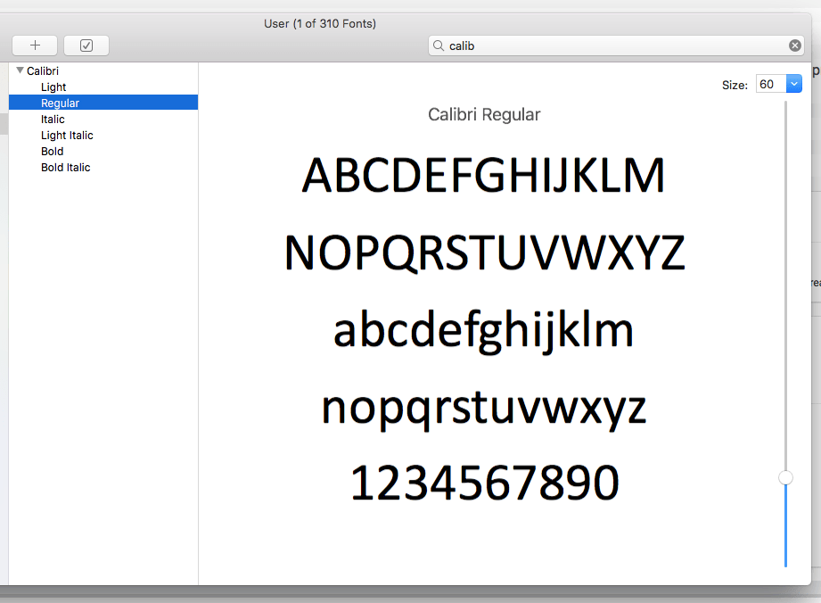
Calibri is a modern sans-serif typeface (fonts without decorative strokes). Its rounded edges, open letterforms, and subtle proportions give it a friendly tone that works well for body text and minimal layouts. It scales well across devices, making it an excellent choice for responsive design. Calibri is a solid font if you want your website to feel professional but not overly formal. It’s also the default font for many current and legacy web processors, so it’ll give your work a familiar, readable feel.
3. Lato

Lato’s geometric structure has a soft, friendly tone that tells visitors you’re an approachable yet confident brand. Its open letterforms improve legibility, and its subtle style works well across body text, headlines, and navigational elements like buttons and menus. Lato is a reliable font pick if you want to prioritize your site’s usability without sacrificing a contemporary look.
4. Futura
Every letterform in Futura’s font family feels intentional. It has perfect circular curves and straight lines, making text seem precise but approachable thanks to the rounder letterforms. It’s especially effective for large headings or logos. Nike, Gillette, Domino’s Pizza, Louis Vuitton, Red Bull, and PayPal all have iconic Futura logos.
5. DIN
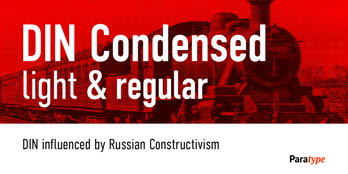
DIN has an engineered, utilitarian feel. Initially designed for road signage, its uniform spacing and letterforms make it highly readable at any size. The mechanical vibe of DIN offers a structured, authoritative feel that’s well suited to architecture, design, and engineering sites. For example, BMW and Siemens have DIN in their logos — both giants in the automobile and tech industries.
6. Baskerville
Common in publishing colophons since the 18th century, Baskerville adds a literary elegance to your website. The contrast between thick and thin strokes makes content feel classic but not outdated. That means you can use Baskerville for anything from upscale brands to editorial sites. It’s also highly legible for headings and paragraph text.
7. Playfair Display
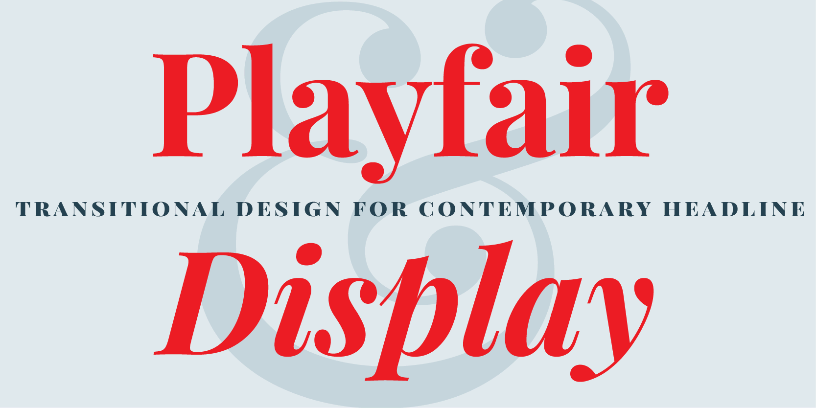
Playfair Display is an expressive font with high contrast and graceful curves. It’s excellent for headings and hero sections where you want to communicate sophistication, elegance, or luxury. It might be too decorative for body text, but it’s highly legible and grabs attention in larger messaging. If your website’s visual identity leans toward artistic, then Playfair Display is a strong choice.


Get started for free
Create custom, scalable websites — without writing code. Start building in Webflow.
8. Didot
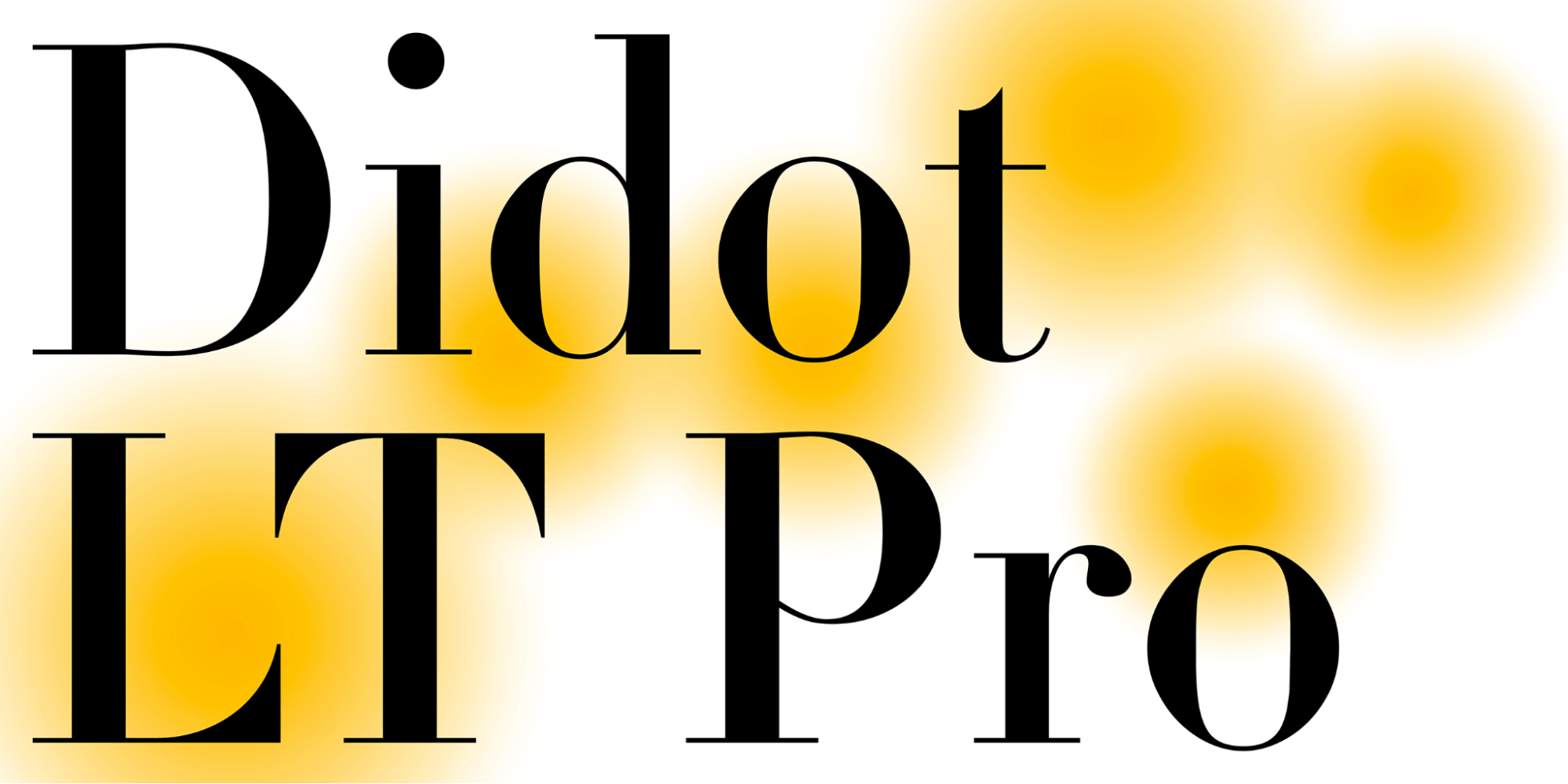
Didot has ultrafine serifs and dramatic strokes, making it an intriguing font option for fashion, beauty, and lifestyle brands. You can use it for headers and quotes or for other testimonials that encourage readers to try your products. Because of its diva status, Didot shines in clean layouts with ample white space that help the font breathe and take center stage.
9. Book Antiqua
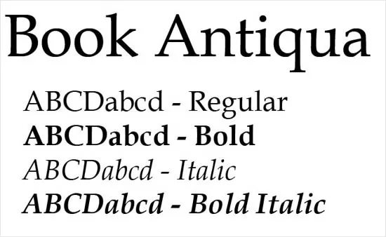
Book Antiqua is a warm, readable serif typeface that’s classic and inviting. Its slightly calligraphic letterforms give text a human touch, which works well for brands that want to be seen as professional yet approachable. Use it for body text, subheadings, or even longer articles on educational sites and blogs.
10. Pacifico

Pacifico is a playful, handwritten-style font with smooth edges and cursive curves. It’s a casual option for creative brands or youth-focused content, but you can sparingly use it in logos and headings for a friendly approach. While more expressive than most fonts on this list, Pacifico remains legible when it sits in enough negative space.
11. Century Schoolbook
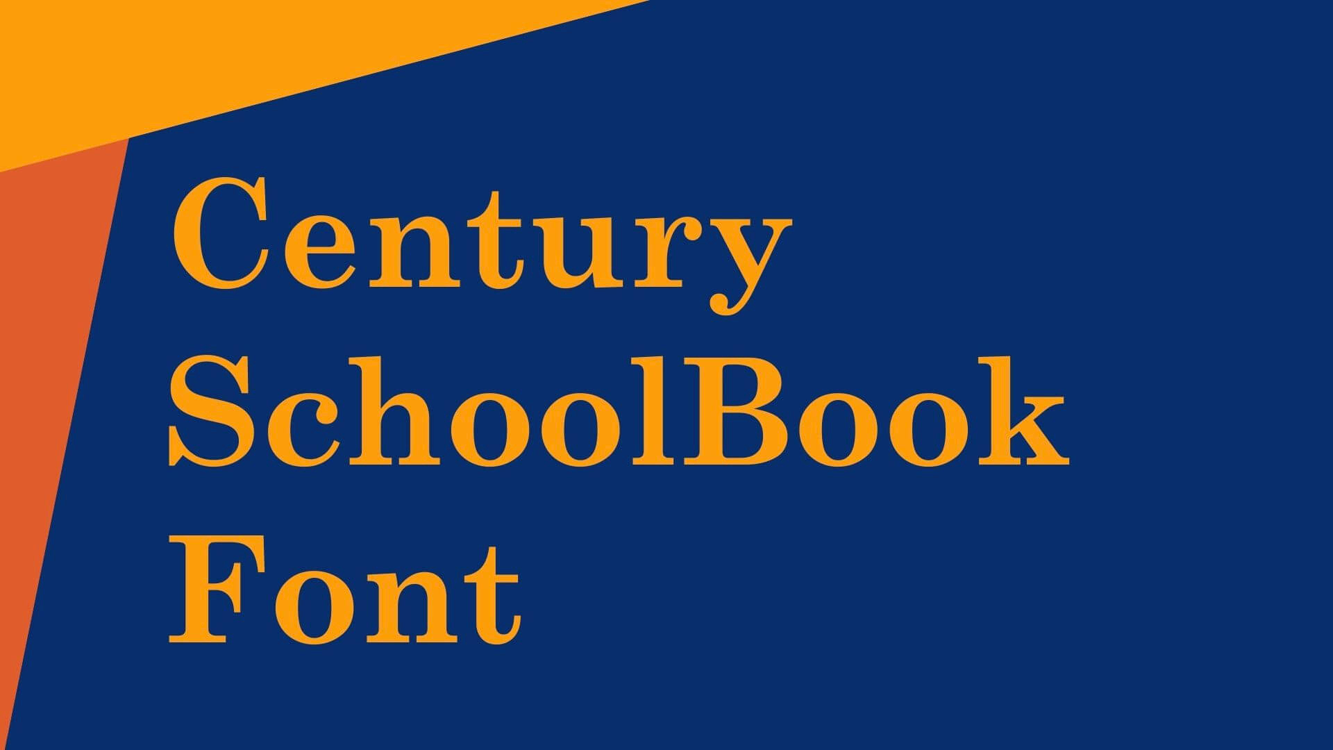
Originally made for printed textbooks, Century Schoolbook’s wide spacing and smooth serifs make text easy to read. It translates well to the web, especially for educational, editorial, or legal sites. In fact, the U.S. Supreme Court uses the Century font family in its official documentation.
12. Bodoni
Bodoni is a dramatic font known for its sharp contrast between razor-thin serifs and bold vertical strokes. Because of these elements, it’s usually best to add a generous amount of white space to guide readers’ eyes to this font. You can use Bodoni for high-end fashion and editorial sites. For example, Vogue’s iconic logo uses Bodoni, making it a staple in the luxury and lifestyle space.
13. Helvetica
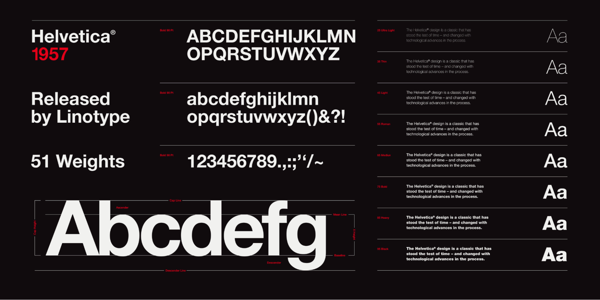
A modern classic, Helvetica was designed in 1957 and remains one of the most popular fonts in the world. Its neutral typeface makes it incredibly versatile for almost any use case. From body copy to navigation menus, Helvetica doesn’t draw too much attention to itself and works best in minimalist layouts.
14. Proxima Nova

Proxima Nova merges geometric forms of fonts like Futura with subtle curves, giving it a handmade feel. This blend makes it a web design favorite — you’ll see it on sites like BuzzFeed and apps like TikTok. It’s versatile and legible, rendering cleanly across different devices at any size.
15. Roboto

Google created Roboto for its Android operating system, and it’s now a go-to font for digital products and responsive layouts. Natural curves soften its mechanical frame, making it approachable and highly readable. It pairs well with other fonts or stands strong on its own, making Roboto a safe bet for tech and user interface (UI)-heavy websites.
16. Verdana
Designed specifically for on-screen readability for Microsoft, Verdana holds up at any screen size. It has open letterforms and generous kerning that feels spacious and uncluttered, making it an excellent choice for accessibility-first designs, data-heavy pages, and long-form content.
17. Ramaraja

Ramaraja, a referent to Rama, a Hindu deity, stands tall with a stately appearance. Its vertical emphasis and pronounced serifs make it an excellent font for editorial content, like headlines, hero text, and blog titles. It’s less common than other fonts, making it an alternative to Playfair or Baskerville, which see frequent use.
18. Frutiger
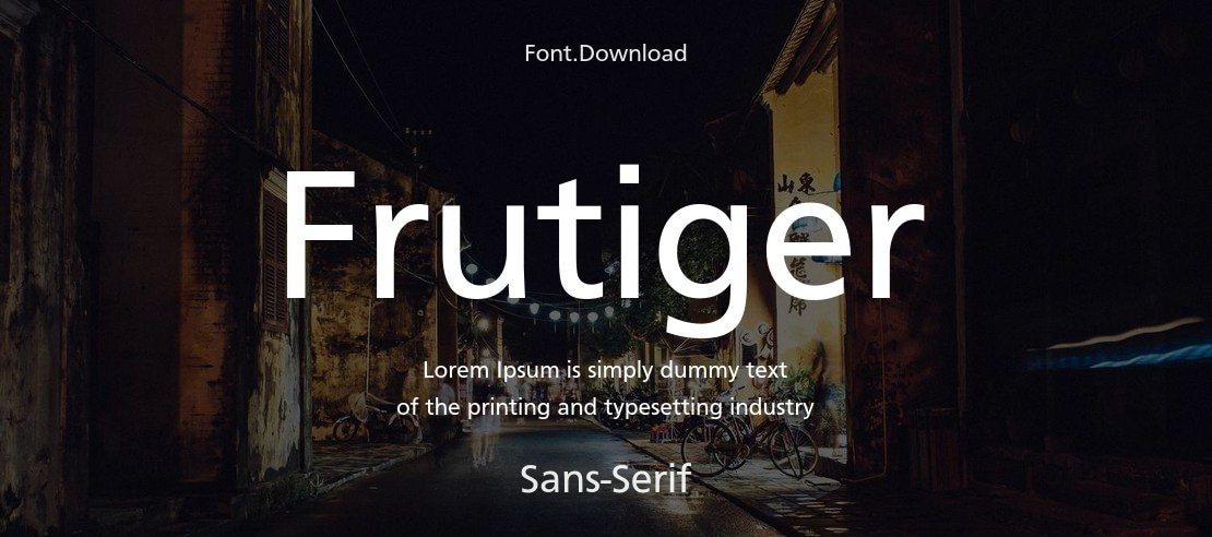
Adrian Frutiger designed his namesake font in 1968 for signage at Paris-Charles de Gaulle Airport. Frutiger is highly readable even at a distance, making it an excellent choice for web accessibility. Its letterforms feel organic and friendly, while tight spacing keeps designs compact. The National Health Service in the United Kingdom and Swiss Railways in continental Europe use Frutiger, showing its strength in high-trust, public environments.
19. Georgia

Like Verdana, Georgia is a web-specific font. Commissioned by Microsoft in 1993, its web-friendly appearance makes text legible even on low-resolution screens. You’ll find Georgia on editorial sites like the New York Times and many blogs, where readability and tradition merge to give content a classic, newspaper-like feel.
20. Teko

The square-shaped, sans-serif font Teko has an industrial appearance. Its uppercase-heavy forms work best in headlines, banners, or UI elements where you have limited space but want to convey something boldly. Teko is excellent for sports team logos, tech companies, and high-energy brands.
How to choose the best professional font for your website
You should choose a font based on how it supports your brand, improves readability, and guides users through your website. Here are a few tips to help you choose the best font for your next web project.
Understand the difference between typeface and font
Before you choose your site’s core font, you should decide on a typeface. A typeface is the broader design family (like Times New Roman or Arial), while a font refers to the specific style and weight (like Times New Roman Italic, 14 point, or Arial Semibold, 16 point).
Knowing the difference will help you build a consistent typography system on your website. You can use different fonts within the same typeface to create a hierarchy without losing cohesion.
Decide between serif and sans-serif typefaces
Serif typefaces have small strokes at the ends of letters and tend to feel classic and formal. Sans-serif fonts skip the extra detail, giving them a more modern and minimalist appearance.
Choose a typeface based on your brand’s visual identity, or pair serif and sans-serif to create variation and give your website a little personality.
Prioritize readability and responsive design
Your font should be easy to read across devices and screen sizes. Look for sharp letterforms, generous spacing, and compatibility across platforms. A professional typeface should work at different weights and font sizes, regardless of where you add it to your site.
Match the font to your brand’s personality
Consider what your brand stands for: Is it bold and energetic, or formal and understated? The right font can reinforce your chosen traits and convey your brand’s personality.
For example, a sans-serif typeface might convey that your company is modern and innovative, while a high-contrast serif suggests a more classic feel.
From font choices to a finished website
When creating your business' website, a well-chosen font builds a recognizable brand identity, connects with your audience, and provides a seamless customer experience — no matter what industry you’re in. From assessing the readability and accessibility to considering the tone and style, your chosen font has the ability to captivate, inform, and inspire.
Once you've chosen your font, create your website using a template, or start from scratch with Webflow. Stay up-to-date on the latest design trends to select a font that resonates with your audience, and then bring your vision to life in our visual design platform.
Build websites that get results.
Build visually, publish instantly, and scale safely and quickly — without writing a line of code. All with Webflow's website experience platform.