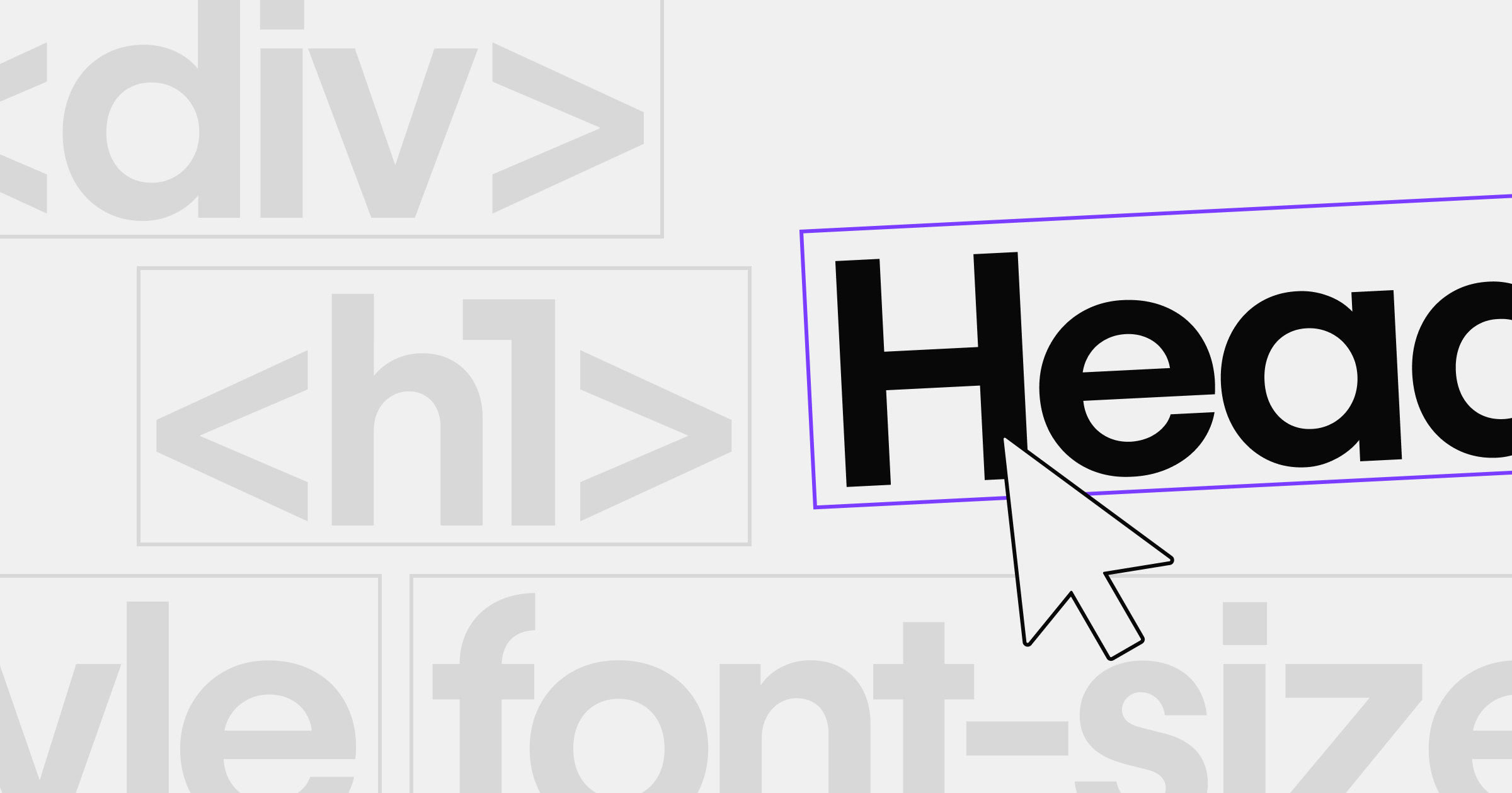


Choosing the right font for a project is one of the most critical tasks in visual design.
Font design has evolved significantly over the centuries. Designers adopted serif fonts long ago for print, while sans serif fonts emerged more recently to embody a clean, modern style that resonated with evolving tastes and digital advancements.
When it comes to your website, a good font has a huge influence on your user experience. Not only does it affect the readability of your content, it can also set the tone and theme for your site and establish the feeling visitors associate with your site and brand.
One of the biggest factors in how a typeface is perceived is if it's serif or sans serif. Each has its own unique characteristics, which can significantly impact how readers perceive them.
Let’s explore the differences between these two categories, their advantages and disadvantages, and how you can use either of them in your next project.
What is a serif typeface?
A serif font is a typeface with small lines or “feet” that extend off of the letters.

These lines are called serifs, giving it the name serif font. Designers adopted serif fonts centuries ago, and they've been popular in books, newspapers, and magazines for a long time. Until the 19th century, nearly all books used serif type.
Popular serif fonts
Times New Roman is perhaps the most notable serif typeface of the late 90s and early 2000s. It first appeared in 1932 in The Times of London newspaper because it allowed more letters in a narrow newspaper column without sacrificing readability.
Times New Roman also became a default choice for early websites, contributing to its widespread use in documents and advertising.
Some other notable serif fonts include Didot, Bodoni, Georgia, and Garamond.
Pros of serif fonts
- Nostalgic, yet unique: Serif fonts have a classic lookthat can feel formal or nostalgic. They evoke distinct emotions thanks to their longtime presence in print.
Cons of serif fonts
- Print-friendly but tricky on small screens: Serif fonts often feel comfortable for long-form print because the serifs help guide the reader's eye. On low-resolution or small screens, they might appear jagged or blurry, hurting readability.


Ultimate web design
From 101 to advanced, learn how to build sites in Webflow with over 100 lessons — including the basics of HTML and CSS.
What is a sans serif typeface?
Naturally, a sans-serif font is a typeface that doesn't have serifs in the typeface. The “sans” in the term "sans-serif" is a French word that means "without." Typically, sans serif faces have lower stroke contrast than serifs.
Popular sans serif fonts
The first known use of a sans serif typeface was in 1816. The typeface was created by typefounder William Caslon IV and was named "Grotesque." Some examples of modern sans-serif fonts include Arial, Helvetica, Futura, and Calibri.Just like serif fonts, sans serifs can appear differently across device resolutions. It's helpful to preview samples on various screens to maintain a crisp, clear design.
Pros of sans serif fonts
- Easy to read on screens: Sans serif fonts are easier to read on device screens, including low-resolution screens, because they have a clean and simple design.
- Minimalist and clean look: The absence of serifs makes sans serif fonts a popular choice for designers who want to create a clean and modern look in a user interface.
Cons of sans serif fonts
- Might feel too minimal for certain brands: A purely minimalist look can come across as plain unless paired with other distinct design elements.
How serif vs sans serif fonts shape brand perception
Font choice can convey a brand's personality and values. A serif font might suggest heritage, trust, or a more formal tone, while sans serif fonts often project a contemporary, approachable vibe that appeals to modern audiences and digital platforms.
Choosing serif or sans serif for your project
The choice between serif and sans serif fonts depends on many factors, such as what you're going to use it for, and how.
Beyond just picking a font style, remember to adjust spacing, margins, and kerning so each font remains legible across devices and screen sizes.
Consider brand personality: Serif fonts can lend an air of tradition or formality, while sans serifs may feel more welcoming and easygoing.
Serif fonts are commonly used for printed materials such as books, newspapers, and magazines because the serifs help guide readers’ eyes. This is especially valuable for long passages of text in articles or books, but serifs aren’t always the best choice for certain aspects of web design.
This isn’t to say you can’t use serifs on websites — just be mindful of things like placement, size, kerning, and spacing so it's legible for your users. Modern brands like One Medical, Spindrift, Great Jones, and Chobani have used serif fonts prominently in their headers and logos. Serif fonts might work well for standout headlines in some brands, while sans serif typefaces often provide an approachable look for body text.
Compared to serif fonts, sans serif fonts are often considered more modern and informal in style, making them a good choice for digital products such as websites and mobile apps. Tech companies often use sans serif fonts for body text when creating digital products because sans serif fonts make brands or products appear new and innovative.
It's worth noting that these aren't strict rules. You can choose your fonts based on your own styles and use cases. For many designers, serif vs sans serif readability can guide decisions around brand trust and user engagement. In fact, many designers choose font pairings that include both serif and sans serif typefaces throughout their web designs. Just be sure to test your designs on various devices to ensure your font choices remain legible across screen sizes.
Frequently asked questions
Which is better for headings and body text on websites: serif or sans serif?
Sans serif fonts are generally better suited for body text on websites because they display more cleanly across screen resolutions and devices. Their simple, unadorned shapes make them easier to read in longer passages, especially on small screens. Serif fonts, on the other hand, work well for headings — their distinctive flourishes add personality, elegance, and emphasis that naturally draw attention. Many effective websites pair the two: serif for bold, expressive headlines and sans serif for clear, readable body text. This balance helps create visual hierarchy while maintaining both style and usability.
Is it easier to read serif or sans serif on screens?
Sans serif fonts are typically easier to read on screens due to their clean lines and minimal detailing. Without serifs — the small strokes at the ends of letters — sans serif typefaces avoid the blurriness or clutter that can occur on lower-resolution devices. While modern displays have improved how serif fonts render digitally, sans serif remains the most reliable choice for body copy across varied screen sizes. That said, serif fonts can still shine in larger text elements like headers or quotes, where their unique characteristics enhance visual interest without hindering readability.
How do serif vs sans serif choices influence brand perception?
The choice between serif and sans serif fonts influences how your brand is perceived — serif fonts often suggest tradition, sophistication, and authority, while sans serif fonts feel modern, clean, and accessible. Combining the two can convey both credibility and approachability when used thoughtfully. For example, using a refined serif font for headlines and a legible sans serif for body text creates visual contrast that supports hierarchy and guides readers through content. Successful pairings share compatible characteristics like x-height and spacing, ensuring the contrast feels intentional rather than jarring — reinforcing a brand identity that’s both stylish and functional.
Use serif, sans serif, or a blend based on your brand experience
Think about tone and context. The best thing about design is it's what you make of it. Whether you go all-in on serif, san serif, or both, make sure that it complements your design and the story you want to tell.
Ready to put these fonts into action? Whether you're starting from scratch or need inspiration, explore templates to jumpstart your next project or Made in Webflow for more inspiration.
Launch with Webflow Templates
Choose from hundreds of professionally designed website templates for any industry or style. Customize visually, launch instantly — no coding required.