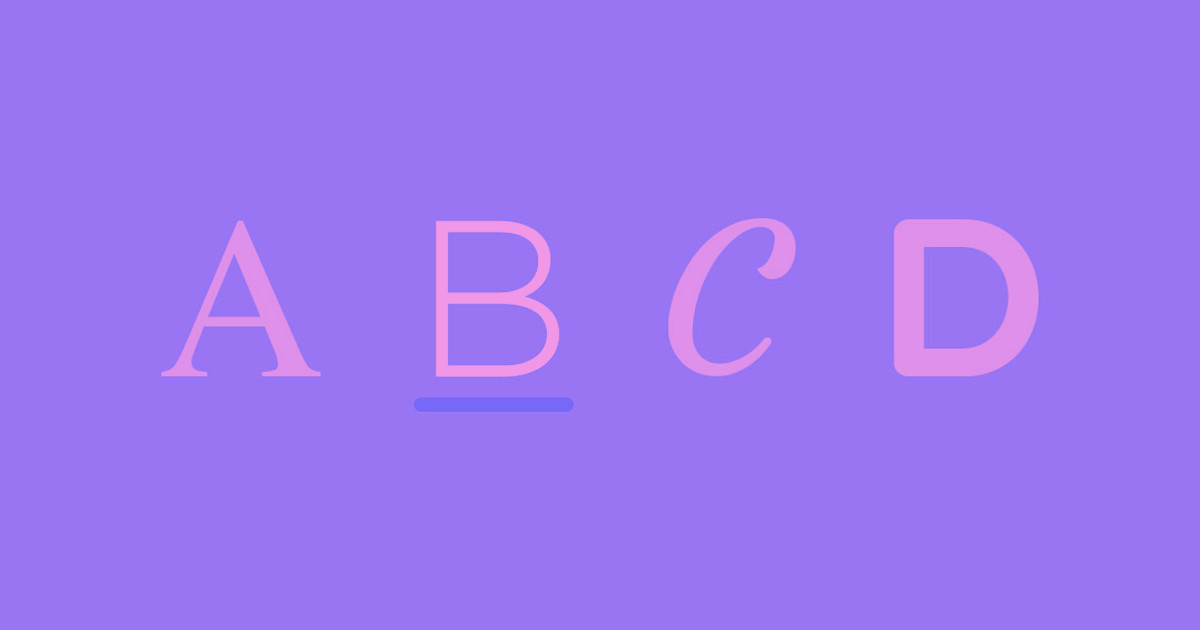
A great font pairing can make all the difference in establishing your website’s unique style.
The best font pairings use varying sizes and styles to complement web layout. By carefully selecting the right pairings, designers make their websites easier to navigate and more compelling to read. In a remote readability study with 252 participants, matching readers with their fastest font among eight digital fonts improved reading speed by 14-25 words per minute compared to default fonts, without reducing comprehension.
Because there are so many typefaces and font families to consider, creating a clear visual style can be difficult. This guide will provide eight great font pairing examples and explain everything you need to know when selecting your own font combinations.
Typefaces to consider when coming up with font combinations
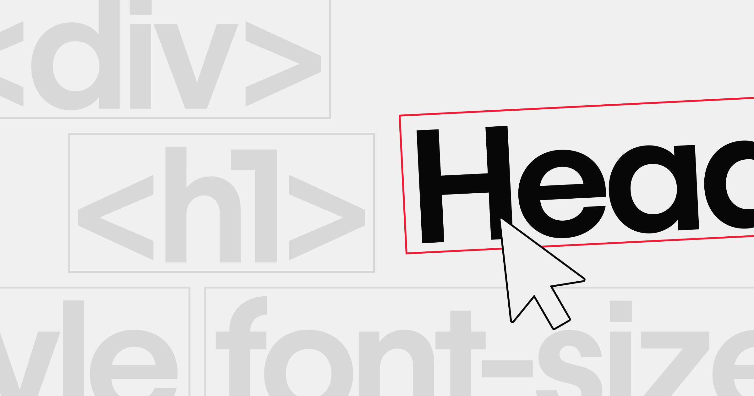
The first thing you’ll need to do when pairing fonts is to choose the typefaces you want to use. Typefaces are categories that describe some basic elements most fonts share, such as the following:
Serifs
A serif font includes embellishments on each letter that make them resemble cursive, handwriting, or script. These details add a touch of flair to your text. They work best for website designs that use a lot of detail and styling.
Sans serifs
As the name implies, sans-serif fonts don’t have any embellishments on their letters. They’re usually plain and generously spaced. That makes them great fonts for legibility, so you’ll usually find them on text-heavy websites like blogs.
Display fonts
Display fonts can be either serif or sans serif. Designers use them as a primary typeface for large headings and titles.
When selecting a display font, consider how well it contrasts with the other fonts you use and ensure it suits your brand’s overall style. For example, an elegant font like Josefin Sans might not work well for a brand that prioritizes edgy, bold designs.
Monospaced typefaces
Monospaced typefaces are usually sans-serif fonts in which every letter takes up precisely the same amount of space. Roboto Mono is a popular example, and designers typically reserve it for code snippets or quotes that need to stand out from the surrounding text.
8 font pairing examples
Here are eight examples of the best font pairings for legibility and style. Use them as-is in your next web design, or consider how you might mix them up to create new font combinations.
1. Roboto and Open Sans
This font combination appears in everything from white papers to websites. It may be standard, but it’s very readable, approachable, and clean. Roboto has several weight options that can be adjusted for different heading sizes, and Open Sans is the epitome of legibility. This plain but useful combination makes a great font pairing for technical documentation, knowledge bases, or support FAQs.
2. Montserrat and EB Garamond

Montserrat is a neatly spaced sans-serif font. This semi-bold version contrasts with the elegant linework of EB Garamond, which has a classic typewriter appeal. The headings in this font combination are especially easy to pick out, making it great for news articles that readers might want to scan through.
3. Alfa Slab and Source Code Pro
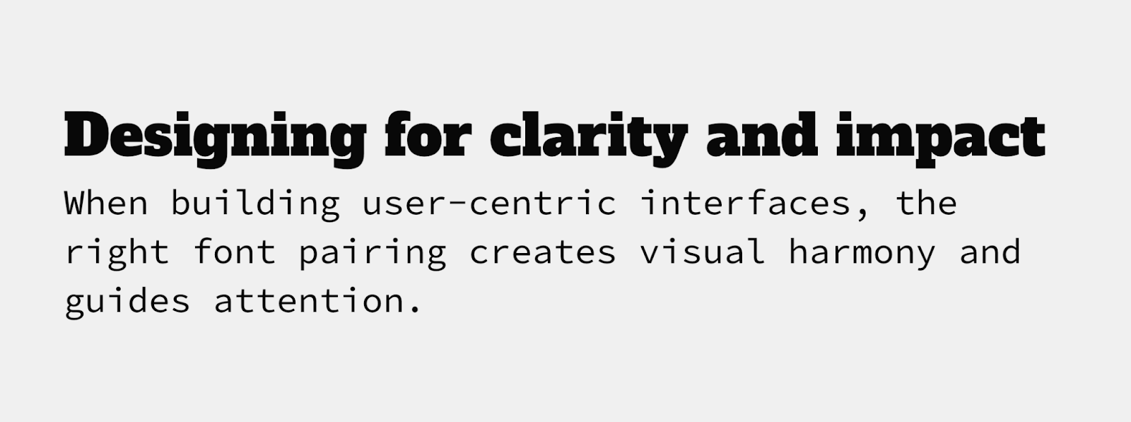
Use this font combination if you really want to break away from the norm. The Alfa Slab font is bold, serifed, and heavy, while Source Code Pro is light and spacious. This monospaced version of Source Sans Pro is useful for code examples, quotes, and long text blocks like the above excerpt. It’s a great font for scripts, too, and when you pair it with a slab font like Alfa Slab, you have a stark contrast that’s pleasing to the eye.


Ultimate web design
From 101 to advanced, learn how to build sites in Webflow with over 100 lessons — including the basics of HTML and CSS.
4. Abril Fatface and Bad Script

This all-serif font pairing combines the classic appeal of old-school typography with the handwritten look of script fonts. It’s a great font pairing for printed products like wedding invitations or playbills. The bold, slab appearance of Abril Fatface clearly marks all your headlines, while the scrawled handwriting of the Bad Script font provides a unique look.
5. Playfair Display and Montserrat
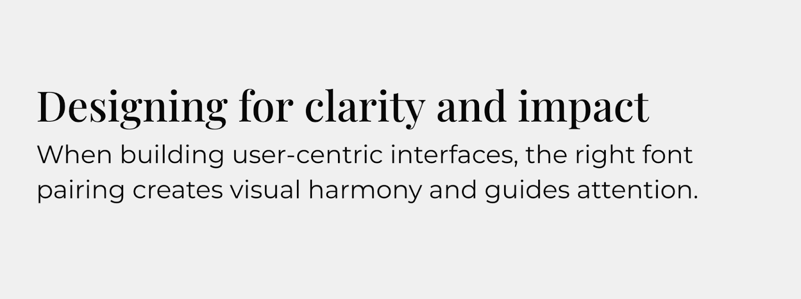
Playfair Display is an elegant, modern font that resembles newspaper typography. The medium-weight version adds enough bolding to make the headings distinct from the body text without losing its sharp serifs. Playfair delivers a bold, modern statement when paired with the spacious and consistent Montserrat.
6. Josefin Sans and Lato

Josefin Sans resembles handwriting, and this sans-serif version is the best font for landing pages or homepages where you want the text to appear inviting. If you follow it up with the equally inviting and readable Lato, you get a consistent text block with just enough subtle contrast to draw attention.
7. Open Sans and Lato

Pairing two sans-serif fonts is a great choice that prioritizes readability, or for sites that use a minimalist design style. Open Sans is familiar to most readers, and when paired with the tight spacing of the Lato font, you get strong headings followed by body text that maximizes use of the page.
8. Source Code Pro and Space Grotesk
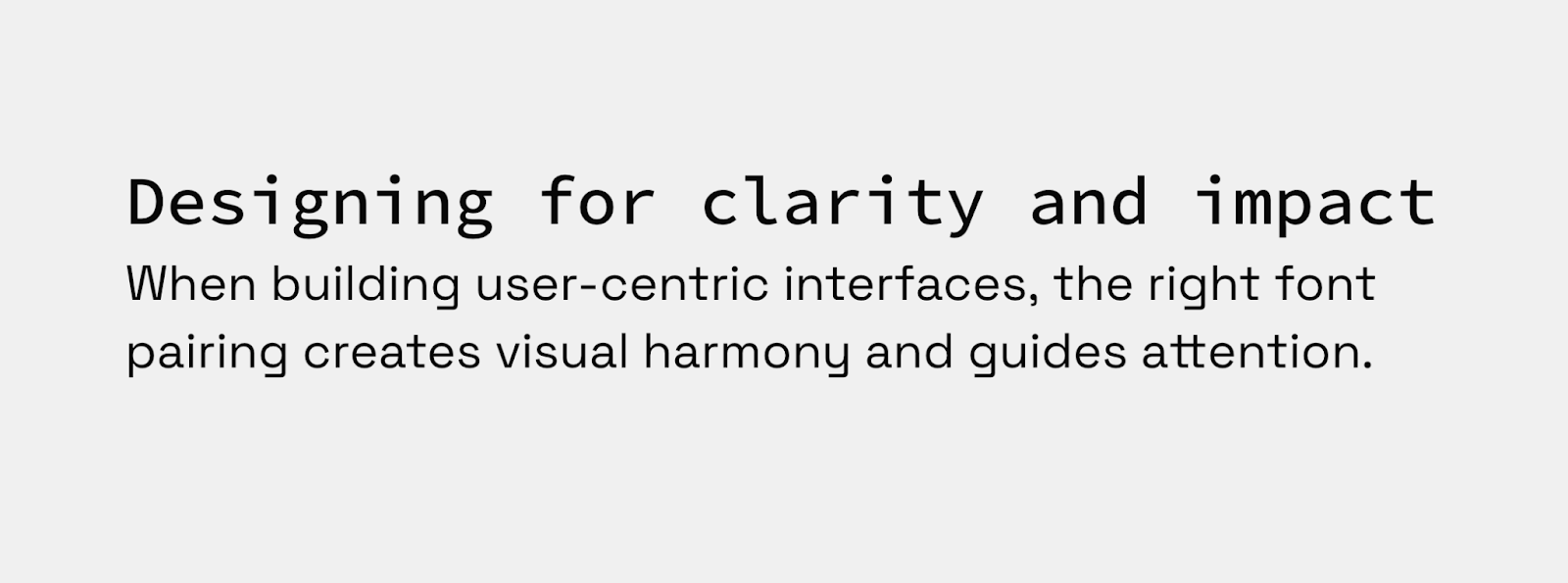
If you’d rather put a monospaced font in your headings, try pairing Source Code Pro with Space Grotesk, a generously spaced sans-serif font that’s easy to read. This font pairing works perfectly for tech and science blogs where a monospaced font will be familiar to the audience, while the body text is ideal for long, highly detailed papers and case studies.
Tips for combining fonts in your web design
Consider the following ideas if you’d rather make your own combinations:
Use fonts that have different tones
Every font adds its own personality to the text, and you should select ones that enhance the tone you’re trying to achieve. For example, cursive script fonts like Lucida are great for conveying elegance on a wedding planner’s website, while slab fonts like Alfa Slab are usually better for a disruptive tech brand.
Create the right amount of contrast with typeface pairs
Your main objective is to keep body text legible and headlines eye-catching, but that doesn’t mean any combination that achieves those goals is the right choice. You don’t have to stay in the same font family or even typeface category, but you should look for commonalities like stroke weights, spacing, and style that make different fonts compatible.
Limit different typefaces to three or fewer
As with color palettes and page layouts, you should stick to a small selection of fonts on your site. Too much variation throughout your page increases the cognitive load required to interpret it, which could cause frustration that leads readers to bounce out of your website.
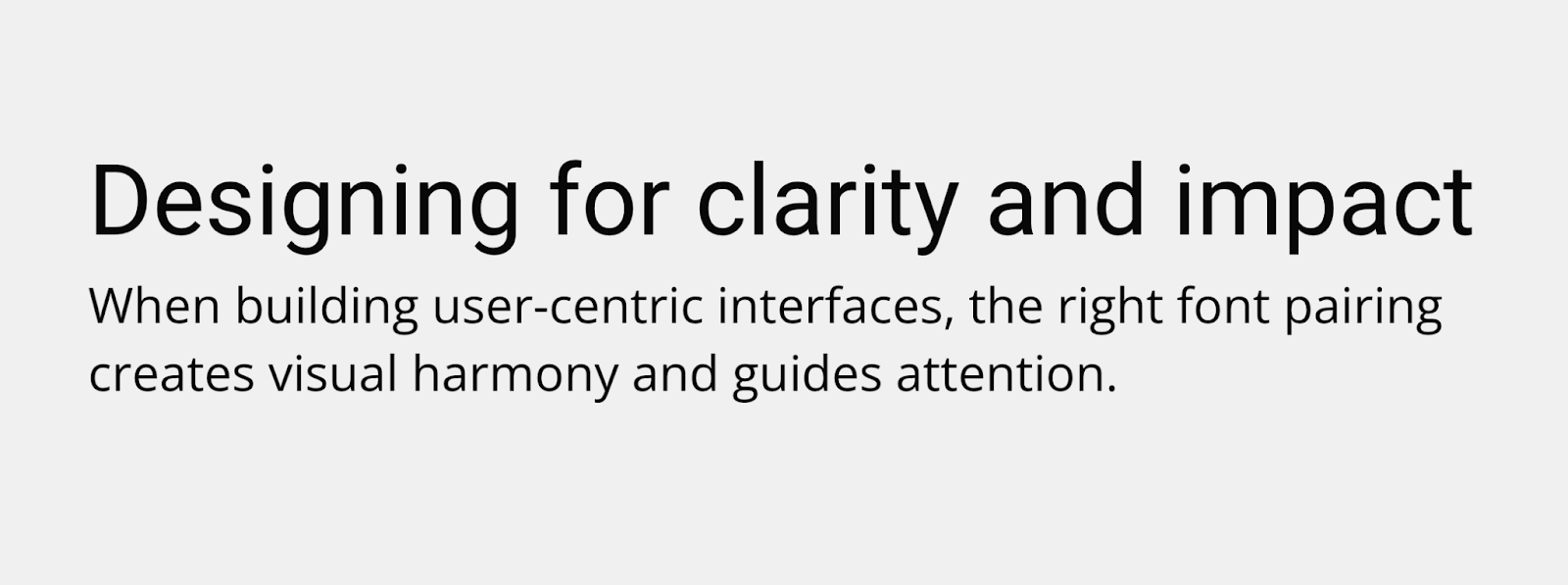
Communicate visual hierarchy through font pairing
Your font pairings should clearly distinguish between titles, headings, and body text. If you keep those differences consistent, readers will naturally learn how to navigate through your website. Here are a few ways to achieve this effect:
- Use font size to imply order. Scale your font size down as you move from titles to headings to body text. Somewhere between a 20–30% reduction for each step is usually best, such as 20pt, 16pt, and 12pt.
- Experiment with different weights. Different weights, such as medium and semi-bold, provide noticeable visual cues for readers. Lean into that behavior by using bold weights for headlines and titles and medium or normal weights for body text.
- Vary font color shades. Your body text should usually be flat black to make it readable, but you can play around with the shades of your heading fonts. For instance, you could increase the saturation of the font color as the headings get bigger to create an obvious visual hierarchy.
In a study of 104 people reading text on screens at different font sizes (10-26 points) and line spacings, readability and comprehension improved significantly up to about 18-point font size; beyond that, gains flattened.
Use a font generator
Try font pairing tools to browse hundreds of unique fonts. Notice which ones catch your eye immediately, and then try different font combinations to determine which ones you like most.
Transform your web designs with perfect font pairings
The perfect font combination can make all the difference in website design. Whether you want to leverage the familiar simplicity of Roboto and Open Sans or the elegant readability of Playfair Display and Montserrat, you’ll need a keen eye for detail and a platform that encourages experimentation.
Start by experimenting in Webflow, testing font pairings side by side on a visual design canvas. Once you’ve locked in the pairing that best fits your brand, use components and global styles to apply them consistently across your entire site — no need to manually update every text class.
Get started for free
Create custom, scalable websites — without writing code. Start building in Webflow.